Skip to Content Skip to Search Go to Top Navigation Go to Side Menu


"photography" Category


The Dice Man


Sunday, May 26, 2019
I browsed in the blog, partly floating, partly with full attention. I moved in the world of the blog through the tags on the left. I had a method: First post I choose randomly, then I scrolled down until the post ends, if something caught my eye or my mind, I lingered, wrote some notes, seldom made a screenshot.  Then, I clicked on a left purple tag that is located on the same line as the end of the post (the grey tagging section). I had some choice between 2-6 tags, depends on how big the grey tagging section was.

The first post was in Dutch, so the visualization was the only thing I had.

Grey Hypocrisy felt like it was made for me, the first hint, “quest for the dull”, he said. With an image of a room, with a personless solitary chair. These kind of rooms and chairs I’m trying to portray for a while.

5 years ago, Marlies wrote about Imme van der Haak . She reminded me of Yocheved Weinfeld,  Yocheved Weinfeld, and her artworks in the 70’s.

“why?”> ON QUESTIONING > “wrong side”

I encountered a post that was written on my birthday, and then a post that was written on my mother’s birthday. It’s gotta be a sign! I found myself looking for hints, not sure for what. 

Keep scrolling.

“warning” > “Ability to choose” >

“waiting”! “For the next to come along.”

More and more hints. Like these sentences are designed for me. I realized that I’m browsing like I could wander the streets as a small girl: not being a “believing person” but to believe in traffic lights. wherever there is a green light is the way I should go, it’s the right way for me, no space for free choice, it’s from above. From the god of traffic lights.

> “waiting to be found” > chairs!

“Death”> “yellow and tiny”>

I agreed with Rosa Doornenbal, she wrote some nice stuff. I started to decide for me, what is a metaphor in this infinite data. To find the metaphors.

Marie Knudsen wrote about a jewelry book about joints. Extract from the book: ”A joint is a place where two or more parts are united or made to fit together.”– is this about silver or people? she asks herself.

for me, it was About putting stuff out of context on purpose. To give things meaning by taking their context away. It’s about the movement between the details and being far from the details until its abstract.

“alive”>”alienation”>”abstract”>”time”>”enjoying”>”no time”>”absence”>”all sort of apes”>”allegorical”>”queue”

brows like you are looking for a quate. Saw a quaote of Walter Benjamin: “Beauty is not the object and not the shell, but the object in its shell.” Ok. Maybe another day it will mean something, keep it.

“I would like to bring your attention to noticing things.” I think it’s funny.

Walking with a Line was beautiful. Made it clear for me that sometimes the combination of things punctuate your heart. The context is important. Context is everything. to put things out of context means just putting it in a new context, in order to look at them beautifully.

look at this together! It’s so different then as two solitary pictures. 

And this also, it does something only together, when isolated it’s almost nothing.

Scrolled more.

I see more chairs. Van Goch’s chair >”walls” >>>

The browsing led me to this:

“The Dice Man”

If you are looking for an answer for something, a hint, or that the cosmos will decide things for you, you are in the right place. This blog and this post in particular. You can try to find your answer in the cards below, just click on one and see what it says.

The dice man is a book that tells the story of a New York psychiatrist named Luke Rhinehart who, feeling bored and unfulfilled in life, starts making decisions based only on the roll of a dice. He can’t change the dice’s decisions, including decisions about sex, murder, rape, and more.

This is your dice.

If the cards are not enough, you can start browsing the blog looking for a hint for life or an answer, using the overwhelming amount of posts the blog has to offer and using the randomness surfing that is possible here. But you need a method, you can use mine:

First post I choose randomly, then I scrolled down until the post ends, if something caught my eye or my mind, I lingered, wrote some notes, seldom made a screenshot.  Then, I clicked on a left purple tag that is located on the same line as the end of the post (the grey tagging section). I had some choice between 2-6 tags, depends on how big the grey tagging section was. And then I continued to the next post, scrolled down, chose a tag one the left that is exactly at the end of the post, and so on.

The amount of time you should do it is as the number that is on your card, or until you find your perfect hint.


Bauhaus and me


Friday, April 26, 2019

I’ve always been very fond of the Bauhaus photography, or photography itself, so when we visited the Bauhaus exhibition in the Boijmans museum, all I really focused on was the photography. The way they use lightning (reflections) on different textures and materials, make the pictures look very beautiful and dreamy. The black and white effect and the high contrast in shade and light in the pictures also ad to the dreamlike feeling I get from the photographs.


So I immediately knew that I wanted to research the photography of Bauhaus. In this post I’m going to compare the Bauhaus Photographs with photographs of myself, as a Rietveld student, and see if there actually are any similarities between us.

First I researched how photography in the Bauhaus was. At the very beginning of Bauhaus they only used photography as a form of documentation for the architecture and art from Bauhaus, so it wasn’t actually seen as a form of art but only for practicality and publication. After that they were very experimental with the camera, they used new angles, new perspectives and new techniques. They got teatched to see with precision so they would be able to capture every detail of an object or texture. A big influence on this experimental phase was Laszlo Moholy-Nagy. He used unconventional and daring perspective, which defined a different relation between people and architecture. Moholy-Nagy inspired the Bauhaus students and teachers to a new way of experimentally exploring and making use of the camera’s potential. By this way, the students used photography as a means to discover themselves and their work. After the experimental phase they put more emphasis on product photography and got teaching in technical and aesthetic skills, which was a more school-like approach to photography.


For this part of the research I am going to search for photographs of my own, that are similar of that of the Bauhaus and compare the images.

What I noticed when I was scrolling through the photographs that I have taken, I see quite a lot of architectural photographs. In the Bauhaus theres a big range of architectural pictures as well. But there are some differences in the architectural pictures in Bauhaus and my architectural pictures. For example in Bauhaus they mainly made photographs of architecture as a form of documentation, to publish in a magazine or a book. Of course there were some photographers who didn’t just take pictures of architecture for that purpose but also in an aesthetic or formal way. What I find interesting when taking architectural photographs is zooming in on its structure and details, taking it out of its context and creating a new kind of space or environment. Hereby I try to stimulate the viewer to create their own context and let their imagination on the lose. A photograph that can be compared to mine is ‘Steps in the water’ (1930) by Kurt Kranz. Similar in our pictures is the cancelling out of the space around it, and just focusing on one part of the architecture, creating a different space and feeling. Of course a difference in our photographs is the technique.  Now in 2019 we have many more (technical) options in photography than they had in 1919-1933. My picture is made with an iPhone and edited on the computer, so its digital. Moholy-Nagy’s photo is made with an analog camera and developed in a darkroom, unedited because that was not possible back than. This difference however is not even that visible to see.


Another picture I want to compare is a picture I made at the Stedelijk museum a few years ago. The photograph is of a fan with thin aluminium strips that move with the wind of the fan. I find that a good comparison to this photograph is a photogram. Which is a technique Laszlo Moholy-Nagy used to experiment a lot with. With this technique you place an object or anything you want on a piece of photographic paper and exposing it to light. The result is a negative shadow image of the item placed on the paper. Why I compared this to my photograph, is because the experience of looking at the images is quite similar even though the technique is so drastically different. What I mean by a similar experience has a lot to do with the lightning and the movement in the pictures. With my photograph the light reflects very strongly on  the aluminium and on the wall, which creates a same kind of effect as the photogram. The differences in the strength of the light is a similarity between the photographs. In the picture of the fan its visible that the aluminium strips are moving, and in the photogram there is also a kind of movement in the picture.

Now how does the Bauhaus photography relate to me as a Rietveld student? Definitely experimenting plays a really big role in the Rietveld Academie, as well as in the Bauhaus. Stepping out of my comfort zone and discovering new ideas and new ways of using my resources. The way that you’re really doing this for yourself and your own development as an artist I also feel strongly related to. Next year I want to go to the Photography department and experiment with different techniques and discover new ways of taking photographs and using photography and discovering what I want to create and become.


William Klein’s City Portraits


Monday, May 21, 2018

The American-born French artist William Klein (1928) is a multifaceted photographer and filmmaker, known for an unconventional style of abstract photography and in the same media a revolutionary approach to fashion. This text, however, focuses on his series of photo books portraying the cities New York, Rome, and Moscow.
This research had its starting point in Klein’s posters for the magazine Domus; As elaborated later in the text, Klein experimented to a great extend with a sort of “trashy”, or maybe just honest, way of expressing “city life”. Domus began to publish Klein’s experimental graphics/photography as front covers for the magazine in 1952. Among the covers were a very rough way of handling photography and typography to be seen: William Klein would torn his own work apart and put the ripped parts back together in an uncouth order.  As a visual language this lack of perfection and polished finish seems to find its inspiration in the actual torn posters one sees on walls in the streets of big cities. Having this style of “torn” magazine covers in mind, this research dives deeper into Klein’s visual language [x] describing the life of a city.

domus-cover-William-Klein_950 Schermafbeelding 2018-05-31 om 12.48.21

Klein studied painting and never received formal training in photography. One can argue that this “lack of technical education” made his experimental approach to the media possible. He would have to find his own way. This experimental and playful way of working with a medium is also present in Klein’s graphic work, as for instance seen in various posters, where Klein mixes photography, painting, collage, and typography.


His lack of academic photography training also showed itself as a virtue in his genre-defining photo books portraying cities that Klein visited. The first one, “New York” started as a photographic diary. When Klein came back to his hometown after six years of studying in Paris, he found momentum in this medium, that he had never really used before, and executed the extensive series in just 3 months. It was also a reflection of him returning to the streets he walked growing up and seeing new representations of people and situations he experienced there. The blurry, close up, in the actual photographs where not popular at the publishing houses but eventually broke through and had a huge influence on what we know as street photography. The next book, “Rome”, was made shortly after Klein moved there to be an assistant to Fellini.

klein-11 hb_1989.1038.2

left: image from 'Rome'©59 / right: image from 'Life Is Good and Good For You In New York'©56

Having two very separate relationships to the two cities must have affected the way Klein approached the photographic investigation. With this background in mind, you can distinguish some differences in these portraits. “New York” contains more pictures of children, a way for him as the protagonist to relate back to his past experiences in the space. He even says in an interview that he sees many “self-portraits” in the series. While “Rome” has similar stylistic features, you can glimpse more of an outside view, even in the way people look back at the camera.

5734df6218267979e8f5e2bae92f128c

379_1_large

One strong characteristic that separated William Klein from the start and became one of his signatures, was the use of motion and blur causing blur. This expression was developed in Paris when he was trying to document a mural he had painted. The wall consisted of a row of rotating panels, that when captured on an image created geometrical shapes with obscure lines. This discovery would be very crucial to several of the branching that his practice took, but would not be well received initially by traditionalists.

When Klein originally tried to publish ”New York” it was perceived as being ”too ugly, too seedy, too one-sided”. The publishers were used to, and wanted to, see the city portrayed in a romantic light. The high class, the architecture, the richness. Klein’s approach was instead semi-aggressive, unpretentious, focused on the people, and had no interest in being a promotional tool. This, for the time, controversial viewpoint would, however, be very welcome when he made the ”Moscow” book, the third in the series. The western/American picture of Russia was (and still is, but maybe even more extreme back then) extremely alienating and one-sided. His book depicts a lively and multifaceted Moscow and is considered to be the book in the city series where he comes closest to the subjects.

124532-1474570722-04Klein_William_bikini-xl

Sarah Boxer wrote a review in 2001 in New York Times [x] of two of his shows, where she brings up the notion that the authenticity in Klein’s pictures might be partially staged. Specifically, she talked about an exhibition where his contact sheets are being magnified and displayed. The contact sheets had notes in the shape of circles, arrows, and crosses, singling out the pictures that Klein had chosen to use when he originally developed the film. What made her questioning was the decoratively ”perfect” manner in which the lines were made. A lot can be said about this. Klein was originally a painter, so that could be an explanation for the way the motions of his hand could come of as decorative by default. Anyhow, it is interesting because much of his legacy, and the tradition of street photography in general, is built on the purity and honesty of the content. Though some of his works are known to be staged, it still has proved itself to be able to catch an essence in a community in a superior way.

Klein4

A general problem in culture is the inevitable tendency for rebellion to become stagnant. As a direct consequence of success and the finding of a language that comes with age, groundbreaking eventually becomes mannerisms. Klein has been lucky to keep a youthfulness about his work, often by sporadically changing lanes and looking for limits to cross in another niche. This quality has made him a prominent figure in a variety of photographic disciplines and testifies the importance of diversity that the market often overlooks.

csm_Lempertz-1058-130-Photographie-William-Klein-Candy-Store-New-York_f1d3875b82

The spoken History of the young worker


Saturday, November 25, 2017

The magazine was on the shelf and the first thing that i picked up, I was immediately drawn to this magazine. The first thing that I noticed was the size – A3 -, demands your attention, gives importance. The cover is the picture of a young man, the eyes immediately captured my attention, eyes that tell a story. They make want to know what he has to tell.

Front

The dialogue in the magazine is mostly told in black and white photographs, what relates to the titel ‘’The spoken history of the young worker’’. The pictures are strong, dynamic, a lot of energy. There are also pages out of newspapers or other magazines from all over the world relating to the young worker. I think they this to connect the workers from all over the world as one unity.

What really spoke to me about the young worker is how relatable they are. Boy’s my age working, revolting, search for freedom. A peak into a different age but we still want the same at the core.  The story of the everyday people that is not what I typically think of when I think of design.

The Worker Photographers from the ’20s were the first amateur photographers to use the camera politically. They were pioneer in what we could call a ‘civil and collective use’ of photography. Far from having a rhetorical approach to Worker Photography, they are interested in their radical practice of photography based on self-representation, self-publishing and image critique

On page 3 you immediately get to know the spirit of the workers, what they have to say.

They are all different

temper

ambition

adaptability

team spirit

On the first page you have a collage for the youth photography programme and on the 4 and on page 4 an NEGATIV-ENTWICKLUNG. So on the first 3 pages you have the spirit of the worker and an mannual how to tell the story of the people. A manual to carry on the revolution.

Page 45/46 touched me the most, the plumber woman that dreams of going to college and the trainees that riot after the suicide of one their colleagues. Both heavy in the themes, and emphasizes by the word SCUM how we treat these human beings.

What i loved about the magazine is the IMAGE ACT, you can take it out of the magazine and made out of green paper. Image Act takes inspiration from the speech act, a concept in linguistics that explains how words can have qualities that go beyond the information they convey and materially affect our existence. These sound files are archived and accessible online at werkermagazine.org/imageact . The speeches are given in their own languages.

Werker correspondent aims to develop an autonomous and economically self-sustainable community of reporters and subscribers. the intention of this network is to function as a direct unmediated information source, communicating the everyday realities in different parts of the world.

Rogier Delfos is based in Amsterdam, The Netherlands. He studied a BA Graphic Design at the Gerrit Rietveld Academie, an MA Critical Studies at the Sandberg Institute and is currently teaching at the Gerrit Rietveld Academie. In his artistic practice he works with publishing as a communication technology that creates a multitude of social behavior. He experiments with an array of techniques of publishing to express his desires and micropolitics and spread alternative views on labour, gender, education and queer sexualities. His definition of ‘publishing’ has a wide and foremost artistic understanding; he is using various forms of printed matter, film, online platforms, installations, workshops and—as a more recent involvement—by way of writing and performative lectures.

Because this magazine is all about telling the story of the daily worker, how do tell a story. I decided to show the world of the the daily worker at the Albert Cuyp market. Young boys that work there but also men that work there for over 20 years. The pictures are taken in the night when they breaking of the market, that is when the workers have the most interactions with each other. Chatting with your neighbour from 3 stalls down, breaking off to rebuilt it all tomorrow.

welkom op de cup24085224_550761031927714_584990146_o24085217_550761231927694_427242328_o24085187_550760125261138_1554252217_o24085185_550760968594387_1853148593_o24085172_550760105261140_2083366229_o24085122_550760958594388_107620977_o24085051_550760605261090_301756406_o24008306_550761158594368_354181755_o24008292_550761201927697_199083987_o24008236_550760155261135_1797684679_o24008173_550760571927760_1725135145_o24008113_550761368594347_788304569_o24116674_550761065261044_1138337676_o24116657_550760685261082_1756487607_o24116653_550761171927700_179825527_o24116552_550761188594365_145621779_o24116532_550760598594424_1605619576_o24116488_550760578594426_1007634969_o24116415_550760648594419_1631676107_o24116355_550760208594463_436619670_o24115540_550760631927754_1712362897_o24115462_550760971927720_951828826_o24115421_550761255261025_1818772717_o24115348_550761145261036_1379700961_o24115341_550760148594469_2008611135_o24115303_550760218594462_590994169_o24115297_550760608594423_827372340_o24115289_550761238594360_511110490_o24115267_550760085261142_1629170884_o24115254_550760998594384_89609813_o24115232_550761041927713_2040479749_o24093885_550760231927794_254548344_o24093861_550761178594366_165234530_o24093831_550760595261091_395663118_o24093733_550760995261051_1647616141_o24093703_550761391927678_2092155428_o24093556_550760705261080_640813926_o
Werker Magazine #1, designer: Marc Riog Blesa & Rogier Delfos, Rietveld Library Cat. no: werk 2a/b

The Continuing Story of Life on Earth


Friday, November 24, 2017

Hamburger Eyes. The Continuing Story of Life on Earth… Bizarre title aside- hamburger eyes? life on earth continues!!- what attracted me the most was the cover, more specifically its texture. The pleasant sensation of its grainy, bulky surface on my fingertips reminded me of snowy twitches of bad TV signal, or, perhaps more curiously, the thick, shiny, rough surface of the corridor walls in my primary school in Russia (a serious throwback!). A visuo-tactile experience. A tactile eye (a Hamburger Eye?)

cover-backside_1200

The object-oriented appeal of this catalogue is emphasized by the cover’s minimal design: front- one black and white image, framed simply and straightforwardly, no text; back- modest typeface (and size) of the title, another black and white shot, Kunstverein München. The Continuing Story of Life on Earth is the sixth installment in Kunstverein München’s Companion series, produced in collaboration with Roma Publications since April 2015,  and was released on the occasion of the exhibition by Hamburger Eyes at Kunstverein München. I’m still not entirely sure what Companion series is all about, other than quietly beautiful, tactile books; book-objects. They are artist/exhibition books primarily, all clad in that leathery grain and defined by simple, sharp covers and minimalist layouts; images taking up full pages, and separated completely from text, which always has its own section. I have managed to get hold of two more publications from the series, You’ve got beautiful stairs, you know (artist book for/by la Vasiljeva), and Serving Compressed Energy with Vacuum (exhibition catalogue for Anne-Mie Van Kerckhoven). Both have the same multi-sensory appeal of a well-designed object; as publications, they are direct in their materiality but somewhat elusive in their origin and intention: where did they come from? Who made them?

design-theory-1_1100

design-theory-2_1100

Companion is conceptualized and designed by Julie Peeters , a Brussels-based graphic designer, editor and educator. For the sake of this brief research we are going to conflate the series with the person behind them; she is credited under ‘identity’ as well as under graphic design. Companion is Julie Peeters.

Peeters deals primarily with exhibition-related printed matter- booklets, posters, catalogues; on her website you can find examples of ‘anthologies of installations’, exhibition designs, as well as credits for the identity of Lithuanian and Cyprus Pavilion at the 55th Venice Biennial. Peeter’s signature minimalism, as seen in Companion, is consistent throughout her design practice: simple yet bold covers without titles (if possible), text relegated to its own section in the back, simple layouts that let images unfold, breath, softly assert themselves. A prime example of this is Julia’s design of Full Colour by Karel Martens, published on the occasion of an exhibition in Tokyo. Graphic, enigmatic cover; title humbly relegated to the spine ; images taking up the whole page, on every page. Never a literal representation, a book by Peeters is an autonomous object, which augments its origin (an exhibition, an artist’s practice), yet has a character of its own.

Full Colour OUTSIDE

Full Colour INSIDE

Upon closer inspection the book’s identity unfolds; The Continuing Story of Life on Earth is not just Peeters. Hamburger Eyes began as a small xeroxed zine, turned into a magazine, and has evolved into a publisher. Publishing since 2001, they have developed their own signature vision of photography-

‘Ray selects images for their almost unexplainable impact, for their ‘epic’ qualities that exceed understanding, that SURPASS LANGUAGE…’
very Peeters?…

and a self-assured design style-

‘the current format is black and white printing on matte stock, print run of 500 copies, 6 x 9 inches, 64 pages, with PERFECT bind

carcrash_1100

catalog pages1_1100

The exhibition

which spawned this curious book (‘facsimiles of spreads from the back issues of Hamburger Eyes’) points to the mutually informative relationship between the design and the content. Each image was exhibited unframed and face up on tables, ‘as if a zine were being collated’. Hamburger Eyes promise to focus on the quality of a given image, rather than on the quality of its framing or installation ~ ~ ~ ~ The Continuing Story of Life on Earth has a very simple yet occasionally claustrophobic (two images stuck to one another on one page, with one blown up on the other) layout that recalls the intimate space of a zine. The book also houses an essay, that weaves throughout the whole book and is punctuated with tiny images- who made the choice when it comes to this punctuation? The publication is authored by Chris Fitzpatrick (editor?…), who also initiated the exhibition; one has to always consider the relationship between the designer and the author. The Continuing Story of Life on Earth is a collaborative effort shared between the two. Here content informs design, but also design informs design: from a zine to a photography magazine to an exhibition and back again trough the catalogue to our book.

Hanburger Eyes /The continuing story of life on earth, designed by Julie Peeters, Rietveld Library Catalog no: hamb 1

Photography: A Reproduction


Wednesday, October 25, 2017

Photography: A Reproduction
Johannes Schwartz’ exhibition Blue, Turning Grey Over You at the Annet Gelink Gallery [x] shows photographs of photographs that Piet Mondrian took from his paintings. In other words, Schwartz’ works are ‘reproductions’ of reproductions. Nevertheless, one should note that Schwartz’ intention goes beyond documenting or copying art works. While Mondrian argues that photography is mainly suitable to imitate art works rather than to be an art form itself, Schwartz proves otherwise by depicting Mondrian’s reproductions, address book and records in photographs exhibited as autonomous art works. Hereby, Schwartz positions himself in a greater debate in the history of photography. The tension between photography as document and personal expressiveness has been the core discussion concerning the status of photography as art.

Nowadays it seems self-evident that photography is seen as art form. This, however, has not always been the case. There was already disagreement on the artistic potential of photography in the 19th century, when the medium was introduced. Nevertheless, it had by far the same recognition as painting. Moreover, photography was often considered a mechanical – rather than an artistic – practice. A century later the distinction between technology and art was put in question. The Bauhaus artists had a multi-disciplinary approach and aimed to integrate design, art and modern daily life. This questioned the position of photography and lead, particularly in Germany, to a highly topical debate during the 1920s. The Bauhaus artists considered photography, as product of modernity, suitable to depict this Modern Era. This was also stressed out in the article “Painting and Photography” (1927) by Ernst Kállai, editor of the Bauhaus Journal i10. Even though Kállai admitted that painting was a higher form of art, the Bauhaus’ approach on photography was still quiet controversial at the time. The Frankfurter School theorist, Walter Benjamin, claimed that art works have a certain authenticity or aura which photographs –whether a mechanical reproduction of a landscape or an artwork – do not have (1935). Mondrian wrote a few lines about photography that comment on and contradict Kállai’s article (1927)[x]. He considers the medium, as Benjamin, a mechanical practice suitable to imitate or reproduce objectivity. He did not value the creative or artistic potential of photography. Mondrian made reproductions for albums that enable him to show and explain his paintings. After that it was no longer necessary to explain the development of his work in his studio. This allowed him to show only his latest painting. Hence, photography was not used as an artistic expression, but as a tool to establish himself as an artist. Interesting is to add that there were only black and white photography at the time, which forced Mondrian to describe the colour composition of his work in the albums as well.

johannesschwartz2017_1100

Johannes Schwartz PM #2, 2017


Johannes Schwartz saw Mondrian’s albums along with other personal belongings at the Netherlands Institute for Art History (RDK), when he was asked to document them for a magazine. This gave him the opportunity to see objects that are normally are not publicly accessible. Schwartz was particularly fascinated by the albums, which demonstrated the motivation and working drive of the artist. Mondrian took great effort in making high quality reproductions and describing the paintings carefully. The limitations of the medium at the time – e.g. being in black and white – did not seem to bother him and instead he found ways to overcome them. Schwartz got interested in creating a possibility in which more people would see Mondrian’s work attitude. However, his goal goes beyond documenting the objects for an exhibition. Instead, he plays with the (re)presentation of them. Mondrian’s reproductions, for instance, are photographed in colour and put on a wooden shelf with a blue-grey wall in the background. In one work different ‘reproductions’ are grouped in one line, noticeably build up from different pictures photoshopped next to each other. All these characteristics remind the viewer that the photographer took different decisions and actions in the making process. The latter raises questions that refer back to the central debate. It also doubts Mondrian’s position [x]… Do reproductions have the capacity to imitate or reproduce objectivity? Can photography in itself be objective or do the choices of the photographer inevitably evoke subjectivity? Does the intention of the photographer decide whether it is a document or an artwork? These questions, from the many one could ask, put the earlier mentioned discussion in a contemporary context. The visual aspects of the photographs add a conceptual level to the works, which differentiates them from reproductions that are merely meant as a copy. His work aims to intellectually activate the viewer and invite him/her to make associations, reflect and take a position in the debate. One can also go a step further and state that the works themselves provide an attitude towards photography. The exhibition shows that throughout the centuries, photography has developed to be part of the visual arts and that a conceptual level allows reproductions of reproductions to be autonomous works of art.

Get the Flash Player to see this content.


A video reproduction of reproductions of reproductions
When visiting the exhibition, I started to think about the role of photography in general and the fact that the medium has never been as accessible as it is today. Everyone can take pictures and videos with their phones and share them globally. This consequently raises new questions about the relation between photography and art. In this train of thought, I filmed my gallery visit on my Iphone. The voice-over is a fragmented reproduction of a conversation I had with Johannes Schwartz about this exhibition.

How to prick’s one eye


Sunday, June 4, 2017

designingsurfqce

« The Faux Series » by Chris Kabel is a serie of small boxes with a very particular 3d-like texture. Through water-transfer printing, photos have been printed on the small boxes’ surfaces. Shadows and bright spots are emphasizing the shape of these boxes. These prints match the objects and succeed at giving more depth to the visual aspect of the boxes.


I chose « The Faux Series » because I have been very interested by photography lately. The work made me think about several references, the first one is the book « The concept of Non-Photography » by François Laruelle. The author mentions the interesting relationship that is established between the image and the real object. The image is a way of perceiving the object almost like formulating a point of view on that object. Chris Kabel’s work challenges Mr. Laruelle statement: « photography is a process that excludes the object-form » by using the technique of photographic prints directly on an originally neutral object.


Photography in my point of view is putting up a boundary between itself and the real object, as Martha Sandweiss said: « The capacity of photographs to evoke rather than tell, to suggest rather than explain ». Photography is i think the attempt to materialize each human beings’ perception of things. It is as if Chris Kabel decided to glue the perception of an object on that object itself to create a new « alien-object ».


The Chris Kabel « Faux Series » relate to the Act III of the booklet. « Faux » in french means false. Act III is made of little humoristic and theatrical dialogues that mainly personify materials such as wood and marble. This short play also gives a voice to objects, an animal and a product (a dress). It displays the following ideas of looking like and ressemblance. It is also about pointing out the complexity of a visual system that deals with notions like authenticity vs camouflage, imitation vs sincerity and all the changes and transformations happening in between.

Chris Kabel is experimenting how two different medium could cooperate together, in that sense the work of Chris Label is interesting.


Faux Series 2017, 3D printed polyamide, water transfer printed. exh.cat.no36-faux

Gaza: A leopard never change its spots but a donkey can change and get stripes


Thursday, May 18, 2017

A cages, a theater, a library and research center – Gaza Zoo, the first one ever in the strip. It opened in January 2006, the same month Hamas, the radical Islamist, came to power

I have chosen to analysis what it is to be Authentic. Authenticity is the undisputed origin and not a copy; genuine. In my opinion, the artist chose to use the donkey as an analogy for the Palestinian people that their “authentic life” is to survive in extremely difficult living conditions. The donkey throughout history has been known to be used for labour by humans and are often overworked. In comparison, animals such as zebras and horses are always seen to be more superior than donkeys. Zebras and horses tend to have more rights and often protected from abuse as though they are on a pedestal. Similarly, the Palestinian people are represented by the donkey who have also been stripped of their true identity as they are not recognised by the Israeli government. Palestinian people have no citizenship rights in the west bank and in Gaza. It is as though Israeli people have superiority and the Palestinian are inferior and are left powerless.

(http://www.bbc.co.uk/newsround/20436092)

faux is made in imitation, it is artificial, it is not genuine. Faux is the opposite to authenticity as it masks itself to look like the real deal, however underneath lies the truth. The chair, similar to the donkey is sat on by man and are used, changed and adapted. Sincere imitation is achieved through genuine feelings. Portraying these feelings of how you see the world and its changes are the keys to make it.

In the picture below, the man seen is Mahmod Berghote standing with one of Marah Zoo’s world famous painted donkeys. The zoo’s two white donkeys caused an international media frenzy after Mahmod and his brother spent three days painting stripes onto them using black hair dye. Unable to find an animal trader to bring a real zebra through the tunnels from Egypt, the Berghote family decided to make a fake pair using white donkeys. The story was reported all over the world as a feel good news piece and often used as an example of the Palestinian people’s resourcefulness during the siege of Gaza.

 The idea that imprisoned people can make a business out of smuggling, locking up, and exhibiting animals is deeply ironic. There are about a dozen Zoo’s in Gaza and their story is intertwined with world politics in a way that would be unimaginable anywhere else.

In 2005, Dr. Saud Shawa, a veterinarian, decided to establish Palestine’s National Zoo. For Shawa, this was about education and showing people how to care for animals. Supported by international donors, he built a spacious compound with big movement, won elections in Gaza. The border was closed and the initiative was halted before it could get started.

As of today, not a single zoo has been profitable. In fact, there is only one person in the Gaza Strip who benefits from the business: Abu Nadal Khalid, an animal trader. He has animals drugged and smuggled through the infamous system of tunnels leading from Egypt into the strip.

gazazoos6

The Swedish/British Anastasia Taylor-Lind (Great Britain, 1981) is a photojournalist connected with the VII Photo Agency, with a special interest in the Middle East. She made this photo of the Marag Zoo Zebra, Gaza 2009.


Untitled photo by Anastasia Taylor-Lind. Exh.cat.no.32-faux

Didn’t I see this before?


Tuesday, May 9, 2017

Didn’t I see this before?

Have you ever had this strange, but uncertain feeling that you have experienced something before? An overwhelming sense of familiarity? A moment you are not sure if something similar or the exact same thing already happened? Then you belong to the majority of people who have had a déjà vu. Scientists are still unsure how to explain this phenomenon. Some try to link it to memory functions, claiming that familiar events can trigger memories of forgotten information. Some say it’s a more like a “memory check” of our brain: a signal that there is a conflict between what we think we’ve experienced and what we actually did experience.

There are other interesting theories as well that try to explain a déjà vu:

Precognition: We have the power of foresight. A déjà vu is the evidence that we are actually able to predict the future.

Reincarnation: We have lived before. A déjà vu is the surfacing of a hidden memory, evidence of a previous existence.

Higher dimension: Our consciousness actually exists outside of our physical bodies in a higher dimension, and when a déjà vu occurs, it’s a brief moment when that separation becomes clear.

Parallel universes: There are other versions of ourselves, living in parallel universes. A déjà vu is a moment we share a memory with an alter ego of another universe.

Precognition: A déjà vu is the evidence that we are actually able to predict the future.


dejavu-gif


In a web app I created for iPads you can move along stories told by various images and collages of hands. Sometimes you end up at a point you think you have experienced before. But is it really the same, or does it just familiar? You might just have a déjà vu.

When browsing through the internet, we often experience this feeling of familiarity. Links and tags create a confusing net of intertwined information, often taking you back to a page you have been before. But because of the information overload we are exposed to, we are often not sure. Maybe you experienced it while surfing through the Design Blog, using the various tags. And you asked yourself, didn’t I see this before?


The Liquid Object


Monday, May 1, 2017

Emulift-text1~

2

~

83510

~

4

~

5

~

6 copy

DSC_0520 DSC_0500 DSC_0497 DSC_0495 DSC_0496

Orange see-through


Wednesday, April 19, 2017

yo yo yo

The photo above is a source of inspiration.

I aimed to get knowledge from people who achieved something in their life. I chose two bloggers that are important to the media community. Internet gives great opportunities for the users, sometimes it makes people famous. I guess, we all have followers nowadays.  The question for me is what is it to be a media guy? I wanted to get a better understanding of certain processes (How it is made? What is that for? How does it work? How did you get there? etc) and ask some personal questions or advice on a topic of common interests. I started with writing an email, in which I introduced myself, explained the idea of the project and said, that I would love to meet them, if possible, and have a personal talk. At this point the meeting was important for me, but I knew things might go wrong and I was prepared for that, as it is part of the game.

I reached Good Guy Boris from thegrifters.org [x] to talk about street culture and his personal artistic experience. I chose him, because, in my opinion, he is a great example of anti-style graffiti artist, as well as street and urban exploration photographer, media-guy, curator and book publisher. He has been around for many years and came up with a lot of cool and funny content, that gives an insight into mysterious, for general public, world of graffiti. Most of artists/vandals tend to hide their identity, Boris, on opposite, does not want to do that because, he claims graffiti is not a bad thing! So, he became the middle man between graffiti elite and ordinary public. It is great, because a lot of people do not know what the language of the streets is.


Good Guy Boris


By the time my project was going, Good Guy Boris Published his new book, from material he has been collecting for around ten years. He told me, that he is busy, but, maybe, one day, the meeting will happen. I was ready for this sort of outcome and had a second option: Michail Charoudin aka Boosted Boris  – journalist, petrol head, media person and simply a great guy, that lives by the famous racing track Nürburgring. The facility is approximately 21 km long and requires a lot of concentration from driver. Most of the production and super cars are being tested and improved there. It is still a public road, while being one if the greatest race tracks on Earth. I am wondering what it is like to live in a car paradise and how he ended up having a dream job there? Boosted Boris 🙂


Michail agreed meet and said, that he might be in Helmond, Netherlands soon. That was perfect for me, because, it is only one and a half hours away from Amsterdam and I had no need to leave the country. Unfortunately, I did not get any confirmation before the arranged date and the meeting, obviously, did not happen. Although both Boris and Michael were kind to reply, they explained, that at the moment they have no time to answer my questions, but they appreciate my interest. Maybe, one day, but not this time. That was the answer.  I had to come up with an other option.

So, I wrote to Utah&Ether, a couple, famous within graffiti community for doing pieces around the world. They are called Bonnie&Clyde of graffiti world and left a mark in many exotic places, mostly on track sites, trains and public areas. You could find their pieces in the Netherlands as well. I wanted to get an insight in their life. This time I got no reply. Luckily, they have been interviewed many times, so I had some good material to read. There is link to check:


In the end I did not meet anyone.


I had to put away my questions for a certain time and continued working on my own. As I usually do, when I have no ideas, I went to the flee market in the neighbourhood and bought some junk for a few coins. One of the things that caught my attention was a pack of two orange bicycle reflectors. I have decided to cut one in half, because I was attracted with a hollow space in between two orange disks with pyramids on the inner surface. When I did that, I discovered an interesting optical effect. This made me want to share the visuals with others and I made glasses, which is a solution to experience the loss of reality with both eyes.

orange_glasses_1000


I was not satisfied with my first result, as I used the sun glasses instead of the clear lens and it was obviously too dark for the full effect. So, I made a simple frame out wood, that resembled binoculars in theatres. Now, when I was satisfied with the effect, I look through my object with a camera. The image that you get is orange and combined from what is around you. Perspectives smoothly merge into each other. It is amazing that this visuals are like that because of the way it works, without editing. No photoshop. Here are some examples:

—————————————-—————————————————————————-

IMG_9357 IMG_9360 IMG_9359

 Perception of space varnishes.

Without meeting anyone I produced an object, that meant to be made for my role model. Does it mean that I made it for myself than if it is not for somebody else? I thought that role models are good to look up to, but you could rely on nobody, but yourself.

Finally, I made a short video in the supermarket filming directly through the glasses. It did not need much editing, because the natural kaleidoscopic effect is important. Difficulty of choice and too many opinions around us disconnect us from reality.

content vs appearance?


Monday, January 30, 2017

In high school, my teachers always thought that the content of a book was more important than the appearance. I had to choose my books based on the texts inside of those. Opposite to what I was asked to do high school, in this Basicyear I was asked to choose a book on its graphic design. I was pretty surprised when I was told to because I am totally not used to do that. I liked the idea of it immediately. At the same time, I actually did not really get why we had to reflect a book’s appearance until we had this guest presentation of Elisabeth Klement, a teacher from the graphic design department in Rietveld. She showed lots of books where she did the graphic design for or just really liked. She told us that the content of a book is dependent on the looks of it and also the other way around.
So when I was wandering through the library, this specific peachy/sand/pink colored book caught my attention immediately. I remembered that Elisabeth showed this one in her presentation. I took it out of the shelves and saw this nice bold font on the front saying: ‘From A to K, Aglaia Konrad’

CjX_gJGUkAEgtE7

The book is like an encyclopedia. In an alphabetically placed order, you go through a list of words which refer to the rapidly advancing process of urban globalization. The content is focused on the relationship of society and spaces and how they change. On the cover of the book, the letters and words A to K are spread playfully over the cover. The A and the K are echoing behind the title as big geometric shapes which remind me of modernistic buildings from the past 50 years. graphic designer Linda Van Deursen made the decisions about the fonts, the cover, and the initial layout. She created an architectonic feeling in all these choices. The co-designer of the book is Eva Heisterkamp, a freelancer who got this job from Linda because she thought the job would suit her.

Aglaia Konrad is an Austrian photographer. She has a fascination for architecture, urbanization and especially their transformation. This leads into rough photographs of abandoned buildings, unfinished constructions and city infrastructures without any human beings involved. She experiences architecture and urbanization as something overwhelming. Something elusive. It is not simply about architecture but about trying to understand space and how it becomes nature itself in at a certain point. She studies the signs and codes, actions, representations and meaning of the architectural system.
Last year she had a solo exhibition called ‘From A to K’ in Museum M in Leuven. Paired with this exhibition she decided to publish a book included all the terms referring to her studies in alphabetical order. The photos featured in the book are her works from 1950 on till now.

Screen shot 2017-03-06 at 4.57.46 PM

Linda van Deursen acclaimed international fame. Together with Armand Mevis she established the graphic design studio Mevis & van Deursen in 1986. Linda Deursen has been head of the graphic design department at Gerrit Rietveld Academy from 2001 till 2014. She is a critic at Yale School of Art since 2003. The agency has done great things. For example identity projects, organizing events, exhibitions. One of their more recent projects is the logo and identity for Museum of Contemporary Art Chicago. They were awarded for several art prizes as the Amsterdam Prize and the Grand Prix at The Brno Biennial
Recently they also design the printed version of the magazine South as a state of mind: DOCUMENTA 14.  A magazine which is being published four times biannually till the opening of the exhibition in Athens which is paired with documenta 14. The magazine could be seen as a manifestation included critique, art, literature and research.

10620522_899477763401936_3140987939653089023_n

Eva Heisterkamp was a student of Gerrit Rietveld Academy, she graduated in 2007 in the TxT department. Joke Robaard was head of the department back then. After having worked for Mevis & van Deursen for four years she now became head designer of Stedelijk Museum in Amsterdam. I was especially interested in her role in the whole design project I was wondering how much she had to say about the layout and division of the content. She answered me all my questions clearly in an email.

After analyzing this book the past few weeks, I could tell that the design of the book made the content stronger. Using Times Ten and Univers as main type fonts is very convincing. The fonts are formal but also a bit playful because they are a bit horizontally stretched. The empty space between the words refers to the emptiness of the decayed cities. The repetition of the words in alphabetical order refer to the repetition of modernistic buildings and the recurrence of urbanization. Every page has a vertical line placed on the left side, which accentuates the vertical aspect of modernistic cities where all buildings are raising to the sky. The book sometimes still seems under construction like cities themselves are. At one page you just see a row of O’s on the left side and a picture placed over what used to be ‘ the rest’ of the word which starts with an O. The pictures are most of the time black and white except for some pages. Eva herself decided which pages she wanted to be in color and which ones to be in black and white. There is also another book which is all printed in color but less editions of those were published.

thumbnail_IMG_4334

Aglaia selected the pictures per chapter. She communicated this to Linda and Eva. Eva told me that through the whole process a lot of things changed and she could decide a lot in the design process. For example this case she told me that the font size of the essays were smaller in the beginning. In the last correcting round, the authors of the texts disagreed with the font size. The whole layout shifted, which made it very hard to finish the book in time. I find it very remarkable and a bit funny that the title refers to an unfinished alphabet because the design itself also seems like ‘unfinished’. Eva noted that here and there are some mistakes been made in the design, but I think we will find it out ourselves.The content, the appearance and even the process were constantly progressing. It all was endlessly in juxtaposition. That’s why I think content and appearance are always dependent on each other.


Aglaia Konrad, from A to K /Rietveld library catalogue no : konr 2

Didn’t I see this before?


Monday, May 9, 2016

Didn’t I see this before?

Have you ever had this strange, but uncertain feeling that you have experienced something before? An overwhelming sense of familiarity? A moment you are not sure if something similar or the exact same thing already happened? Then you belong to the majority of people who have had a déjà vu. Scientists are still unsure how to explain this phenomenon. Some try to link it to memory functions, claiming that familiar events can trigger memories of forgotten information. Some say it’s a more like a “memory check” of our brain: a signal that there is a conflict between what we think we’ve experienced and what we actually did experience.


dejavu-gif


In a web app I created for iPads you can move along stories told by various images and collages of hands. Sometimes you end up at a point you think you have experienced before. But is it really the same, or does it just familiar? You might just have a déjà vu.

There are other interesting theories as well that try to explain a déjà vu:

#1: We have the power of foresight. A déjà vu is the evidence that we are actually able to predict the future (Precognition)

#2: We have lived before. A déjà vu is the surfacing of a hidden memory, evidence of a previous existence (Reincarnation)

#3: Our consciousness actually exists outside of our physical bodies in a higher dimension, and when a déjà vu occurs, it’s a brief moment when that separation becomes clear (Higher dimension)

#4: There are other versions of ourselves, living in parallel universes. A déjà vu is a moment we share a memory with an alter ego of another universe (Parallel universes)

When browsing through the internet, we often experience this feeling of familiarity. Links and tags create a confusing net of intertwined information, often taking you back to a page you have been before. But because of the information overload we are exposed to, we are often not sure. Maybe you experienced it while surfing through the Design Blog, using the various tags. And you asked yourself, didn’t I see this before?


Retracing, I swear I use no art at all


Friday, November 13, 2015

retracing

I enter the space and I know my mission.
I know that Today is my lucky day.
I’m heading up for something that interests and feels good to me, only one item is required.
It is an especially pleasing and reassuring occasion because I know what this place could do to me.
I love and hate this place.
As an example I know that I don’t know much, and this, adding a bit of curiosity, could keep me here for a couple of days.
Entering here I am well aware that words can trick, seduce, redeem or amaze people.
I remember that words are doors, that books are sleeping souls and that this open graveyard was once compared to a labyrinth, which indeed it is a sneaky way to describe a prison.
But today I’m blind from any content and this is my luck.
Thousands words laying down like disarmed soldiers, sleeping giants.
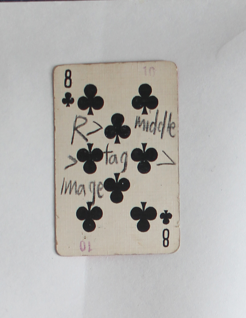
I’m blind and that’s the reason why I am wandering between bookshelves touching each spine, trying to use a different sense.

In this way I find the book, or the book shows itself to me.
Only by touching I read its title.
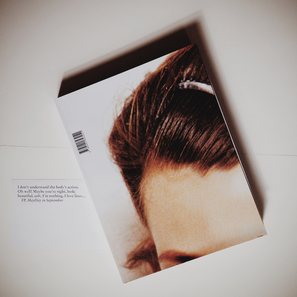
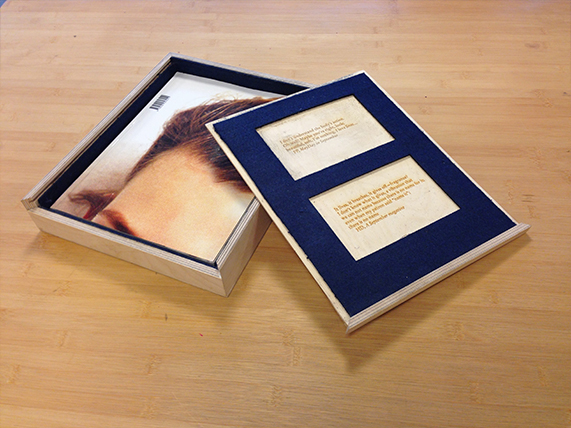
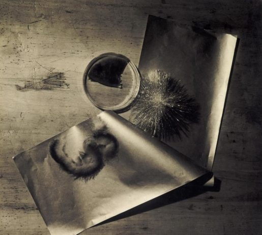
I open it  and I  feel the ink on its pages, the different kinds of paper used. It seems an attempt to remember something lost,it presents pictures in various format, it looks like dialogue between material. I still don’t know what this lost message is, after there is a text that I have not read yet. Anyway I am going to explore it now, trying to retrace it.

retracing.3retracing.2

Artist Rein Jelle Terpstra,
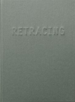
Book Retracing
Publisher Post Editions
Design, Studio Joost Grootens

17:45 12-11-2015

I am starting my research, I flipped twice every page of the book, still haven’t read the few written pages at the end. I am not doing so because I think it will probably be a sort of description of the work, and I would rather focus on the first part.
Like when facing a magician, you don’t want to know the trick from the beginning.
As well I want to keep being blind all those words cause this is why I choose this book, my research method.
Within its covering major capitals that protrudes through the grey linen cover, I can feel a dialogue, and I want to follow to it carefully.
It seems we are facing double track, series of thick deeply back matte pages are followed by glossy, light and shining ones, it is such for all the length of the book.
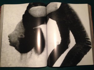
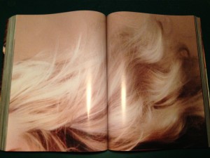
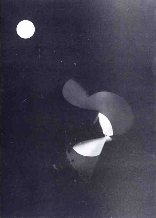
I figure out that the big thick black pages depict what it must have been a slideshow projection.
projection
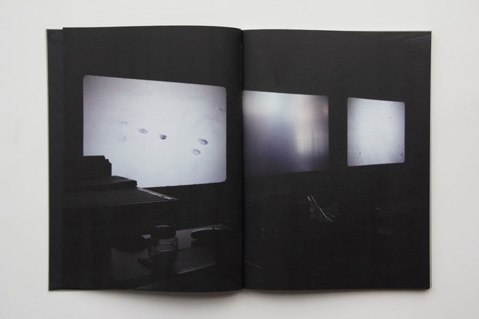
In the dark of the room you can recognize the size of 35mm colour film slides projected on a wall, in the background emerge some objects like a desk and a chair. I have no clue what this slideshow is about, the diapositives depict snowy landscapes, flowers, tables.
The photos seems unrelated and the only thing I can feel is a taste as nostalgia and loneliness.
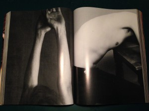
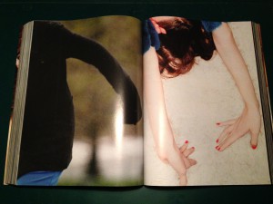
After few pages, this dark thick and deep side crash against a bright, clean and light one.
This new part is showing also some 35mm diapositives, but this time, thanks to the properties of the paper and the print, the images are clear and easy to watch. Still they are presented as part of a slideshow, and sometimes images are cut in half, leaving a white space before or after them.

Bright

For the whole length of the books these two part keep switching, dark and light pages alternate themselves, here you can see how.
If content of the pictures seems random I notice that the photos of one section reappear in the other, the slideshow must be about these 35 mm presented in the white side. My feelings are now confused. I feel like facing a reality (each photo) and being driven from a clear to a dark side of it continuously, as if we were inside a paradox,or like facing a duality a transition.
Like going form consciousness (white and clear pages) to oblivion (dark and blurry ones),from reality to memory.
All images show familiar, personal or peculiar places. I don’t know why the author made this double track, I don’t know why these and not other photos are in it and I don’t know why in this order. I need to know more, I wish I know more.

02:21 16-11-2015

I read the end of the book, everything sounds so funny to me now.
I discover why the book was and is so special to me, why I did chose it and indeed why I was so confused by the way is designed.
As described in the internet “Retracing’ is part of a wider investigation into perception, memory, photography, and the possibility of imagelessness. Rein Jelle Terpstra is working with people who are about to lose their eyesight. He has photographed images that are valuable to them on Kodachrome slides, with the promise to describe the prints after a few years very carefully in words, in an attempt to invoke the images in their heads through language. Earlier Terpstra made a slideshow installation with multiple projectors in which the light images of ‘Retracing’ slowly blend”.
The book that I chose blindly turned out being made for blind people, and it’s content try to describe how an image can disappear.
It simulate how our memories work but it is also an the attempt to save them. In fact Rein chose to make visible something impossible to visualize, to describe the process of disappearing while at the same time reverting it. She crystallize memories in order to give them back to their owner, to change the destiny of a memory while showing us how it can and does fade.
I said it sounded so funny to me because in a cynical way I think that my choice couldn’t be more natural.
Retracing came to me because of my research method, but the real magic lay in the fact that its design has been able to translate the content of the book into a material form. The design of the book, starting from its cover, where the letters of the title are almost invisible and only “vaguely looms out at a certain incidence of light”. The cover already speak about its content starting a tautological circle, the thickness and the quality of the paper, different for different papers and its printing methods.
Every element sustains the concept behind the books giving it a physicality.
Every detail is a confirmation  of the central statement and it strengthen its power.
I wish I know more about who designed the book, I know that his name is Joost Grootens, that he lives in Amsterdam and that following what internet says should look like this:

joost_grootens_portrait


01:32 18-11-2015
I still think how nice it is that a book can speak in so many ways.
For example  I have always appreciate old books, probably because you can feel that somebody (and not something) made it.
You can feel that the personal touch overcome its production, and I can wonder how much work and attention is behind every page.
In this way the page itself is becoming a medium behind the text or the information it is presenting. It feels that reading while touching such a book goes beyond its text.

22:24 19-11-2015
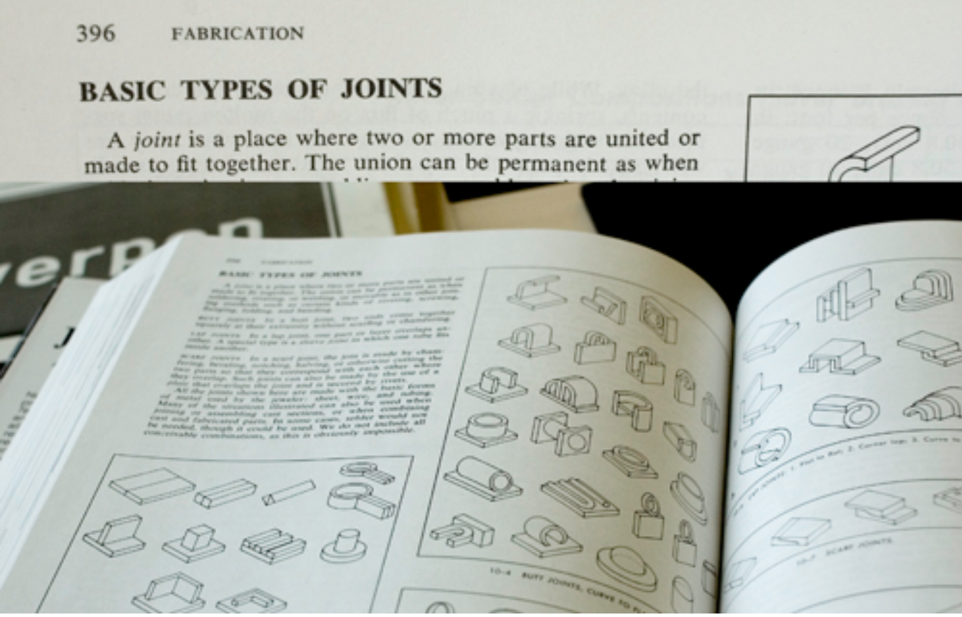
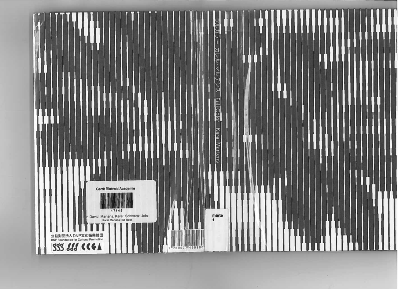
Today we had a meeting regarding our researches. I had more info regarding Grootens, for the entire meeting I had in my hands another book he designed, actually his own book, designed by himself for himself,
and it is GREAT.
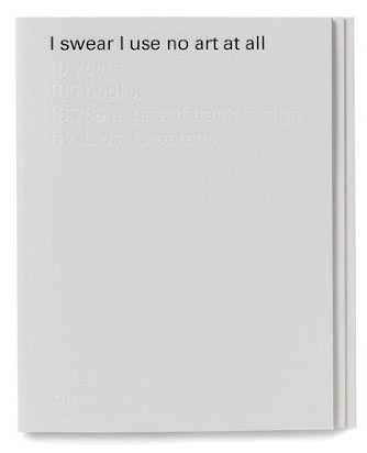
I realize I should start a new post regarding this book but I will just say some words about “I SWEAR I USE NO ART AT ALL, 10 years, 100 books, 18788 pages of book design”, (in short ISIUNAAA).

ISIUNAAA_000_cover

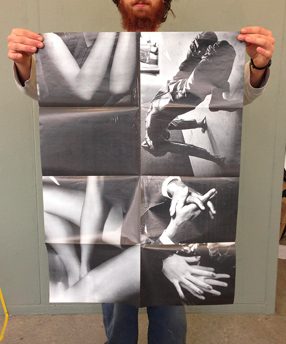
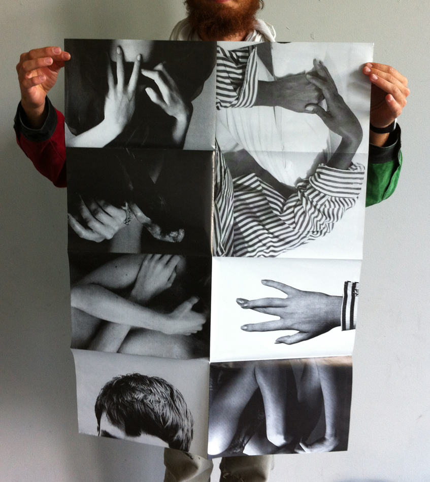
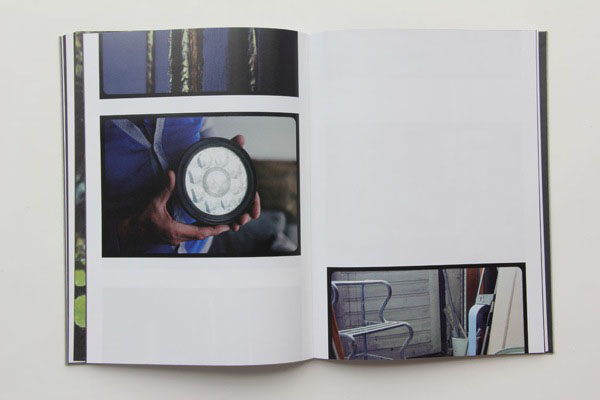
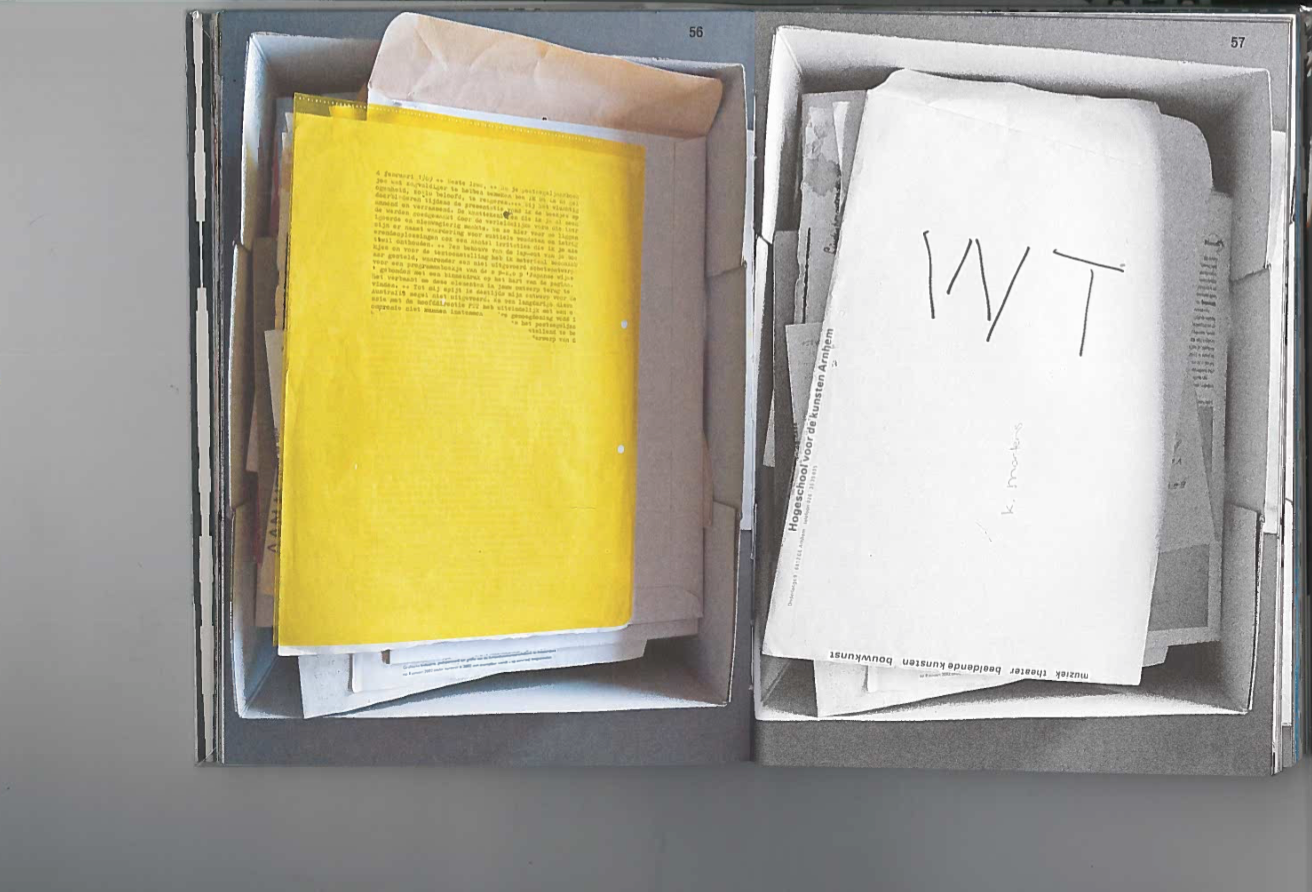
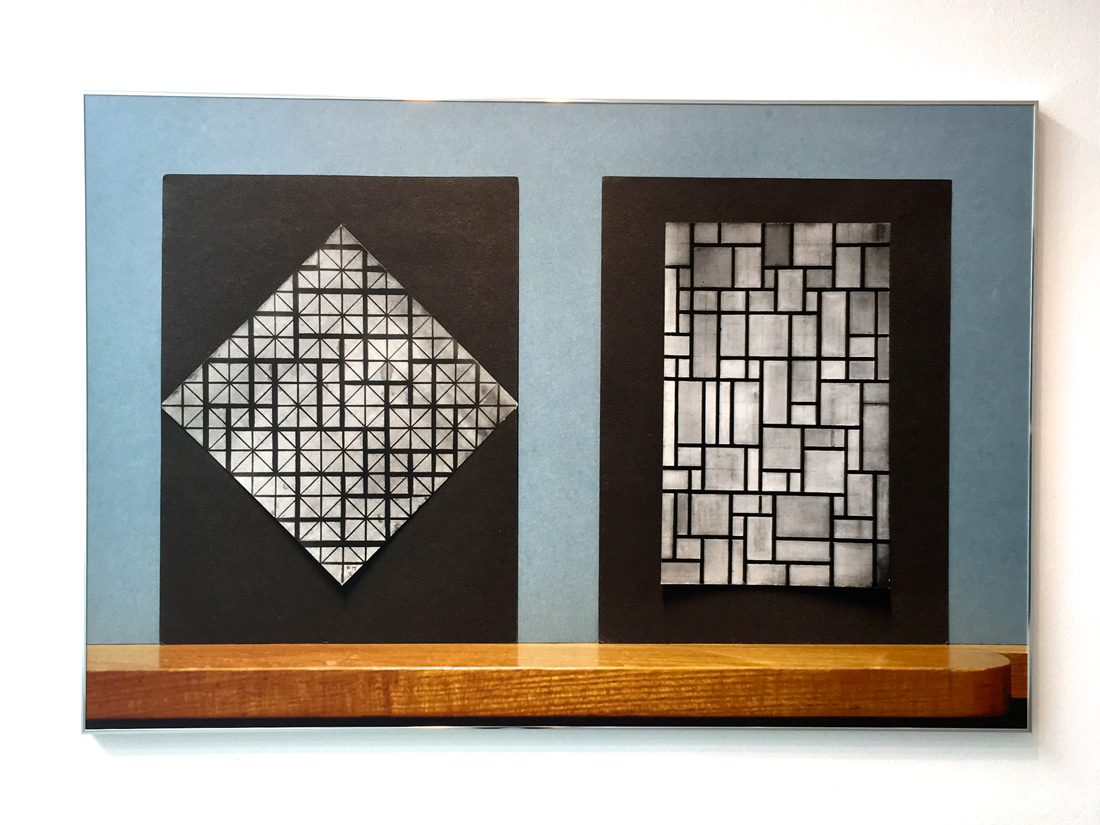
First of all, it seems to me as the most rational and efficient work-related autobiography one can person can eventually make, for what I saw so far at least. In it are described all the works Joost made in the last 10 years, first presenting various charts regarding how his projects evolved, with whom, when and how.
As well he show a timeline about how each book or project was connected with others, describing why they were made or how they started, he present a map of the different studios where he worked, which and how many different kind of paper he used, all the kinds of binding methods, typeface, pictogram, pattern, grid and colour he chose for each book.
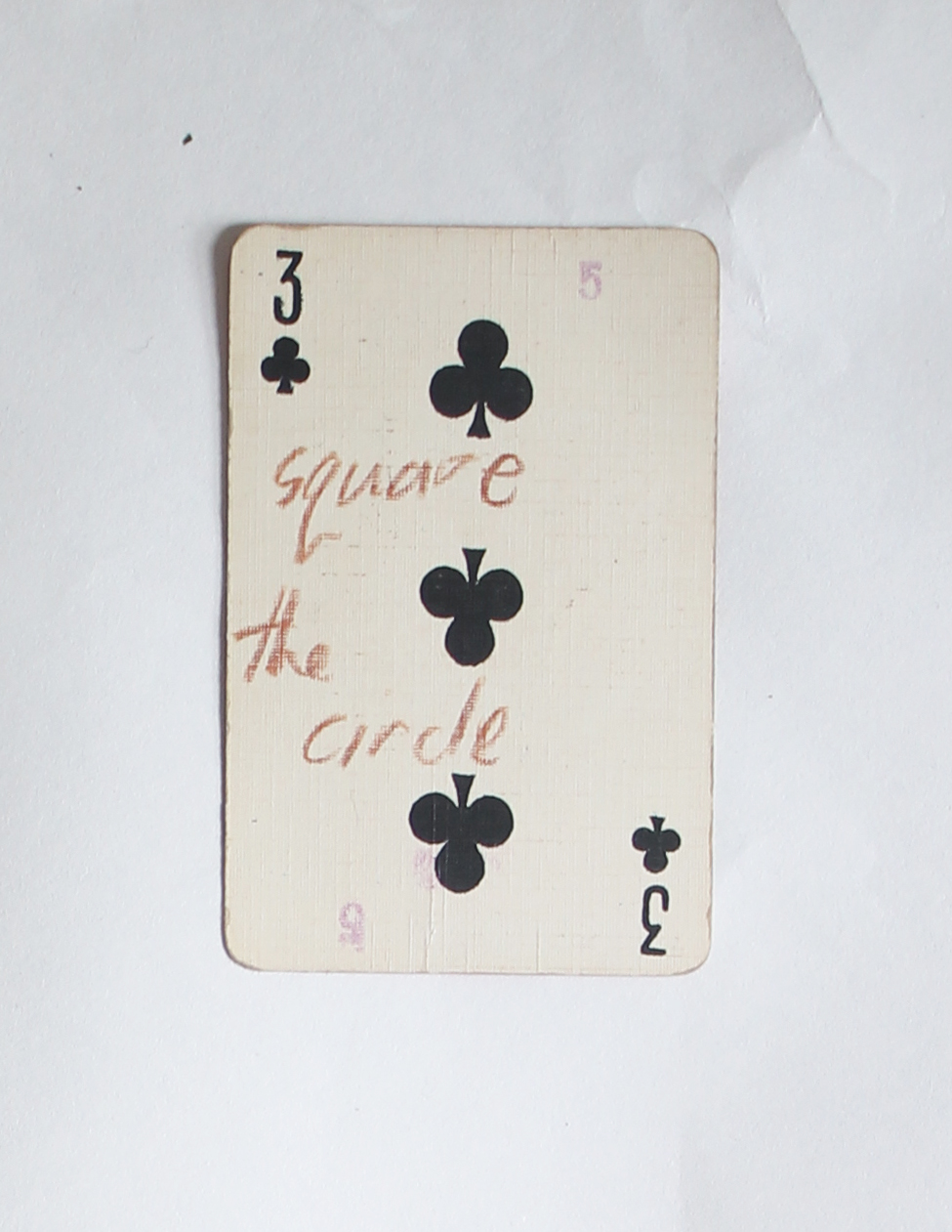
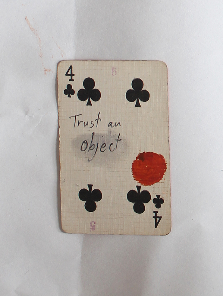
Here I decide to post some of these schemes and charters to make my amusement understandable.

no-art-at-all-crop-09 no-art-at-all-crop-07 no-art-at-all-crop-04 no-art-at-all-crop-10

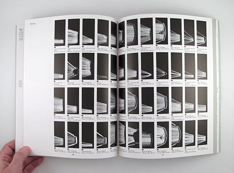
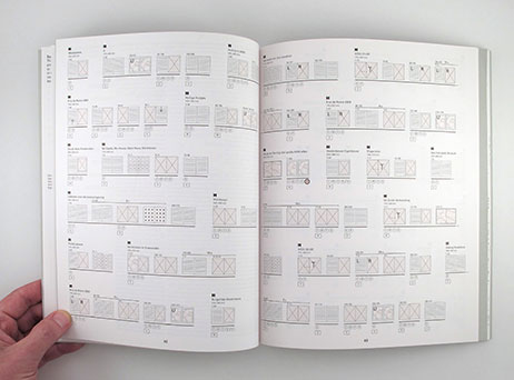
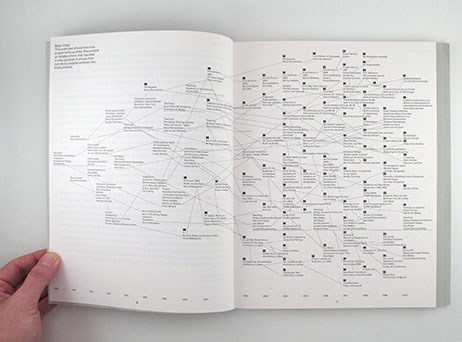
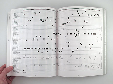
The book is a masterpiece of order and functionality, but without losing an intriguing physical effect.
As for RETRACING the book can speak for itself about itself without the use of words, intact in the last part Joost present some samples of the 18788 pages he made, but with a trick. He reverse the order of each page so where it should be written “apple” you will read  “elppa”, this on order to make the reader look at the design without the possibility of reading its content.

00:35 23-11-2015
I found myself thinking a lot about ISIUNAAA,and I am amazed about the attention the author placed in his book, as for the control he has over it and the power of a systematical method. I think Grootens must love his work and in his book his passion manifests powerfully. RETRACING is a vivid example of it and ISIUNAAA is its symbol. It is like an old book, the attention in making it help to create a new channel of communication.

3:09 30-11-2015
It is more than a week that I am collecting memories about the book I saw only for one afternoon.
In the last week I went to the city looking for Grootens magical book, no one has it but I finally found it in Denmark.
It arrived yesterday and I can’t escape from it.
This is the end.
My research end with the beginning of a new one.
I had one more proof how much books are powerful, how much they can speak depending on how much attention they received while making them. I understand that an almost maniacal approach can be useful if it explores carefully the possibility to best way for express an idea and I intend to use this approach for my future researches.
It is important to remember that the focus and attention in the phisical presentation of a work is essential for increasing its power and strength. I am very glad all this happen, I am glad RETRACING pushed me to RETRACE, claiming awareness screaming beneath an almost invisible but powerful surface.

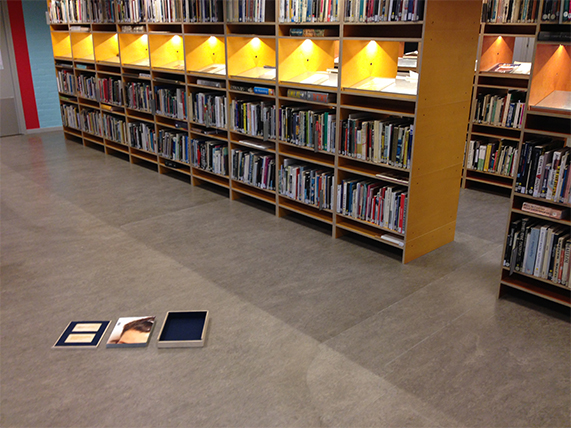
Rietveld library catalog no : ter 1


Didn’t I see this before?


Saturday, May 9, 2015

Didn’t I see this before?

dejavu-gif


Have you ever had this strange, but uncertain feeling that you have experienced something before? An overwhelming sense of familiarity? A moment you are not sure if something similar or the exact same thing already happened? Then you belong to the majority of people who have had a déjà vu. Scientists are still unsure how to explain this phenomenon. Some try to link it to memory functions, claiming that familiar events can trigger memories of forgotten information. Some say it’s a more like a “memory check” of our brain: a signal that there is a conflict between what we think we’ve experienced and what we actually did experience.

In a web app I created for iPads you can move along stories told by various images and collages of hands. Sometimes you end up at a point you think you have experienced before. But is it really the same, or does it just familiar? You might just have a déjà vu.

There are other interesting theories as well that try to explain a déjà vu:

Precognition: We have the power of foresight. A déjà vu is the evidence that we are actually able to predict the future.

Reincarnation: We have lived before. A déjà vu is the surfacing of a hidden memory, evidence of a previous existence.

Higher dimension: Our consciousness actually exists outside of our physical bodies in a higher dimension, and when a déjà vu occurs, it’s a brief moment when that separation becomes clear.

Parallel universes: There are other versions of ourselves, living in parallel universes. A déjà vu is a moment we share a memory with an alter ego of another universe.

When browsing through the internet, we often experience this feeling of familiarity. Links and tags create a confusing net of intertwined information, often taking you back to a page you have been before. But because of the information overload we are exposed to, we are often not sure. Maybe you experienced it while surfing through the Design Blog, using the various tags. And you asked yourself, didn’t I see this before?


There is no future, we create the past.


Monday, December 1, 2014

3 During the visit at the Boijmans Van Beuningen’s, between all the dresses who can melt and the one who construct themselves there where an UFO. Three little canvas on the wall of a red room , hidden by a giant costume referencing to the solar system. These three pictures were the work of Phyllis Galembo, the sample of an all life research about the ritual costumes and masks in Africa and the African Diaspora. This work was specially interesting not by the subject or the strong visual effect who drop out of these images but because it’s presented in the exhibition -The future of fashion is now- How can we related the future of fashion and a research about traditional costumes in Africa, who exist from centuries? We can relate this question with the work of Pablo Picasso who has been influenced with the first exhibition of african’s sculptures and masks in France and revolution the art history, but now is it still accurate? What is interesting about these traditional costumes is that they construct a bridge through the past and the future, pieces of art who travel between the ages, but the future of our own civilization is to look back in the past of other’s one or to build our own, now.

1 2

4

Phyllis Galembo is an American artist, fine art photographer. Her work is now related from more than twenty-five years at the African masquerade and ritual clothing. her first travel to africa was in Nigeria in 1985 since she travel through the west and central africa and regularly to Haiti. She document with simple and sober portraits these ritual clothing/art pieces without adding any meanings, keeping them in there own environment. This is a really important part of her work because these costumes are already meaningful in a lot of different themes (religious ceremonies, secret society, rituals, spiritual meanings…) An other big part of her work is to create a relation with the members of the different tribes and then be able to be in contact with these sacred objects. Here we find another interesting relation with the exhibition at the Boijmans Van Beuningen’s. The relation between the creation of a new area for the fashion designer’s and the work of Phyllis, who don’t create a new idea of fashion but put in the podium an ancestral art. The attention of the spectator is fixed on the clothing on the pictures relate to the meaning of the exhibition and not the pictures themselves who are the work of the artist. The projector should’t be pointed on the creator of these art pieces, or is it the collaboration with the photographer who make them important for this theme -The future of fashion is now-

7

These pictures were presented in the section “The (re)definition of the human figure”. It was the topic who interested me the most in the exhibition and also the one that disappointed me the most. The theme is so large and for me unxploited at all. Only the work of Pyuupiru (Tokio) “Mercurius” and the “Akata Masquerade” from the american photographer was relevant, even if my only wants was to see in real the costumes on the pictures.
The african traditional masquerade costumes are for me a door for a mystical world and also a question about the definition of the human being. These costumes are more than a redefinition of the human figure but a way to escape totally this human aspect, physically and spiritually. And maybe lead us to this question, why i was interested by this part of the exhibition, What is it to be human, Just a concept, are we just animals or is it something spiritual that we should be aware of, or search for?

6 5

Untitled : September Issue


Tuesday, October 28, 2014

Untitled September Magazine, by Paul Allman


In the book Untitled September Magazine by Paul Elliman designed by Julie Peeters, you can find about 600 pages of glossy magazine, including scans from Vogue amongst other brands that make the book indefinable in the first place. You have to go inside and try and read another kind of ‘text’, that is not said in words, but images, textures, and relations.

Note: Whilst working on the research, I made a box to transport the book, as transporting this big soft book without damaging it is impossible, there is a picture below. The box is a case of wood with felt on the inside, and the quote from ‘A September magazine’ (seen below) was laser-cut on the inside of the lid, in case that someone loses the paper. Before I started researching the book, the first instinct I had was to build the box, as a way to get more attached to the book, before getting into the details. The laser cut was added later on, as I thought it would be a nice addition to the box.

Untitled-2 cufsa Untitled-2
Untitled-2cufsa

The book was published in 2013, inside you find a collection of scanned pictures from magazines, which is important for the perception of the details of the images themselves. With this you can also even sometimes feel the texture of the print. Paul Elliman collected the images for many years, roughly 10 years. However, according to colleague Julie Peteers, nobody is really sure of how long Paul has been collecting. In the end, Paul Elliman had this collection of photos, as he is a designer/typographer, and assembled them.
Before the book was published, the images were presented in a different perspective, namely an exhibition of 2 posters. For example, a poster designed by Paul Elliman called I can no longer drink Tea, seen below, published by Colophon and Casco, as a contribution to the exhibition Latent Stare at Casco, Utrecht (link).
The book itself was a part of an exhibition by Paul, hosted in the MOMA in 2012, and the book was presented as one of the objects.


He exhibited the Paul Elliman at MOMA book lying on the floor

lying next to a brick with the same measurements as the book. The effect of this is that the nature of the book is not a book anymore, but it has transformed into an object that is treated more like a sculpture of a book, with insides physically visible as details of a sculpture.

unnamed-7 pster unnamed-7

I can no longer drink tea, Paul Elliman for Casco


Paul Elliman joined with Julie Peeters to put all these images together. In the beginning there were a lot more images, but they had to select images one bye one, to determine which pictures would make the cut. The major work was that they put the images together one by one, and make decisions about what details, rhythms, forms, or psychological relationships would exist or were created. At the first glance, the book is very thick, which is also the reason for the name September Magazine, which comes from a concept belonging to Vogue. Vogue would always publish their thick winter issue in September, which resulted in Julie and Paul deciding to imitate this magazine structure. For example, you have foldout pages of certain images that are similar pages to that of the magazine in Vogue. Unlike a magazine, the structure is very different. There are no constrictions, descriptions, texts, or information anywhere on the pages, as the pages are exclusively close up shots of picture scans. However, uncharacteristic photos in the book are sometimes seen, like pornography, or ‘disgusting’ images. That gives a different tone to the book, totally different from a fashion magazine. And after a time, after seeing relationships in the pages, it is like seeing storyboards between pictures that create a rhythm from one picture to the next. Because the book is mostly about fashion, humans, and society, Paul and Julie managed to reshape the human form as it where, with strange oppositions.

IMG_2085 IMG_2086

IMG_2087 IMG_20881

After studying and ‘reading ‘the book many times, you see types of languages or feelings that you can interpret in your own way, each their own. There are parts of shapes and combinations of close-up parts and bodies, put together in a certain way, that create movement. It makes you want to flip the page, until you have seen all the images. The only piece of text that was found in the book was a small quote on a note between the first pages that supports this feeling:

It lives, it breathes, it gives off – fragrance?
I don’t know what it gives, a vibration that
we can not name because there is no name for it;
even when my patron said “name it”;
there is no name

–       HD, A September magazine

To conclude; Untitled September Magazine is a collection of images of magazine scans details that are put together in such a specific way, that you start to see relationships, patterns, and rhythms that together form a unique feeling of an exhibition, rather than a normal book.[x]


Rietveld library catalog no : ell 1

 
if you want to read more on paul Elliman [link]


Log in
subscribe