In high school, my teachers always thought that the content of a book was more important than the appearance. I had to choose my books based on the texts inside of those. Opposite to what I was asked to do high school, in this Basicyear I was asked to choose a book on its graphic design. I was pretty surprised when I was told to because I am totally not used to do that. I liked the idea of it immediately. At the same time, I actually did not really get why we had to reflect a book’s appearance until we had this guest presentation of Elisabeth Klement, a teacher from the graphic design department in Rietveld. She showed lots of books where she did the graphic design for or just really liked. She told us that the content of a book is dependent on the looks of it and also the other way around.
So when I was wandering through the library, this specific peachy/sand/pink colored book caught my attention immediately. I remembered that Elisabeth showed this one in her presentation. I took it out of the shelves and saw this nice bold font on the front saying: ‘From A to K, Aglaia Konrad’
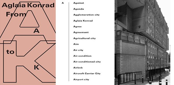
The book is like an encyclopedia. In an alphabetically placed order, you go through a list of words which refer to the rapidly advancing process of urban globalization. The content is focused on the relationship of society and spaces and how they change. On the cover of the book, the letters and words A to K are spread playfully over the cover. The A and the K are echoing behind the title as big geometric shapes which remind me of modernistic buildings from the past 50 years. graphic designer Linda Van Deursen made the decisions about the fonts, the cover, and the initial layout. She created an architectonic feeling in all these choices. The co-designer of the book is Eva Heisterkamp, a freelancer who got this job from Linda because she thought the job would suit her.
Aglaia Konrad is an Austrian photographer. She has a fascination for architecture, urbanization and especially their transformation. This leads into rough photographs of abandoned buildings, unfinished constructions and city infrastructures without any human beings involved. She experiences architecture and urbanization as something overwhelming. Something elusive. It is not simply about architecture but about trying to understand space and how it becomes nature itself in at a certain point. She studies the signs and codes, actions, representations and meaning of the architectural system.
Last year she had a solo exhibition called ‘From A to K’ in Museum M in Leuven. Paired with this exhibition she decided to publish a book included all the terms referring to her studies in alphabetical order. The photos featured in the book are her works from 1950 on till now.

Linda van Deursen acclaimed international fame. Together with Armand Mevis she established the graphic design studio Mevis & van Deursen in 1986. Linda Deursen has been head of the graphic design department at Gerrit Rietveld Academy from 2001 till 2014. She is a critic at Yale School of Art since 2003. The agency has done great things. For example identity projects, organizing events, exhibitions. One of their more recent projects is the logo and identity for Museum of Contemporary Art Chicago. They were awarded for several art prizes as the Amsterdam Prize and the Grand Prix at The Brno Biennial
Recently they also design the printed version of the magazine South as a state of mind: DOCUMENTA 14. A magazine which is being published four times biannually till the opening of the exhibition in Athens which is paired with documenta 14. The magazine could be seen as a manifestation included critique, art, literature and research.
Eva Heisterkamp was a student of Gerrit Rietveld Academy, she graduated in 2007 in the TxT department. Joke Robaard was head of the department back then. After having worked for Mevis & van Deursen for four years she now became head designer of Stedelijk Museum in Amsterdam. I was especially interested in her role in the whole design project I was wondering how much she had to say about the layout and division of the content. She answered me all my questions clearly in an email.
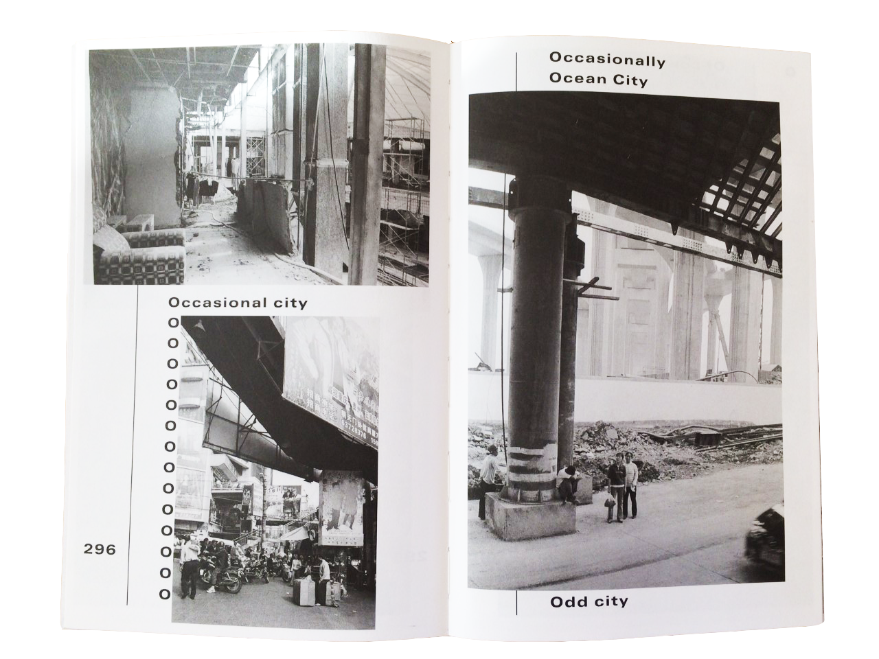
After analyzing this book the past few weeks, I could tell that the design of the book made the content stronger. Using Times Ten and Univers as main type fonts is very convincing. The fonts are formal but also a bit playful because they are a bit horizontally stretched. The empty space between the words refers to the emptiness of the decayed cities. The repetition of the words in alphabetical order refer to the repetition of modernistic buildings and the recurrence of urbanization. Every page has a vertical line placed on the left side, which accentuates the vertical aspect of modernistic cities where all buildings are raising to the sky. The book sometimes still seems under construction like cities themselves are. At one page you just see a row of O’s on the left side and a picture placed over what used to be ‘ the rest’ of the word which starts with an O. The pictures are most of the time black and white except for some pages. Eva herself decided which pages she wanted to be in color and which ones to be in black and white. There is also another book which is all printed in color but less editions of those were published.
Aglaia selected the pictures per chapter. She communicated this to Linda and Eva. Eva told me that through the whole process a lot of things changed and she could decide a lot in the design process. For example this case she told me that the font size of the essays were smaller in the beginning. In the last correcting round, the authors of the texts disagreed with the font size. The whole layout shifted, which made it very hard to finish the book in time. I find it very remarkable and a bit funny that the title refers to an unfinished alphabet because the design itself also seems like ‘unfinished’. Eva noted that here and there are some mistakes been made in the design, but I think we will find it out ourselves.The content, the appearance and even the process were constantly progressing. It all was endlessly in juxtaposition. That’s why I think content and appearance are always dependent on each other.
Aglaia Konrad, from A to K /Rietveld library catalogue no : konr 2