When I presented the designer I selected to write about to my teacher, and mentioned the fact that it was difficult to find information about him even at the libraries, he asked me to think of what made me chose Paul Schuitema and not one other of his contemporaries like Moholy-Nagy or Piet Zwart.
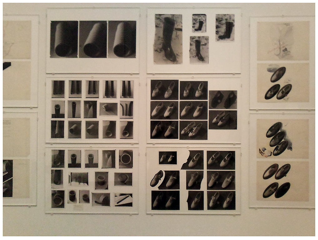
Actually the answer is quite simple. When I first entered the exhibition I was very impressed of how the museum chose to present his work, as if it was a work in progress in his studio. The presentation consisted of repetition, cuts, different papers, drawings, different tryouts, and sketches, all very obsessive and concentrated, almost like a mechanical machine.
Of course, all of this made sense immediately as I read that he lived in the time of industrialization and mass production after World War 1 and was inspired and worked with the ideas of the Russian constructivism, the Dutch DeStijl, German Bauhaus and “
New Objectivity”. But still, first I was a bit startled. I tried to look for something else because I thought, like my teacher also said, that photography is as such an autonomous medium so in not very many cases it can be seen and understood as design. Than I understood that he uses images as “Applied or Useful Photography” – cutting and organizing them with pieces of text, creating a sort of collage for posters and advertisements – using the techniques and aesthetics of Graphic Design.
I knew he had links with the Bauhaus and the “New Objectivity” movement and I found the names of the other better known designers of his time, but there was nothing mentioned about Paul Schuitema. Finally, after reading about all the theories from Weimar, I found some scanned pages from the english vesion of the book “Visual Organizer”.
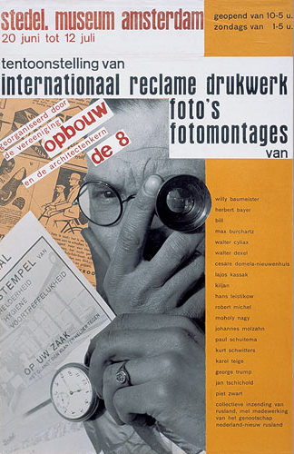
Soon I discovered that he was not only a graphic designer, but also a furniture designer, a photographer, and a typographer. He studied Drawing and Figurative painting at the Academie voor Beeldende Kunsten in Rotterdam. He was a member of Kurt Schwitters’ “Circle of New Designers”. In 1931 he designed the poster for an exhibition at the Stedelijk Museum (which displays names such as Moholy-Nagy, Herbert Beyer, Karl Teige. Lajos Kassak, Jan Tschichold, Piet Zwart, Cesar Domela and himself) and yet despite the seeming fact that in his time he was a well known advertisement designer, today people seem to have forgotten him.
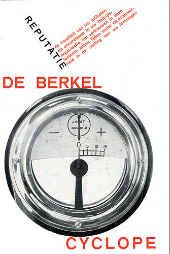
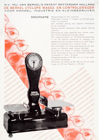
In the early ‘20s he had to perform building-jobs to support himself. This is the moment when he got in contact with the working class. This was soon to be a big influence upon his works. Berkel is mentioned as being the first who gave Schuitema the opportunity to work on graphic design. And here comes the moment when the photographs he uses becomes as important as typography in advertising a product. At first he worked with professional photographers, but because of their ‘artistic’ approach they couldn’t catch the simplicity of the subject as Schuitema wanted it, so he had to learn to use the camera, and all the techniques included, so he could get rid of the decoration and aesthetics and created his own photography.
“If you become more of an expert yourself, and if you are also creative, your work will only get better” Schuitema once said.
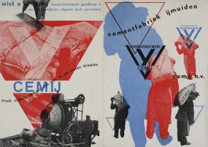
His contemporaries understood his wish to abandon any form of decoration in his prints, and saw his works becoming as sober and direct as he himself. Schuitema used the spatial effect of text by printing one on top of the other (only san-serif’s), simplicity, asymmetry and contrast such as horizontals, verticals, and diagonals, juxtaposed. Applying narrow, bold, small or big letters, mostly red, black, white, and sometimes blue, colors he managed to create dynamic covers. In relation to this process his images are not only illustrations or symbols or decorations, which accompany texts, but represent an organically linked body of work.
“You sought automatically for unity of text and image. This is also the reason why you printed the letters on the photo, then you got at least one optical occurrence. A red text on a black and white photo, a black text on a red picture.”