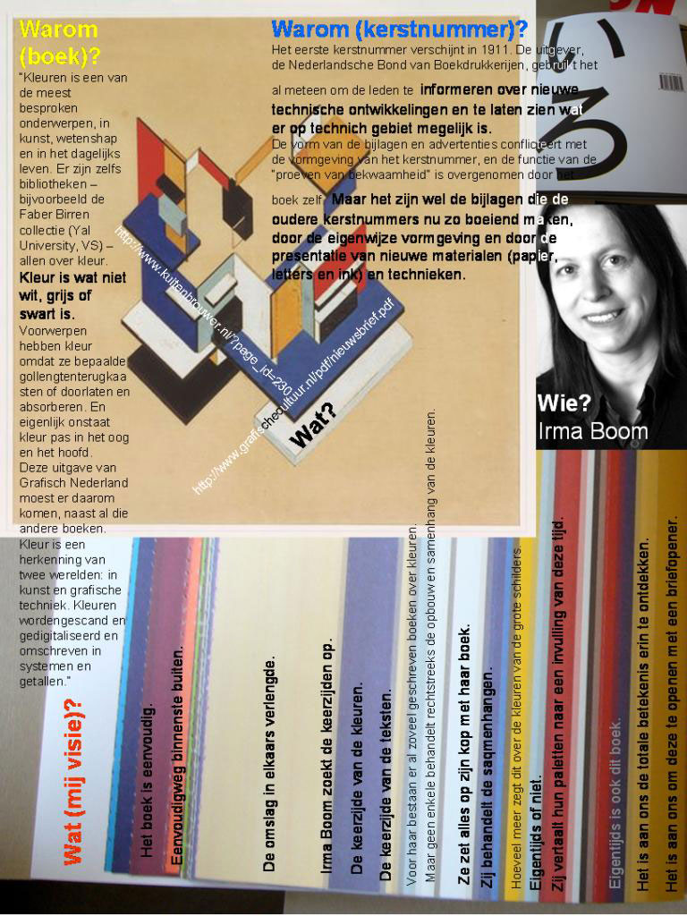
Ed Ruscha is an artist who mainly works with text. His works have been assigned to pop art at the start of his career. As pop artists put common objects into images, such as, advertisements, magazine, cartoon, Ed Ruscha started his career by dealing with so called typical images and texts. Soon he began to focus on text.
For more information about a brief introduction about the artist (Click!)
When I faced his works for the first time, I thought that meaning of text must be influential on his works regardless the artist’s intention because text is tremendously powerful. At the same time, a question was raised about his approach to text. What is more, I also realized that some of Ed Ruscha’s works has a similarity with a Korean conceptual artist Yi-so Bahc’s one. So, this essay will explore some of Ed Ruscha’s methods to handle his subject by both investigating a couple of his paintings and comparing to Yi-so Bahc’s ones.
A change in dealing with subject
Ed Ruscha did not intend to convey messages but wanted for viewers to enjoy text itself as an image. To achieve his purpose, it was important for the artist to make viewers experience his point. In fact, his earlier works were relatively illustrative and expository. For instance, in ‘20th century fox’, relatively many imagery elements – such as the angle that the text was drawn or the horizontal thrust – were provided to explain what the artist would like to mention about the text directly.

Ed Ruscha, "Large Trademark with Eight Spotlights", 1962. Whitney Museum N.Y.
However, Ed Ruscha has kept trying to reveal a text itself in his paintings and minimize other unnecessary elements. He has eliminated illustrative elements from his paintings, and at some points, only a vague background and a text were remained.

Ed Ruscha, "Voice", oil on canvas 16 H x 20 W (inches) 1968
An artist who keeps silent
Ed Ruscha once said at an interview, “Words are pattern-like, and in their horizontality they answer my investigation into landscape. They’re almost not words – they are objects that become words.”As he commented, he sees words as objects. However, suggesting text as an object must be arduous. How can it be possible to force viewers not to read words but see them as an object though it is natural to read text? Although I doubted, the result is successful. Explaining with an example of my experience, when I looked at his paintings, I have completed viewing a painting by reading words on it and kept reading another words on the next painting.
By the way, even though I thought that I was reading text, there was a strange aspect that I could not remember the text I had ‘read’. I merely could remember an image which consisted of an uncertain background and text in the middle of the image as if I recall a painting. That is because the text in Ed Ruscha’s paintings keeps silent and did not convey any information like the text in newspapers. It can be clarified by comparing with Yi-so Bahc’s drawing as this reaction is the opposite of that of Yi-so Bahc’s case. Following is Yi-so Bahc’s drawing showing an installation for the phrase, ‘We are Happy’. Yi-so Bahc’s work encourages viewers have a question, “Are we really happy?” Furthermore, viewers remember they have seen a message rather than a drawing. In Yi-so Bahc’s case, the text conveys a message and does not exist as text itself. In other words, each drawing of each artist shows text in common, yet viewers’ reactions are clearly different.

Yi-so Bahc, "We are Happy", 21x30cm 2004
To achieve Ed Ruscha’s goal of enjoying text as an image, he took a position of being objective. That means, he strictly eliminated unnecessary or descriptive elements. Then the artist entrusted enjoyment of his works to viewers. There is another comparable example of works from the two artists which deals with stains in common. In Yi-so Bahc’s work, which titled as ‘A long story’, the artist dropped artificial tears on a spot of a paper one thousand times repeatedly, and an invisible stain remains on the paper. Tears usually implies something emotional reaction and encourages to imagine that an important event happened. Also, the title has a role that helps viewers to approach the artist’s thought. Yi-so Bahc utilised elements that he dealt with to emphasise his message, and consequently, the message in the work is strengthened by all of the elements.
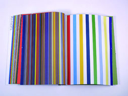
On the contrary, in Ed Ruscha’s case, he collected various kinds of stains then made a book. He titled the book as ‘Stains’. The artist collected various images repeatedly and categorized them as stains. Every stain was treated as a mere stain itself, and no other explanation was given why the artist did that work. What is more, the title indicates repetitively the content of the book-stains. Ed Ruscha commented like following. “It’s nothing more than a training manual for people who want to know about things like that.” and “I think with Stains there was no latitude for any kind of manipulation of the image. In other words, the stains were exactly what they were stated to be. They were like little droplets in the middle of a piece of paper; there’s no gestural opportunity, no opportunity to do anything else besides simply dropping the liquid on the paper… I didn’t want it to look like art. I wanted it to look like a stain.”The artist merely introduced his work as ‘stains’, and viewers should explore what they are looking at themselves.

Ed Ruscha, "Stains", Portfolio of 75 mixed-media stains on paper, 1969
As the artist followed manners which is used in objective investigations, such as, a biologist gathers specimens, Ed Ruscha does not suggest his opinion directly, but exposes objects.
Ed Ruscha keeps this style through most of his works. The artist’s message is hidden or unclear, while his subjects reveal themselves as an object. This style sometimes can causes a trouble that viewers cannot acquire any clue to understand his work at all. However, it is obvious that his style is efficient and proper to implement his subject firmly. As mentioned in the beginning, I was curious about Ed Ruscha’s approach to text as I have dealt with text as a material and thought about how to develop it. So it was entertaining to know that his works are controlled not to be swept away by the meaning of the text as my work did not either. Furthermore, his works were supposed to be enjoyable for the artist as a sort of play experimenting with text and other elements. The Rietveld Library just aquired a beautifull book about Ruscha’s latest self curated exhibit in the KunstHaus-Bregenz. This book show his latest work and also all his famous books
*Works Cited from "Ed Ruscha" by Richard D. Marshall [Phaidon]. Recommended reading also: Cotton Puffs, Q-Tips, Smoke and Mirrors: The Drawings of Ed Ruscha