Skip to Content Skip to Search Go to Top Navigation Go to Side Menu


"Highlight" Category


The Endlessness of Designblog


Sunday, May 26, 2019

Exploring the endlessness of Designblog


While browsing through design blog, the first thing I did was scrolling down to see how many tags there are.
The scrolling felt everlasting, at one point I thought maybe the tags will never stop. They did stop at a certain point when I realized that if there where an infinite number of tags, the Designblog would became infinite itself.
This infinity intrigued me, because I cannot and will never be able to fully understand it. The endlessness dawned on me even more when I noticed the clear edge between articles and emptiness, two different dimensions. For me these dimensions worked the same as Earth and Space.
Earth has limits and the Universe has not (as far as we humans know). The first dimension “Earth” begins at the top of the blog and seems organized, there Is a clear layout, the highlights have a limit of 10 and the articles have a limit of 25. After scrolling down these 25 articles “Space”, the other dimension, begins. This dimension is infinite and after you crossed the edge where the articles stop, the tags could go on forever…

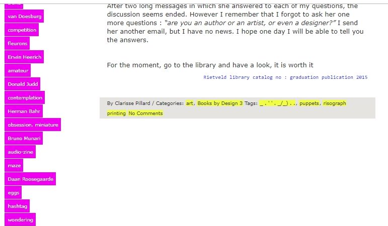
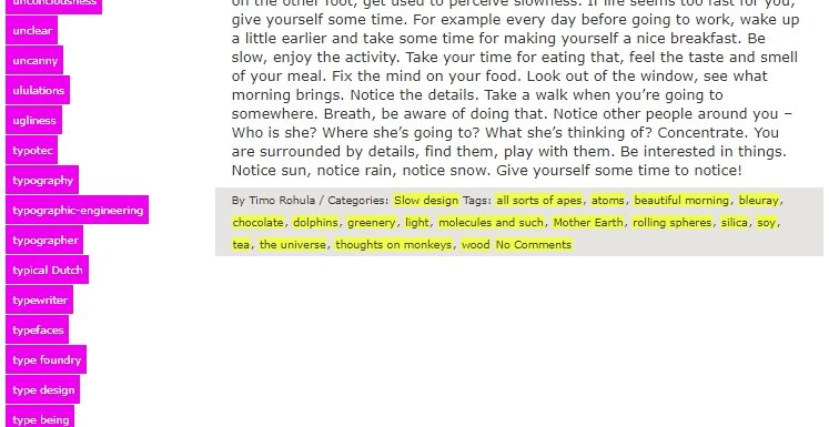
The “Space” dimension is also more chaotic because of the tag system that changes the order when the page gets refreshed. There are three outcomes, tags in order from A to Z, tags in order from Z to A and tags in a random order. Every time you go to another page or refresh the existing one, you don’t know how the tags will be ordered. Because of this I noticed a section of tags with numbers and symbols I wouldn’t have noticed otherwise. This section is separated from the alphabetized tag-list and unlike them these tags don’t seem to be arranged in a logical order. This makes them seem unimportant to me and some of the tags are not something logical you would use while searching. For example:
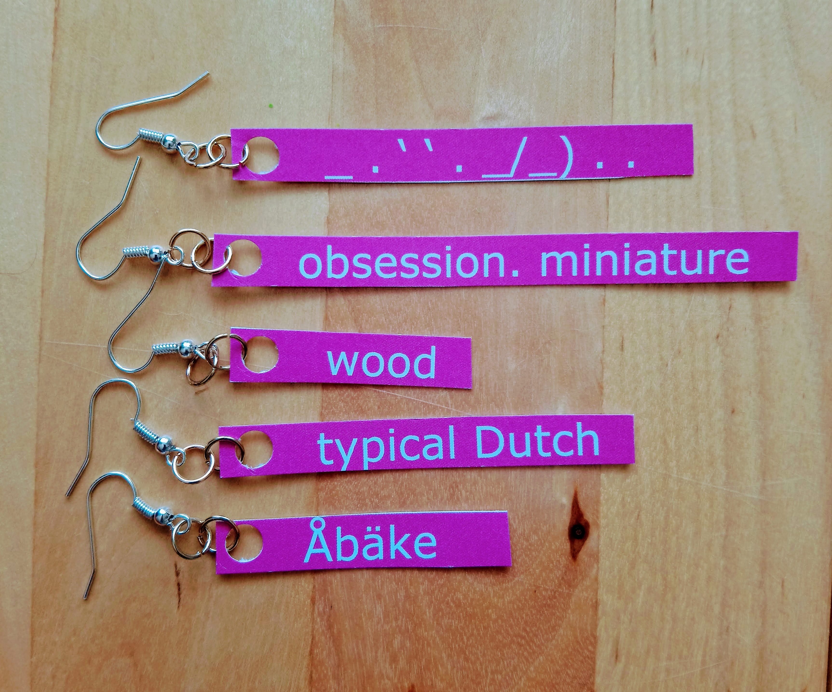
_ . ‘ ‘ . _/_) . .
?
.scr
”A”
???
0-dimension
0=?
21grams
45%
524
98%

The tag which made me question the most was:  _.’’._/_)..
The page this tag sends me to tells about a graduation book made by Marion Molle with has these symbols as a title. She told the writer of the article that while making the book she felt obliged to add text but she didn’t want to, so instead she used the symbols as title.

The core of the endlessness of this blog is for me the edge where the articles stop, and the tags continue infinitely. The tag  _.’’._/_).. became my starting point of visualizing this.


I scrolled down to the “edge” of the articles and noted the tag that comes after the grey block. Then I clicked on this tag and continued this way of collecting tags a couple of times.


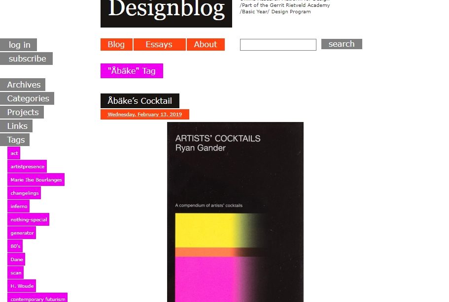
When I reached the tag Åbäke I stopped and checked my browse-history list.


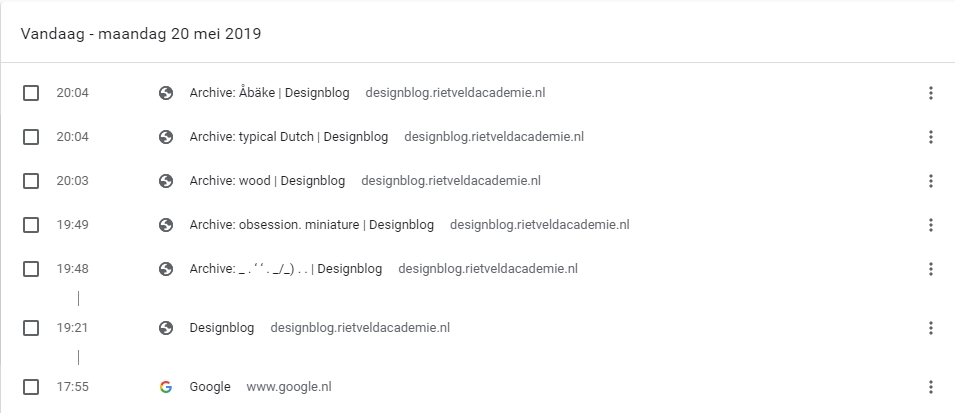
This ‘Åbake’ tag is the first word in the alphabetical list and felt like a good closure. The words I collected were in the following order:

_ . ‘ ‘ . _/_) . .

obsession. miniature

wood

typical Dutch

Åbäke

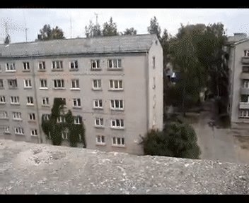
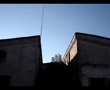
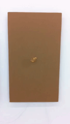
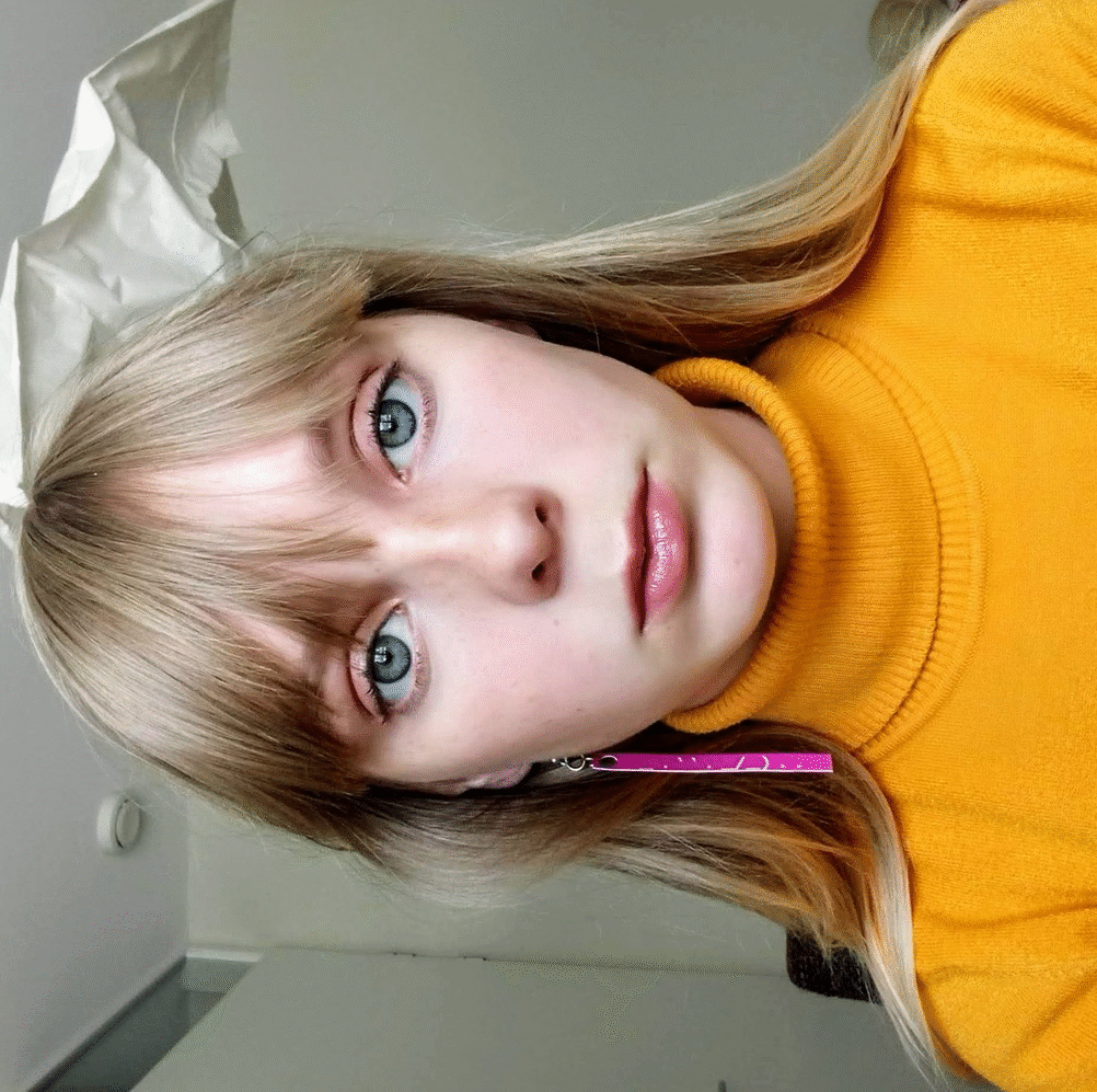
Because these tags only exist in the virtual world, i wanted to bring them into the real world by materializing them. I wanted to approach this with a personal view, so I chose to look at it from a Jewellery Department perspective because i would like to go there next year. I made earrings with the tag words in the same colour and typeface as Designblog. To show my path trough the tags and pages, I made a .gif of the tag word earrings going through my ears in the same order as my browse history. Like clicking on one tag and going to another, not knowing which tag comes next. The tag words I ended up with are not something I would normally click on, this made me see pages I otherwise would have never seen. Because of this research I now know that Åbäke is a London-based collective of four graphic designers.


It doesn’t make sense to end a post about endlessness right?
So this is not the end!
Try it yourself, click on Read the rest of this entry »  scroll down to the edge where the ‘space’ dimension starts, click on any tag you find there and see where it brings you.
_________________________________________________________________
(more…)

Highlights


Sunday, May 26, 2019

As I open up Designblog, the first thing that caught my eye and took all the attention were the yellow highlights. I almost got annoyed, that my focus wasn’t even on the title. I don’t think my focus is that easy to distract but maybe, who knows. At first I didn’t wanted to choose a focus subject yet, so I decided just to surf around on the blog. Some of the posts I found interesting others not.

But I still couldn’t not escape being aware of the yellow highlights every time I arrived at a new post. The highlights were very different in the way of the use of them. Some of the posts had a lot of highlighted words, some had a small text highlighted and some only had a very few. So I went on surfing on the blog with this in my mind until something strange happened.

I came across a post, where something was different. It didn’t had any highlights at all (except for the ones in the bottom, they all have). I felt somehow confused and relieved. I made it to the end of my journey on the design blog. I hit a wall. Just a clean post about “Doing aerobics before painting?: What can we expect during the Basic year”.

I followed the different yellow highlight to the end and I wanted to do something with the placement of them, the shapes and lengths. That was one of the nice thing with them, they changes and had a nice random flow.


So I decided that I wanted to work with them only. So I screenshot a lot of the different post on the Designblog. So I could have a nice “library” for the highlights. From there I started working on how to visualize it. Because it was such a simple gesture they made, but were quite strong, I wanted to make it as a very clean piece.

So what is a highlight, why do we use it and how do we use it?

Highlights works as you might know to make one specific word or sentence stronger. In some cases you underline your point for example. They are KEYWORDS in your text. The most important words to sum up your text. It is there to show the importance and your valid point in your text.
As Wikipedia also says: Highlight adds translucent color to a paper or text to emphasize particular parts of the text. The highlight can be seen in different displays as colors, fonts, depending the meaning of the context. You can also use the highlight to confuse the reader by putting them places where it is out of context. So in a way, it is a very simple but strong tool.
So as I said before I wanted to do a simple visualizing of the highlights. In the blog the highlights are colored yellow, it could also have been blue, green, different fonts etc. But my idea was neither of these. I thought that another way to make something pop out of the context could be levels. Levels in that sense that you don’t adjust anything else that the level or height of the highlights.

Imagine that you read a book, suddenly one of the words is in another level that the others. You would notice that in the same way as a “regular” highlighting as color. I’m not saying it is a more clever way to do it. Especially not in a book (it would be unpractical, so unless that is the case. I wouldn’t recommend it) but for something else than that it has the same effect. So I wanted to make a board, where I took some of the highlights I printed from the blog, and visualized it on that. Where everything is the same color and same font (in this case no fonts at all) where the only different is the level of the surface. I placed my “higher levels” as the highlights from the blog I had screenshotted earlier.


The result is very minimalist, but I think it sums up the thoughts I have been dealing with, while doing this assignment or exploring. The levels of course also works because of the shadows. And I think they work stronger, the more shadow and light they have. It is actually also the only highlight you can feel, unless we make a new highlighting with materials instead. That could be interesting too..

PixELs


Friday, May 24, 2019

Another 21st Century Ballet


Friday, April 26, 2019

In Oscar Schlemmer’s ‘Triadic Ballet’ we are presented with a plethora of colours and shapes that touch the imagination as if being in another universe. The opening scene starts with two ‘living puppets’ standing in a yellow room. Their costumes resemble harnesses from some other age in another space with primary shapes that limits their movements incredulously. With a staccato walk they move around each other, surrendering to the costume that hides the true identity behind these puppets. As the performance proceeds, and yellow changes to pink and pink changes to black, the dancers appear in various costumes that share the same alien ‘harness’ look and all seem to be made to make movement impossible. With these minimalist movements, Schlemmer seems to be commenting on the position of the individual within the roaring Interbellum: the performers were reduced to puppets that were meant to blend into the colourful decorum.

The ‘Triadic Ballet’ is an important manifestation of the aim for interdisciplinarity that characterizes the legacy of the Bauhaus academy that was founded in 1919 in Weimar, Germany. Schlemmer, who was originally schooled as a painter, turned sculptor, turned decorist, turned choreographer, subsequently found himself at ease within several disciplines. And so did many of his colleagues: painters became designers and drawers became weavers. The true modernity of this Bauhausian aim for the integration of disciplines might have only become clear much later in the 20th century with the rise of Postmodernism. As to this day artists and scientists altogether seem to become increasingly convinced of the benefits that arise when two or more disciplines are being combined. [The appeal for interdisciplinary practice is also very apparent in the educational system of the Rietveld academy in the present day.] It is argued that, within the realm of an educational system it might be beneficial to learn through several disciplines in order to deepen the learning experience, to connect with your subject on many levels as opposed to just one. This also touches on the theory of constructivism, which suggests that people create their own understanding and knowledge of the world through experiences and reflection on those experiences. In other words: a plurality in narratives calls for a plurality in educational journeys (and results in a plurality of learning outcomes).

To me it seems that in my generation (y) a common awareness towards this plurality in narratives is manifested more clearly than ever as we have been exposed to so many through both mass media and personalised media. And yet again, just like in the Interbellum, the position of the individual within this digital era is being discussed. This made me wonder: what would a triadic ballet look like if it was recreated to-day?

I therefore set out to research and create a choreography that would share a minimalist approach with Schlemmer’s ballet, but simultaneously touches on contemporary culture. Evidently enough there are many possible ways to represent the novelties of postmodern civilization within this historical context, so I made the choice to focus on the subjects of digitalisation and individuality. I discovered that these two themes are apparent in our lives not only through visual experiences, textual communication or metaphysical perception, but also through bodily adaptation. With this term I refer to the different adjustments modern humans allow their bodies to make in order to make use of digital devices and/or media. This bodily adaptation displays a process where an individual’s reality-identity somehow seems to have merged with their digital-identity. Inspired by Anne Teresa de Keersemaeker, who often attempts to create dance forms out of daily movements, I tried to work out different movements that I found to be exemplifying for these bodily adaptations: people crouching over their phones on trains, people shifting their view to and from their screen.


With these movements mimicking digitally-driven bodily adaptations I made a short movie showing a 21st century ballet in 21st century costume. Unlike in Schlemmer’s ballet music and sound has been left yet-to-compose in order to limit the scope of this research. A next step would definitely be to experiment with audio in order to create a complete experience. An important notion must be taken in the fact that this outcome is highly context specific (and therefore quite postmodern for that matter) as it is a result of my interpretation of what a 21st century ballet should look like carried out through my body.


Its very salty, but it just needs a little bit.


Friday, February 15, 2019

The Alphabet book seemed an interesting choice among other publications that the Rietveld Library had acquired last year (2018) because it is an odd book at first glance. It is very different from most books you might come across in a library. There are only eight pages, yet each of those pages is nearly 3mm thick and made of cardboard. The book is slightly larger than A4. Another thing that sets this book apart is that there is no title on the front of the book but rather on the bottom of the spine. You can also find the title on the Kunstverein website. What really strikes me about this book is that each page has one image of an alphabet. In total six different alphabets are shown. Each alphabet is from 1971 or 1972. The ‘Alphabets’ series was a project originally initiated by Vincent Trasov and Michael Morris. The artists who created these alphabets all seem to have an alter ego of sorts, the most prominent being ‘Mr Peanut’ which is an alias for Vincent Trasov. He dons a peanut suit inspired by ‘Mr. Peanut’ which is a logo and character made famous by ‘Planters’ a company which sells processed nuts, mainly peanuts. The reason Trasov’s alias Mr. Peanut is more prominent is because of his run for the 1974 Vancouver civic election, where he dressed up in his peanut costume. He ran on the platform of ‘PEANUT’. ;- Trasov was persuaded to don the costume as a symbol for the collective aspirations of the art community and run for mayor in the 1974 Vancouver civic election on the art platform: P for Performance, E for Elegance, A for Art, N for Nonsense, U for Uniqueness and T for Talent.. Trasov received 2685 votes accounting for 3.4% of the total vote. Trasov could not likely have really thought he was going to win but this would serve as a satire on the political climate of the time. Canada in that time went through a period of political unrest and economic difficulty. What made his candidacy even more interesting is that he did not utter a single word. Mr. Peanut became a kind of walking sculpture. The talking was left to his campaign manager John Mitchell.

In 1972 Trasov and Morris using their Imagebank (sort of collective) hired a silkscreen printer and printed the Peanut Alphabet. One of the people I spoke to at Kunstverrein speculated that the alphabet project was an exploration of visual language via the alphabet as a kind of study. At the time the hopes of Morris and Trasov was that this project would become larger than it really did. They invited some artists to create alphabets as representation of this language they where exploring. These alphabets also had a correlation to their alter egos in some way. At that time you would have been considered to be a part of the status quo if you did not have an alias for your work. So in some way to keep up a certain authenticity these artists felt they had to have an alter ego, and so it is only logical they would strive to create an alternative language that went against the status quo in the art community that they did not want to associate themselves with. At the same time artists in Canada Including Trasov and Morris, found themselves in a period of immense sharing of ideas with like-minded artists, this created systems and networks for artists to share these ideas even before the internet. Morris says that their survival as artists even depended on these networks.

‘The Alphabet Book’ was designed by Marc Hollenstein who does most of the design for Kunstverein publications. The Individuals I spoke with at Kunstverein are a student and Rietveld Academy alumni . For the most part I did not have to ask them any questions since they had allot to say about the book, but one thing that interested me about the publication was the thickness of the pages. They told me that this was a kind of suggestion of the volume the book could have been in regards to Morris and Trasov wanting this project to be larger than it ended up becoming.

In a way you could see ‘the alphabet project’ as a tragic comedy. There are these satirical elements, a strive to share ideas, and artistic work yet, a certain failure in the exact systems these artists  tried to create in a pre-internet society that in reality faced a similar political and economic climate that we face today. The difference today maybe that satire is so relevant yet so irrelevant, we live in a society where the satire has potentially become reality, at least in political terms. This does not take away from the work and ideals behind the project, maybe it would have taken a different direction in a post internet society. The most ironic thing about this project is maybe the fact it never became so big is what makes it so interesting.

Also if anyone has a couch that isn’t straight apparently the designer of ‘The Alphabet book’ Marc Hollenstein is looking for one because he has a non square living room.

Vincent Trasov: The Alphabet Book. design by Marc Hollenstein, Rietveld library number: tras 1

Performative communication


Monday, May 21, 2018

Hi Luna,

So let’s make a resume of what has been discussed and where did the direction go. 

We start by relating those two types of font for their quality of being created by one repetitive movement, one single infinite repeated shape.
In the thread type, it’s the circle that you make to go through the fabric, while in the second font, the shape of an 8 or infinity is repeated in different sizes in order to fill up all the empty spaces that the letters left. Here are the pictures, the second one is done by Daniël Maarleveld.
 
Font-Luna copy_950 Font Agathe copy

What does differentiate that from classic handwriting? Well, because in handwriting, the constant of the shape is not equal: the movement of the line needs to change for creating different symbols and letters. So let’s take this as a focus of research: what are other systems of one movement fonts? How do they work and why did the designers decide to create it. Why would it be attractive to create these type of font? And how this repetition implies the body – after all, these repetitions of movements for making a font with a thread come from a body movement.
I found this guy on the internet yesterday, his name is Kosuke Takahashi, have a look at his twitter.
It’s a bit different from our first trough but in a way, his work is still around our question of movement and repetitive font. He’s trying to make a font relating Braille alphabet and “visual” alphabet (the international one and the Japanese one).
Tell me what you think about!
Love xxx
———————————————————–
 
 
Hey Agathe, 
 
I think its super interesting topic, I feel it’s a deconstruction of writing into a smaller concept, somehow like if the letter was an atom, and then we go from there to the electrons, I feel the construction of the atom by the constant movement of electrons resonates on the construction of a letter based on one repetitive movement. Kosuke Takahashi looks very amazing, a new idea of integrating both alphabets, finding the common link between them.


Captura de pantalla 2018-05-21 a las 14.36.44 copy


I also thought about the performative movement for language and got into morse code as a performative alphabet. It all is based on repeating one movement, constantly. Found out two Spanish cyborg artists, Moon Ribas and Neil Harbisson have done a performance with morse code, just speaking by biting. Both of them had a Bluetooth tooth, which vibrated on the other’s mouth. I find it pretty interesting how morse code could be taken to other levels of language nowadays. Also here you can find more information about their other cyborg art.

MesaCyborg_Day5-2882

Not only with technologies but also in other artistic fields, I was investigating about graphic design and looks like there’s also a visual co-relation to the dashes and the dots of morse code when it comes to visual arts. There’s an alphabet that visually explains or adds morse to it, maybe it could be a way to represent morse code in a graphic design way.

52e788ef1d0346a1b73fd789a67bafa7
 
L, L.
———————————————————–


Hello Luna,

I really like your comparison between Takahashi’s work and the formation of an atom. It also completely relates to Morse code,
see this panel: from hither to thither

Screen Shot 2018-05-21 at 17.01.58 copy

So this tree explains the formation of the translation of a letter to morse code, constructed step by step from an element with another to articulate a sign, which will articulate a language with other signs. Like cells, let’s say? In the field of art, precisely in music, it reminds me of two things.
This first is a bit famous, Glenn Gould. He’s mostly known for his interpretations of J.S. Bach’s. Goldberg Variations. If some find his way to play piano extremely cold and mathematics, I actually found his play a clear way to “ear” a partition and understand the composition of the music. I don’t know so much about music, but he seems to me “cutting” the sound in different states that I can visualize better the written language the sounds come from.
For being honest, he’s the musician who made me understand music in general and appreciate contemporary electronic music. And probably not by accident : In contrary to most classic interpret at that time, he decided to work his play for the recording more than making concerts, implying on the fact that people who would listen to his music would need to manage their radio and sound at home, and in that way, his public would need to participate in the music to make it each time their own.
Another example is this partition for Jean-Philippe Rameau, La Poule (The Chicken). He’s a composer from the end of the 15th and beginning of the 16th century who made this research of repetition in music. As you can see the partition, the notes are constructed (as we said on the morse code and Braille alphabet) in a repetitive way while creating a system. Visually, it seems extremely repetitive, and quite modernist.
la poule
But the result is playful. Let’s say that creating an organized system of codification does not involve making something serious with it, haha. Here is a video of the performance by Grigory Sokolov, I really enjoy watching the movement of the body around this play.
Xx
———————————————————–
 Hey.
In general, all these elements that are summed up here have in common the fact that they are all performative, or better said, all the research comes to a common field which is the performance. Not only is it about reading or writing anymore, but also about acting. The movement becomes an essential part of all of the elements. The typography is not anymore about reading/writing communication but also about expressing it with other parts of the body, some of them not vocal, or even with external elements. 
 

The Pursuit Of Completeness


Sunday, May 6, 2018


ColourCard-4


Once in a time, lived a young hero who found himself on a quest: the pursuit of completeness. He traveled across the lands, west and east, observing cultures and reading the ancient texts. He discovered so much on his journey, and came across many wise sages who offered him mysterious advice. And yet, the hero found that the more knowledge he gained, the more distant his goal seemed to become. At certain moments the target would completely disappear and he would be left raw and dizzy, lost. In these moments he would cling even more desperately to the words of the wise-men, reading, researching, searching obsessively until his vision would once again appear in the distance. But it was hopeless, it hovered like a mirage on the horizon, never any closer no matter how fast he ran towards it.
On a particular night, exhausted and alone, stuck but stubbornly holding onto hope, the hero fell into an unexpectedly peaceful sleep. It was as if his body was floating gently on a warm sea, and, in the eye of his dreaming mind, an image appeared: A full rainbow across a grey landscape. It was so dazzlingly crisp and clear, so bright and vivid. The air was still and perfectly silent and in that moment the hero knew that he had received the sign that he had so desperately been needing. He woke up with the new day, crying tears of joy and gratitude. His quest was far from being over, in fact he was certain that the hardest challenges were yet to come but, finally, he had clarity and direction. He would leave his texts behind, all his pointless, distracting knowledge and set out on his own path.

The next night, as the hero was sleeping, he dreamed of the devil and of fear. The dream was bathed in a red glow and the devil knocked on his door. Terrified, the hero resisted but then a calmness came to him. He opened the door and invited the devil in and together they sat down for a meal.

The following night, the hero dreamed of a woman of the night in an orange dress and a fight against yellow men, a dream of guilt and shame but also of an incredible strength and willpower.

The night after that, he dreamed a beautiful dream of the woman he loved. Lost together in the night, in an empty world, they mourned the loss of all those they had once loved but, gazing into each others eyes, saw the eyes of their parents and friends and past lovers and they smiled in their hearts.


ColourCard-1     ColourCard-2     ColourCard-3


The hero could feel it in his body. Finally it had come! Life was guiding him. So strange and peculiar these dreams, so profound the significance of these colours! The full spectrum of life, in the full spectrum of the rainbow. Now he understood red, orange, yellow and green with an understanding beyond words. Oh silly, silly words he laughed. It was all in the colours, it was all in life always. The hero fell asleep that night full of anticipation, but the blue dream did not come. Nor did it come the next night, or any of the nights that week. No blue, indigo or violet dreams. He started to worry, he had made such incredible progress. He was almost there but now he could feel himself slipping away again. Weeks went by and the hero had no dreams. The colours which had once seemed so vivid now seemed dull and meaningless. Life seemed dull and meaningless and the hero mourned the loss of those clear, bright eyes he had once looked through. Weak and confused, he reached again for his books. He was desperate to understand and so desparate to feel that beautiful way once again. But, remembering how certain he had been of their futility, he put them away again.

Gathering up strength, the hero resolved to set himself out into the world to search for the answer. If the colours would not come to him, he would go and pull them out of whatever situations he found himself in! He would do whatever it took. He started with painting the dreams he had had. And then he painted paintings with all the colours of the rainbow, trying to understand what they had meant to him and how they were in relation to each other. He came to some interesting, intuitive understandings. It seemed that the first four colours existed on the foreground plane and the blues and purple in the background plane. The further he explored this, the more obvious it became to him that there was a divide. There was the realm of human emotional experience, of textured and colorful personality, all belonging more to the material world and then there was the realm of the spiritual, the land of the soul which belonged to a mystical, divine world. Yet how to split this mystical world up into blue, indigo and violet, he could not yet work out. He needed some kind of way to access them.
Remembering his earlier dreams, the hero went in search of the devil. Let me find the adventure that will take me through the full spectrum, he thought. He kept his ears and eyes open and wandered the land. After weeks of following symbols and signs he found himself, one dark night, approaching a huge and abandoned church. He heard a terrible, hypnotic chanting inside. He quietly pushed open the door and looked inside. There was a huge crowd of all terrifying, evil beings; men with knives and guns, gangsters and crooks, giants and witches and demons. They did not notice him as he crept inside. He was scared but calm in his determination. He looked to the front of the church and saw, standing by the altar, a man leading the chant. The hero’s ears singled out the man’s voice and he was gripped by an incredible torment. The voice was so

big, powerful and so direct. It felt like it was calling him directly. He was filled with fear and immediately regretted his ever having come here. He wanted to turn and leave but the voice was so beautiful and hypnotic that he could not. He was trapped in indecision but then the calm voice of his red dream came back to him, ‘open the door and let him in, offer him something to eat and drink’. He watched himself as he pushed his way to the front of the crowd to stand in front of the devil. The devil slowly turned his fiery eyes upon the hero and as he did this the hero felt his body fill up and he stood taller and he felt amazing and powerful and he lifted up off the floor and reached out his arms and roared. The crowd of people roared back and he flew up higher and higher spreading himself out more and more until, all of a sudden, he came crashing down to the ground. He felt a sharp sensation in his face, it took him a second to realize what had happened and then he got up and started laughing at himself. Walking back through the crowd, his nose bleeding, he laughed because it seemed so funny how seriously he had been taking it all.


ColourCard-5 Tarot7-1


Systematically Confused


Monday, April 2, 2018

After I made my research on Michel Albert-Vanels innovative colour-system which pushed processes related to colour forward, I had a very scientific image on colour-systems.
After the announcement of creating our own colour-system, I remained being caught in a very theoretical and scientific image of the function of a colour-system.

When I look through my notes, I see a lot of short-living attempts of different approaches to the assignment.

First, it was mostly notes from already existing colour-systems, which should inspire my own one. The first idea was, to connect our free longterm assignment in mixed media with the colour system and looking back, I should have stayed with this idea. In our mixed-media assignment, we work with texts as a starting point. The text I’ve chosen is an excerpt of a dialogue between two friends: Wolf Singer, a distinguished neuroscientist and Matthieu Ricard which left a career as a molecular biologist to become a Buddhist monk. In their dialogue they discuss meditation-practice and it’s direct influence to the human brain.

I’ve started with the idea of making a series of etchings and silkscreen-prints on the topic.

plan_b1
plan_b2
plan_b3
plan_b4

I thought, it might be handy to break down this dense and complex article with the help of colour by, for example giving both of the positions – Singer and Ricard a certain color. So their points and positions are expressed in a certain colour tone of the print.

That would have created automatically a colour palette which is linked to their positions and a mix of new colours when, for example, they agreed on a point, so that both of their positions come together as one.

I wasn’t fully convinced of this idea and missed the systematical approach to it, which I thought is the centre of a colour system. To select some colours for both of the speakers was more of a colour-palette, rather than a system, through which I could „run“ these prints and which would automatically create a colour-composition.

This wasn’t the last idea which started to crackle when I was thinking about systems and probably it was this image of a programmed application like on a computer, which was standing in my way for a long time.

systematical_illustration

Soon, I realized, I could look for a Buddhist and neuroscientist colour-system and bring them in a next step together. But how would this look in the end? what would be the product and the outcome of this idea? I remained helpless and moved on from idea to idea until I rediscovered these promising systematics in music.

I’ve heard about micro-tuning systems a while ago in connetion with the Finnish DJ and producer Aleksi Perälä.

Perälä and his long-time friend and collaborator Grant Wilson-Claridge developed a musical tuning system, the „colundi sequence“. Despite that, Colundi has the character of a spiritual entity, which makes Perälä refering to it as the creator of the music he is producing.wp-content/uploads/2018/04/Schermafbeelding-2018-05-23-om-11.20.23.png

It remains a mystery for most of the people, including the journalist from the article I’ve read about it, what the „Colundi Sequence“ actually is, but what was very inspiring to me is it’s origin:

As we know, most western music is based on the 12-tone tuning system. All of these tones have a certain frequency in Hz, based on harmony.

Like other artists did before, Perälä started developing his own tuning systems in his music which resulted in the Colundi scale, a sequence, which is not a tuning system, according to Perälä.

The Colundi scale „is a sequence based on specific frequencies, often not related to each other in a traditional musical way“.

Grant Wilson-Claridge, Perälä’s friend which was mentioned before, came up with the frequencies for the colundi sequence.

“via experimentation and philosophy, each relating to a specific human bio-resonance, or psychology, traditional mysticism or belief, physics, astronomy, math, chemistry.” he told the music magazine „the wire“.

What he meant by that becomes more clear in one of his Facebook-posts:

“E.g. 90-111Hz – Beta Endorphin range. 126.22Hz – 32nd octave of Earth year, The Frequency Of The Sun, Color=Green, Tempo=118.3 BPM, centering of magic, Hara (chakra).” So the frequencies all have a specific origin in something natural.

This approach highly inspired me to do a colour system, which is based on specific frequencies, which then would be transformed into colours.

Around this time, the idea of creating a video came up, in which I would involve certain narratives, which carry the colour of their frequency, so there would be the ocean and the frequency of it’s currents as a narrative, as well as other positions like myself and the frequency of my heart-beat.

On the search of different narratives, I rediscovered a Youtube-Video, I used to watch very often as a child.

It is one of the first Freerunning-Videos I’ve seen, where Latvian Traceur (Word for people practicing parkour and freerunning) Oleg Vorslav climbs up buildings, flips walls down and jumps from roof to roof.

This video was probably one of my first experiences using youtube regularly as an archive. I was watching this video over and over again with my friends and it was very exciting to rediscover it after so many years.

I knew, I wanted Oleg Vorslav as one of the narratives, so I started to cut out short excerpts from the video to use them for mine.

Oleg_on_the_roofOleg_roofjump

I also started to go through my own video-archive and discovered alot of interesting material associated to colour. At the same time I didn’t know how to continue with my idea of frequencies and this system started to stand more in my way, rather than being a rich addition to the process, what made me decide to drop this idea and naroow it down to it’s essence: producing a video – in anyway.

During the whole process, I had a very thoughtful and conceptual approach to the project which often became an obstacle. At this point of the work, I had a need of a more free and spontaneous approach, so I started soon to edit the video and combine it with animations. I made my decisions quickly and intuitive, which opened up more possibilities for me.

Slowly, a system developed itself, where animations and moving images guide each other through the video, from colour to colour.

Get the Flash Player to see this content.

Looking back to this process, it was very much about handling disturbing thoughts and bringing me back to motivation in any situation or stage of struggling. In the end, I realized, that I could have trusted more into my own ideas and directions which I was attracted to.

I’m still a bit confused about the video I did, because I can’t really explain what it is and where it comes from. It’s been the first time, where I had to act on my gut-feelings out of emergency and tie-pressure, which was a unique experience. Under circumstances like this, great things have been discovered, so maybe we should appreciate stress and time pressure more as an opportunity to make us explore new grounds of our creative process.


Interview to Mr. Martelli


Wednesday, February 21, 2018


A few weeks ago I had a really sensible idea. I would have a sit-down with one of architecture’s most progressive faces, ask my questions and occupy their precious time, all in the name of a little assignment. I sent this email out to some emails pulled from the internet:


“I know that Mr. Koolhaas and Mr.Martelli (as would be anyone at OMA reading this) must be supremely busy, what with a world filled with commitments, responsibilities and the occasional pause for breath, but I was hoping you could spare a few minutes to a young, art enthusiast with lofty expectations, and help me in contacting him.”


Several fumbling attempts at communications; email, Instagram, other emails; (and a flash sighting of him at a crowd at SM some weeks later): I had secured a meeting with Federico Martelli, a proper, nice lad, in Rotterdam the next day. That Sunday I was quite nervous, the interview seemed to have fallen through altogether and only materialised in the last 12 hours. Federico was scheduled to jet off somewhere exotic that day, and I had never conducted an interview. The anxiety gripped me, what to do? I got on a train before I knew where to go, cleared it up with Federico en route, and finally met him in person. I asked Federico Martelli if he was Italian, he said “No.”. Misleading names are a rare sign of genius. After formalities and inviting him to cake and coffee, we presumed to the interview.

Throughout, Federico would emphasise certain things that were of importance to him. Among them are some I would like to focus on: temporality, durability and that architecture makes up the foundation on which him and Rem Koolhaas designed Base °1 and °2.

Martelli explained me how He, Koolhaas and the Stedelijk curators approach the project since the beginning. The collections is recognised as one of the most important in Europe,

the walls are filled with the history of the Stedelijk’s past; more than a century of choices made by directors and curators. What has grown is a 90,000 piece archive to choose from, a supremely diverse catalogue of art reflecting the individuals who have shaped the museum’s existence. The new approach can properly adjust to this diversity as free-choice pathways do away with traditional ideas of how we are guided in our experience. It rids the audience of rooms that follow formulas, instead creates open mazes in which “each wall is a theme”. New meanings can be created by the visitor as two or more walls make relations. Clusters of relation can converge as themes relate to a multiplicity of closely placed others. To summarise: The collection is on display with purposively selected highlights and clusters created by the walls. Two or more walls implies spaces, so relations. These relations are not obligatory and the route around the space remain undetermined and personal.


AMO_concept_collage_02

diagram


Federico stresses this point, him and Rem are architects. They have designed and built “walls”, not free-standing art display cases, hangers or frames.

The walls are constructed to be solid, Federico and the team spent ages testing re-design to be durable and immutable. They are meant to look solid, some arch over unmoving, as free-standing extensions of the building’s skeleton. This perceived solidity for the audience is a reaction to a fragility in how artwork has been displayed in the past. Free-standing wall within museums, including ones used at the Stedelijk for decades, are seen as aesthetically temporary, provisional. They allow for flexible re-constructions for new exhibitions or for creative freedom in presentation. Bases °1 and °2 extend this trend of mobility and flexibility, yet attach a material solidity that optically asserts permanence. The new walls further allow for greater threshold of art to be displayed, being heavy enough to support differently weighted works. The team faced another challenge to its goal of perceived permanence in the bases’ lighting. Martelli tells of internal discussions with some offering critique of a lack of natural light, arguing that certain, special, artworks would suffer in a space without openings for natural light to filter through, thus being in constant exposure to artificial light. On the other hand, artificial lights if implemented smartly, were found to be able to highlight some works more efficiently, say a cold light that could expose a Mondrian’s vibrant colours. So while the base lacks the natural setting that windows and openings for light to filter through, it can control the direction of light completely thus maintaining the base in one state over time.

All that internal debate, discussions and the good amount of compromises the result of almost 2 years of work is clearly visible today inside Stedelijk.

At this point everything turns out to look like a confidential chat between friends in addition of some little secret funny stories that of course I am not gonna reveal and I will preserve together with the memories of my “official” first “serious interview” of my life

This experience teaches me how many factors are as important as the final result, how many things for the viewer are imperceptible in their individuality but essential to make the whole well balanced and produced by smart studied choices. I hope I successfully find out a bit more about this project and maybe  answer to some of your questions…


stay tuned for the next one

Selfie_Clementina-Martelli_950

Final Selfie with Mr. Martelli


Putting a book on a bookcase


Tuesday, February 20, 2018

I decide to fracture the Stedelijk’s linear path of the new “Base” collection, on a personal/performative dérive, I notice an object, ‘Bookshelf – 1960 – Unknown’ it hangs politely and awkwardly in a small amount of white space in-between a series of wallpaper like paintings by the situationist artist Constant and a collection of Post-War Dutch Design by Jan Van Der Togt. From the bottom up, 3 different coloured rectangular shelves are spaced evenly and fitted onto a thin steel frame, the frame extends an extra 2-3 inches as it curves tightly around 2 nails that are protruding from the wall.The colours, pale reds and yellow and a light grey, a great post-modern colour strategy, they look like faded colours of a Mondriaan.

Screen-Shot-2018-02-19-at-21.00.23

The object was created by the Tomado Company. Tomado is a design company that was very popular in the Netherlands. It has now recently had a resurgence in popularity leading to a very sleek and minimal book being printed called “TOMADO – Van der Togt’s Mass articles Dordrecht 1923-1982” I was very eager to read this until I realised that it was only printed in dutch. The online space were I tried to find sources were also very barren, almost all of the pages where only hosted on Dutch domains that have to get translated via google once you loaded the web page. I didn’t want to struggle with some poorly translated foreign articles so I decided the only way I could get into true contact with this design was through…

1)The Museum – An easily accessible yet unreal space.

2) People – People have experienced real space, people are harder to access. People don’t have large doors where you can enter and exit.

I had heard from Dutch tutors and Dutch friends’ mothers about small experiences with Tomado and offcuts from its history, from what I patched together, Tomado created must have furniture in post-war dutch life because of how cheap it was to produce and purchase. With the popular flat pack system being championed by IKEA at the time, Tomado began to follow suit and made there furniture nomadic; it was easily transportable outside the house AND due to the design only requiring two nails, it became easy to transport in the inside spaces of the architecture. The Netherlands was also greatly improving it’s social housing meaning that instead of families living together in one room, the members of the family dispersed into the different rooms of the house. Children for the first time ever had their own rooms, and with that their first design objects, their first Tomado.

I wanted to see the object in a different space, I used the city for this. Armed only with a creased A4 photograph of the mystical bookshelf and the phrase “Ik spreekt Engels?” I started looking for Furniture stores. I spotted my first piece(s) of tomado furniture accidentally in the window of a coffee shop.

unnamed1

The whole inside wall was littered with the same tomado shelf, around 15 of them, they were hung in a way so that it emphasised the logo “DIGNITA” in thick two-line wall lettering. On the shelves there were bottles of prosecco and cacti that were way out of the reach of any human to grab. This reminded me a lot of how the Stedelijk had exhibited the furniture, it was devoid from any human interaction. I asked where they got the Tomado from and they gave me directions to Overtoom. Here I met a nice Dutch woman who said she does have Tomado objects in sometimes, but it usually goes within “seconds”. I asked her if she used to have any of the furniture when she was growing up and she replied “fuck no” and then said “I hated it, but if you didn’t have it you always knew someone who did”

I now find my self lost in a strange space, it’s a gallery. There is a lot of shitty materials lying on the floor and hung on the wall, curled up straws, large pieces of cardboard and a lot of plastic jelly. I become aware that everything moves in some way, either attached to pistons or to small motors. I go back to what I thought was just some cardboard and I see a small toy camel being spun 360 degrees by a motor. After staring it for around 1 minute I realize I am a camel. Like the camel has a dessert, I have a city, I have to go to different sources to pick up information which leads me to the next source. Through these sources I am given GPS coordinates that I must travel with. I am self sustainable as I access my pocket satellite which I can replenish at different Café’s, I pretend to be a customer and instead siphon their wifi, After I am quenched and have loaded the web page, I travel the city again.

giphy WillemPoos

Eventually I found an antique fair,  after showing my piece of paper and saying the magic word beginning with “T”. I was soon led to meet a man called Willem Poos,

Willem talks to me about how he likes to go to England to buy Tomado furniture and sell it in the Netherlands. He clearly has a passion for this stuff. He also had the bookcase when he was growing up and he said he remembered very clearly that he had a book called “Wim is Weg” translated as “Wim (short for Willem) has gone” I then had the idea of returning to the Stedelijk (the only place I knew the object was) and activate its function as a bookshelf.

I found that the only place selling it was in ‘De Bijenkorf’  an Expensive Dutch mall. The building looked different to how it did when I googled it, it was now encompassed in a outer layer of scaffolding, it wasn’t stable in the real world nor was it stable in my memory. I found the book inside and left for the Stedelijk.

Bijenkorf Wim is Weg

I returned to the fabled bookshelf and upon seeing it I realised this design was placed here because it wanted to be appreciated as a design, yet I found this hard to do as it had no function in the gallery context. It existed as how you would see a photograph of furniture in a catalogue, something that could fit into an empty hole (literally, as in a hole in your apartment) in your life. What I wanted to do was reinsert a personal experience ‘thing’ to make the bookshelf into a design object again. And then I put a book on a bookshelf it stuck out a funny angle with around 2 inches hanging off the edge.

shelve-with-book

it didn’t really fit.


Back to intimacy


Monday, February 19, 2018

When visiting a museum, it is often hard for me to decide what to find more intriguing: The exhibited artworks or the visitors walking carefully among them, observing them. Hardly ever do they physically touch, or if it happens, then in shyly hidden ways. Especially when it comes to everyday design objects, there seems to be a big gap in between the visitors and the exhibited pieces, which are locked away from their original function: to be touched and used. During my last visit at the Stedelijk Museum there was for instance a person standing for quite a long while infront of a vitrine where, in between other objects, Kaj Francks „Kilta Services“ was being exhibited.

Franck was one of the designers who developed the „Iittala philosophy“: creating design that is both beautiful and functional, and lasts a lifetime. „Does not ‘beautiful’ ultimately mean necessary, functional, justified, right?“ (Kaj Franck, 1978)

In the center: service „Kilta“, glazed ceramics, production in 1953 – 1975, designed by Kaj Franck

In the center: service „Kilta“, glazed ceramics, production in 1953 – 1975, designed by Kaj Franck

The person looked at the plates and cups inside, slightly leaning against the glass that was separating him from the objects. Why was he so attentively watching them? The longer I observed the visitor observing the tableware and the distant space between them, the more I started to think the glass vitrine away and imagined him having a real physical experience with one of the cups instead: the two being naturally rejoined, exchanging what is deep inside.

‘He holds the cup that is filled with tea, leads it towards his mouth and drinks from it. The content flows in one direction which is his interior. Luxoriously he sucks the liquid inside and the cup seems to be very willing to feed him.

“The cup is the drone of the ceramics world, perhaps the hardest working of vessels and the least appreciated. In the grandest of tea or coffee services, the cup is usually the most underdesigned object, playing the role of subservient pawn to the teapot’s queen.“ (Garth Clark, „The Book of Cups, Abbeville Publishing Group, New York, 1990, p. 17)

He drinks everything of it until it is empty. But it still contains the warmth of the hot drink, as he inserts his finger he can feel it. For a short moment they contain the same warmth, the cup and him: he contains the warm tea and the cup the rest of warmth of the tea.

„Close space! Close the kangaroo’s pouch! It’s warm in there.“ (Le Temps de la poésie, G.L.M. July 1948, p.32)

cup, Service "Kilta", designed by Kaj Franck

Service “Kilta”, designed by Kaj Franck

He shouts into the cup and holds it close to his ear: he hears a distant echo. The echo vibrates a few times and is gone. He holds it close to his breast and feels that it is vibrating synchronously to his heartbeat.

„When we evaluate everyday objects, we should place more emphasis than we usually do on ergonomic quality and tactile sensibility“ (Kaj Franck, 1978)

He fills it with tea, looks at it and it is roundly opened as if it was calling him. He lifts it towards his mouth and his lips connect to the cup. They softly touch and his tongue reaches the wet content. Then the kiss becomes wild.

„Many a slip twixt cup and lip“ (Garth Clark, „The Book of Cups“, Abbeville Publishing Group, New York, 1990)

service „Kilta“, designed by Kaj Franck

Service „Kilta“, designed by Kaj Franck

After finishing he cleans the cup. The cup is very deep, so it is hard for him to reach the ground. He cleans and dries it with care and attention, outside and inside. That makes the cup shine and renews its promissing interior.

„A house that shines from the care it receives appears to have been rebuilt from the inside.“ (Gaston Bachelard, „The Poetics of Space“, Beacon Press, Boston, 1994, p.68)

Afterward him and the cup are cold and empty. He looks around and decides to continue drinking from it: what comes out is sweet. He feels a strange feeling that is increasing and expanding inside of him. It tickles him in an unknown place and he bursts into tears.

„Moreover the cup does not have any immediate sense of drama (…). But that does not mean the drama is absent, rather that we need to examine the cup a little more closely and consciously to discover its sense of domestic theater“ (The Book of Cups, Abbeville Publishing Group, New York, 1990 p. 19)

     "Venus von Willendorf", 1963, by Otto Piene, oil and soot on canvas

“Venus von Willendorf”, 1963, by Otto Piene, oil and soot on canvas

His tears keep on falling inside the cup. It takes more or less three seconds for the first teardrop to reach the ground, the noise sounds far. When the cup is filled with tears he is still crying. He looks inside and sees his face inbetween reflections of light.

„My cup runneth over“ („The Bible“, Psalm 23:, Ezekiel 34:11-24; John 10:1-21)

Suddenly he grabs the cup and throws it against the wall…’

service „Kilta"

service „Kilta”

„A kind of cosmic anguish precedes the storm. Then the wind starts to howl at the top of its lungs. Soon the entire menagerie of the hurricane lifts its voice.“ (Gaston Bachelard, „The Poetics of Space“, Beacon Press, Boston, 1994, p. 44)

As I awake from my daydream, the visitor of the Stedelijk Museum is gone, leaving no trace of evidence for what in different circumstances might have happened between him and Kaj Francks „Kilta Services“.


A commentary on the Lower Level Gallery display design for the STEDELIJK BASE


Monday, February 19, 2018

–>On December 14, 2017, the Stedelijk Museum opened its doors to inaugurate the curatorial re-purposing and display of their permanent collection. Under the influence of the research and architectural design of OMA/AMO’s Rem Koolhas and Federico Martinelli, STEDELIJK BASE presents on the Lower Level Gallery, a display and curatorial experiment.

I attended the festivities and found myself overwhelmed by the masses gathered, and the maze of thin steel panel-structures overloaded with works. The crowd of Art enthusiasts traveled the space restlessly and it became a dense environment where all senses where assaulted. Every corner of the space was utilized and the works where closely displayed, interacting and clashing with each other both in context or physically, showing in this first installment of the exhibition pieces from the 1800’s to 1980’s in a great hall tracing endless possible routes by means of the a set of slim self standing steel panels from which most of the artworks where hung or held. Its kind of hard to talk or read about this exhibition if you haven’t seen, so if you are reading and haven’t, and can’t see the animation below, click on the black box.


1


I have visited the exhibition repeatedly in the past month to informally survey the thoughts and reactions of spectators on day-to-day basis, to get a broader sense of how this specific architectural endeavor on artwork display has been perceived. Eavesdropping conversations and asking around, I’ve heard all kinds of inclinations towards this unexpected environment:   A young student anxiously disapproving a Barnett Newman cornered by a pile of chairs collaged into a wall that, in her opinion, deflated the experience of such a powerful painting into a piece of an absurd scalene puzzle where great art works where being interrupted.

A couple eagerly wandering about the labyrinthine pathways, surprised by the fact that every direction their eyes turned to, there was either a piece provocatively displayed or in conversation with another, that otherwise could have never been intertwined. I myself have been in a constant state of flux about how I feel about it, as in the many visits I have payed to the show I could relate in separate occasions to one or both of the previously mentioned comments, both retrieved from my time in  the BASE’s lower level, dismissing the first floor more or less entirely, due to its conventional curation and display that is densely misted over the experience and for some, controversy of the former. In fact, in the last few visits I didn’t even pass by the first floor and proceeded to focus on the lower level.

Looking for more insight on the stimuli behind the final decision to discharge an overload of works  in this particular manner, I consulted the statements made by the people behind this project. Martinelli expressed in a publication in the OMA’s web project description, that the design and display was highly bound to the way in which and due to the multimedia means of communication function, from a users perspective, people have become prone to focus, process and compare abismal amounts of information. As a way to homologate these tendencies, the disposition and amount of works in the gallery, are in fact, a reflection of these communicative behaviors, where artistic perspectives can be assimilated.

That being said, I still am not sure if I fully appreciate the collection’s display management. If, in deed, it seems to have managed a dialogue between works and compiled and engaging environment to freely associate and compare different works, this does not necessarily mean that it has a positive repercussion on the value some pieces can have by themselves. Even though I felt the heavy devaluation of certain works have been a consequence of this overcharged curation, I have to mention that it has been the very reason I returned and have been in a constant state of critical thinking regarding the reasons behind STEDELIJK BASE’s curatorial experience.

I realize that the dominant ways of communication are shifting the way we perceive things, but should we let them stimulate the way in which we view everything else? Are our lives so strictly joint to  the high tides of rapidly flowing information that it is becoming the standardized form of perception? Is this merely a superficial association? How can we evaluate it, in any case?

Error or hyperlink?


Thursday, February 15, 2018


It is tricky to recognize when you are misplaced, it is even harder to respond to it right on the spot. You are supposed to serve your human, you are most and foremost functional and have sublime social purpose. Then your human drags you out of your context so inconsiderately that it leaves you nothing but to show your worn out bottom on the pedestal which supposed to elevate you. As I approach you, by climbing the stairs which is set up next to you, I have the chance to look at you horizontally. Although, a deep and artificial ravine appeared between us. The human expression provoked by your forced position urges me to interact with you but the circumstances leave me unsatisfied.


Mies-vd-Rohe-chair_950


 Chair by Mies van der Rohe (but it doesn’t matter)


The chair was the first object at the exhibition which talked to me through the atypical situation that chance created. The situation was somehow absurd and opened to interpretation. Just as if Pawel Freisler, a Polish avant garde artist would had created it to dislocate my train of thoughts.

Freisler “was negating reality and its status quo by encouraging people to create alternative imaginary order. In his work a given subject or place served as a catalyst for creating an extraordinary social situation.

His actions in public space are a form of probing reality, to reveal its absurd dimension. (…) In 1971 he undertook his first work with a table and a chair. What mattered was the table’s status as a “basic idea”. He was attempting to arouse interest, to break routine, without giving observers any hints as to the real meaning of his activities”.

I found myself in the position of a pleased voyeur, which tickled both my curiosity and fantasy. I was busy with taking photos then I looked around with a sheepish grin. As if I was afraid of being caught on the street while taking sneaky pictures under a stranger’s skirt.


 freisler_6656354

freisler

Pawel Freisler – Activities: Table and Chair


Self-realisation as a spectator helps to stay alerted and turn reflective. Gabriel Lester found another way to break habitual patterns down. He introduced a project (SEEN) in an arts centre where “projections suggested a look inside. The projected scenes are environments where groups of people observe something that is out of sight, hidden behind the wall. This juxtaposition – created by watching a projected environment inhabited by people who, in turn, appear to be watching something out of view – provokes the sensation of the observer being observed, and consequently a higher awareness of one’s active and inverted role as a spectator –

as though watching an image that is quite literally looking back at you.”

SeenF-1600x1027

SEEN (2006)


Standing and staring underneath the pedestal, the unusual imagery in my head widened my perspective as I was abducted of the traditional and passive spectator’s role that I usually undertake. I started to look at Stedelijk’s way of displaying more critically as their concept seemed to override the artworks so much that whole new stories were about to emerge. My story, and the museum’s story. But certainly not the chair’s.


The designers explained, they made the arrangement in order “to  reinforce cross-connections and shared narratives. The lay-out understands the collection as a network of relation rather than as a presentation of individual artworks. To capture these networks, very thin walls define an almost urban environment of free association and multiple relations.” 


How much freedom do I have while walking between the walls of the designers’ concept? How much space do the objects have to be explored from three meters high?


 Zofia Kulik and Przemyslav Kwiek were post war Polish artistic duo and uncompromising critics of their surroundings. They said once: “The world is half wonderful, half ugly. The humanistic and artistic theories are usually formed in the mood of the former half. This creates a false edifice of ideas and philosophies, especially a false concept of the artist, his mission and values, his false status.


IMG_9331_950

 Chair by Mies van der Rohe (exhibition design by Rem Koolhaas)


Real exchange with the chair could not happen. I could not find anything beyond the meanings that I gave to it. The revealing moment that I experienced did not say much about the object itself. It was about the gap between me and it, and all the uncanny thoughts I filled the gap up with. The chair appeared to be in the weird melting pot of the museum’s peculiar way of showcasing, chance, and my tyrannical associations, which made me unable to explore the chair’s real properties.

But still,

how handy errors can be?

.

.

Are they errors to be fixed or useful hyperlinks?

WEARABLE TECHNOLOGY


Sunday, December 10, 2017


WEARABLE TECHNOLOGY

Our clothes are probably some of the most tactile and flexible objects surrounding us – touching our bodies at all times. This is probably also why it has been such a hard job for designers and researchers to combine it with the stiff mechanics of technology. The term used when these fields are combined is Wearable Technology. Something that fashion designer Pauline van Dongen has been known internationally for exploring. But while Pauline van Dongens works primarily exist in the span of the human body interacting with its physical surroundings, I find it more interesting to research how technology can elevate our identity through clothing.


solar-shirt


We use technology to perform our identities online.

We use fashion to perform our identities through garments.

Why not try to physically combine technology with clothes as a way of enhancing how we showcase our individuality and uniqueness.


For wearable technologies to become truly integrated with fashion we have to bridge the divide between aesthetics and how we understand technology’s usefulness.” – Pauline van Dongen


FASHIONABLE TECHNOLOGY

It is obvious that clothes functions as a protective extension of the skin, but it is just as important that they help us form our individual identities. Our identities are ‘wearable’ and changeable through fashion, and have been so for a long time now. The new aspect of adding technology to this equation will hopefully be able to offer alternative and new ways of transforming our identities.

At the moment, there is already a lot of researching going on and a lot of solutions being proposed as to how wearable technology can change our current view of fashion. This research does not only include experiments like Pauline van Dongen’s, regarding the practical usefulness of technology in fashion, but can also have a more conceptual or aesthetic focus point. These projects become interesting since this is where a lot of the ‘identity-making’ in fashion occurs.

Ying Gao is another fashion designer dealing with the concept of technology intertwining with her designs. But in comparison to Pauline van Dongen she uses technology primarily for conceptual and aesthetic reasons. However, this still interacts between the human body and its surroundings, but does not allow the wearer itself to manipulate his/her clothing. Something I think that would be a logical next step with wearable technology.


ying-gaos-kinetic-garments-move-with-sound-designboom-07


Other research exemplifies how this self-initiated interaction might become possible. Dr. Sabine Seymour, who is the director of the Fashionable Technology Lab at Parsons The New School for Design in New York, has even written a book with this exact title, Fashionable Technology, that researches the intersection of design, fashion, science and technology. On top of that, several companies are working on inventions involving textile – such as touch-screen fabric. I find this study interesting because it is the steppingstone for making fashion truly customizable at any time. And not only by the external domain of a phone or computer, but by actual interaction with the textiles you put on your body. This idea of technology leading to a more tactile and touchable communication with your clothes – instead of it being dematerialized in a device – also takes technology in a totally new direction.


Google+Levi+Strauss+Touchscreen+Clothing+Display+Alliance+Blog


INDIVIDUAL TECHNOLOGY

Of course there is plenty of ways to approach linking the gap between aesthetics and the functionality of technology. Personally, I am curious about a solution where that link would manifest new ways of projecting my personal identity. Combining the idea of a, supposedly soon-to-be, future where textiles can act as touch-screens, I have tried to conceptualize how technology can have an effect on fashion and its personal value.


Get the Flash Player to see this content.


There is no doubt that technological innovations will have a deep impact on the meaning and communication of fashion and thereby identity.

[…] we have now entered an age in which technology is not only a bodily extension, but also a physical improvement, enhancement and expression.”

Throughout your life your identity is constantly changing, so it seems only logical to design new types of clothing that can follow your personal development. As my video suggests, this would be possible if clothing became truly obedient to your personal wishes and could be customized with your own hands. You could then at any given moment change the appearance of your clothing – and your identity. A more analogue example of this is the Color-In Dress, made as a cooperation between Berber Soepboer (fashion designer) and Michiel Schuurman (graphic designer). Although my experiment is limited to colors and patterns, you could imagine that even shape or texture could be transformable too, with the rate technology is developing.

Indeed, this way of customizing your style is already possible, but at the expense of a fast, unsustainable and trend-driven industry. If my (suggestive) model of wearable technology [x] is realized, I believe that this would establish an intimate dialogue between body, mind and fabric – making fashion more valuable to the wearer. It is the relationship you have with your clothes and how it mirrors your personality and emotions, I find interesting to develop further with technology.

Pauline van Dongen’s vision is based on the belief that technology can add new value and meaning to fashion. She does this while focusing on the human body and an interactive relation to its surroundings. I believe, that it is just as important how wearable technology can add an interactive level to our projection of ourselves, and change our relationship with fashion on a very personal level.


Results of day-to-day technology and modern media.


Thursday, November 30, 2017

An introduction to: Forensic Architecture. 
Forensic Architecture (FA) is a research based agency located at Goldsmith’s university, London. It undertakes advanced architectural and media research on behalf on international prosecutors, human rights organizations and political and environmental justice groups. It refers to the production and presentation of architectural evidence – buildings and larger environments and their media representations.

As contemporary conflicts increasingly occur in dense urbanized areas, homes and neighborhoods become targets. Casualties come to be in cities, buildings and the ‘safety’ of their own home. Nowadays, thanks to this multimedia era, urban battlegrounds are overflowing with information and data shared to social media platforms. Many violations, undertaken within cities and buildings, are now caught on camera and are made available almost instantly. The premise of FA is that analyzing IHL and HR violations must involve modelling dynamic events as they unfold in space and time and creating navigable 3D models of environments undergoing conflict, as well as the creation of filmic animations, and interactive cartographics on the urban or architectural scale.

 Forensic_Architecture3.top_

These techniques allow FA to create precise, convincing and accessible information that could be crucial for the pursuit of accountability. Architectural analysis is also important because it enables new insights in context of urban conflicts.

The widespread possession of cheap digital recording equipment, the development of satellite communication, the public availability of remote sensing technology and the ability to communicate and diffuse information instantaneously through the internet have made urban conflict more complex, but also generate enormous amounts of data that can be used as potential resources for monitoring. However, these transformations also lead to secondary conflict about interpretation that takes place on news and social media websites. The establishment of new forums of international jurisdiction mean that also contemporary forums themselves become dense media environments. In them screen-to-screen interaction replaces face-to-face deliberation. The combined process of the urbanization and mediatization of war makes FA an urgent and indispensable practice for human rights investigations. FA seeks to respond to these challenges by developing new modes of media research and new modes of media presentation for urban and architectural environments.


FA1-6.5-Photo-montage-TO-BE-CROPPED-TO-IMAGE


Results of day-to-day technology and modern media. 

Nowadays our lives are filled and dependent on electronic devices, and with that I don’t mean ‘the ones that keep you breathing in the hospital’. It is the smartphones, tablets, laptops, smart watches and what not, that makes that we can function in modern society. Because of it we can keep up with the ever-changing world on a speed that we have never seen before. Now it is a very contemporary debate if this is a positive development, many pointing out the negative. From a subjective and personal point of view I would have to place myself on negative end of the spectrum as well, seeing the unfavorable short and long term effects. Finding out about FA was because of that very thought-provoking.
I will open up a research project that compares positive and negative aspects of modern media and technology use in the present-day.
I will introduce this research through a series of set examples.


Generation Selfie

First of all, a negative side to the rise of social media is the deteriorating self image and esteem of essentially Generation Z and the Millennial’s.  Quoting scientist Clarissa Silva:

“Social media has been linked to higher levels of loneliness, envy, anxiety, depression, narcissism and decreased social skills. As a Behavioral Scientist, I wonder what causes this paradox? The narratives we share and portray on social media are all positive and celebratory. It’s a hybridized digital version of “Keeping up with the Joneses”. Meaning for some, sometimes it appears everyone you know is in great relationships, taking 5-star vacations and living your dream life. However, what is shared across our social networks only broadcasts the positive aspects of our lives-the highlight reels.”

The idea of saving and sharing the highlights of our lives has been a long past introduced concept, think about the photography albums your parents made of you and themselves. But in this new form of doing so, we are constantly bombarded with other’s excitements and achievements in life as well. From the envy and hate- love relationships we hold with our online society grows a competition with a non-existent finish line. Seeing photos and videos of your ‘friend’s’ beautiful holiday destinations, their new set of clothing and perfect life is just a start. The image we have our own appearance decreases drastically, not only as an indirect result of the examples shown above, but also the obsessive behavior around beauty.

It has been part of mankind that the vision on beauty evolves over time and differs from culture to culture, but the coming of social networks has changed the game thoroughly. We can change our DNA online to look like what we see as perfect. Setting impossible goals for ourselves in real life, which makes it less interesting to ‘live’ there.

Animated GIFAnimated GIF

Here is a link to an ongoing social media based project using Instagram as publishing base and inspiration input.


Panoptical Society

“He who is subjected to a field of visibility and who knows it, assumes responsibility for the constraints of power; he makes them play spontaneously upon himself; he inscribes in himself the power relation in which he simultaneously plays both roles; he becomes the principle of his own subjection”

A quote from Michel Foucault about ‘Discipline and Punishment’ and his theory of the panopticon, referring to an experimental laboratory of power in which behavior could be modified, he viewed it as a symbol of the disciplinary society of surveillance. Jeremy Bentham proposed the panopticon as a circular building with an observation tower in the center of an open space surrounded by an outer wall. This wall would contain cells for occupants. This design would increase security by facilitating more effective surveillance. Residing within cells flooded with light, occupants would be readily distinguishable and visible to an official invisibly positioned in the central tower. Conversely, occupants would be invisible to each other, with concrete walls dividing their cells. Due to the bright lighting emitted from the watch tower, occupants would not be able to tell if and when they are being watched, making discipline a passive rather than an active action. Strangely, the cell-mates act in matters as if they are being watched, though they cannot be certain eyes are actually on them. There is a type of invisible discipline that reigns through the prison, for each prisoner self-regulates himself in fear that someone is watching their every move.


3000

Cross section drawing of how the prison is structured.


Nowadays we can question till what extent our privacy is legitimate. Especially in the western world where conspiracy theorists can not stop about ‘big brother’ and the never ending evolutionary steps in technology which make registering everyone’s smallest move and collecting this data easier. Still to be a fully functional in the society we shaped we require the illusion of privacy. It allows us to be fully human. This illusive quality of privacy is not something of the past decade, it goes back to the Hebrew bible. Consider beautiful Bathsheba, who strips for a bath in the second Book of Samuel, an ancient text, only to come under the lustful gaze of King David, pacing on his palace rooftop. Or Hamlet, whose private conversation with his mother is overheard by Polonius, hiding behind the drapes.


1-bathsheba-at-her-bath-jean-francois-de-troy

Bathsheba at her bath, by Jean de Troy (1750)

Hamlet Kills Polonius

Hamlet killing Polonius, by Leonard de Selva (ca. 1980)


This enormous growth of ways to document humanities slightest movements with or without their full realization is not lacking a reason. Governments worldwide are gathering data about their civilians, justifying it by telling us it is for our protection. Like possible terror attack prevention. But why would they need your WhatsApp messages? A connection to your webcam? And access to private files? Princeton computer-science professor Edward Felten explained that simply because it’s cheaper and easier than trying to figure out what to take and what to ignore. “If storage is free but analysts’ time is costly, then the cost-minimizing strategy is to record everything and sort it out later,” Felten noted. Ofcourse this is questionable as well. And we have reason to be suspicious, we all know how classified and mysterious the higher working powers can be. Cases like Edward Snowden’s make us aware of the ambiguity of the top authorities. Snowden, a former contractor for the CIA, left the US in late May after leaking to the media details of extensive internet and phone surveillance by American intelligence. Mr Snowden, who has been granted temporary asylum in Russia, faces espionage charges over his actions.

This being a very contemporary topic, artists (as they tend to do) have taken a liking in the subject as well. At the Sonic Acts: The Noise Of Being exhibition in February 2017, I saw the work of Zack Blas called Facial Weaponization Suite. It showed several masks hanging on the wall and a video explaining the cause. He calls is a protest against biometric facial recognition and the inequalities these technologies propagate. This mask, the Fag Face Mask, generated from the biometric facial data of many queer men’s faces, is a response to scientific studies that link determining sexual orientation through rapid facial recognition techniques. With this work he makes us question ourselves how much autonomy, privilege, power and privacy we let them take away from us. Or have they taken it all already, and is what is left just an illusion?


Thinking small, shrinking (hu)man ::


Thursday, November 30, 2017


How good is your zoom? please device-zoom in order to simulate
the viewing experience of a shrunken person :
 

Short people

Humans have been evolving, growing ever larger with no popular trends in the reverse. This movement is fueled by vast amounts of resources that the human being demands as it grows – things like energy, space, dairy and popular consumer goods. In turn immense costs are inflicted on the environment and fellow human beings, to get such produce on the shelves. This inherited idea that being taller is generally better is widespread in many societies and consequentially those in power tends to also be taller than average..

This collective drive is being fueled by vast utilizations of oh so precious resources that the human species demands as it grows – things like energy, space, dairy and other consumer goods. In turn the immense costs are let out on the environment and fellow human beings, to get such produce on the shelves. This inherited idea that being taller is generally better is widespread in many societies.

But in our time  this aged-old trend be upheld?

The song short people was released by the artist Paul Newman to popular though not universal acclaim in the 1977 with a satirist lyric mocking short people in the favor of the tall. This was quite very ridiculous but also funny, with many short people taking a liking to it on their own. I therefore decided that the opposite of the song, (offered above) should be created to switch the social experience. It’s another sign of the discrimination against short people which does not seem to have receded to this day and beckons the tall as the gold standard.

Throughout vast plains of the internet some attention are being paid to this perceived difference of social values in terms of height. Popular mass media provider Buzzfeed made videos highlighting the many boons of being on the short side (or tall for that matter), and many other accounts add to this. All the more reason to not assume that taller = more prestigious.


Short

Going against this widely held belief in the preferability of more height, Dutch designer Arne Hendriks proposes a reverse trend – to shrink. Currently Arne teaches at NextNature of TU Eindhoven, the Design Academy Eindhoven and the Gerrit Rietveld Academie and apart from the Incredible Shrinking man is making on a Fatberg.

The Incredible Shrinking Man had, for the past eight years been proposing alternative possibilities diligently curated from all over the world and many specializations. The ultimate “theoretical” goal is to shrink the human average height to 50 centimeters, and greatly reduce the material demands that society consume. The endless litany of social observances and projects featured there offers wondrous though perhaps hard to implement promises to redesign human beings.

Man chicken


This is a good opportunity to examine the role of a change maker – if it is indeed possible, and if so how can anyone bring about such a leviathan and un-instinctive changes to the world. Perhaps someone have a brilliant idea, but how then should they show and communicate it to the rest of the world. With this project, Hendriks chose to continue contributing to the development and contribution of this project for the past eight years. Through this sustained timeline, examples have emerged across time, culture and region to show that this thought has perhaps been something lurking in the back of our mind. From this unique body of research Hendriks, often referred to as an artist establish short term, pop up studios in art establishments that keeps evolving with a bigger body of research every time – the latest being Museum Boijmans van Beuningen and ‘invite’ visitor to fish through the considerable body of research including a wall of postcards each illustrating a small info.


Studio of suspended disbelief

There seems to be no clear connection from the project’s base in such white cube spaces to major established institutions, namely the government and commercial entities so one wonders how far can this idea go? However upon a closer look in the project’s heaps of documents lead to references to the real world abounds, with a prominent example of the Thai government’s policy to encourage the consumption of milk through its multi-state collaboration, the The Thai Danish dairy company. The government’s policy aimed for project growth of its younglings of 6cm for male, and a rather lesser 2cm extra for females. Hendrik’s admirable research length is able to uncover other unseen details of our society through his dedication to the Incredible Shrinking man. And he is not the only one doing something about it.

shirinking-man12

Mass damon resized


This idea has also recently taken off on the Hollywood mainstream albeit in the form of a badly reviewed film, ‘Downsizing’ in which the development of new technology allow the protagonist to choose to downsize his to body to a tiny size, smaller than even a hand. The concept of shrink here is thus illustrated to the extreme, although it is important to note that even though one of the reasons to downsize in this film is impeding human devastation on the environments, which perhaps mirror the situation in our real world, Paul the lead character has another main factor to downsize, namely the financial perks of being able to spend more. His assets of $152,000 becomes a gargantuan $12m when converted and perhaps enable him to splurge and consume even more in a large estate. It is not surprising too that the film’s title of Downsizing alludes to the unsavory act of corporate efforts to cut cost and relief its employees. The notion of going small gains a comical element in Downsizing but nevertheless highlights the need for alternative ways to reduce our hazardous impact on the environment, large part of which are being fueled by the footprints of gigantic big corporates – whom dystopian downsized world has to deal with. The film’s little community worryingly mirror the flawed outside one.

The world is a complex place and being more mindful about the hidden details, whether it be the gargantuan, empirical human footprints on the environs which this day few can deny acknowledging these hidden worlds as Arne Hendrik’s incredible shrinking man project discover are vast and fascinating. Somehow this idea of an ongoing research that involves you, and invites all to add on, is very attractive. 

And who knows maybe you will now see more traces of going small in your life!  

P.S. If you’re interested in Arne’s approach to shrink, take a look at this video where he presents his research and a closer look at the studio of suspended disbelief here, and thank you for your up close attention.


The Aesthetic Green


Wednesday, November 29, 2017

Facing the future access to resources and the wish to preserve today’s climate, changes need to be made.
Looking at the world of design there has always been a tendency to broaden the horizon of consumers, buyers and users. Designers found ways to deal with daily life difficulties, which weren’t considered as a problem until there was a solution, as well as they made groundbreaking discoveries. Some designers are pioneers in developing and processing innovative materials into aesthetic products and others find solutions for social and psychological conflicts by approaching them from unusual angles.
In the last years the concept of sustainable design raised and increased, showing it’s today’s presence in plenty of remarkable projects with approaches diffusing across various disciplines as fashion, architecture, product design and even fiction.

grün3 grün4 grün5 grün7  

This is to be seen at exhibitions such as ‘Change The System’ in the Museum Boijmans Van Beuningen, where many projects were dedicated to sustainability.
So Eric Klarenbeek, called the designer of the unusual, who developed a 3D printing material based on straw, water and Mycellium, the threadlike vegetative part of fungus. Printed into a thin layer of bio-plastic the material can gain stability through drying and – in Klarenbeek’s case – become a chair. He went even further and created possibilities to 3D print with only local materials as algae, potato etc.
Remarkable is the aesthetic presence of the final products. Cups, vases, bowls, which you simply want to hold in your hand but cannot as they are displayed in the showcases. This might be what makes a researcher become a designer: using the power of aesthetics to create a bridge leading from innovative development to the manifestation of the product in daily life.

Unfortunately many green designers are seen as criminals when it comes to aesthetics. Next to the pursuing of sustainability as something of moral value, aesthetics are sometimes seen as luxury and therefore a waist of energy.
People who are already familiar with sustainable values, seem to see the beauty in the ethics.
However, this understanding of beauty requires the motivation to consume with a small footprint. A motivation which wants to be spread.
Thus, the power of an object’s visual appearance shouldn’t be underestimated. It can communicate and celebrate ideals and make users value the object and what it stands for.
Experiments in interaction design even reveal that people consider objects they emotionally bond to, as more functional – and use them more likely.

In the end we conserve only what we love.”
Baba Dioum

Thus objects which don’t attract us on an emotional level, will simply not be used and kept.
If it’s not beautiful, it’s not sustainable. Aesthetic attraction is not a superficial concern – it’s an environmental imperative.” wrote Lance Horsey in his book The Shape of Green. He is the first to write and examine the relationship of sustainability and beauty. According to him “beauty could save the planet” as in the end people consume and use what they love. Horsey here uses the example of wolves and dogs to enhance his theory:

The fate of many things depends on whether they please people. Wolves might seem heartier than dogs, but there are 50 million dogs in the world and only ten thousand wolves. Which has adapted better? This view of nature may give you pause—should other species exist just to please us? But as a principle for design, it is essential. If you want something to last, make it as lovable as a Labrador.

grün7 grün4 grün5 grün3

We personalize things we use – and we use things which are personal.
Based on this theses, Jonathan Chapman helps to create an alternative consumer’s philosophy, than our present ‘throw away’ society has. He developed a new design strategy, called Emotionally Durable Design.
Through the conscious shaping and strengthening of the emotional bonding between consumer and object, one can endure the using period and thus reduce waste. According to him this can be achieved through the consideration of the following five elements:

How users share a unique personal history with the product: Narrative
How the product is perceived as autonomous and in possession of its own free will: Consciousness
Can a user be made to feel a strong emotional connection to a product? Attachment
The product inspires interactions and connections beyond just the physical relationship: Fiction
How the product ages and develops character through time and use: Surface

This results in products such as the Stain tea cup of Bethan Laura Wood – an object which gains character through being used. It builds up an individual pattern of tea stains, according to the personal ways of drinking tea.
To establish this design approach further, Lance Horsey asks the question:

What if we created a different approach to aesthetics, one based on intelligence and not intuition? Can we be as about how things look as we are about how they work?

Answers will lead to new aesthetics based on the complex connections of efficiency, sustainability, character, endurance, and the potential to develop with the users personal demand. An understanding of aesthetics which goes beyond an object’s physical presence.


Log in
subscribe