Skip to Content Skip to Search Go to Top Navigation Go to Side Menu


"Graphic Design" Category


Programming language as a System of Thought


Wednesday, January 18, 2017

by Medeina Musteikyte

From a conventional viewpoint programming is a process of command execution that brings about a certain result; a problem-solving tool to produce a desired outcome. Aside from its practical usage, coding is expanding to a different sphere of interpretation where new meanings gained, outgrow its primary function.
My essay examines the role of non-function oriented programming, the artistic value of the concepts behind works of code and experimental programming languages. An overview of examples from Algorithmic Auction to ‘Esolangs’ — Esoteric Programming Languages is questioning the boundaries between programming and artistic practice and exploring the creative potential of such method.

bodyfuck – undo from nik hanselmann on Vimeo.


A work of code can acquire different forms and exist as an object, text or music piece gaining new definitions and material qualities.
[audio:https://designblog.rietveldacademie.nl/wp-content/uploads/2017/01/castleman_css_descramble-.mp3|titles=castleman_css_descramble] Likewise conceptual programming languages can be perceived and interpreted by their instructions alone, without executing a command or using a computer. Designed for experience of thinking through them, esolangs unfold the confrontation of computer logic and human thinking in the most rational or the most absurd processes [x].

Sound file: castleman_css_descramble


pdf-scan_cover [click on image] to download thesis by Medeina Musteikyte

all rights to this thesis are property of the author © 2016 : http://medeina.xyz/


Welcome to my homepage!


Tuesday, January 3, 2017

by Noémie Courtois

The Internet arrived like an ufo, bringing a promise towards the future. When it became accessible to the broad public, users started to play around and share their hopes, dreams and productions with  the global village in which their children will be living. The birth of the Internet created a specific utopic spirit and everybody was invited to the party.

‘‘And here comes everybody ; moms teens, celebs, goths, tots, gamers, nerds and artists’’. Everybody else, Cory Archangel, 7 [x]


20131231131117-7c05877a


The Internet changed a lot over the last decades, this utopic spirit began to fade and its users with it. Today, these webpages have been hidden and forgotten by everyone. Luckily, our digital heritage defenders do exist and are truly active ; there seem to be a resurge of our digital culture and artefacts.

In my thesis, I’m exploring the Internet in a sociological and archeological perspective. I’m developing the idea of a ‘digital folklore’ (cf Olia Lialina ) ; Today more than before, there is a wish to keep traces of our digital tradition. The defenders of our Internet culture are fighting against the forgetfulness of a material that henceforth belong to the past. This thesis is a contribution to save that part of history that went missing in the fast Internet evolution.


hakims


The first users of the Internet were the first digital tribes and they were living in a specific environment:

‘‘A structural, visual and acoustic culture you could play around with, a culture you could break. There was an ocean of options and one of the options was to be different. (…) It was bright, rich, colorful, naive, slow, personal, direct and under construction.
It was a web of sudden collections and personal links. It was the Internet of personal pages and personal collections. It was the web of indigenous and barbarians, the web for the amateurs soon swept by Internet experts’’

A vernacular web, Olia Lialina, p19 [x]


img5

 
The importance of the first tribes lays in the spreading of the Internet architecture and culture. The shutting down of GeoCities (the biggest hosting service at the time) marks a shift in the Internet history : only a very small part of webpages have been saved,  there are holes in the shallows of the World Wide Web and pages are filled with dead links.


ghhj

Shot(picture?) of one of the many digital ruins, where images have been replaced by the icon "image not found".

They work as a religious triptych and are inspired by traditional construction : The birth, the life and the death

They are the remains of the first digital tribes : structures that were once complete and have fallen into a state of partial of complete disrepair. These digital monuments became places of worship, places where you can remember this specific time where movement and construction were the core of the online activity.

This specific idea lead me to my graduation project:

« Incidentally they’re all gone,
well not exactly gone… more sort of… absent… »


unnamed (1) nonot3

taps2 nonot tapes4

The 3 tapestries were part of the graduation show.
They work as a religious triptych and are inspired by traditional construction : The birth, the life and the death

The tapestries pay tribute to a web that is gone or -say- hidden. They work as a religious triptych and are inspired by their traditional construction : The birth, the life and the death. The idea of making tapestries came into my mind quickly while writing my thesis. Initially, tapestries were made to educate illiterate and uneducated people about subject of war, religion and so on. Whilst contributing on saving the history, they were also made to make a space warm and welcoming (such as the first webpages). The connection between the Internet archeology and tapestries was really straight froward; they also recall the computer screen and pixels.


thesis_900 [click on image] to download this thesis by Noémie Courtois

all rights to this thesis are property of the author © 2016 http://courtoisnoemie.tumblr.com/ [x]


willit


Walking with a Line


Monday, November 21, 2016


“For there to be lines, do there have to be a surfaces, or can lines exists without any surfaces at all?”Tim Ingold


IMG_09452.cover_image

Images: A Line, collaged book, graduation project, 2016

Making a line basically means connecting point A with point B, but it does not matter whether the line is connecting two points in geometry or people waiting in queue. It is a fundamental form that is defining, shaping, connecting or dividing. A line can be on its own, or in close relation to other forms. It can exist in space or simply be drawn on a paper, there are an endless number of possibilities.


IMG_0972 IMG_0963

Images: A Line, collaged book, graduation project, 2016

This thesis “Walking with a Line” describes a line as a form appearing in different kinds of fields. It shows about 30 examples of various types of lines across a history, biology, astronomy, maths, art and so on. The text is structured as a simple kind of dictionary which you can just flip through and start reading wherever you want.


2.cover_image download this thesis by Jolana Sykorova
all rights to this thesis are property of the author © 2016


Wimble click crumblechaw beloo


Thursday, September 15, 2016

650-ANDREEA_PETERFI_ANNELAKEMAN

Umberto Eco in his Six Walks in The Fictional Woods is referring to the idea of an optical illusion, for explaining how we are perceiving the fictional novels. Throughout his essay we are being shown, several illustrations with which he is visualizing the concept behind his es- say. Although it is not a children’s book, he is adding the illustration for the means of having a common understanding on the topic he is referring to and the concepts he is presenting.
While in children’s books, unfortunately, the freedom of the child using his fantasy is taken away, by – and thus imposing the fantasy of – one or more grownups, directing them in what they must see and understand as to have a common memory. I will come back on this subject later.
In Eco’s book though it is necessary to have the same understanding of the concept he is proposing. He is pointing his finger, saying “this is what I mean and not other”. Being able to maintain a certain common understanding, while using words, either in speech or writing is very difficult, as De Certeau is pointing it out in The Practice of Everyday Life:

“The readable transforms itself into the memorable: Barthes reads Proust in Stendhal’s text; the viewer reads the landscape of his childhood in the evening news.”


650-ANDREEA_PETERFI_ANNELAKEMAN-2

Simply because we have agreed that, say: cup is a cup it does not mean that we are talking about the same subject/object. Each of us are having a specific memory of the word, being related to either the time we have learned it first, space, surrounding, atmosphere, mate- rial, color, size or form, are additions to the experience we are relating the word to.
When we say the word cup we refer to all the cups from everyone’s memory, and to the only one cup we relate to personally, all the cups we have happened to see, and even the ones we do not yet know about.
Here I will make a short parenthesis for coming back to what I have said above, about the common memory of the children, whom have shared the same book in the past. Clearly there are a few objects in each generation (related to time) or cultures (related to place) we can think of, that are bringing a sudden nostalgia. Referring to one of these objects from our common memory, has the power to affirm and acknowledge the ground where one that stands facing the others. Thus sharing a specific memory of a specific object can be decisive for taking or not part of the group.

650-ANDREEA_PETERFI_ANNELAKEMAN-3

Once this idea is settled there is no need for other words to explain ourselves. We now can trust each others understanding on a number of other discussions, that we do have similar experiences.
Let’s take the 90’s generation as example. We might have experienced objects as Tamaqotchi, Nokia Querty, Pokemon and Dexter’s laboratory even though we come from all different countries and cultures. Recently I have participated in a some similar talks in a few different settings about Tamaqochi. It seems that somehow the memory of this object, keeps reoccurring. There are exactly a few specific answers to the question: “Oh! And do you remember Tamagotchi?!” that represent the object at it’s best and everyone understand their meaning.With or without the additional –
annoyed : “Oooh! Noooo, please….(it was such a stupid game, it would always die during the class)” .
and the enthusiastic : “Yes Yes! (I actually had a few)!”.
Whether one remembers more the annoyance or the pleasure, in the end both sides know exactly what it all meant or felt like. Thus trough sharing a common reference point they are becoming ‘a group’. They can now feel closer by the fact that they have shared a common/similar experience. Trough sharing a common experience the ‘other’ becomes ‘we’. While the ones that did not share the experience have a harder time to relate to the word and the meaning it carries with it.
This of course is a simplistic example and as such I am here not discussing the importance of sharing the idea of the Tamagotchi persé as an object/name, or as an experience, but replace it with something of a bigger importance – and that is where we, although having developed language to be able to transmit thoughts, can not get over the struggles of truthfully understanding their meaning and in some cases we overlook their importance by not being able to relate to other people’s experiences only trough words.


Cover_shaded download this thesis by Andreea Peterfi
all rights to this thesis are property of the author © 2016


Un Use You All


Thursday, September 15, 2016


How much can a few oddly functioning objects tell us, about the written and unwritten rules and conventions revolving around the world of artifact? The on-the-verge-, in-between-, half-, unhandy-, surprisingly-, weirdly- or not-at-all-functioning objects – or is that even possible?

Through a series of 10 short-stories, the term Shift Spectrum is introduced. An objects journey from fully functioning (as its initial intention) to the broad field of “what else” during which the object behaves as a sort of “social agent”. Where the object speaks back to us and we listen creating a two way dialog which reflects, sometimes in confronting ways, the useful and personal values we imbue objects with. Whether in a dry product description or the object becoming a protagonist, an object narrative power is prominent in the text.
The examples given are both historical and contemporary, ranging from a tent peg, a kitchen chair, a warming pan and a Neapolitan coffee pot to a name a few.

Handing the thesis over to William Jacobson to design it was a way of taking a distance to the text and another dialog, this time between my text and his design was created. His choice of making the cover sealed, puts the reader immediately in a position of questioning the object, even before starting to read.


SAMSUNG CSC SAMSUNG CSC


This thesis became a theoretical foundation for my graduation work, Sauðfjarveikivarnagirðing. A story of a broken down fence in the highland of Iceland. It wasn’t until after writing the thesis that I was able to go back to the material I had gathered a year earlier about the fence and contextualize it.


Cover_shadow download this thesis by Halla Einarsdottír
all rights to this thesis are property of the author © 2016


WHERE DID YOU HIDE THE GUN?


Wednesday, February 24, 2016

text by Celina Yavelow


Guilty_Screen Shot

She changes this thing in the house to annoy the other, and the other is annoyed and changes it back, and she changes this other thing in the house to annoy the other, and the other is annoyed and changes it back, and then she tells all this the way it happens to some others and they think it is funny, but the other hears it and does not think it is funny, but can’t change it back.

The Other, by Lydia Davis


Loaded Language


The fact that language can change a state being is pretty much wow to me. Say the word and there’s a chance something will change: your insides start hurting (“Cunt”), you’re suddenly single again (“I’m breaking up with you”), or forced into a guilty state (“You’re under arrest”). The load in this kind of language is taken literally here, considering the body not only as the agent for speech, but also as physically subject to the force and effect of loaded language — realizing you can actually do things with words, and realizing also, that its authority can be both threatening and empowering.

Complex_Screen Shot

This thesis is titled Where did you hide the gun? because it’s a famous example of a question deliberately loaded by its formulation. It does not ask if there is a gun, but ensues there is, and where did you hide it? According to the question you’re already guilty of the shot — regardless (“POW POW!”). I’ve connected this mechanism to a term in language philosophy and theater studies called performative speech utterance, which is quite a tough shoe to chew, so my theoretical framing is constantly interrupted by metaphoric associations and a fictional narrative, offering a melodramatic illustration of the concepts employed.

And_Screen Shot

Meanwhile, I became completely hooked to the thought that language can be so directive, that we are so easily affected, seduced or tricked by it. I continued my research in a sound piece called Hi, Mary, which was set out to be a subjective audio tour of a small part of the GRA graduation show of 2015, but was mostly exploring this reflex in our body to surrender to a voice and its language. Listen to it here!
Sound file: Hi-Mary

[audio:https://designblog.rietveldacademie.nl/wp-content/uploads/2016/01/Hi-Mary_Celina-Yavelow.mp3|titles=perfect fifth]

650-Celina_Yavelow_LS_05_low_res audiotour at Rietveld graduation show


the thesis
The subject –loaded language– is in itself interesting. But what makes the thesis original and engaging is the way in which she approaches the subject - a mix of various types of material (film, language philosophy, literature, current events, memories) and registers (short story, academic prose, interview, collaged/found text), all capably, impressively intertwined. Yavelow presents the reader with both basic and not-so-basic linguistic concepts, each of which she proceeds to explore through various perspectives.
The writing process is thus integral to the subject matter. The bluntness of certain images (for example guns) and juxtapositions (for example romance with guilt) is largely offset by the assured writing style. A range of literary devices are used to good effect: repetition, sentence fragments, double meanings, omission of conjunctions. An enjoyable, kaleidoscopic read.
[text by Louis Luthï]

Screen shot 2016-05-15 at 3.23.50 PM download this thesis by Celina Yavelow


On recordings (…)


Monday, February 1, 2016


henk2

listening to a 70’95’’ audiobook on a white cotton pillowcase

During the GRA Graduation Show 2015, the thesis “On recordings (…)” was displayed in the Graphic Design Department reading room as an audio piece. The different parts of the thesis have been recorded as separate mp3 files and reassembled together as a playlist. The text written by Émilie Ferrat is read by her, while her references are read by Ben Clark. The mp3 files were being played from an iPod, hidden in a white silkscreen pillow, displaying the title of the thesis and its references, which were printed at the back of it.
An extract of the first part, is available here.
Soundfile : “Memorizing litterature” (…)

[audio:https://designblog.rietveldacademie.nl/wp-content/uploads/2016/01/Hi-Mary_Celina-Yavelow.mp3|titles=perfect fifth] For any inquiries regarding the project, please contact: emilieferrat@gmail.com.
Pillow_backside-references

references on backside pillowcase


.Pdf-icon download this thesis “On recordings (…)”

Emilie Ferrat,
was also nominated for the GRA Awards 2015: Category Applied Arts in collaboration with François Girard-Meunier. To read more .... link


Forgery and Appropriation, Art opposed and compared


Thursday, January 21, 2016

In ‘Can Forgery be Appropriation Art and Vice-Versa? (bachelor’s thesis Art & Design, Gerrit Rietveld Academie), François Girard-Meunier questions and tries to compare the processes of two seemingly similar forms of “copying” artworks and ask on which terms they could be considered as their opposite.

img1_small

7th Avenue Garment Rack with Warhol Flowers (1965) Elaine Sturtevant

The act of copying has multiple connotations depending on the cultures and eras on which it is performed. It can be a proof of mastery and an honest tribute (esp. in China), a mandatory step (from emulation to creation) towards producing genuine artworks or, as we know it, an underlying statement of looser value (lack of originality, usurpation of the original).

img2_small

Mark A. Landis

A forgery is a specific type of copy that tries to conceal its origin and passes as the original. An appropriation is a type of copy which clearly states that its author takes over an authored form and makes it his own while retaining the properties (and embracing) that links the copy to its predecessor. One can see the two practices as illegitimate and legitimate opposites.
We value experiences with artworks (or life experiences in general) with different criteria. Sight is one of the most impactful stimuli of the human kind, so aren’t we surprised by believing what we see?
Which leads us to the hypothetical confusion of seeing two images which might look exactly the same, while having contexts, meanings and intentions which are obviously divergent.

img3_small

Left: Woman in Blue Reading a Letter (c. 1663) Johannes Vermeer, Right: Woman Reading Music (1935-40) Han van Meegeren)

This essay takes takes as source material works of famous forgers (Elmyr de Hory, Han van Meegeren…) and early Appropriation Artists (Elaine Sturtevant, Mike Bidlo…) and seek to figure out what makes a work of art a work of art in terms of attitudes, discursive frameworks and intentions. The two practices are looked at with the magnifying glass of their opposite’s framework, to see if by stretching any definition they could be thought differently.


download_over download this thesis   “Can Forgery be Appropriation Art and Vice-Versa?”  If what differentiates an art forger from an appropriation artist is a matter of intention, then on which terms one could become the other?

UnDeR My Own COnstRUCtIOn OF RUIns


Monday, January 20, 2014


while wandering around the city center I become an observer….


ruin_image_5


sPACes considered to be MOnUMents turning out to be RUIns in the FRAGMents of my MeMORIes.


ruin_image_10


what I mean is a …

RUIN

– that what happens to the image from the moment of first gaze
– is in- between
– although beeing a man made it seems to be a gift of nature
– a law of nature that all things must fall into
– is to pass from perfect state into a state of imperfection
– it is a remnant of a future
– a souvenir -and souvenir as a suggested memory
– solitary presence whose reasons we understand less and less


ruin_image_15


Figuring out or misusing a building is an interesting way of defining an architecture for ourselves, and that becomes possible with ruins I am talking about.
Where is a ruin there must exist a natural force which created it. Like buildings which were here before us and lived lives of previous generations, survived repetitive demolition of past dreams of future. sometimes trying to reconstruct from old is just a human inabil- ity to adapt to the new conditions and a fear of letting go. Visually I don’t see a ruin as an old architecture not being able to keep up with the shape which it was designed for. I see it as a transition from design back into nature.

text by Denisa Kollarova [graduate student department of Graphic Design 2013] : the images above are random compositions of the folds and flaps that construct or decapitate the pages of a limited Cyclostyled publication of the essay : more Denisa Kollarova

Screen shot 2014-01-20 at 2.36.21 PM Download this thesis [44Mb]

Cyberflânerie


Tuesday, January 14, 2014

The thesis of Olya Troitskaya “Virtual walking” studies a gesture of strolling in physical and cyberspace.

It looks into the history of a “deliberate walk”, starting from the concept of the flâneur developed by Charles Baudlaire, its degradation by capitalism into the figure of the shopper, its later radical political update coming with the concept of the “dérive”, its development through a notion of “Psychogeography” with Guy Debord and Situationist International and its popularity later in 1990s in artistic and academic circles, building up psychogeographical praxis in various ways.

Physiologie_du_flaneur
Louis Adrien Huart / Physiologie du flâneur

Further the thesis draws a parallel between these historical processes happening in the real space to the ones taking place in the cyberspace.
With the development of capitalism flânerie becomes increasingly restricted. Is it possible that Cyberspace, that can be looked at as an update of a personal, bodily and architectural space, would become a more popular place for flânerie?
If in the 1990s “cyberflânerie” is associated with a free “strolling through information space, taking in the virtual architecture and remaining anonymous”(1), then in 2000s it doesn’t seemed such an intriguing activity as in the early days of the Web.

The processes happening to the internet in 2000s can be considered similar to ones happening in 19th century Paris, lead to the change of its original, playful identity.

live-rmb-city-1
Cao Fei / China Tracy, 'Live in RMB City'(2009) Video
: Courtesy of Artist and Vitamin Creative Space

Various artistic practices are being developed around a cyber stroll. Will they react to the changes happening to the figure of cyberflâneur and challenge its appropriation by capitalism, similar to Debor’s challenging capitalism’s hold over the city? (x) http://www.ceramicstoday.com/articles/051998.htm, last accessed: 06.09.2013

What is the future of the cyberflâneur? Is it possible to learn from Situationist’s example? Where to look for the “dérive” in cyberspace?

text by Olya Troitskaya [graduate student department of Graphic Design 2013] : more www.olyatroitskaya.com


Pdf-icon Download this thesis ”Virtual Walking“


Ecosophical Roadmap


Friday, August 30, 2013

intro

Haeckel_Orchidae

“The drawings in Kunstformen Der Natur express Haeckel’s fascination and devotion to the study of nature. Haeckel himself described his fascination for the world he was investigating, mostly referring to his main discovery, the Radiolarius [x], a single cell organism discovered in the depth of the ocean.
“It’s hard to believe that these creatures are single cells, some are like grids, broken nets or stems, others like tiny balls, helmets or bells when others appear to us like tender houses, windmills, fantastic towers.”

These words reflect on how much the artistic impulse of Haeckel seemed to have taken over his wish to be perfectly accurate and neutral as a scientist. His drawings are projections of real observations but they are as much projections of the inner interpretation of the artist’s vision of reality. Kunstformen der Natur was a way for him to unite these two projections in a single work. He by doing so “began to see not only the outer forms but also the inner content, the nature and the history of things”. He’s been trying to see nature as a “single unfolded work of art” by trying to understand the sequences allowing the Radiolarius to be present in such a multitude of forms. By doing so he achieved an astonishing body of work that can be seen as a suspended moment in time, a witness of this wish to leave space enough for observations and fantasy in a single picture. Following Goethe’s attempt to present nature in its diversity and trying to find unity in it at the same time, Ernst Haeckel created hybrid specimens that reflected on his subjective way to create the marvelous and the poetic in order to try to decode the genesis and the evolutionary systems of nature. That lead him to coin the word “ecology” itself.”

Excerpt from “The Curious, the Marvelous and the Particular”
(thesis by Rudy Guedj can be downloaded as pdf at the end of the article)


roadmap

By exploring the potentialities of ecological worldviews, old and new, through theory and art, WHERE ARE WE GOING, WALT WHITMAN? seeked, to accelerate, accumulate, animate and activate our poetical and political understanding of the world. (Introduction of the Studium Generale 2012-2013 “Where are we going, Walt Whitman? An ecosophical roadmap for artists and other futurists”)

The visual campaign for the Studium Generale — designed in collaboration with Sophie Rogg, Olya Troitskaya and Martin Huger –all graduates from the Graphic Design department in 2013— revealed itself progressively. It was trying to both map knowledge acquired during the past lectures, and project on a fictional level thanks to a visual pollution which was growing exponentially on all the mediums we used.

billboard1

The first layer of the campaign, the map, was created before the Conference-Festival as a simple topology arranging references into a single spacial representation. Day after day, the basic map, as all the different supports we used to communicate with, was taken over by a visual infection.

DSC_0030

The creation of each of the collages has been realized as a reaction to the existing publication Kunstformen der Natur (Ernst Haeckel, 1899-1904). These bold interventions on top of the existing drawings shaped a fictional journey throughout the campaign and provided endless interpretations of the very broad topic of ecology today.

Collage_Orchidae calabi-yau-2 poster_3 Haeckel_Kunstformen_Page_065_2
< illustrations Rudy Guedj, Sophie Rogg, Olya Troitskaya and Martin Huger >

“A welcome pendant to the overload of terms and theory is the online Ecosophical Roadmap: an ongoing encyclopedic exercise accumulating (visual) footage that inspired the speakers. (Ecosophical Roadmap) I dare say this experiment is the only contribution to the Studium Generale that practices what it preaches: it actually embodies our way of interacting with the material world, mediated through technology and immaterial digits.”
From : Metropolis M (online reviews)

DSC_0110 DSC_0127
< Studium Generale poster, physical translation Roadmap >

The online roadmap was a way for us to respond to the immediate and ephemeral format of the lecture by gathering notes and other references mentioned during the discussions. It functions today as a remaining archive, an attempt to visualize the many connections that were progressively built up and to emphasize on the important role that plays serendipity in our daily use of technological medias.

text by Rudy Guedj [graduate student department of Graphic Design]

thesis


Pdf-icon Download my thesis: ”The Curious, the Marvelous and the Particular“


Orthogonal Allegory – the reality of architectural plan drawing


Friday, July 26, 2013

In this essay not only does the plan delineate (describes) the basic ‘syntax’ of a building, but it also creates a reality on its own; through allography the plan creates an allegory. This thesis won the 2013 Rietveld Thesis award


The floorplan takes a peculiar position in architectural creation. As a notational device, it translates the conception of a built space to a graphical code. The form of an orthogonal projection of a building abolishes the illusion of space, it excludes exactly the elements that are elementary to architectural expression, “light and shade, walls and space.” Le Corbusier, Towards a New Architecture.
Scan 2
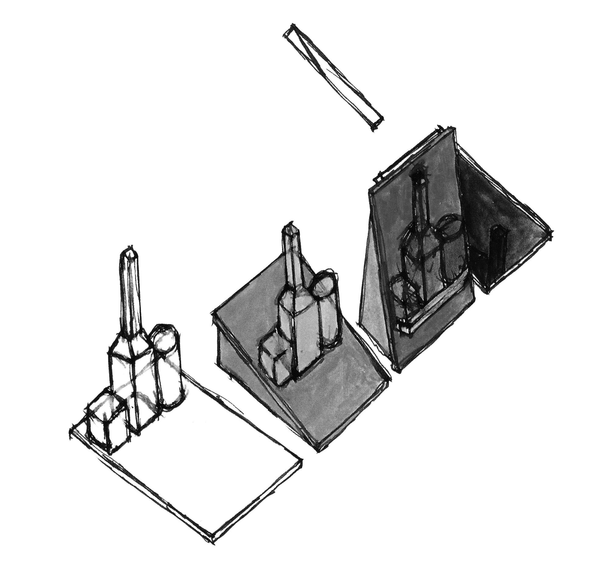
John Hejduk Still Life Museum / Museum for still lifes, could it be possible for the architect to take the natura morta of a painting and by a single transformation build it into a still life?

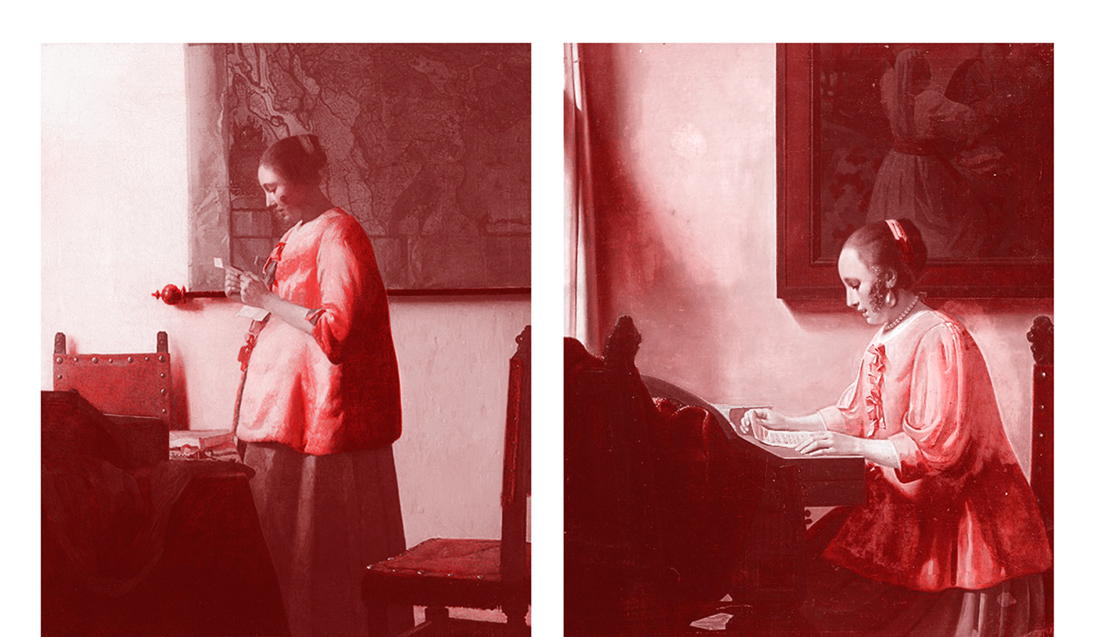
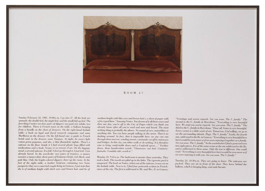
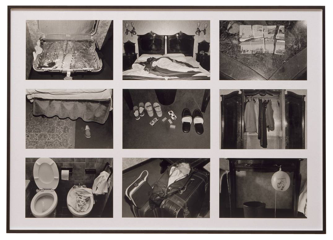
First and foremost architectural plans are a tool for instruction and documentation of a building process, but the graphic compression of a spatial idea creates a reality on its own. The plan equally takes part in other disciplines, painting, literature (think of Alain Robbe Grillets Jealousy), as it does in architecture.

chamberworks III-H
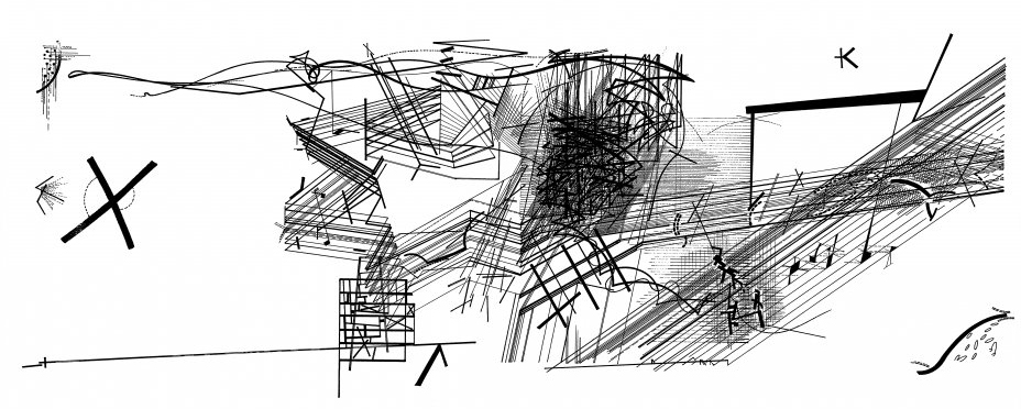
Daniel Libeskind, Drawing from the series Chamberworks, 1983, Chamberworks, carries in its title the notational character of the drawings, the form of their conception of space.


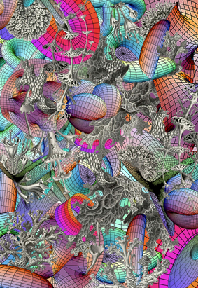
The planar form of representation is able to develop architectural problems independent from the construction process. It writes a text, different from that of the building, though in an indexical relation they contain each other. The factual information given by the plan creates a metaphor of the building through decisions made in its form of graphical notation, the format of drawing enables architecture to incorporate and appropriate parts of other disciplines, literature, philosophy, painting. The foundations of casual literacy are different from those of architectural, spatial literacy. In John Hejduk’s Architecs wheel the history of literature stands of the same level of elemental necessity, as that of construction materials, forms of depiction and building elements. Still, a plan is bound to an indexical relation towards reality, but it narrates a different story about the building it depicts, just as the story of the building differs from that of the plan. In its abstraction, the plan creates a Sinnbild (symbol), ideograph, allegory of the building.

DP109642
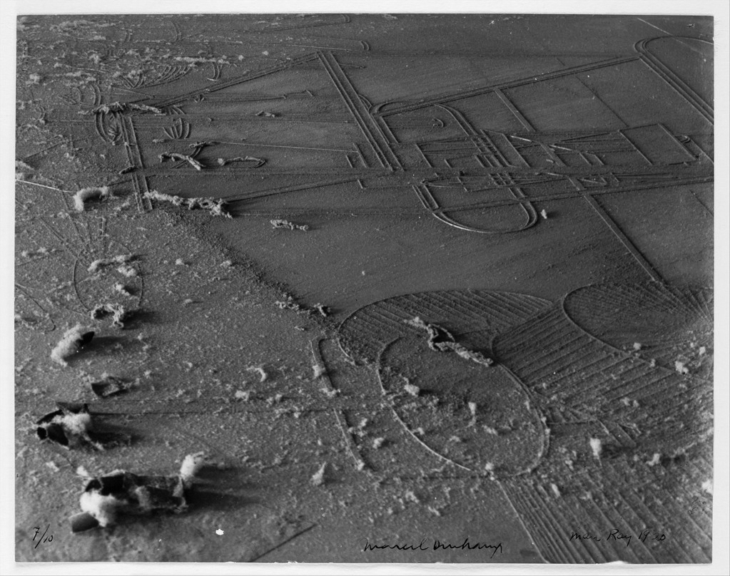
Man Ray, Dust breeding, 1920, Duchamps 'Large Glass' metaphorically turns it into a huge landscape, a pictorial setting.


The text formed from a logic of graphical signifiers, line, plane colour, typography, delineates what a building is about it a two-fold way: Syntactical, as the composition of spaces, and theoretical, as the Weltanschauung (philosophy of life), a complex synthesis of philosophical, religious, social beliefs. In that sense, the architects wheel is an archetypical plan, containing Hejduks complete vocabulary, a model for his architecture, for the narrative of basic shape, rather than a concrete building. Every plan evokes the world in which that building exists, the possibility of a space, just like every lie creates the world in which it is true. The plan formulates principles of grammar, methods of thinking and working, it integrates tectonic space and form and human experiences and conditions that comprise our existence and thus it is essentially philosophic.

dubai_masterplan2
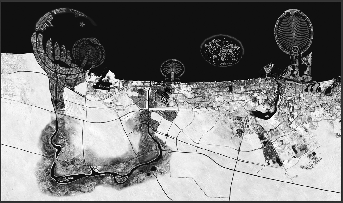
Dubai Masterplan, “It was the precision of my memory which enabled me to demystify the imaginary quality of the dream: surreal and real became interchangeable metaphors.” Raimund Abraham, the architects dream, 1983

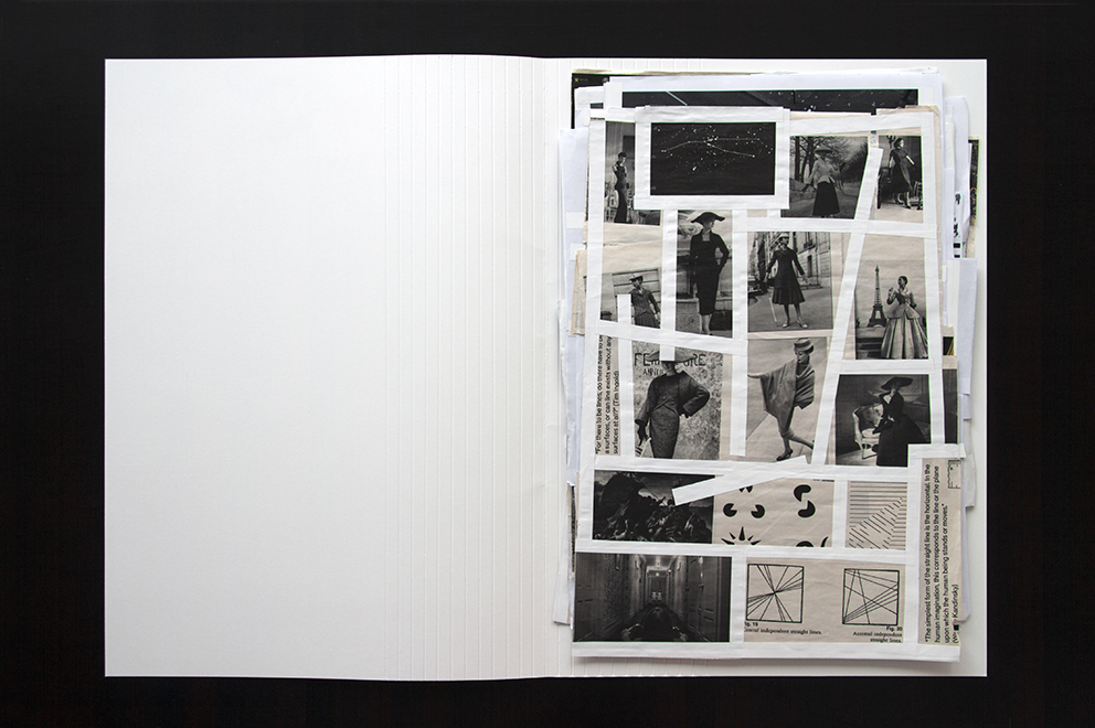
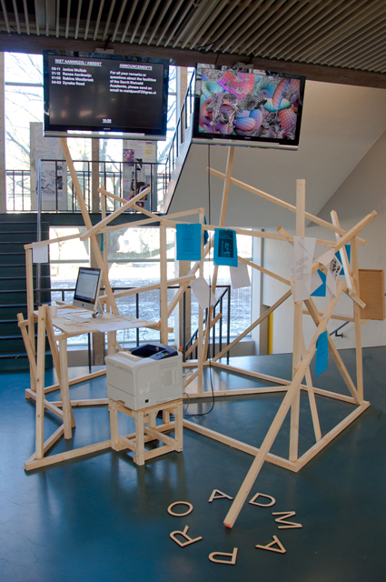
text by Anton Stuckardt [graduate student department of Graphic Design]


from the jury rapport: In ‘Orthogonal Allegories, the reality of architectural plan drawing’ Anton Stuckardt has tackled the difficult subject of how the three-dimensional form is two-dimensionally represented. Still Anton manages to make the subject understandable in a very intelligent way and the thesis shows that he is a sharp thinker. The jury also found it to Anton’s advantage that he took his own interest in architecture, and connected this to the field of graphic design. Overall the thesis was compact, powerful and well written with good illustrations.


Pdf-icon Download this thesis:

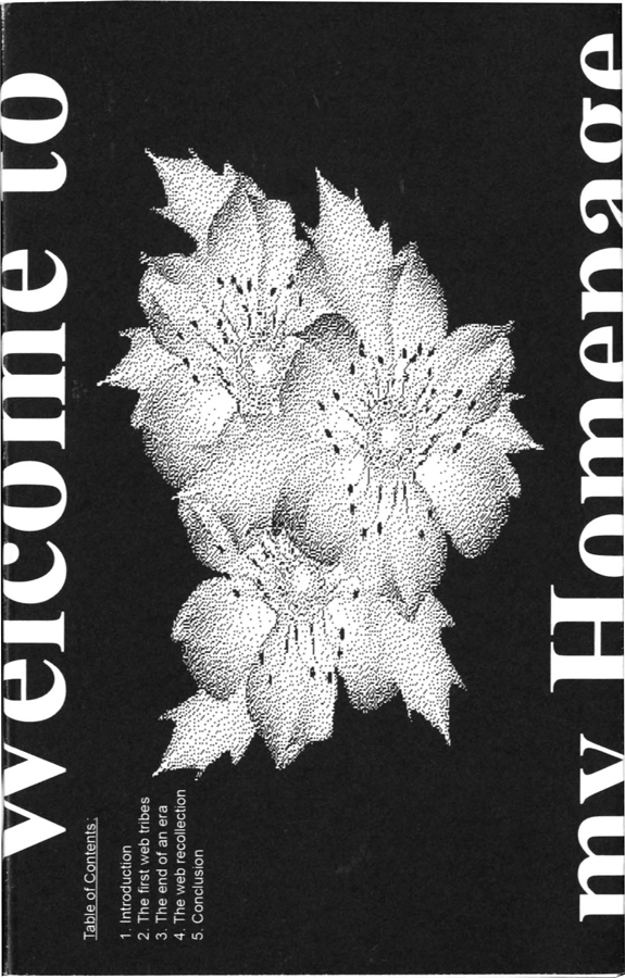
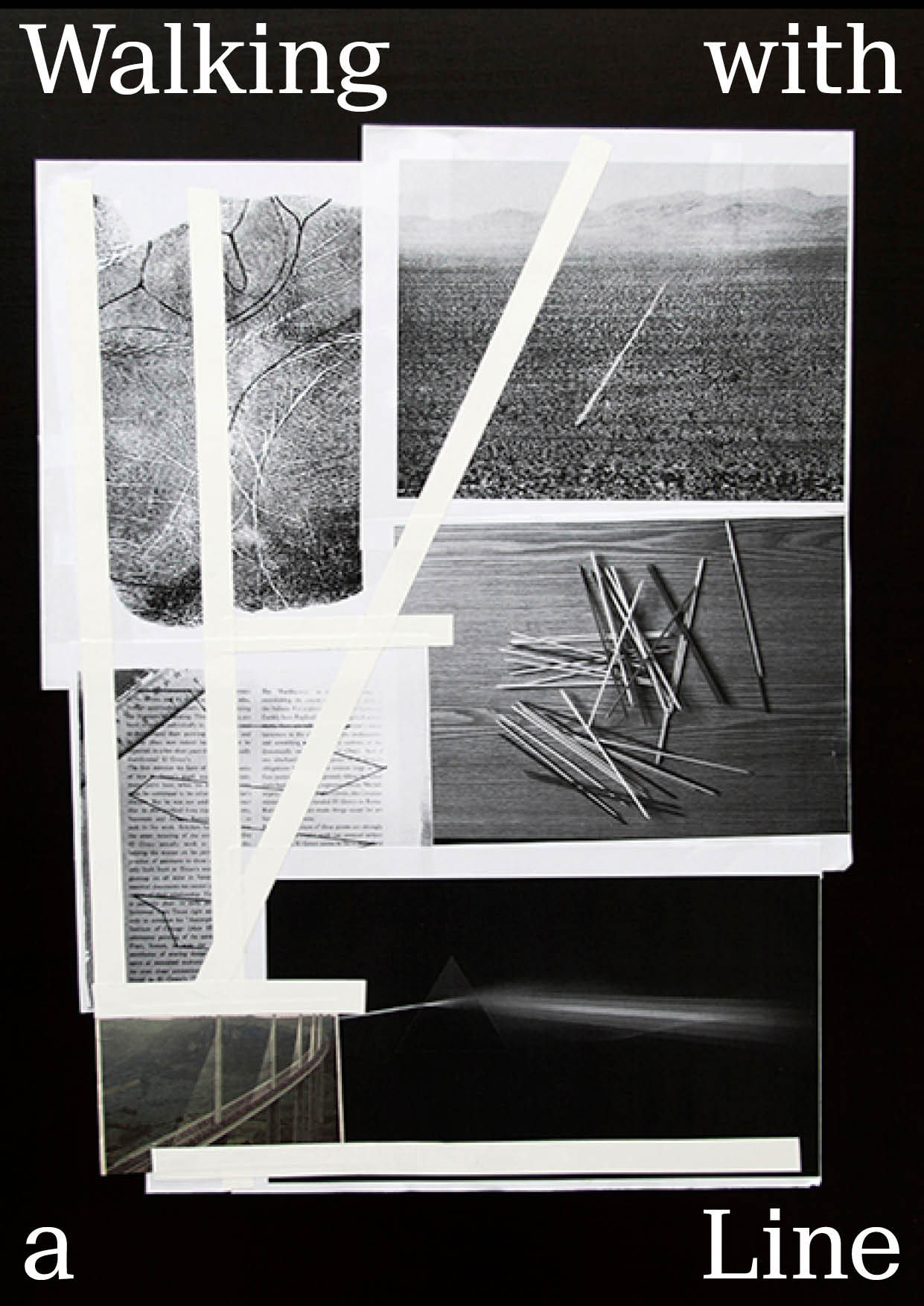
Orthogonal Alegory – the reality of architectural plan drawing.


Over de kunstenaar die een detective wilde zijn


Friday, July 12, 2013

The Hotel, Room 47 1981 by Sophie Calle born 1953

In L’Hotel (1981) neemt de Franse kunstenares Sophie Calle tijdelijk een baan aan als kamermeisje in een Venetiaans hotel. Ze krijgt 12 kamers toegewezen, die ze gedurende enkele weken zorgvuldig moet schoonmaken. Tijdens haar werkzaamheden documenteert ze de voorwerpen die de gasten in hun verblijf achterlaten. Ze fotografeert de bedden, die soms niet eens beslapen zijn. Ze opent de koffers, bevoelt de zijden stropdassen. Ze leest brieven, die niet aan haar gericht zijn, en maakt aantekeningen van wat ze in de badkamers aantreft. Ze documenteert alles wat de gasten in hun kamers achterlaten. Als een ware detective onderzoekt ze hun levens.
De foto’s en teksten die Calle maakte tijdens haar werkzaamheden als kamermeisje, publiceert ze later in de serie L’Hotel. Met dit werk maakt ze het publiek deelgenoot van haar voyeurisme: ze biedt de toeschouwer een intiem kijkje in het leven van de hotelgasten.

The Hotel, Room 47 1981 by Sophie Calle born 1953

both images : Sophie Calle, The Hotel, Room 47 1981, © DACS, 2004

De kunstenaars die in deze scriptie behandeld worden gedragen zich net als Calle als een detective. In hun werk nemen zij het leven onder de loep: ze verzamelen informatie, onderzoeken deze zorgvuldig en komen vervolgens tot verrassende ontdekkingen. Aan de hand van het werk van onder andere Douglas Huebler, Hans-Peter Feldmann, Arjan de Nooy en Hans Aarsman, wordt in deze scriptie ingegaan op de overeenkomsten en verschillen tussen de werkwijze van de kunstenaar en die van de detective.

text by Rosan Dekker [graduate student deartement of Graphic Design]: www.rosandekker.com


From the jury rapport : The jury found the carefully designed thesis of Rosan Dekker, which looks like a poetry booklet from the early twentieth century, very charming. Scriptie - boeken - Rosan Dekker - Detective_small But the jury was also impressed by the content of the thesis. In her thesis Rosan investigates what we can learn from the artist in the role of detective. Rosan shows in a well-written narrative that the artist should be a detective that asks the wrong questions and takes up the false leads to get the best results. The jury has found that Rosan's is the only thesis that shows good art criticism in that she is not afraid to take in a position and defend it. [thesis nominated for 2013 Rietveld theses prize]


Pdf-icon Download this thesis: Over de kunstenaar die een detective wilde zijn [dutch language]
 

Half Constructed Infinity


Tuesday, October 23, 2012

Ape  Lydia Sachse [x] graduated from the Rietveld Academy Department Graphic Design in 2012. Her graduation theses was titled “Half Constructed Infinity; On Algorithmic Literature and Text Generators”. It shows her fascination for complex machines and mathematical order as well as the visual beauty of chance. The essay’s introduction starts with two quotes and before you know you –artist as well as designer– get caught in this rich and intriguing subject;

Roald Dahl, The Great Automatic Grammatizator

“carpets … chairs … shoes … bricks … crockery … anything you like to mention – they’re all made by machinery now. The quality may be inferior, but that doesn’t matter. It’s the cost of production that counts. And stories – well – they’re just another product, like carpets and chairs, and no one cares how you produce them so long as you deliver the goods.”

Sol LeWitt, Paragraphs on Conceptual Art

“When an artist uses an conceptual form of art, it means that all of the planning and decisions are made beforehand and the execution is a perfunctory affair. The idea becomes a machine that makes the art.”


Spread_SolLeWitt_small

“The subject of the text is automation with a special focus on text generators and algorithmic literature. Text generators are not limited to the computer, Already the invention of the movable type transformed religious and literary writing into algorithmic structures and even sytemic theory of rhetoric (Aristotle) was a step towards this direction. This research focuses on different examples of automatic processors from the 20th century and how these emanate from each other in consideration of the technological background.
Inspired by mathematical thoughts scientists and artists started to experiment with computer generated text in the early fifties. Many writers got exited by the new possibilities of computer technology with the hope of finding new ways of artistic expression…..”


Pdf-icon Download this thesis: Half Constructed Infinity

[Algorithm: pattern of action which describes how to achieve an aim in several steps (functions as work routine)]

The Erratic Life of Texts Made Public


Tuesday, October 23, 2012

[publication of graduation essay by Laura Pappa 2012


In the spotlight is a collection of books and book-related projects that are introduced through the subject of this essay: the erratic life of texts made public. This text takes a look at what happens to books after they’ve been published, and in what forms can they continue their existence. For this a narrative of sorts has been put into practice where at each step texts are subject to more and more deformation and alienation from the original content. This order defined the selection of projects to be introduced as well as the context for their analysis. This curated collection of books is subject to a close study through examining the different ways material can be treated and made use of, weighing the ups and downs of it and defining the core of these projects.
The text is divided into several different chapters titled by the act material is exposed to and under each title a handful of projects are introduced. Aside from individual critique of the selected examples, the text touches upon subjects such as publishing, authorship, appropriation, reading and books in general.
…… Alongside the disappearance of the material, somewhere between sharing and creating, uncommon types of publications and projects emerge that infuse (parts of) existing texts with new layers of information that begin interacting with the chosen content. The additions can be textual, image- or form-based where the selection of the source material can also often have a key role to play. All the models, no matter how simple or perhaps seemingly worthless, provide numerous possibilities for the creation of new publications. Through questioning and implementing the “originals” newer and better formats may emerge.
 
Download this thesis: The Erratic Life of Texts Made Public

[image thesis flyer by Laura Pappa]


from the jury rapport: “The Erratic Life of Text Made Public” by Laura Pappa of the Graphic Design department is an outstanding thesis because it is well written, has a good outline and gives original examples. The thesis describes and researches everything that can happen with a text, which takes flight from Laura Pappa’s own discipline of graphic design. The jury only found one blind spot in the thesis in that it doesn’t question what the – sometimes devastating - effect of the graphic designer him/herself can be on the text. Still it is a remarkable thesis in that it is one of the few that really shows an independent manner of thinking and a train of thought that is taken to its utter consequences.


Improvised dialogue


Wednesday, January 18, 2012

Dialogue, Wendy, Robert, Anne" from Zara Zerny on Vimeo


about the movie: text in progress


[images Graduation Show, Zara Zerny]

The essay by Zara –as part of here graduation project– is an investigation and interest in approaching a method used in the moving image, film; the improvised conversation.
For years improvised conversations have mostly been used in independent films, which have a different focus and storyline then a traditional Hollywood movie. It is often noticeable to the viewer when a conversation is improvised; a specific atmosphere appears in which the random is made possible in a controlled environment; fiction becomes infiltrated by reality. A director works in a different way, when using an improvised conversation. Instead of following a strict storyboard the director designs a setting that allowes the actors to improvise within restricted environments.


download thesis: ‘Conversations and Design in Improvised Conversation’

The revised edition of Die Neue Typographie.


Saturday, December 31, 2011

summary

650-MaartenKanters5  As part of the graduation program at the Gerrit Rietveld Academy, we were asked to write a thesis. I conducted a research into the early days of Modernism and Constructivism. One of the books on my list was the English translation of Die Neue Typographie, by Jan Tschichold.
This publication included an introduction by Ruari McLean, translator of the original, German version, who was also a personal friend of Jan Tschichold. On the first page of his foreword, McLean tells us that already in 1967, Tschichold asked him to translate Die Neue Typographie. McLean continues his introduction: “He planned it as a second, revised edition.” McLean states that he translated the greater part of Die Neue Typographie, incorporating all the revisions, but no publisher could be found. For the 1995 edition, McLean together with the University of California Press, made the editorial decision to translate the original text, treating it as a historical document.

covernew DieNeueTypographie TheNew Typography

original ©1928 "Die Neue Typographie" by Jan Tschichold - first English edition "The New Typography" ©1995

After finishing the introduction, I was curious about the revisions Tschichold made to his original text. McLean tells us in his introduction that after the death of Tschichold, in 1974, he placed the draft of his translation in the St Bride Printing Library. So, the next day I called the library. It took me some weeks, to finally get hold of the document, but these weeks gave the opportunity to research Tschichold’s personal and professional life.
Tschichold transmogrified from a traditional, German trained typographer, into a “true modern designer” (his own words), to finally reform back into his old working method, a classical and traditional approach to typography. Over time, he became his own frenetic antagonist, with Die Neue Typographie in the center.

Tschichold_book-4

What I found out, is that Tschichold during his life, tried, but repeatedly failed, to publish a revised edition of Die Neue Typographie. Throughout his life – while criticizing himself and others, who were still confederated to Die Neue Typographie movement – he worked on this document, trying to mitigate his rather excessive statements from his younger self. This revised edition of Tschichold was now fragmented in different archives. As an archaeologist I started to recollected these sparse pages and revisions by Tschichold, and incorporated all my findings into a version, as coherent as possible.
While working out the manuscripts by Tschichold, I tried to find out in what physical form, Tschichold wanted to present his revised edition. In correspondence with Piet Zwart, he speaks about presenting it in A4 format, a format he later labeled as: “devils format”. Die Neue Typographie was set in either Aurora Grotesk, or Akzidenz Grotesk. The choice of typeface, was decided by practical circumstances: no other sans serif font was available in an amount large enough, to set a whole book. I took this opportunity to design my own sans serif font, called Takhir. The shapes of Takhir were drawn, to tell a story about Modernism. But, it is too bumptious to appear, as pure, as Modernism would have wanted it to be.

Tschichold_book-2

This whole project resulted in the revised edition of Die Neue Typographie, containing all the revisions I collected in my research. The publication is introduced by a foreword, that I wrote as my thesis [presented as pdf at the end of this post], in which I present the historical background of Die Neue Typographie movement, and the publication by the same name. Beside all the revisions Tschichold made to his text, he made a number of personal comments, which reflected or criticized the content. The combination of these two, are really important for me, because it shows Tschichold’s difficult relationship to Die Neue Typographie. In one hand he rewrites its whole content, but he no longer agrees with its tenor. In the final publication, these personal comments are presented on errata’s, placed on the corresponding page of the content.
The whole publication is set in the typeface Takhir, which was finally created in two weights, both with Italics. Printed digitally in an edition of 50 copies 157 pages on 110 grams silk machine coated paper with a silkscreened cover, for sale at San Serriffe Bookstore [x].

text by Maarten Kanters [graduate student department of Graphic Design 2011] : more www.mrtnkntrs.nl


It appears you don’t have a PDF plugin for this browser.
No biggie… you can click here to
download the PDF file.


Log in
subscribe