Rietveld > lib. 779.0 fer 1
Rietveld > lib. cat. no: 779.0 fer 1
 We could imagine that an artist who decides to make a book to present his works, will make the choice to present it in the most realist way. The works have to be shown as clear as possible, with all the details and from the best angle in a way that the public can figure the work out as better as possible. (more…)
After a few days scanning through the book Radical Modernism
you start feeling a bit dizzy
from all the different theories within the development of design.
You head begins to feel swollen from all these different words and their definitions.
Paradigmatic, postnuclearism, electisism. All refering to the atitude and the meaning
that designing absorbs from.
But it all seems to lead to one specific word: Juxtaposition.
It triggers a linguistic imagination, a word scramble. Playfully putting things in the
wrong order
just to see if it can be better understood.
Drives you to imagine things such as twisted dictionaries, chaotic and senseless.
A whole other reality and a whole other perspective for the spectators
that are looking upon it.
Is juxtaposition the word that concludes the role of deisgners entering the 21th century?
Thus the solution lays in taking twist and turns until it's completely unrational.
Is that
the only
way we can
"rationalize"
all these enigmatic theories.
And if so,
Let's juxtapose ourselves in the flaws that embraced our creation.
A mental furniture in the waiting room of life perhaps?
Illustrating messages that aren't it's original meaning.
Collecting peoples confused gazes on what seems to be our contradictory selves.
Instead they will have to cope.
They will have to stand right beside what seems to drag them in confusion and frustration.
While thinking on how we use opposites to explain ourselves.
I wrap myself in this beautiful idea of being things that
can only be seen with eyes closed.
Feeling with just the mere idea of beauty.
My mind drifts in different directions.
I see myself becoming displaced messages to the universe.
Compelled by its matter.
So lets design a reason for our contradictions.
Let's yield to the aesthetic need of expression.
Let's design a symbol of the beauty our flaws reflect on while
we aren't starring or paying attention.
Rietveld>lib>cat.no: 772.9
book (bOOk)
n.
1. A set of written, printed, or blank pages fastened along one side and encased between protective covers.
there were some books in the library that didn’t fit this description of a ‘usual’ book.I chose a rather mysterious one.
Have you ever wondered if there is something in common between offices in
New York, desert tribes 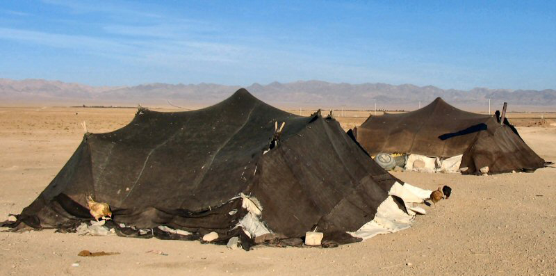 and living spaces of Amsterdam?
In order to find out the answer for this question I went to the Rietvedl’s library.
When I was looking for a book I was keeping in mind two key-words : “focused” and “imagination”.
I had an incredible finding – a book about nomadic design and architecture. It tells that in today’s dynamic and global world more and more people are departing from the settled family houses tradition, where all the things are heavily rooted in a single place and don’t change for generations.
In order to keep in synch with the pace of changes people gravitate towards more agile and lightweight lifestyle that eventually unfolds into it’s own new ecosystem.
This phenomena is known as “nomadic lifestyle” and it has been around for ages ever since the first nomad tribes roamed from place to place.http://www.nomadicarchitecture.com
“Over decades people in western societies have experienced the world and their private lives as static with respect to their spatial and social coordinates. In the view of globalised and virtualised societies this felt security vanishes resulting in behaviour that falls back into strategies long assumed buried in the past: nomadism…One of the later stages of nomadism, called nomadic pastoralism. The concept of nomadic pastoralism celebrates its resurrection in industrialised nations in various forms, i.e. In management practices, social organization, or the composition of information. An example of nomadism in social organisation is the growing movement of RV lifestyle (RV = recreational vehicle), where people are interested in travelling and camping rather than living in one location.”
"Nomadic Information in Social Environments".Frank Nack and Simon Jones HCS, University of Amsterdam.
Nomadic lifestyle develops it’s way in architecture and design starting from poorest neighbourhoods with homeless people all the way up to the yappy residential areas.
This design was inspired by utility of nomad life and has absorbed it’s plasticity to transform and adapt to the environment. It’s not trying to stand against something, it just follows the trend making any change easy and keeping it in human scale.
As proponents of the nomadic design say “We’ll share with you what we know about the process of going from work-at-home to work-anywhere-you-damn-well-please.”
http://www.knowmads.nl/
They call themselves “Technomads”.Technomads make use of work arrangements in which they enjoy limited flexibility in working location and hours, such as e-commuting, ework, telework, or telecommuting.
The main aspect is that the daily commute to a central place of work is replaced by telecommunication links. Many work from home,while others utilize mobile telecommunications technology to work from coffee shops or myriad other locations.
There are two core aspects of nomadism, namely mobility and individualism.
All nomadic design, architecture and lifestyle are about these very two words.Being inspired by this idea I’ve traveled to many places in Amsterdam from refugee areas to student campings and the downtown.
Here are a few moments:
If you want to read about how nomadic design develops itself in New York, try “New York. Nomadic design.” by Ronald Christ/Dennis Dollens.
Rietveld > lib. cat. no: 772.9 chr 1
The year is 1924. That’s a long time ago. That’s why this book smells of old grandpa.
The title is intriguing. “Woodcuts, and some words”. An honest title. Plain simple. As if the phrase “what you see is what you get” was authored for this book only. It doesn’t have a fancy wordplay. Someone once upon a time spilled coffee on it. Maybe also dropped a cigarette on it. Drank coffee and smoked cigarettes, while glancing to it’s precious content. This book I’m holding in my hand is some book. Extraordinary. Classic. Both fragile and pretentious at the same time. The thick papers, the fine composition on each page. So elegant and authentic. So anti-industrial, so handmade. This book can teach you how to make woodcuts…
– It’s like an old school version of one of the many ‘how-to’ videos on YouTube. I’m actually holding an offline version of a ‘how-to’ video. It makes me think of information, and how we approach and handle the nonstop floating information on the WWW.
What is the actual difference between information in a book and information on the internet, besides the limited/unlimited amount? I recall my teacher saying something like: “I will recommend you all to buy the book and not make scans and read them on your computer… because… it’s nicer, you know”. What makes us grab a book instead of browsing the web?
What is the fuss about a book in general? Is it because it’s capable of generating a certain feeling or a certain “vibe” which will never be generated from the most awesome and well-made webpage? Is it the typography on the paper, the quality of the paper, the fact that you can touch it and that it isn’t ongoing?
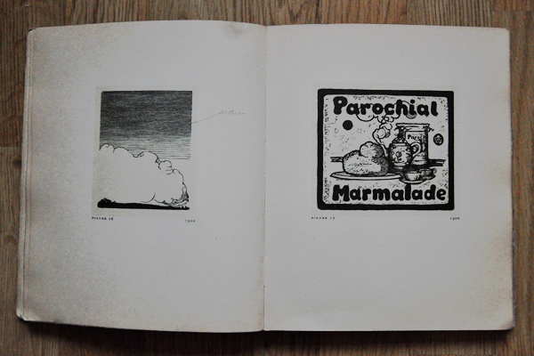
There’s an enormous difference between getting information from a book and getting information from the internet. I, myself, is having a hard time keeping track on the endless amount of available information on the internet. It’s interesting that the information about any subject on the internet is unlimited. It’s like having unlimited access to ‘knowledge’. There’s always more. You’re never finished. It’s ongoing. It will always follow time, never become obsolete.
The information in a book is not developing. There’s a last page. A period. It’s printed and can’t be changed in a sec. No further links. No sudden brand new pages. No updates. No hidden information. What you see is what you get. And *that* somehow puts the whole ‘info on the internet’ in perspective. You never see what you get, until it’s there. Always floating, constantly changing. Eternal information.
Rietveld > lib. cat. no: 755.1
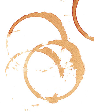 Once every often when browsing between the many beautiful glossy covers in libraries I come across a tattered old book that I feel I need to save. Especially when held together by peaces of tape and covered in coffee stains of it’s previous users, I am convinced it needs my love and attention. This book ticks all the boxes.
Inexplicably immediately memories pop up of me hovering at my fathers desk while he is working. Looking up to him and his work which I don’t fully understand. Then again, my father was a graphic designer and my associating him and that specific memory with a book on typography might not be that strange after all.
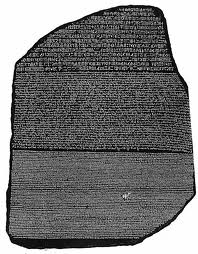 The book “Drukletters hun ontstaan en gebruik” (Printing types their origin and use) by M.H. Groenendaal is filled with old mysterious languages I can’t read. Worlds of knowledge I can only imagine. Wonderful shapes I love looking at. Shapes that take me to exotic places, inhibited by people you now only find in books. Or maybe the way words used to look before I could read. Wasn’t it a fascinating thing? Adults staring at pages covered with weird lines that didn’t make any sense for hours at a time. You could only imagine what these lines told them. It was almost like a secret society to me, and I couldn’t wait until I was invited in. This is what intrigues me most still, something I cannot understand and therefore let’s my fantasy run wild.
When you start reading the dry factual text, however, all mystery of meaning evaporates. Fantasy disappears and is replaced by hard fact. Being a hopeless dreamer, naturally I was let down a bit.
But then I come across delightful sentences that have now regretfully almost disappeared from use, and instantly I am charmed again.
The book by Groenendaal is actually a very thorough reference work on the history of typography. Dealing from the earliest types of passing on information; such as cave paintings; and the development of the alphabet, up until the most contemporary typographers of the seventies.
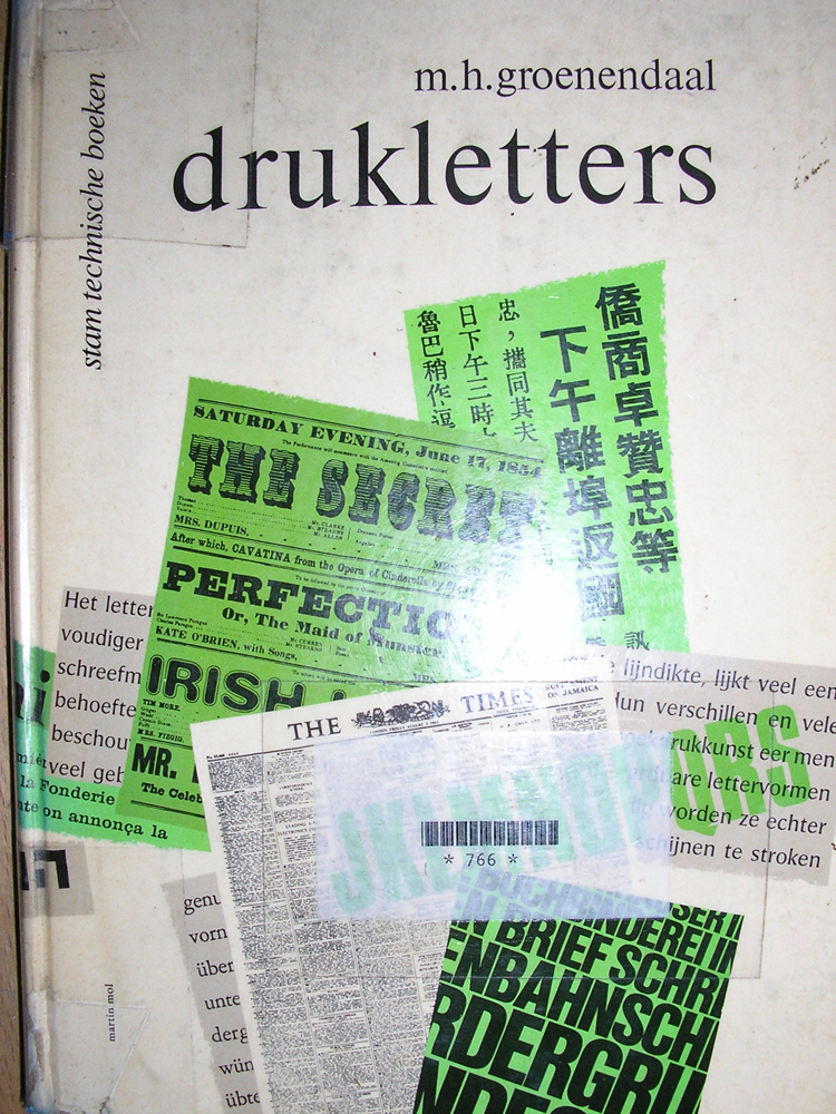 As the book is written before the computer age when the phototypesetting was hardly introduced yet, it’s not completely unfair to say it is heavily outdated.
However I am glad to find that the book is still widely used and it is often referred to in new publication to date. Also, earliest copies of “Drukletters” are now sold as book antiquities. It is safe to say that it really has no need for me to save it.
Rietveld > lib. cat. no: 757.3 1F
What is drawing? Is it possible to define it as one of the basic way of expression of mankind? I think so. And as a so elementary medium it is also possibly the most versatile. That’s why I’m so fascinated by this powerful medium, I guess.
The sign traced on the ground, at first, and then on rock, paper and many other materials is the most immediate gesture, which remains for the future. It is something that survives the moment it is done, it’s time itself expressed, and gives the possibility of a general overlook on the process of tracing, and therefore of thoughts. As an expression of time it’s the best medium to communicate something of that moment, every idea, process, image. The zeitgeist of a precise moment. Applying the drawing process in history, humanity had described itself for millenniums, and the language didn’t replace this medium, and overpassed its power.
There’s a book who in which this process appears evident, a book who inspired these considerations: “The New Yorker Album of Drawings 1925-1975” by Penguin Books (ISBN 0140049681). It is a collection of cartoons from the famous american magazine, all the cartoons from several artists, Saul Steinberg, William Steig, Richard Taylor, Peter Arno, Charles Barsotti, Geoge Booth, Barney Tobey, James Thurber and Charles Saxon among others, that contributed to its celebrity and authoritativeness. Many designers and artists worked and keep on working for the magazine, expressing by cartoons the daily facts, the ideas they had and their considerations on every topic that comes into their mind. The book as a powerful archive of human activity, a window open on a huge part of social, cultural, politic context of our times.
Through a closer look to its cartoons it is possible to spot many of the concepts i’ve mentioned in the first lines of this essay. For instance, this cartoon by Steinberg, in its essentiality, holds the articulated concept of the idea that becomes gesture and then sign, being able to disclose its nature. It happens, as in this case, that the sign itself tells much more than a thousand words. In fact, I won’t spend more words on this concept.
But drawing is also subjective, being the expression of a singularity. In this cartoon the dancing girl expresses something through her gesture (which, in this case, don’t concretizes itself into a sign), but every one of her class mates gets a different concept from the one she feels. It’s clear that, so as in tracing sign everyone puts something of him/herself, in acknowledging it the viewer puts what is part of his/her experience of the world. This causes the fact that drawing as a medium is also very personal, and even if is possible to state that there are not good drawers and bad drawers (the sign is not objective, but reflects the exact image of the drawer), is also possible to say that a good drawing, on the field of expression, is the one that communicates in the best way the concept that inspired it, and the purest it is, the better the idea goes straight into the viewer.
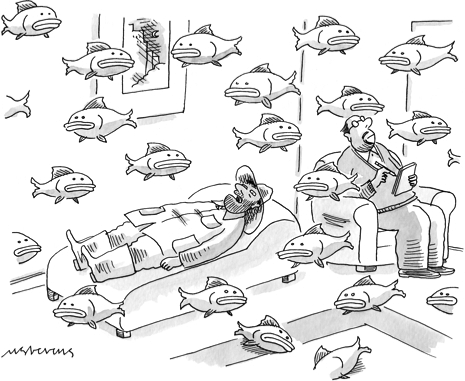 Considering the history, thou, the drawing had always been the way to describe the zeitgeist of a period, through the widest range of expressions. Is it personal or or collective, then? Is it the personal expression of a singularity or the collective depiction of a society? I think that it is both, depending on the scales we can consider drawing, as the process that turns the expression of a singularity into a depiction of a society is also a collective process.
Another question. The culture influences the art of drawing and drawing itself builds consciousness and culture. Is there a good use we can make of it?
Rietveld > lib. cat. no: 738.8 new
Weldoordacht geklad en geklieder is wat er in mijn hoofd knalde toen ik dit boek uit de schappen trok.
Gewicht, omvang als dat van een saai oud wetboek. Maar uiterlijke kenmerken die speelsheid en frisse veranderlijkheid verraadden.
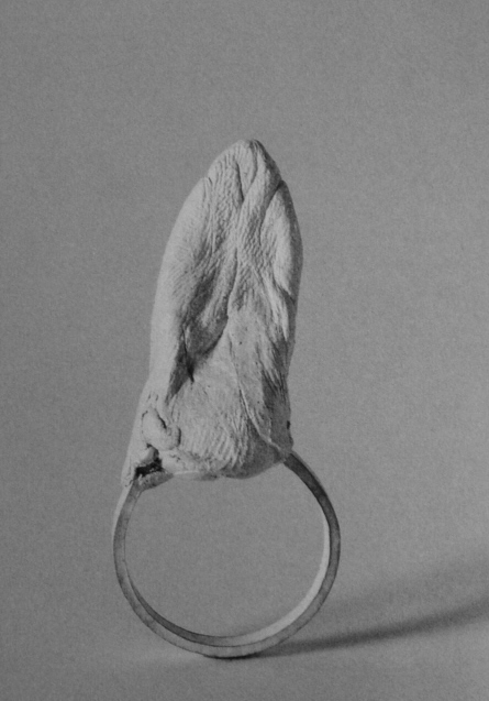
Het is een boek over sieraden, hedendaagse sieraden om precies te zijn. Allemaal ontworpen door (ex) studenten van ‘Munich Academy for Applied Art’[x]. Blad voor blad ontdek ik, dat mijn kennis over sieraden nog armer blijkt te zijn dan ik dacht. Dat, terwijl ik me verbaas over de vele opties en keuzes in materiaalgebruik, vormgeving, grootte.
Wat zijn hedendaagse ofwel autonome sieraden nou eigenlijk?
Is de term ‘Autonome sieraden’ niet wat de Engelsen een oxymoron noemen?
Een stijlfiguur zoals ‘knap lelijk’ of ‘oorverdovende stilte’?
Deze term lijkt in te gaan tegen het idee dat deze sieraden een toegepaste kunstvorm zijn. Dus daarmee, geen autonome. Wat is het verschil tussen een antieke trouwring en een neonkleurige kunststof ring in de vorm van een schedel? Misschien heeft symboliek ermee te maken, misschien het verleden. Voorheen hadden de sieraden behalve een decoratieve misschien wel meer een praktische functie.
Status, afkomst, burgerlijke stand en noem zo maar op.
Maar dan, een kunstwerk dat ‘ toevallig’ gerelateerd is aan het lichaam en alle eigenschappen bevat van een sieraad. Is dat kunstwerk per definitie een sieraad, dus dan ook toegepast?
Nee, vind ik niet.