When we paint we create compositions, shapes and forms from colour. The colour choice is important in our spaces and on our walls sending messages to the brain, different colours evoking different emotional response. Colour is engrained in literature and film like ‘The Yellow Wallpaper’ where yellow connotes to madness and insanity or visually in ‘Blue is the Warmest Colour’ (where blue features in every scene) we can see it as freedom in deeper tones and a depression as it becomes more diluted, in each context colour can play a different role. Red, the third primary, is depicted as villainous characters and day-to-day we see red road signs as danger. Each colour resonates, we have an emotional response, and this is why the psychology of colour is intrinsic to human life.

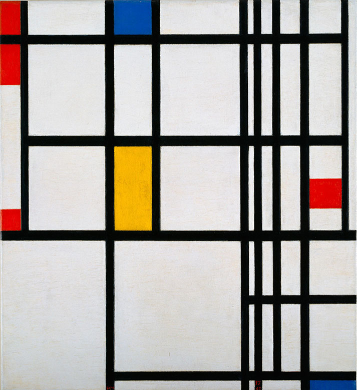
In De Stijl we saw a reduction in form and simplicity of colour pulling back to these three primary colours. This movement strived to strip back the chaos of war and the ornate elaborate architecture of 1917 as painters Piet Mondrian and Theo van Doesburg took two dimensionality into the three dimensional architectural form. In Mondrian’s paintings the lines move out almost from the canvas to enter the viewers own space and pull you in to the squares of colour. In the recreation of Mondrian’s room I felt the same pull, there was a flow in the space that I enjoyed, the room was awash with white but had these fleck of colour that mirror his paintings. The freshness and purity was achieved through colour awakening my eyes to a new experience to colour. It opened up a window to my experience of colour and its effect on the soul, first looking at these three staple colours and then then into the wider sphere of the colour wheel.
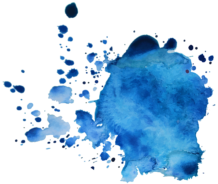
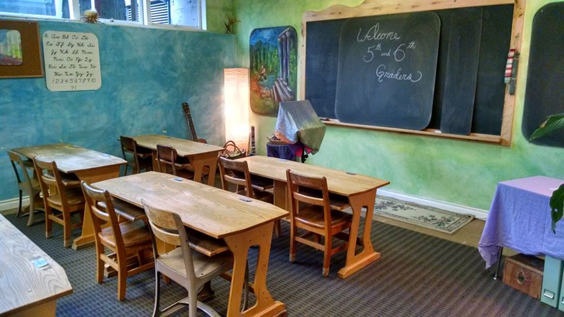
My room also is predominantly white to promote a clean fresh feeling but is splashed with blue in curtains, cushions and rugs. Blue is said to promote a feeling of creativity in a study by the University of British Columbia as creative blue is represented as something that is not tangible, the sky, the horizon, the sea. Where sky meets sea it is a point of contact that can never be reached and this adds space to an environment and seems to give depth to a room. Rudolf Steiner’s schools used colour as a vital part of the formation of a child and blue was especially key. For the 6th, 7th and 8th grade the classrooms where painted blue because Steiner believed that we undergo a 9 year old change, finally seeing colours for what they are. Before the classrooms where painted in warmer reds and oranges because at this age the child sees the colours for their complimentary match on the opposite side of the colour wheel. So, in both cases the cooler blue tones calm the child down and add space for the child to focus, promoting Steiner’s non-suffocating environment to set free their thinking and ideas.
Yellow makes babies cry and irritation in adults which is why this colour is used to paint restaurant walls, stopping people from staying too long taking up valuable space. Where I currently live the walls are drenched in a bright sickly yellow pressing a sense of forced optimism, this tone reflects more light, excessively stimulating the eye making it understandable that yellow can fatigue both eye and optimism. ‘Yellow Scream’ by artist Kim Beom beautifully reflects this angst creating a composition reliant on the psychological weight of each scream. This use of yellow links back to an idea of madness and as Beom adds black it reflects Steiner’s theory of this darkened yellow depicting the grotesque creating a compelling piece of performance art. It is an unnatural colour, like the other primaries drawing away from the natural mirroring De Stijl’s movement, however out of this context yellow can be antagonistic to the human eye.
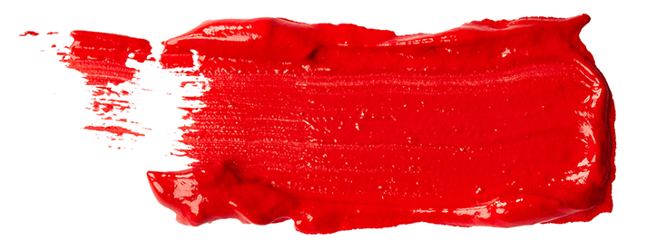
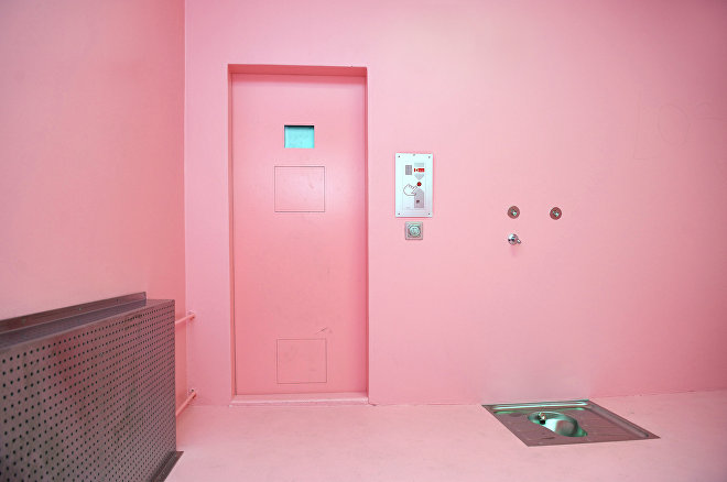
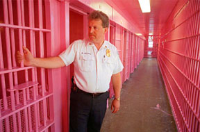
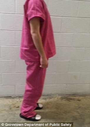
In Barnett Newman’s ‘Who’s Afraid of Red, Yellow and Blue III’ we can see the use of an overwhelming red applied layer upon layer, the artist presents us with an invasive red further juxtaposing nature in industrial mechanical colours. This piece demands the viewing to look at it and have a reaction in Newman’s didactic idea rather than that of De Stijl’s expression of freedom, the red evoked such strong emotional response is was attacked by critics and attempted to be destroyed. The red of the teacher’s pen acts as a warning through colour conditioning and it is interesting that within a different a context primary colours can have a different response and pose as a protest. If we add white, however something different happens and pink can be used to calm. ‘Cool down pink’ is widely used in prisons in Switzerland to calm down the inmates because it is believed to be physically soothing. This soft feminine colour has spread through prison to Texas where prisoners are dressed in pink jumpsuits or drunkards being locked in pink cells to calm down. It is interesting how diluting such a vivid colour of blood, passion and anger can alter its effect on the human spirit becoming something to pacify a patient.
The psychology of colour influences how we decorate our homes, institutions and environment. Tonal variation, hue and complimentary colours all play a role in how each day is coloured. De Stijl reduced it down to a purity and simplicity of colour that opens up new ways of seeing, transforming our space into something painterly and making the two dimensional into the three. We connect to colour through conditioning and through tone playing a part in each moment. Colour responds to the spaces we move in and alters our perspective on how we see our homes and world.