The most interesting thing about the book I chose in the library: For Every Dog A Different Master [x] was oversized texts which were intolerable for me. I was very confused how to perceive the texts on the book which did not seem like texts because of illegibility. At the beginning I thought it has something to do with different cultural background, which is that moderation from the balance between negative and positive space is highly valued in life generally in Asia. However, soon I had to admit that graphic design no longer can be classified its style by borders.
Since I have researched about Radim Peško [x] who is, editorial, typeface designer as well as photographer combined, I gazed that texts could become images and be totally looking different with the other not only by its size and composition, but also typeface itself. There was no much things to get from his other books which were about his photographs so I made a research about typefaces that he designed. Furthermore, I wanted to know what kind of impacts typeface can have because I used to marginalize it.
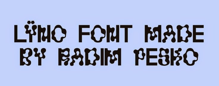
Lÿon by Radim Peško and Karl Nawrot
![]()
Stedelijk Museum Logo
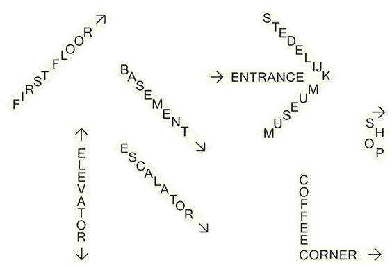
Signage proposal
Usually logo reflects the value and direction that the brand pursues. Throughout research about many kind of logos, it was interesting to see how the image of the brand remains in memory by the logo. Also, I was intrigued to investigate conspicuous components in the logo design such as typeface. Union is a typeface which was designed by Radim Peško. Union was designed based on Helvetica and Arial.
Helvetica was designed in 1957 by Max Miedinger. Helvetica’s design is based on that of Akzidenz Grotesk (1896), and classified as a Grotesque or Transitional san serif face. Originally it was called Neue Haas Grotesque; in 1960 it was revised and renamed Helvetica (Latin for “Swiss”).
Arial was designed in 1982 by Robin Nicholas and Patricia Saunders for Monotype (not Microsoft), it’s classified as Neo Grotesque, was originally called Sonoran San Serif, and was designed for IBM’s bitmap font laser printers. It was first supplied with Windows 3.1 (1992) and was one of the core fonts in all subsequent versions of Windows until Vista, when to all intents and purposes, it was replaced with Calibri. [x]
In brief, these typefaces have something to do with their intended usage. Helvetica was designed for print, while Arial was designed for laser printers and then adapted for use on computers.
Normally Arial has been considered as an imitation of Helvetica although both have its own uniqueness by each delicate details that they have. Look at the below pictures. For instance, the terminals of the lowercase in Helvetica cut off straight while Arial’s is cut at an angle. Arial has blander appearance and Helvetica has an overall less rounded appearance and slightly higher waistline. Due to these trivial differences, Helvetica looks more elegant than Arial.
Radim Peško explained about this combination, “Union is intended for situations where Helvetica seems too sophisticated and Arial too vulgar, or vice versa.”. Eventually the new is evolved from the combination with the old. I think that the intention of Union implies the position of Stedelijk Museum.
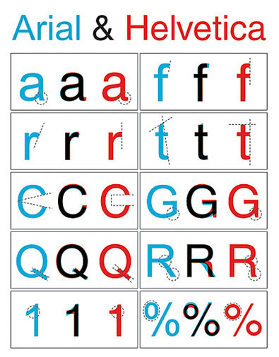
Helvetica and Arial
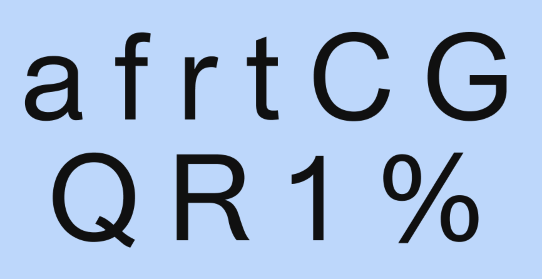
Union
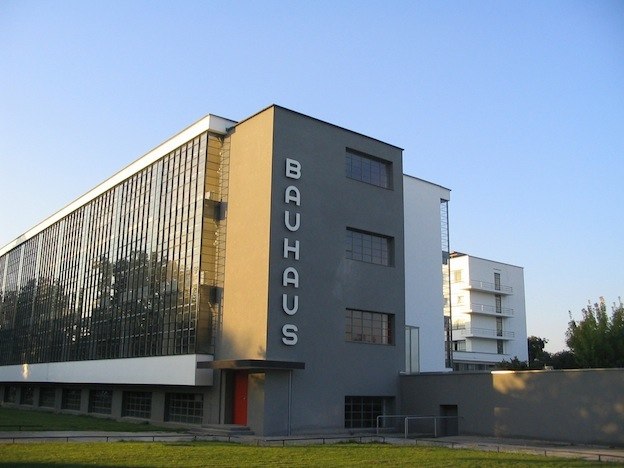
Frequently graphic designers design typeface only for museum itself. Another examples for instance are: the identity for The Chicago Museum of Modern art (commissioned by the same designer duo Mevis & van Deursen and designed by Karl Nawrot) or Bauhaus-Archive Museum. Design studio L2M3 looked to the typeface Bayer Universal reflecting the heritage of Bauhaus typographical design designed by Herbert Bayer. Universal encapsulates the Bauhaus’ stark aesthetic by basic principle of typographic communication of Bauhaus,
1. Typography is shaped by functional requirements.
2. The aim of typographic layout is communication (for which it is the graphic medium).
3. For typography to serve social end, its ingredients need internal organization (ordered content) as well as external organization (the typographic material properly related).
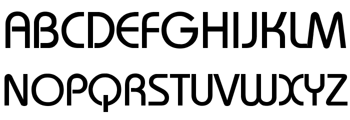
Bauhaus and Universal
The interesting fact in design process of new identity of Bauhaus-Archive Museum: Bayer Next is that it retained originality but did not restrained its possibility. Sascha Lobe of design studio L2M3 [x] updated more than 555 glyphs and we see more than 10 different versions of each letters. The goal of Bayer Next [x], he says, was to create peculiarities within the typeface. This idea is contrasted with Bayer’s original ideal for simplifying typography down to a universal typeface as we see Bauhaus’ philosophy.
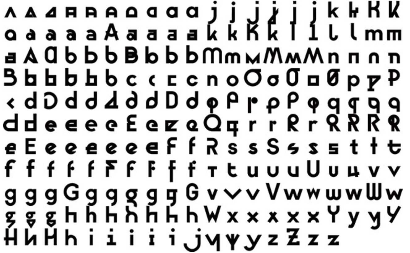
Bayer Next
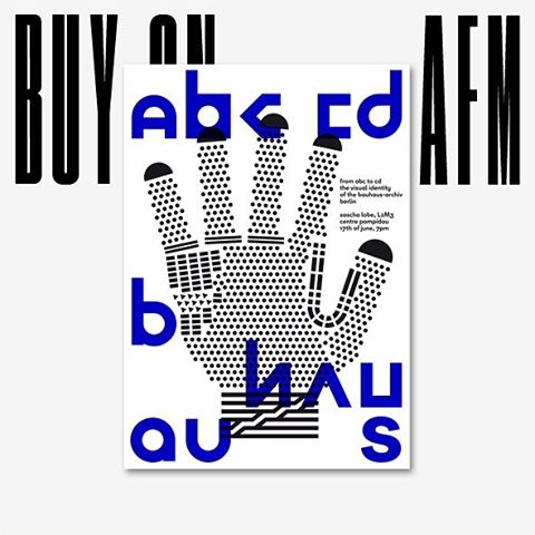
Poster of Bauhaus-Archive Museum
I had thought this expansion and flexibility of identity does not give exquisite image of the brand in memory of public. However, good identity does not mean tangibility as a one certain figure. These examples, see below another example of Moscow Design Museum, are ubiquitous. This museum is based on Moscow but it is mainly imagined as a nomadic, pop-up museum. And, their identity was designed by Amsterdam-based Lava design studio [x]. The identity of Moscow Design Museum does not even emphasize its name to identify them but numerous and changeable icons for logo, which was inspired by Russian glass patterns. Good identity is adoptable for various applications and formations in digital society. Eventually typeface is recognized as one of the strong image although sometime they are not readable.
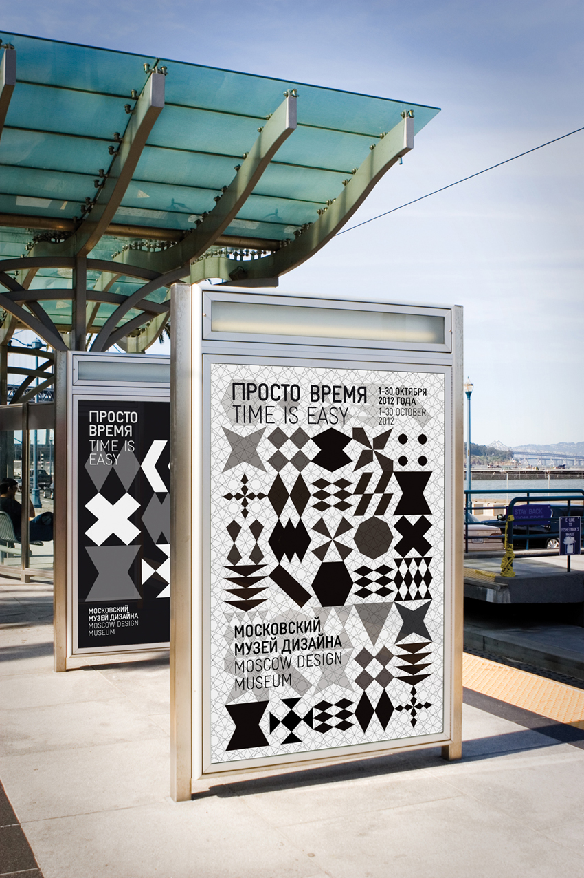
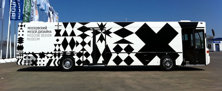
Moscow Design Museum
Katerina Sedá : for every dog a different master = kazdej pes jiná ves.. /Rietveld library catalogue no : sed 1


