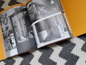
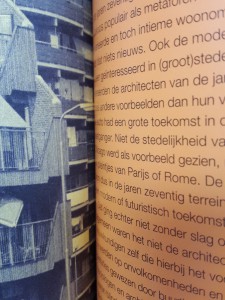
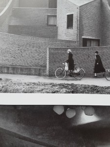
Coarse antique white paper. Slick bright white paper. Corresponding with these two feelings 70’s architecture gives me. This vintage feeling of the past, but in its day so modern and progressive. The book feels historic yet contemporary. I feel like I’m holding a treasure in my hand. This book; 17 by 24 centimeters, comfortable in one’s hand and easy to carry with you. Beautiful pictures in black and yellow printed on this coarse paper feeling like an old precious book in my hands.
O B S E R V A T I O N S:
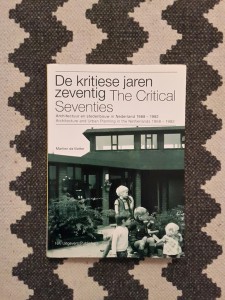
First of all, the book is titled “De kritiese jaren zeventig”, which I think is genius. The 70’s way of spelling “kritiese” is used in the titel, rather then the contemporary “kritische”. The book, designed by Beukers-Scholma, is linked to a 2004 exhibition with the same name. Their work contains several award winning designs.
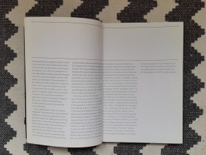
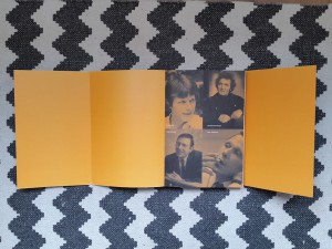
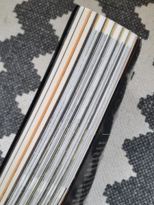
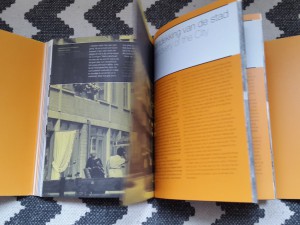
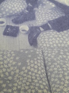
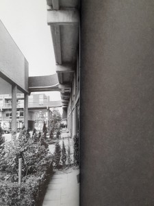
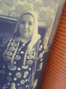
The book consists of 2 types of paper: coarse antique white paper and smooth bright white coated paper. Furthermore it contains 3 types of pictures: black and white, black and orange, black and yellow. The coloured pictures are like black and white prints on coloured paper.
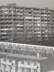
Black and white prints are used for specific buildings. Every chapter is divided in paragraphs that deal with a building. The pictures of these buildings are in black and white on coated paper. The texts are also printed black on white coated paper.
The colour yellow presents scenes: People or streets. They are accompanied by relevant quotes and precede the introduction of every chapter. They are printed on antique white paper.
Orange is the colour being used in the general introduction as well as every chapter’s introduction and the first and final page of the book. The black and orange pictures that introduce the book are printed on antique white paper. The single orange introduction pages for each chapter are printed on white coated paper.
THOUGHTS:
How can I not read this book? Knowledge, knowledge, knowledge. I’m not, I’m not reading. But I see words, I see sentences, their meaning is clear to me without doing effort and so I want to read, I want to continue what my mind processes without conscious effort. This coarse paper feels so…… coarse? soft? Old? Precious I guess. I know this book is about the past. And we’re making the same mistakes all over again. Humanity makes the same mistakes all over again all the time everywhere, always. Why is there so much violence, why are people so unhappy. And I mean unhappy, unsatisfied in a well-developed country. This book evokes so much in me. And it’s not the architecture, not so much the design, but the fact that I know it’s about the past and I am not happy about the world and… Past, present, past, present and I wonder; where is this going? The design of the book anticipates on the context very well. At least on the fact that the book is about the past. And the design feels like the past, it feels like not now. Old pictures, blurry pictures, pictures in black and white, black and yellow, black and orange. Then again I also think this book is bullshit. Pure bullshit. Like everything contemporary related to architecture; this quasi science. Conceptual bullshit about how architecture makes a better world. But it doesn’t because we are inherently messed up. People are insane.
Let's try to take a step back.
The book feels like an escape. Just like how I can get lost in google maps, looking at buildings, I can get lost in this book
The book makes me passive, receptive. Maybe that’s how I am in general. No I’m not. I’m creative. I create. I’m not that passive. But then again I am. Well at least lately I am. Sigh. I just want to see, touch, feel, sense the book. Which is okay. I guess. That’s the assignment. But then again, am I researching? Is this going anywhere? No. I just want to get lost. Lost in the images of the book. Lost in the colours of the book. Why do I enjoy looking so much? I do it so much. Just watching buildings. Going on google maps or biking around the city and just looking at buildings. Getting lost in watching them and enjoying them. I can hide my face behind the book. I like it. I want to disappear……………………….
With drawing and painting I tend to write a lot. Write previous to painting or using written words in paintings. I tend to write a lot. In this assignment however. I seem not so capable of writing. Even though I’m writing now. The book makes me very passive. Makes me want to see the book, feel the book, read the book, but not write about the book.
Now how did this all start? How did I end up picking this book? It started with a list of books we could choose from and I decided to look for books about architecture and found this lovely book about 70’s architecture. I happen to have a thing for post-world war II, pre-90ties architecture, so I had to choose this book. Then the book also happened to be so well designed. Also, the text is not only about the architecture but the whole social context of the 70’s. The book contains beautiful pictures, not only of buildings but also of people and sceneries. Sceneries of the 70’s. This book is a history book and its content is wonderfully converted in its design.
It wasn’t a spontaneous encounter. I looked for it.
De kritiese jaren zeventig : architectuur en stedenbouw in Nederland, 1968-1982 = The critical seventies : architecture and urban planning in the Netherlands, 1968-1982. /Rietveld library catalogue no : 719.22 vle 1
