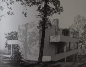
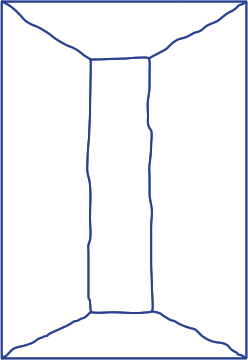
Because Rietveld’s architectonical designs don’t inspire me that much. I don’t like the straight shapes he uses most of the time and the sober way of designing his buildings. So it was quite a task to pick one. So eventually I picked ‘van Slobbe House’ because it was build in a hill halfway. And because most of Rietveld’s buildings are build on flat ground I found that part interesting. And Rietveld used the fact that it was built on a hill in a very smart way as you can see on this picture. On the left image below you can almost see the building ‘float’ of the hill.
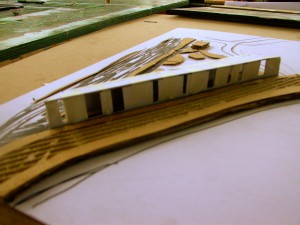
With this as a starting point, I continued with a certain aspect of Rietveld’s way of thinking; the placing of a window. This was a very important to him. He never placed a window out of the blue. He considered the surroundings sincerely and looked for the best view. And there he placed the window and considered the size of the window depending on the view. This thought interested me. So I went on with it. My first try was some sort of bus stop with different sizes of windows as you can see on the image above.
During an academical trip to Valencia Spain, I found out that I don’t have much affinity with modern architecture [x]. ‘Old’ architecture drew my attention much more. I had more affinity with that kind of architecture. And especially churches interested me because of their unique atmosphere. It felt to me that older buildings had much more of a soul. But where does that soul come from? The answer I from the windows and the old material they we’re made of. The way light falls through the stained-glass windows. Where churches are famous for of course.
I made some sketches of old buildings and loose round forms 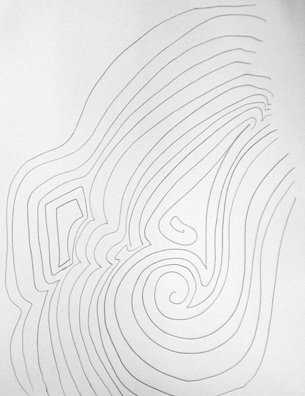 from out of my head. I found it too easy to just ‘copy’ old architecture by
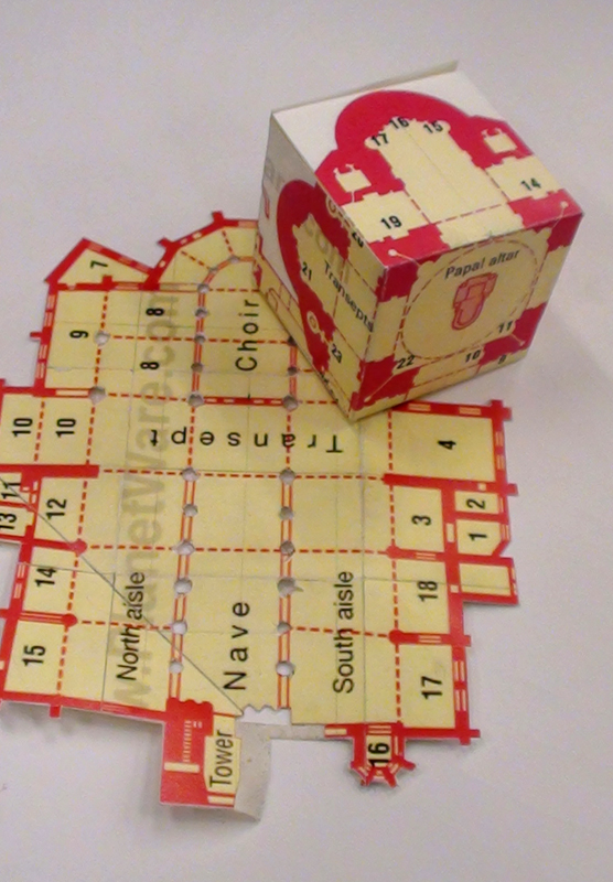
re-building old buildings. 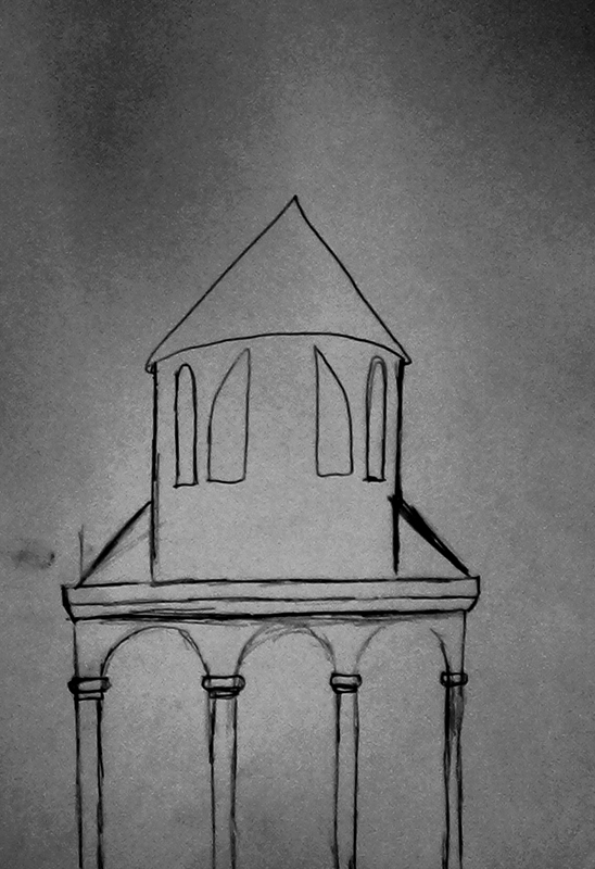 I wanted to do something new with it. I printed some church maps and discovered that the Latin cross, which appears in every church map, also was the basic form of a cube. Before you fold it to a cube. So I started to fold cubes out of church maps of churches I found interesting or special; like the Saint Peter in Rome and the old church in Amsterdam.
The next question was how to translate those interesting parts of churches into architectonic concepts. So I started to cut out the piles of the church on the map to create some windows to relate to Rietveld; since windows were so important to him. I found out that there were to many windows to achieve the mystical effect in churches.
The map itself turned out a much more interesting thing to work with. More interesting then the church itself or the church as a source of inspiration. I considered which church and which map I wanted to use. Finally I choose the Old Church in Amsterdam because of the holy atmosphere in which it dwells. I wanted to relate to that atmosphere through using the map.
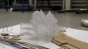
Eventually I placed the map, 45 degrees turned to the right, behind a cube made out of glass. The images of my final result are at the bottom of this post. The map, still isn’t a Latin cross by only cutting the edges. So cutting the pillars, shows the Latin cross within the map more clearly. As I stated, these holes are the windows as well.
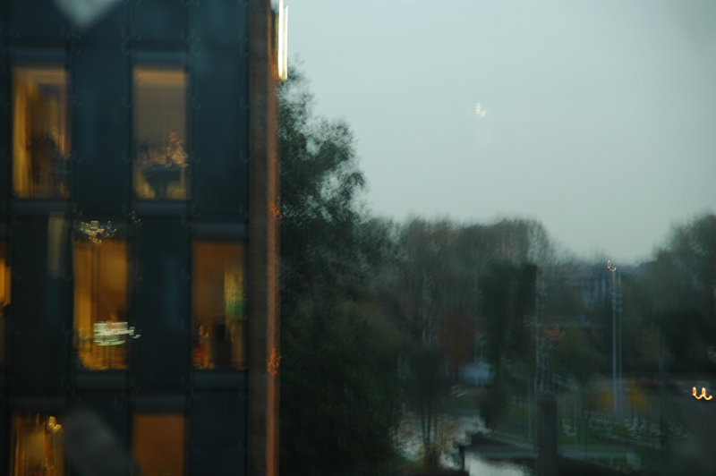
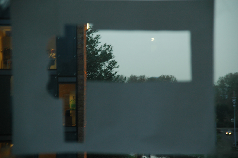
I experimented with these windows to select a certain part of the view. You can see that on these pictures.
The map is oriented at the east, 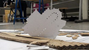 so that when the sun rises the sun falls through the holes that are the windows. Besides of this the cube is vertically divided into two parts. The part that is the closest to the map has got floors that are laying half a floor lower. This creates a basement only underneath that part of the building. This means that people who are walking or staying in the basement will be seen only from the belly from outside. And the uneven floors are giving the cube a flashy look. While the cube is a very harsh form, those form give it another dimension. A lot like a church actually.
