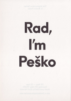
My research is about a Czech graphic designer named Radim Pesko who, along with contributing to various magazines, is running an Amsterdam based type-foundry (RP; a digital type-foundry established by himself in 2009). Occasionally he does curatorial practise and teaches in the graphic design department at the Gerrit Rietveld Academy Amsterdam.
In this text, I will focus on a collaboration Pesko did along with French graphic designer colleague Karl Nawrot in 2010 and compare it to Wim Crouwel’s “New Alphabet” from 1967.
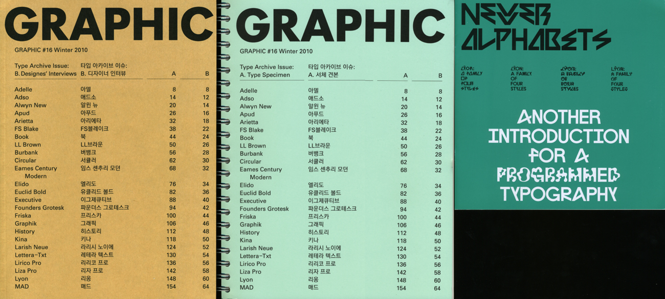
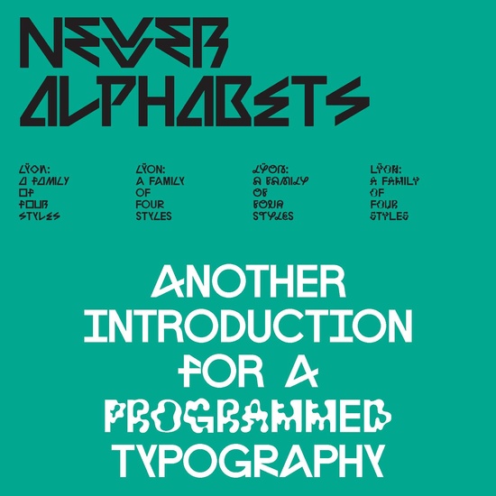
Pesko and Nawrot made a family of four rather unique and aesthetically compelling type-faces; The Lÿon Family. This family is named up after Nawrot’s hometown Lyon, and the designer himself claims that the umlauts in his and Pesko’s ÿ were added to make it appear more personal and playful. The Lÿon font family was introduced to the public as a booklet supplement called “Newer Alphabets” to the “Typefaces Issue” of GRAPHIC (16th edition); a design magazine created by another colleague and friend of theirs, S-Korean Na Kim.
At the launch of Na Kim’s 17th edition of GRAPHIC (“When Design Becomes Attitudes”), both Pesko and Nawrot were there in person to have a talk about their collaboration on the Lÿon project. Lucky for me, since I happened to be in the audience.
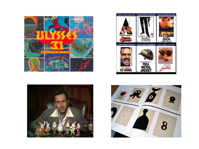
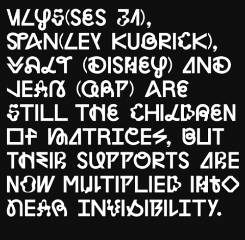
I must mention that prior to this, I had made an attempt to interview Pesko via e-mail, but I found the talk at the magazine launch to be more fruitful for my research; basically all my questions were answered without me even having to ask them. The (funny and to some extent rivaling) dynamic between the two collaborators was also obviously easier to catch, and it helped me develop a more wholesome image of both their process and final outcome. But first a little more about the members of the Lÿon family; the Lÿon’s are Jean (after artist Jean Arp), Stan (after director and photographer Stanley Kubrick), Ulys (after Franco-Japanese animation series Ulysses 31) and Walt (after founder of Disney Pictures Walt Disney).
These brother type-faces are creatively based on a feeling or the essence of the characters they’ve been named after, as well as the fact that they have formal approaches to their subject qualities. This is also stated shortly by James Langdon in the “Newer Aphabet” booklet “…they are open and various and their spirit is this: to resist normative tendencies and to reject the idea of definitive form”, but as the booklet basically focuses on presenting the different family members and suggests various juxtapositions of their letters, it was quite helpful to hear the designers explain their work furthermore. Amongst other details, they mentioned how the different “Lÿon brothers” are created with the intention of being able to mix with each other; a feature I personally appreciate a lot because it encourages their potential users to be creative and exploring by being allowed to play around with them.

The term “playful” is also relevant when it comes to describing the creators of the Lÿon brothers. During their talk it occurred to me that they seemed like people of very different temper/tempo, and the difference created a special dynamic between them. Pesko appeared to be the low-key one, with a subtle voice and carefully chosen words. Nawrot on the other hand semed more like the “nutter” of the two, with his leant-back attitude, bizarre humor and smiling grin. Their explanations of the Lÿon project came through two somewhat differing versions, pretty much simultaneously as they had a tendency to finish each other’s sentences as well as interrupting each other. They showed us some examples from their working process, and to the audience’s amusement it was obvious that they came from two different creators. Pesko’s paper sketches were tidy and very picturesque. Nawrot had torn open some box of Albert Heijn deteregent and cut wobbly shapes out of it. He he. One thing they clearly agreed on was that there had been disagreements along the way, and they joked about how they had tried to work together without having to see each other in person. These factors may sound trouble-causing, but I believe they must have made the process of developing the project more challenging; hence more exciting. And playful.
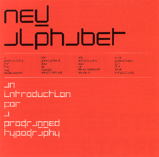
When explaining the Lÿon project it is also important to say something about how their booklet, “Newer Alphabets” (which I thought was “Never Alphabets” at first sight), is inspired by Wim Crouwel’s “New Alphabet”; a booklet promoting a radical and experimental type-face of 1967 early space age, consisting only of horizontal and vertical lines (only 90-degree angles and 45-degree rounding). To those of you who haven not heard about Wim Crouwel; the man is basically a God in the world of graphic designers. Some more popular facts about him can be found in “Turned to the Grid” by my fellow student Rein Sanders.
Anyway, Crouwel is an old man. The point is that he was already a professional graphic designer when the very first computers entered his line of work. His virgin encounter with digital large scale prints in Germany in 1965 made him fear for the future of digital typography, as the prints were horridly pixelated and distorted from their original designs. His reaction to this encounter was that he decided to create a type-face that would not be modified by scaling, but keep it’s crisp design and original concept whatever the transformation applied to it would be. The result was the “New Alphabet” publication, which promoted a few slightly varying versions of this new, radical and minimalistic type-face; the New Alphabet. Crouwel himself claims that the project was a theoretical exercise, not an alphabet ever meant to be used; it was too cryptically reduced from a standard readable alphabet. It has however been used quite a lot (especially in England in the 80’s and 90’s (for example by Brett Wickens in his design of Joy Division’s “Substance” album cover), with some slight changes applied to transform it from theoretical experiment to readable type-face.
My impression is that one of the links between Crouwel’s “New Alphabet” and Pesko/Nawrot’s “Newer Alphabet” is a desire to explore and comment on the current status of computerized typography. The two different booklets also bear strong similarities in format and formal appearance, as if a young graduate salutes an older professor. I like to think of the “Newer Alphabet” of 2010 as a kind of bold relative of the 43-year old senior “New Alphabet”, even though they are of two different families. However, there are indeed differences between these publications as well. “New Alphabet” was made as an one-man project, and never actually intended to be used by anyone but himself. I find these elements to add “excluding” qualities to the first booklet. This is quite opposite to the second one. “Newer Alphabet” has two parents and is a child of a dynamic exchange of ideas. It makes easily detectable references to popular culture and becomes accessible through this, hence it has “including” qualities. The “including” qualities are also supported by the provided possibility of playing with the four different type-faces, quite opposite from the “New Alphabet” which most of us are not able to read or express ourselves through.
The “New” and Newer” alphabets actually have different mission statements, and that makes it trying to decide if one is better than the other through comparison useless in a way. As with people from different generations; there will always be great differences between them, but does that necessarily have to be a problem? Personally, I don’t think it is.


