#####Turned to the grid#####
(Wim Crouwel)
When walking through the main entrance of the Stedelijk Museum Amsterdam towards the coatroom one quickly notices the array of poster prints papered to the subwalls of the main stairs to the second level. These prints are from past exhibitions and many are made by the functionalist designer Wim Crouwel. When Willem Sandberg (director of the SM and did most graphic work) retired in 1962 Crouwel took the job and designed many from ’64 until 1984.
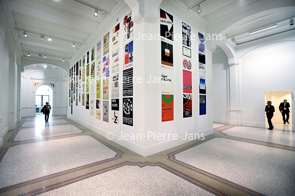
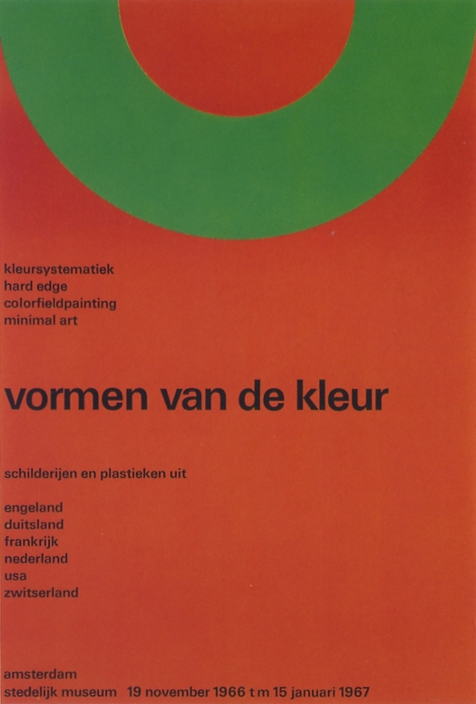
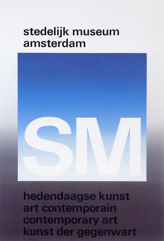
Stedelijk Museum Amsterdam, Wim Crouwel Shapes of Colour exhibition
c Jean Pierre Jans Photography poster 1966, Contemporary Art museum poster 1971

![]()
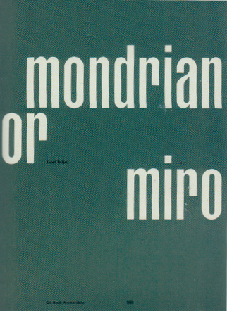
Mondriaan or Miro 1958 (Letterpress), Vormgevers in SM, Hiroshima 1957
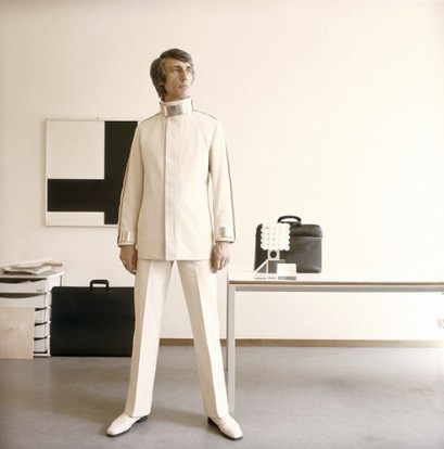
Wim Crouwel (Groningen, 1928) studied Visual Arts at the Academie Minerva in Groningen from 1946 until 1949. There he became acquainted with ‘The Ploeg’ artist collective that was established in 1918. His father was a block maker and perhaps this made the transition towards typeface design very logical. He Continued as an abstract painter with the ‘Creatie’ (Creation group) he joined the Amsterdam School of Art and Design evening courses and the Liga Nieuw Beelden (1954, co-created the Manifesto in 1955). The Liga was a group of urban designers making demonstrative exhibitions.
Crouwel started to focus more and more on design and less on painting. His design was featured on the 1961 Christmas Issue cover of ‘Drukkersweekblad’ and he started making posters for various artists and exhibitions and established his agency: Total Design in 1963.
He later became active as a teacher in the ‘s Hertogenbosch Royal Academy of Art and Design. In between he met with Kho Lhian Le and together they started designing exhibition stands and pavilions with their innovative design, for example the 1958 Bruxelles World Exhbition and in 1970 in Osaka, Japan. Crouwel became a teacher in industrial design at the Technical College in Delft and later on became director of the van Abbe Museum.
After a visit to the Rietveld library I had some of the catalogs designed by Wim Crouwel in my hands. Personally I found the design extremely functional but “boring” or non-expressive to an extent. The choice of color (lightgrey backgrounds) and layout were not as emotional at all as I read previously about his work. However further investigation shows some remarkable choices and works by Crouwel who somehow lowers the functional underlaying design with a high level of purposeness but once it’s about a more free subject interesting things start to happen. Like with his 1957 new year’s card where Crouwel switched the 5 in 1957 with an S so he could remain curvy with his typeface.
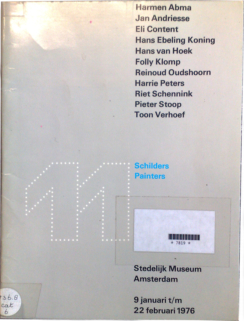
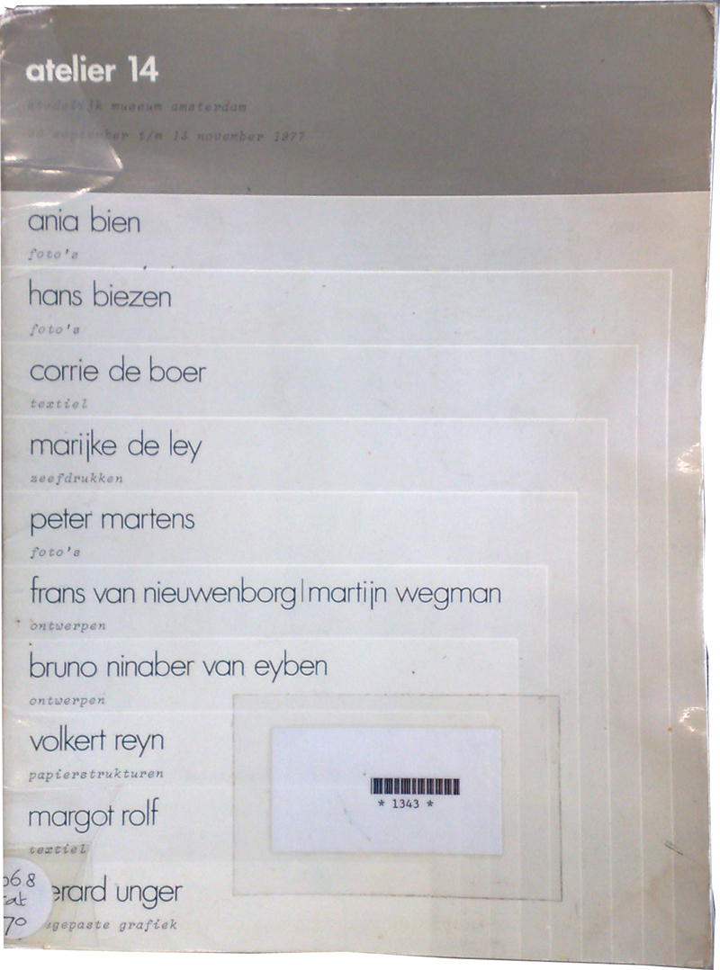
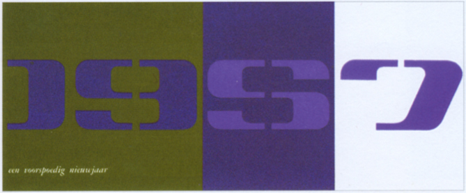
11 Schilders: SM Amsterdam 1976 / Atelier 14: 1977 / New year's card 1957
Although the functionality of Crouwel’s work has been thoroughly analyzed often (Broos, Quay, Middendorp, De Winkel, Cleven) tracing the source back to the ‘strategically structural approach by the daring clear typography and by the minimalism of the formal elements they used [Scheidegger, Ifert, Gerstner]’. But even Wim Crouwel himself admits in a interview to Max Bruinsma in Items Magazine in 1993 that the realization was a shock of recognition in the aesthetics of the elemental and a compulsion for order.
In the publication Dutch Type by Jan Middendorp a new factor in Crouwel his style is mentioned: The Calvinist one. One that forbids you to abandon the path you’ve taken. Perhaps this is an explanation to much of the straightforwardness in his works.
Influenced by the International Style (Josef Muller-Brockmann, Karl Gestner) with aim towards a more logical, and rational approach, a universal design language, to be applied everywhere. Yet Crouwel remained to create a more emotional response to subject matter compared to International style, applying a ‘human dimension’, saying ‘I’m a functionalist troubled by aesthetics.’
In the inaugural speech of prof. dr. Clevens, who was Honorary Professor of Modern Typography and Graphic Design (2004-2010) at the University of Amsterdam, titled “Irrationeel: Grafische vormgeving en de context van de beeldcultuur (English: Irrational: Graphic design and the context of the imageculture)” of 2010 she uses the publication ‘Het primaat van de zichtbaarheid’ of Camiel van Winkel (art critic) to exemplify the ruling conviction in the 70’s to involve more organization and integration of the mass-media and information industries in the designprocess. In this example Crouwel is used as an iconic figure of this ‘managerial revolution’ into bureaucratic procedures and structures as he positions himself as information intermediary and becomes a direct link of this chain. Priorities in his work are readability, order and neutrality as visualizing information is what is required. According to Cleven Hugues Boekraad mentions in his monograph of Wim Crouwel that the style used by Wim Crouwel is one that is “representing for those who make the new policy in technology” and van Winkel even goes as far as saying and I quote “that functionalism imitates the new control techniques [bureaucratic procedures and structures] and even usurps them..”
For me this discussion is a tough one. As a designer, Crouwel has a profile as similar as described above, doing work in fields varying in many differentiations such as telephone directories, corporate identities and catalogues, posters to letterforms and stamps.

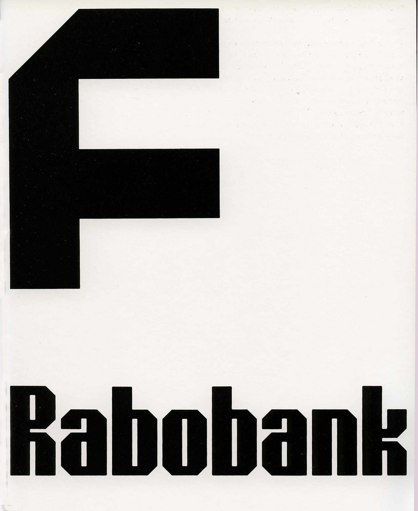
![]()
Haarlem phoneguide of 1977, Friesland Bank logo and under it the Rabobank logo designed by Wim Crouwel, both 1973. bottom: Dutch Stamps 1976
But this is what a designer does in the modern age. For me you can’t blame functionality or the designer for human behavior and desires in design. If these paths cross so be it, the better for the designer perhaps.
In 1967 Crouwel designed ‘The New Alphabet’ a typeface based on the limitations of the CRT cathode light, and other typefaces such as Fodor, for Museum Fodor in Amsterdam, and Gridnik for the Olivetti typewriters, based on the Politene (that is what Olivetti called Crouwel’s work) type. The Gridnik name derives from an inside joke where friends amicably call Crouwel Mr. Gridnik for his use of grids. He used a Grid system but alternate for specific jobs. ‘Content determines the form, the typeface, the format, the cover, the binding’.

Crouwels:New Alphabet 1965-1967 and a design for the Pattern Foundry
The artist and designer has known many influences trough out his career like Piet Zwart, Dick Dooijes, Jurriaan Schrofer, Benno Wissing, the typefaces of A.M Cassandre. The 1920-30’ s Modernist traditions of Bauhaus and ‘Nieuwe Bouwen’, Jan Tsischold and Willem Sandberg with the New Typograhpy and the book ‘Typografische Gestaltung and the constructivist artist Joost Baljue with his 1958 Essay ‘Mondrian or Miro’. Influenced by Akzidenz Grotesk of Armin Hoffman, Karl Gestner, Gerard Ifert and Bombelli and its Abstract Geometric painting influences with its cradle at Piet Mondriaan and Theo van Doesburg. By concrete art such as featured in the Swiss magazines of ‘Werk’, ‘Graphis’ (Walter Herdes) and the ‘Spirale’ magazine for International review of young art by Marcel Wyss.
Today Wim Crouwel is a very well known designer and his work is continued in the Total Design practice and expanded now to Total Identity. His work currently featured in the London Design Museum.
sources:
Boekraad, Hugues, Wim Crouwel - Mode en module (1997 101

Publishers Rotterdam)
Broos, K.& D. Quay, Wim Crouwel Alphabets (2003 BIS Publishers Amsterdam, printed in Singapore)
Irrationeel: Grafische vormgeving en de context van beeldcultuur(2010 UvA inaugural speech)
Middendorp, Jan,Dutch Type (2004 101 Publishers Rotterdam)
download this nice research on Wim Crouwel by S. de Melo:
Wim Crouwel's work is wel documented at various online

archives. Like one the
De Stichting Nederlands Archief
Grafisch Ontwerpers (NAGO) or Wim Crouwel Archive on
"Het Geheugen van Nederland site. The design bureau he founded is the: Total Design website
Wim Crouwel, A Graphic Odyssey : Design Museum London 201

also read Desigblog entries: "Functional vs Engagé", "Beeke vs Crouwel"

and "Unique versus serial" or "Objectified Bits"


