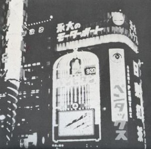
In my previous post I talked about “City Signs and Lights”, about the design of a modern city landscape, attracting customers. City signs are in an ongoing competition for attention. In this post I want to focus on the interaction between the consumer (the flaneur) and the environment. I would like to shift between two cases: the architecture of The Strip in Las Vegas and the passages in Paris, in the first half of the 20th century.
The passage is a covered shopping gallery. The culture philosopher Walter Benjamin wrote about early consumer culture in Paris in his text “Passagen” (1930). He describes the citizen as a flaneur, not as someone who is exposing him/herself, but someone who is exposed to the attractive lights in the shopping gallery. The flaneur is a person who walks through the city without a specific goal. He/She gets into an ecstacy, going from one attraction to the other. The city unrolls as a landscape to the eye of the flaneur, but at the same time, locks him in. Benjamin calls this new city environment a “Fantasmagory”, the city becomes a dreamworld where different rules apply than in reality.
” If there is one place where colours are allowed to clash, it would be the Passage; a red-green comb is hardly noticed here ”
(W. Benjamin, Passagen, 1930)
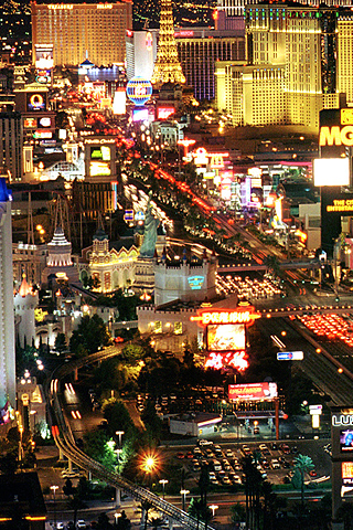
I believe that Las Vegas is a great example of a modern day Fantasmagory. The city is almost entirely made out of neon signs. After the second world war, Las Vegas was growing extraordinarily fast. The consequence was a speed-up of competition along the Strip (the central road through Vegas). The actual buildings are all more or less the same: low, but a large ground level surface. This has to do with the climate and economical reasons. The outside of the building needs to stand out, both during the day and night. The result is a total mash-up of different styles, quotes, hightened symbolism, eclecticism, all in neon lights.
In the end, the building itself becomes a sign.
Vegas references:
W. Benjamin, Passagen, 1930
R. Venturi, Learning from Las vegas, 1970
Cocteau Twins, Heaven or Las Vegas, 1990
cat. no. 700.6-benj2
keyword: neon
March 27th, 2009 at 3:05 pm
I took the liberty to change the position of the images. if you don’t like it I will reset it.
The posting is beautifull second part to your City Lights story.
Nice to add some references. Maybe you can add a link to the recently re-issued “Learning From Las Vegas” : http://mitpress.mit.edu/catalog/item/default.asp?ttype=2&tid=3723
quote fro Abebooks: a revolutionary book of architecture by architect Robert Venturi, city planner Denise Scott Brown, and architect Steven Izenour’s manifesto expressed their critiques of the plainness of modernist architecture, and extolled the virtues of a different aesthetic in which architects were more receptive to the tastes and values of average people. “The target of Venturi’s attack is Mies van der Rohe’s formula ‘less is more’, a phrase coined to denote a form of aestheticised functionalism. Venturi’s response, illustrated by historic examples, is ‘More is not less’, or, in a particularly aggressive formulation, ‘Less is a bore’. Venturi sets out to put his experience of Mannerism and Baroque to the service of a new concept of architecture by returning to the complexity in form and substance, of these two styles; at the same time his experience of contemporary Pop Art turns his thoughts to the everyday world of the consumer society” (Kruft, 440). The influence of this work extends far beyond architecture: it is credited with inspiring the post-modern movement in art and literary and social theory. This first edition includes a section on the architectural work of the Venturi and Rauch firm, and more and larger photographs than do revised editions. With errata slip laid in. Included with book is a metal ruler from Venturi’s father’s produce stand in Philadelphia’s Italian Market, from the late 1960’s. Book fine. Scarce and fragile dust jacket with only lightest edge-wear. (first edition 1972 $4000)