This description appeared in my research on the Amsterdam residential graphic designer/teacher Karel Martens.
His name was stored in my memory, but I didn’t know anything about him, probably because I’m Danish and just moved here. I guess every Dutch person would or should know him or at least his works, in fact even touched them. He designed coins, stamps, phone cards and signs.

€ 5 (Queen) Beatrix and Vincent (van Gogh) coins
His style is very clean I would say; clear colours overlapping each other and forming a new colour. But what I really found interesting about his works is his way of translating a language or information into form or grid; his own new language.

proposal for a festive sheet of good-will stamps. The design was never executed
A good example of that is the façade he did of the philharmonic in Haarlem. It is situated in front of the big old church St. Bavo. I found some pictures on the Internet, but they didn’t give me the right impression, so I went to Haarlem to see it in real life.
The philharmonic building itself is very old, but as part of its recent restauration he designed this modern glass façade around the entrance and on a piece of wall high in the air.


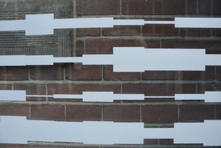
l: the view of the glass facade from the church / r: glass facade entrance
The façade is made of glass with a printed grid in gray. The grid I found out is the graphical reproduction of the composition ”De klokken van Haarlem” (the bells of Haarlem) of the international famous Dutch composer Louis Andriessen, which is the composition that has been played for ages of the carillon of the church in front of the philharmonic. And as the façade is made of glass, the church is reflected in it and the composition as well.
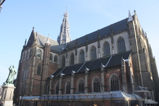
l: closeup of the glass facade / r: St. Bavo Cathedral
It is a genius way of uniting modernity with the surroundings; you can almost say that the buildings talk to each other. A beautiful solution, and if you don’t have the information about the grid being a translation of sound, it still works in
it’s simple nakedness. 
His way of making what I would call art more than design in this case has so much depth that you can dig into, which gave me a great deal of respect for this guy.
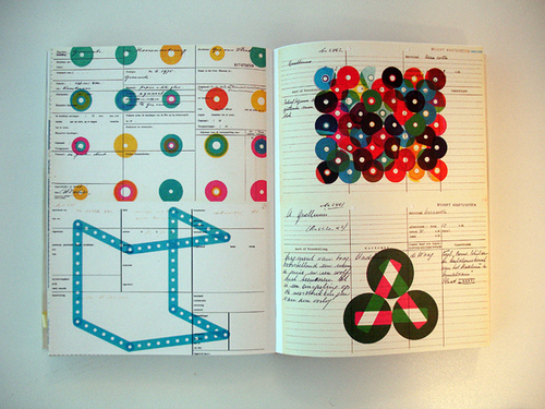
Another example of his way of coding information are the phone-cards he design in the ninetees.
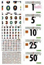

l: front and back of standard phone-cards designed by Karel Martens in 1994 /r: numbers becomes shapes (5 guilders)


l: colour overlappings (10 guilders) /r: pattern of numbers (25 guilders)
From my first eyesight they looked nice, numbers in different colours put on top of each other creating a new form and new colours. These numbers comes from this system he made of the Dutch national anthem, where each word is coded into a series of numbers.
I really understand his fascination for these colour overlappings. You can see some great examples on this website of the patternfoundry or if you like more check out repeatnorepeat
There is an almost childish joy in it, like mixing paint just for the sake of mixing and ending up with this greyish mass.
Which reminds me of this thing he also did with Donald Duck magazines; he took a bunch and stabled them, then he cut off the binded side and ended up with this coloured lines.
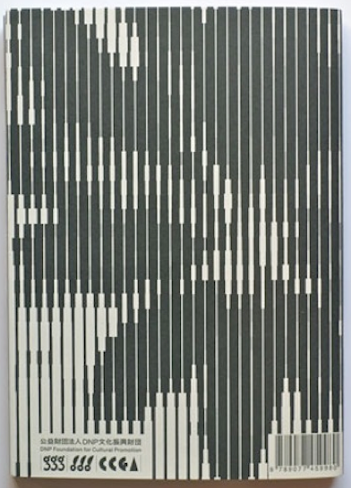
I liked the fact that information got turned into this new kind of pattern, so I tried it out myself with a book, not in colours, but black and white.
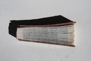
Book by Pernille Kier
On my journey around in Karel Martens universe I got very inspired of his way of working. There is no distinction between art and design in most of his works, which I like. There is a beautiful publication on his work called “Printed Matter”
He is also involved in the ArtEZ Masters Program Werkplaats Typografie:
A nice movie about him can be seen at “DutchProfiles“