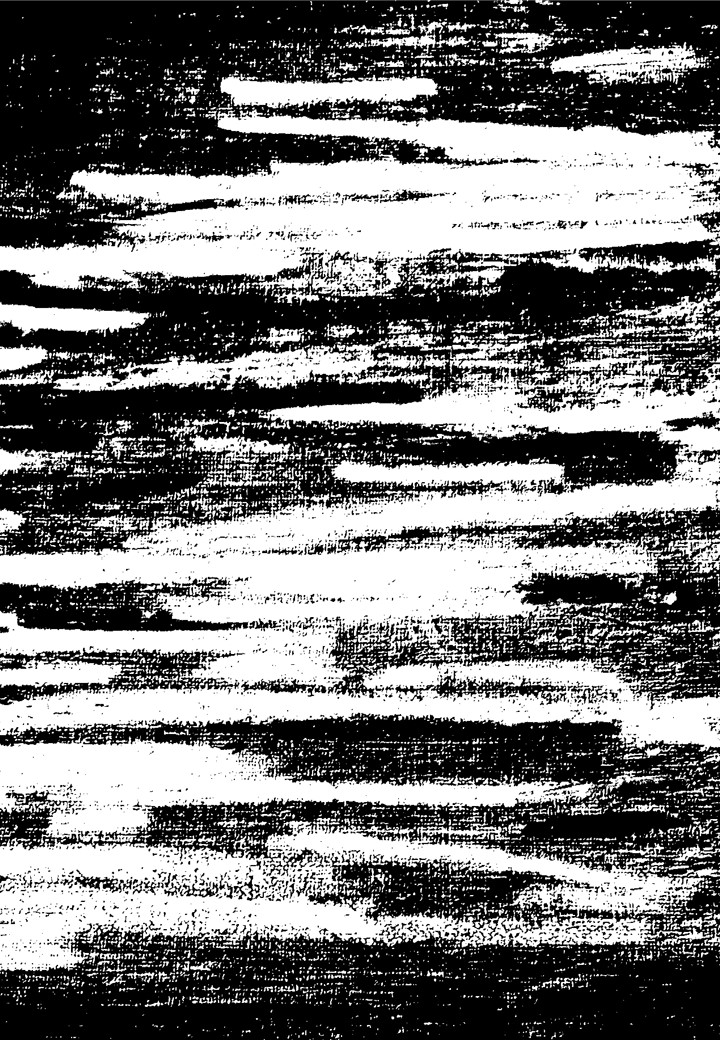
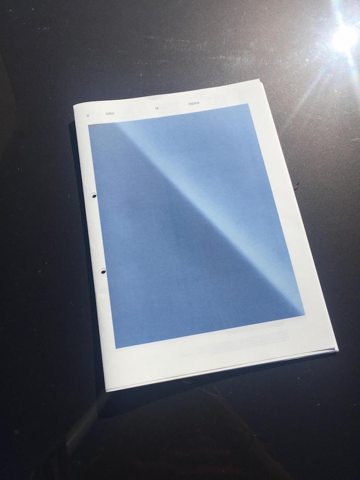
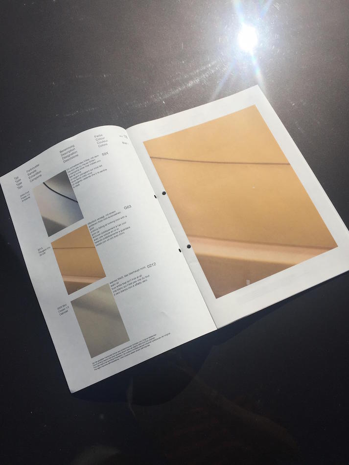
During the research of Isaac Newtons colour-wheel I had the image of colour being spread into flakes, much like flakes in the paint of cars. Another thing is also the separation of the colours within the prism that is projected by Newton. These to points gave life to the idea of the book: A letter of rejoice.
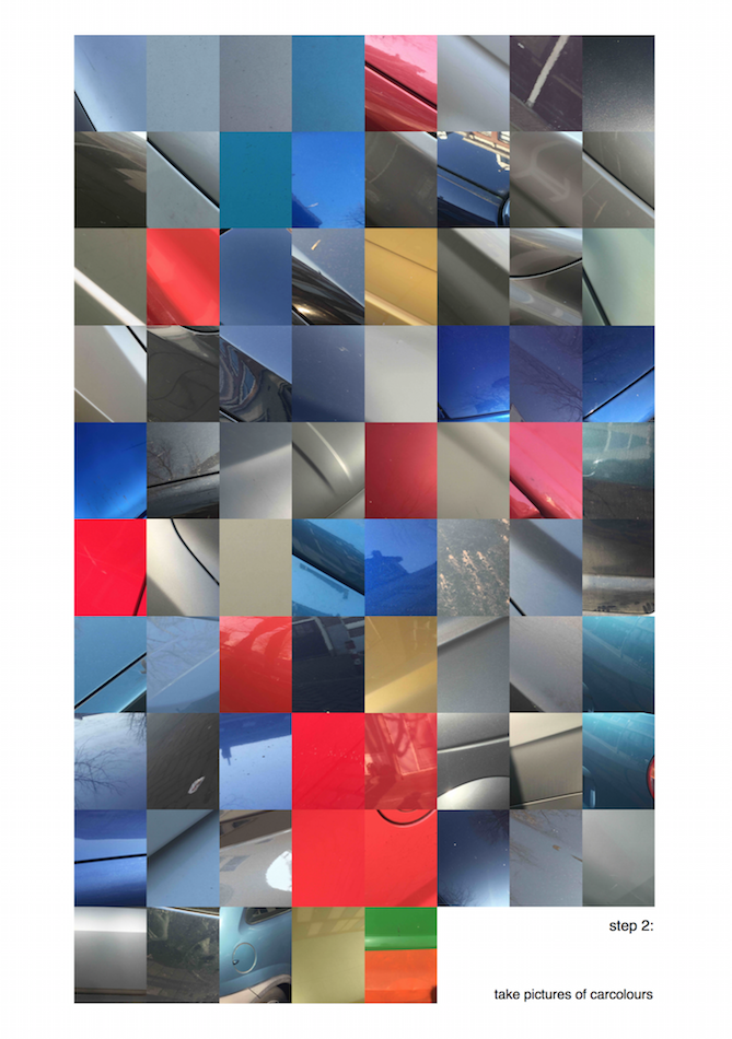
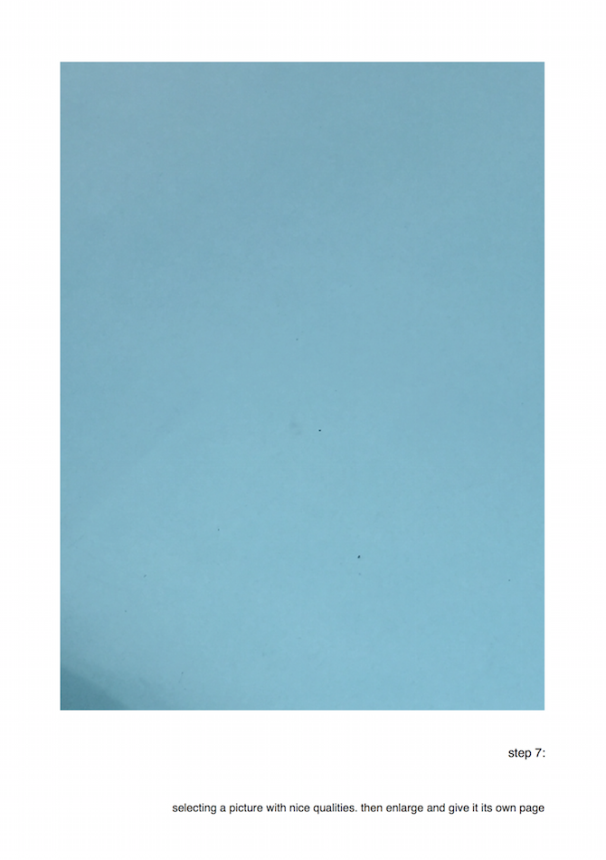
The colours of cars come in every shape and form just like the rainbow. With the paint from cars as a starting point I went out in public trying to gather as many photos of car colours. With no system in what pictures of cars I took I quickly gathered +70 pictures of different car colours. Looking through the pictures on a laptop one thing was clear. The reflection of the sun changes the colour of the car. A black metallic will turn into a less black and a bit more dark blue.
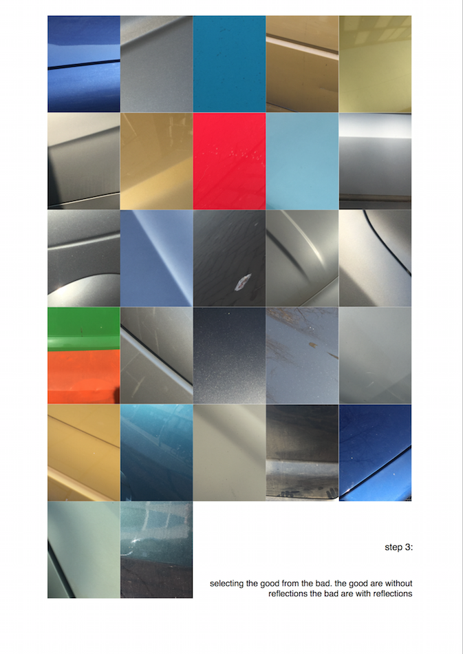
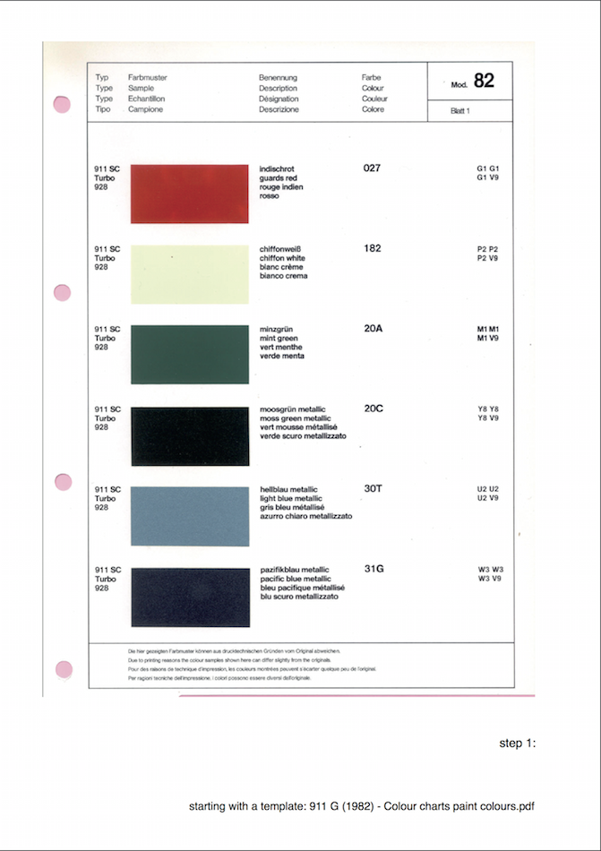
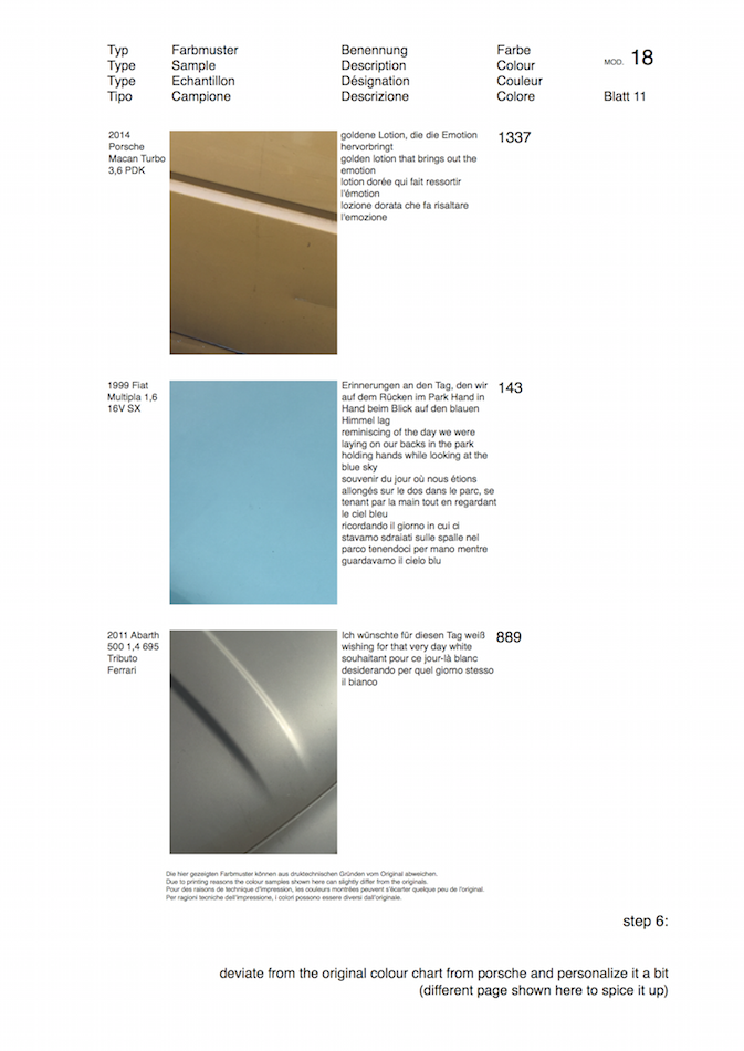
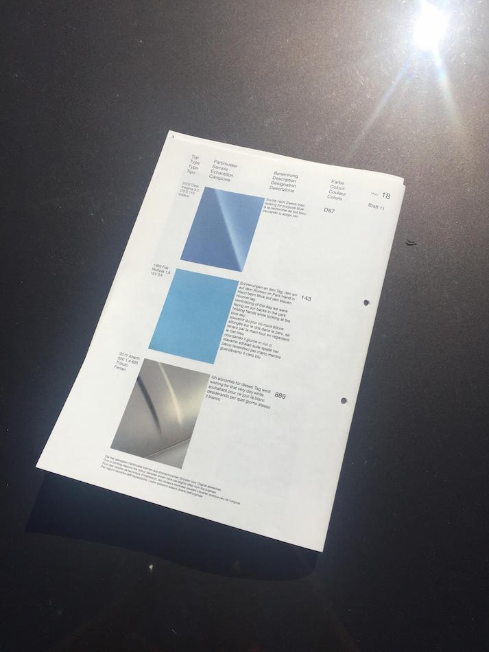
The reason for the dramatic change in this case is because of the blue sky reflecting in the paint. This was the case with some of the colours. Some will stay true to their original colour while some change significantly. In order to create a system I had to select the images of cars that were relative to each other and remove them from the collection. Reason being to create a book that isn’t boring to look through. Reading a book where at least 50% of the images are difficult to distinguish from each other can be, quite frankly, boring. Another reason for some of the images being removed is because of the main inspiration which was a catalogue from 1982 by Porsche (911 G (1982) – COLOUR CHARTS AND PAINT COLOURS).


In the catalogue the colours are far from similar. This is to make it easier for the buyer to choose a colour for the car they want to order.
Using the Porsche catalogue as a template for the project I sculpted my own “German” catalogue. For this I used Adobe Illustrator. Anyone can set up an illustrator page like the catalogue from Porsche. Its just like copy paste. However the real obstacle was to name every colour in the book. In order for the text to become alive and for the reader wanting to read on wards the text needed to be related to what I felt when I see the specific colour. The text attached to each picture but in total it creates a story and that’s what I wanted to create. A story with no end nor beginning. If the pictures were to be switched around the story would still be the same because of the nonlinear course of the text. One restrain that I wanted to keep from the Porsche catalogue was that the text shouldn’t be any longer than a few sentences. A lot can be said with just a few words. A lot can be felt with just a few words. A lot can be misunderstood with just a few words.
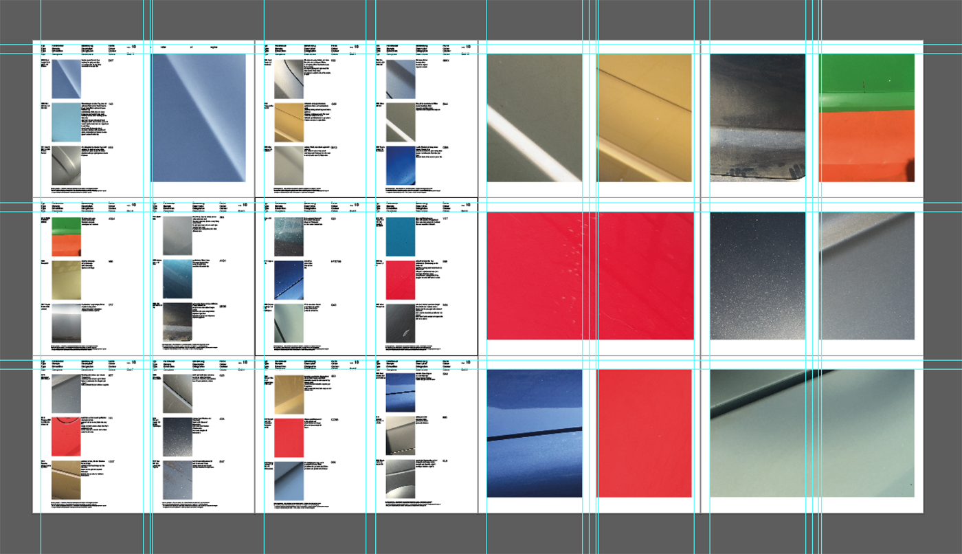
design theory process compressed (1)
Layout became like so:
flakes of colour pdf compressed
The draft for the catalogue looked like so:
This draft is very close to what I would imagine the catalogue looking like back in 1982. Or at least my interpretation of what it could look like. However it is also very plain and it doesn’t have any flare to it. When making a book the outside has to reflect whats on the inside. It was therefore back to the drawing board.
Using Adobe Illustrator CS6 to set up the pages
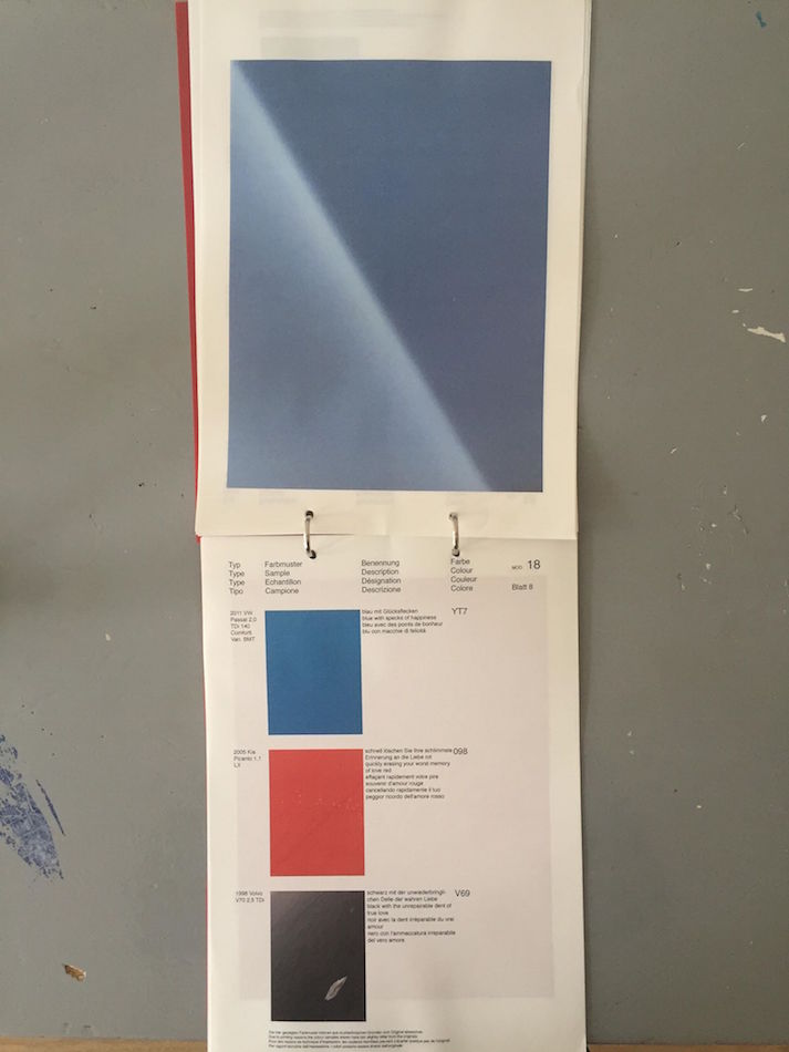
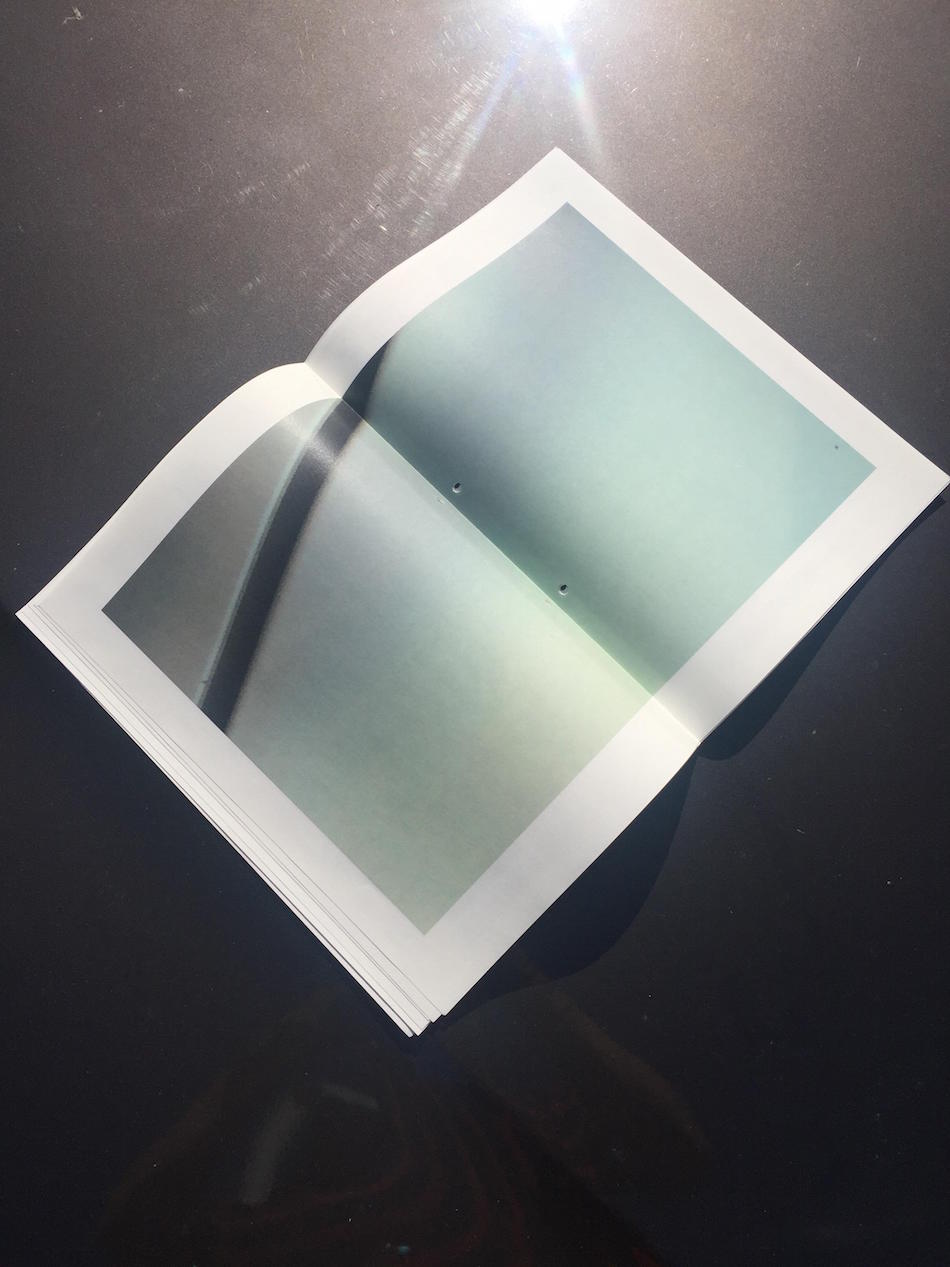
A few problems were to be considered when I was changing the catalogue into a book. What page size, matte or shiny paper, the printing setup etc. All these problems are something that can be difficult to choose from but once you narrow it down to what you want it look like it is fairly simple. I went for A3 paper, so I could fold the A3 and have two A4 pages on one A3 page, and a different setup with the order. The reason being that the pages with images now could be on shiny paper while the text pages could be on matte paper.
The experience of going through a book like this is a lot more enjoyable.
Rather than having to flip the pages upwards its now the normal way. It also changes the characteristics of the book it self. Before it was leaning more towards the original catalogue from Porsche where as now its something on its own. The departure from the catalogue is a great improvement.
Orders can be done on my instagram account @carlottolinde