One poster stuck to my mind while visiting Crouwel’s exhibition in Stedelijk Museum. It caught my attention because it seemed a bit different from others- from really systematic and clear ones although, the letters still remained in the grid. The thick black graphical line covered white sheet of paper and red type announced the Bissiere’s exhibition in Stedelijk.
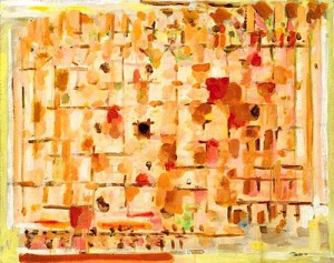
I was trying to figure out what that black dynamic line wants to say to me. It is obvious that it is something about Roger Bissier’s work. Bissiere was a french tachisme representative in whose paintings black outlines are quite a common thing. Therefore, I was wondering if the graphical part is an extract from the painting or engraving or it is Crowels personal interpretation about painter or maybe even something else. So, I kept thinking about Crowels way of dealing with the ideas, but still the main questions remain in my head: how Crouwel constructs the concepts-messages and how his work communicates with us?
I found it difficult to understand how the image represented the Bissiere’s exhibition as I relied on my small research about the painter. It seems that Crouwel was struggling with this poster. Maybe Bissieres work didn’t really appeal to the designer and he couldn’t deal with it in his usual way so, in the end the poster became different in the context of all Crouwels work. In the end I found out that he used a fragment from Bissiere’s autograph on the poster. Which just made my doubts about struggling grow stronger.


