READA-LEGIBILITY OF FORM
Tracking the mutability of forms of logographic script to pictorial images and back again, we wondered, how are these forms created? While creating is the act of mark making, it is also the reading of the mark that realises its objective. How do these marks come to be read, and who reads them?
As a single unit, type is able to express itself independently through its form. From the pictorial evolution of early ideographic and mnemonic characters (e.g. Hieroglyphs, Indus script, Oracle Bone Script) to typographical manipulations of the modern age like three-dimensional fonts or Toki Pona, the image of a printed character possesses a compelling representational force. Be it logographic or asemic (see Asemic magazine), something can be ‘read’ in the image of the type, even if there exists no content that can be extracted from a surface reading of its writing.
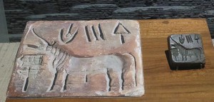
Pictographic unicorn seal
The way in which type is assembled to be read; like building blocks stacked upon each other, individual letters at their most basic and mutable are formed into words, sentences and paragraphs. As always a system of structure is needed for random bits of buildable content to be organized meaningfully, language’s orthology is the grid that gives single units of type the ability to function as part of a larger picture. This can be seen in letterpress printing, where typesetting treated each character as a block of type that could be moved and arranged into boxes of legible text in the composition of the page.
The form of type and its structure both lend to its ‘readability’, which appears to occur one block at a time. To understand how such ‘reading’ might work we can move to the pictorial roots of type where some similarities between the component-centric reading of images will surface. For example, unlike the way in which we treat type in writing, focusing more on the spelling out of words and thus, used to glossing over the small units. The way in which type is broken down and treated in typesetting and by digital processing systems, unit by unit, is also mirrored in the way whole sceneries are pieced, tesserae by tesserae, in roman mosaics.
Underlined text above translated to mosaic
THE UNDERLAYING GRID – MOSAICS & BIT PLANE
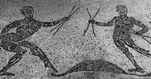
Early roman mosaics were simple constructions of dark Tesserae and light Tesserae, relying on the dramatic, harsh contrasts of these colours to sculpt forms on the two-dimensional plane. A binary system like this creates a yin-yang situation of positive space and negative space, filled and unfilled pockets within a structure that controls the presence of these two factors. The stark contrast between the negative space and positive ‘filled’ space of a mosaic lay is instrumental in carving the form of a glyph from the empty, unfilled space, thus creating a mark, an indication of presence. Established before, the link between pictorial representations and type is evolutionary, but stems from the simple act of mark making. In leaving a mark, a definition of a ‘readable’ form from the senseless blank space is created, images pieced together in mosaics and paintings, penned verses in manuscripts all produce by various marks a ‘readable’ concentration of meaning. However, unlike calligraphy and letterpress printing, which deals with an active method of mark making by addition, the way in which mark making occurs in mosaics can be described as the ‘surfacing’ of a distinction. It is this definition not by addition but rather, distinction, that draws an interesting link between the laid mosaic surface and the bit plane beneath the impenetrable screen of our computers. Digitally rendered type and warriors in mosaics appear to be drawn from the blank space, even if the forms are so clearly distinct from their backgrounds, they inherently belong to the weave of the grid interlocking the entire plane.
Floor mosaics of the Severan Period @ Caupona di Alexander e Helix
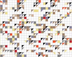
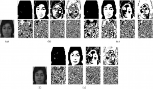
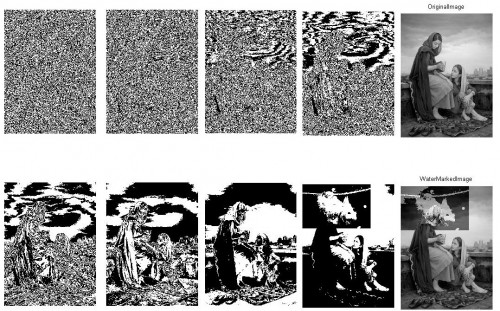
Bit plane image slicing
This can be attributed to the shape of Tesserae which allowed for a tight fit of pieces within the structure of a mosaic lay and naturally with its geometry, producing a grid network that flowed through the entire mosaic. More importantly, it also determined the placement of other pieces, functioning independently as a growing support system. The bit plane of a computer functions on a similar grid logic in developing computer graphics (see 4:14 Ivan Sutherland’s Sketchpad, 40:44 for graphic animation ) that allows for simplified organization of information and systematic mapped identification of what should go where. With the grid system making for an efficient positioning of negative and positive ‘marked’ space, with both being created simultaneously, as opposed to a hierarchy of surface-to-type. As a result, we see a single grid plane (surface) created containing both contrasting elements, a ‘reading’ of such a surface becomes more attentive to the qualities of form in type, as something carved from the plane itself and therefore intimately tied to the surface upon which it exists. Eventually, mosaics evolved to contain elements of gradation and cutting of Tesserae to accommodate circular shapes, making for more elaborate and decorative lays, much like how bit computers from the 80’s have played up their resolution game. What doesn’t change is the language upon which the form is communicated; inter-woven presence and absence.
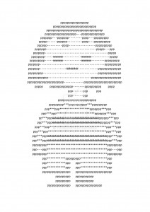
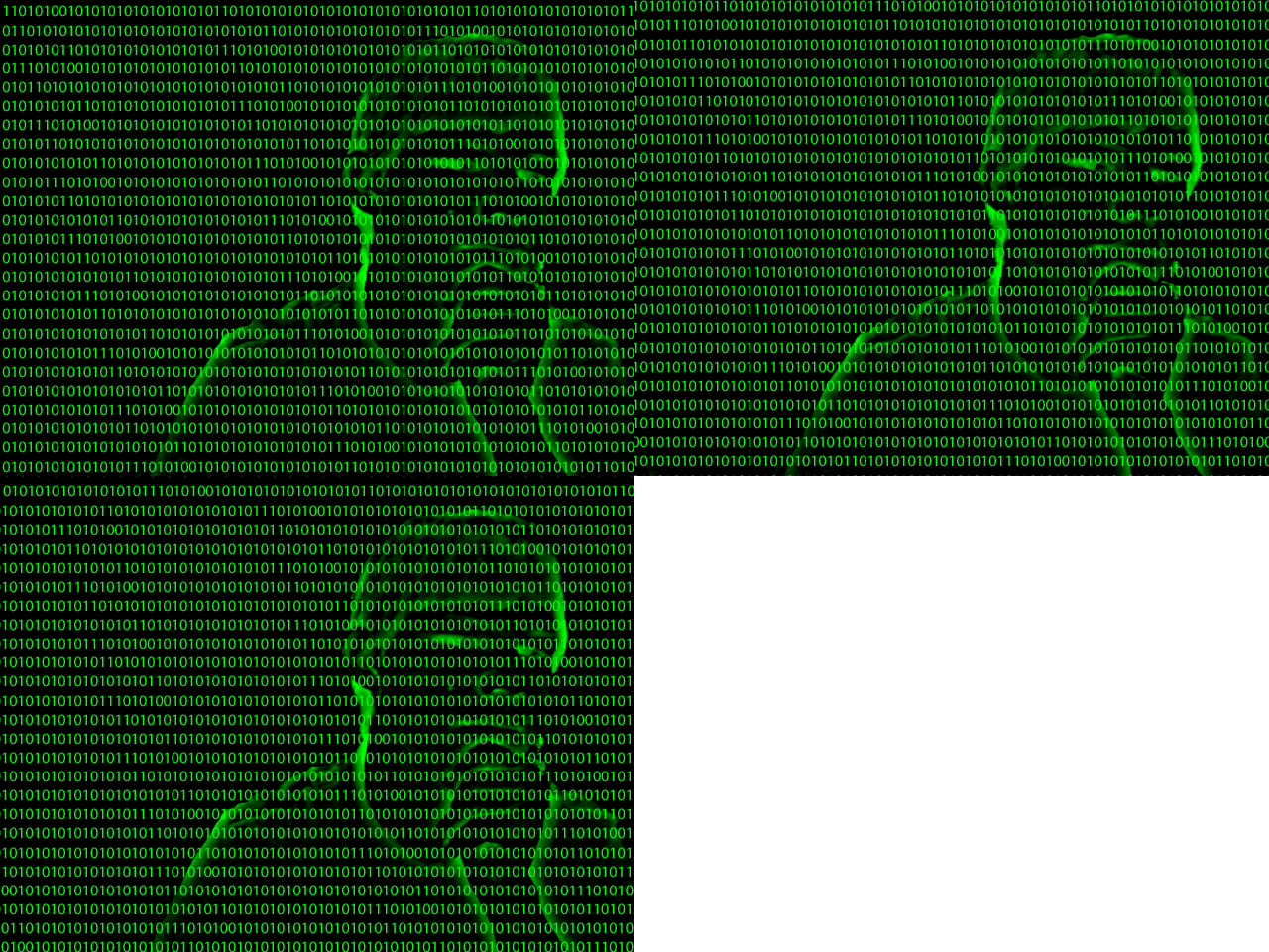
ASCII art
ONES AND ZEROES
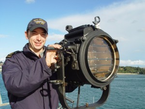
The translation of alphabets into Morse code produces a type that can be transmitted via electrical pulses, audio tones and mechanical/ visual signs (heliograph/ Aldis lamp), one that while can be recorded in print, is transmitted in a form distinct from the printed aspect of type. Morse relies on a binary system of dots and dashes, or equivocally, flashes and pauses, positives and negatives, ones and zeroes. The materializing of this information as ‘readable’ content on the bit plane follows a series of conversions of data, text and instructions from the same binary system (e.g. B=01000010) to corresponding alphabets, actions and responses and in the process computers read each letter as a series of 1s and 0s (or any other two-symbol variant) , which to us remains complexly coded when left untranslated. Yet, to a reader who recognizes the tightly knitted fabric of language, presence (1) and absence (0) are meaningfully placed to form a legible and therefore visible picture.
Aldis Lamp
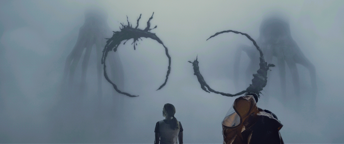
If we were to consider how non-humans read or what type would be in a situation unable to relate itself to print, we could say that the attention to presence and absence, down to how a character materializes itself, being conscious as well of the textural fabric in which it materializes, will form the basis of the behavior of such a type.
Heptapod Logograms
Arrival (2016)
