Sometimes it happens when you think that you do not have any relation with something, suddenly you find a chain of connections with yourself.
Richard Niessen – graphic designer working and living in Amsterdam, the Netherlands. Since 2006 he works together with his wife Esther de Vries. The main focus was – search for a relations between Richard Niessen and Gerrit Rietveld Academie. Richard Niessen graduated from the Gerrit Rietveld Academy in 1996. Esther de Vries graduated from this Academy as well in 1998. I selected some fragments from interviews where they mention the Rietveld Academie:
“The class in which I graduated, in 1996, we all started on our own. I think there was a need for a new generation. We were the first generation of creatives that were used to using computers. I think there was also an economic boom; a lot of clients wanted to work with young designers. Linda van Deursen had been teaching us and she was very influential. Ajax won the Champions League in 95 so she called us her Champions League.”
“It’s one of the best schools,” says Niessen, “because it takes students seriously. Also, great designers teach there. A lot of art schools in Holland are more like schools, but the Rietveld is different…”
“It’s also because there are lots of interesting students,” adds Esther de Vries. “Everybody wants to go there, so they get a great selection of people to choose from. It generates a lot of talent.”
“Students at the Rietveld are taught that they shouldn’t ever expect to earn any money,” laughs Niessen. “Most people prefer to stay poor and do exciting work. Sometimes we’re asked to work with commercial clients but it never works out because they see a piece of work and say ‘we want that’.”
“Rietveld is a quite particular school. Rather than being taught in a certain style, you are trained to have an attitude. Students aren’t given straightforward assignments like ‘make a letterhead’ or ‘design a business card’. You are encouraged to be autonomous, to adopt a more art-like approach, to work more conceptually. Of course at the time I wanted to make letterheads, but after I left I was thankful for the training. It’s attitude that prepares you for anything, and you have plenty of time to find your own style after you graduate. Now I always start by thinking about what is the most interesting aspect of an assignment for me.”
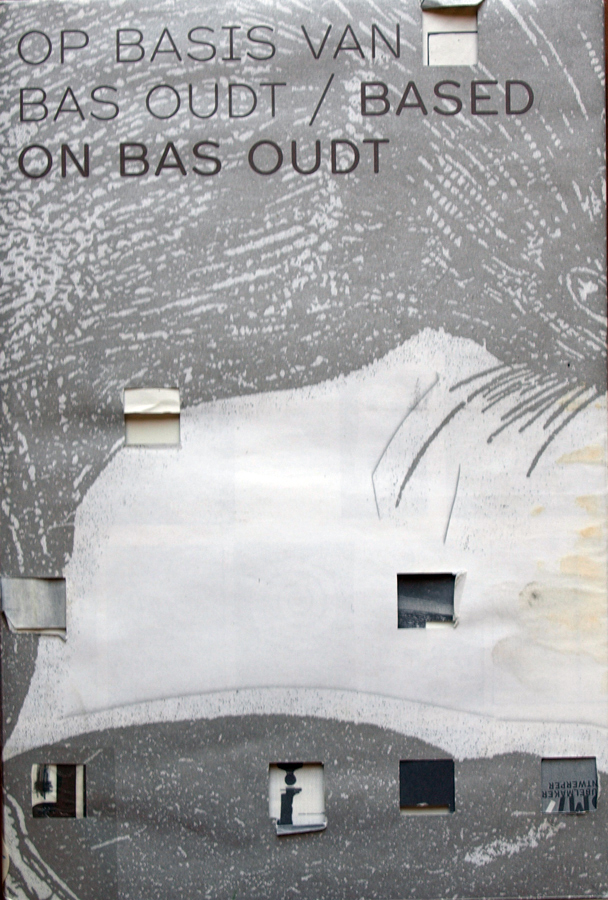
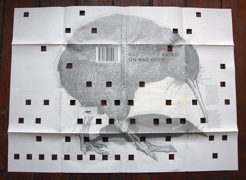
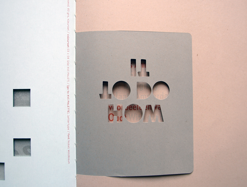
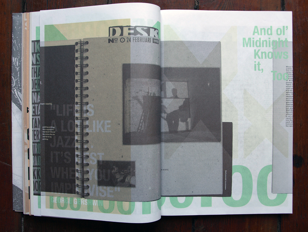
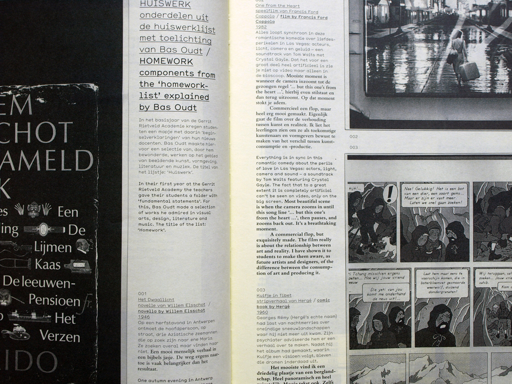
At first, after I started to research Richard Niessen, I thought I never heard of him or was confronted by his works before. After a while however, I realized that I have a book designed by him! Moreover I even saw him at the Academy at a presentation of this beautiful book. The book was lying on my bookshelf almost for two and a half years-
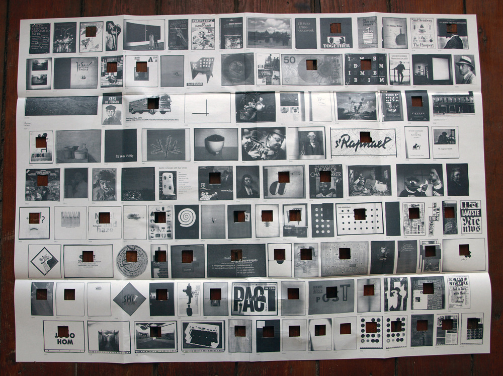
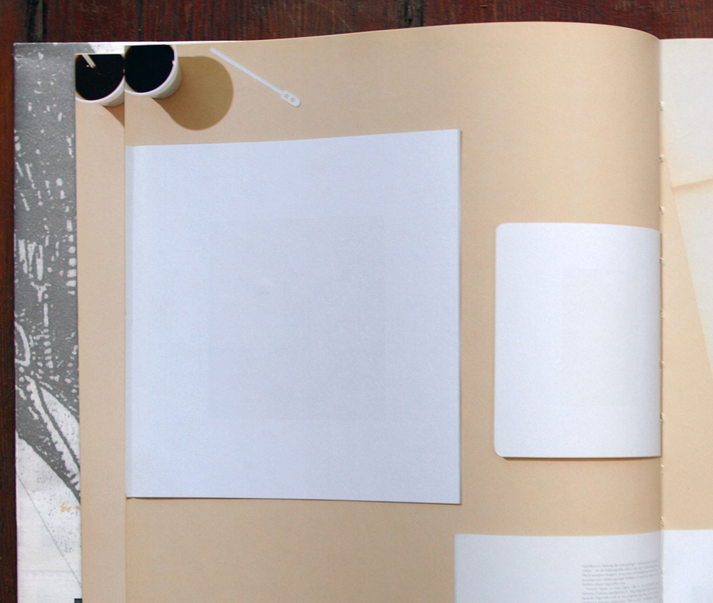
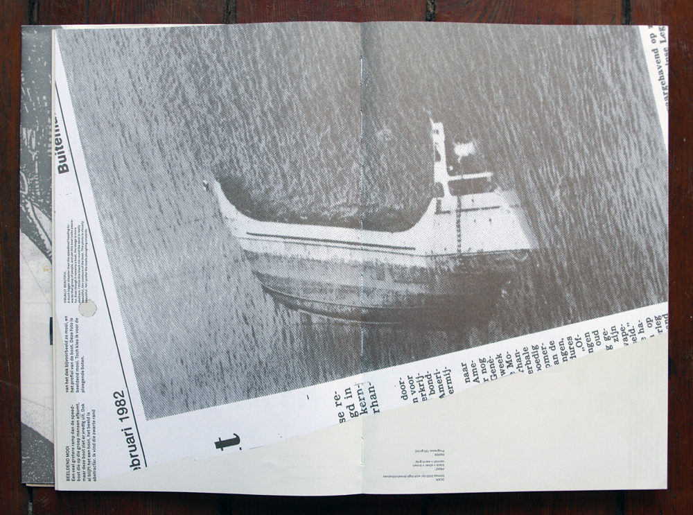
The book is about the graphic designer Bas Oudt who is a teacher at Rietveld academy. The reason I did not remember Richard Niessen, was because my main focus at that time was on Bas Oudt and his work. Back then he was my teacher in the preparatory course at Rietveld Academy. The book was made by seven ex-students that Bas taught in the Rietveld Basic year and Richard Niessen was one of them. Every person made a booklet in the book showing different point of view on Bas Oudt and his work.
Esther de Vries made a chapter as well in this book. Esther sets out on a graphical exploration using Bas Oudt’s disaster photos which he collected from newspapers.
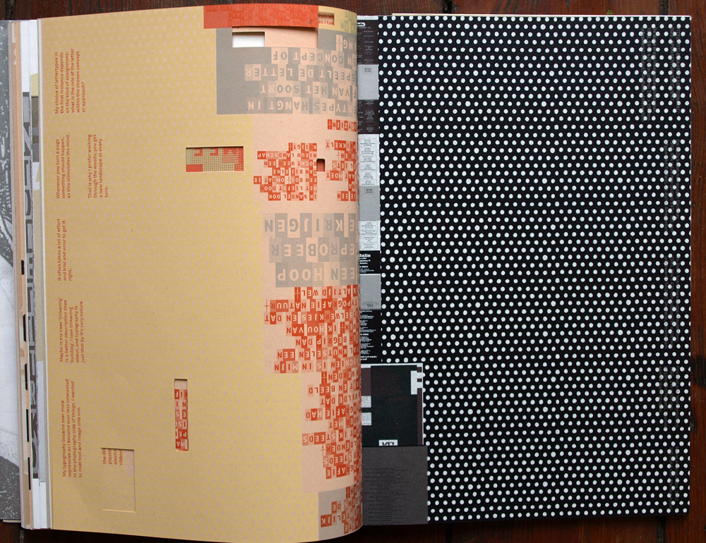
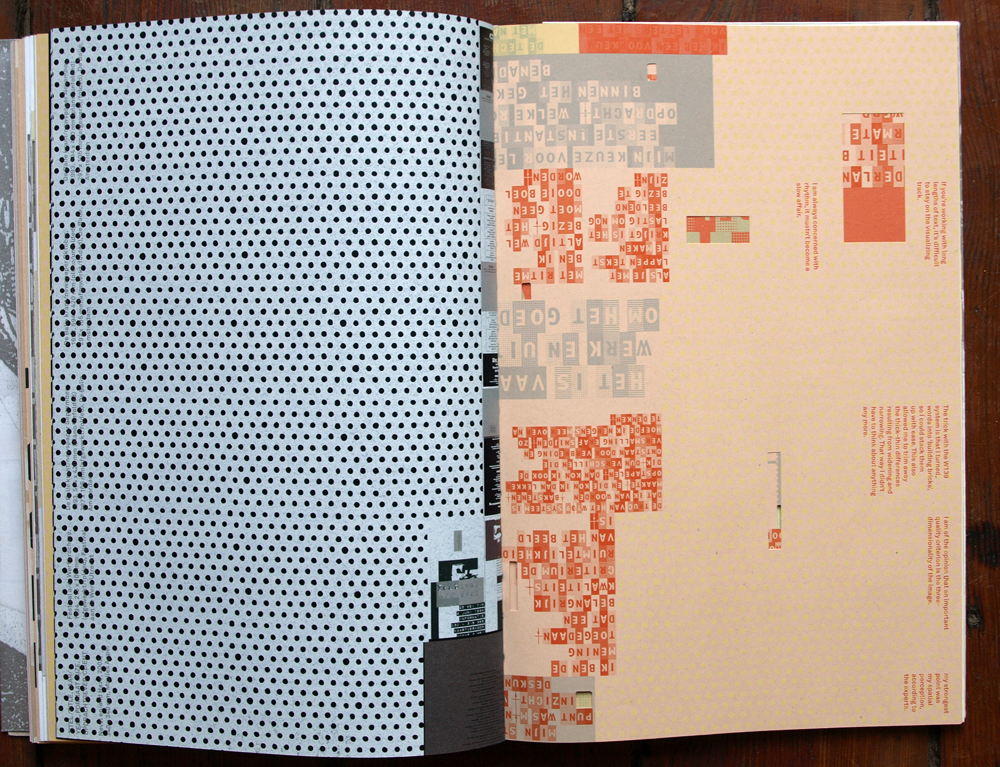
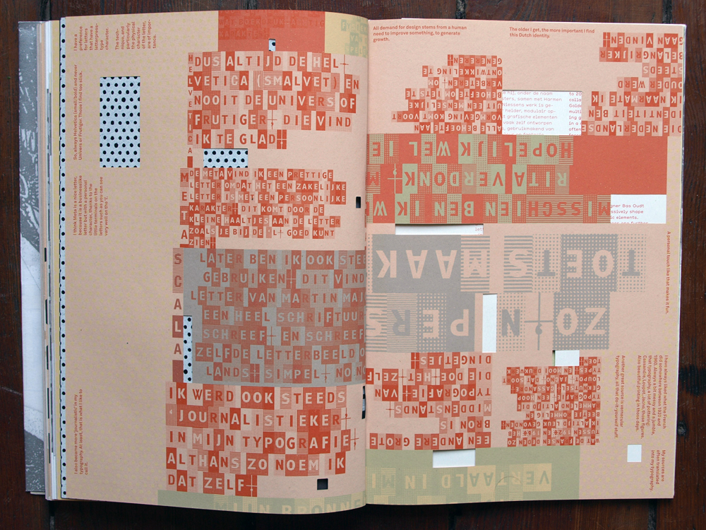
As a graphic designer Bas Oudt knew how to expressively shape letters and graphic elements. Richard Niessen goes one further and interprets letters as building bricks for constructing a folding tower: typographical bricklaying. Richard Niessen chapter:
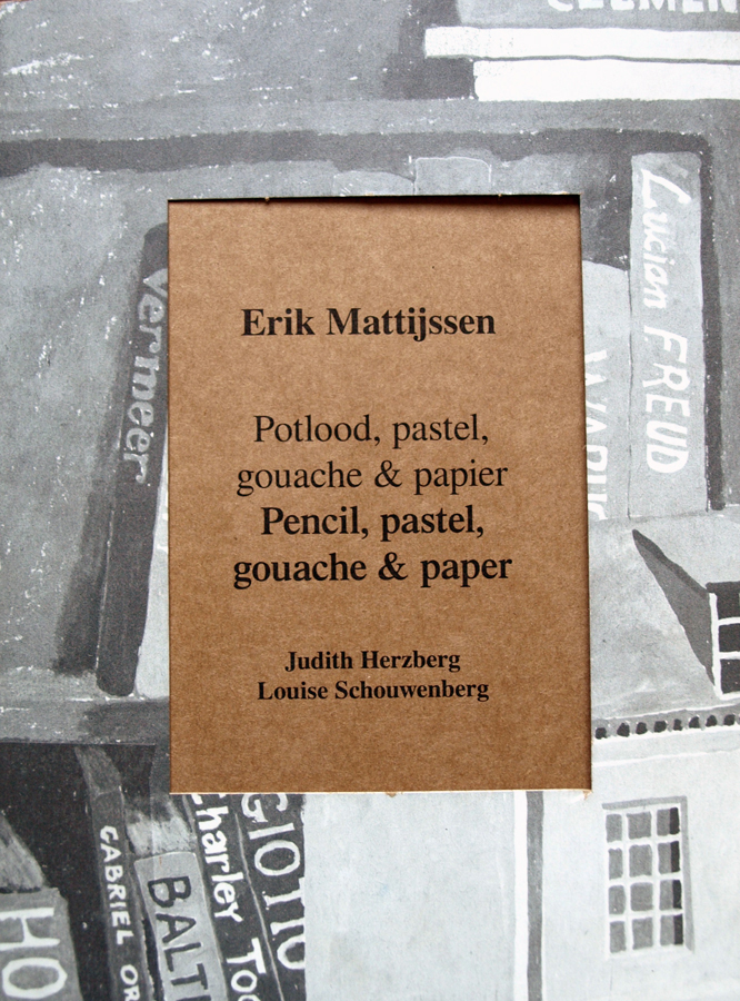
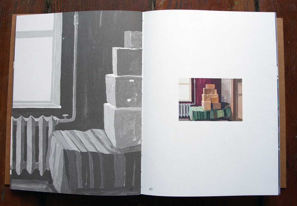
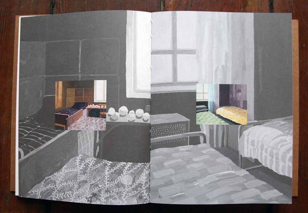
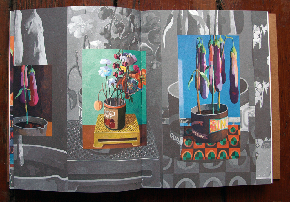
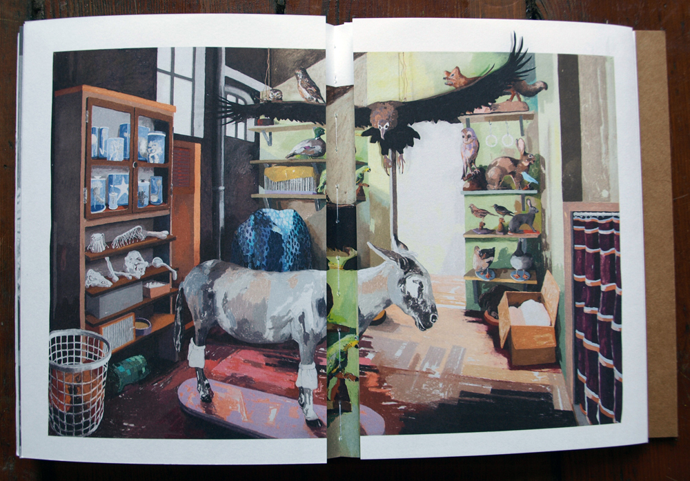
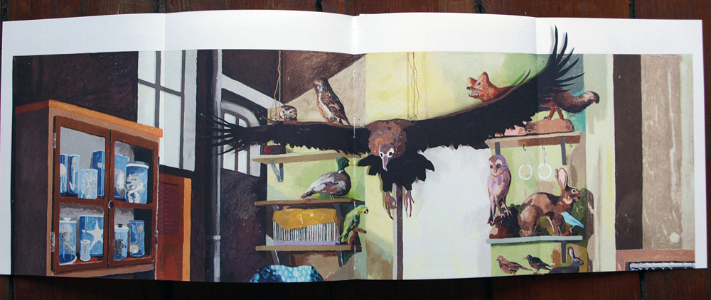
Another connection to Rietveld and myself that I found in relation to Richard Niessen’s work was a book that he and his wife Esther de Vries designed for the artist Erik Mattijssen who as well is a teacher at Gerrit Rietveld Academy and whom I had previous year as my mentor.
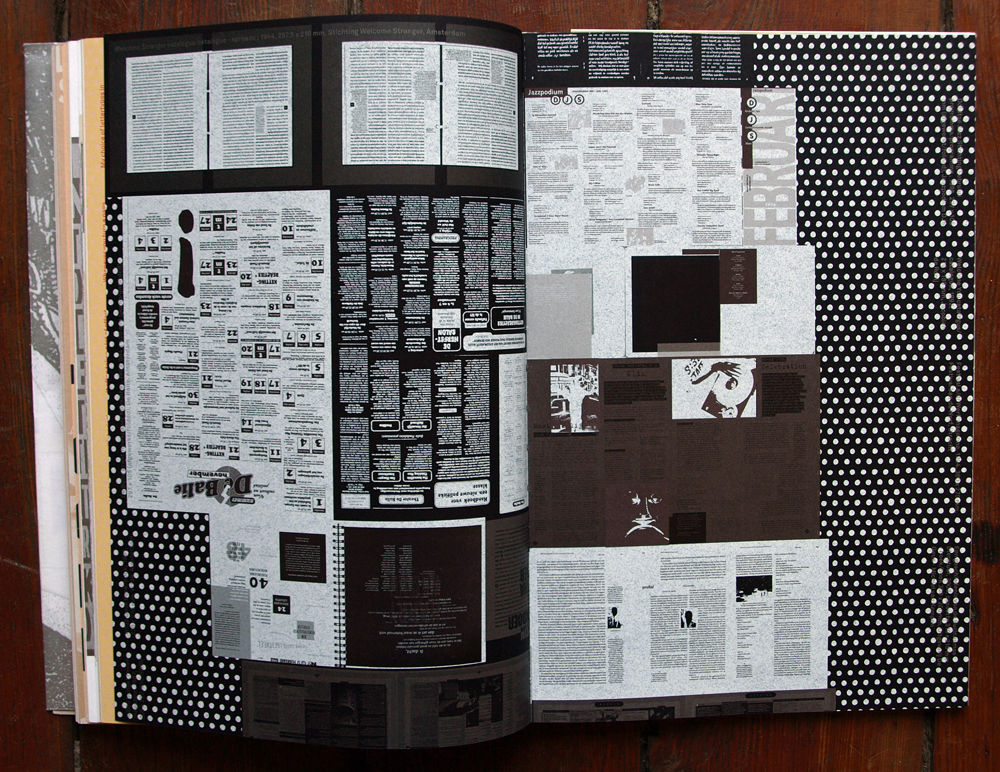
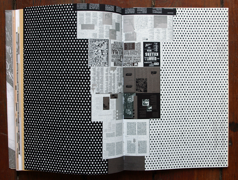
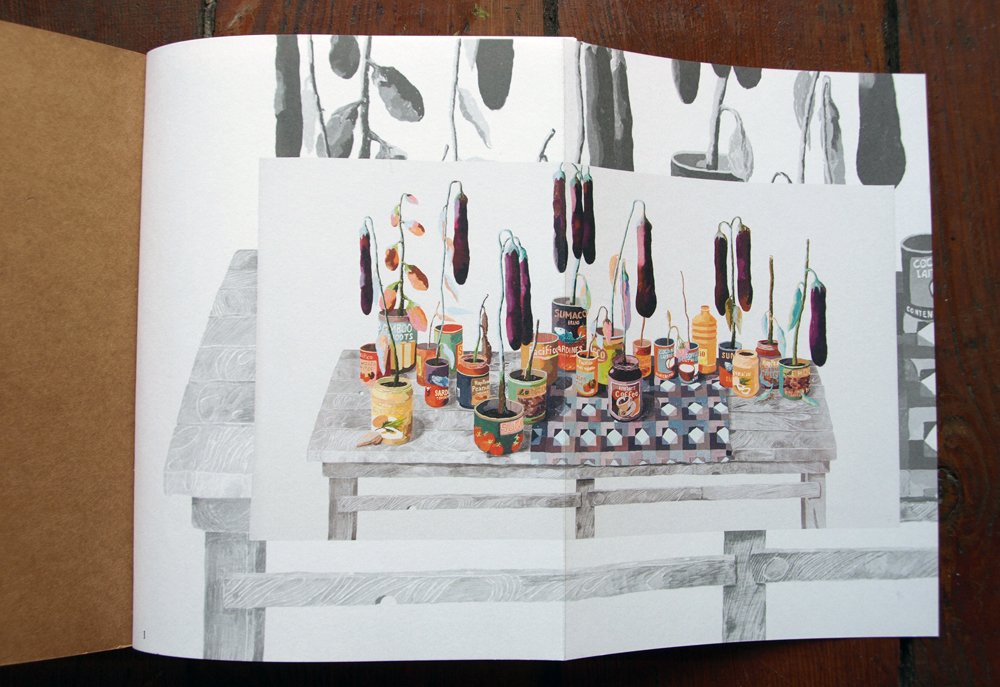
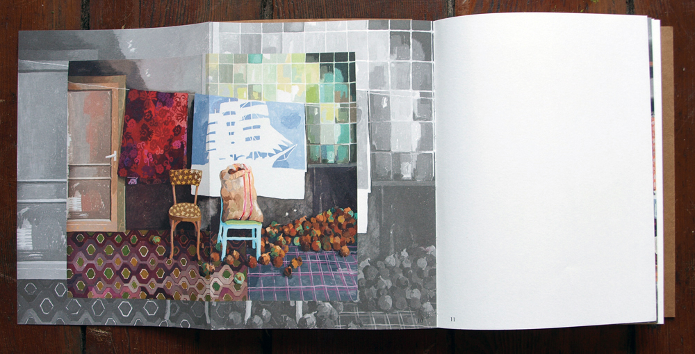
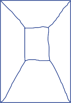
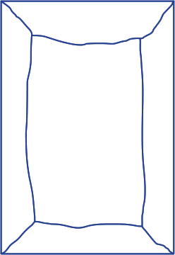
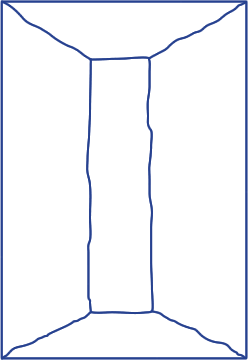
The structure of the book “Pencil, pastel, gouache & paper” was based on an idea of a house with different rooms. When reproducing the drawings of Erik Mattijssen, Niessen and de Vries made every effort to come as close to the real thing as possible, and to catch the essence within each of them. A large drawing doesn’t allow a dramatic reduction to format of a small image in the book, without consequences; one loses the sense of size and scale. Niessen and de Vries made the important decision to enhance the perception of space by using a black-and-white reproduction as a background on which to place the drawing.
“Well, if you have a book with lots of structure and details, it is hard to take it all in from the start. I like to think that people keep my books on their shelves, seeing something different every time they take them out. In the end, if people are interested, they catch up on all the layers. Sometimes books and posters are based on a single good idea, but after you have ‘got it’ there is nothing left. I am very disappointed with several books I have bought. After feeling very enthusiastic in the store, I’ve got them home, taken another look, and seen the ‘trick’. And that’s it. That’s all there is. I always try not to simplify or sloganize, to create a unique language. I hope this will make my books durable. “
When Richard Niessen designs books he tries to have extra layers, secret messages that makes his works more complex. This aspect makes you more involved in the books. He sees different chapters as different rooms. You can discover something different every time when browsing through those books he designed. They are not one-dimensional for sure.


