Skip to Content Skip to Search Go to Top Navigation Go to Side Menu


"Amsterdamse School & Enschedsche School" Category


Enschedese School; a fire still burning


Monday, May 30, 2011

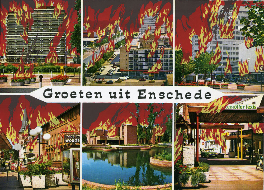
GroetenUitEnschede

'Municipal Inferno', uitgave nº 6 van De Enschedese School.

The freedom of control.

What really fascinated me about our talk with Frans Oosterhof, was his way of talking about the freedom of control. When everything is made by hand, you lose control. Every item gets unique.

I think that is the reason, when I go down in the basement at school, I feel like going to heaven. When I enter the basement, I lose all control and works from a great passion in silkscreen and letterpress. I let stuff happen.

I love the physicality and the diversity in every work. You may have one starting point, one stencil, but end up with 10 individual works.

I am a control freak but love the freedom of control.

[by Kristine Andersen]

from basics

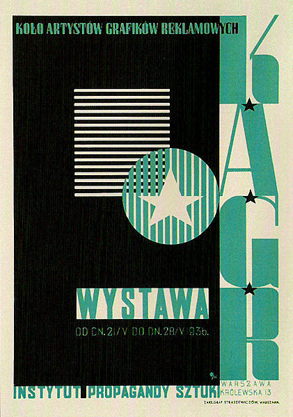
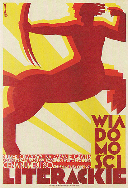
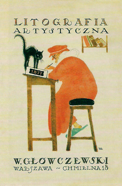
This “primitive” design when no computers were in use took me to the beginnings of poster design that plays such a huge role in modern world .  As to understand what is happening now it is good to have a look in the past. I took myself to the very beginning of polish poster design as this country is very famous for.

I picked one of the most known poster designer Tadeusz Gronowski that reminded me of the words said by Frans Oosterhof that skills play large part of self development and can lead you to the unexpected results. It is also a way to explore new fields of creating that may affect your work later on.So, i chose him as an example to show that innovation , new skills and experimenting resulted in posters with new light and fresh background for innovative design.

“Instead of merely adapting his painterly style to the poster format, he sees in it the opportunity to create something new, indeed a new form of artistic expression. He is one of the first artists to consciously integrate the typography with the illustration and instead of choosing the obvious he offers the viewer a different look into the subject, often displaying a disposition for the light and the humorous which endeared him to the viewers.”

For more examples of early poster designs

[by Agnieszka Zimolag]

The secrets of the Basic Year

Frans Oosterhof is not only the key figure behind the Enschedese school, but also behind us: the basic year. So what are the secrets of the fist year study of Rietveld?

The year is there to tease us, to turn things upside down, so that at one point, after being troubled, we notice that actually it works, we can do it! We have confidence and means!

Also the January project is already a tradition to shake the dust of the christmas holidays back home from our shoulders. I was amazed by the stories of knocking down all the walls of the third floor and people from one class flying naked in the sealing of the school.

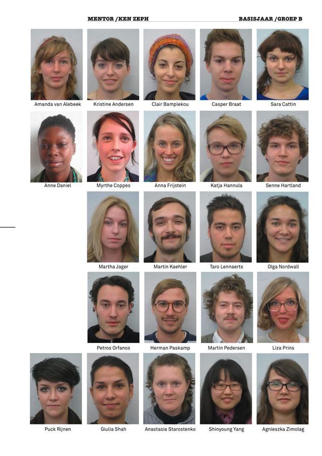
The groups are made with intuition, but carefully thought. First thing, to get the biggest possible mix of age, gender and nationality together. We also heard they look at our pictures, what attitude the face signals, how do the names sound together. It’s all part of the big plan!

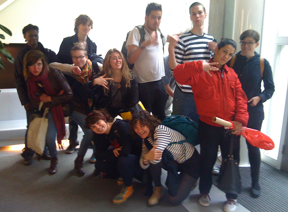
Group-B Basic year 2010/11

How did we all get together? It is not a coincidence!

(by Katja Hannula)

Enschedese School

ft Renaldo and The Loaf

Enschedese School could be considered as a movement that’s similar to Fluxus, Dada, and the Nul-beweging, but according to Frans Oosterhof it’s not considerable as something that we should describe as a recognizable style.

According to the music that Frans Oosterhof played, and the things that he did reminded me of a band called: Renaldo and The Loaf. The band made lyrics that we could describe as: disorientating, hilarious, ungraspable, and ´it´ does not mock certain things and is also not considered as anarchistic, but maybe more nihilistic by denying that:
A. There is no style connected to them
B. Playing around creates a fundamental or essential work
C. Experimental, and considerable as avantgarde

http://www.youtube.com/watch?v=3n3MbVoLYns

Most strong connection to this non-movement [Enschedese School] is Fluxus:
A. It is not a movement or a style
B. Intermedia

George brecht considered it as ‘the smallest unit of a situation’ and i could also conclude that some fluxus-art-works could be overlooked as a art work [Duchamp’s Fountain, Manzoni’s feces etc.]

Conclusion is:

it was no movement + it did had characteristic qualities of other movements = a statement without belonging to something.

(by Petros Orfanos)

Personal Strength

On Thursday we met Frans Oosterf, a retired teacher of Rietveld Academie and a former founder of the Enschedese School. Within a couple of hours he explained to us how the movement emerged in the late 1970’s in the small town of Enschedese where some art students denied to specialize and decided to make a second foundation year to experiment more with their creative ideas using a variety of media that they chose for themselves. It wasn’t until the next year where the same people decided to move all together in a communal studio space, working in a collective way with their teachers and publishing magazines and vinyl’s of their songs and artworks. The Enschedese school lasted for several years as an independent art movement using reproducing techniques managed to send their Art by post to their subscriber within using comical elements and repetitive patterns.
Personally I admire truly their revolutionary spirit and I wish that I would one day find myself in the position of doing something similar.

(by Claire Bamplekou)

Is it possible to be ‘style less’

Frans Oosterhof said that he once promised to be and remain style less.
Don’t get me wrong I was amazed and very much inspired by this man, but still I wonder if it is possible to avoid a certain style.
I do understand that he meant that he and the other members of the Enschedese School didn’t choose one medium to reveal their thoughts, but still it made me think of how and if it is possible, to escape from any style at all. When I looked at the work of the Enschedese School I still detected a certain overall style, I do not already want to say that that’s a bad thing. If we see for example the song ‘van Agt Casanova‘ and the ‘fake stamps‘ and the strip of ‘de Doka van Hercules’ but also in the painted crockery I sense the same kind of spirit, the same kind of style. Al these works mock certain settled persons or phenomenons in society.
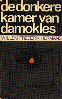
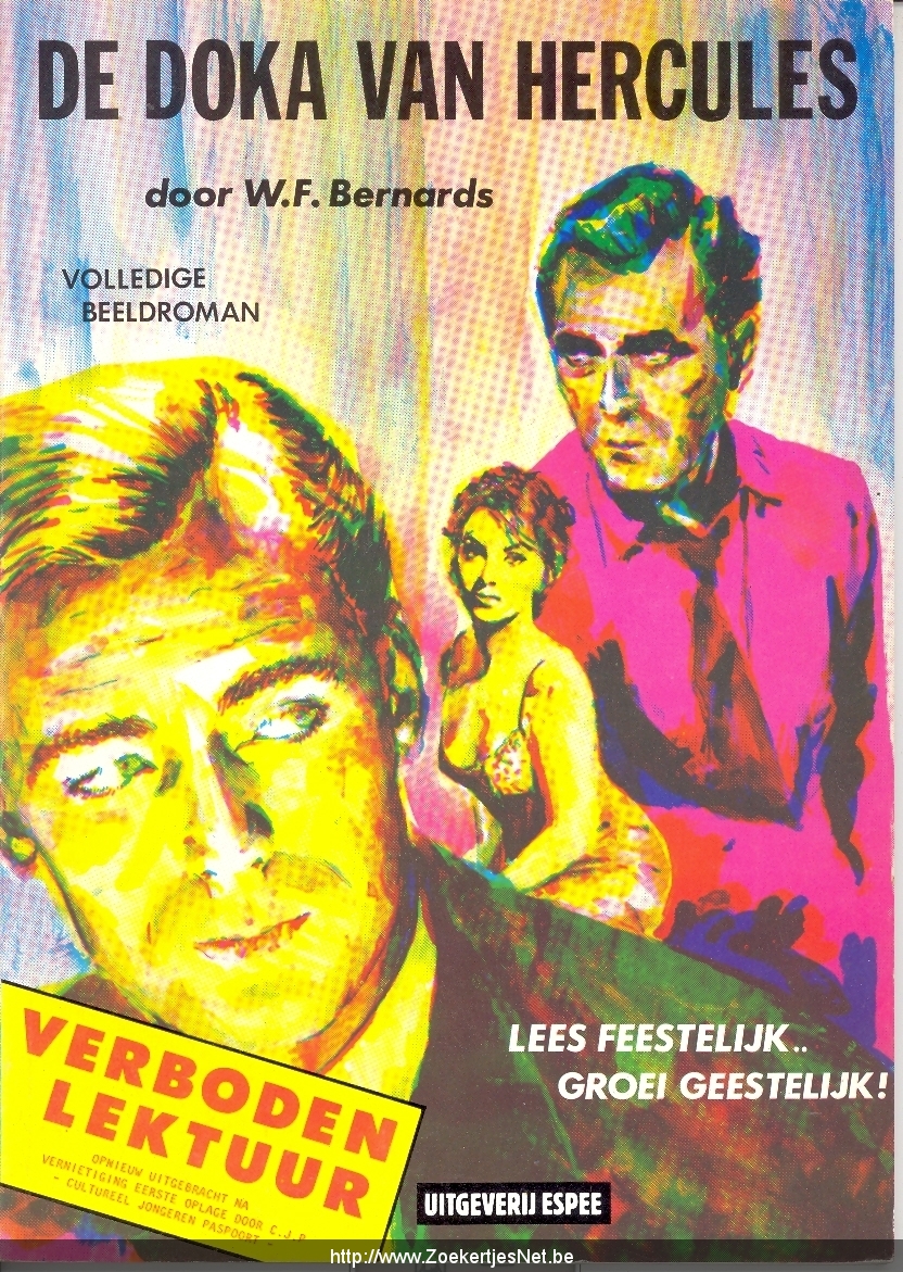
Actually now that I’m thinking about it more and more, I do not think that an artist should be style less at all. Of course he or she should try a lot of different media and should not be bound to certain usages. But every time an artist expresses his or her ‘obsession*’ derived from the outside world and every time it is an obsession of the same person (or group), that is creating an overall ‘style’. Besides this (visual)artists have a strong visual intuition, I don’t think we (maybe this sounds arrogant) are able to escape from that! Of course we can make it as wide as possible, but making it to wide would also implicate a kind of indifference, a complete commonplace for an artist.
What I mean by an obsession is a kind of affection or unease about something in the outside world that inspires to make a work of art. The way such an obsession comes to us, how we interpret them or express them is I think quite personal (groups only arise from sympathizers, by whom this personal process works quite a bit the same, it’s not likely that you’ll find yourself in a group with people whose thinking process you don’t understand at all.)


(by Liza Prins)


Loving it to Death

On the cover of an EP a girl stands in front of a piano. She is wearing a t-shirt with piano keys on it. Standing on the piano is a tiny piano. On the back cover there is a little biography explaining in a very joyless and matter-of-fact way that this girl likes playing piano and makes songs. There’s a certain insanity subtly presented here that’s hard to grasp and easy to miss. Even though the creations done by Frans Oosterhof and the rest of the Enschedesche School were too sharp-witted to simply call them parodies, they certainly expose the apparent clumsiness of popular media in the Netherlands of the seventies. The media and objects created by the Enschedesche School seem to, in a subdued kind of way, reflect the madness of the world that surrounded them. I believe the Enschedesche School were cynically honouring these stupid media by loving it’s form to death.Personally, the meeting with Frans Oosterhof reminded me of the joy and excitement of creating things/media/objects/situations/ART according to one’s own vision and of the significance of Doing It Yourself.

Besides “Van Agt Casanova” it is difficult to find any music by Enschedesche School’s 1000 Idioten label online. However here’s the chords of one of their releases so you can play it yourself!

[by Senne Hartland]

maybe I’m in time!

Without being pretentious, last Friday gave me the impression to understand a bit of my contemporary time. Frans Oosterhof told about his studies in art academy and his years in the Enschedese School movement in the 70s/80s’. The Gerrit Rietveld Academie follows the same way of thinking, revolutionary at the time and strongly contemporary nowadays. Frans also reorganized the Rietveld’s Basic Year, which he did several times going against the idea of taking a specific direction in a department. To hear the foundations of the Foundation was revealing and encouraging: the Enschedese School is just one of the influences that stays at the bottom of a contemporary way of teaching and learning. Frans says that in others academies “art” is not possible to explain, they teach every technique, but not how to be an artist because they don’t know what is the magic potion for that. He believes that art or not we should understand nothing around us, without right and wrong and stupid school critics, we need to surprise ourselves. We don’t need to choose a direction because we should say what we want, how we want and again swimming in millions of possibility. No prejudices about media and contents ,of course, and feel the education as moment of tryout and living together.
I felt part of something bigger, also if I’m not supposed to understand and only living making art accidentally etc… I had the real intuition to be part of a cultural machine working to produce a precise thought. I know we will write the history of today in the future, but I felt perfectly in time to perceive by intuition the reason to stay exactly where I am.


Drawing a tree, by Bruno Munari
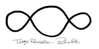
the Third Paradise, by Michelangelo Pistoletto

[by Sara Cattin]

MAD = BAD = BETTER

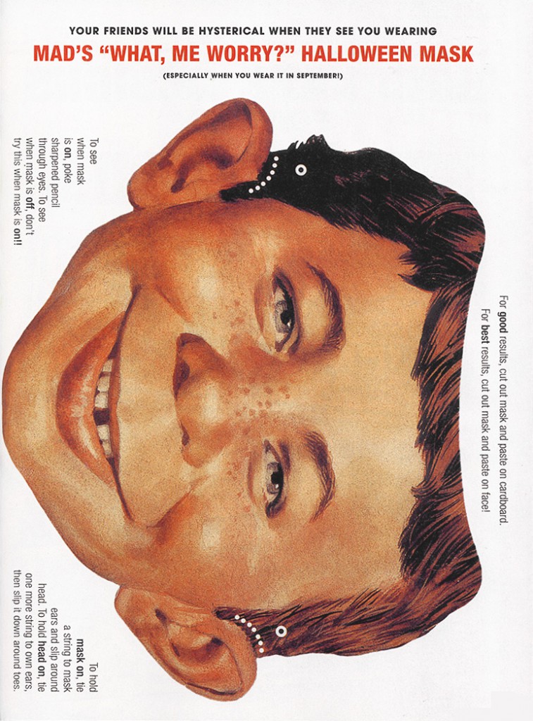
Taking part of some of the treasures of the Enschedese School’s vast production; I started thinking about MAD. I always loved the magazine when I was a kid, and my parents had some really old ones at home. When I saw all the printed media and witty designs in combination with mind-bending but tempting objects, it felt like the MAD Magazine had entered another sphere and all of Harvey Kurtzman’s old drawings and perverted fantasies came to life, walking and talking just as lifelike as Oosterhof in front of me. At one point I got really attached to the little brush-bird (the one made with pencils and grey wings), and I was sure I’d seen it before as a sketch. Searching my mind and especially old MAD archives, I couldn’t find the original source I was looking for. But it was satisfying enough, because playing around with it confirmed to me that if you put your mind to it, visions/dreams/unhealthy fantasies can come true. Even if it doesn’t make any sense at all to yourself or your audience. (If you print this and wear it at school I’ll give you an ice cream.)

[by Olga Nordwall]

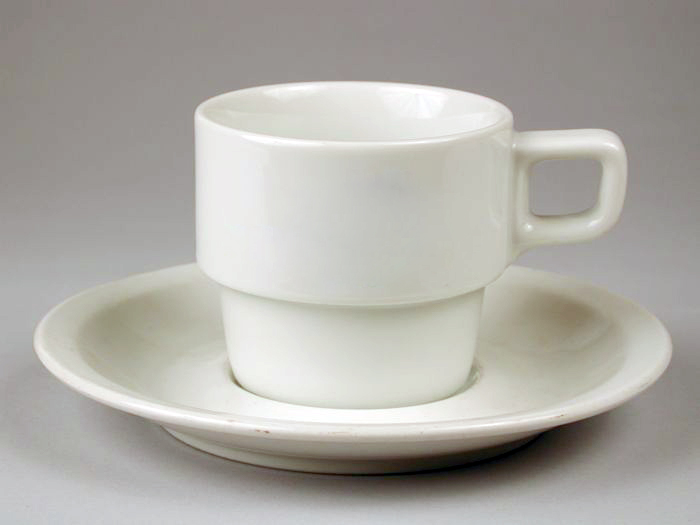
De kopjes van Frans Oosterhof

Frans Oosterhof heeft tijdens zijn verblijf aan de Enschedese-school een groot project gehad met al bestaand ziekenhuis kopjes. deze vijfhonderd kopjes en schotels verfde hij subtiel met kleine verf spatjes en druipers.
Wat ik kon zien bij de kopjes die hij mee had genomen, leek het vaak op de kring, die je krijgt als je koffie morst, maar dan gekleurd. Dit was zo subtiel gedaan dat de schoonmaakster van Frans een paar jaar geleden een deel van deze kopjes die hij nog bezat heeft weggegooid. de schoonmaakster dacht namelijk dat het mengbekertjes waren die niet meer schoon te krijgen waren. Zelf zag ik ook eerst niet wat er zo bijzonder was aan deze kopjes, maar juist omdat het zo subtiel gedaan is, zijn de kop en schotel het project van Frans Oosterhof dat mij het meest bij gebleven is.

[by Casper Braat]
Old sailors do not whistle!


Friday, May 20, 2011

Old school sailors

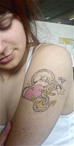
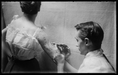
My class-mate Olga makes beautiful old school tattoos with markers and colorful felt-pens. Maybe for her graphic hand or maybe because she was for a year on a sailing ship, the Falcon.


Roses, sacred hearts, daggers and anchors are her favorite subjects, exactly like the Old School style tells. Black lines draw easy and round figures that have to be filled with solid colors. Thanks to the sailors coming from exotic places (like the Philippines where Olga’s family come from) during the XVIII and XIX centuries who had contact with different tattoo arts and cultures. For sailors tattoos were a sign to remember adventures and reason to tell stories. In the beginning of ‘900 the tattoo practice started to arrive in the western important ports with the same sailors were opening small tattoos studios. Sailor Jerry (1911-1973) is the initiator of the style in Honolulu
in a notoriously neighborhood, frequented by the best names in prostitution and crime and, as always, by the well sailors. What shock me most of the Old Style is the elastic feature in design that from aggressive and poetic can become sensual and delicate. In the western society it easily changes attitude being used also from elegant women in visible and provocative places, maybe trying to imitate the sensual free body language of the same sex over ocean.

picture of William Vander Weyde, (1871-1929)

From my researches one of the first country that adopted tattoos was England, from the sailing in Polynesia, in the middle 18th Captain Samuel Wallis, French explorer, was one of the first to write about tattoos: “universal custom among men and women to get their buttocks and the back of their thighs painted with thin black lines representing different figures”.
The polynesian women were having their first tattoo at the age of 12. From that point tattoos were defining roles, position in society and head also religious meaning. The design of Polynesian tattoos was a Tribal style: geometric forms and stylization from natural element. It was really different from what we know about the Old School style of the sailors. I didn’t understand exactly what was the western approach to the indigenous culture in the case of tattoos and what european people kept from it. I think they were really fascinated by the act, painful and beautiful at the same

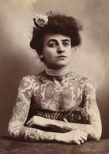
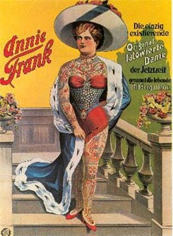
time. Looking at pictures of european and american women full of tattoos at the beginning of the 1900, i was thinking about their role in society, how was possible at the time of the “belle époque” to look like a polynesian? I didn’t find a lot, but in one of the most famous example there’s Nora, daughter of Martin Hildebrandt who in 1846 opens the first U.S. tattoo shop in New York City, servicing from both sides of the Civil War. Nora, rises to fame in the 1890s when she tours with the Barnum and Bailey Circus as the Tattooed Lady.

[by Sara Cattin]

Never on a Friday

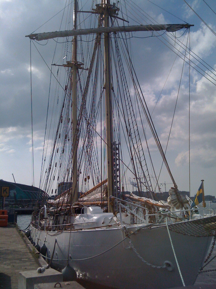
Not a gem of the Amsterdamse School, the HMS Falken nevertheless originates in Dutch craftsmanship as a ‘Schoener’ first set afloat in 1947 and still sails the Seven Seas. The term or idea of the Seven Seas was coined as early as 2300 BC, but as many myths and legends at sea, the stories change. However, they do survive. Some might not think that brave and adventurous men at sea waste their time and occupy their minds with silly stories and folklore but more so than anything else – that’s exactly what they do. Sailors are without doubt the most superstitious people I’ve ever met. Among loads of quirky habits and traditions, these are a few does and don’ts you should consider when embarking a ship:

  • Don’t put your left foot down first when going aboard.
  • Sail out on a Sunday when leaving the port, never on a Friday.
  • If you meet a priest, a redhead or women without shoes on your way to the ship – stay at home for the rest of the day, don’t leave the port.
  • Keep a black cat on board for good luck; all other black items are banned.
  • Don’t kill any birds if you run out of food at sea. Especially not an albatross. Birds will bring you to land, but most important; albatrosses carries the souls of dead sailors.
  • Do keep your eyes open for nude women; it’s good luck. That’s also why the figurehead in the bow of the ship often is a female (with one breast bare in good taste).
  • Wear earrings, they will enhance your eyesight. Sailors ought to wear a golden earring in case they’ll drown and get found ashore because it will finance their funeral.
  • Don’t light a cigarette or pipe on a candle, if the candle blows out you’re doomed.
  • Don’t whistle. Whistling resembles the wind in the sails and will for sure call upon the storm.

Keep this in mind and you’ll likely go along with the skipper.


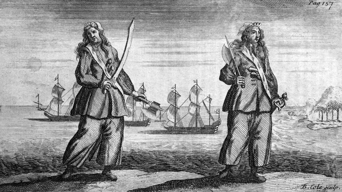
Anne Bonny & Mary Read [x]

[by Olga Nordwall]

The Amsterdamse School Trip


Friday, May 20, 2011

De Stijl versus Wendingen

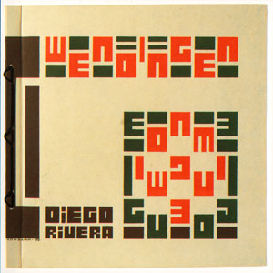
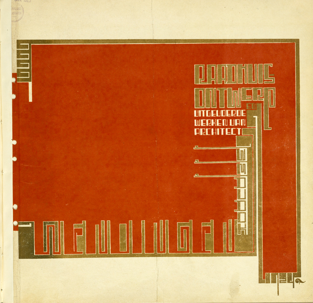
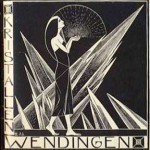
Wendingen magazine 1929 #3 on Diego Rivera. Cover by Victor Huszar

The magazines de Stijl and Wendingen were both founded around 1918. De Stijl was connected to the artistic movement of De Stijl and Wendingen was connected to the Amsterdamse school. These two movements are completely different, if not opposite to each other (De Stijl being functional and minimal, only using the primary colors and black white and grey, and the Amsterdamse School playing with different colored bricks and all these ornaments). Logically these two magazines felt like competitors when they started to publish.

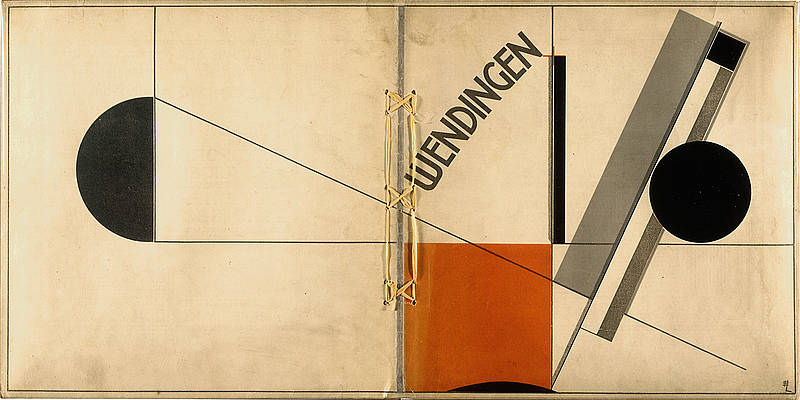
Wendingen magazine 1921 #4 on Frank Lloyd Wright and Berlage. Cover by El Lissitzky

That’s why I was completely confused when I saw a cover of Wendingen depicting a work of El Lissitzky, a constructivist artist and what I’ve always been told is that constructivism was kind of close to the Stijl. This issue was about: Frank Lloyd Wright’s architecture!!! I always thought that he was the one heavily influencing the Stijl. What turned out to be the case was that the Dutch back in those days weren’t really making ‘groups’. They stayed individuals and were inspired by different sources and that’s why, how different the movements may be, also individuals brought characteristics of the Stijl into the Amsterdamse school and the other way around.
Isn’t that just great: they were existing movements but there seems to be no rules or boundaries in taking aspects of other movement, you are free to be inspired by everything.

[by Liza Prins]

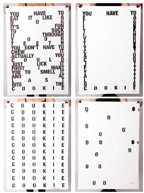
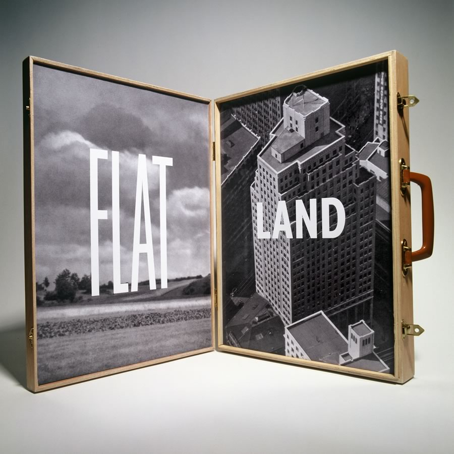
SMELL it, LICK it, SUCK it, BITE it, CHEW it, EAT it.

4 years ago I went on a study trip to a curtain great house, build by a curtain great architect, that I do not remember. And just before I went in, my previous teacher at Architecture and Design, Aalborg (Denmark), told me and the rest of my class, that we would get goosebumps, when we first got inside this building. He was in love. Than I went in – but no goosebumps. I apparently did not feel a thing.
Only now I understand, what he was taking about – but in another context.
Today I was placed in front of these amazing art magazines from the 1920s named “Wendingen”. I really felt it.
I tried to smell it.
I was just about to lick it.
I would love to suck it!
I wonder how it would be to chew it.
I really wanted to eat it.

[by Kristine Andersen]

Inside and Outside the Amsterdam Ring

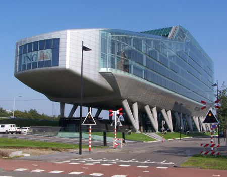
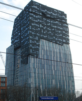
>As the capitol of the Netherlands Amsterdam is a popular place for new businesses and companies. Still you see that a lot of these companies place there new architectural masterpieces outside of the ring. Is this because of the high ground prices inside the ring?


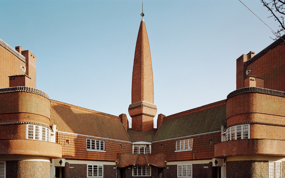
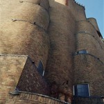
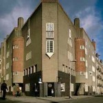
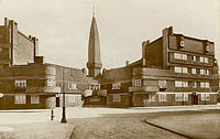
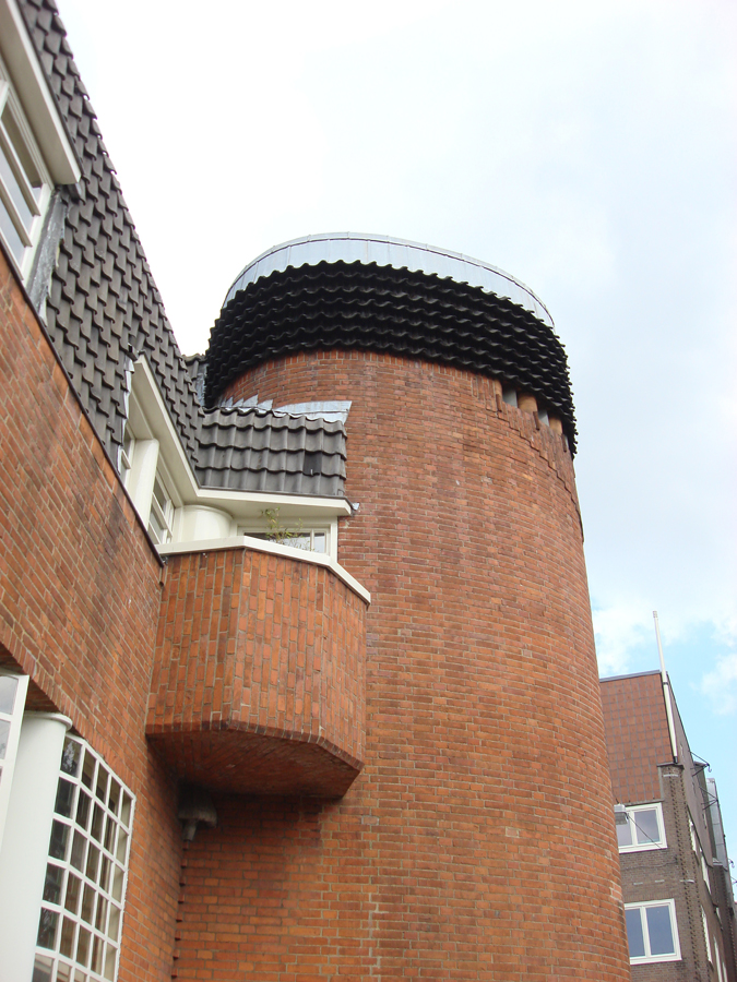
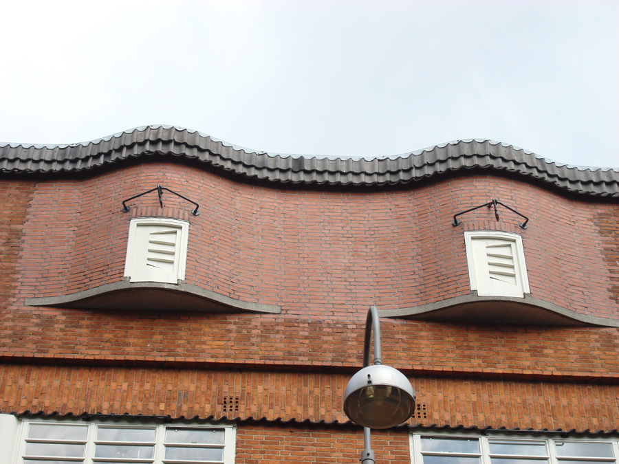
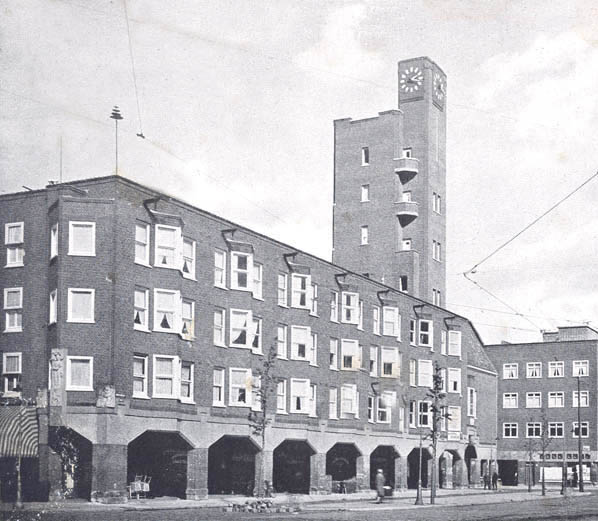
> On a trip trough Amsterdam we quickly discover that the historical buildings of the city are not only in the center-canal areas. Around these canals you see a band, almost like a protecting layer, made of architecture that is maybe even historical as its center. The buildings and blocks give you an unique look on the wide collection of the Amsterdam School architecture. This is something that a lot of tourists miss when they come to the city: icons like ‘het schip’ in the Spaardammerbuurt, mercatorplein, the Berlage Lyceum and the many blocks and bridges through the city. Maybe this is a good thing; in this way it stays as an unique treasure that functions as a decor for the the daily life of many. Lets hope this architecture will be protected in the future and won’t be replaced by transient cheap Almere buildings that will be replaced every twenty years.

[by Taro Lennaerts]

B-Group goes “Wendingen”


[click left for English / click right for Dutch]

[by Henk Groenendijk]

A call from the past

In some places the atmosphere doesn’t seem to change with time. Regardless of new interior pieces, integrated technological devices or relatively fresh layers of paint on the walls, you just come in there and dive into the setting of decades ago.

That happened to me when I stepped into the hallway of a former post office, which is now turned into the museum called ‘t Schip. Blue shiny tiles on the walls and floor, wooden benches, iron bars around and the coolness of the air immediately placed me into the first half of the previous century, when the work there was humming: post office workers were stamping, sorting or preparing for dispatch numerous letters and parcels, customers were writing addresses on envelopes, buying stamps and waiting for the telephonist to scream out loud their name and the number of the telephone booth where they could pick up the phone and hear the voices of their far away families or friends.

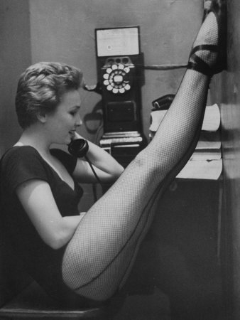
The booths are still there. With exactly the same heavy door, yellow tiles on the walls and little table. And even though the place of the telephone was taken by the modern computer you still get a feeling that if you come in you can hear those voices. The voices of the past.[x]

photo by Gordon Parks

[by Anastasia Starostenko]

A wrestling match

If de Amsterdamse School and de Stijl were to fight each other in a wrestling match de Stijl would totally kick de Amsterdamse School’s ass. De Amsterdamse School would be wasting time executing these beautifully choreographed moves while de Stijl would engage in some straight on pounding with it’s massive angular fists and totally destroy de Amsterdamse School’s ass. Then de Amsterdamse School would attempt to retaliate by trying to impress de Stijl through jumping around like a ballerina but like a true wrestler de Stijl would bellow out “None of this fairy Efteling crap!” And pound de Amsterdam School straight into the floor, leaving only some bricks in a beautiful brownish/red color and a perfectly square hole in the ground.

Doctors wouldn’t be able to restore de Amsterdamse School to his old self since the resources are no longer around. De Stijl however, would collapse some days after the match as it would turn out his sturdy build was way overestimated and so the next week’s competition would be between a Bijlmer “Honinggraad Flat” and a temporary complex of sea containers.

[by Sanne Hartland]

Typotecture


Wendingen Dudok-issue cover design by Wijdeveld • Hilversum Cityhall by Dudok
dive into the exiting world of Typotecture [x]

[by Casper Braat]
Architectura et Amicitia

The ‘Amsterdamse School’ is a interesting architectural-style and is partly als known by it’s social-aware approach. The style belongs to a neo-style and contains architects such as: van der Mey, de Klerk [known by his work ‘the ship’], Kramer, and others.

I think it’s interesting that the ‘Amsterdamse School’ does not only stand for architectural knowable realizations, but that there’s also a whole movement for furniture [tables, chairs, clocks, lamps, textile etc], and even the idea of a ‘typical type font’, > Amsterdamse School is everywhere.

Wendingen was a interesting magazine [launched by the group, Architectura et Amicitia, of architects, artists etc] and was mainly focused on the ‘Amsterdamse School’.

I see this style as organic and yet non-organic, same as that it looks formal and family-aware. It is all and non, and that strikes me the most.

[by Petros Orfanos]

My Little Time Machine

Being born and raised in Amsterdam and going around this city for 23 years I can still every now and then catch this utopian feeling by walking past the frozen canals in the winter or taking the ferry to the north part of the city by sunset, but I sometimes wonder what it must feel like being a tourist in my own city discovering new places and seeing things you have never seen before. The 5 minutes I spend inside the Scheepvaarthuis was the first time in a while that I felt this way. For this very short period, for just these 5 minutes I was a tourist, a tourist who stepped in a Time machine and was able to see inside a little part of her city from almost a hundred years ago.

[by Giulia Shah]

pelican + crystal + ship = Amsterdamse school

What made the Amsterdamse school style buildings so colourful was the rich use of symbols. Perhaps the easiest thing to notice was the inspiration from the nature in the structure of the buildings: flowing round forms (like a shell) or geometric forms (like a crystal). This gives the buildings a feeling of a living organism.

Then there are also sculptures full of symbolism. Sometimes they are telling the story about the building, like it’s function or it’s history. For example the Scheepvaarthuis is built in a triangular shape so that it looks a like a huge ship and there’s a lot of Indonesian style statues and sculptures to tell about the Dutch colony.

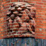
The funniest thing I saw were the pelicans in Spaandammerbuurt. One of the explanations that I found for a pelican as a symbol was that it is a sign for charity after a legend that the pelican pecks her own breast to feed her starving chicks with her own blood. Well, is this maybe something for social housing then?

– From nature to architecture and from architecture to printed matter –

[by Katje Hannula]

Een historische wandeling in een moderne stad

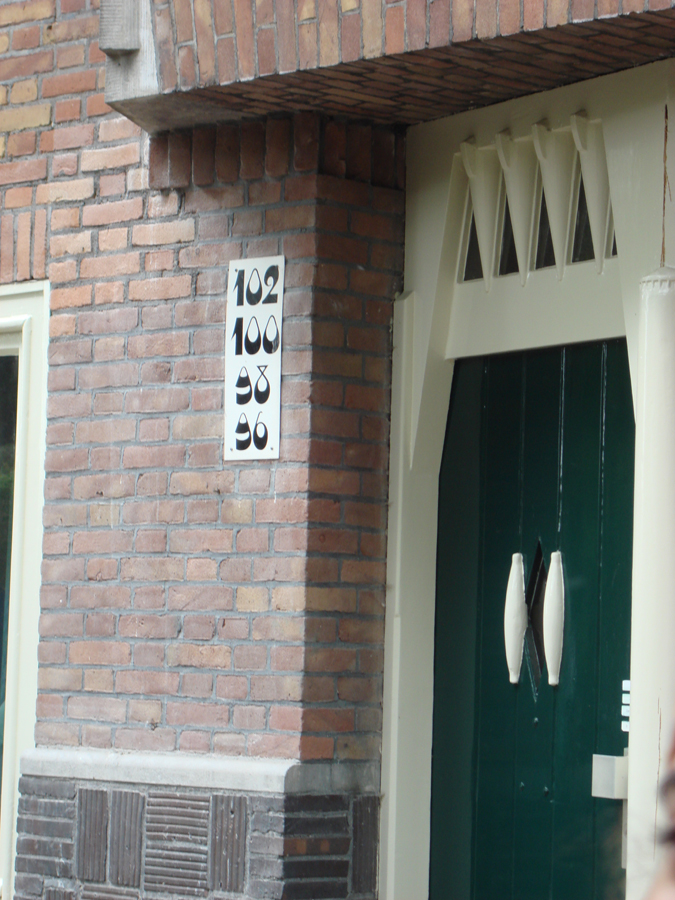
De excursie was een belevenis op zichzelf. De eerste keer dat ik zolang heb gefietst in Nederland en tegelijkertijd zoveel moest onthouden. Je leeft in het heden maar wordt omringd door het verleden. Gebouwen uit de negentiende eeuw of veel verder met hedendaagse bouwstijlen in hun glorie. Een vermoeiend uitstapje met interessante gebouwen zoals de Gerrit Rietveld academie die in de stijl van het modernisme is gebouwd met veel staal en glas. Het gebouw is een transparante doos terwijl je aan de achterzijde ervan massieve gebouwen ziet. De straatnamen die flitsen voorbij tijdens het rijden sommige heel duidelijke leesbaar o.a. Oost zaanstraat, Hembrug straat, Spaardammer plantsoen. Ik kan ook zien hoe de architecten mee gaan met de tijd: combinatie van oude bakstenen, glas, marmer, hout, enzovoort. Mijn hersenen proberen de tijd en de ruimte te bestuderen hoewel niet alles tot me doordringt. De hoeveelheid aan informatie is niet te verwerken. Ik wilde nog meer weten over het soort typografie, dat gebruikt werd voor de nummers van de gebouwen. De tijdschriften wendingen zijn heel uniek en hebben een heel diepe indruk achter gelaten. Ik zag ook hoe de verschillende architecten de stad tot eenheid wilde creëren ondanks de moderne gebouwen tussen de oude. Men wilde geen afbreuk doen aan de historie van de stad Het Olympische gedeelte dat alleen zichtbaar was voor me toen Henk erover vertelde. Door dit alles besef ik dat de exterieur van een stad ook aantrekkelijk wordt als je meer erover te weten komt.

[by Annemarie Daniël]

archi*-talent or archi-braveness

It really makes me wonder how is it possible that architecture differs so much every time you go somewhere . It happened to me in Amsterdam in even more intense way.
Amsterdam’s architecture for me personally is in a cartoonish style or like someone wanted to created imaginary world called “ let’s fit in here”.
I feel like there were not strict guidelines for building . People seemed to enjoy planning the city. No restrictions and open mind are definitely the keys of the

whole charm of the city.
Compare to Poland ( it was a communistic country for some time), our architecture is packed with straight lines and forms and it visibly dominates in large cities. It has a bit of sadness and harshness in a way you approach it and how you feel about it. Amsterdam posses flow of energy that comes and goes . It is a great piece of art in itself and even it is already artistic and feminine it wants to be even more chic by putting f.ex. typography on buildings, graphical images on pathways or even decorating the edges of the houses. It is all to make people’s lives here better to let the energy be felt by people living in here.

Another aspect that attracted my attention a lot is the way buildings from different styles are put together, next to each other. Are they any aesthetic limitations? Is it the way people make art – experimenting in a way, showing the contrast, behaving mad or just enjoying the weirdness of those different styles? Does it has to be clear why something stands next to other object? In my opinion and the best explanation that works for me is simply to intrigue people’s imagination, to let them feel special. What is more this way of building may not fit established rules but by not feeling “ as it should be “ it gives the reason for existence the city needs to posses. To inspire people , to disturb and to let you discover it. This is the purpose an architecture should serve to really strike your mind, excite you and wake up when you, still sleepy, go out to face the world. Just like an art.

* archi – trouble of endless movement of investigation

[by Agnieszka Zimolag]

Glass Windows

Mercatoplein is one of the Amsterdamse school constructions which developed through out and after the First World War as an architectural movement. Mercatoplein is influenced greatly influenced by Frank LLoyd Wright’s le Corbusier that was a project developing 5 years before the square was completed and is a good example of how a suburban space can be turned into a socio economical center where people gather and shop or eat.
What intrigued me most in the square was the design the of windows, because contrary to their small shape,their frequency of their repetitive pattern reminded me of simplified church stained glass windows.
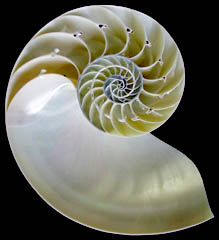
Patterns were indeed found in the window design of Het Schip by Michel Klerk as the top windows of the backside opened in a shape of semi spiral form could convey to the Fibonacci theory.
Sources: studiokoning, Amsterdamse_School [Wikipedia]

[by Claire Bamplekou]

SM Research@TS2


Thursday, May 19, 2011

Berlage’s secret

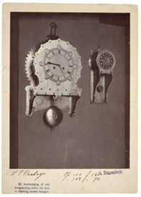
For the people that have a big interest in hanging clocks the reading about the Berlage clock could have been exiting, for all the other people it was three times nothing. People that are against the cut downs in art should turn their head and look the other way, because if you find out that someone that studies on a clock for a year and finally comes with nothing is probably not worth any grants.

It is wonderful that a museum gives a look inside their research department. The presentations on the Amsterdam School and the Gijs Bakker dress were interesting to listen to and even though both of the researches weren’t finished on the moment of presentation, both of the researchers could justify very well what they did. The presentation on the Berlage clock was about a failure, about a broken clock with no information to be found, about a lot of compromises with an not original and not working clock as the result. As a researcher there is a chance that you’re not much of a speaker but if you can’t prepare a presentation after a year maybe you should make the decision and keep it with only the presentation of the work itself.

[by Taro Lennaerts]

Influence of the collar!

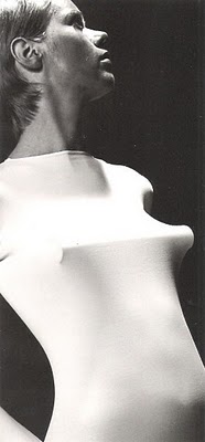
The radical design duo Gijs Bakker and Emmy van Leersum, famous for there futuristic creations, had there most sensational show in 1967 at the stedelijkmuseum. Not much remained of there fitting mini dresses with large metal collars, only one set of collar and dress survived and is now in the Stedelijk Museum collection.

At the time Gijs and Emmy’s works were not always appreciated and even considered instruments of torture by critics. Now 40 years later this new mentality in jewellery design founded by Emmy and Gijs is part of dutch design history and till today of great influence in designers works all over.[x]

rubber and metal collar by Katja Hannula and Giulia Shah, February 2011

[by Giulia Shah]

bijoux et le minimalisme

Emmy van Leersum's and Gijs Bakker's designs can be summarized as futuristic (similar > Pierre Cardin, Andre Courrèges) and conceptually groundbreaking (the ''unisex clothing'' > similar > Jean Paul Gaultier, Claude Cahun.)
The comparance of Courrèges's and Cardin's ''Space Age'' collection (towards Bakker and van Leersum) is intriguing and i was fascinated by the experimental jewelry (extreme sizes, unwearable, minimalistic and the Avant Gardistic approach.)

conceptually it's very interesting for me [according to the idea > jewelry without it's historical ballast and just a pure essence] and the awareness of exhibiting their works in a stable conceptual way, the free spirit thinking and the idea that aesthetics are not ''the main essence'' but that a concept is nr. 1 comforted me and made me feel challenged in several ways.

Equal [according >conceptual influence]:

Jean Paul Gaultier has a very similar way of thinking [reappyling gender codes, equality between female and male etc] and the idea of creating a unisex-line is fascinating. The idea's [according to groups, minority's, majority's etc] do remind me of Deleuze and Guattari. There is a equality [according to my aesthetical approach] according to Stanley Kubrick's 2001: A Space Odyssey [Djinn Chair by Olivier Morgue], Wiliiam Klein's ''The Model Couple'' and the ballets of Hans van Manen.

All by all; this similar approach has nothing to do with ''being similar or comparable'', it just has to do with the moment and the things that seemed equal [could be through a feeling, a aesthetical view point, etc.]

[by Petros Orfanos]

Share Our Stories

”After three hours of listening to lectures about design and designobjects everybody was a bit bored. This was not because of the content, but about the way it was presented and the retorical skills of the speakers. But see it from a other point of view than only the level of entertainment. What is the importance of art/design research and making it available to the general public? In my opinion it’s a opportunity, that it is made accessible, for everyone that is interested or wants to participate in preserving/documenting history. Cause this is what we saw. Not a great story, but people asking for help to make a great story. If you think about this, there is still a lot we need to find out to complete it. After a certain amount of time information gets lost and also the possibilities of creating a clear picture about history. Today some of the stories might be boring or uninteresting. It even can stay that way, but when times goes by it can become relevant and important. It is not up to us to make that judgement, but for later generations still to come. For now we need to search, share and organize information. So everybody has the same opportunity, like us, to access our history in the best way possible.”

[by Herman Paskamp]

obsurbed by research

Quite interesting to see these curators completely absorbed by researching one subject. Information was given about the 1960’s fashion of Emmy van Leersum and Gijs Bakker, the Amsterdamse School and then there was some dribble about the restoration of an old clock. In the following text I will focus on the first of these subjects.

It was compelling to learn from Marjan Boot that styles of dressing that are now totally accepted (a woman wearing pants) or trite (a jumpsuit) were completely groundbreaking back when van Leersum and Bakker gave their (apparently legendary) fashion show. Little proof that the show ever even happened remains today, so the curator explained her challenge was to represent the fashion show’s relevance and atmosphere in an exhibition with what little information and material was left of it.

My problem with this is, it’s not really possible to translate the excitement of then into a gallery now. If you exhibit remains of a fashion show in a museum, you will always be hindered by the limited possibilities. No matter how much information and material you collect, it will still come down to some text on the wall, dressed up mannequins behind glass and maybe (how exciting!) some moving pictures and sound on a screen. I’m not saying it shouldn’t be done, just that it will surely be disappointing experience to anyone expecting something as edgy and provocative as the original fashion show.

It will probably be a nice sunday afternoon for anyone who was young and hip and probably wealthy (and probably still is, rich bastards) and really with it and happening when it was still 1967. They will be reminded of the olden days and for them, but only for them, it will come alive again. Then they will go home again and read some Gerard Reve while smoking a pipe and listening to Vivaldi or whatever, after which they will go to bed and probably die in their sleep. God why don’t all these old people and curators just die already.

Unfortunately the tape Ms. Boot located with the music of the show was not yet in her possession so we did not get to listen to the pounding beats of early electronic music, which frankly excites me more than fashion.

[by Senne Hartland]

Liza on ‘over de jurk van Gijs Bakker’

It was in 1967 that a sensational show took place in the Stedelijk Museum. In this show futuristic creations of Gijs Bakker and Emmy van Leersum were presented, among music from Karlheinz Stockhausen. Only one dress remained, still I do think they have quite a elaborated idea about what the show must have been like. Marjan Boot, the conservator leading the research, put forward that she wanted to know (even) more about the show in order to find a way to present it in this time. I don’t actually know if she’ll ever know enough to get the right ‘feeling‘ back. I know this sounds vague, but since we’re not living in the sixties there’s no way we can present the work in the same way, or in another way but grasping the same ‘spirit’, as back then. Some things are just great because they happen at a certain place in a certain time, and we can’t bring them back. It’s a bit like childhood memories; we want to re-encounter them, but we will never succeed. Maybe this quality of time in relation to ‘memories’ is what make the ‘memory’ even more valuable.
So my advice is don’t try to hard to make people re-experience a faded memory. (I don’t want to say that you shouldn’t present it, but do it in a simple way, just pictures and the dress, and don’t be disappointed to hear that people didn’t ‘feel it’ )

[by Liza Prins]

DeBazel


Thursday, May 19, 2011

On Chaos, Fine Matter & The Immaterial.

From a Theosophical point of view, the whole body of the Stadsarchief Amsterdam represents the three basic evolutional stages; chaos, fine matter and the immaterial. The dark, syenite foundation of the building signifies the lowest level of cosmic evolution from which all forms emerge. From the solid base rises the concrete skeleton hidden by the façade of interlaced yellow bricks and purple granite. To the Theosophist yellow is equal to gold and represents the sun and male cosmic power, the purple symbolizes the moon and female cosmic power. In this sense the façade realizes one of the most important principles in H.P. Blavatsky’s (founder of Theosophy and the Theosophical Society) work The Secret Doctrine; the cosmic creation rising out of the chaos. This is called the fine matter or Svabhavat. Finally the massive glass roof that rest on top of the building, letting the light reach all the way down to the central court embodies the spirit or the immaterial. The immaterial is the highest level of cosmic evolution and brings everything to life through astral light (imagine all the employees working on the ground floor of the building still being able to get a glimpse of sunlight). This brick spekkoek is not just a fireproof vault; it is the manifestation of cosmic evolution.

[by Olga Nordwall]

Light in ‘De Bazel’

Bazel’s unique architectural form was greatly influenced by the American architect Frank Lloyd Wright as it conveys a feeling of harmony and balance, with hidden religious influences in its simple organic form de Basel achieved to combine modern architectural ideas with ancient archetypes.
The glass ceiling of the building creates a sense of transparency as it leaves space for an everlasting game between light and darkness to be played within its chambers. In de Bazel sky is the lightest element of the building nearly unreachable source of luminosity then you have the last floors escalating like Japanese rice fields, 3 floors down , allowing thin air occupy most of the space in between. As you go down its round stairs the light becomes dimmer due to the stained glass that covers the windows, leading to the basement of the building where light slightly becomes less and less as you go further down, until the only source of light is artificial, asphyxiatin (being smothered) between the close walls of the basement, the spaces become smaller and the air thicker.
From the outside de Bazel seems like a close fortress contrasting with the true inner nature of the building, containing hidden beauties and mysterious qualities, stands and talks for itself as the great architectural piece that it is.

[by .............]

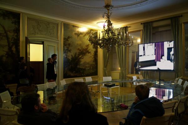
Checkout that amazing table.

I wanted to write you something about the amazing table in the Italian room/italiaanse zaal in de Bazel but I could not find any information about it from the internet and I missed the name of the designer, help me out please!
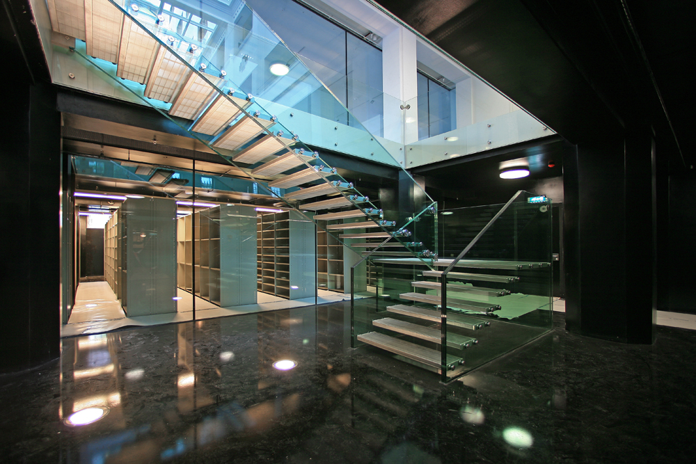
I think the contrast of something so modern with the rest of the room (18th century style Italian landscape murals) is a very cool effect. Since the weird Italian room quite stands out from the whole building and it’s style, placing such a minimal design table there was a brilliant move who ever then did it in the later years. I also had to think about a connection to the glass stairs (by Claus & Kaan) down to the archive that the guide was so enthusiastic about.

[by Katja Hannula]

Amsterdam City archives

Amsterdam City Archives was first built to be used as a bank, and it was not until 2007 that the purpose of the building changed to host the city’s archives.
The building was designed in 1919 by de Bazel and was finished at 1926, three years after de Bazel’s sudden death.
Its unique architectural form was greatly influenced by the American architect Frank Lloyd Wright as it conveys a feeling of harmony and balance, with hidden religious influences in its simple organic form de Basel achieved to combine modern architectural ideas with ancient archetypes.
The glass ceiling of the building creates a sense of transparency as it leaves space for an everlasting game between light and darkness to be played within its chambers, the glass ceiling also supports the contrast between the inside-outside impression since when you look at the building from the outside it gives the feeling of claustrophobic space but in contrary to its illusive form when you enter the space a feel like you re in the middle of an open space.
The building was officially declared as a national monument in 1991 for its distinctive formal values by the Dutch government.

[by Clair Bamplekou]

Balanced architecture

Amsterdam Archive building. A creation of Dutch architect Karel de Bazel in which each and every measurement and size are dedicated to the proportions of the human body. However the architectural tradition which seems quite unique for that period, takes its roots back in the ancient times…

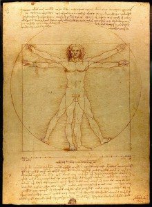
The philosophical approach, formulated in 5th century BC by the Greek philosopher Pytagoras, stating that “Man is the measure of all things”, was further developed by the Roman architect and theorist Vitruvius, who created a famous code of human proportions, describing how a well-built man fits with extended arms and legs into the most perfect geometrical figures (circle and square), which was supposed to be the basis of temples and churches of those times to be able to give a person a feeling of balanced architecture.

This principle greatly inspired Leonardo da Vinci, who in the 15th century made a famous drawing of a vitruvian man as an attempt to relate human body to nature and architecture, as well as trying to define the ideal Renaissance church.

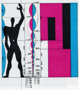
At the beginning of the 20th century, continuing the research of da Vinci, Le Corbusier created his modular, an anthropometric scale of proportions, based on the height of man with his arm raised as an attempt to discover mathematical proportions in the human body and then to use that knowledge to improve both the appearance and function of architecture.

In his own way, based on theosophical approach, de Bazel also set out in search of universal harmony and balance for his work on the Archive building. In the lay-out of the building he used a raster of rectangular’s of 3,2×3,6 meters, in other words 8/9×9/9, which reflect the proportions of the human body with and without head. A result of it – a building, which feels comfortable, inviting and truly made for a human-being!

[by Anastasia Starostenko]

personal architecture

What is fancy about building De Bazel designed by Karel De Bazel is the whole ideology he put into forms, patterns, outlays and finally the facade of the whole construction. He believed in harmony and balance in life so its projects, expressed his personal feelings and confessions. Noticeable is how every detail has been refined and his travels to Indonesia rebounded imprint on the inside of this building here. I liked the idea concerning the architecture as a bridge between cultures, beliefs. Coming into the building, despite not knowing the architect's plan was to feel the atmosphere of stability and peace. It seems to me that you have to have an amazing sense of form to achieve this effect. It is almost like being a good psychologist. Because of the openness of architect’s mind the building he constructed could be very easily called a place of a surprise and admiration but also curiosity. Indeed, when you keep moving between the rooms, halls, you almost get an impression that you are in a museum. The idea to place the archive there is the more accurate and suits his concept better than it did for the bank that was originally there, I guess.

[by Agnieszka Zimolag]

Bazel Civilization

The Bazel is not only a building, but also furniture! I had been visiting the Bazel before, but this time the guide was putting a particular accent for the furniture “designed by De Bazel”. Not only tables and chairs, but also coffee cups, inkwells, the colors of the walls. Everything inside the building was made on purpose to fit in the building and consequently I imagine the people looking like the building too! I personally find really contemporary the idea of making such big project and follow it from the beginning until every final detail (or almost, because Karel de Bazel was dead in 1923, just before finishing the project). A “total” architecture that keeps together the whole environment inside it. It makes me imagine at the creation of a new civilization where all the tools are thought in a way that consequences and growth are predictable. It sounds science fiction, but it’s what happen when design is perfectly designed. In the Bazel furniture, colors and objects have differences depending on the level of importance of the person they were  made for. Most of the differences are details that say “we are almost the same, but my chair has a more comfortable seat” or “my table is bigger”. That’s why the hierarchic system of the bank, De Bazel designe, required respect and strict definition of roles. This is not difficult to understand for that time (early ’20s), but weird to realize in the proud voice of the giude talking about “the desk set for the president manager, a bit more black of the others desk sets, designed BY DE BAZEL”.

[by Sara Cattin]

De Bazel

Vijzelstraat number 32. the front of this huge building is covered completley with construction frames. Workers are shouting.

Karel de bazel is responsible for this.

Enter the 1920s. Look at this beautful wooden floor! Elegant white. Sunflooded. A sealing out of glass.

„karel did this all by himself!“ i love our guide, she fits the building.

Shocking from the outside and so sensible from the inside, like everything in this cityarchive; the cellar, massiv tresor doors.

Esotherik painted sealing.

„ de bazel designd everything in here, thats a gesamtkunstwerk!“ „ de bazel designd everything in here, thats a gesamtkunstwerk!“ i love our guide.

But she loves karel.

Black marmor. Dark green walls. Thats the chef etage. Now a days you can get married here.

This going back way back into time. 1920s and stylishe lightswitches. De bazel is a craftsman he knows his bussines. This is love for the detail.

He died before the building was finished. True romance. he would be proud.

I am.

[by Martin Kaehler]


Log in
subscribe