Books. They are there. Just there. As long as I can remember. Starting with Maan, Roos, Vis (Moon, Rose, Fish) and Wie heeft er op mijn hoofd gepoept? (Who shitted on my head?), learning the alphabet, learning how to read. But there is another way of looking at books. a total different kind of books. How does the book look like and why. Why is it done the way it is, why does it work this way and why did they do it.
Design.
When we were looking at the books in the library of the Gerrit Rietveld Academy, this was the book that got my attention. “Boy Politics”. It’s the color of the cover I saw at first, the grey, green color. Typical Rietveld I would say. Now when it’s lying next to me in the room, it’s almost like camouflage against the wall. Maybe this color is something we inherit from the Rietveld because the designers of the book, Anton Stuckhard and Andrea de Sergio both graduated last year at the Rietveld from the Graphic Design Department.
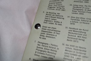
Second thing you see: the way of binding. Screws. Good combination with the title I would say.
Boys. Strong. Screws. Politics. Connection.
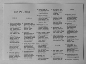
On the cover there is only text, 5 narrow columns next to each other. The title is pretty clear in a simple fond. The cover is the index of the book but on the same time every number in the columns is related to another book. The front and the back cover page form the index together. Because it’s simple and clear you get immediately a lot of information. There are ninety-one numbers, relating to the other books and twelve different themes.
Science. Education. Work. Family. Hygiene. Sport. Media. Art. Sexuality. Murder. Music. Fight.
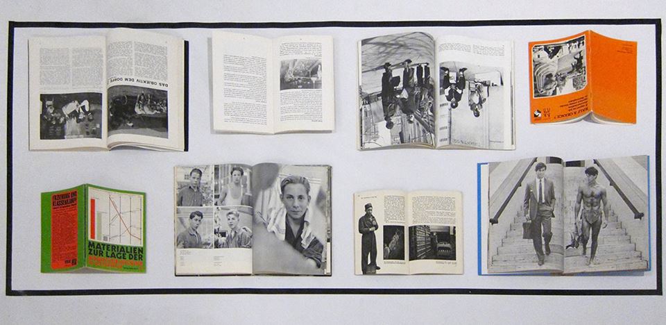
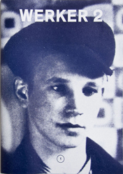
When you turn the book around there is in the right upper corner a small text. It tells about the makers of the book, they didn’t design the book but they designed the presentation from which the book results. Marc Roig Blesa (2009, VAV, and Rogier Delfos. They work also together at the “Werker” Magazine. It’s a contextual publication about photography and labour that inquires into the possibility of formulating a contemporary representation of work [link]. While reading the small text you find out that the whole book is made out of ninety-one other books, the other books related to the numbers on the cover. The pages out of the books they choose are a visual essay analyzing the historical and still present instrumentation of the figure of the boy. All the books used are from Roig Blesa’s personal book collection, published between 1920’s and 1990’s. These books were presented at the Rietveld Library, organized in conjunction with the Marginal studies, a workshop by Marc Roig Blesa and Rogier Delfos at the Graphic Design Department. In the vitrines they presented the different books, opened on the page you see now in this one. So in a way, the design of the presentation was determent for the book. In between the different subjects there is again a thin paper with the index on it. All the books in the vitrines had a number, these numbers are the numbers related to their place in the index.
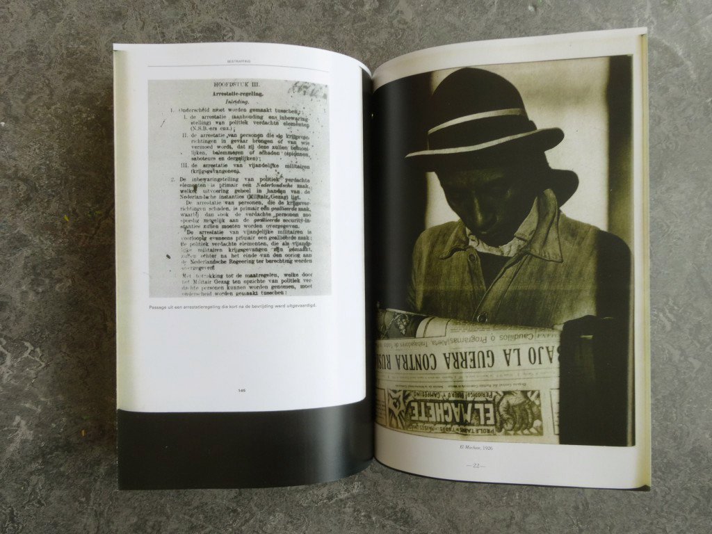
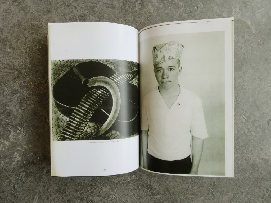
The pages are printed on a bit bigger than A3 format, but they are folded in the middle so the size of the book is kind of A4. The folding of the copied books and the folding of the A3 paper isn’t the same. It’s done that way that the left page of the first book becomes the right page of the new book, and so they form a new page with the second book. The difference between the images is very nice, they change from black-and-white into color and back again. Because it are all copies from the old books, they couldn’t choose them self which images would be color or black-and-white, but the rhythm in it is great. On the side of the pages you have a folding line and not a cut, you can open the page and see the copied book page in total. When you flip one page, you have two different books next to each other but that’s something you almost don’t recognize.
The different size is what you see immediately but the subjects are the same. Also the switching between text and images makes it interesting to look at. On the top of the page there is on every page a small white line and on the bottom there is only black. Just to make sure that you see that it all are copied pages. Reading for me was a bit harder because the language of the books is various. German, English, Spanish, Dutch.
The image language in the book speaks strong, for me at least. The way the different books (Werker and this ‘catalog’) were putted together, forming a relation, made me curious how the rest looked like. Because the text that’s on the pages isn’t complete, you mainly focus on the images. As said before, a visual essay. While relating to the year the books are made and the photo’s it was for me a playful and inspiring way of trying to understand a bit of the boys history. The size, the weight, the coloring, the screws, the simple idea of only photocopies turned into a book, makes you want to hold it in your hands and really understand it.
In a way I think that the designers of the exposition were the main designers, they were the ones who provided the inside of the book and related the images. But without the strong outside it would have remained only a temporary presentation. The designers of the book found the perfect solution in translating it.
