« The library is unlimited and periodic. If there were an eternal traveler crossing it in any direction, the centuries would eventually teach him that the same volumes are always repeated in the same disorder». These thoughts from Borges’s Fictions often influence my mind when I’m searching for a book, where it seems that your choice will always be part of a gigantic spiderweb.
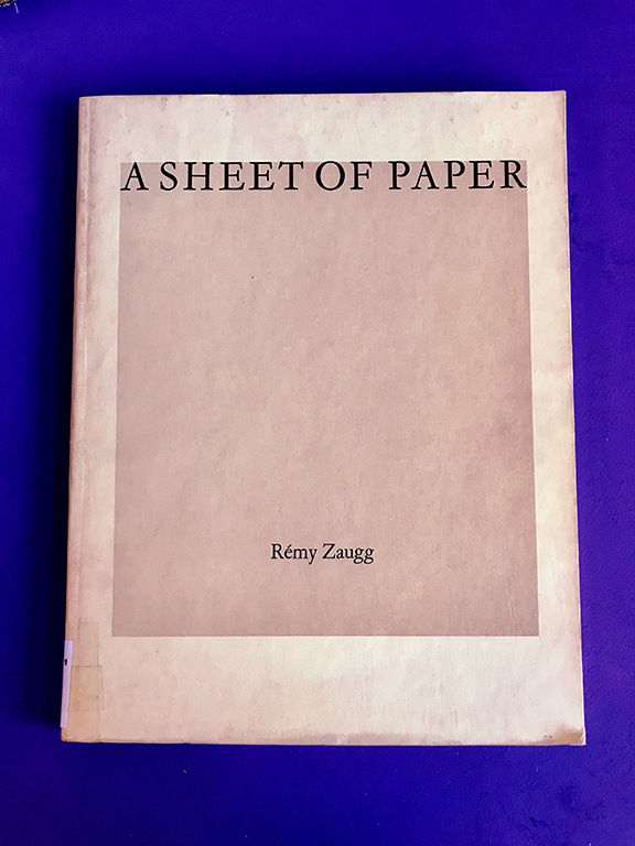
“>The title « A sheet of paper » and the name of the artist, Remy Zaugg, appear centered, in a Times New Roman font. The book, in a rectangular format (23×29.5), has a hard cover with a plain pale ocher background, accompanied by a gray square in the center that hosts the title. At first glance, A sheet of paper does not appear to sollicitate any attention, without breaking away from a very classic aesthetic regarding exhibitions books.
I thought I should reconsider my choice, even if it attracted me, for some other book, with a more modern, singular or attractive design. However, this book then seemed too willingly simple, hidden, to be just let on the side.
By offering another look at it, I could then notice singular formal protocols that unravel, through visual variations and repetitions, the boundaries between the so-called informative and artistic content. In fact, A sheet of paper has been designed by the artist and his wife, and can be considered as another piece, or a prolongation of his works : on the second page, we can see written « This book as well as the reproduced paintings were produced in collaboration with Michèle Zaugg », exhibition photographs are made by Hans Biezen.
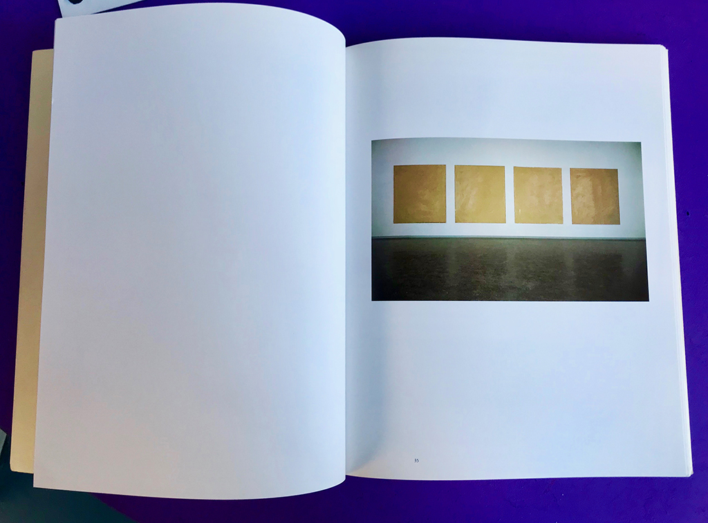
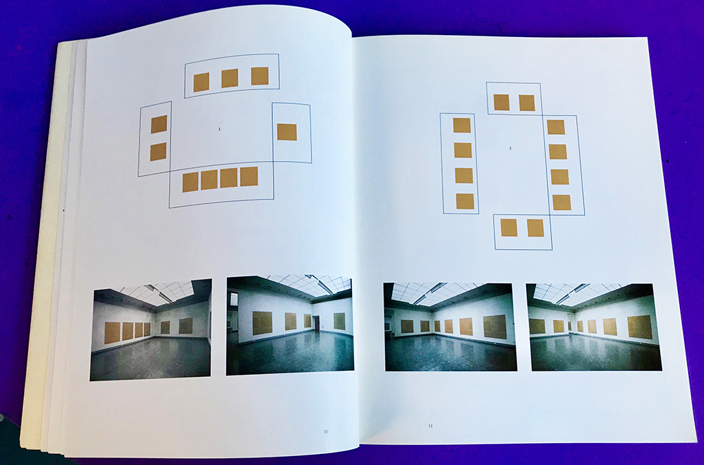
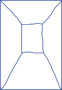
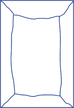
While opening the book, I could discover that the large ocher pale square from the cover multiplies itself in various ways : in the artworks presented, as in the architectural plans of the exhibition that are presented above the photographs, and many other forms.
In fact, Remy Zaugg’s artworks are large pale ocher canvases, and we see the m spread in different forms in the book. They appear sometimes photographed singularly : one big square taking a whole page, existing only in the space of the printed page with the white backgroung. Or, they also appear in an exhibition context (from Zaugg’s solo exhibition held at the Van Abbemuseum in Eindhoven, from August 31 to October 7, 1984.) Finally, they appear in their more abstract form with the different architectural plans that repeat as well the square structure. Thus, these artworks are existing in various forms on context (scans, photographs in exhibition, modeled), creating an effect of echoes, transmission, of this simple ocher square. You cannot discern a proper delimitation or annotation that intervene to say ‘this is the artwork’ and ‘this is the research’. The design seems to be confusing on purpose, to delete the boundaries of the classical artbook and offer something closer to experiment. Then, we can notice that the whole book is designed through an iterative process regarding this pale ocher square, that disseminate itself in every element presented.
The same visual phenomenon is present with the textual content : the text takes place under the same fonts in the artworks as in the information shown. Even if it’s still pretty classical (most of the text content is centered, justified, in a times font), the fact that it appears through different layers contributes to this repetitive visual process that ponctuates the whole book. The title « A sheet of paper » appear different times in the book, in different sizes and font.
These variations of patterns and games between the information and the artistic production creates confusion but then but at the same time they offer the possibility to approach as closely as possible Zaugg’s work. Indeed, all of his work is a reflexion on the absence, the disparition through the « banal » in art. The book A sheet of paper appeared to me entirely trivial at first sight, offering no necessarily different aspect. Yet, it is not the peculiarity of the elements presented that makes it a singular object, but the work accorded to visual rhythm, repetition, variation. It is the relationship between the elements that becomes interesting, where the repetition of extremely banal things suddenly creates a particular set. A contraction between the particular and the general. All of my research focuses on the possibilities and appearances of different forms of rhythm. The choice of this book makes me feel even more at the heart of this spider’s web, ponctuating and creating echoes between every choice.
Remy Zaugg: A Sheet Of Paper. design by the artist, Rietveld library number: zau 1
