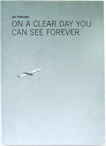
To be honest, nothing in particular made me take this specific book out of the shelf. Had it not been sticking out of the shelf already I probably wouldn’t have noticed it among all the others. It has a simple glue binding and is the size of about a standard sketch book, between an A4 and A5. The cover is a photo of a grey sky with an airplane, so the whole book is covered in a grey hue. But looking at it a bit closer, I started noticing the little details that made it a bit more interesting. The title on the cover of the book is actually not a standard font like I initially thought, but each letter is instead hand drawn from a squiggly line. A hand-made detail that’s not easy to catch on the first glance. The book is filled with diary-style texts, simple line drawings and black-and-white photos. The drawings are often of a little character, possibly a self-portrait, with funny captions. The drawings were the first things I found interesting, before I started looking at the layout and the design. The photos are most often centered on the page, but sometimes allowed to fill the entire space. They also often appear in pairs, or corresponding to a text or drawing on the opposite page. The layout was probably meant to work within each spread rather than just the page. There’s also a lot of white space still allowed on the pages. This allows the book to not feel cluttered and overwhelming. Although to be honest, nothing about this book gives an overwhelming feeling. The muted grey cover and the photos inside that are all black-and-white give the book a sober impression. One thing that sticks out is the choice of font. At first glance it looks to be a regular font made out of hand written letters. But looking closer at the different ‘e’s and ‘g’s and ‘f’s, I realized that the whole thing is probably hand written. It is however way too neat to be convincing as his actual hand-writing, but is something I found interesting enough to further research.
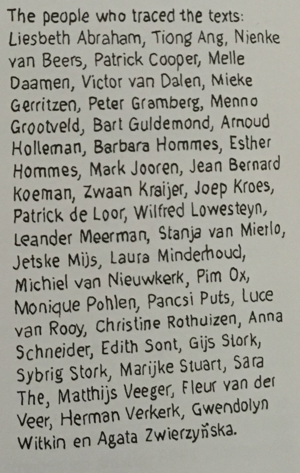
Looking into it more, I understood that the book is not hand-written but actually hand-traced over a printed copy of the text. If this is more or less time-consuming than just writing the entire book by hand is hard to say. But I do think it gives the book a softened appearance with it still being readable as the lines stay quite neat. Here’s an example of the traced text:
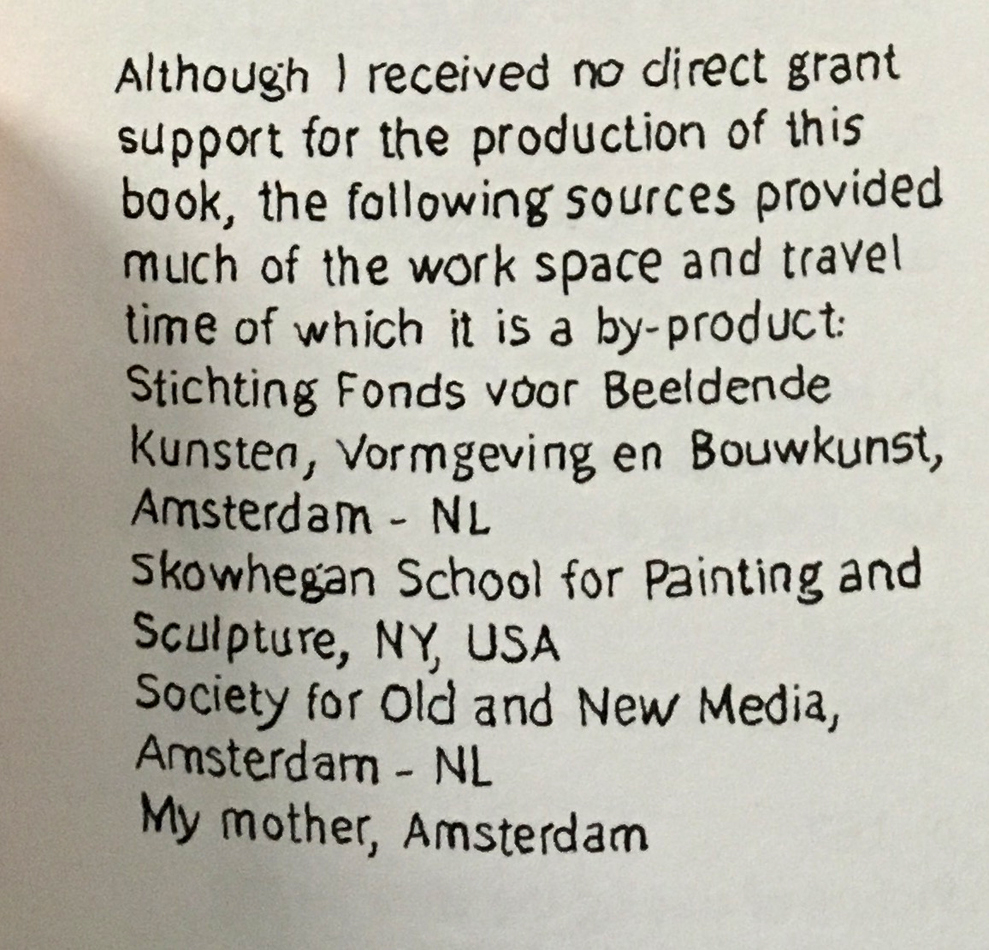
However I’m not sure if the (in my opinion) minor interesting effect it has on the appearance of the book is worth the time and labour needed to accomplish it. Since this is quite an odd choice of design and not something that I’ve come across before, I wanted to contact the designer. The designers of this book are the artist (Jan Rothuizen) and Armand Mevis. He is a renowned graphic designer part of Mevis & van Deursen, a well-recognized graphic design-duo in the Netherlands (although they received a lot of criticism over their design of the new logo for the Stedelijk museum). I e-mailed Armand Mevis and asked about their decision to hand-trace all the text in the book. What I primarily wanted answered was “why?” but the reply i got only answered the question “how?”. Armand Mevis told me that Jan Rothuizen had initially planned to trace the entire book himself, but it turned out to be too much work, which is not very surprising. So instead, he invited some friends to help him. In the back of the book there’s a list crediting “the people who traced the text”. The list contains no less than 40 names, and the whole project apparently only took one full day.
I found out that there are a lot of interesting people that contributed to this book by tracing the text. From art conservationists to the previous head of the Design department at the Sandberg Instituut and of course several artist, designers and gallery directors. I also tried to hand-trace a printed text myself to see how long it would take for me. I didn’t get very far as my hand started cramping after about 25 minutes. In that time i managed to trace about 2/3 of an A4. Needless to say I was very disappointed with my performance, and it’s understandable that Rothuizen decided against tracing all of the text himself.
I’m usually one to appreciate any added “handcrafted” component, especially in printed material like books. But I am having a difficult time justifying the time/effort vs. the result in this particular case. Although I appreciate the bold choice to do this and I do think it looks nice, I am still asking myself “was it worth it?”. I could easily have gone with just a hand-written font, or any font for that matter.
Jan Rothuizen: On A Clear Day You Can See For Ever. design by Mevis & van Deursen, Rietveld library number: rothu 2


