Sunday, April 5, 2009
New Tags for the Rietveld Library:
How do you find interesting books when you don’t know what you are looking for? How do you stray through the collection in search of inspiration? Can the library catalogue help you or do you better construct one yourself, Exploring connections in the library between design- and artbooks, students created keywords/tags that linked them together.
a recount of tagging the library
Click the keywords/tags from the Tag-list [purple column at the left] to see all related postings, or use a yellow keyword link [below] to read the postings and experience how they are connected together. Use these keyword links to navigate between the postings!
overview, freedom, animal, elder, identity, intervention, repetition, connection, tattoo, self sufficiancy, structuur, illustration, pyramid, leader, visual language, individuality, playground, best, give, beeld, independent, shelter, West Coast, time, neon, develope envelope, fragile, construction, wisdom, invention, oppervlak, culture.
By Henk Groenendijk
/ Categories: Subjective Library 1 Tags: animal, beeld, best, connection, construction, culture, develop envelope, elder, fragile, freedom, give, identity, illustration, independent, individuality, intervention, invention, keywords, leader, library, neon, overview, playground, pyramid, repetition, search engine, self sufficiency, shelter, tagging, tattoo, time, visual language, west coast, wisdom
No Comments
Wednesday, April 1, 2009
“Vorm van sculptuur” is on mine opinion a sculpture about sculptress like Marenne Welten, Anne Auloos, Inge van ‘t Klooster, Mia Trompenaars , Melanie de Vroom and Marenne Welten.
It’s a collection of small books form each artist.
Based on what i am seeing from the inside and outside of these small books,
i would say that they are showing fragments, details, sketches of the works.
The most interesting picture of the work of Anne Ausloos is for me one of her paper works from 2009. The reason why this photograph is so interesting to me, is because it brings questions and the form is funny.
what does the object represent? is it solid, is it edible, is it a sandwich?
if i talk about Inge van t’ Klooster i am talking about the most not attractive works of the whole group. i am basing this sentence on my taste and not on the quality of the work. the reason why i don’t find it attractive is because the massiveness and the darkness of the work. The Virtual work that she made with Martin Riebeek called “Between you&me” is interesting to me because it’s an outside platform for digital art. I think that this is a funny way to involve people in art. You could say that it’s performence art.
Anne Ausloos, 2009
Inge van t’ Klooster and Martin Riebeek
cat nr:726.8
keyword: best
Thursday, March 26, 2009
1. if you are searching for the best way to walk clumsily with a book, take this one.
2. if you want the best book for architecture of 21 century.
3. if you are searching for a book that is 4 kilos, this is the best choice in the library of the Rietveld Academie.
4. this is the best book if you want one that probably will not fit into your bag.
5. if you want to have a book that is larger than A3 format and if you open it, even larger that A2, then this is the book .
6. if you want to know everything about the architecture of 21st century, this is probably the best book for it.
7. if you want to carry a book that makes everyone say ” wow, a big one” this is the best choice.
8. if you want to find out more about this book, the best way to do that is to go to the Rietveld library and search . .
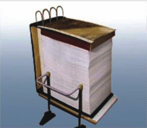
cat. no. 715.9
keyword: best
Thursday, March 19, 2009

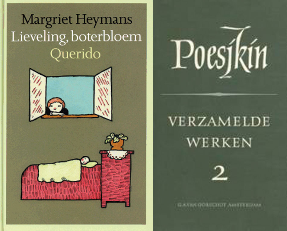
Although this is a completely black book, this book represents the best book designs of 1988.
The design of the books is simple but elegant. Just with the name of the author and the title of the book. Some designs make use of illustrations. There is not much use of different colors. Mostly, two
or three colors on one book. The designs of the books that are the most attractive to me are those with a simple choice of typeface , that represents just the basic information of the book.
For me the most attractive design of he book is the one that uses very light colors’ for illustrations. Although I already said that the most attractive books, for me, are the ones that use, just words for the design, I found this design the most fascinating in the collection of 1988 because of the simplicity of the illustrations that make the book very stylish. It’s a children’s book of Margriet Heymans “leveling, boterbloek Querido”. The book that is less attractive to me is the book of Poesjkin “verzamelde werken 3”.The reason for that is because of the use of, on my opinion, hideous use of the teletype and large font for his name. The color of the book is dark green that is used a lot in the design of books from that period. Although I like the simplicity of the design of the books from that period, this specific green is not attractive to me at all.
cat. no. 758.3
keyword: best