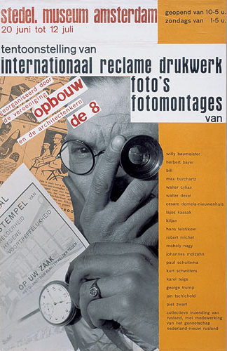
Berkel Ham from Berkel LTD. Rotterdam (1928) By Paul Schuitema.
In the Stedelijk’s permanent design collection, I chose one of Paul Schuitema’s posters. Paul Schuitema (1897-1973) is a Dutch graphic designer who also designed furniture, practiced photography and typography. He constructed his advertisements on the principles of De Stijl (more mathematical, abstract and simplified, when compared to previous styles) and Constructivism (as art had to contain social means). El Lissitzky’s ideas, as well as Rodchenko’s (his way of using new angles in photography – such as from high above or down below the subject) influenced him in the design of his industrial advertisements. Those same influences can be found in the works of his colleague, Piet Zwart. Repetition, geometrical forms and the use of primary colors are used in a similar way in both their posters. Paul Schuitema lived during the time of industrialization and of mass production after World War one. These periods can be felt in his poster and the subject chosen.
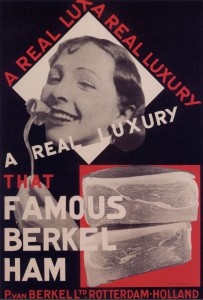
He started to use Photomontage in 1926 and was one of the pioneers of this technique in the field of industrial design. This poster is an advertising print for food processing industries. It was situated amongst others of his in the Stedelijk’s Design collection. It was explained how photography, not yet considered as an autonomous art, was used for another medium’s finality. Photography was newly used in the 1930’s in order to bring further other types of art.
This is what first appealed to me when I encountered this poster. It felt relevant to our times and to how projects are now executed. More and more of final projects aren’t only constructed of one medium. For example photography is rarely a finality in itself, but a way to get to an other specific result. This new technique of photomontage is relevant to our time in that way. In projects and art works, the medium used is now rarely thought as a finality in itself.
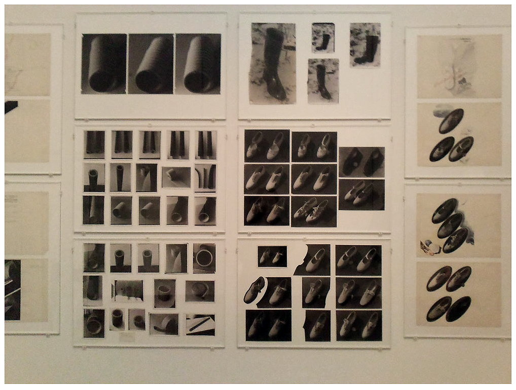
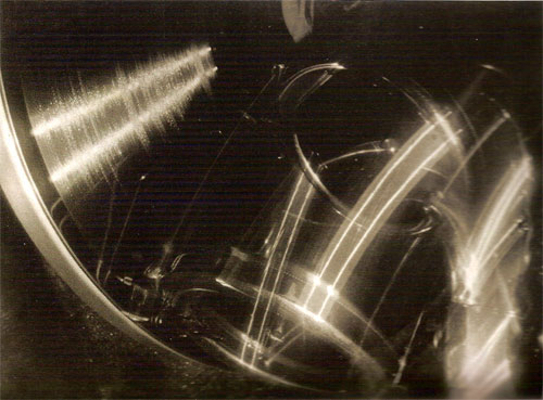
This new technique and his influences can be noticed in other posters of his:
Primary colors, the use of photography, repetition and new angles as from high above or from down below are used in this second poster as well. Here is another example of his colleague’s, Piet Zwart’s, work, which is closely related to his:
After paying attention to Paul Schuitema’s poster (the first example used) – It’s design qualities and it’s historical position in the development of arts – I looked at it in it’s original function. This poster was designed in 1928 as an advertisement for the Berkel Ham industry. This subject, presented in the poster, actually takes over its technique and style. It appealed to me more when I tried to look at it in its original context.
Food nowadays is still advertised everywhere, however the energy coming out of them feels different. Therefore, I started to question the accuracy of this poster, for us today, on that matter. Food and its industry is a constant subject today – where it comes from, what is in it, how we eat it, how to eat in a balanced way, the products used for its production… The worry of how we feed ourselves could be considered as one of society’s current obsession. Seen from this point of view, this poster underlines the change of perception we have of food, from the 1930’s to nowadays.
The typography, the choice of photography, and the way the whole poster is disposed, gives me a feeling of playfulness and simplicity. A feeling of innocence almost emerges out of it. As I looked through other food advertisements, of different syles, the gap seemed even more clear:
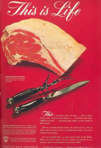
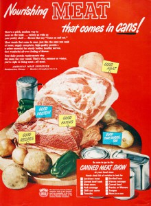
These posters were used as advertisements in the 1940’s and 50’s. Sentences as : « This is not just a piece of meat … this is something a man wants to come home to … something that helps children to grow … something that makes women proud of their meals », were used. If these posters were contemporary, they could almost only be received in a satiric way.
Based on the same principles of photomontage, the Dutch group of graphic designers « Wild Plakken » (1977) created posters with a specific social and political goal. They chose clients according to their ideological means. Their belief that a designer had to use his graphic designs in order to mix life to art related to Paul Schuitema and his influences of De Stijl and Constructivism. They illegally pasted posters in Amsterdam, fulfilling this idea of spreading their ideals. Women rights and racism are some examples of subjects they would portray in their posters.

Some of the same principles of Paul Schuitema can be refound in the esthetic of this poster. In the same way as in the Berkel’s ham industry poster, a different feeling appeals to me. This example of the Wild Plakken’s poster doesn’t recall innocence, but still gives me a feelling that such an image on such subjects, today, is not as easily disposed for everyone in the city. It is interesting to see how, through time and the development of one technique – such as photomontage – these posters still give a feeling that a gap has been created. Paul Schuitema’s poster and this one example, still give me the impression that this type of expression is less accessible to everyone nowadays.
On the subject of the portrayal of food through images : Andreas Gursky’s photo « 99 cent » (1999) states a point of vue which completely contradicts with the posters above. Without giving us a direct position to take towards this subject, Andreas Gursky still pushes a feeling of being overwhelmed and crushed under the overtake of food industry. The feeling is completely contradictory to the one Paul Schuitema’s poster gives us. Both art pieces are thoughtfully structured but opposing themselves in their function.
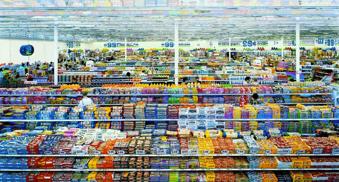
They are however hard to compare as one is an advertisement and the other, a photography piece. I used Andreas Gursky’s photography as an example of what continuously changed our minds on the food industry. It is pieces of art as this one that put us aware and more distant from the advertisements we see. The opposition of those two examples, in the way they apply photomontage, can maybe explain the gap that I feel in the feeling those images give. As one (Paul Schuitema’s poster) shows a one sided image on how to perceive a subject, the other (« 99 cent ») faces you to a situation, without giving a straight opinion but implying it through the image.
Art pieces (with « 99 cent » as an example), the overflow of news and a number of new scientific researches, give us a constant possibility to mistrust what is shown to us in advertisements. It is why Paul Schuitema’s poster struck me more than his others. His image underlines such a great gap of how society approached food industry at the time to now. His poster isn’t accurate for today’s society, which is what pushes its relevance in the Design Collection. It is relevant in its design – to how art works are proceeded today – , and relevant in its subject – as it is one of today’s main concerns.