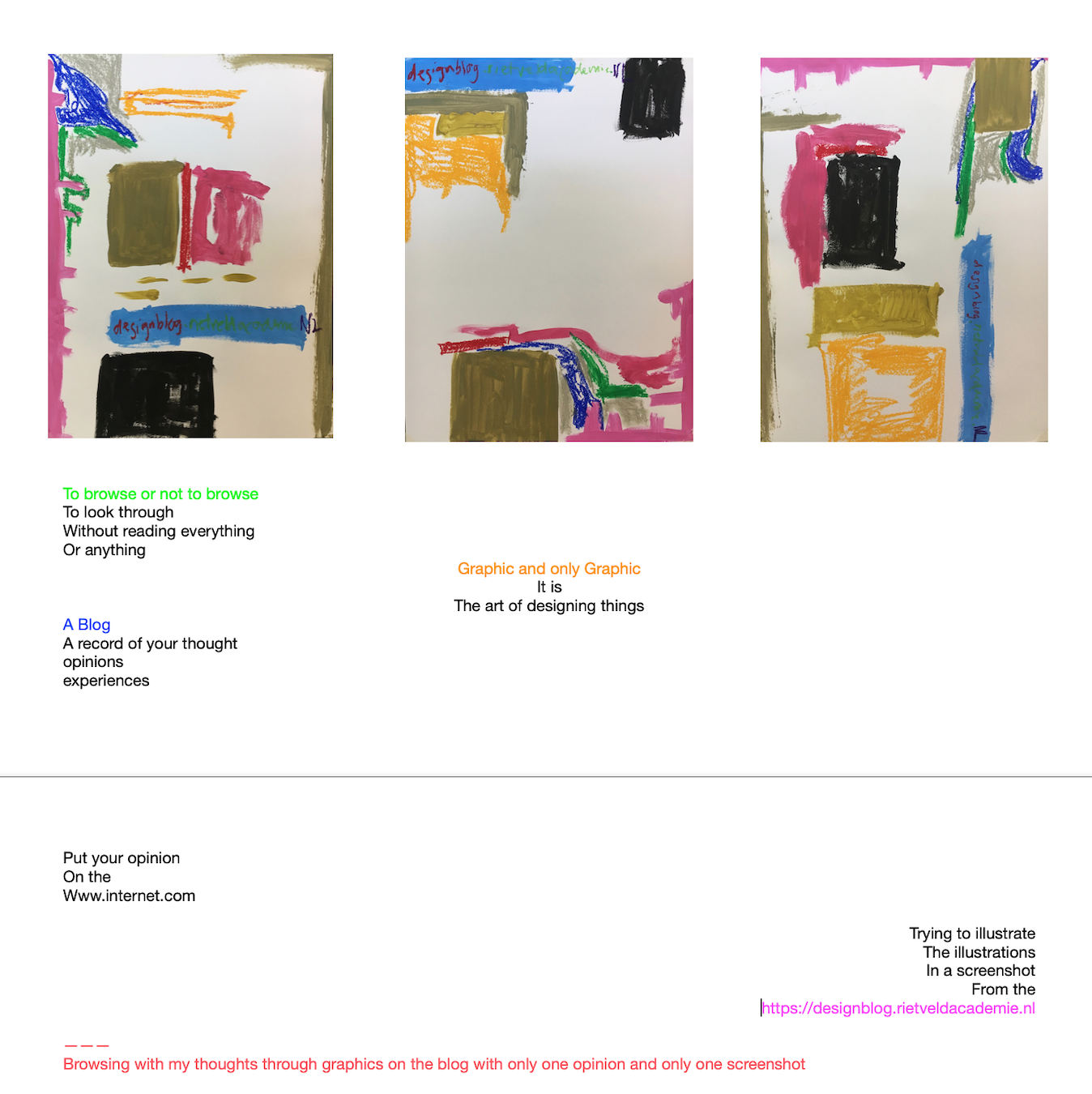
"opinion" Tag
Oh so queer
Sunday, November 29, 2015
 Choosing a book

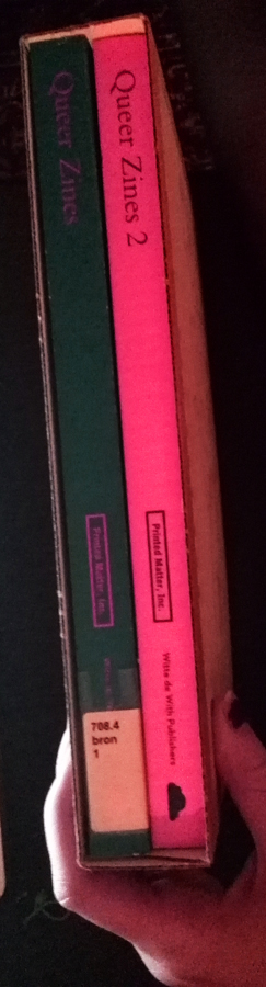
At first it took me a while to even figure out how to find books in the library. All these numbers, letters and no (in my opinion) logical order. So after asking everyone around how they found their book i started to get a grip of the system and chose Queer zines 2.
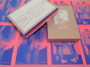
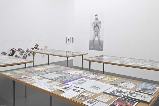
I walked around, touched, sniffed and saw many many books before my eyes were drawn to the bright colors of this publication. Off course the title spoke to me, although i should not admit that, because in this case i was focusing my research on the design and not the content. Also the fact that these books where in this boring brown cardboard, organic looking box didn’t really made sense to me. These bright interesting neon colors in combination with this organic, trendy box.
When I started looking through the books it looked quite familiar to me. So I dug deep in my memories and remembered all these great queer magazines that i once saw at a exhibition in ‘Witte de With’ Rotterdam. It was old-school, bright, daring and they had a really nice Punky/queer (obviously) design. I remember really liking them. Off course this convinced me to work with this new more modern version of queer zines. Just because i became curious if it could give me that same almost rebellious feeling.
Who made the books
After the last unsold queer zines books were blown away by the American super storm Sandy in 2012, the staff of queer zines found an opportunity to create a better and improved version of the book. The first edition of the book was put together very simple and fast, done by Garrick Gott. They also hired him the second time and in both cases they gave this graphic designer total freedom in whatever he felt was the good decision for the book.
Garrick Gott’s studio is based in New York city. The studio focuses on the design and production of fine printed matter. A large portion of the work is illustrated books and catalogs for arts and cultural clients. These can be individual artists, designers, non-profits. But also galleries, museums, institutions and publishers. At this moment Garrick Gott is working on also including film titles and posters in his practice.
Apart from this and the people he worked with I could not find much about Garrick. I did find some interesting details about his marriage and relationships. Garrick Gott is married to Terence Koh, an canadian (born in bejing) artist. Garrick gott is very much involved in the gayscene and this is also why he worked with Queerzines.
If i look at Garrick Gott’s graphic design I see trendy, clean graphic design. I see a lot of bright colors, interesting fonts, and a lot of white. He plays with color, and different kinds of paper (using see through plastic in stead of regular paper he creates new compositions.) I’m trying to put my finger on what it is in his work that does not really speak to me. And I think it has to do something with the fact that if i look at his website, it looks like almost every graphic design website I had to research on my last school, which was graphic design on practical level, and those are just about being commercial. On the other hand I really like what he did to Queer zines, so that brings me to the next point.

The design
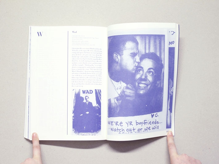
Let’s take a objective look at the book(s) itself. At first i see a brown cardboard box with a naked man silk screened on top of it. The man is printed in white so it is a bit hard to get a clear picture of him.
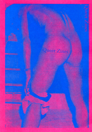
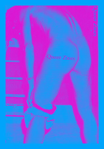
You can already see the spines of the bright neon colored books inside the box. We see bright pinks and bright blue colors. If we take the books outside of the box we have two of the same size books in front of us. One in pink and blue and one in orange and blue. Both books are covered on both sides with big images of naked or almost naked men.
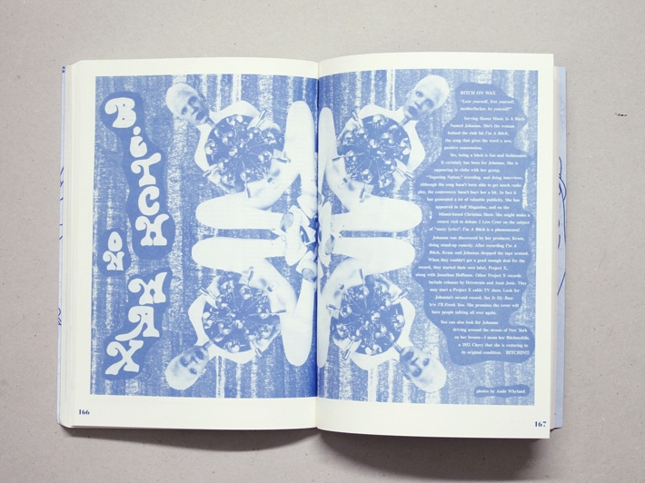
If we look through the book you will notice that the whole content is printed in the same dark blue color. Which in my opinion works really well because it brings all these different queer zines together like they are one (and I think that’s the point of this bundle). The fonts change from a typewriter font to a thicker helvetica like font. Sometimes Garrick Gott plays with the fonts of the zines that are on the pages itself.
The images are places in and outside of the columns that Garrick Gott works with. There are pictures, scans, covers and whole articles placed in the book. Some are just really interesting to look at (it’s nice to see the different time and culture in the book) and some need some explanation (which is given). And there are also a lot of interesting interviews shown.
All placed in an interesting way that will keep your attention and will take you further into this rebellious scene.
The content
The content of these books are all the queer zines bound together into these bright color books. I like the way Garrick Gott organized the magazines in such a way that they tell you a story about this queer scene. The book takes you back in time and while reading it i think we all imagine ourselves living in this open minded, rebellious, anarchist way of living.
Now that I read the book, having seen the zines in real, I still like the real ones better. But this is because I have seen them in colour and now these are becoming reproduced pictures of persons, creating an image of a certain time and scene. I think you need color to stretch the real picture. Instead of a blue print picture.
I enjoyed studying this book. It is totally in my area of interest and even though I thought Garrick Gott’s graphic design is a bit trendy. I really admire what he did to this book. The more I looked at it the more I discovered.
Rietveld library catalog no : 708.4 bron 1
The opinionator
Wednesday, January 21, 2009
Wouldn’t it be nice to have an opinion machine. In witch you could exchange your opinion for that of someone else.
But how would you make such a thing work?
You could categorize into subjects, such as politics, weither, celebrities etc. But you would end up with an endless amount of subjects.
Or you could leave it up to the opinion exchangers to bring the context themselves.
This to me sounded excellent. You could start out the day absolutely hating the way your hair looks. And end up the day singing your heart out – because you are the best singer in the world.