Skip to Content Skip to Search Go to Top Navigation Go to Side Menu


"jewelery" Category


The Dice Man


Sunday, May 26, 2019
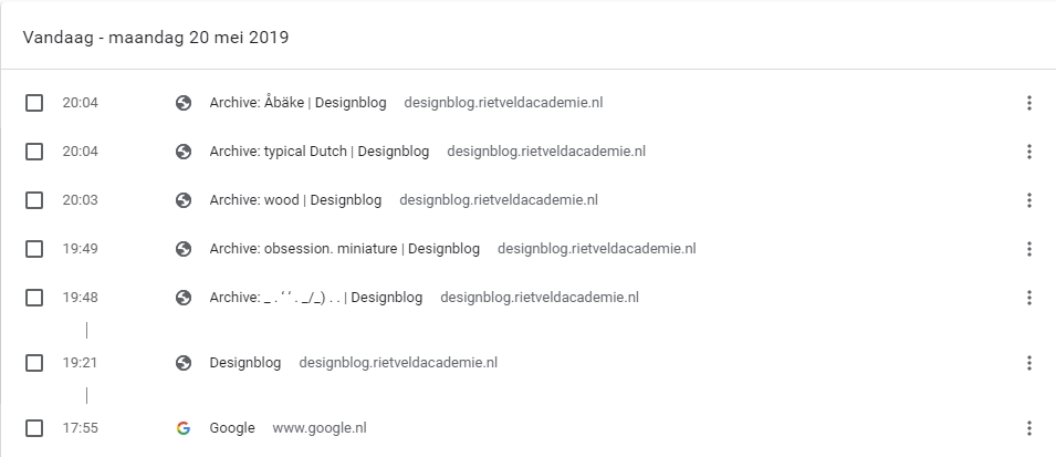
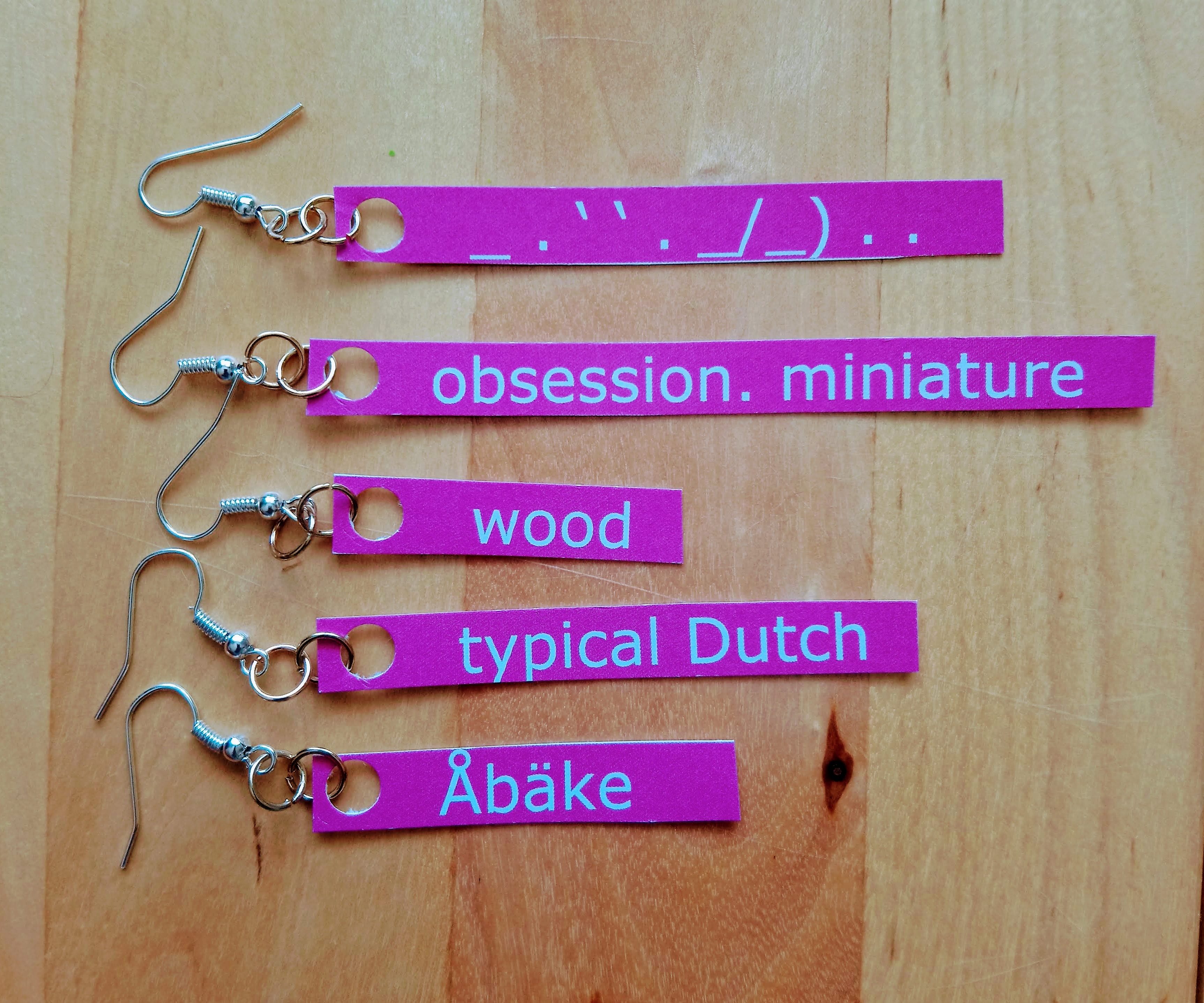
I browsed in the blog, partly floating, partly with full attention. I moved in the world of the blog through the tags on the left. I had a method: First post I choose randomly, then I scrolled down until the post ends, if something caught my eye or my mind, I lingered, wrote some notes, seldom made a screenshot.  Then, I clicked on a left purple tag that is located on the same line as the end of the post (the grey tagging section). I had some choice between 2-6 tags, depends on how big the grey tagging section was.

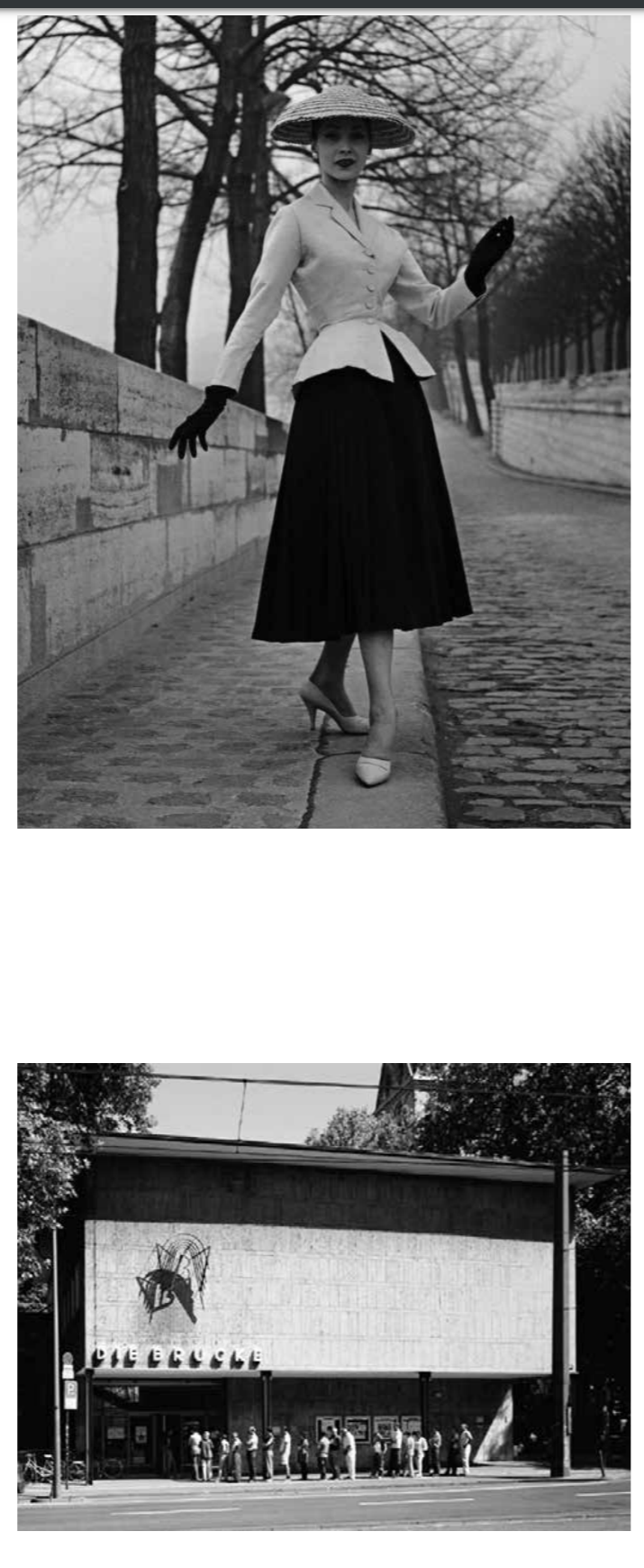
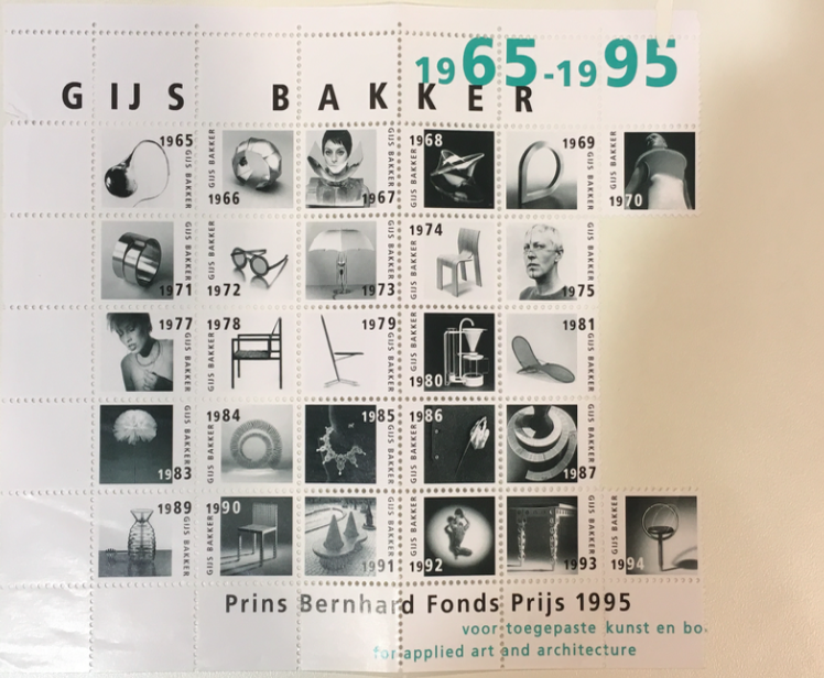
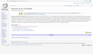
The first post was in Dutch, so the visualization was the only thing I had.

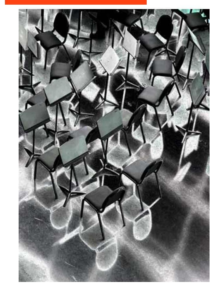
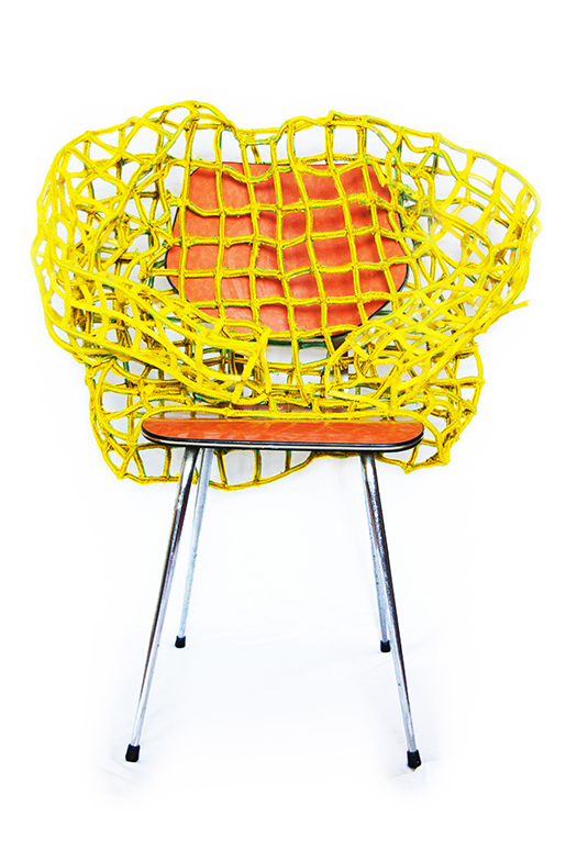
Grey Hypocrisy felt like it was made for me, the first hint, “quest for the dull”, he said. With an image of a room, with a personless solitary chair. These kind of rooms and chairs I’m trying to portray for a while.

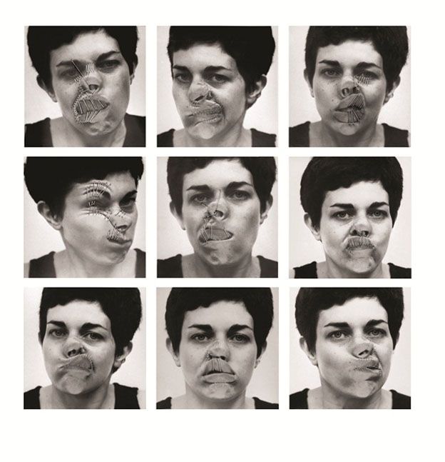
5 years ago, Marlies wrote about Imme van der Haak . She reminded me of Yocheved Weinfeld,  Yocheved Weinfeld, and her artworks in the 70’s.

“why?”> ON QUESTIONING > “wrong side”

I encountered a post that was written on my birthday, and then a post that was written on my mother’s birthday. It’s gotta be a sign! I found myself looking for hints, not sure for what. 

Keep scrolling.

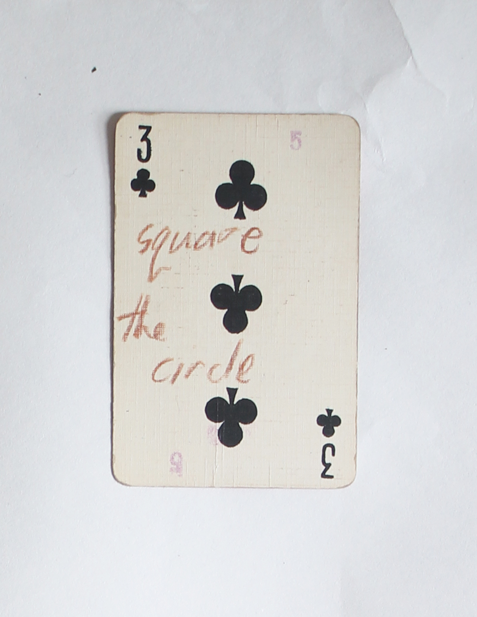
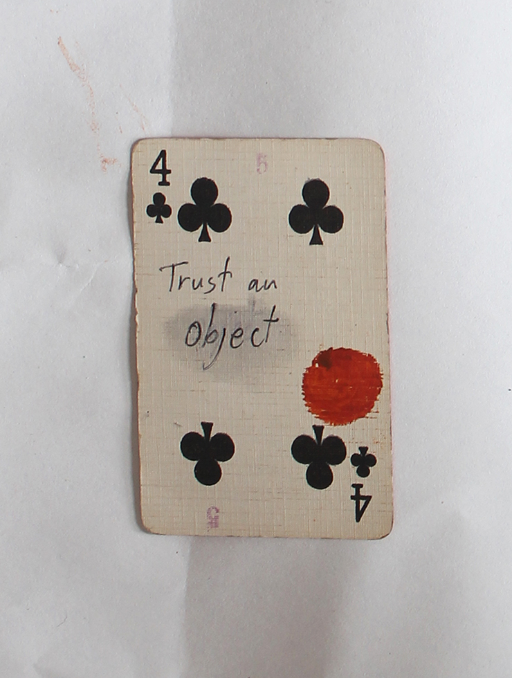
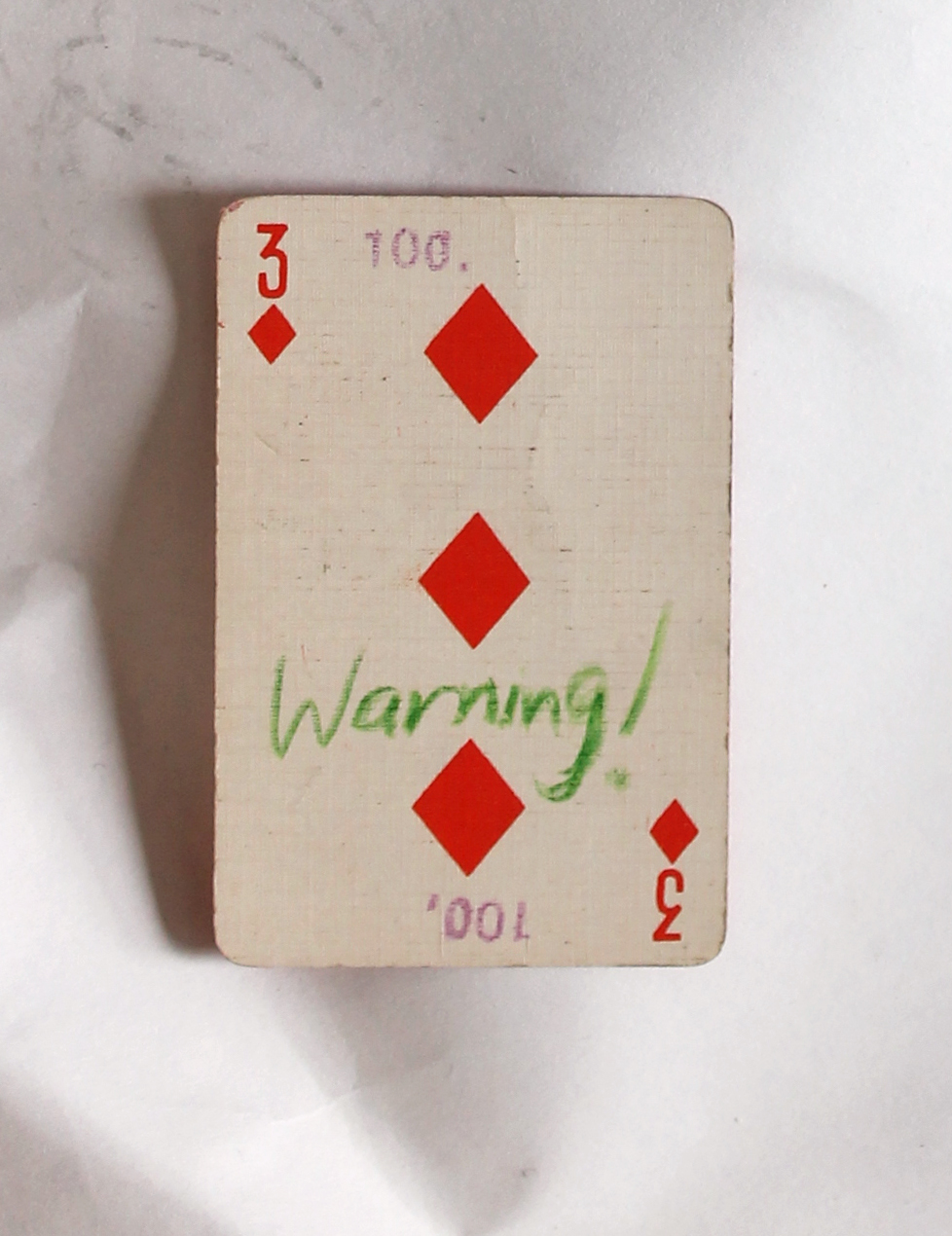
“warning” > “Ability to choose” >

“waiting”! “For the next to come along.”

More and more hints. Like these sentences are designed for me. I realized that I’m browsing like I could wander the streets as a small girl: not being a “believing person” but to believe in traffic lights. wherever there is a green light is the way I should go, it’s the right way for me, no space for free choice, it’s from above. From the god of traffic lights.

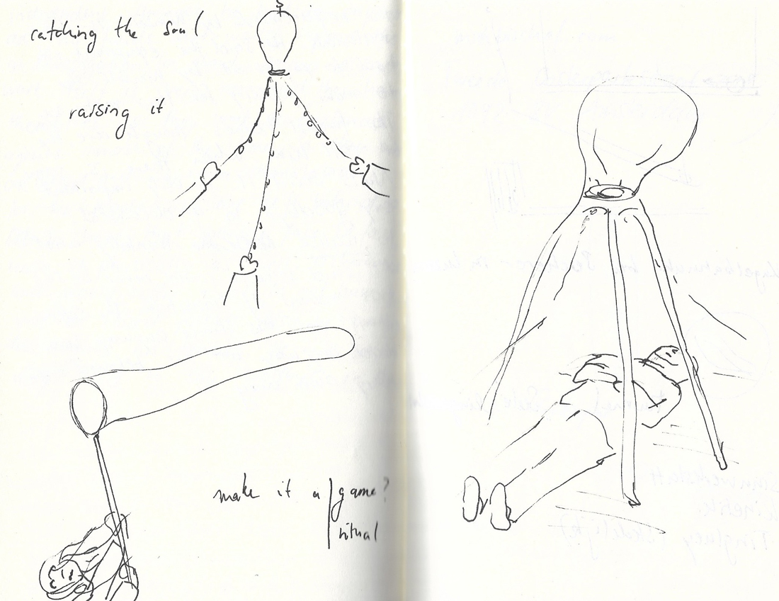
> “waiting to be found” > chairs!

“Death”> “yellow and tiny”>

I agreed with Rosa Doornenbal, she wrote some nice stuff. I started to decide for me, what is a metaphor in this infinite data. To find the metaphors.

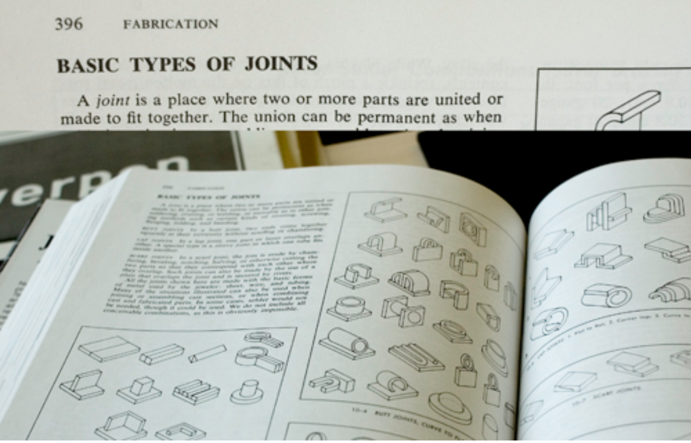
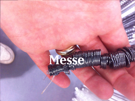
Marie Knudsen wrote about a jewelry book about joints. Extract from the book: ”A joint is a place where two or more parts are united or made to fit together.”– is this about silver or people? she asks herself.

for me, it was About putting stuff out of context on purpose. To give things meaning by taking their context away. It’s about the movement between the details and being far from the details until its abstract.

“alive”>”alienation”>”abstract”>”time”>”enjoying”>”no time”>”absence”>”all sort of apes”>”allegorical”>”queue”

brows like you are looking for a quate. Saw a quaote of Walter Benjamin: “Beauty is not the object and not the shell, but the object in its shell.” Ok. Maybe another day it will mean something, keep it.

“I would like to bring your attention to noticing things.” I think it’s funny.

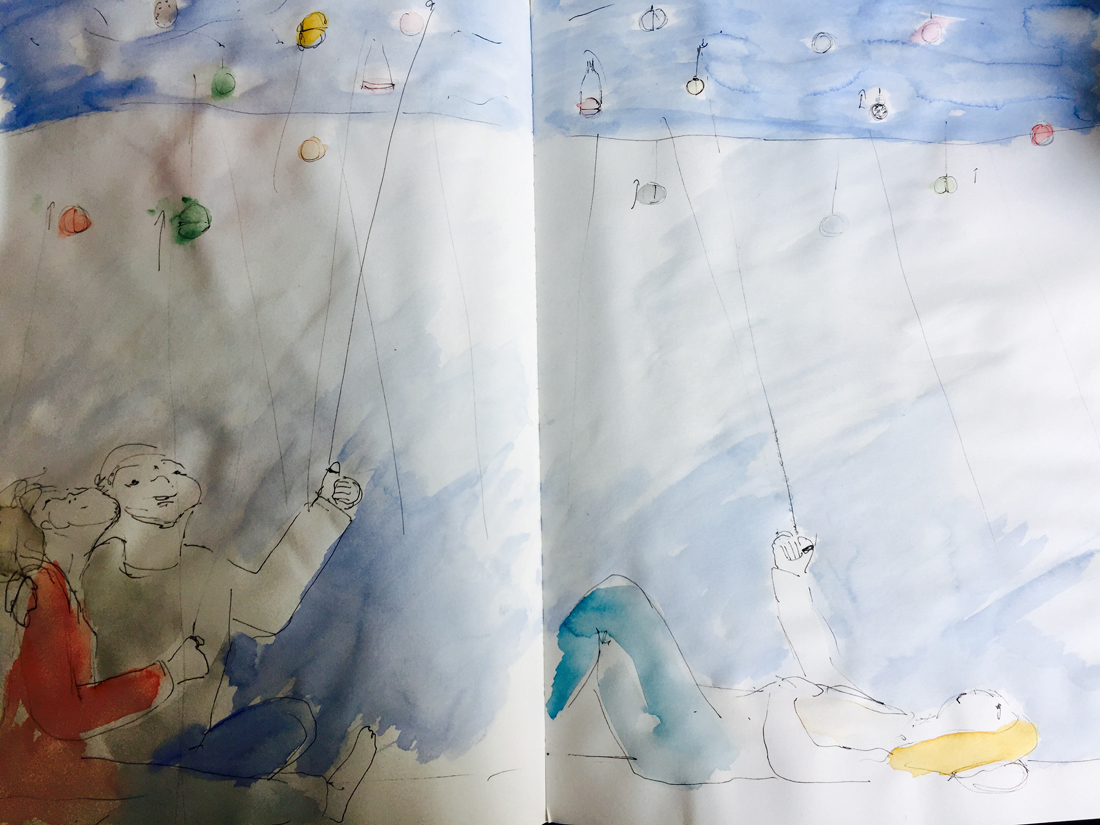
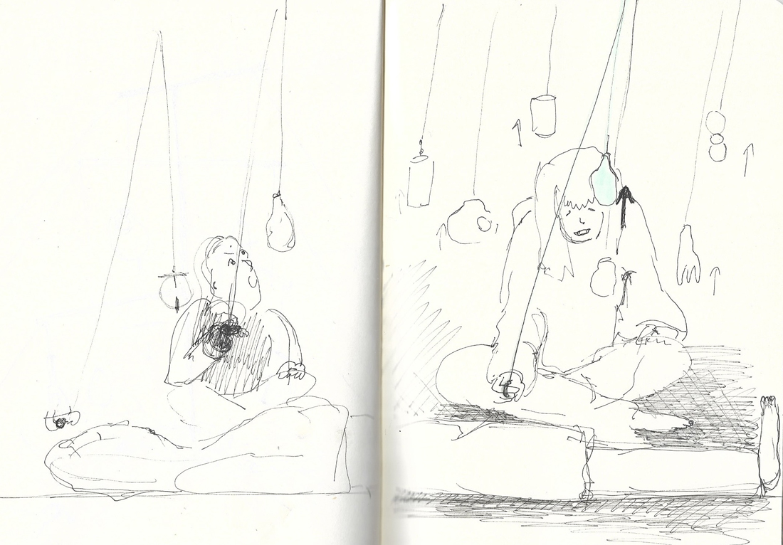
Walking with a Line was beautiful. Made it clear for me that sometimes the combination of things punctuate your heart. The context is important. Context is everything. to put things out of context means just putting it in a new context, in order to look at them beautifully.

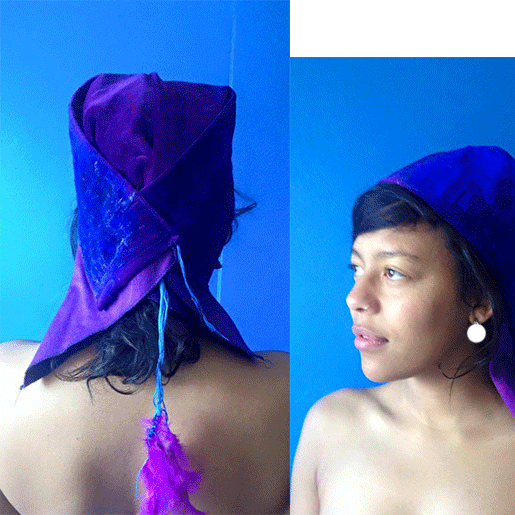
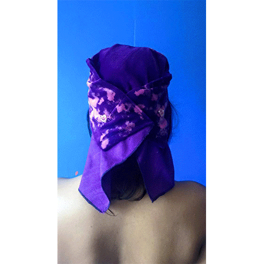
look at this together! It’s so different then as two solitary pictures. 

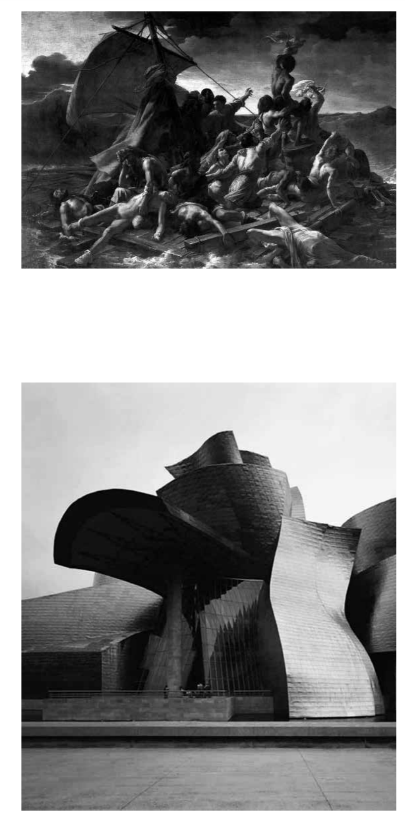
And this also, it does something only together, when isolated it’s almost nothing.

Scrolled more.

I see more chairs. Van Goch’s chair >”walls” >>>

The browsing led me to this:

“The Dice Man”

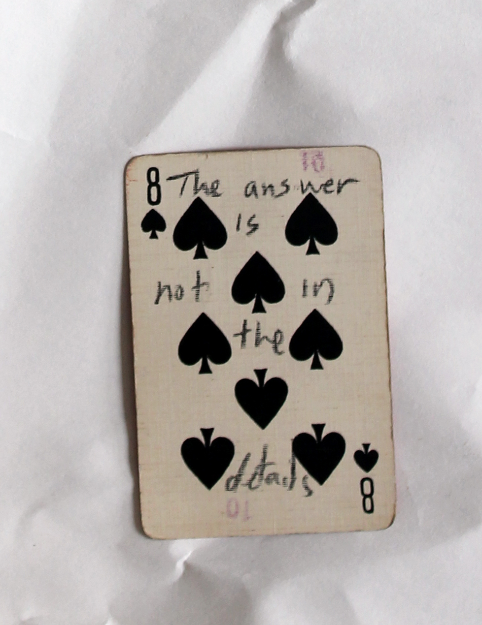
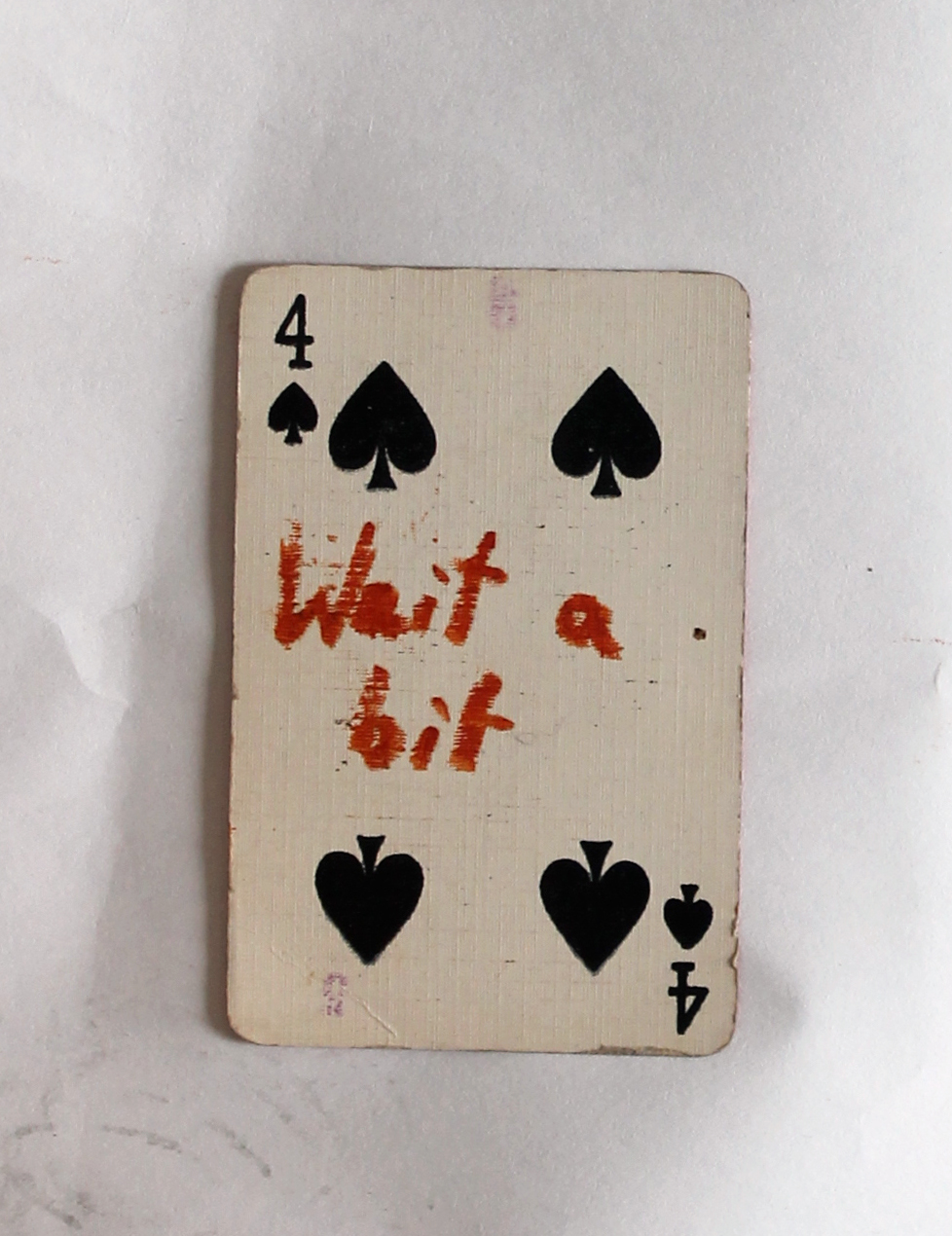
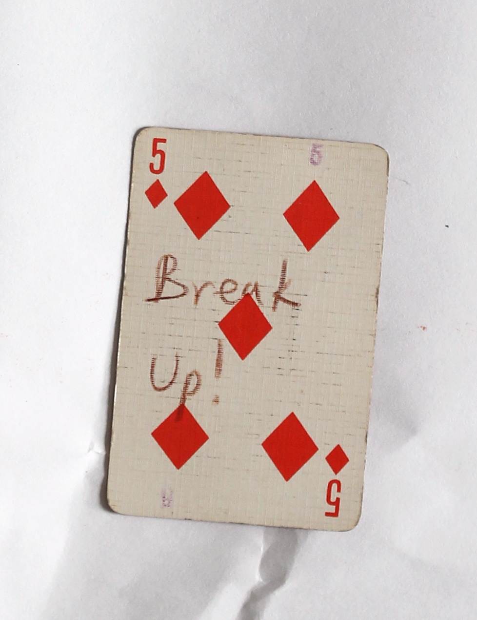
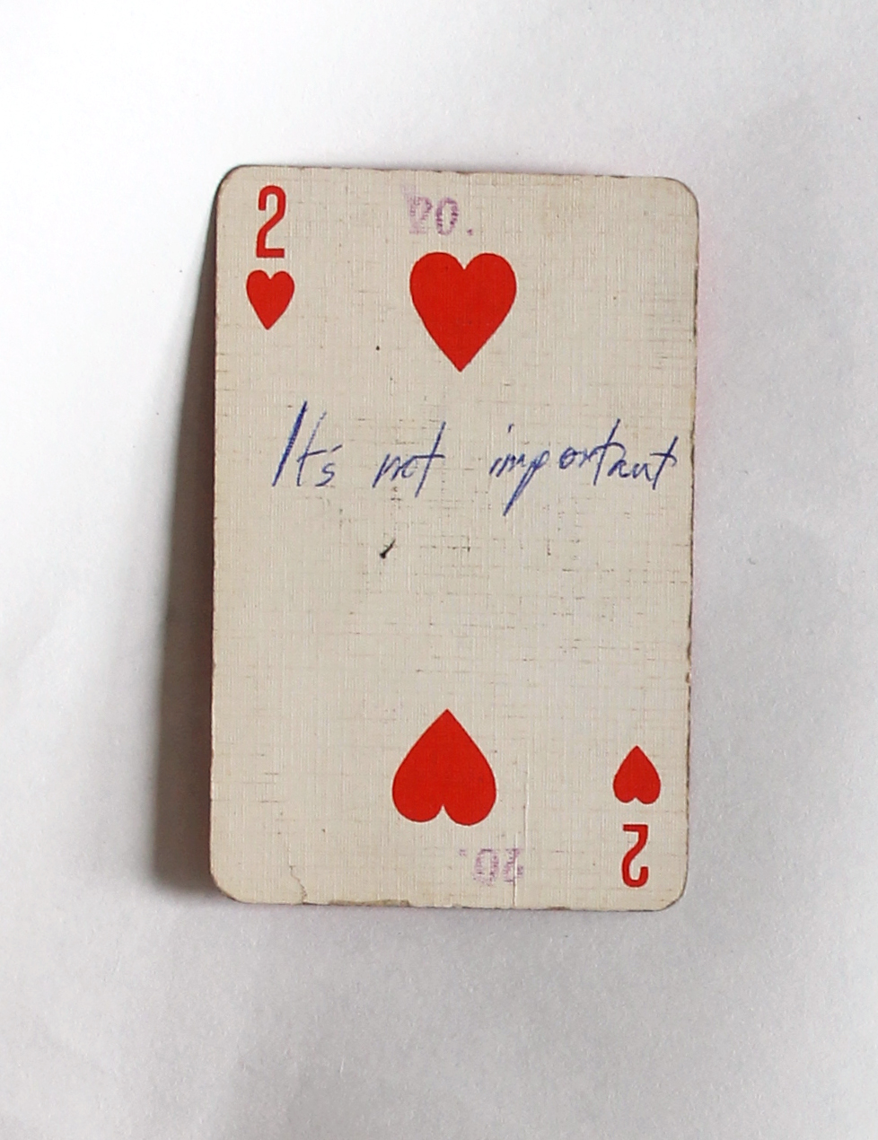
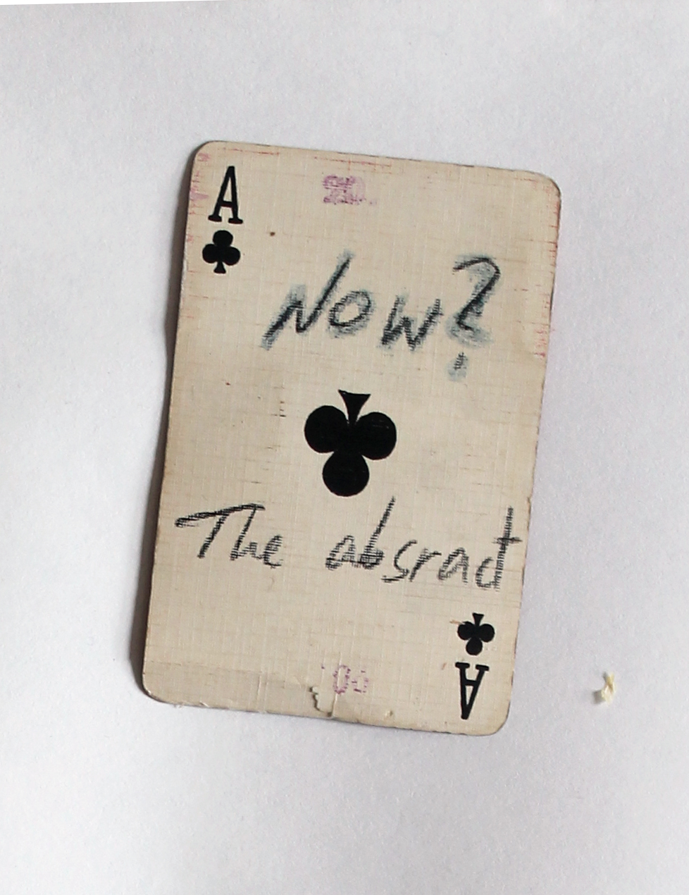
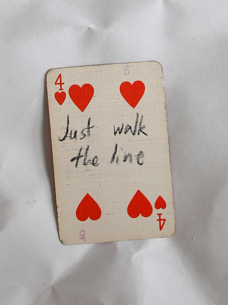
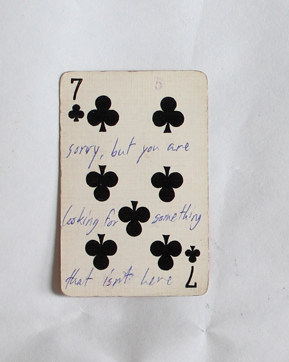
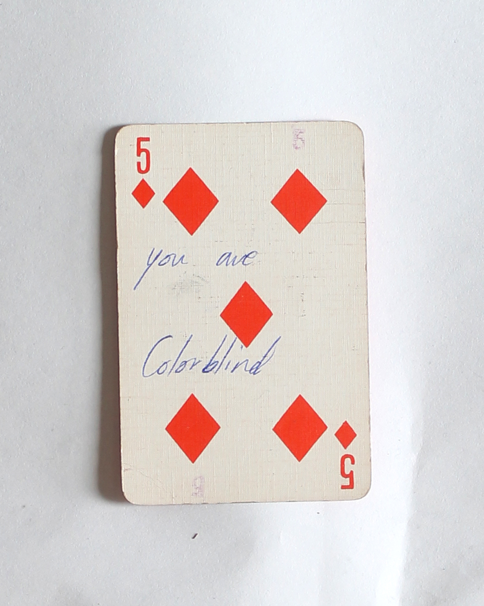
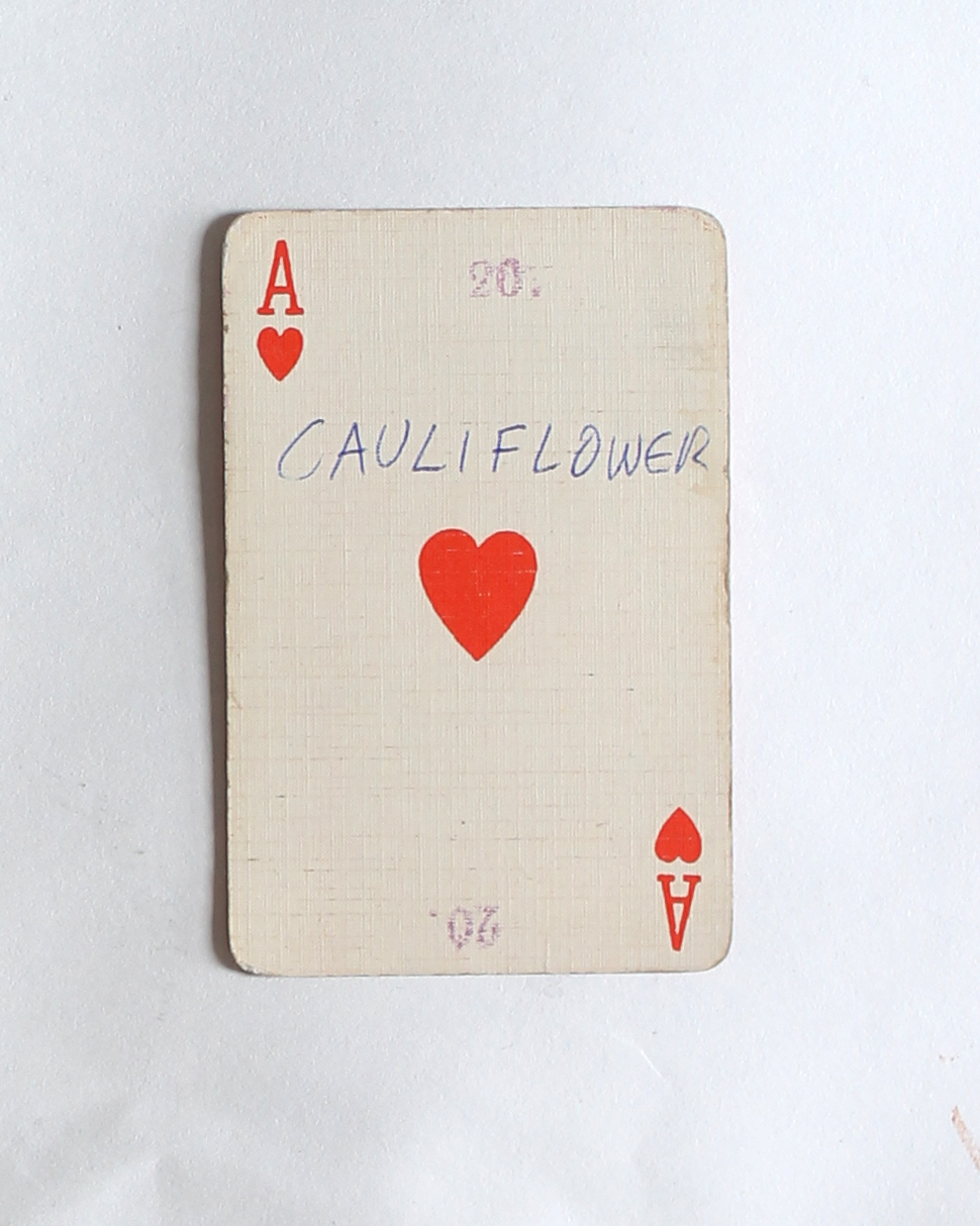
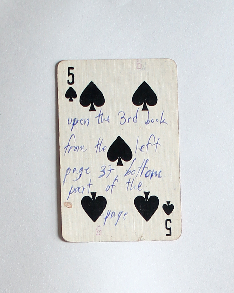
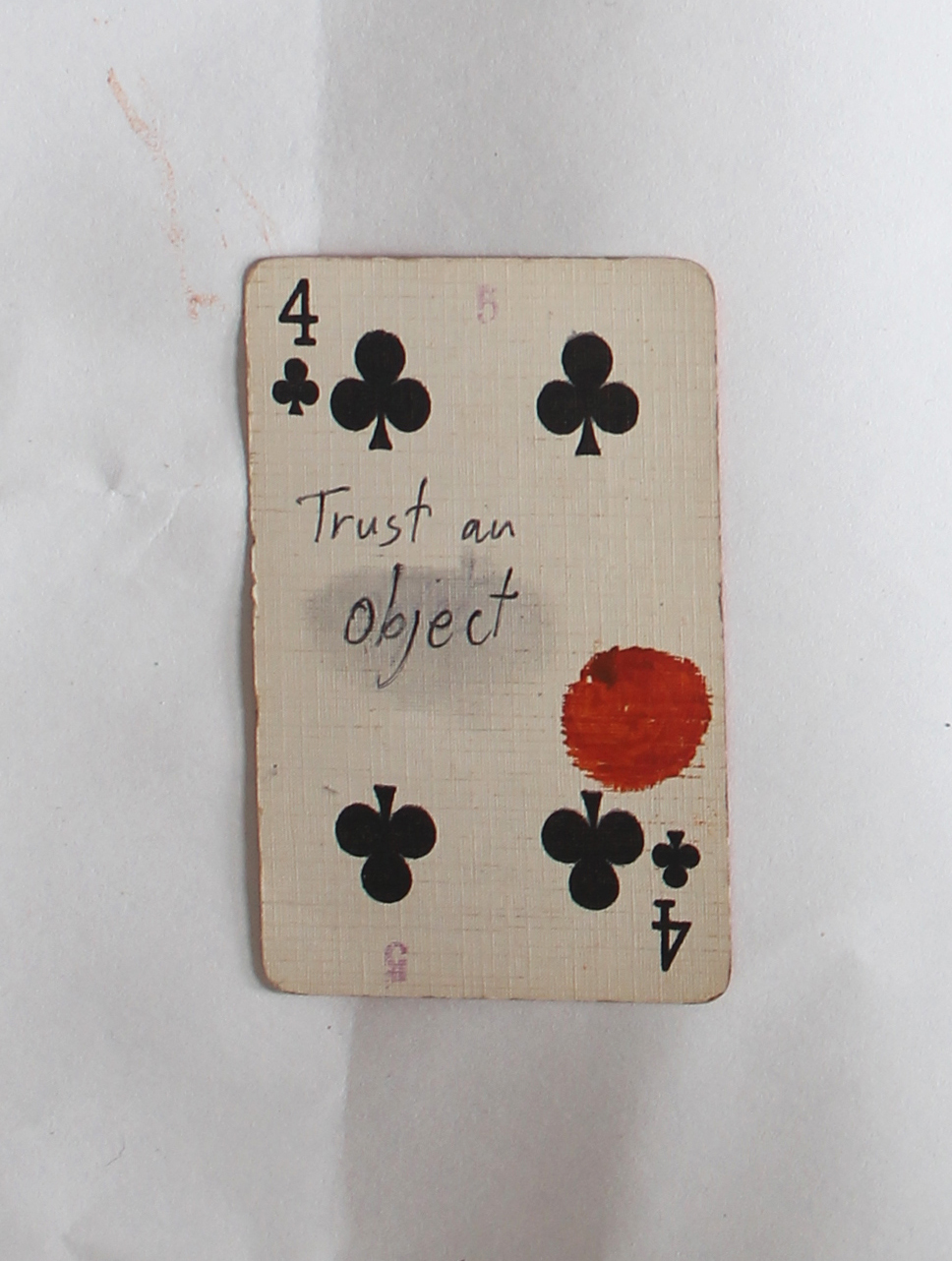
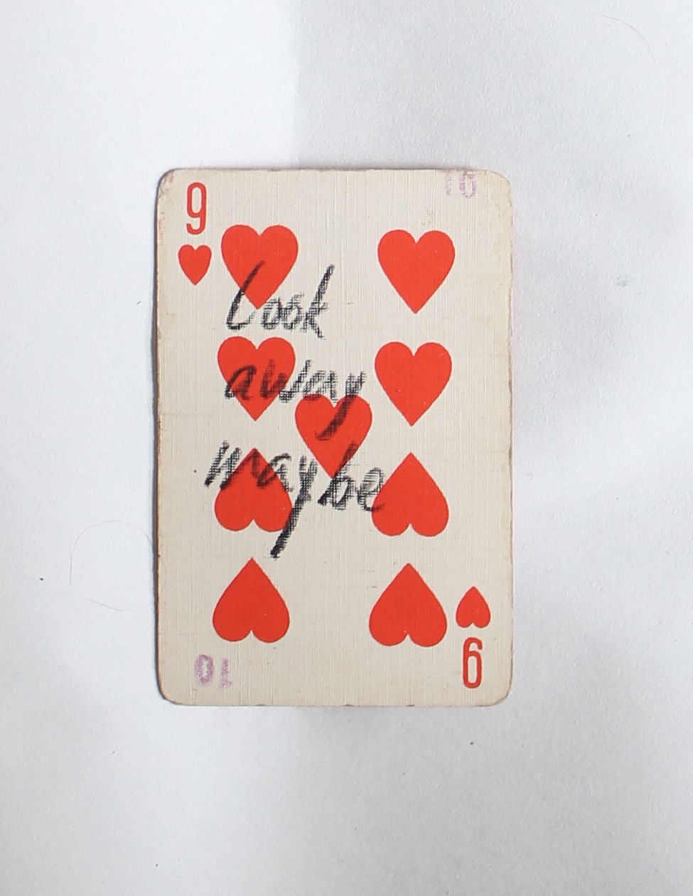
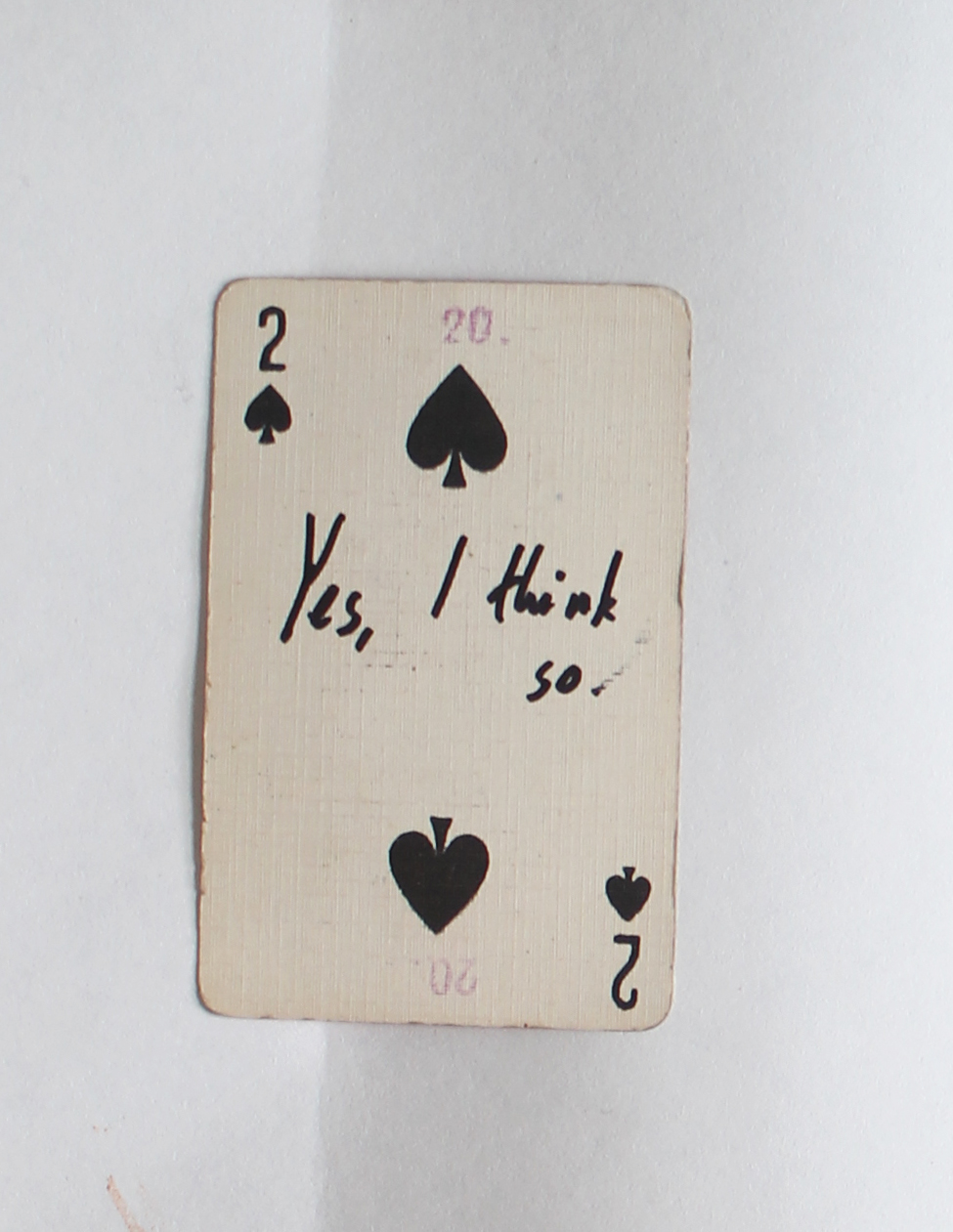
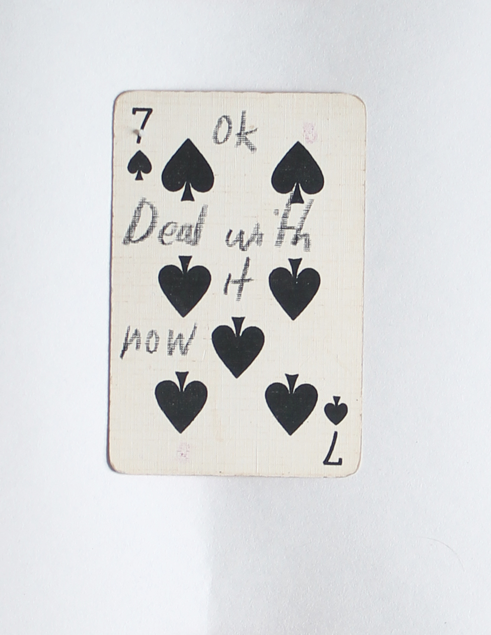
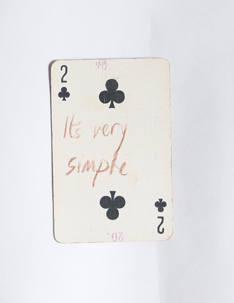
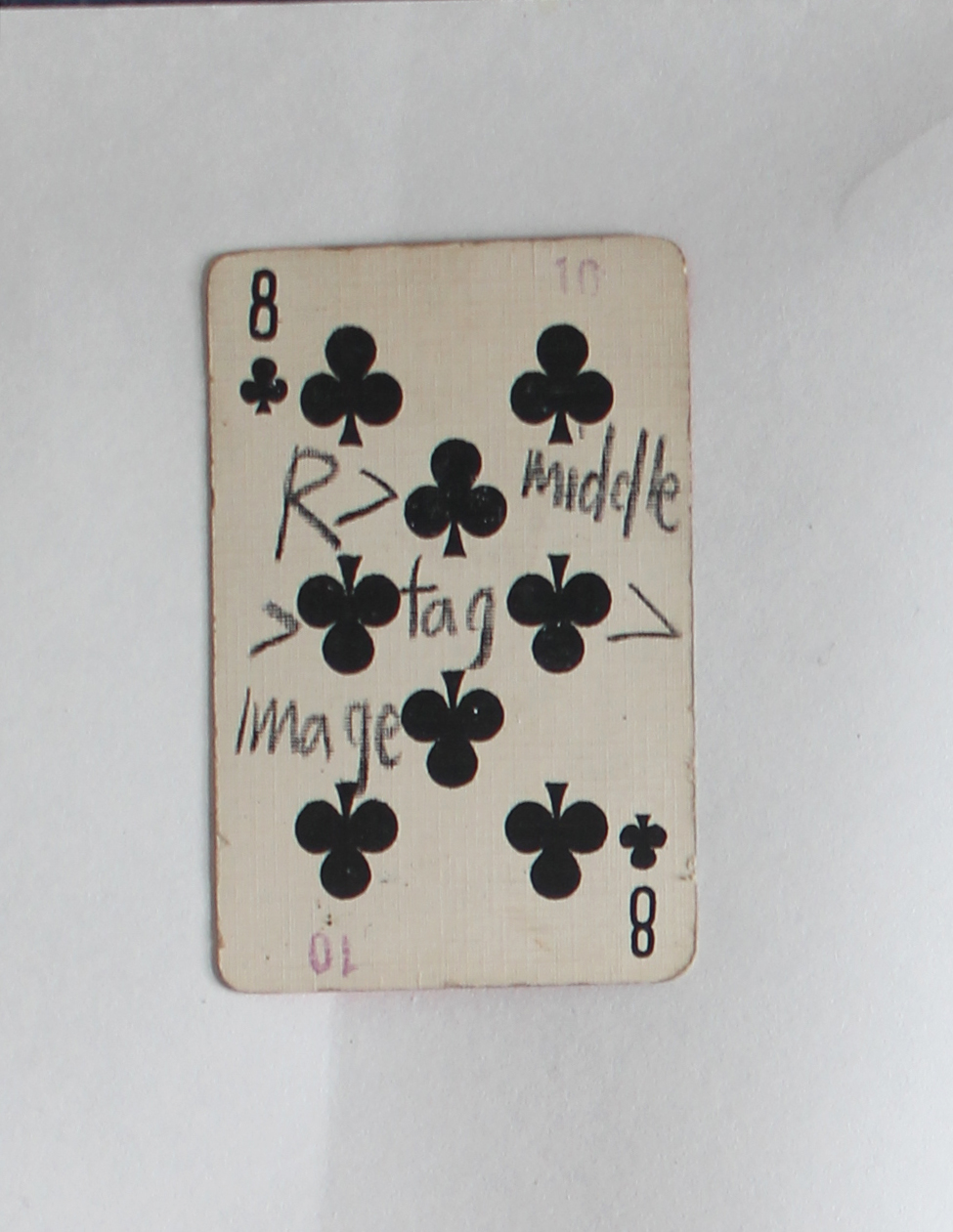
If you are looking for an answer for something, a hint, or that the cosmos will decide things for you, you are in the right place. This blog and this post in particular. You can try to find your answer in the cards below, just click on one and see what it says.

The dice man is a book that tells the story of a New York psychiatrist named Luke Rhinehart who, feeling bored and unfulfilled in life, starts making decisions based only on the roll of a dice. He can’t change the dice’s decisions, including decisions about sex, murder, rape, and more.

This is your dice.

If the cards are not enough, you can start browsing the blog looking for a hint for life or an answer, using the overwhelming amount of posts the blog has to offer and using the randomness surfing that is possible here. But you need a method, you can use mine:

First post I choose randomly, then I scrolled down until the post ends, if something caught my eye or my mind, I lingered, wrote some notes, seldom made a screenshot.  Then, I clicked on a left purple tag that is located on the same line as the end of the post (the grey tagging section). I had some choice between 2-6 tags, depends on how big the grey tagging section was. And then I continued to the next post, scrolled down, chose a tag one the left that is exactly at the end of the post, and so on.

The amount of time you should do it is as the number that is on your card, or until you find your perfect hint.


The Endlessness of Designblog


Sunday, May 26, 2019

Exploring the endlessness of Designblog


While browsing through design blog, the first thing I did was scrolling down to see how many tags there are.
The scrolling felt everlasting, at one point I thought maybe the tags will never stop. They did stop at a certain point when I realized that if there where an infinite number of tags, the Designblog would became infinite itself.
This infinity intrigued me, because I cannot and will never be able to fully understand it. The endlessness dawned on me even more when I noticed the clear edge between articles and emptiness, two different dimensions. For me these dimensions worked the same as Earth and Space.
Earth has limits and the Universe has not (as far as we humans know). The first dimension “Earth” begins at the top of the blog and seems organized, there Is a clear layout, the highlights have a limit of 10 and the articles have a limit of 25. After scrolling down these 25 articles “Space”, the other dimension, begins. This dimension is infinite and after you crossed the edge where the articles stop, the tags could go on forever…

The “Space” dimension is also more chaotic because of the tag system that changes the order when the page gets refreshed. There are three outcomes, tags in order from A to Z, tags in order from Z to A and tags in a random order. Every time you go to another page or refresh the existing one, you don’t know how the tags will be ordered. Because of this I noticed a section of tags with numbers and symbols I wouldn’t have noticed otherwise. This section is separated from the alphabetized tag-list and unlike them these tags don’t seem to be arranged in a logical order. This makes them seem unimportant to me and some of the tags are not something logical you would use while searching. For example:

_ . ‘ ‘ . _/_) . .
?
.scr
”A”
???
0-dimension
0=?
21grams
45%
524
98%

The tag which made me question the most was:  _.’’._/_)..
The page this tag sends me to tells about a graduation book made by Marion Molle with has these symbols as a title. She told the writer of the article that while making the book she felt obliged to add text but she didn’t want to, so instead she used the symbols as title.

The core of the endlessness of this blog is for me the edge where the articles stop, and the tags continue infinitely. The tag  _.’’._/_).. became my starting point of visualizing this.


I scrolled down to the “edge” of the articles and noted the tag that comes after the grey block. Then I clicked on this tag and continued this way of collecting tags a couple of times.


When I reached the tag Åbäke I stopped and checked my browse-history list.


This ‘Åbake’ tag is the first word in the alphabetical list and felt like a good closure. The words I collected were in the following order:

_ . ‘ ‘ . _/_) . .

obsession. miniature

wood

typical Dutch

Åbäke

Because these tags only exist in the virtual world, i wanted to bring them into the real world by materializing them. I wanted to approach this with a personal view, so I chose to look at it from a Jewellery Department perspective because i would like to go there next year. I made earrings with the tag words in the same colour and typeface as Designblog. To show my path trough the tags and pages, I made a .gif of the tag word earrings going through my ears in the same order as my browse history. Like clicking on one tag and going to another, not knowing which tag comes next. The tag words I ended up with are not something I would normally click on, this made me see pages I otherwise would have never seen. Because of this research I now know that Åbäke is a London-based collective of four graphic designers.


It doesn’t make sense to end a post about endlessness right?
So this is not the end!
Try it yourself, click on Read the rest of this entry »  scroll down to the edge where the ‘space’ dimension starts, click on any tag you find there and see where it brings you.
_________________________________________________________________
(more…)

Search path, just a matter of straying


Tuesday, October 30, 2018

4

GIJS BAKKER

(1942)

halssieraad / neck ornament, 1967

aluminium / aluminum

verworven / acquired in 1990

Gijs Bakker neck ornament at the Stedelijk Museum


The few words that can be found on a white rectangle, the reference, all that I have in this temple of modern and contemporary art and design. It’s better to think about objects with my own perception. Too many precision in the vocabulary and words prevents me from really seeing, feeling an object. The few words on the white rectangle : the starting point of my research. The few words on the white rectangle that I type in the Google search bar. It’s not easy to immediately get Gijs Bakker’s necklace as a result. I can criticize the few words on this white rectangle because it has a lack of detail from the museum. But maybe it’s up to Google to be more selective? Google Image, Pinterest : websites that look like Ali Baba’s cave, or the attic of my grandparents. There are pages and pages that distract from the intended goal. I can’t stop looking, scrolling.


It’s curious. It looks like there is no end. The time looking seems unending. There is a lifetime of content. More than a million years to see everything. I can research for hours on end to no satisfying avail. The task at hand is a prevalent one, the thought of finishing an essay is an up hill battle that seems to push you back down with distractions.

It’s just a matter of distractions. I click, I slide with my computer mouse. I like to let myself go with the waves. Four words typed can generate a profusion of images for a research module. This often feels like my mind has traveled great distances.

I easily loose the landmarks of my departure, as soon as I see a flashy thing go by. I think, I’m inspired by the recommendations. I dive into a sea of images. But fishing can be a test of luck. I swim between DIY and designer pieces. That way I learn the names of small and big jewelry designs. When I come to the realization I have departed from my initial topic, I cry trying to get back into the flow of things. The information is incomplete, unnecessary. Too much advertising also.

However, I sink deeper into the internet. Social networks. Instagram, Facebook. The draw of familiarity and humor. Gijs Bakker on his feed invites us into his daily life. It’s a good way to capture the universe of the designer, I try to catch images of his insight to understand his inspirations, or how he integrates his creations into reality. I like to see photos taken on the spot, not made for respectable publications. These forms of publication bring a different way of sharing creations.

It’s hard for me to let go of my digital research, maybe laziness … but we always must look for more precise information with sources we can trust. So I take refuge on the designer’s website. Not surprisingly there are details on all his projects there, it is organized and clear. Also, I can find a list of publications in which Gijs Bakker appears in. On the other hand, there is no more information about the necklace than the few words that were on the white rectangle.

I continue on the website of the Gerrit Rietveld Academie, after all, he studied there. Yet nothingness, nothing about the old students. Shame. I feel that I will have to get going on the paper reading. It’s time.


Rietveld website no result

But it is true that I, a person who has become accustomed to the simplicity of a Google search, I also likes to rid themselves of the inanimate screen. So I open books but soon I starts to get bored. I use the Rietveld library. There are many books about jewelry. Most of them are focus on eras, styles of creations, parts of the world, techniques or materials. The depiction of his exact item is very scarce, even in very specific books.

It’s finally the same as a Pinterest search, or almost. There is of course the pleasure of the paper’s touch and the smell of a book. There is also the promise of more dedicated information base. Why is it that we always believe what is written on paper? In the publications I’ve been flipping through, the designer is never represented alone. Always a name of book that creates a topic, it can be the use of certain materials, an era or a style of creation … I see that Gijs Bakker is a small part in a much larger book. It’s finally for me as another form of tab “recommendations”.

I also found Gijs Bakker’s portfolio. What I think is interesting is that the design of the website is the copy of the book, or the opposite. Who knows ? I’m not sure that the same design on screen and on paper really change something…

http://www.gijsbakker.com/

It is clear that the book searches are much more accurate and reliable, it is not the new of the century. However I appreciate internet research more because of it’s sprawling nature. I have the feeling that with a few words typed in the Google search bar, it’s a small fire that starts, just a click to take off, I like to lose myself in the web, whirl and lose myself completely in what I’m doing. It’s a way to have fun, to escape rigor, solidity and this kind of traditional and logical way to make research with books.

Panasonic Toot-A-Loop R-72


Friday, October 26, 2018

z111z11
‘It’s an S it’s an O, it’s a crazy radio! Toot-A-Loop!’ that was the phrase of the famous transistor radio called the Toot-A-Loop. The Toot-A-Loop… We both got mesmerized by this yellow thing that was laying behind glass in the Stedelijk Base and we knew that this was the piece that we wanted to do research on. At first we thought it was a weird mobile device, later on we read that it was a transistor radio, a transistor radio where the designer was unknown from, something that made us even more curious.

Because of the fact we speak different languages, we decided at first to do our online research separate, Philipphine did it in french and Sena in English. We were curious about the fact if the results in the browser would be different because of the language. We soon saw that the information was almost identical so we decided to do the research in one language.

Our research began with first going on Google, we typed in Toot-A-Loop and Google gave us a lot of links and pictures of the radio, the first link that popped up was Wikipedia, of course.

wiki

This information about the Toot-A-Loop that Wikipedia gave us was comparable on almost every website, there was nothing more, nothing less.

After Wikipedia we went to the websites of different museums, almost every museum website was disappointing, because they didn’t had a lot of information about the object, they all got a picture of their own Toot-A-Loop with a short text (or no text!) about when it was made etc. but nothing more. The Metropolitan Museum of Art and the Stedelijk Museum of Amsterdam gave us some book references, something that we could definitely use later.


The many pictures on Google were linked to auction sites and even Marktplaats (the ‘Dutch Ebay’)  we saw that a lot of people were selling their old Toot-A-Loop or already sold them, so there is still a lot of interest in the radio, it hasn’t lost its popularity. The selling price of the radio was quite various,  for example on Marktplaats the radio would be sold for around 30 euros, but on the auction sites it would cost around 100 euros.

zzzzz

We also found youtube videos, videos where people were most the time trying to explain how the radio works, we noticed that the videos were quite recent and that the people who commented under the videos were most of the time talking about how they would (and still love) the radio, so a lot of people from earlier generations.

zzzzzz

After long clicking, link after link, (it must have been the last Google search page) one of us ended on this Italian radio website where we finally found some new information about the radio, they  mentioned the name of the designer, somebody called ‘J.M. Willmin’, after reading this we started to Google the name of this designer, the only information about the designer that Google gave us was linked to the Toot-A -Loop. Later on we found an antique website where they were also talking about J.M. Willmin as the designer of the Toot A Loop, we sent them an email with the question where they got there information from, this is what they answered

z1

We think that the name J.M. Willmin was made up by Panasonic so the radio would sell better abroad (in countries like the US and UK),  this is probably why we couldn’t find anything about this designer.

After our online research we went to the library of the Stedelijk Museum and the library of the Gerrit Rietveld Academy, thanks to the book references we found online we were able to find books that mentioned the Toot-A-Loop. The information we found per book was different, in the first book, Twentieth-century ornament by Jonathan Michael Woodham, the Toot-A-Loop was used as an example to show something about the Japanese design of the 1960s/1970s further then that there was no information about the Toot-A-Loop itself. In the second book we found, Radio Zeit by Isabel Brass, there was more information about the radio, but nothing we hadn’t read before.

That was something that surprised us, because books carry this magic trustworthiness with them, you should be able to find everything that you want to know in a book, at least that’s what we thought.

img020img0210001

It’s strange that there is only limited information about such a popular radio on the internet and in the books. Maybe we should use our imagination to answers the remaining questions.

With this in our minds we started to think about other purposes the Toot-A-Loop could have had, the Toot-A-Loop was designed to put around your wrist, so it could also be a kind of jewelry. We found out that Marc Jacobs probably got inspired by the Toot-A-Loop. Our imagination helped us already a bit, we are curious what you will find!

the wearable future


Monday, February 19, 2018

Looking at Gijs Bakker‘s neckpiece in the stedelijk BASE exhibition directed me to an intriguing subject: (neo-)futurism. Working together with Emmy van Leersum Gijs Bakker was aiming to make jewellery less frumpish. By making big statement pieces they made jewellery less of a status symbol and more of an accessory to fashion. This was a totally new approach. Jewellery and fashion had not been connected in such a manner before. They were also very futuristic in choice of materials. They chose materials like aluminum, again breaking with the crafty connotation jewellery had, and with the jewellery as a status symbol since the material was cheap and easily produced, making it available to the masses. Them revolutionizing jewellery made me wonder what a new form of futurism could be, in what ways we could reinvent jewellery nowadays. A huge amount of sub questions arose that I believe should all be looked into when trying to reinvent jewellery. Here I name a few. Could contemporary jewellery serve a social function? How could we reinvent the material (I believe this was vital in the futurism of Gijs Bakker’s jewellery)? How could we bring it to the masses? In this tiny research I only slightly touch the surface of these complicated matters.
The-Gijs-and-Emmy-Spectacle-exhibition-at-the-Stedelijk-Museum_dezeen_3

the neckpiece by Gijs Bakker


Material future

When it comes to innovating material a lot of exciting things are happening. We are living in a time of rapid development of technology. New findings could be integrated into contemporary jewellery design. Renewing the world and meaning of jewellery altogether. Structurally changing the current function of jewellery or enriching it by adding an interactive aspect. In contemporary jewellery many materials are being used. Such as fabrics, when we look at fabric a lot of exploration of means of energy storage is taking place. To get an interactive piece an energy storage is vital. Researchers are doing a lot of research in finding ways to make fabrics store energy without losing wearability. Think for instance of yarn batteries, sources of energy being 1D-yarns that are woven to construct the fabric. Imagine the possibilities! The technical aspect is quite intricate but if you are interested there are multiple articles available online. Overall there are still many problems with washability and there are safety issues but it seems to me like an inspiring look into the future.


untitled

in example b you can see the so-called 1D-yarn


Social participation

Can we start to discuss questions in modern day society through the medium of contemporary jewellery? I found some interesting insights in an essay written by Rebecka Huusko-Källman. Jewellery can be seen as very mobile as it is made to be carried by our bodies, therefore it can be considered a great medium for conveying a message in all kinds of environments. As you leave your house the jewellery does too. 'Moving around in social contexts, jewellery operates between the personal and public space, it has a unique ability to interact with the viewer.' (den Besten, 2012) However Liesbeth den Besten also states that contemporary jewellery -making statements or titillating to the point of discussion- often only moves around in small circles. The mass does not have the access and/or does not seem as interested in these kinds of contemporary wearable objects. Another issue is the fact that the contemporary jewellery being displayed in galleries can make it seem like merely a commodity and thus not a subject of reflection or discussion. Whereas on the other hand displaying the pieces in museums can separate the viewer from them, through its significant context it’s isolated. Lastly, the masses often fail to read the meaning of the works, the ‘language’ through material and form seems remote and inaccessible to people who have not been initiated into this specific field.


veiligheidsspeld

provocative safetypin 


Economics

To get messages across or start a conversation one might consider the commercial side of it all. The jewellery industry is growing rapidly (according to ‘A multifaceted future: The jewelry industry in 2020’ written by Linda Dauriz, Nathalie Remy and Thomas Tochtermann) it is expected to grow 5 to 6 percent a year. They state that the trends that formed the apparel industry the last thirty years are starting to show in the jewellery industry. These trends being: internationalization and consolidation, the growth of branded products, a reconfigured channel landscape, ‘hybrid’ consumption, and fast fashion. From these findings we could conclude a couple of ways of getting into the public eye. First of all branding is on the rise so really strengthening a brand or producing via a brand can make reaching the public easier.Secondly using the online platform is important. The article says: 'According to a recent McKinsey survey, two-thirds of luxury shoppers say they engage in online research prior to an in-store purchase; one- to two-thirds say they frequently turn to social media for information and advice.' Thirdly there is a supposed ‘hybrid’ consumption which means consumers either buy more quality orientated ‘fine’ jewellery or the cheaper ‘fashion’ jewellery. The article recommends the following: ‘Fine jewellers might consider introducing new product lines at affordable prices to entice younger or less affluent consumers, giving them an entry point into the brand. Fine-jewellery players could decide to play exclusively in the high end and communicate that message strongly through its advertising, in-store experience, and customer service.'

Het zijn net mensen


Monday, February 19, 2018

Ze lijken niet op sieraden. Ik had het ook niet geweten als ik het niet wist. [x]
Een blaadje met foto’s, die vrouwenlichamen afbeelden. Ze dragen een soort ringen, vormen, objecten, onder hun strakke kleding.
Links naast de afbeeldingen liggen metalen voorwerpen. Ze lijken op gebruiksvoorwerpen. Gemaakt vanglimmend metaal. Aluminium. Ze zijn breed, robuust. Ze zijn grof, niet sierlijk. Niet sieradelijk. Ze noemen het een hoofdsieraad, een armsieraad. Dan kijken we terug, naar onze vrouwen. Met hun ringen aan. En ik vind het intrigerend hoe zij daar staan. En wat ze aanhebben. En waarom je dit ooit zou dragen. Maar de boodschap is duidelijk. Sieraden te dragen onder de kleding. Waarom heb ik daar nooit aan gedacht. Het is zo simpel en daarmee mooi en klaar. ‘’Klaar’’, vind ik precies het goede woord. En ‘’gladgestreken’’ of ‘’rond’’, want dat is het voor mij. Zo voelt het voor mij als ik ernaar kijk. Ik zou het willen aanraken. De onbuigbare ringen. Zelfstandig zijn ze, onder het rekbare textiel. Ze beïnvloeden het textiel, de kleding, van binnenuit. In plaats van een toevoeging, een accessoir, veranderen ze het kledingstuk. Ze worden deel van het kledingstuk. Niets erbij, gewoon anders. Een verandering van binnenuit. Vanuit de kern, het hart.
Vijf kleine fotootjes achter glas. Je ziet niet meteen wat het is. Het valt niet op. Wat jammer is. Maar ook wel toepasselijk. Want als je het eenmaal ziet. En als je eenmaal weet waar je naar kijkt. Is het indrukwekkend. Art & Bulletin 25, 1970, staat er op het kaartje. Ik had het niet geweten als ik het niet wist.
93.Clothing-suggestions2.1970  93.Clothing-suggestions4.1970

Je zou de sieraden onder de kleding door Gijs Bakker en Emmy van Leersem als een niet-permanente vorm van bodymodificatie kunnen zien.
Als voorbeeld, een korset. Een korset wordt ook gedragen onder de kleding met als doel de natuurlijke vormen van het lichaam te vervormen. De meeste vrouwen die een korset dragen doen dit natuurlijk om hun taille slanker te laten lijken.
Net als in body modificatie heb je met een korset opeens controle over hetgeen waar je normaal gesproken geen controle over zou hebben.
Controle hebben over je lichaam is een bekend en terugkerend thema in de hedendaagse maatschappij. Op instagram kom je vaak bewerkte foto’s tegen. Meisjes die voor de buitenwereld mooier en slanker willen doen voorkomen dan ze er daadwerkelijk uitzien. In de modebladen zijn ook alle foto’s bewerkt. De onzuiverheden van het model worden weggewerkt. De opdrachtgever, modeontwerper, of instagram-influencer kan voortaan per keer kiezen hoe hij zichzelf presenteert aan de wereld. [x]

Controle hebben over je eigen lichaam is dan ook een belangrijk thema binnen de body modificatie. Sommigen worden in hun modificaties beïnvloed door een niet-westerse of een inheemse cultuur. Zij verlangen naar een meer pure vorm van het zijn. De ‘’moderne primitieven’’ romantiseren inheemse identiteit en cultuur als authentiek en spiritueel. Zij zien traditionele vormen van bodyart als een uitweg voor de hedendaagse maatschappij en de technologische ontwikkeling om het redden van het lichaam en het zelf. Anderen laten zich juist inspireren door de toekomst. De technologie. Hun houding naar het lichaam is postmodern en cyberpunk. Zij mixen tribal en high-tech toepassingen om een hybride stijl te creëren. Ze zien het lichaam als een grenzeloze exploratie en technologische ontwikkeling. Cyberpunt body modificeerders proberen hun lichaam zo te bewerken als hoe ze zich voorheen alleen konden inbeelden in science-fiction. Ze snijden de vraag aan wie medische technologie beheert en controleert, of richten zich meer op seksen georiënteerde politiek, gender ongelijkheid en culturele identiteit. Feministen binnen de bodymodificatiecultuur zien hun lichaam doorgaans als kunst en gebruiken het om te rebelleren tegen mannelijke dominantie en het voor terugwinnen van de macht over hun eigen lichaam.

Begin jaren 90 omarmde modificeerders in het westen vergeten rituelen van inheemse volkeren en dit was terug te zien in hun bodyart. Ze begonnen met insnijding, een gebruik overgenomen uit Afrika. [x] De huid werd ingesneden met een scherp mes om littekenweefsel te creëren. Ook brandden ze de huid met een stempel of speciaal verhit metaal om littekens te vormen. Mensen gingen experimenteren met onderhuidse implantaten, maakten 3D kunstwerken met littekenweefsel, rekten hun oorlellen uit, droegen grotere en meerdere gezichts-piercings. Bodyart werd ook steeds meer beïnvloed door opkomende SM en Fetisj-subculturen met erotica en seksuele vrijheid als uitgangspunt. Bodyart werd beschouwd als een tribaal ritueel, een statement of een erotisch optreden. Later, als een voorbeeld van technologische ontwikkeling. Cyberpunks gebruikten technologische ontwikkeling letterlijk, en als inspiratie voor bodymodificatie.

Het perfecte voorbeeld van een hedendaagse bodymodificeerder is kleurenblind geboren
Neil Harbisson. Screen Shot 2018-02-19 at 18.26.40

Neil Harbisson met zijn implantaat, voorbeeld van een hedendaagse cyborg

Hiermee is de cirkel rond. De sieraden van Gijs Bakker en  Emmy van Leersem kan je als een voorspelling zien voor de cyborgs van tegenwoordig. Met wat er om ons heen gebeurd, veranderd alles langzaam in technologie. Zelfs wij. Dit doet mij afvragen wat de toekomst ons zal brengen. Je kan al pinnen door middel van een chip in de arm. Dit zal zeker niet de laatste, maar zeker helemaal niet de meest invloedrijke verandering van de toekomst zijn.
De telefoon geldt al als een verlengde van de arm. Dat terwijl de armen gelden als een verlengde van het hart. [x]
TEDTALK  NEIL HARBINSSON

Show Gijs Bakker en Emmy van Leersem (filmpje)

Fordite: the post-industrial agate


Friday, May 19, 2017

Skærmbillede 2017-05-27 kl. 19.20.22

Fordite is a material left over from when car manufactures used to paint by hand. It is an incidental leftover material. Fordite comes from layers of paint being sprayed on top of each other on the bed the car chassis would sit on when its was painted.
 

Fordite_Carplant Skærmbillede 2017-05-19 kl. 15.06.23

It can be found mostly in America, especially in Detroit were all the old great car-factories were. The layers were hardened repeatedly in the ovens that the car bodies went into to cure the paint. Eventually the paint would layer up so much that it had to be chipped off. The practice of spray-painting by hand started in the 1920s and stopped in the 1970s when the process was automated. Because of this fordite has gotten a nostalgic appeal, with people also remembering their old cars. Also it means that its finite with people looking around the ruins of old factories to find it. All the layers of different coloured paint end up making a unique looking product, striped, almost psychedelic to look at. Its hardness makes it possible to cut up and polish, making it ideal for things such as jewellery.

The name Fordite is of course made up, nobody is sure where it originates from. Maybe Ford-ite. Its also called other names like motor-agate, Detroit-agate. Agate is a gemstone, where the slow accumulation of sedimentary layers creates beautiful patterns and colours.

In the ‘Designing the Surface‘ exhibition, Fordite is in the second act of the “lustre” section. Part of the”pearly entourage” playing the character of the ‘The Derivative’. Lustre is a type of metallic glaze, that’s originates from the middles east and has been around for almost a thousand years. It is the first enamel if you will, while the car paint might be the last.

unnamed (1) DSC0475

raw fordite v.s cut and polished fordite.[x]

A new material is rare, and what peaked my interest, is that fordite is a new material born out of chance. An accidental waste product. Alas it had to take some time before it was perceived as something much more precious, and beautiful.

I’m fascinated by idea that something like a massive industrial operation, such as the ford factories can leave something as complex and beautiful behind. I hope in the future that our current wasteland of factories might leave small nuggets of beauty like this behind in the rubble.

raw Fordite v.s cut and polished fordite.


21g


Wednesday, May 3, 2017

THE DOCTOR OF DEATH

On the 2nd of March at 14:35 I was sitting in the Starbucks at Rembrandtplein, ready to meet the “Doctor of Death”. It may sound like the title of a Blockbuster but in fact the Doctor of Death really exists between us. In Amsterdam. There are many more who have the same job like him but are not willing to talk about it. Believe me, I tried.

I meet Hans S. with mixed feelings. First of all because I was happy to finally find someone who wants to talk about his work and his feelings enrolled with it.

How does it feel like driving a Van filled with tools, make up, a cooling table and 2 big canisters of formalin? Does he whistle when he drives to work?

I was nervous, excited, but mostly curious to find answers to all the questions I had in my mind. It didn’t even matter to me anymore that I was sitting in a Starbucks coffee, listening to jazzy tones and observing the stage, filled with actors

A CALL FROM MY MEMORY

When I was asked to contact a person who’s work we are interested in I saw many pictures in my unconsciousness, but only one was very sharp. It was the picture of a Thanatopracteur. He looked into the camera (it was a scenery of a documentary I watched years ago), commenting: “I am not thinking about the fact that the person is dead. If I would think about his life, I couldn’t do this job as I would loose the focus.” The camera slides back and you see the surroundings of a body, covered by a clean, white sheet which is as stiff as the body under it.

FORMALIN VS. CELL EATING ENZYMES

A Thanatopractuer conserves dead bodies temporary with the help of the conscious use of chemicals. Four minutes after someone dies the body starts to decay. Blood circulation and respiration stops, the body doesn’t get oxygen and starts to release carbon oxides which cause an acidic environment. The low ph level causes cell membranes to rupture, releasing enzymes that would eat the cells from the inside out,……[x]. The “Doctor of Death” slows down the process by exchanging the body fluids, restore or reconstruct body parts in some cases and cover the appearance with make-up.

IMG_2287 IMG_2291 IMG_2295

TO MAKE-UP THE DEAD

Hans S. told me his daughter describes her dad as someone who “makes dead people look beautiful“. In that sense he gives people who are left behind the opportunity to say goodbye on an open coffin in a respectful way. Especially when people die unexpected the left behinds want to get the chance to see the person one last time before the coffin is closed forever. Hans S. said that otherwise you don’t consider someone as dead. You need to have the visual proof, see the dead person to truly understand the consequences.

NASAL FORCEPS, MEDICAL SUCTION PUMPS AND MORTUARY TROLLEYS

My first intention meeting a Thanatopracteur was all about attending a practise. I was interested in the tools he would use and the process itself as I imagine it a strange scenery and atmosphere to see someone working on a dead body.

Unfortunately it turned out it is not possible due to hygienically reasons and privacy rules. Therefore I had to work with the information I get from the talk.

THE GERMAN CODEX

The most fascinating topic for me became funeral rituals as part of a culture and how they see death in the context of life. During my research and comparing funeral rituals from different cultures my own culture became strange to me. It seemed like other cultures like the Mexicans make death part of life and even celebrate it. In Germany funerals proceed a specific codex [x] in which some points can be designed free depending on the way the body is buried.

I have never been at a funeral as I never lost a close person. I can only make assumptions for myself, exploring the territory like a journalist but also as a concerned. One day I will be at a one.

death-1_950death-4_1100

THE FUNERAL AS A MEDIUM

I based my design object now on the idea to figure out what would help me to process the loss of a person and make use of the funeral as a medium. The funeral as a medium has the potential to help the bereaved to let go their emotions and share it. Everyone in the funeral came with the same intention and feelings as they had a story with the person who died. This creates an invisible bond between them which helps to feel no longer alone with your grief.

What if there was a room or space after the burial where you could go alone or together to transfer your emotions to an object and let it go whenever you feel like?

FullSizeRender-144_1100death-7_1100

THE RISE AND FALL

The first idea I had was to create an installation with small, handmade objects from different materials that would refer to the person who uses it. Each object would be linked to a ring with a thread and on the ceiling there would be hooks attached. The Thread would go threw the hooks to make the object rise.

However when I was working on the objects I felt there was something wrong with it. It seemed too artificial, too complicated and overloaded. The thread reminded me of a doll house theatre and I felt the technique of rising something would keep your mind rather busy than free.

FullSizeRender-105_1100

THE SUM OF 21g

However I still wanted to work with the body and the funeral as a medium to create a ritual, a shared experience for and with people who need to free their emotions.

While I was working on the objects I developed a feeling for the weight of different materials and started to become interested in it. I remembered from my research the story of a Doctor in the early 20ies, Ducan McDougall, who measured the weight of 5 persons just before and after they died. The result was, that their bodies lost 21 grams after the Doctor considered their death.

SCALE IS A BIT__!

I started to fell in love with the number and made it a restriction to create as many objects I can that would weight 21g in a sum.

I became inspired by the aesthetics of weights for precision scales and wanted to make objects that work as rings. Each ring would have a specific weight attached but will be carried by the person who chooses it.

 Immediately I began working on the objects in metal. However I didn’t had a precision scale during that time. When I already created a small metal collection I finally get a precision scale.

IMG_1486_1100

The precision scale made me realise to stop working in metal and find other materials instead.

THE UPSIDE AND DOWNSIDE

During the process the way how to carry the object became really important. As a jewellery maker I am trained to see the ring-head upside, on the hand. In Jewellery terms it is so to say the main character of the Design. But do I want to communicate that?

((((CONTENT)))) >  DESIGN

The Design of the objects became less interesting to me than feeling their individual weight. It was like you are holding something fragile in your hand and you want to protect it.

So I stopped considering the objects as rings that would decorate your body but start to explore the content. When the object is hanging from the finger you are more sensitive for the weight. You can close your Hand around the object and feel the shape, the surface, the temperature, the weight and it is energy. You start to imagine what could be inside and take all your time you need to carry it with you during the funeral. You would be free to test the other weights or talk to other people to exchange your experience.

Get the Flash Player to see this content.

THE WEIGHT OF LOSS

Duncan McDougall was obsessed with the idea to proof that the human have a soul by trying to measure it. For me as a creator it was interesting to work with the restriction of 21g. It became a challenge for me to be directed by a precision scale as it make you operate like a scientist.

The final piece will look like a wooden box on which surface there would be a formula resulting in 21g. Opening the box you would see different handmade weights not only from metal that you can carry with your finger. The box would be a suggestion to  put your thoughts of the dead person into the object and feel the weight of your memories, your thoughts and emotions. They will always stick to this object and you can carry it whenever you FEEL like.

CAPTURED AND CARRIED FOREVER.

IMG_1432_1100

Three stones, and more various sections


Sunday, March 12, 2017

In the design exhibition of the Stedelijk museum, when you see the objects displayed in terms of “surface”, you can see what you can feel in the three kinds of stones obtained from nature and human touch.

velo speichen kette

Bernhard Schobinger -Zurich CH [1946] • velo speichen kette [1988]

These three different kinds of stone, and they are fragments of a huge object that contains their own time and story.
They were also woven into a spoke chain, a part of a bicycle, and became a jewel with objects made by human beings that seemed to fit. This seems to be pretty rough, but the combination of color and the trimmed stone and bicycle key chain is harmonious. Also, the inscription of each other method makes another section, and the meaning that each section conveys has come to me very symbolically.
In Schobinger’s work, we can see that there is already a concentration of colors in combination with what exists in nature, its meaning, and personal experience. And it can be guessed that it is also meaningful to collect the  minerals that is made by volcanic activity, one of the quartz-the second most abundant mineral on the planet he chooses, and weave them with iron, a familiar material in everyday life. It was also interesting to me that the selection of quartz minerals with colorful colors, especially in minerals.
The general view of the occasional visit to the stedelijk museum and the perspective of looking at a particular viewpoint – surface gave me a very different analysis. The reactions of the surface of objects with different physical properties and the created, intended surfaces were found at the same time and when they were discovered sequentially. It gives us a sense of unexpected angles, such as fine touches on the outside, exotic patterns, physical properties itself as well as their meaning.

Rebellious jewellery


Wednesday, March 1, 2017

Marble that looks like concrete, oxidized silver casts and penetrated diamonds – the jeweler and artist Karl Fritsch plays with the use of material and with the common perception of jewellery. By using different techniques, he challenges his profession’s tradition and the notion of value.
What makes a ring valuable? How does it need to look and feel to be wearable? Having these questions in mind, Karl Fritsch interprets jewellery-making in a new way through unusual combinations of different material. For example, in contrast to the process of marbleizing, where artists try to paint a surface that looks as close to real marble as possible and even go to special schools to learn the techniques of painting faux marble, Fritsch doesn’t want to achieve a look that is familiar to our eyes. Instead, he works with real marble and leaves it in its raw state.

fritsch1

Karl Fritsch, RING 2008 coll. Stedelijk Museum

The Stedelijk Museum in Amsterdam displays five rings and one brooch of Fritsch that perfectly illustrate his unconventional approach. One striking piece is a ring made out of silver, sapphire, quartz and marble. On first glance, the materials used seem crude; however, when you look closer, you notice the materials are actually real marble and precious stones. Fritsch plays with conventional ideas of what a material should be in the jewellery world. When we look at high end jewellery we tend to expect perfect finishes and nicely polished stones with smooth surfaces. However, the marble of the piece seems more like concrete and the silver doesn’t have a shiny but dark surface due to the oxidation.

fritsch111995.1.0228

Karl Fritsch, RING 2003 and BROOCH 1994 coll. Stedelijk Museum

Karl Fritsch is known for his unique working methods and techniques, ignoring social conventions and traditional standards. Precious stones like diamonds are usually finished in a specific way. The treatment of the surface – the special cutting and sanding of the material give diamonds their value. Nobody would dare to ‘destroy’ the surface since the gemstone would instantly lose its value. However, Fritsch does exactly that – he penetrates diamonds, sapphires and other precious stones. By ‘destroying’ the value through damaging the surface Karl Fritsch is able to give the pieces another layer of value. His pieces are unique and blur the line between common conventions of jewellery-making and fine arts. His former professor Otto Künzli described his rebellious works “as if [he] repaired the broken ring[s] with a golden chewing gum”. His interpretation of jewellery turn rings and brooches into wearable pieces of art

faux is functional


Wednesday, February 22, 2017

FAUX


TedNoten_ChewBrooch
Chew your own brooch • Ted Noten [1998]


who’s Ted Noten?

He is a Dutch artist who studied at the Rietveld Academy and at the Academy for Applied Arts. He works with themes of the unusual and familiar. The designer plays with our symbolic values and perception.


what’s the piece about?

Noten hands you a chewing kit, you chew the gum and send it back to him. In return he’ll give you a replica of your chewed creation but this time as a wearable brooch made out of silver or gold. Anyone can become a jewellery designer.


how’s that faux?

It is triggering to see the combination of the famous green gum pack next to the golden jewellery pieces when you encounter the work in the museum. Questions arise and curiosity grows. Then you realize the piece was created from saliva and teeth, and the gum pack is a replica of the real “doublemint gum” brand.

doublemint_0.351

Wrigley's Doublemint Gum


 A treasured replica

Ted Noten copies the recognizable design of the pack to attract the viewer’s eye and make the subject clear as most of us know this brand. As an audience you are appealed by what you think it is, but it actually isn’t. He fools us, trying to get our attention, and succeeds. However he adds his own instructions and name, and through a simple gum pack, sets the rules.

Also, the final pieces shown in the exhibition are the golden replica, which aren’t what the chewers created. It is a copy, even though it is more valuable than the original, it is still a copy, an imitation.

“It is said that imitation is the sincerest form of flattery, but it sometimes follows function (…)” (Het Nieuwe Instituut booklet)

In this case, no one would have worn a sticky piece of gum on themselves, but many would adore wearing a golden reproduction of what came out of their mouths (and still proudly say they made it). The function of the final piece is the reason why they accept the falseness of it.

There is a clear link between Chew your own brooch by Ted Noten and The Transylvania Archive by artists Marta Volkova and Slava Shevelenko (https://designblog.rietveldacademie.nl/wp-content/uploads/2017/02/VanilleOugen_screenshot.jpg). These three artists are trickery masters and no one blames them for it. Both of the pieces question the capacity of viewers to see through the surface and discern its core. Imitation is used plentifully and effectively but it isn’t perceived as immoral. As a matter of fact, imitation is the powerful characteristic that elevates them.

In conclusion, the copy of the gum pack served the function to explain the project visually, and the golden jewellery which is a reproduction of the actual creation serves the function to be functional.


When the surface is sticking it to the man


Tuesday, February 21, 2017

At the design section of the Stedelijk Museum I felt an attraction towards objects that glitter and sparkle instantly. The jewelry collection was filled with extravagant pieces made from expensive materials and with a shiny finish that effectively seduced me. But in the middle of all of these flashy designs I found a simple and minimal bracelet made from lusterless rubber and with a small bulge in the middle as the only detail. As it was in such contrast to the other items, it raised my curiosity.

Gold macht blind

Otto Künzli, Gold macht blind (1980)
galvanized rubber, gold


Otto Künzli created his jewelry piece ‘Gold macht blind’ in 1980. It’s seemingly just a simple rubber bracelet, but Künzli claims that under the surface a ball of pure gold is concealed in the rubber. Instead of letting the gold do its job by shining and seducing the viewer, Künzli has decided to cover it up by a cheap, industrial and unpolished material. He raises the tension between what you experience on the surface and your desire to dig inside and reveal the gold. This way the bracelet comments on our destructive greed towards everything that glitters: “If the owner wants to know with certainty whether gold is concealed in the armband, he must destroy it.” (x)

concrete stereo

Ron Arad, Concrete Stereo (1983)
Concrete, steel wire, electronics

Gold macht blind was made as an effort to undermine the expectations we have that jewelry is supposed to be decorative and flashy symbols of status and rank. This way Künzli’s bracelet has a lot in common with the industrial-looking record player covered in concrete, Concrete Stereo, Ron Arad created in 1983, which I described in my last text (x). Both works play with notions of value, and whether objects with lusterless surfaces can be desirable, and both artists create works that devalue status symbols. While Arad was part of the punk movement, Künzli is known for his humorous “stick it to the man”-attitude [x].

It’s obvious how ‘Gold macht blind’ with its matte rubber surface is in huge contrast to the sparkling works seen in the collection LUSTRE from Designing The Surface. Just like Arad’s Concrete Stereo [x] I find it fascinating how Künzli can convey his anti-elite opinions by playing with our expectations to what the surface of a piece of jewelry is supposed to look and feel like. By removing the shine and luster, the jewelry piece appears valueless, even though beneath the surface gold is hiding.


‘Jewelry attitude’ as a way of looking at the world


Monday, November 21, 2016

Stone needs a special care and appreciation to shine. Conversely, any stone can shine if you care for it. In my thesis, I am exploring the particular kind of value which derives from the personal observation and appreciation of seemingly ordinary objects. Furthermore, I examine how this value can be shared with others through an inscription of observer.


P1110820_72dpi

Roger Caillois author of "The Writing of Stones" [x]


There is a picture book which is called EVERYBODY NEEDS A ROCK, written in 1974 by Byrd Baylor, an American author of picture books for children. With her sparse poetic prose, she gives us ten rules for finding our own special rock. The rules of the book are highly sensuous, therefore it rather becomes a kind of tool, to switch our mind and invite us into observing mode; they change our way of looking at things surrounding us.


IMG_2063

"Everybody Needs a Rock" by Byrd Baylor [x]


Through the invitation to the observation of neglected objects – in the case of the book, ‘rocks’ lying on the ground start to gain our awareness and appreciation. This awareness and the observer’s eyes brings new value into existence. This value is perhaps not only applied to rocks, but also to anything ordinary around us. A piece of plastic rubbish on the ground next to the rock could get the same attention as rocks, if the one looking, could appreciate it.


sae_72dpi


My graduation project has started with an inspiration from an article about a new kind of rock found in Hawaii, which contains plastic debris. According to the article, the rock won’t be decomposed, but will remain in the ground forever. Therefore those rocks have been considered as a potential marker of humanity’s time on earth – a kind of our generation’s rock. It led me to imagine that people in the far future dig those rocks out from the ground and appreciate it like a ruby or diamond.


plastiglomerate2


Based on the principle of the formation of the stone containing plastics, I have collected plastic rubbish and natural materials surrounding it such as twigs and shells on the street. I melted them down together, cut, polished and obtained plastic gem stones out of it. From that point, I observed the different qualities in each stone that I made, and turned them into jewellery. By caring and celebrating such a neglected object – plastic trash, I tried to generate a new value of it, and give people a new way of looking at the world and new encounters in everyday life [x].


IMG_3756.retouched_72dpiretouched101.2_72dpi

graduation presentation Sae Honda ©2016


Writing the thesis gave me a great insight and I started to understand my graduation project more and more in the process. Moreover, it eventually led me to realize why I chose jewellery as a medium.
The essential role of a jeweler is perhaps not dealing with rare materials, but rather reading the signs in any material and inscribing them through a process of making and caring. The jewellery attitude could be a way of looking at the world, and a way of creating the new value.


EVNR_BOOK_COVER_A4  [click on image] to download this thesis by Sae Honda
all rights to this thesis are property of the author © 2016 www.saehonda [x]


Electric Emotion


Saturday, April 23, 2016


designblog ting 72
 
So, make a headpiece which relates to a person that you find interesting.
 
‘Identity check’.
 
Björk used to be a creative inspiration for me. Actually she was that, when I was quite young – but stil very relevant in relation to this assignment I found her interesting because of her complex universe, that does not seem to have any limitations. That could only be an interesting starting point. In an old MTV clip you find her in the end sitting next to a boiling geyser on Iceland. “I really like it here. It’s very very ancient but then futuristic at the same time. Sort of sci-fi. And all the colors you see makes me believe that plastic is natural” she says, and this idea became a foundation for my work.


img004 By listening to her songs and watching these documentaries about her, I collected a bunch of words. These words I putted together – arranged differently according to the simplicity and complexity that she represents at the same time. I ended up with the words Electric Emotion, which lead me to the next step. It was driven by contradictions, and I wanted to reflect this in the choice of materials. Something that reflected both the organic and high tech world that Björk creates. I also wanted to discover something from the Icelandic traditions – and the overwhelming Icelandic nature.


IMG_5693tradition_boardtryout_2

process_4process_5


I found an Icelandic headpiece that was worn by women in the 17th century and into the 19th. A Faldbúningur it is called. It has a specific rounded shape, like an ornament – pointing upwards, which I also found in some microscopic pictures of an Icelandic Orchid. So I though that this would be a reasonable foundation for a form. During the tryout for this shape, I figured that it would actually be more interesting to work with material research and then find a form appearing from that. In that way I would end up with a self-created shape instead of working out from one that was already created centuries ago.


process_1process_2process_6

 
I find the peel of a Pomelo and grapefruit interesting because of its tactile appeal. When just peeled, it is soft looking but quite strong as a material and after being dried it seems hard but turns extremely fragile. The dry edition of the peel also has a certain transparency and visible fiber structure. It very much seems like veins running in the skin. And when sewed on textile, it forces a curved shape to the textile when drying. I really liked this.

I found some cable connectors which I teared apart and connected again in a pattern that I though could show an idea of the electric streams that runs through your energy system in your body. To make this electric part look more organic, I melted the cable connectors so the plastic changed to a more rounded and random form around the screws. I kept this question in mind: can I keep trying to make plastic look natural, and natural materials look like more or less complicated technology?

These two materials became my conceptual focus, and the other materials appeared afterwards – due to my search after appealing colors and structures that could relate to the whole idea. I started working with light colors to calm down on the material wise diversity that I expected in the beginning. Transparency and layers also appeared because these create an interesting expression which I wanted to examine. And also because I think it visually relates both to phenomena in nature and the mystic of the undiscovered future.


designblog ting 2 72


Due to the material research I figured it could be fun to make a collection of headpieces – more related to body jewelry. I focused on the ‘emotion’ part, and created different shapes that could function in both expressing and healing emotions. As an example the feeling of calming down when having a palm against your forehead.

Curiosity and fun is what I immediately see in the headpieces when looking at the end result. I see the material as body extensions that shows emotions which are usually hidden inside the body. In this case the Electric Emotion that appears when feeling excited, aware, confused, curious, related or in love. Because of the many wires that are used in especially one of the pieces, it is also creating a feeling of being trapped in emotions, when wearing it.


OLYMPUS DIGITAL CAMERA

OLYMPUS DIGITAL CAMERA


JAPAN’S “TIN DRUM” ALBUM WAS NOT MY INSPIRATION.


Sunday, April 17, 2016

I                     A    M       W HI   M S I  C  A L


I      A              M          L  O  O S   E    


I      A M           G R AC   IO U  S


I     A M    I   N    LO V   E


A N  D    I     S   A Y    T HI  N  G S


I    S H  O   U    L  D      N O  T  S  A Y


SONY DSC

Oh, it was such a glorious day. A new assignment, a new struggle. Exciting, i’d say.

I couldn’t imagine who to pick.

See, we had to choose one very special person to use as a subject or better said, starting point, for this project.


“D    E S  I G    N     A      H   E A  D    D   R  E S  S”,

A sentence said a bit  too much during the last few weeks. However i was motivated. So motivated that i started collecting materials, before even knowing who to pick as a subject. Who the hell would be good enough for me? What about some current and past obsessions? Radiohead’s Thom Yorke? My favorite artist, Anish Kapoor? I could’ve taken quite a leap, by using a fictional character. Rocky Horror Picture Show had a lot of great characters to base something on. How about Frank-N-Furter?
Nothing was interesting enough for me and nothing really sticked to me.
After doubting for quite some time, i made my decision. Olof Dreijer!
For readers who don’t know who that is; Olof Dreijer is one halve of the Knife. A Swedish electronic duo, consisting of siblings.
I’ve been listening to them for quite a while now and they became one of my most favorite musical acts and after seeing them live on the 6th of may, back in 2013, i became obsessed. I have all their mp3’s, almost all of their records on vinyl and even listen to Karin Dreijer’s (Olof Dreijer’s sister) 90’s band “Honey is Cool” .

I          A     M      G E  T   T    I     N      G      O F   F     T R  A   C    K

ezgif.com-resize

After deciding whom to pick, i did some spherical research. Collecting images of landscapes, materials and weird textures that i thought would be inspiring for and to me, regarding the project.
The collected images are based and connected to the different almost completely unnatural sounds, used in the Knife’s and Olof Dreijer’s other projects’ songs.
What really sticked to me was the amount of metal and plastic imagery between the collected images. Noticing this, i disregarded my former material choices and decided to use something more rich. I ordered 5KG tin/lead and started playing around with it.
First i made molds of objects (toy-soldiers, plants, self-made statuettes) using polyurethane foam, floral foam, clay and plaster and of course dripping tin into the earlier said molds.  The results were surprising and inspiring, but didn’t really fit to what i wanted to succeed.

SONY DSC

I      A    M       G   E  T    T      I    N  G         E  X     C  I  T     E  D


I know now and i knew back then, that i like(d) being unorthodox. Thus I wanted to make headdresses for the dead, AKA taxidermy’d animals. Still having most of the earlier made abstract tin shapes, i started putting them to use. Even though it looked quite good, I found out that this wasn’t the way to go. In this case it was all about aesthetics and not so much about Olof Dreijer. This is something i could use in a future project, but it was very disconnected from the wanted atmosphere.


SONY DSC

I        A    M      M O   V  I   N     G      O N

Most of my end-products came from improvisation and experimentation and even though i can be a wild card at times, I did know I wanted to base the mask on my own face. This was logical, to me, as i was the one who’d wear it to feel / be like Olof Dreijer.
 SONY DSC
I made a mold of my face and afterwards poured some porcelain plaster into the mold, with amazing help of a peer (I am in doubt if i should name her by her name or not). Having a lot of trouble with keeping the mold completely in shape, the plaster cast turned out a bit misshapen and crooked. However in the end i was satisfied with the result, as it was inspiring to see how it turned out and i am inspired to do more. I want to make plaster casts of everything.

I         A  M              H           A  P       P    Y

After making a plaster cast of my face, i wanted to go trough several other proci, before deciding that i was finished with the project. The first one being, making another mold of the cast, using silicon. When it was completely dry, i took it of the plaster and the result was as magnificent as I hoped for. Not having to0 much time to waste, I went on to the next step. Dripping tin into the latest silicon mold, resulting in several masks of my face.

SONY DSC

This being a step and not a result, i started playing around with plastic rope, whilst burning the skin off my fingers by attaching the pieces in this manner. I created a grid-mask, using my head as a base and painted it yellow (making a low-key reference to the Knife’s first album’s cover) and when it was dry, i attached two of the tin-faces to the grid using copper-tread.
SONY DSC

I            B      E  C A   M E         D I     S S A    T I   S F   I E D

Soon after finishing the headdress, i wanted to make a sweater to go with it. Using the same grid in the same dimensions and painting it in the same color, it became a unity. It became a whole. The sweater is a bit of a hassle though. It’s quite sharp and i had to accept it hurting me constantly, when wearing it. And thinking about pain and pain-relief, i knew this was still not enough.
SONY DSC

I                 A    M             B      L   I     N  D

SONY DSC
Using clay to make a mold of old sunglasses, i started experimenting with the same dripping techniques to make the wanted shape for my soon to be glasses. Also i decided to use glass that was in my own eye-strength, so i’d be the only one that’d be able to see through them.


I                AM                    S    A T ISF IED

This was it and it still is. I presented them, in a very non-humble way, as it is! A peer wearing the headdress and myself wearing the sweater and glasses.
I got good feedback and i am very grateful for this project and how it turned out

I AM DONE

I AM DONE

I AM DONE

I AM DONE

Between Proud and Amibitious


Saturday, April 16, 2016

by Marguerite Bonneil
who has been proposed to design a headpiece for someone of her own choice.

You want to know about my design process ?
How do you want me to explain it to you clearly ? It’s such a mess …

OH I LIKE IT //1// Bring your shits and sheets

First aim. Find a character. Find an universe. Find an aesthetic.
You didn’t ask me to create a headpiece.
No, no, no. You asked me to design it.
So, if I wanna be free in my design,
I should design my own character.
Let’s see what I want to work with,
let’s hang this stuff on my wall,
and see what comes out of it…

I WANT SOMETHING WHICH IS

INTRODUCTION

TELL A STORY //2// Colors, characters and desires

I want to tell a story, a story for grown-ups,
to remind them that we are never the same,
to remember that we never know what is going to happen.
I want to tell a story about materialities,
about this objects among us, in which we recognize ourselves so well.
I want to tell my fascination for objects, who are so human,
because they all reflect one human’s mind.

Here is the beginning of the story;

(this is a slow gif, be patient)

Georgy-I-

Gold, Clear Pink, Sand and soft.
Those are the materialistic translations of Young Georgy.

Georgy has a neighbor, a creepy neighbor …

The-Creepy-Guy

Slimy, Latex, Yellow, White, Creamy, Blury. Those are the materialistic translation of The Creepy Guy.
He looks at her through his window when she’s going to school.
And when she’s coming back.

Georgy met a new girl, Kristy, she became her friend.
Her BFFFE (Best Friend First Forever & Ever).

Kristy

Fluo, Shiny, Plastic, Too much. Those are the materialistic translations of Kristy.

As you may have understand Kristy is the one who is gonna free Georgy.
Adventurous, gorgeous, extrovert, insolent, our girls discover London’s night life. As usual, they went out on a Saturday.
Georgy is gonna tell you what happened.

This-Saturday

So now, we have a story with 3 characters.
At one point they were 4, including a man that Georgy would meet at this party.
As you will understand everything didn’t happened as it was supposed to.
And I wanted to show the Georgy Before (16 years old) and the Georgy later (20 years old).

Georgi-II-

Cool blue, dark, This is how Georgy would materialistically look at her 20-tieth.

4 HEAD PIECES, YOU WILL MAKE 4 HEADPIECES.

TRYING-OUT // 3 // Sounds Like Ready-made

And here comes the mess … In my time, in the productions and of course in my head.
Due to a loss of phone, and nothing else to take pictures, this part of the process suffers of a lack of documentation.

“Marguerite you’re really a magpie”
(It’s this bird who gathers all the shiny objects)

Short travel to Frankfurt, lucky to go to Ambiente.
This fair is what I would describe as the supermarket of the supermarkets, all kind of product design for your house, your kitchen, your garden … professionals come there from all around the world to select what they will sell in the shops of their various brands, in one, two or three years.
I’m really happy to see that it’s the first edition of the Jewellery section in there, and I go to look for some inspiration…

Messe.Frankurt

“As your work is more intuitive I would advice you to make a model you can work on.”

Let’s make a model in clay, try too put all my precious objects all around this head. Begun to make some pearls …

“Marguerite, I would love you, not to use pre-made pearls or elements, but to make your own materials.”

Here are some really bad pictures of some (really good ?) try-outs.
Enjoy the quality of the details !

Experimentations


Use materials / create your materials.
What is trying out ? When are you done ? When is it enough ?
How does your material constraints and lost your abilities ?

“Oh now I know what I wanna do ! I want to write a play !
So I need to find my comedians and then I’ll be able to make it on their heads, Georgy will be my roommate, The Creepy Guy will be a friend. And who will be Kristy ? I think I can be Kristy … ”

“Hey come here I need your head”
“Here I am, what is your problem ?”
“No… I don’t have any problem. Just need your head, sit here, please.”
“Ah… I thought I was smart…”

“I don’t want be the creepy guy, I wanna be the sexy one”

“Me, actress ?!? Your model ?” (biggest smile ever)

So. My process is in a mess.
I don’t know yet which try-out is for who, even it’s more or less define from the color… I begin to write some part of my play which doesn’t go anywhere, I prevent myself to tell my teacher about it. I want to work with materials I don’t have, and I don’t want to work with material I have. As usual, I’m more speaking about what “I’m busy with” than really being busy with it.

SHOWING CODES//4// how to make a choice ?

In this way I decide to make decision !
I decide to make first a “structure”, a fabric structure, and then the other elements will find their place, naturally (I hope).

FIRST STRUCTURE, GEORGY.

As Georgy is the main character, and that she has two mind steps, it’s the first headpiece I will focus on.
Young and then (a little bit) older, she shifts from clear pink, to strong blue (indigo or Klein), between this two colors is the violet.
The two structures will be violet. The two structures will be the same.

Folding-1

SECOND “STRUCTURE”, KRISTY.

Folding-3

SEWING PROCESS

Sewiing

Between Proud and Ambitious //last// Holidays, Prada and All-nighter.

When does your life melt with Georgy’s ?
Do you remember being the shy young Georgy ?
Are you now the seductive shiny ass Georgy ?
Have you ever been ?

Will you ever be ?

How did our filmsy rose Georgy lost herself ?
What really happened during this Bacon night,
How did Kristy disappear ?
Did she loose herself in some hairy arms ?

Final-Blue-Georgy

Final-Pink-Georgy

And here is our Creepy Guy.
THIRD STRUCTURE, THE CREEPY GUY.

Folfing-4

Package for Jewelry


Thursday, May 28, 2015

For the collaboration project I met Nadine Kieft, a young jewelry designer based in Amsterdam. I got in contact with her via her website. Her work looked fresh and trendy, not so traditional and a style that people would love to buy in these days. This was important for me because I was curious how she is working. How she is getting in contact with people and how she is organizing the sales of her work. Because her work looked so nice, I thought that she was a popular designer. I sent her an email and we made an appointment to meet for one hour or a little more. She told me that she was busy but that she could make a little free time for me.


mad3  mad2

In the beginning of my process I experimented with candle wax and plaster to make molds. It ended up as jewelry which is captured in materials, almost like fossils.


I met her on a Thursday in January. I visited her in her atelier in the East of Amsterdam. She had a really nice working space. Not super big but enough space for the small works she makes.

I got a nice cup of tea and from that moment we talked about her work and her life as a jewelry designer. She told me a lot about how she started and about her study. She studied at a Jewelry Crafts School in Amsterdam. She learned the craft there but later in her life she discovered that she did not got the appreciation for her work she deserved. It is super hard for her to get an exhibition space in a gallery for her jewelry simply because she did not study at an art academy. Because of that she is forced to sell her work via organized jewelry markets. These markets are quite expensive to join. To rent one stand on the market she had to pay around 1500 euro’s, what is quite a lot if you are just started with your own business.
Nadine told me about the rest of the organization she has to do for her business. It became clear for me that the part of organization, promotion, talks with customers, and website issues, is bigger than the part of designing and making jewelry. It is the bitter sweet truth about being an artist. It made me think. It made me think about the jewelry she makes, that the outside, the part that has the shiny stones and gold is not only the work but that there is much more inside one jewelry piece, namely all the organization around the piece.
I got an image in my head of a ball containing three layers. The ball is a symbol for the jewelry. The core of the ball is the concept, the personal part of the work. The layer around the core is the materialized work, for example the jewelry piece with gems and gold. The outside layer is the organization of the work. The promotion, the connections with people, all the things that are invisible to see but what is almost the most important part of the jewelry piece. The outside layer is invisible and visible in the same time. It leads the eye to the work. Without this layer it will be hard for the artist to sell the work and to make a living out of it.


mad6 mad1

The second step I made was working with layers and experimenting with different materials. I was inspired by the look of a traditional pearl necklace, using clay to make the beads by myself. The fossil slightly changed in a roughly made package. Still the material was not speaking to me as if it was a real package. 


My thinking process went on. How to make an “organization” for a jewelry piece? What is “organization” exactly and how to materialize it. These questions where constantly in my head. As always, I got stuck with all these problems, I tried things out containing the “organization” idea but most of the hick ups didn’t work. It took me a while to find the right word for the “organization” to give it a more materialized meaning. I came up with “package”. Organization is the packaging of the jewelry piece. This helped me by developing an idea and when I am writing this I am in the middle of the making process.


mad5 mad7

I made a material change to plastics. Namely because plastics immediately speaks to me as a material mostly used for packaging. I used two different kinds of plastic, a transparent one and a semitransparent one. I sewed the layers together and captured the necklace inside. The thread of the first necklace broke inside the package, though it is possible to wear this jewelry piece.

The second try out is a little more advanced. I used a different kind of thread, but the middle part of the plastic is still there what directly means that this piece is not wearable yet. The aim is that the middle part is part of the package but easy to take out if you want to wear it as a necklace. I like the plastic material but still it is not package-like enough. An advantage of this material is that it is flexible, what makes it nice to wear.

At this moment I am still in the process of making the ‘organization’ for a necklace. The package and the necklace has to work together as a symbioses. Step by step I come closer to the end result of my jewelry piece.

Experimenting with different materials is something what I really like to do and what I can do a lot in this project. Now I am focussing on finding a way to use plastics to capture the jewelry piece. Finding the right plastic is harder than I first expected. For the last experiment I made, I used the vacuum machine. Unfortunatley the plastic I can use for this machine is too thick and hard to bend. It will not form around the human body, which I find important for jewelry. I have to find another solution for this and will try to stick with the vacuum machine because it gives the perfect look of something what is packaged. Soon I will visit a cheese shop where I can vacuum one of my necklaces with there soft, thin, package material for cheese.


mad4

Necklace, captured in a not bendable plastic.


Log in
subscribe