
William Eggleston’s Guide.
Photographer: William Eggleston.
Author: John Szarkowski.
_______________________________________
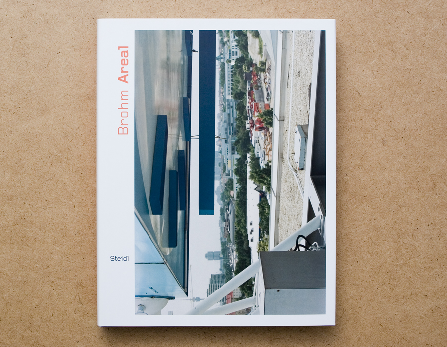
Brohm Areal.
Book concept: Joachim Brohm
layout, typeset: Heike Nehl_moniteurs, Berlin
_______________________________________
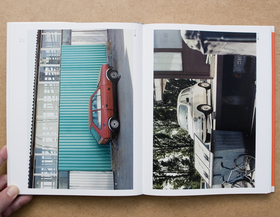
William Eggleston’s Guide is an intriguing photography book. the pictures come from the first one-man show of color photographs ever presented at The Museum of Modern Art, New York, and the Museum’s first publication of color photography. The book i am going to talk about is a reprint of the original from 1976, the books are very similar accept that the new plates have been made from digital scans from William Eggleston’s original 35mm Transparencies.
The first thing you probably notice is that the book is bound in a textured cover inset with a photograph of a tricycle and stamped with yearbook-style gold lettering. this makes it noticeable when let’s say it’s laying on the table, it is hard to overlook and invites you to open it. The book starts with a essay by John Szarkowski on coloured green pages with thick black letters. After the essay follows the series of 48 photographs from William Eggleston’s home town and surroundings. On every page there is one pictures on the right and a small description on the left. The photographs are completely isolated from each other. The thing that struck me was the placement of the pictures on the page. Although most of them are central placed on the page some of them are placed in such a way that they could continue on the blank paper. Overall the design is a bit bland and not to exciting.
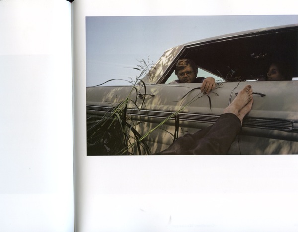
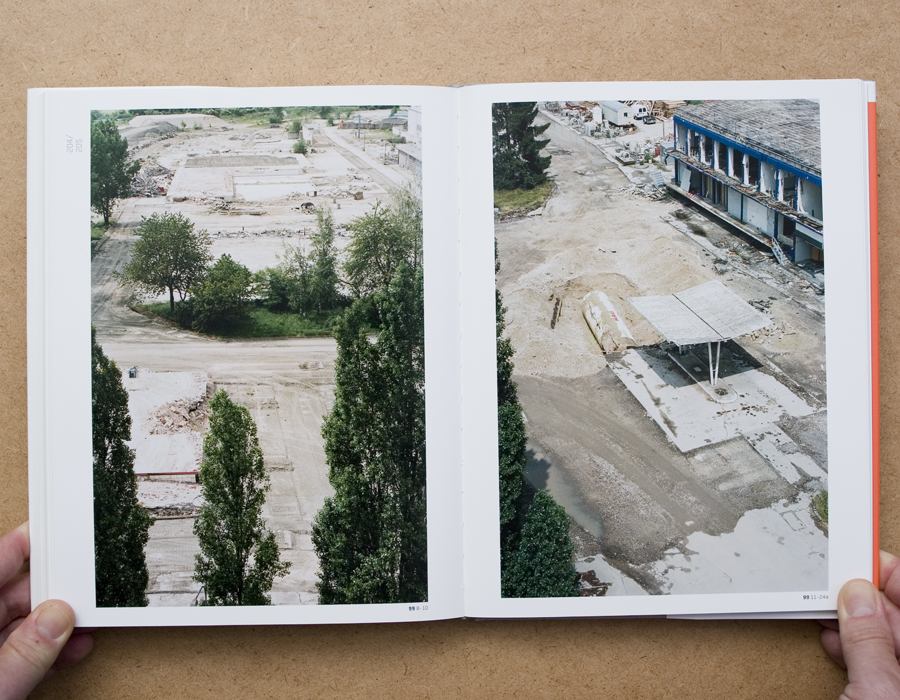
When I was in Germany, I went to the “Museum der bildenden künste leipzig”. In the book store of the museum I came across a book from Joachim Brohm and printed by Steidl called ‘Areal’. This Photography book reminded me of William Eggleston’s Guide, and i immediately saw a connection between the two books, so i bought it. Joachim Brohm undertook a photo-urban project of long-term observation. for roughly a decade, from 1992 to 2002, he took photographs of the same location- on the outskirts of a german city as it was being redeveloped from a 1950’s commercial/industrial district into a gentrified post-industrial services center and living area. In a meditative return, Borhm cartographically captured the premises, their buildings and materials, chronologically documenting the changes and developments during this period. Brohm’s pictorial idiom-characterized by a dissolved center, layering and compositions referring to the continuation of space beyond the picture’s limits-is both documentary and deconstructive. So where ‘William Eggleston’s Guide’ photographs seem too continue on the pages of the book, the photographs in ‘Areal’ refer to the continuation of space.
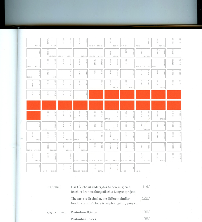
What I found interesting is the way you can see this in the book design. ‘Areal’ is a very “clean” book with big images of which most are placed in landscape, So you need to turn the book too see them. underneath the images there are numbers existing out of the year the photo is taken followed by to others. In the middle of the book there is a index with a overview of all the numbers. I like how the two books work together, although there is not a real connection between the two, they feel really similar, content-wise but also design-wise. There is a certain emptiness or void that fill these books, if you open them you get a kind of sad feeling inside but it is hard to figure out what that is. Like a cross between melancholy and sentimental, but not only the photographs give you this impression but the whole design of the books as well.

Rietveld library catalog no : egg 2