Skip to Content Skip to Search Go to Top Navigation Go to Side Menu


"Beauty in Science" Project


Techno Beauty


Sunday, November 27, 2016

We humans have created technologies and machines to enhance our lives, we invented cars to liberate ourselves, built all kinds of factories to raise efficiency, but now these innovations are striking back, making the environment extremely polluted in high-density cities; some visible, while others may be invisible, but still left the real impact on our daily life and health. Think about donating 50 euro to get a Smog Free Ring[x], which contains smog filtered from 1000 m3 of air, in order to support the Smog Free Tower and Smog Free Project by Studio Roosegaarde.
Will this make a real contribution to solve the problem of pollution? By purchasing a Smog Free Cube, Ring, or Cufflink, are you purchasing a souvenir, a design or are you building your association with the Smog Free Project, the anti pollution movement?

Smog_Free_Ring2324-7394-image
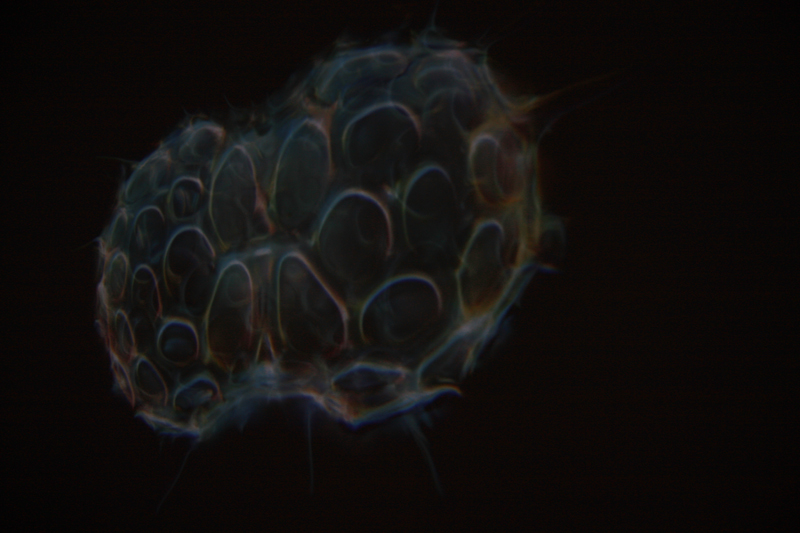
Daan Roosegaard’s Smog Free Ring • Smog filter in Bejing

Our technical interaction with artworks has only developed within the last decade at the level of using touch screen to improve the understanding of drawings, but now in the art and design world, both these two elements have been introduced to the real application domain.

3 Dune by Daan Roosegaarde, Photo Tomek Whitfield_originalFigure-1-X-Ray-Examination
Daan Roosegaard’s public interactive landscape Dune (2006-2012) • John Constable: The Great Landscapes” 2006


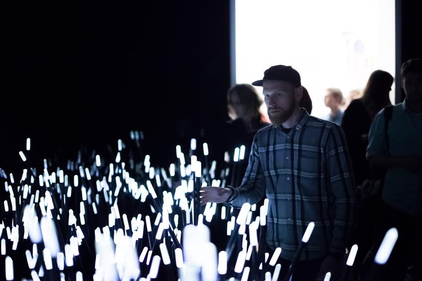
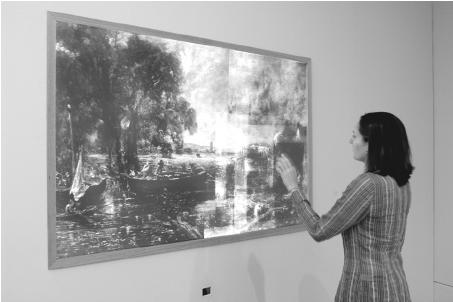
To gain a better understanding of this change, we can look at Daan Roosegaard’s public interactive landscape Dune[x] (2006-2012) which interacts with human behavior, and the Tate Britain exhibition “John Constable: The Great Landscapes[x]” in 2006. The Great Landscape used X-Ray examination and Drawing screen to help the visitors to obtain an understanding of Constable’s working practice and techniques through body movements in front of the X-Ray projection and figure movements on the touch screen (Engaging Constable: Revealing Art with New Technology), while  Dune served itself, stood for a hybrid of nature and technology, artwork and the way to present the artwork. It is composed of large amounts of fibers that brighten and made sounds according to the sound and motions of visitors. Both enhanced social interactions with the help of sense-based technologies and being recorded with cameras and microphones in order to study and analyze people’s interactions, Dune and The Great Landscape had quite different starting points.

The visual impact of the eyes decrease as the other senses are heightened due to the introduction of tactility and sound, thus the aesthetic value is no longer of primary importance and the design opens up a broader spectrum of uses and practicality. This also explains Daan Roosegaard’s later works, how he uses modern technology to deal with multiple subjects; such as the relationship between intimacy and body (high-tech fashion project Intimacy[x], 2010), the historical heritage and sustainable idea (Van Gogh Path[x] [x], 2014), the power and poetry of living with water in Netherlands (Waterlicht[x], 2015 and Icoon Afsuiltdijk[x]).

The modern presentations of art and design in museums and galleries provide personal and collaborative experiences as The Great Landscape did, but Roosegaarde’s tactile high-tech environments enable the viewer and space to become one, not only because it can encourage more people to interact with each other and the environment simultaneously, but also because the technology leads the viewers to become both users and performers, thus the art raises people’s awareness of public issues.

Concerning its unique background associated with environment protection and sustainable development, the Smog Free Ring distances itself completely from traditional souvenirs in a museum and the association created by purchasing it, just as putting yourself in the Dune and reacting with it stands apart from the traditional way to appreciate an artwork. But is this different to other design works which also aim to serve a better life?
As science and technology are an essential part of his work, I want to introduce the Three Cycle Review of Design Science Research from Alan R.Hevner’s “A Three Cycle View of Design Science Research”.

design-cicles

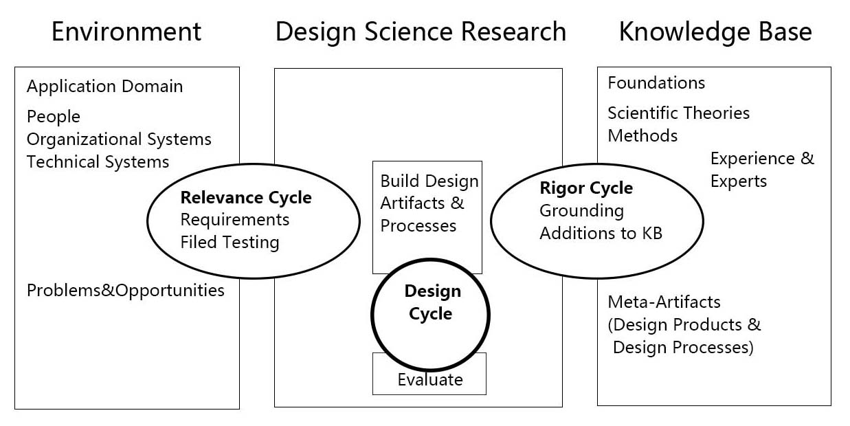
A Three Cycle View of Design Science Research [download as pdf]


Design Science Research is motivated by the desire to improve the environment by introducing new and innovative artifacts and processes. The Three Cycle Review of Design Science Research consists of Relevance Cycle, Design Cycle and Rigor Cycle. Good Design Science Research often starts by identifying problems in an actual application environment or recognizing the potential to improve a practice before a new problem occurs. When applied to the Smog Free Tower, people’s neglect towards air pollution interested Daan to think about building the largest purifier in order to solve the problem. In the Relevance Cycle, the air-polluted environment is not only where the problem is found, but also a testing field in order to see if the design results meet the criteria. Then, they moved to Rigor Cycle and the knowledge base and found the existing air purification technology which is used in the hospital. Following the search for technology, they moved to the internal Design Cycle, and built the Smog Free Tower based on the original issue found in the environment and the technology found in the knowledge base. While the artifact is being built, field testings are input from the relevance Cycle and the design and evaluation methods to Relevance Cycle and Rigor Cycle. After several rounds of improvement, The Smog Free Tower and The Smog Free Ring, which contained both technology and beauty were born.

To give a brief conclusion, pragmatic science, interaction between human, responsibility for the living environment and beauty are core components in Daan Roosegaard’s works and in the future world of art and design. But not only the world of art and design, or let’s say, since art and design has gradually found their new position in 21th Century, they will no long serve aesthetics as the core matter. Techno Beauty, as how Daan Roosegaard described his own works, may becomes a direction in design to beautify and save the world.


Data Visualisation


Thursday, May 19, 2011

Data visualisation

History

Maps are the earliest form of data visualization. The history of cartography starts in 2300 BC with Babylon clay tablets depicting parts of the world. From 350 BC on maps became preciser when the Greek came to the conclusion the earth is round and started to draw forerunners of meridians on their maps.

Data visualization outside of cartography started in Egypt around 200 BC. with tables to organize astronomical information to become suitable for navigation.

Charts are invented in the 17th century by Descartes, who was a mathematician when he wasn’t philosophizing. He used it for calculations but later on people recognized they could be useful for illustrating numbers in a clear matter.

William Playfair introduced among more the bar charts and pie charts. He used them all his ‘commercial and political atlas’ from 1786 and now we cannot imagine an atlas without graphs and diagrams.

The American statistic John Tukey was one of the further founders of data analyzing in the seventies, followed by Edward Tufte in the eighties. After this statistics are integrated in the business world and anyone with a computer can make his own graphs en tables without thinking twice

Albert Bartlett

Mr. Bartlett would like us to think twice about how numbers are integrated in our daily lives, the way facts are presented to us and how easily we can be misled.

He gives lectures about the importance of understanding the exponential (“The greatest shortcoming of the human race is our inability to understand the exponential function”). The subjects he speaks of are still recent, about problems caused by the worldwide speed of population growth.

What we are told in his talk is that we should be more easily get worried about growth percentages. He gives examples from the seventies about the duration of our oil supply. People were told by companies; there will always be enough fossil fuel because we will always find new sources. When that seemed nonsensical the replacement estimation of 1975 was that based on the fuel use of that year, we could last another 500 years.  Ignoring in this calculation the enormous growth of energy use every year, therefor being completely inaccurate as well. The lecture is on youtube under the title; ‘the most important video you’ll ever see’.

Eric Fischer

To bring some art in this article I bring you Eric Fischer, an artist who combines his interest in society and statistics into different works about life and tourism in cities.

Eric Fischer combines information of different websites with his own social questions, rustling in colorful maps of cities that tell a story about its inhabitants and visitors. In his project ‘Locals and Tourists’  he researches the difference in locations of where the locals and visitors take their pictures in town. In the project ‘Race and Ethnicity’ he displays on which places people of different origins live, and at first glance you see groups stick together in neighborhoods.

Final Note

What Albert Bartlett and Eric Fischer both do is combine their expertise and interest for human behavior into a form they then communicate to the rest of the world, trying to get their view across. Albert Bartlett is very literal in pointing towards problems and Eric Fischer’s works are also in your face obvious, but neither bring us an answer. Data visualization doesn’t provide with answers anyway; it is neutral and it’s up to the viewer to do something with it as did the Egyptians 2300 years ago I mentioned; navigate.

The search for perfect symmetry


Thursday, May 19, 2011

Looking at the pictures on the website of Spacecollective I was fascinated by the pictures of patterns and structures. Most of these pictures where pictures with a high degree of symmetry. This started my research to look into the topic of symmetry.

Structures with symmetry most of the times seem to have something that is called visual esthetics. These structures have been a topic of study for centuries. It appeared that most structures consisted out of geometrical shapes that can be split into parts each of which is a reduced-sized copy of the whole. So the structure is build out of an infinite number of copies of the geometrical shape. Structures that have this quality are called fractals. The fractal is the perfect self symmetry. This perfect similarity can be described with a mathematical equation that undergoes iteration. So it seems that there is a language that can describe the perfect similarity to some extent.

To look more in to this language of similarity I researched one of the most fascinating fractals, the Mandelbrot fractal. Everywhere in the luminous area around the central Mandelbrot fractal you can find copies of the Mandelbrot figure. If you zoom in on the figure there are an endless number of copies, which get smaller and smaller.

In a more mathematical depiction of the Mandelbrot fractal the self symmetry be come even more clear. With the enlargement of the picture new small spots appear. Which appear to be new Mandelbrot figures if you look closely. When this detail of the Mandelbrot fractal is colored it becomes visible that all fragment are connected via a complex network of curls and spirals to the biggest depiction of the fractal. So there is cohesion is the most perfect example of self symmetry!

Fractals seemed to have an important function in the description of things that appear as chaotic systems. It brings structure in messy looking systems like particles with an extreme rough surface, the leaf shape of plant or the branches structure of trees.

(more…)

“Beauty in Science”


Thursday, May 19, 2011

After visiting the exhibition, Beauty in Science, I had mixed feelings/thoughts about the exhibition. Of course scientific imagery gives us the possibility to look in a variety of new ways. It open ups a new world which can contain “aesthetics” which we can indeed enjoy like a landscape. In some cases I found this so called “aesthetics”. But in science this imagery has a totally different function that how it was presented in the exhibition. For scientist the image or the search for aesthetics is never a goal. The image is just a presentation of a data set (a model). This way of making an image will always be attached to the image, so presenting it as just aesthetic imagery is too simple. It would be interesting to also present the way of making the scientific imagery (showing the model, the data, the calculations). By showing that it would be a real search for the beauty in science. Now it was, for me, just a search for nice imagery.

Conditional Design and the Human Condition


Tuesday, May 17, 2011

Exponential technological progress is altering the circumstances of the human condition. This evolution and apparent progress in its very attempt to liberate from existing constraints, catapulting humankind towards new frontiers of feasibility and seemingly endless possibilities, creates new limitations. The dynamism and increasing complexity of this world becomes more and more difficult for mankind to grasp, since these new possibilities demand the ability to access, overlook and manage heaps of information necessary to understand and make use of those very possibilities. Choice through reflection and contemplation out of this vast pool of information and possibilities has become more and more difficult, if not impossible given time and resource constraints both on an individual as well as a collective level.

Hannah Arendt introduces in her book The Human Condition three levels of activity that allow us to deal with and survive in the world we live as who we are, experiencing a particular social, cultural, and personal context, inherent to being human and not connected to gender, race, class.

These levels of activity and creation are labour – reproductive activities necessary to survive not leaving anything lasting behind, work – activities, which have a beginning and an end leaving behind an enduring artifact, and action – unpredictable and irreversible deeds and words deriving from contemplation. Arendt places these activities on a scale where action has the highest value and labour the lowest, classified according to the outcome and its perceived contribution to life on an individual and social level.

The term conditional design as coined  by a group of young designers in the Netherlands, describes an alternative, not linear way of design and creation through the simplification of processes by selection of input, translation of action into work, into labor deriving action from labor to speak in Arendt’s words in a larger sense. Conditional design puts the emphasis on the process as the product, fully endorsing the creative potential contained in the making and doing, whilst aiming for a result of any kind. The input feeding the process is selected through the use of logic in order to define rules and constraints to shape the process. The input is derived from the external and hence complex environment: nature, society and its human interactions. Logic is used to outline conditions through and under which the process takes place.

The elements of process – input – logic in the conditional design manifesto are used to redefine the notion of design process and product. The very constraints created are intended to sharpen the perspective on the process and stimulate play within the given limitations opening up new possibilities within the process.

Through these very limitations new creative input is given, since alternative ways around these constraints have to be found or new ways to deal with existing processes are found.

When looking at Arendt’s classification of labor-work-action and the conditional design paradigm process-logic-input, in the past output or product (in design) and action (for Arendt) used to be the main focus. Conditional design theory can be explored as an alternative way of dealing with an increasingly dynamic world by focusing on process rather than end result. Increasing creativity through setting of deliberate limitations or more consciously accepting and incorporating existing ones. When process becomes more important also work and labor can contribute to shape the way we live in this very world. Through the deliberate setting of rules and conditions we can explore new and alternative ways to deal with this what we call and understand as the human condition, where while we might by exploring the how as Animal laborans we might understand the why as Homo Faber.

This is what conditional design can mean on a macro scale, on a micro scale it can be applied to any sort of creative process. Ranging from creation and

design of material or immaterial artifacts, to execution of daily habits, to working processes in any realm.

Translating scientific rules, patterns of nature into fine art projects is another way the logic of conditional design can be used as for example in the work of Stefania Batoeva. This young artists plays with the reversal of the natural conditions as known to us. In her latest set of work Wrong Way Up she reverses the rules of gravity to set a framing condition for her creative process.

I applied the process-logic-input frame to textile design, where I combined existing, rather complex input (the fibonacci series, a mathematical rule related to the golden ratio) with my idea (create a piece of  fabric) and the design process (knitting).

Since the fibonacci series states that each number in the series has to be equal to the sum of the earlier two, I applied the same to the textile design where each new section had to be knitted with the same material used in the earlier two. The most simple Fibonacci series is 0,1,1,2,3,5,8,13,21,… . I used 1 black thread for 0, and 1 white thread for 1, arriving at the equivalent of the number 13 with 5 black threads and 8 white ones.

Conditional design in a larger sense is what happens when we deliberately choose to work under constraints, which will make us explore new alternatives to existing ways of dealing and creating. When looking at sustainability and environmental awareness seasonal cooking, going to work by public transport instead of using the car (not applicable in the Netherlands). Altering existing habits or ways of doing things can lead to change and improvement, or at the very least new insight, and potentially the development of viable alternatives.

What matters is a matter of perception.


Monday, May 16, 2011

When I heard about the powers of ten I thought it was some highly complicated scientific theory that you had to read really carefully and with much mathematical understanding to comprehend.
But in fact the ”Powers of Ten” is a 1968 American documentary short film written and directed by Ray and Charles Eames, re-released in 1977.

The film depicts the relative scale of the Universe in factors of ten.
It illustrates the universe as an arena of both continuity and change, of everyday picnics and cosmic mystery.

It presents the profound idea of orders of magnitude, with the subtitle of the film being:A Film Dealing With the Relative Size of Things in the Universe and the Effect of Adding Another Zero.

I want to show you one of the many remakes that have come up since 1968.

A little bit more cheesy, Americanized than the original with Morgan Freeman’s voice.

It shows the part of space we (humans) can see.
it’s stupendously big!!

Cosmic voyage – the power of ten HQ on YouTube

The theory of powers of ten tries to comprehend our world in numbers.
It fits everything from the atoms in our cells to the outer universe into a simple scheme of multipliing by ten.

By depicting this scheme the film gives a portrait of the various perspectives we can have on our world.

Our brain is capable to perceive the world on so many levels.
We can think a lot further than of what we actually know or have experienced, like the universe for example.


But we can as well think about the ungraspable development of thought .
Our brain can think about itself thinking.

There are many different levels of perceiving the world we live in.
Starting from ourselves I could think of the following levels:

The material level (what we consist of)
The personal level
The closer social level
The cultural (society level)
The global level (political/environmental)
The universal level ( seeing the world as a spot in the universe/ a world of constant change)

What matters to us changes violently depending on in which level we are thinking about things.

(more…)

9 1/2 by 12


Thursday, May 12, 2011

Karl Blossfeldt born in 1865, was like his father before him, a huge lover of nature. This love soon turned into an obsession. For more then 30 years he documented and photographed sections of plants with a self made magnifying camera. No longer revealing them as natural forms but more as abstract forms.
In the time that Blossfeldt began taking photos around 1899, photography was more seen as something scientific. Karl just saw it as documenting to restore our relationship with nature.

At that time his photos shocked and inspired the art world, never before had the world seen plant formations like this, in such great detail. His photos were taken just about 60 years after the first ever photo was successfully produced.
If we look at Blossfeldt’s curriculum vitae, it clearly states he was a sculptor and professor of art, something quite different from a trained photographer or scientist/botanist.
But that didn’t mean he wanted his photographs to be viewed as art. The question remains, was Karl just one of the first macro fanatics studying the biology of plants, or was he an artist looking further then biology or was he both?
This is a question that Karl himself was obviously not fazed by at all. He simply stated:

“My botanical documents should contribute to restoring
the link with nature. They should reawaken a sense of
nature, point to its teeming richness of form, and prompt
the viewer to observe for himself the surrounding plant world.”

If he is trying to do so –trying to reawaken a positive feeling for nature– he is giving it to us, by no system of emotional representation. Just plants against a gray wall. So I’m guessing it is the plants themselves that are supposed to reawaken this in me and I’m not quite sure it is working.

Even if I can’t find an immediate understanding of his work right now, I can at least have an admiration for his ability capture something on camera, no one had done before. For his ability to show how our man made world –with its architecture, fashion, design etc– is visually not much different from formations and patterns found in nature, probably without those designers even noticing it themselves.

Here are a few examples of architecture, fashion and design that is very comparable to the images Blossfeldt created.

code


Thursday, May 12, 2011

The mutual thing between the human genome and vending machines is the fact that they are both working by a certain code, in the terrible future where they will make human clones as organ donors there will be no difference in the code of the ones you save and the ones you sacrifice, vending machines that puts out livers and lungs.
code is a pattern, a repetitive logo ,buildings are made out of codes shaped like bricks ,physical truths are based on codes, if that(x) then that(y) .
code is a routine, even music is made out of code, 3 notes creates a chord, certain structure to create certain effect on the soul, minor chords make you feel sad, major ,makes you feel happy, and D minor makes you feel weird and suspicious .
the anarchistic code of sugar cubes is translated to energy = life . coded slaves can build a pyramid. the world war two was finished by cracking a code . fax could be transferred by codes , time is expanding with codes.
Dolce & Gabbana has a code .
analog photography has no code but mostly it is printed by coded printers, pictures of reality we see are usually made out of pixels in a certain order, dots, squares, circles . the eye isn’t seeing codes its sees forms, the brain translate it to codes, or maybe its the opposite .


Wednesday, May 11, 2011

Due to sickness, I was not able to attend the excursion to “Beauty in Science” in Museum Boijmans Van Beuningen. The name of the exhibition though really triggered my interest but I had heard some rumors that ‘checking the web page of the museum would not be any different from paying the exhibition a visit’. I had a look at the Boijmans website and classmates’ contributions on our design blog and I came quickly to the conclusion that the rumors were likely to be true. I had hoped for stuffed animals, old education books, fascinating scientific tools from out of space and paintings as ‘The anatomy lesson of Dr. Nicoleas Tulp’ – things that I had seen on my favorite floor of the beautiful Naturalis (Leiden) very often and that inspired me every time I had visited this museum. And though I don’t need stuffed animals and fetuses in jars every time I visit something science related – I’m also very open for new experiences – the things I saw on the website were pretty dissapointing and above all, nothing new. Something on the web page of “Beauty in Science” says it all, actually:
In his essay Hans Galjaard writes about how he was moved by a film of 4D ultrasound images of the development of the human foetus made by the gynaecologist Stuart Campbell. This was the beginning of his plan to collect aesthetically pleasing scientific images. In his quest for images he has asked many researchers if they have also experienced such a moment of overwhelming beauty – a so-called ‘Stendhal moment’ – but this was not the case.
So how should we experience this ‘overwhelming beauty’ if even the researchers who contributed footage for the exhibition did not feel anything of this themselves?

The hands of Nicoleas.

s-objectivity


Wednesday, May 11, 2011

“The YouTube slogan is “Broadcast Yourself”, an encouraging motto that calls up associations of a democratic Internet commons where all voices can speak and be heard. Here, it says, is a space for all individuals to create and control a channel of their own, transmitted to the world.”

Elizabeth Clark – What Good is the ‘You’ in YouTube? Cyberspectacle and Subjectivity

http://gnovisjournal.org

What is objectivity? Is it what we learn in school, the universal truths, that are right and won’t change no matter what context? Water will always frozen under 0 degree Celsius. Fair enough, objective truth. But what happens when objective facts are translated in subjective ways? Where is the neutral space there? What becomes of the neutrality of objectivity? We live in a world of exposure, of the self exploting, where the more you show the more you become. So where is the objectivity in all this? Where does it places itself within this world of subjective googles?

Laid Off – Natalie Bookchin from natalieb on Vimeo.

If we take the work of Natalie Bookchin – Laid Off, she shows an objective fact, to be fired, through the light of a lot of different experiences, all of those told by the person fired, in the first person, as if they were talking to a friend, but in fact made for youtube. Here she uses the personal diary of millions of people, put at disposal by them through a videoplateform, to talk about a fact, being fired. There is no maybe in that action, you don’t get “maybe” fired. You are either fired or you are not. But the way this fact it’s told by all these people, expresses more of the sensation of being fired, the feelings, the human side of the objective fact. Though I might question the means of communication that these people felt the urge to use, this self entertainment, I do nevertheless agree that objectivity is useful, but nothing without subjectivity. As one thing can’t exist without it’s opposite. So objectivity has it’s place in this neverending “me” world, it’s neutrality might be hidden under all these personal experiences, but it is the base of any reaction, it gives the impulse of reality that you need in order to jump (or not) into your own truth.

https://designblog.rietveldacademie.nl/wp-content/uploads/2011/05/Screen-shot-2011-05-11-at-6.24.31-PM-161×300.png


Wednesday, May 11, 2011

'Schotter' by Georg Nees

Computer art is any art related to computers – in the display or in the production of the work. It is such a broad term that I did not really know where or how to start. In the 1960s, computers were very exclusive things and the artists who started experimenting with these machines were really doing something that was never done before with tools and techniques that were never used before. But nowadays, digital technologies are integrated in traditional disciplines and therefore it is a bit harder to define where the term ‘computer art’ is applicable.

For what I have see until now in my short life, I don’t have too much affection with digital arts. But that might also have to do with ignorance, and the fact that even my mom can handle computers better than me – sometimes I even edit my photos in Word, something that people would like to kill me for. But when I found an article about algorithmic art, I could not ignore the fact that computers can actually do stuff that goes beyond human capability, and create things that would not be possible without automation, which is interesting, especially when you think of it as something that started about fifty years ago. They now seem a bit ‘flat’, but these works were the first steps into making art that involves science (and maybe also, science that involves art?), which makes me find them truly fascinating.  Because these artists really explored the borders of what was possible with new techniques, using them in favor of their creativity, I find the link between art and science in these works much more interesting than in the works in the Beauty in Science exposition.

mystery in beauty


Wednesday, May 11, 2011

First i’ll quote a little bit of wikipedia so that you know, if you didn’t already, what the golden ratio is, because that’s what the subject is and it might be nice to know:

“In mathematics and the arts, two quantities are in the golden ratio if the ratio of the sum of the quantities to the larger quantity is equal to the ratio of the larger quantity to the smaller one. The golden ratio is an irrational mathematical constant, approximately 1.6180339887.”

The golden ratio can be found in a lot of things that are considered beautiful, because it gives a certain balance that is liked by humans. It can be found in: nature, music, architecture, human body/face, art, etc.

The golden ratio was already ‘found’ by the ancient greeks, but it was only during the 19th century that they discovered that it carried a beauty that can be connected to art, architecture and nature.


Le Corbusier, a swiss-french architect, developed the Modular, an architectonic measuring system that uses the golden ratio. He used the modular for all his buildings, but he stated that he thought it was a bit sad that the golden ratio was discovered in relation to aestethics, because it took the mystery away from beauty.

The mystery of beauty appeared to be, in much scientific opinion, just the average.

I wonder what is this ‘mystery’ anyway. The beauty of ambiguity, something that keeps you wondering, and surprises you. Because at some point, caricaturing an attractive shape will result into abnormality that that con­cur­rent pref­er­ences for av­er­age­ness will out­weigh pref­er­ences for the at­trac­tive shape di­men­sion.” To put it more simp­ly, Plain Jane is not with­out her charm.

Minerals, dead pets, design?


Wednesday, May 11, 2011

When searching for ‘mineral art’, Google suggests I look for ‘minimal art’. When searching for ‘mineral design’, the first hit I find is a website from someone who collects minerals and sells them as design. The first question that arose in my mind was inevitably: is there such a thing as mineral design? Sabine Amory, the woman who ‘seeks the most beautiful minerals she can find for her own collection and for her customers’, simply calls her website “mineraldesignshop.com”, but can you call it design when someone merely finds something beautiful of which Mother Nature is the only maker, and labels it design? I say no. In the art world you can put a ready-made in a museum, and then call it art. But the whole idea of design, is that you design something. You use your brain and your hands to create something new. Or is it old-fashioned of me to think like that? Am I condemning Sabine without a good reason? I decided to ask her, along with two other companies that call themselves ‘Mineral Design’ (mineraldesign.com.br and mineral-design.com). My question was: could you please give me your opinion on minerals as a material in contemporary design? It’s been two weeks now, and I don’t count on a reply anymore. Maybe Sabine doesn’t see herself as a designer after all.

So-called ‘mineral design’

(more…)

Father and son Blaschka dealing with reality


Wednesday, May 11, 2011

Leopold Blaschkas (1822-1895) came from a long line of skilled glass makers. The family was originally from Venice, but lived in Bohemia, (what is now the Czech Republic). When young Leopold studied to become a goldsmith and gem cutter but then joined the family business and his main work was to produce glass eyes.

In 1857 his son Rudolph was born but shortly after two tragedies occurred in his life, his wife died in an cholera epidemic and two years later his father too. It was hard on him but he found a way to deal with his sorrow. He was artistically talented and started to look at the nature for inspiration, and sketched what he saw, plants and animals from outside his home and in exotic natural books he found. And then, on a boat trip to south America, he spend his time looking out in the sea around him. There he got struck by and fascinated by the sea animals he saw, those without

backbones especially, because of the transparency of their skin surface, which reminded him of the glass he was used working with as the glass master he was.

Although he was already one, he and became even more a passionate nature history lover and as a hobby he recreated both plants and animals in glass. After his encounter with sea animals he started making them in glass and then became one of the first who recreated animals from the sea in an accurate way, at that time you couldn’t take photographs under water.

In the late 1850s Leopold was commissioned by a Mr. Prince Camille de Rohan to create 100 glass models of a orchid collection Leopold already had started to work on. His models then got exhibited in Dresden Natural History Museum, This was the start of his career.

(more…)

Further understanding of ”Beauty in science”


Wednesday, May 11, 2011

In the ocean, small creatures are swimming around, a form of zooplankton they are, called radiolarians. The name zooplankton is derived from the Greek word ”zoon”, which means animal, and ”planktos”, which means ”wanderer” or ”drifter”, a drifting animal. Individual radiolarians are normally smaller than a hundredth of a millimeter, but some reach the size of a full millimeter or even more which makes it possible to see them with the naked eye. Some species are holding onto each other in a group and may reach a total size of a centimeter and even meter scale all together. The remains of the radiolarian skeleton cover large parts of the ocean bottom and works as radiolarian ooze. The shells of the radiolarians when they die, sinks to the bottom of the ocean, and over time, if enough shells sink together, their skeletal remains become sedimentary rock.

These drifting animals have been a great inspiration in creative fields. They look almost non earthly, both peculiar and beautiful and works as sorts of readymades from nature. An important person in the mapping of the radiolarians is a german biologist called Ernst Haeckel. He named around 150 species during his lifetime. More than a biologist he was also a philosopher, physician and an artist. I find this combination of working fields interesting and the story of Haeckel links to the beauty in science exhibition that is running at the museum Boymans van Beuningen this year. In year 1904 Heackel published a volume called Kunstformen der Natur, which consists of his 100 best prints of organisms from the sea, many of them first described by Heackel himself. Heackels work is a proof for that science and art can operate side by side and that they inevitable borrow from each others world.

It is not only Heackel that has been inspired by radiolarians. There are music pieces composed, architectural work and there is even a whole art genre named radiolarian art.

It is indeed something special about the planktons. Their structure is a living proof for that the more even a geometrical structure is, the more solid a construction will be. The shell which is made out of silica, also used when making glass, is inspiring for material oriented people. Radiolarians pattern have been casted and used over and over again and my conclusion is that reality and what reality offers is a fascinating subject and a good design and art recipe.

Radiolarians looks as if they were born out of pure imagination and they make me think of cells from a body, about the depth of the see and of universe in its whole. I get the same feeling as I got at the Boymans-exhibition when looking at a picture of the universe. It made me think how very surreal it is that we live inside that picture, now I think how very surreal it is that us living things, built out of small details, living in that big picture. The picture of the universe made me think about how we so badly want to understand why and about our need of decoding our reality and I suggested that religion, science and art works with the same questions but with different approaches, and now I think it is fascinating that when zooming out and when zooming in, the same magic occurs.

And then I wonder. Why did the picture of the universe got my attention in first place. And why do I react the same way on radiolarians? Not many other creatures inspire in the same way, i haven’t heard about rabbit art for example, or shark art. And why is that? My conclusion is because of the esthetics and because we are forced to leave our everyday proportions. It is actually purely the look of the radiolarian that was interesting to start with, I assume it was the beauty that made Haeckel treat radiolarians in artistic ways. The beauty, not the function they have, or history or further anecdote. It makes me think how important esthetic actually is? Is the magic I try to describe beauty? And is actually the good art and design recipe beauty? Would the radiolarians be interesting if looking like potatoes? I don’t think so. And what would happen if not needing to zoom in and switch from everyday proportions? Would radiolarians be as interesting if they were in human size laying around on every street?

It is somehow comforting that radiolarians swim in the sea and that stars shines from universe. And in whatever field we are working with, we are striving to find our place somewhere in between. And some make buildings and jewelry and other radiolarian art.

Don’t you wish you had microscopic goggles?


Thursday, May 5, 2011

Exhibition rooms were made bare for imagery with such vivid and strange colors and shapes that its hard to believe that these images are in fact real life forms, just microscopically zoomed in. At the beauty in science exhibition in Boijmans van Beuningen museum, this kind of scientific imagery is on display, only taken out of its scientific comfort zone.

You could discuss if this is in its favor or not. On one hand having a different audience looking at ‘scientific’ imagery might give light to those who don’t understand what their seeing, to make use of the visual aesthetic and inspire them. But on the other hand they are also taking a risk, in a way like art, by  showing a whole different audience things they understand themselves. A lot of people looking at it most probably won’t.

A majority might end up aimlessly walking around the museum wishing they had microscopic goggles. Just like some who go to art galleries and instead of thinking about the ‘message’ of a painting, instead think something more like: I wonder if her boobs looked like that in real life.

But no matter what they were trying to achieve, this exhibition could certainly change your way of thinking that there’s so much more visually to our world that we couldn’t get our head around it. But I don’t think this is something groundbreakingly new and for allot of people the beauty in science exhibition will do nothing more then the name says, show us the beautiful side of science, but if it will do more then that, I guess is just a matter of opinion.

beauty is the content?


Thursday, April 28, 2011

The exhibition had the effect of a breeze to me. After spending hours on the internet, coming across hundreds of images, of which you never really know their origin; and when the manipulation of any image is a knowledge available to any 10 year old, seeing these images in the museum seemed like a pause in the middle of all that noise.
I knew at least watching these, that their purpose was neither glamour/beauty nor economical or political.
These images are somehow free from the media society, which is allowing them to just be, simple as they are, an “objective” observation on life. Of course some decisions were made by the maker of the experiment, incorporating some subjectivity in the result, but all in all, these images depict some sort of truth.
Without pretending to be anything else than documentation or aknowledgement of what “is”, you become interested and surprised by their beauty value, but certainly more because of the fact that these images are not seeking it. But couldn’t we have this feeling by just going to a science museum? To placed them in an art museum and naming them art is really questionable. Since these images are not meant to be beautiful in any way, even if we find them beautiful, it seems a bit too simple to show them to the society as “hey, look at these, we never noticed how pretty they could be”. It’s almost as making an exhibition of children drawings in a museum, of course they can be interesting, but it’s more of the rank of a gallerie exhibition. A museum should show works that are relevant socially, in the sense that each exhibition should (and are meant to) convey a message. These scientific images in this context just seem to be visual enjoyment. Somehow I couldn’t figure out clearly where was the museum going with this choice.
Nonetheless, it made me wonder how strange and surprising nature, the universe or us are, and made me think that in these overmediated times, we can easily derail from our own awareness of basics, such as our own body, by being just a big communicative muscle.


Log in
subscribe