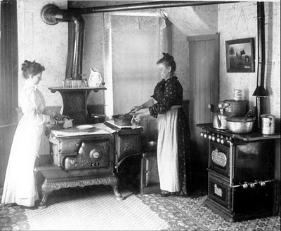
Skip to Content Skip to Search Go to Top Navigation Go to Side Menu


"“subjective library” Part 3" Project


Why Not?


Wednesday, May 22, 2013


Choice, Cover, Sound. What can I find? Books, Visual, Design Why should I choose this one? Well. It wasn’t easy at all. But it was at the same time. operating 6 different words, which are never combining on the same title but can be easily associated with one single cover.
That was the idea. That was the choice. That was the start and finish point at the same time.
“Why not?” – that is the title for the third book I took from the library. The name that matches all of three chosen tags. If you start to Google it with "why not.." you will immediately have few options
Why not design,
Why not associates?
Why not" and "why not both".
You will also find website called WhyNot which propose "How to Use Everyday Ingenuity to Solve Problems Big and Small" or
Why Not Eat Insects? Or
Why not build more Schools Without Walls?”
Why not take up knitting again?

Sex and intimacy after 60: Why not both?
Why not kill two birds with one stone and send IRS to Gitmo?
Dogs on trains? Well, why not?
Why not be a naive?
Why not to swipe your girlfriend's skincare?
SO when I was googling in the library by hand, touching, looking for something special, taking, putting back to the shelf, searching and exploring and when I saw the perfect book for that
I had no more doubts – that was the right one.
That is funny, you don’t care actually what you will read about. Just simple choice of a book, as a subject, as a thing, as a piece.
Ask “Why?”, think “Why Not”? And take it!

Rietveld Library cat.nr: ?


History repeats itself.


Wednesday, May 22, 2013

Does this mean you make the same mistakes twice?

Do we re-live our past but in a different atmosphere?

Can we see our future in the history of time?

It is surprising how the sum of the past and the future can result in the present. As well as in the last book I’ve chosen, I have the feeling that two different time spirits come together.

The layout and especially the letters used on the cover of this book are very old fashioned; the use of soft orange dyes in a round shaped fond combined with a black and white frame. A frame which reminds me of origami class where at least six women with the age of forty-five and higher are sweating over a piece of paper trying to construct a whooping crane. But the picture of the cover doesn’t correspond to my slightly ironical conclusion at all. It is a picture of two wooden beams with beautiful shapes on the end of each beam. The shapes are perfectly opposite so that they can fit together as two pieces of a very complicated puzzle. It looks very modern, like something they use in high tech vehicles or space ships.


At present, the title began to dawn on me. It said: ‘The art of Japanese Joinery’, made in 1977


After a small peek into the content of this book, it occurred to me that it was filled only with old Japanese ways to attach two or more pieces of wood together. Not in the prefab-style we attach stuff these days, but on the most exquisite, caring and futuristic way possible. I felt for a moment so angry at our IKEA society where everything has to be cheap so you can buy a new sofa every four years, not caring about old handicrafts and their gift to make the most refined details. Details of such beauty that you have to suppress the urge to dismantle your closet only to see how it has been made.
The tender approach of something so simple as to attach two pieces of wood together reminds me of the first book I had chosen, where Nabokov describes individual letters of the alphabet in the way he experienced them.

Affection, or at least attention, for stuff we work with everyday, like the feeling of a specific letter, a symbol or a construction, is very rare these days. We don’t seem to have time to notice these small ‘gifts’ in the rush of everyday life. So next time you go to the library, go with an open mind and grab the very fist book that draws your attention. You’ll be surprised what comes out.

Rietveld Library cat.nr: 694.1

Mike Mufasa Edwards, I miss you


Tuesday, May 21, 2013

continuing from ……[Here, here little foxie]


I walk up to the book that I found in the catalogue online and realize that the devil isn’t even orange. Which it was on Google. God damn it. I wrote a shitty text about an orange book that isn’t even orange, and thought I’d get away with it.

In the corner of my eye I see a big, fat, shiny book, almost bursting out from the self a couple of backs away. AMERICA! the back screams to me. Reminds me of my sweet friend Vera, who is absolutely and almost frantically in love with this country. Oh Vera, I sigh, America is just about burgers and cars, what can this book really offer me? I do as I usually do and pick the book ironically.

A jambalaya, the word for hot black dude my friend Irene uses shamelessly, cover the front. Gold tooth and all. It’s about portraits. In America.

I open the book and suddenly I understand why it was so important to actually go to the library and not just surf the catalogue for this assignment. In this glossy package I see dreamers, lovers, haters and the America Vera fell in love with. A sensitivity that needed this screaming shiny cover and assignment for me to see it. And it makes me think about Mike. My best friend’s ex from Miami whom I never hang out with anymore because that would be kinda weird.

He was exactly this book to me eight years ago when they first met. Tall, shiny, too big for the place he was put into, screaming around but with a magnetizing effect that immediately made everything around him dull.


I miss him. And I think I want to go to America, just to see the America that Andres Serrano gave me a glance of with this giant of a book. And Im not even sarcastic know. I really mean it.

Rietveld Library cat.nr: -serra- 3


The Attraction of the Unknown


Monday, May 20, 2013


In my third research I wanted to be more concentrated on the tag “paradox” because the last two researches where more based on the focus on the object chair and the humoristic association of the presentation of a chair in those books. Anyways this research now was more extended which made it also harder to find only one book fitting to the tag “paradox” but I stumbled over one book which is besides its outer appearance, the cover work, also a really interesting book about photography. “Mapping sitting” caught my eye first of all because of the title, the word mapping sitting doesn’t make not really much sense to me, not even with the subtitle “on Portraiture and Photography”, which all start to make sense when you see the front cover, together with the back  and the back cover of the book. Under the written words you can see old photography’s probably of a square in a big city where, when you take a closer look, the ghost shapes of humans are recognizable, those are overlapped over each over and seem to first build a big and hard to identify mass, on the second and closer look the mass is building a crowd. On the Third look you are also recognizing that the square is also a overlapped collage of photos of different squares which seems to be build one big picture of a square. The impression of just these photo collages on the cover, for me, means documentation, a documentation of another time (all the pictures are in black and white and obviously from the early last century), a collection of photos which have been put together in a book, one page laying over another. Therefore the word mapping start to make more sense; the photos are documented and collected as the information’s of geographical facts on a map, which is my first association of a map.  Still the word sitting stays mysterious for me, at least as the title on the cover without knowing the content, because you see actually mostly portrait photos of people sitting, inside the book, but on the cover design I cannot really find a connection to the word sitting. All in all I would probably say that this is the reason why I have chosen the book, the paradox or the not understanding of the title, which makes the book to something exciting.

Rietveld Library cat.nr: 761-bas-1

Pick me.


Sunday, May 19, 2013

Hello, i´m very very very small. But worth to pick me out of the closet. There is mold in me, but I can´t do anything about it. I will fit in your pocket. I´m grey but not boring. I can tell you many things but not too much. But sometimes you shouldn´t tell too much because you can figure it out by yourself. I want to inspire you instead of telling you everything. Did you ever thought a person that you met and told everything about their self is interesting? Well that´s the same with us books. Encyclopedia´s are so snobby. They are know-it-all. You don´t want to be neighbors with an encyclopedia on a shelf, believe me. A chick flick is also a nightmare. I think I prefer also the older books. But the more specific ones. I had an amazing neighbor it was an old ancient roman. But it was in pain. The cover was almost hanging of the pages. The conversations were interesting but in the same time painful. Because I could hear the pain. I can only hope that I will get to that age. That I´m interesting enough to be in a library instead of being sold or thrown away. E-reader.. yes, that´s our enemy. It´s getting harder every day. We are in fear. That´s why we don´t want to look old and dirty. Because the chance you will be thrown away will be bigger. Some of us has been thrown away or sometimes never returned. It´s always exiting to be picked in the library. It can be amazing but also be horrible. Some people put boogers in us. Or fold our pages. One of our neighbors had a lunatic that put his dick on every page because he knew people would touch it. It was traumatizing.

If books could only speak


Sunday, May 19, 2013

Because I was thinking why I always chose small books, this time I a took a bigger book. But it was thin.. I don´t even look at big books. The cover was grey and it looked so boring. Boring in the way that no one will take that book. The books that get forgotten. I wonder sometimes what if books could only talk, what would they say. I think this one will be the strange one. The older book and I think he would have white hair. I´m thinking this because on the cover there are Greek pillars. A wise old white hairy man. Would some books just scream like in Harry Potter: PICK ME! Or hide because they are so old and a lot of people already read them. I think the new books would be the one that scream pick me and appreciate what is inside of me. The date on which someone rented my book was in 1994. I´m wondering why she or he would have taken that book. That is such a mystery about books in the library. Who took them and where did the books travel to? I think if you take a book on holiday, they will hate the beach. Because there will be sand in it and they will be wet. I think they would prefer old people. Who still really appreciate a book and cares about how you threat them. That don´t use Wikipedia but look their information up in an encyclopedia. I think if books could speak they would feel much lonelier than 20 years ago.

Do you ever read your journal?


Sunday, May 19, 2013

The first thing that I noticed about the book that it´s a very small. Always when I have to pick a book I take the smaller ones because I am less scared of it because I know that I can always carry it around. Also that I don´t have to read hours in it to understand everything. But actually it doesn´t make any sense because one phrase of a philosopher could keep me busy for days to understand. The cover is made of marble paper. My brother use to make it when we were kids. In the country house we used to be busy for days playing with colours and patrons. What is it that when you grow older you are more thinking about the past? Sometimes I´m thinking of what will happen to all the old books in 200 years. Will people throw them away? Or will it be something to collect and cool to read instead of an e-reader. Or whatever people read from in 200 years. There is an etiquette in the book. I wonder about the days that people were so proud of their book that they put an etiquette in every book. Like they were treasure. I think this book is treasure because it´s gives me the feeling that is a kind of journal. Orange and yellow are strange colours to combine for a cover. A choice I didn´t see often. Also I never made that colour combination with the marble paper. I never had a journal. Maybe this book makes me wanna have a journal. Because you lose your thoughts. But at the same time you shouldn’t live too much in the past. I also wonder how many times a person that has a journal actually reads it after.

Humols


Sunday, May 19, 2013

‘Symbols are more meaningful than things themselves’
Jenny Holzer

The definition of the word ‘symbol’ in the Dutch etymological dictionary says the following: ‘that which represents something abstract of absent’. To me, this is a very clear notion that there is no actual difference between letters and symbols. Both are representations of images we gave a certain meaning to understand each other in daily life.

Imagine ancient times where we communicated with sounds, clangs and certain movements. The visual aspect of life wasn’t half as important as it is now. There is no need for physical attendance of ‘the other’ to communicate your message. We live in our own virtual and visual bubbles where we are surrounded by symbols of many kinds.

In the last hundred years technology took over the world, physical labour will not be necessary in more than 50 years. Symbols ,the collective noun of codes, letters, numbers and icon’s, have become our life-force. Everything in our daily life runs on notably abstract ‘doodles’.

What stroke me of seeing this publication was that it is a clear example of the evolution we’ve been through. Alpha being cave drawings and Omega the clear letters and numbers on the spine of this magazine. On the one hand it makes me proud being a part of this species but on the other hand it scares the shit out of me that it is only a matter of time that we become a symbol ourselves.


This book is not from the Rietveld Library but my own.
If you want to know about Trans-Humanism look at this video documentary [X]


Captured in the infinite


Sunday, May 19, 2013

The  three figures on the cover reminds me of a person that is structured in life.

A person that is good in maths and can calculate a drawing.

M.C. Escher for example.

I’m the total opposite.

I just passed my maths exam with a 6,5 out of 10 and a lot of effort.

Some people are capable to make an other dimension with just a pencil, ruler and their knowledge.

Precision it what it takes and a huge focus.

The music of Nujabes a Japenese hiphop producer reminds me in the way of producing a whole other world.

Audio clip: Adobe Flash Player (version 9 or above) is required to play this audio clip. Download the latest version here. You also need to have JavaScript enabled in your browser.


His songs are for me a translation of certain feelings and atmospheres that we don’t even have a word for.

A lot of times people describe those moments as nostalgic.

But far away you know it’s something that you can’t describe.

Because there is no word existing for that feeling.

That’s why language always will have this barrier.

Rudolph Otto a German religious historian has a beautiful quote about the moment in history that people could provide their own food while none of the 3 monotheistic religions were there yet. The book which holds this quote is about the history of the three monotheistic religions.

quote: The symbolic stories, cave paintings and sculptures were a try out to express their amazement for the ubiquitous mystery and to connect it to their own lives. Nowadays poets, artists and musicians are driven by that same desire.
-'das heilige 1917'

For me that is the best explanation that I crossed awareness about what an artist is.

We try to translate fragments of the ubiquitous mystery that there is.

There will never be one work that will explain what the ubiquitous mystery is.

It can be the cliche question like why are we on this earth?

But for me the same mystery is that I can connect a song with a certain atmosphere for which there is not a word.

Such a translation of that atmosphere recognizable in a painting, sculpture or a song etc. is a mystery that doesn’t work for everyone.

So if you connect to and experience that certain feeling of recognition that is a fragment of that ubiquitous mystery.

Rietveld Library cat.nr: 004 Lau 1


Synesthesia As a Reason For Subjective Choice


Saturday, May 18, 2013

There is a Synesthesia exist.

As for information from the Wiki difficulties have been recognized in finding an adequate definition of synesthesia, as many different phenomena have been covered by this term and in many cases the term synesthesia (“union of senses”) seems to be a misnomer. A more accurate term for the phenomenon may be ideasthesia.

According to Richard Cytowic, sound ? color synesthesia, or chromesthesia is “something like fireworks”: voice, music, and assorted environmental sounds such as clattering dishes or dog barks trigger color and firework shapes that arise, move around, and then fade when the sound ends.  For some, the stimulus type is limited (e.g., music only, or even just a specific musical key); for others, a wide variety of sounds triggers synesthesia. I’d like to have it. How is it to feel the sound with the color, or drawing with the sound?

Sound often changes the perceived hue, brightness, scintillation, and directional movement. Someone can see music on a “screen” in front of his face. Deni Simon, for whom music produces waving lines “like oscilloscope configurations – lines moving in color, often metallic with height, width and, most importantly, depth. My favorite music has lines that extend horizontally beyond the ‘screen’ area.”

I pretended being an synesthet while I was touching hundreds of books on the library’s shelves. I would like to see in all of this pictures a sound. To feel that the title of the book I chose is not a trick, and design made by machines is truly loud and 3-dimensional. Is it?


Signs can be art to


Tuesday, May 14, 2013

The art section of the library, this is where we have to choose our third book. This week again we had to take the key words of the last book that we chose, and then choose a new book taking these key words as criteria.

So my question this week is what do we consider the art section of the library of the Gerrit Rietveld?

To start with its all ready a small library in which they already have a small selection of book, and I would say the selection they have there is a selection made on books that would be useful to art and design students. It would seem weird if they had mathematics and science books cause they wouldn’t really be the most used books there, although it would be nice and maybe useful if they had science books.

So saying that I would say that the whole library of the Gerrit Rietveld is already an art library, with books about art, design and of course philosophy.

So that already makes my task easier, now I just have to pick my last key words which were distinction, yellow and stencil, and take these to choose a new book in the whole library (except the philosophy section).

So this is what I did, I entered the library started walking through the shelves picking up every book with an yellow cover, none of them had something with stencil so this keyword wasn’t really useful. All the yellow covered books were quiet boring and not at all distinct so I kept on walking through the library until I got to this book titled 1000 colors (since yellow is a color I picked it up) it had a traffic sign on the cover and an yellow sign that said END at the back. I flipped through the pages and it was a book with let’s say about 500 pages all about signs, a few known signs but also made up ones. It turned out to be an interesting book that shows that you could make a sign up for practically everything and you can make an art out of it.

Rietveld Library cat.nr: 754.9

Here, here little foxie


Tuesday, May 14, 2013

I like this one.

Or maybe not. Because it’s orange. I hate orange.

Or do I.

Strong feelings, dragging both ways. It hurts. No, I like this one. But it’s orange.

Since I moved to Holland I think orange is the colour of annoyance. It represents drunk and ignorant people with no sense for fashion, running around in the streets, pissing in my staircase and littering the veins of Amsterdam.

But also, the colour of my hair. Gingerlicious. Makes me wonder, is it so, that also I am one of those?

Well I guess a little bit yes and a little bit no. As in all deep cases in life, it’s easy to get lost in this grey area of orange. To be or not to be – a deuce.

No, I like it. Because it doesn’t say anything about what the author has between his or her legs, even though it’s tagged with feminism. I like it because it represents a feministic artist and not a gender. A genderless-looking book full of questions about gender. Orange, square and just a book. Perfect to sneak in to any chauvinist nearby. And then the chauvinist finds it and picks it up and is like yeah cool orange book gonna look in it. And then is all oh yeah cool book no way cool stuff oh my god and comes out from the situation a bit less chauvinistic and a bit more enlightened. Never thought about that when you picked up an orange, easy book huh? Nice one.

Yes, I like it because it’s orange. And sneaky. And smart. Like a fox. Fox-book.

Rietveld Library cat.nr:

to be continued ………..[X]

The shortest search


Tuesday, May 14, 2013

This search for a book was the shortest search in my life. I’ve got six tags. One of them is ‘rules’. So, I’ve set up rules for myself. I am allowed to check books only from top shelves. The third tag is ‘coincidence’. I have had no idea what kind of book I was looking for, which means it was going to be a coincidence any way. One of the first book I picked from the first top shelf from the art section is a book with a naked lady on the cover. I went thought the book. The artist was mostly working around naked human body. My search was going really well!
Inside of the book I found oily finger stamps and prints of cup of tea. Apparently some one had breakfast in front of the book and left all this marks inside by coincidence.  First book I took from the book shelf exactly fitted all the tags I had! It confirmed the rules I made for myself. The power of coincidence convinced me how important to trust your own intuition and used a bit of imagination.

Rietveld Library cat.nr: BECK 3

OH LA LA I WANT YOU


Monday, May 13, 2013

this time i dont have time for pretty small talk my eyes are hurting i slept i dont know 2 hours been at school drawing and making stuff all day even though im still sick and should be in bed but i cant cause assessments are coming soon. besides i read my last text and even though it was also written over one night i still kind of got ashamed cause it felt so pretentious and i hated this side of me that always pops up (stomp on it!!). so i just wanna find something quick to get this shit done, so what do i write about fine ill write about japan, i like japan, japan is interesting japan is fine. but i forgot to borrow the book of course so i have to make some shit up i guess? or what do i do
or wait i can go into the library online from my laptop at home while laying in bed in my pyjamas eating icecream awesome.
japanjapanjapn what do i find i want something crazy something wild to prove that i’m not boring or pretentious or just to have fun and not think too much while writing i guess now i find this book about araki and i guess that could be something cause i really hate that guy. sexist disgusting fuck. i remember when me and sara did our art coup in gamleby and he was one of our main targets.
here’s what happened: we snuck out early in the morning, completely overexcited and got into the school before everyone else. then we put up the speakers with the music blasting loud, and all the pictures of the most disgusting slimy sexist art ever made rolling in the worst slideshow made in history, BAM on a big screen in the entrance hall. (not that it actually was the worst slideshow made in history, i think rather that it was one of the best slideshow ever produced by humankind. only the pictures were the sleaziest).
it was araki micke berg araki araki anders zorn all these sexist artists (araki) portraying naked passive women as muses, all rolling around in our awesome slideshow to the sound of the most sleaziest sexist singer of them all: ULF LUNDELL.

the song was OH LA LA JAG VILL HA DIG /
 
OH
LA
LA
I WANT YOU

Audio clip: Adobe Flash Player (version 9 or above) is required to play this audio clip. Download the latest version here. You also need to have JavaScript enabled in your browser.


YES THAT’S RIGHT
when the first students entered the school early in the morning they could hear the music and see the flashing lights from faraway. it was like a bomb

and we were invincible

anyway, araki. i still really hate that guy.

Rietveld Library cat.nr: arak 2


Muddy Love


Monday, May 13, 2013


Map.

I cheated a bit last time by picking a book that was not part of the design section. It could be, because it dealt with cartography, but it’s maps were torn apart and put back together in different ways to form new landscapes; or used as starting points for spatial installations; or written, painted and drawn on; folded, pierced and even torched to make up new worlds.

Water.

A lot on architecture. I drift off and think of how much I would like to go for a swim now. To take a dive in the cold fresh water. A bit muddy probably. The kind of mud that slithers through the space between your toes when you stand on it, before it gives way a few inches under the pressure of your body.

Memory.

Mixing up these keywords doesn’t lead to anything.

Computerwise. Librarylike.

Hitting “memory” does provide for some compelling outcomes. Like “Bodies Voices Memories”, a book that looks at the remembering, speaking and sensing body. Specifically on instances where these abilities are disrupted or displaced by traumatic or physical causes. The book is bursting with text. But I like looking in it. The text has fascinating accompanying pictures and every new chapter title is printed on the folded corner of the previous page.


I end up with “It Crossed My Mind”, a catalogue on an exhibiton of Marijke van Warmerdam at the Kunsthalle Nurnberg in 2000.

Funnily enough it has an abundance of water in it. From showers to bathtubs and lakes. The pages are split in two. A text, sometimes in white or black, but mostly transparent and glossy, moves over the featured photo’s of film stills, installations and sculptures. An empty attic room. A man in folkore with his mouth wide open, a woman doing a headstand in a dress. A red wall.

-NO WONDER IT SOUNDS LIKE LOVING-

,

Not laughing.

Loving.

It’s in fact a map. Of her mind.

Rietveld Library cat.nr: -WA- 1

The X-Factor: Interior Edition


Sunday, May 12, 2013

Even though the title of the book that I will discuss here sounds like a cheap television-show, I am forced to be objective today. Therefore I would like to mention that the title of the book is, in fact, both good and bad. I’m totally neutral about it, really.

Xtreme Interiors – Courtenay Smith + Annette Ferrara;
is what the cover screams (the ‘X’ in ‘Xtreme’ covers most of the cover, printed in pink).
You might wonder why I am discussing the book with this particular cover at all. Well, dearest reader, with the three old keywords from a previous article (the keywords being: Bauhaus, contemporary, decoration) I have written for this site, I had to choose a book from the Art section in the Rietveld Library. As you may expect, the Art section in the Rietveld Library covers more than just one shelf. I even am under the impression that the Rietveld Library is an art-minded library rather than a usual library. Anyway, the three keywords in combination with the Art section of the Rietveld Library brought me to this book; since it’s full with contemporary architecture that does use decorations a lot.

The cover turns out to be very straightforward about its content: it’s a simple book filled with pictures of extreme interiors. Unlike the previous book, this book does look a lot like an art book: every two-pager has at least one image; every image is supported by some text. The book supports a wide range of architectural interests: it shows images from renowned architects to companies like IKEA, it shows interiors from all over the world and from many different movements/years – although it does not show any interiors from before the 20th century.
I think this book is more a fun-to-have, a visual page-turner to inspire your architectural designs once you found out that your designs are just as boring as the ones of most modern architects.

Rietveld Library cat.nr: 14564

Where is the Tradition?


Thursday, May 9, 2013


Choosing a book using the three words from the previous post was a tricky task, whenever I thought I had found a suitable solution, it failed on one of the criteria. This time I had to take more care and consideration in looking at every book individually. But as one of my key words was ‘small’ I started looking only at small books, but with no luck, so I decided to jump to the other end of the spectrum and only look at the oversized books.

Then I came across a book on Japanese prints. Japanese art is something that I have always for interesting but I know very little about it. The traditions are so different to those of the western world that I find a lot of it very hard to access. This book fails in all the areas the last book succeeded, It is made from this horrible shiny card which is almost sticky to the touch. It is bound just like 99% of the other books, it all looks a bit cheap in the end. But the one area where it is successful, unlike the previous book, is the content. The collection of prints are really intriguing, mostly black and white. Also included in the book is a lot of Chinese calligraphy, which obviously is very unclear for me, but nonetheless it as a certain elegance that is unique to the Asian aesthetic. But I can’t help but think that this book would be so much more successful had it been bound with the Japanese traditions, it would just make sense.

Rietveld Library cat.nr: 1058

It’s All About The Spine


Thursday, May 9, 2013

Looking through the aisle of books in the library and trying to find that one book out of hundreds that I could be interested in was a difficult task. So instead of picking out every book and inspecting it in detail, I chose to find a book that I found interesting purely from the spine. This meant I was looking for a unique bind, or a unique choice of material. Both these criteria are too often ignored in my opinion, for example if your book is in amongst thousands of books in a library, with only the spine visible, I think it is essential to give your publication that little bit extra to set it above the rest.

So I came across a small book crammed in at the end of an aisle called ‘Mechanisme’ and it stood out for three reasons. A) It was bound with a traditional Japanese binding. B) It was so much smaller than all the other books around it. C) It was made from a very textural recycled card. It’s no bigger than a CD case, yet it has more character than the majority of the books in the design section. There is something personal about it, as it is almost definitely handmade, so it has a delicate quality to it. So delicate in fact that it is falling apart slightly. To be honest I was slightly disappointed when I decided to check out the contents of the book, although it was made using very nice materials it’s design was far too bland and the actual purpose of the book wasn’t clear, as far as I could tell it was a book explaining the contents of different materials. The cover and general outer appearance gets 10/10, the content however 5/10. But at least it was interesting enough to stand out from the rest.

Rietveld Library cat.nr:

the clouds of Andy


Tuesday, May 7, 2013

Moving towards the theoretic department, exiting! or boring? the book “studio and Cube” caught my attention because i am currently writing an essay about curating, and the title popped in to my eye “Hello there, im relevant to you, the book screamed” and i took it without any consideration. futher more, the curating subject is to me imediate future, the book looks boring, but I think the opposite. the subject is no where near childish, but my method of grabbing it and running out of the library without any hesitation kind of is.

What turned out to be funny, and not funny as in “funny, haha” but a perculiar coincsidence, was that i imediately opened the book (which is mostly text rather than images) to page 61 (this is a guess or estimation as the book is to fancy to have page numbers on all pages) wich features a work of Andy Warhol, Silver clouds 1966 – wich. hold your breath, in my mind imediatly linked to the previous book of my choice with the ambient work of Hanna Jung of a cloud like bed with a cloud of whool over it. In Andys case, the clouds are made of aluminium something, and are shiny pillows floating around in space. If I had’nt had my previous reference of cloudy rooms the clouds would have had no signifigance to me but now they imediatly pressent something poetic, as light, but in another time frame. Other times, other clouds.

Rietveld Library cat.nr:

Self-expression, constructed in mathematics


Friday, May 3, 2013

With three keywords in the back of my head, I had to search for another book in the Rietveldian Library.
I had chosen a book I new that I would hate – a book about modern architecture.

The keywords ‘Bauhaus’, ‘Contemporary’ and ‘Decoration’ had to give me a clue what to choose. Yet this time, I had to be objective. Ah well, when I saw the book entitled ‘Postmodern Urbanism (Revised Edition)’ it was easy to choose without judging. It was clearly the best book to choose for me, since Postmodern Urbanism is extremely contemporary, Bauhaus-influenced and therefore a-decorative (relating to ‘decoration’ as a keyword).

The first thing one could notice about the book, is that it feels a lot like a modern building itself. The book is solid, practical, safe, strong, linear in design, no decorations (except for the cover, however, the decoration is rather mathematical than baroque-like) and unpersonal. I estimate there are about 15 pictures in the book that counts almost 400 pages. This is definitely remarkable for a book about art, where the visual aspect is usually so important. It feels like a book written by a philosopher rather than an artist; rather focused on the inside visuals of one’s mind than the outside visuals of the physical world, in which all contemporary postmodern buildings are standing after all (if we forget about the people that say that what is in their brains is reality too, which of course is debatable).

Upon studying the book a little bit longer, one could notice it’s full of footnotes. The book really looks a lot like a scientific paper, it does not look like an art book at all. I feel the urge to complain about modern architecture again, how it is so different, so ancient, so non evolved compared to other forms of modern art, but let’s keep it objective here, hey!

Rietveld Library cat.nr: 14749

What does it mean?


Sunday, April 28, 2013

If you start a research without the desire to find anything does the result have any meaning? I think the purpose of this last research was to assemble all the pieces. Find a sense to this sometimes automatic, sometimes random, book hunting. When you are finally looking for the meaning behind your actions, I deeply think you actually limit yourself. Think about looking for the ultimate solution to all your trouble is probably one of the most stressing action. This time I walk around this books with actually no desire to find anything. Your eyes go around with this emotionless sensation toward the object you are looking at. Of course this is an assignment so I tried to respect the rules. Look for the words my other research led me too. I knew before entering this will be pointless.


Them let the meaning behind and let’s act past forward. The art section is now open to me. The first choice I ever did during this assignment is them accessible. And there is actually nothing that I can find today, which match more word in my head. This a book about Jacques-Henri Lartigues. This is a name I for long hear, but I could not related any image to it. And if during the past assignment the purpose was to describe our research, as a results it is here in the content that the sense appear. Why this book sounded interesting to me in the first place is quiet easy to understand. The name remind me of something. The tittle is french as well and probably could be link to some nostalgia i felt them. But if all the element are quiet random and actually boring the content offer an ultimate and unexpected resolution to the research.


Jacques-Henri Lartigues, have been an amateur photograph during all his life. From the age of 8 when his father offer the young boy, his first camera. The desire of taking image never left Lartigue. It is though only as a painter that he was well know during most of his life. The picture stayed a passion. An habits practice and repeat as an amateur. The meaning was kept by himself only.


The black and white image reveal a pure and simple beauty. Because at any moment this poet had no idea of the work he was making. It is as a “Flaneur” that he keep wonder around taking image after image out of the reality. There is nothing else to say from here, my choice might not been issue from the word it should have been, but the results couldn’t be more relevant.

But why to my eyes this is the case is not to explain. I discover trough a random research across words and envy, something I’m really glad to have in my hands. A piece of a life I never knew of. A unique expression of poetry as my eyes can read it.

Rietveld Library cat.nr: 761* lar 2

Purple Rain


Friday, April 26, 2013

Purple Rain

I had to look for another book based on the keywords of 40 years of Chinese rock’n’roll. First I tried all my chosen tags. But nothing came out of it, so I just typed in Rock and then I got the title The art of Rock. I found the book easily. But the first thing I noticed when I actually saw the book was the weight of it.
The colour purple remind me the most of royalty and Prince. Maybe the two things go together. Prince has something royal in his way of performing. On the book cover the colour white turns into deep deep purple. The hair exists out of flames. If you look long enough you can read: the art of rock posters from Presley to punk. I saw the cover maybe 15 times but never saw the text into the fire hair flames. That’s some nice graphic art work! My first thought was that the man on the cover is still smiling with his head over his shoulder, but his hair is fire? Also he looked pretty pleased with himself. Most people whose hair is on fire don’t smile that cool. So is it sacrifice for being cool or is he just being stupid?

Tina Turner also smiling over her shoulder but with some more sexiness and joy. Wearing clothes that you normally don’t wear to the supermarket.

But then Jimmy Hendrix his hair turned into snakes.

There are some similar connections between these 3 pictures. But there are also other images on the back of the cover. I have to mention the rolling stones with the two falling dices poster. Because I have to mention them.

Rietveld Library cat.nr: 754.1

Rush into poetry


Wednesday, April 24, 2013

No time to wonder around

Only number this time

Tapping them down

Moving backward

I arrived to a section of graphic design. A few are matching the right number. Two are too small for contain all the letters. Two 75 where I was looking for some 758.3. They are small and easy to grab.

Seven hundres fifty eight point three

Seven

Five

Eight

Three

Two books in my hand

One efficient research

Go.

I barely open them. They are for sure about poetry. Which kind I don’t know. But apparently they are in Dutch, but that something to fins out later. I have two book instead of one.

Now it could be simple. Red or black. Stick to the cover and avoid a contact to the content. Except I already encounter the book in the library. As I was taking them my eyes went inside, turn the pages. My look inside change the way I see them now so why not dig a bit more into them now.

Transparent paper

Poem in construction

White page

Simple drawings

The visual take over the text. I’m confronted to a lovely sensation in my hand. But even through the graphic construction of the lines I don’t manage to read this text. It stays mute. Impossibility to relate to the language, the text loose his meaning. Beauty stay cold and lines unclear.

A world of lines

Symbole of black and white

Visual poetry of square

There is some words

Some birds

Animal by themselves

One dog fucked by a men

Juni 1991

Gerrit Rietveld Academy

The rest is up to you. A new journey is now open across the book. I meet see you along in between a deserted landscape and the sunset over my head as I swim in this ocean of poetry. See you later.

Rietveld Library cat.nr: 758.3 wee 1a

Materialization of thoughts


Wednesday, April 24, 2013

According to one of the tags I decided that I am allowed to search for a book only on the top shelves which made it a little bit easier for me. I could give to my search a better structure and can check every book from that area.
I set up rules for myself that the second tag has to be a part of a title of the book and it has to be written on a cover or it has to have any semantic similarity. My second tag is ‘living book’. I was thinking about something contemporary or something new but happening at the current moment. Or it also could be something which has any quality of living or alive object. A part of the title of the book I picked is ‘themes and movement’. I thought about living moving books and also the subject of the book is quite new for me. I have never been into this topic before. It did not attract me before. Recently I come across this subject all the time. I’ve never divide art according to these categories before for myself. I found this topic quite interesting at the moment. This book caught my eye and it was a coincidence.
My third rule was ‘relay or trust coincidence’. I opened the book some where in a middle and I discovered a picture of a naked lady sitting in the dust surrounded by rubbish. I did not have any doubts about my choice.
My search took about 10 min. Was it accidental or do we always cross over things which we are really into or do those thing find us?

Rietveld Library cat.nr: 708.4 rec

“The space for nude feet and the space for a stone”


Tuesday, April 23, 2013

A boring childish future?
A futuristic boring childhood?
A childish futuristic boredom?
the book “7th Biennale Internationale de La Tapisserie somehow came closest to fulfilling these not easy criteria. Or maybe not. It mostly fits the childish criteria, the cover has a knitted foot on it, very naive and silly. but still quite pretty or intriguing. boring I would say as well, because i find nitting really really boring. Im sure it can be used as a good medium and bring out exiting results, and it sure does in the book, so delicate and structaral a material, photographed in black and white, but however, the procces of knitting is to me quite boring. so kntting is definitley not gonna be my future. A picture that captures me is a picture of th ework by a polish artist named Hanna Jung. the work is called “Two spaces -

The space for the nude and the space for a stone”. In a room you have a delicate fur like cloud of fuzzyness as a gigantic bed overflowing the room on the floor, and above a lamp like shape of the same fuzzyness. almost touching eachother, but not quite. he work comes out so fragile but still so space consuming and i want to touch it. but its not even possible to find a picture on the internet. And im sure, because im really good at internetting. Its really as shame with work like this i think, that they only are documened in a dusty black and white book hidden between to much bigger books in the design section of knitting and fabric where you would never imagine to be drawn in to a magical white cloud of dominating light fur.

Rietveld Library cat.nr:779.2

These black hairs in my ass will soon be in Yours.


Tuesday, April 23, 2013

It’s a screaming gorilla. And it could be me.
Many times when the subject is discussed I really do feel like I’m another type of animal than the others around me. We speak different languages although it all sounds like English. I’m made fun of, I’m put in a gorilla suit.
The gorilla girl.
When I first came to Rietveld and discovered the lack of knowledge and interest I was stunned. The situation baffled me for a second before I realized how freaking much work there is to be done here.
The sleeves of my gorilla suit are rolled up and I’m ready to go to work. I’m a hardheaded one. Because I do it for You. I do it for Your grandma, Your sister, Your dad and the entire payroll of society.
And of course, for myself. The fucking gorilla suit is making me sweat. And sometimes I must admit that it brings out sides in me that are not the most flattering. Chest pounding is very powerful and expressive, but not always convincing. And to make people scared of the gorilla won’t help my cause.
Feminism. It’s a field of Science. Not my personal gorilla opinions. First lesson taught, right there.

Rietveld Library cat.nr: 708.4

The Spatial Brain


Tuesday, April 23, 2013

Entering my three tags in the search engine of the library didn’t lead to any results. At least, I hoped of course to find a book that was at the intersection of all three keywords leading to a publication that delt with designers of Asian witchcraft and mapping their whereabouts.

Fortunately I did find books with every specific tag; one on contemporary Asian architects; one on the map as art; and one on devils, demons, death and damnation. The latter of course sounded very inviting and it is indeed filled with the most fascinating gothic graphics of infernal punishment, public witch executions, demons riding to the Sabbath and Lucifer reigning over the souls of sinners.

On a lighter note, Asian architecture with the Zen-like attitude on dealing with space and the use of water -for tranquility and balance instead of drowning alleged witches- has a certain appeal as well.

But my eye can’t stop getting pulled to the last book of my pile, called “The Map As Art”. Cheating a little bit? Yes. This book is not from the Design department. But it sounds like it’s interestingly bordering on the edge of science, art and design. Cartography assembles scientific data in a technical way and models our reality as to effectively communicate spatial information. But then maps take on a life of their own. They may be worn out, damaged, have decades-old coffee or wine stains on them reminding of holidays or trips effectively pushed to the corners of the memory to make room for new ones. They may be folded so many times that crucial information is deleted, or have scribbles and writings on them that may be even more cryptic than the maps themselves can appear to be on first sight. These alterations seem to be lifted to a higher level in this book, making maps almost into fantastical designers of political landscapes, neighbourhoods and private spaces.

Rietveld Library cat.nr: 708.5 har 1

Inside the egg


Tuesday, April 23, 2013

I was searching for gold.

1988, the year before I was born.

I was searching for something that I could take a look at, pick up and say

“Yes, here is it. I’ve found it.”

Something to put on a shelf, inside of glass, something to be fragile and beautiful.
Or maybe heavy and beautiful at the same time. Like rococo is heavy. Or baroque.
Heavy beauty, when something is meant to be admired.
Money and gold. This thing with power.

When I was 8 years old my mother and my grandmother took me to see the exhibition of the famous Russian Fabergé eggs.
This exhibition got stuck in my memory somehow.

I remember the big rooms.
I remember the whiteness of the walls.
I remember the small glass cages where the most delicate, fragile things were put.
I remember my grandmother, my mother and me getting lost in the whiteness and all the beauty.
Like small animals in a bigger picture, circling around.

Then there were the eggs.
They were made of gold, silver, glass and something that almost seemed like air.
They were magical and impossible to touch.

Maybe it is also about this fascination with the exotic.
Beautiful creations, very far away from my reality.
This idea of something up there in the sky, out of reach.

Lately I have developed this fascination with Japan.
I don’t know what started it, maybe it was my friend who is obsessed with Japan.
Maybe it was just to have a fantasy about something.
I think about their delicate manners. I think about their delicate objects.
I see their patterns in design and art and I don’t understand them but I like it.
I look at Hentai porn, anime and all these crazy comic live shows and I am fascinated.

It is this idea of something, of a country, a people.
I construct it in my head.

I feel somehow that it is the same distance from me to Japan as from the jewelry eggs of Fabergé to me through those glass boxes where they were kept.

Rietveld Library cat.nr:

The Dark Side Of The Chair


Tuesday, April 23, 2013

It is funny and scary in the same time to which result I was leaded this time of researching by using the tags chair, history and portrait. The book is dark on the back and the front and shows an image of a chair, the unclear shape of a phantom which covering the shine of its own ghost, heavy and stiff but the best thing is the book is German. Another German book about the history of chairs and again the title of the book is making me to laugh again. “z.B. Stühle: Ein Streifzug durch die Kulturgeschichte des Sitzens” is for me as well absurd and funny as my first choice in the library “A Chair makes history”. This time the book introduces itself as a guide through the cultural history of SITTING, which I think is the most funniest and beautiful way to find a title to describe the history of a design object, which function is mostly to relax the human bag and ass.
As well as last time the image shows no longer a simple picture of a chair, it is almost again a portrait of a chair which you can find on the front cover of the book, but this time tis image becomes for me to something strange. While the last book I took had a really bright and sort of funny, colorful, cover, which was perfectly hanging together with the title, the book “z.B. Stühle” has a really dark and heavy appearance. Without the title and the text it could be misunderstood as a book about satanic rituals with chairs or dark spiritual experiences with chairs but not as a leader through the history of sitting. The title in relation to the book cover design is for me a big paradox. The title “z.B. stühle” which means “for example chairs” sounds really easy, like “let’s talk about something, for example chairs or trees” which is really well supported by the text below. It sounds cool and relaxed, while the book cover is dark and heavy and doesn’t represents coolness at all to me, rather an image of violent and brutal history, which might be also presented in the book, for example chairs as torturing instruments. All in all the most interesting point is that the tags which I used for the research are leading back to a book which is almost as well absurd in its appearance as the first book I’d choose about the history of chairs. It seems to be not easy to write or create a good or well-chosen title for a book about chairs without letting it sounding absurd.

Rietveld Library cat.nr:774.9

Ruler book


Monday, April 22, 2013

Distinction

Stand-out

Taste

Those were my tree tags from the previous book I choose when we had to write about subjectivity.As you may have read in my previous blog post subjectivity is all about your own individual personal interests and characteristics. When I had to choose a book at random and not by its content the thing that mattered for me and that made me chose that book was that the book was different and therefore it stood-out from the rest and of course your own personal taste is always an important factor.

This time we had to do the same thing, pick a book out of the design section at the library but with a different approach. We didn’t have to choose a book based on subjective criteria but we had to choose a book using the tags that we made for the previous book, so basically the things that defined our subjective criteria now became our objective criteria. So now when I entered the library and went to the design section my goal was to find a book that was distinct as in different from the others, it had to stand out and of course my own personal taste had to be involved, cause basically I have to like the book in order for it to stand out or then I would like it because it stood-out (so it is still a little subjective).


So there I was standing in front of the book shelves looking for book covers that were different then the rest, looking for a book with some kind of new fond that is not used often or for colored stuff that would grab my eye (cause allot of the books have common fond and colors). And then I saw a popping yellow plastic side cover with stencil printed letters, so I picked it up and then I saw something that I have never seen before. The cover was a ruler, it also had this cut-out letters and shapes like the ones old rulers used to have for you to “write’’ or more like fill in the letters. At that point I knew that that was the book I was going to choose this time, the popping yellow made it stand-out and the cover was certainly different. It’s a really nice book.

Rietveld Library cat.nr: 772.9


Log in