I always felt this inner urge for adventure and to built crazy machines like airplanes. I never thought I would ever be capable of doing so, so I never tried to realize these dreams. Until I found out about Joost Conijn. He’s an artist that builds his own airplanes, cars and other vehicles. I tried to contact him. This ended up into an email contact drama. Then I tried to meet with two other, but with no result.
Eventually, I thought it to more challenging to go to a specific place in which people exist. For me it was important to spontaneously meet a person and not having an email contact introduction. I went to a church. Religion, or in this case Christianity, is such an undiscovered way of perceiving the world for me. It feels so distant and isolated from what I think is the ‘truth’. The main idea was to talk to a person in a confession booth to talk about my ‘rage’ that nobody cared to meet me or help me with my project.
The day I went the church was closed and the confession booths were out of use, but a small chapel was open. Two ladies opened the door and one of them guided me to the chapel.
A confession-booth with a sign that says 'afwezig',

meaning absent in dutch.
She told me about what her relation was to religion, about the future of religion and the people that come there. She said that religion resembles the inner truth to existence. People who believe, are people that have felt a lot of pain in there life or people are simple raised that way. Pain brings people back to the ground, it makes people see the light and realize what’s really important. She says that people nowadays also have to much distractions, people shroud themselves with fun and give importance to things that really differ from what she says is important in life.
Our conversation was so honest. I realized that if I were to talk in a confession booth about certain things, it would almost feel like I’m mocking the people that actually go to a church. Talking to this woman, made me realize that there was far more than just believing, it was an undiscovered world.
I thought the element of pain was something to work further with and for me after the talk religion in a modern society also became an interesting subject. What makes people nowadays believe and how is religion holding up. The interior of the chapel was very modern and recently renovated with unnatural white lighting. One lamp was broken and blinked the whole time, for me that felt like a metaphor for religion in a modern society. Also the whole ritual churches have of lighting a candle for good fortune inspired me. Especially because wax is also known as a material with healing abillities, it made me think of the people in pain that decide to devote their lives to Christianity.
Click ->
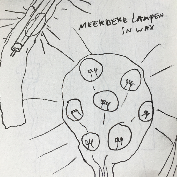
My first ideas how to translate my experiences into matter. Candle-like drawings with lightbulbs.
For me it felt obvious to make a lamp. My first idea was to make a lamp out of wax in the shape of a candle. After some feedback I realized that I wasn’t using the wax in a way that I could fully explore the material. I had an idea to make a lamp and using wax was just to live up to certain aesthetics I imagined in my mind. So making a lamp was to limiting.
A construction for a 'candlelamp'. The idea was to pour liquid hot wax over it so the construction wouldn't be visible, but it would look like a candle with a lightbulb instead of a flame.
——————
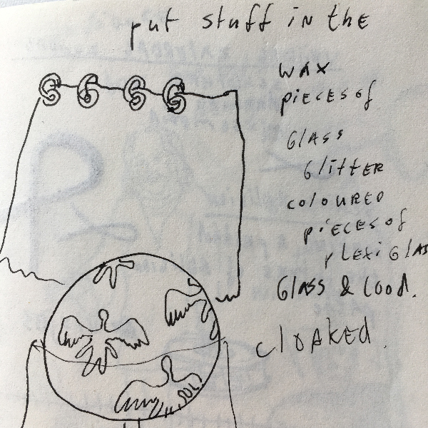
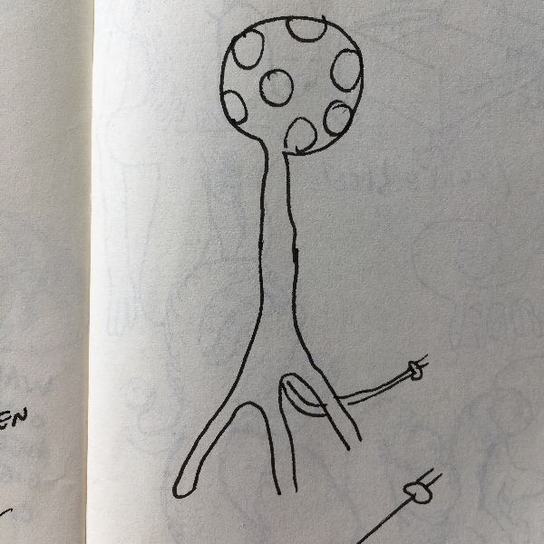
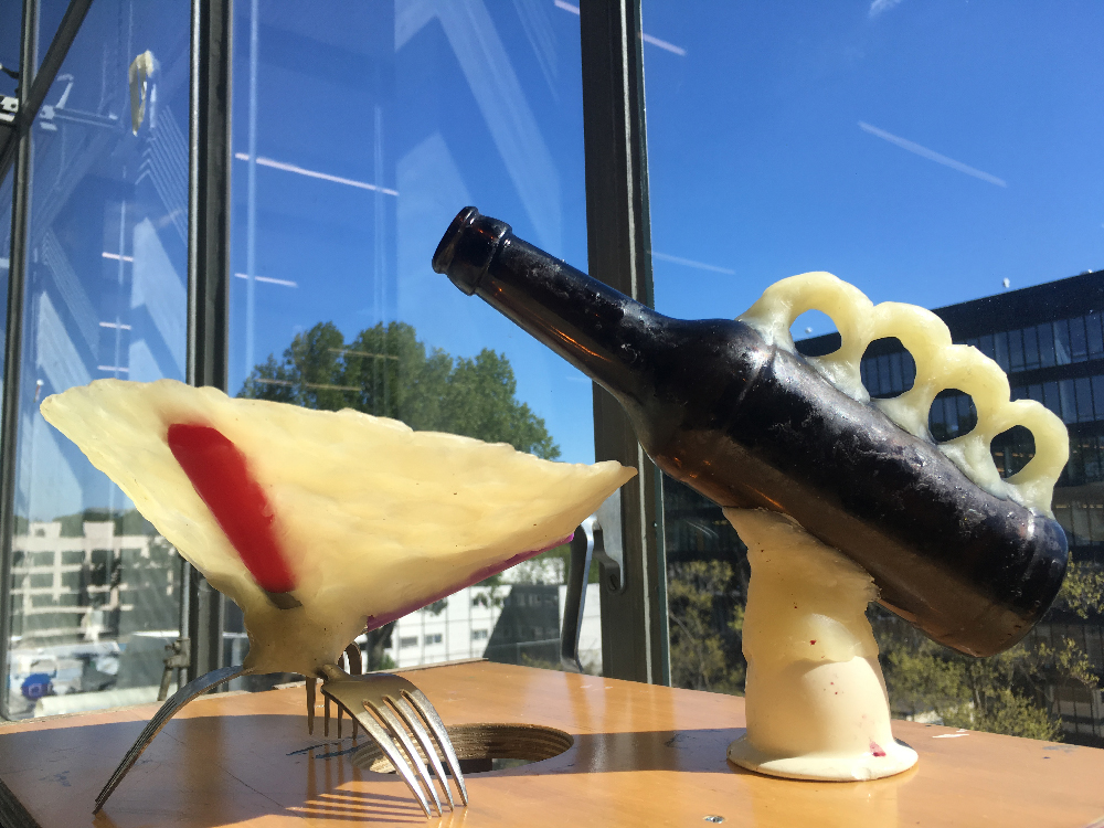
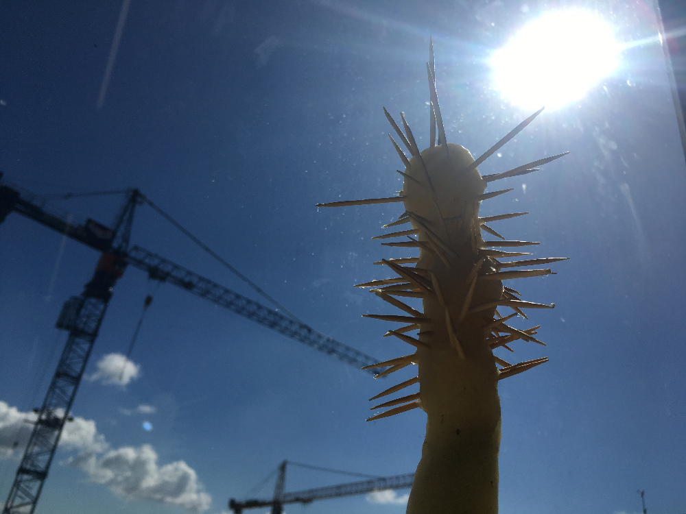
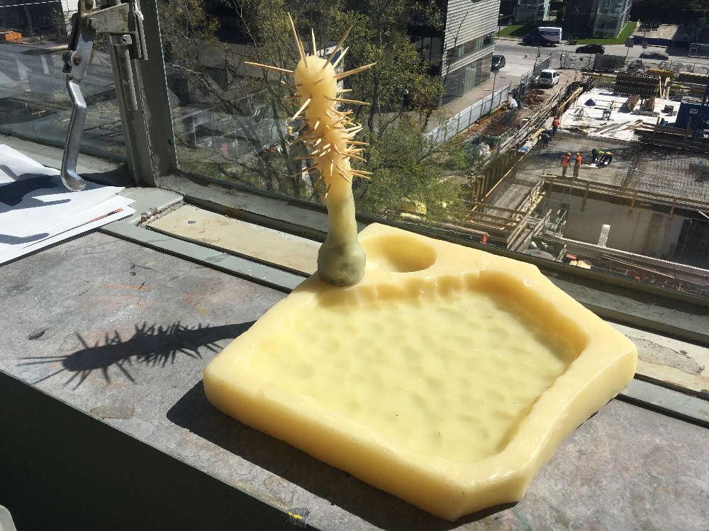
I started rethinking what my experiences were going to the church. Looking back the aspect of suffering and this isolated community of people that kind of live outside of society were the strongest memories. I started working with a big chunck of wax and started carving into it with a spoon, it felt saying a prayer over and over again, a road of suffering… Eventually this weird religious object came out of it, looking like a plate. After this I started making objects that resembled a kind of ritual, but in a way that I used very recognisable objects and used the wax to melt them together and creating a totally new function.
These are three of the eventual religious objects I made; a cup together with a leaning carafe and a square plate with it's inside carved out with a spoon and with an object that fits in it that holds coctail picks to display small foods.
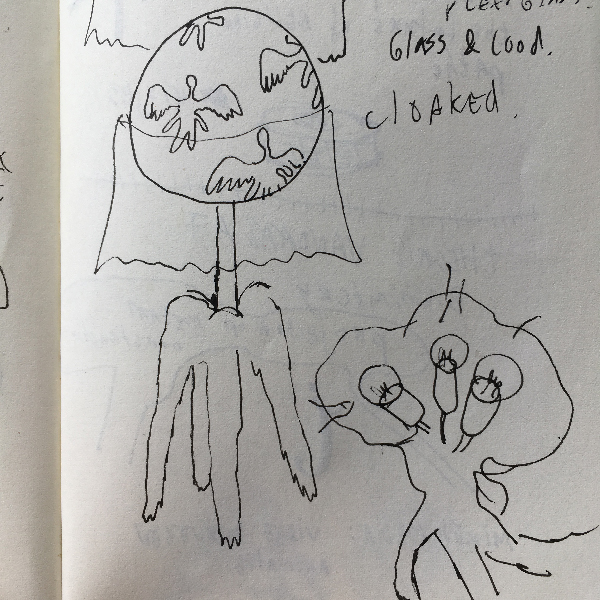
Then came the idea to go back to my startingpoint, church, to make my objects interact with what made me make them. The voices in the video are recordings of collective praying by the people (just ladies) in the chapel. It is said that jesus is present in this chapel, they were singing directly to jesus.
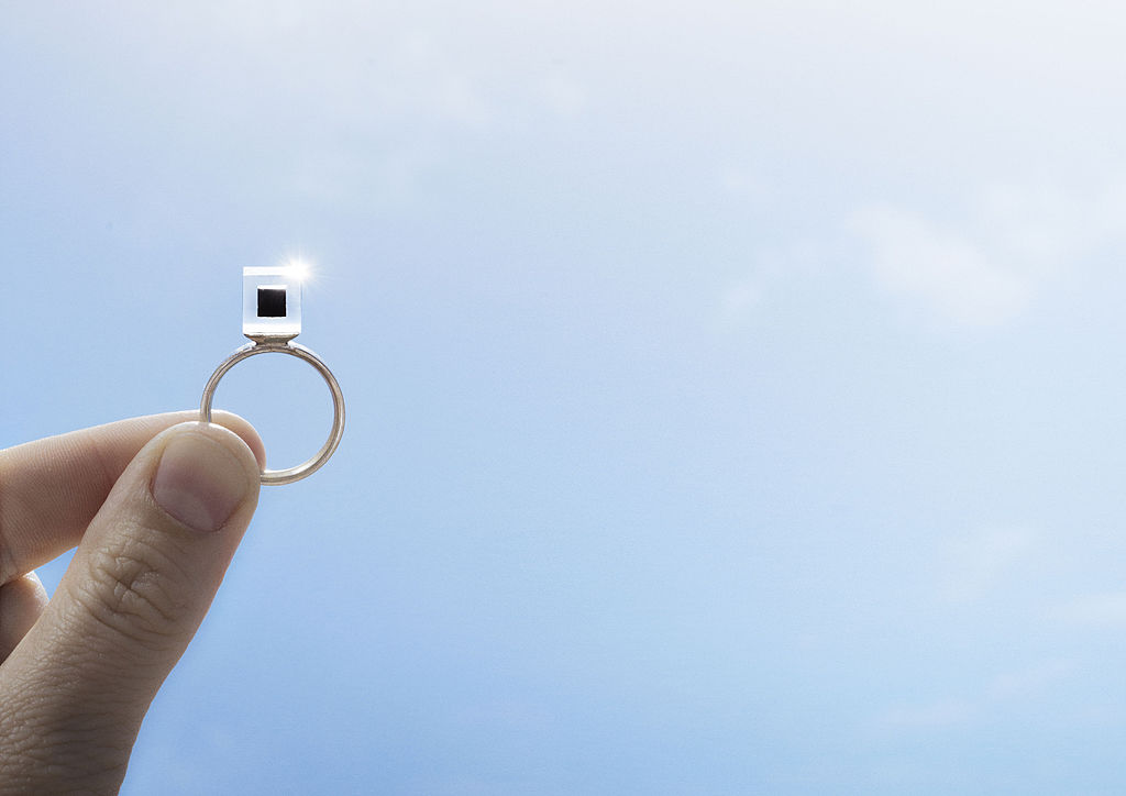
We humans have created technologies and machines to enhance our lives, we invented cars to liberate ourselves, built all kinds of factories to raise efficiency, but now these innovations are striking back, making the environment extremely polluted in high-density cities; some visible, while others may be invisible, but still left the real impact on our daily life and health. Think about donating 50 euro to get a Smog Free Ring[x], which contains smog filtered from 1000 m3 of air, in order to support the Smog Free Tower and Smog Free Project by Studio Roosegaarde.
Will this make a real contribution to solve the problem of pollution? By purchasing a Smog Free Cube, Ring, or Cufflink, are you purchasing a souvenir, a design or are you building your association with the Smog Free Project, the anti pollution movement?
Daan Roosegaard’s Smog Free Ring • Smog filter in Bejing
Our technical interaction with artworks has only developed within the last decade at the level of using touch screen to improve the understanding of drawings, but now in the art and design world, both these two elements have been introduced to the real application domain.
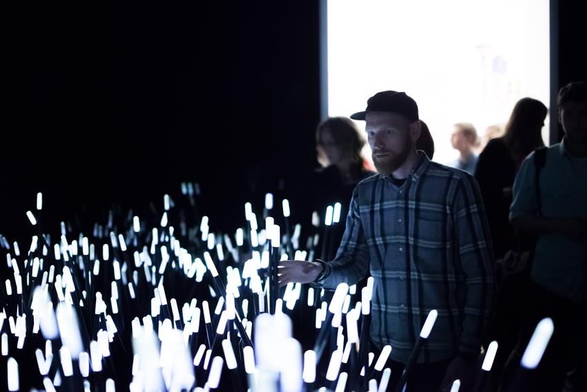
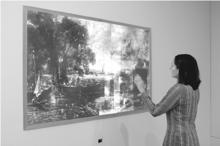
Daan Roosegaard’s public interactive landscape Dune (2006-2012) • John Constable: The Great Landscapes” 2006
To gain a better understanding of this change, we can look at Daan Roosegaard’s public interactive landscape Dune[x] (2006-2012) which interacts with human behavior, and the Tate Britain exhibition “John Constable: The Great Landscapes[x]” in 2006. The Great Landscape used X-Ray examination and Drawing screen to help the visitors to obtain an understanding of Constable’s working practice and techniques through body movements in front of the X-Ray projection and figure movements on the touch screen (Engaging Constable: Revealing Art with New Technology), while Dune served itself, stood for a hybrid of nature and technology, artwork and the way to present the artwork. It is composed of large amounts of fibers that brighten and made sounds according to the sound and motions of visitors. Both enhanced social interactions with the help of sense-based technologies and being recorded with cameras and microphones in order to study and analyze people’s interactions, Dune and The Great Landscape had quite different starting points.
The visual impact of the eyes decrease as the other senses are heightened due to the introduction of tactility and sound, thus the aesthetic value is no longer of primary importance and the design opens up a broader spectrum of uses and practicality. This also explains Daan Roosegaard’s later works, how he uses modern technology to deal with multiple subjects; such as the relationship between intimacy and body (high-tech fashion project Intimacy[x], 2010), the historical heritage and sustainable idea (Van Gogh Path[x] [x], 2014), the power and poetry of living with water in Netherlands (Waterlicht[x], 2015 and Icoon Afsuiltdijk[x]).
The modern presentations of art and design in museums and galleries provide personal and collaborative experiences as The Great Landscape did, but Roosegaarde’s tactile high-tech environments enable the viewer and space to become one, not only because it can encourage more people to interact with each other and the environment simultaneously, but also because the technology leads the viewers to become both users and performers, thus the art raises people’s awareness of public issues.
Concerning its unique background associated with environment protection and sustainable development, the Smog Free Ring distances itself completely from traditional souvenirs in a museum and the association created by purchasing it, just as putting yourself in the Dune and reacting with it stands apart from the traditional way to appreciate an artwork. But is this different to other design works which also aim to serve a better life?
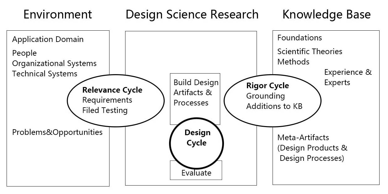
As science and technology are an essential part of his work, I want to introduce the Three Cycle Review of Design Science Research from Alan R.Hevner’s “A Three Cycle View of Design Science Research”.
A Three Cycle View of Design Science Research [download as pdf]
Design Science Research is motivated by the desire to improve the environment by introducing new and innovative artifacts and processes. The Three Cycle Review of Design Science Research consists of Relevance Cycle, Design Cycle and Rigor Cycle. Good Design Science Research often starts by identifying problems in an actual application environment or recognizing the potential to improve a practice before a new problem occurs. When applied to the Smog Free Tower, people’s neglect towards air pollution interested Daan to think about building the largest purifier in order to solve the problem. In the Relevance Cycle, the air-polluted environment is not only where the problem is found, but also a testing field in order to see if the design results meet the criteria. Then, they moved to Rigor Cycle and the knowledge base and found the existing air purification technology which is used in the hospital. Following the search for technology, they moved to the internal Design Cycle, and built the Smog Free Tower based on the original issue found in the environment and the technology found in the knowledge base. While the artifact is being built, field testings are input from the relevance Cycle and the design and evaluation methods to Relevance Cycle and Rigor Cycle. After several rounds of improvement, The Smog Free Tower and The Smog Free Ring, which contained both technology and beauty were born.
To give a brief conclusion, pragmatic science, interaction between human, responsibility for the living environment and beauty are core components in Daan Roosegaard’s works and in the future world of art and design. But not only the world of art and design, or let’s say, since art and design has gradually found their new position in 21th Century, they will no long serve aesthetics as the core matter. Techno Beauty, as how Daan Roosegaard described his own works, may becomes a direction in design to beautify and save the world.
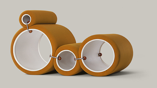
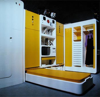
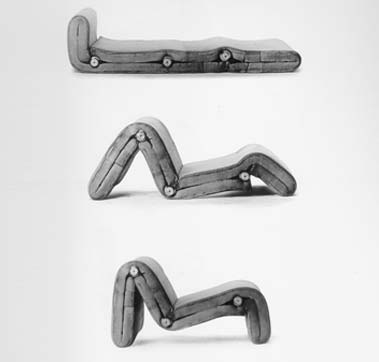
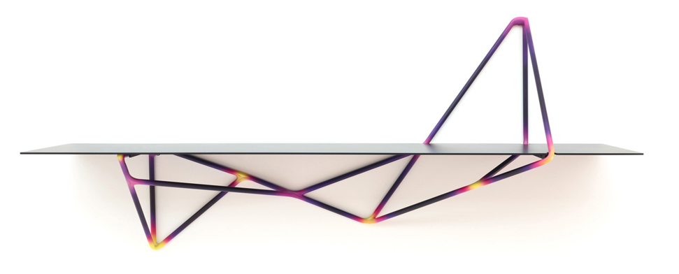
This is my chair. The Tube chair designed by Joe Colombo in 1969-1970. First I will introduce the intentions of this designer as a representative architect of that period and shed some light on the ideals behind designs from this time. Colombo was mainly focused on the creation of living systems (Combi- Centre of 1963) that were made to become micro-living-worlds with dynamic, multifunctional living spaces. He was very interested in furniture systems (Additional Living System), as an example the Tube Chair that could be set up in several different ways depending on the users wish!
first impression
One of the things that caught my attention when looking at this chair is the shape. To me it is quite unusual and therefore appealing to think that a construction could be shaped by only using round cylinders. I also found quite interesting the fact that these shapes could be organized according to the position you want at the moment, which to me is fascinating. Also the color of this particular model is very present and strong, adding to the shiny material it is made from. All of these elements create a quiet eye-catching construction.
Intrigued, I decided to research more about the aesthetics of the sixties and early seventies and learn the meaning behind this particular aesthetic and philosophy behind this kind of design.
perfect colliding cells of bodies, body parts inside parts of parts of bodies inside shiny parts of bodies, is this a body, is my body this, parts of colliding shiny cells colliding bodies?
or cold neglected manufactures of machines? Machinery taped forcefully by robotic aggression or casually naturally beloved shapes holding, sustaining, lovingly enclosing tender body parts?
this is my question when sitting in the tube-chair.
both.none.both and none at the same time
because time is the reaction after this action.
orange tube chair.
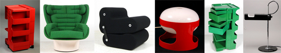
I saw lots of similarities between the interior design that is visible in furniture design, decoration and the architectural use of space used by Joe Colombo during the late sixties/early seventies. here are some pictures to show some representative interiors designed by him in this period!
Joe Colombo, Visiona-Livingroom of the future, 1969, Total Furnishing Unit, 1972, Spring Lamp’s prototype, table lamp version, 1968,‘Plywood Chair’, 1963, Carrello Boby, 1970, Spiral chair, 1932, B-Line Colombo Modern Multi Chair, 1969
some history lessons:
The 70s represented a reaction against the sleek minimalism and simplicity of modernism and instead sought a “playful embellishment and radical experimentation with form.” So this meant that functionality had a high importance yet still creating an exciting and almost utopian space. These spaces had unusual colors, shapes and functions as to move towards a successful future of living.Self-expression and individuality were defining for the time. Technology started gaining importance and spaces were used as organisms that were part of their surroundings.
The architecture of the time was also very innovative when it comes to light and space. In many ways, the 70s started the concept of “open plan living”. Many designers reacted to changes of how families were starting to be structured (women started working outside of the house thanks to technological advances and overall economical growth f.e.) with double-height spaces, open planned living and grand entrances. Many homes had giant windows, spiral or “floating” staircases, interior and second-floor balconies. The kitchens were made to accommodate more cabinets and high spaces. Many kitchens had islands or breakfast spaces, bringing the family into a room that was once reserved only for women or staff. This was a symbol for the slight change in position women were starting to have during this period, that was to be seen in the way the living space was designed by the architects of the time.
During the seventies there was an enormous use of bright colors. Houses became very inviting and there was a lot of eclecticism when it came to the furniture designs and nearly every object had a bright color such as toilets, walls, furniture and decorations which came in several colors .
The 70s was a time of many advances in the design of chairs and office furniture. Designers began experimenting with ergonomic designs for the workplace and home offices. Many Italian Designers were at the forefront of radical and experimental furniture design, using high tech materials, tubular steel, bright colors, and polyurethane plastics.
1970s stuff
• Sleek plastics and high-tech materials
• Avocado green and gold
• Bold patterns and prints
• Stacked stone fireplace and stone walls
• Timbered ceiling beams
• Exposed brick walls • Metal (chrome, polished steel)
• Geometric shapes and lines
• Thick and chunky masculine furniture
• Fiber optic lights
• Wood paneling
• Skylights
• Atriums
• Indoor gardens
• Fireplaces with elevated hearths
• Big windows and lots of glass
• Wall-to-wall carpeting
• Sunken living rooms
• Wicker furniture
• Shag rugs
• Earth tones
• Brightly colored furniture
• Orange
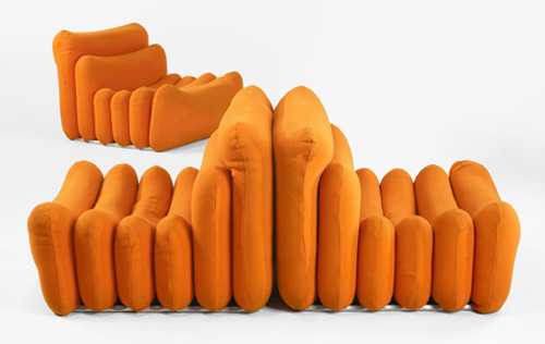
Joe Colombo, Additional System chair,
1967-1968, demonstration of positions
parallels to today:
IKEA
Reading about the sixties/seventies really got me thinking about how much of the ideals and aesthetics I recognize in our contemporary culture today. Some of the things such as experimentation with form, eclectic interiors, technological advances (that are employed within living spaces) and individualistic approach to the design and embellishment of a living space are elements I strongly recognize in our culture today. The first place that came to my mind was Ikea because of the presence it has amongst nearly all of us, as well as its attracting quality it has to people today. Here are some pictures that I thought were representative for the similarities!
«Innovation can’t be found in the drawing of an object but in the use that is made of technology, materials, techniques. Technology has no interest for its image, but it is interesting for the service it offers. Its image must disappear, melt into the object. Technology is at the service of the result : price, lightness, comfort…» Patrick Jouin
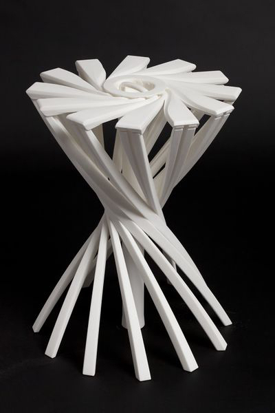
OneShot.MGX is a 3D-printed stool designed by the french designer Partick Jouin in 2004.This stool was manufactured using the 3D printing technique. Born in the mid 1980s, 3D printing, more formally known as additive manufacturing, was used at this time for visual prototyping. But some companies soon realized that the technology had the potential to do more than just producing prototypes. In 2003, .MGX by Materialise was founded and they invited world-class designers to experiment with this new technique and come up with novel products that were only possible with this new technology. Patrick Jouin was one of them and created on this occasion two chairs, a table and this stool.
I consider this item as one of the the most relevant among the Stedelijk’s design collection. Innovative, surprising, light, handy, delicate, subtile… it satisfies all the expectations that we have from a stool. You can take it anywhere easily, store it in a cupboard, in a car, in a bag. This object is in harmony with Patrick Jouin’s philosophy if we believe his words : «The objects we draw today are more discrete. They are more «affectuous». Discrete friends. They don’t tell less, they simply do it more slowly. It’s like homeopathy. They diffuse rather than they speak.» I discovered Patrick at the same time as his product during the exhibition and I think he has a clear mind about what is going on in design nowadays. He created his own agency in 1998 after some years at Philippe Strack’s agency. His style is often qualified as discrete.
Patrick Jouin is really interested in experimenting new technologies. In an interview about rapid prototyping, P.J. said «The distance in between the creation, the drawing, and the final object was very short. It was like a sketch which is coming alive and taking shape in 3D. I know that every time in the history of design, when there is a new technology, there is always a new aesthetic.»
«Industrial production requires a radical conversion : we must start from the function of the object and possibilities of the machine. The limited performance of the craft production allowed sometimes the realization of original or richly decorated forms. Production by the machine, in series, needs a simplification of manufacturing’s forms and processes.» Willem Sandberg wrote these words around 1970 in a catalogue about the german designer Wilhelm Wagenfeld. Should we consider this way of thinking as still relevant nowadays ? New technologies such as 3D printing make these ideas a bit old-fashioned. I am not saying that this aesthetic is over, but 3D printing doesn’t undergo the same rules as the more industrial technique. Patrick Jouin said : «There are so many aspects, undiscovered yet, it is a new way to think how an object can be made.»
In his book Fabricated : The New World of 3D Printing, Cornell University researcher Hod Lipson describes ten of the underlying principles fundamental to 3D printing. The first principle he notes is that «manufacturing complexity is free». Unlike traditional manufacturing processes, where extra complexity requires a more expensive mold with more parts, there is no penalty with 3D printing when an object is made more complex. On the contrary, in some cases there may even be a benefit. With 3D printing, designers and artists can explore new kinds of highly complex and intricate forms that would have been impossible to realize with traditional techniques, and these come at no extra cost. It is a proverbial candy store of new formal possibilities, resulting in a new design language that is baroque and often eclectic.
«Just because you can, doesn’t mean you have to». It is true that there is a risk of overuse, a risk that it becomes too much. What should designers do now that complexity is not a problem anymore. Designers are still in the early stages of the search for aesthetic in 3D printing. Many of the experiment we see today may appear outdated in ten years, but they are playing an important role in paving the way. With an increasing number of designers, artists, and makers gaining access to 3D printing, a mature formal language will develop over time, uniting and exploiting the full potential of the technology’s aesthetic powers.
«…people often proclaims grand ideas, things that are just after all, the qualities expected about an object. What an object owes us.» Patrick Jouin
Many studios and companies are working on developing this technique. In Amsterdam, we have the 3D Print Canal House, the first 3D-printed house. It also acts as an exhibition and interactive research center for 3D-printed architecture and related areas, such as material recycling, policy making, and smart electricity grids. The 3D Print Canal House has been printed on-site with the KamerMaker, a shipping container that has been converted into a giant 3D printer.
An aspect of 3D printing that I find particularly interesting is the way you share a product. The designer creates a file that could basically be printed anywhere by any 3D printer (if the printer is able to do so), but then a question appears, how is he going to sell it ? In a shop as a finished object or on internet/in a shop as a file still ?
What will make him choose a certain option ? If you decide to sell for example your 3D printed vases in a shop, you will propose to the public a definite object, with definite colors, materials and price. These choices will be of course part of your research and of course as a designer you know better than anyone the nice colors, but you don’t give to the buyer many possibilities. Eventually you could print ten times the same vase with each time different materials and/or colors, but then you take the risk that some of them might not be successful. You might have eventually planned everything with a marketing analyze or something else, but I am sure that 3D printing could be exploited in a much better way. In this way, the 3D print is not highlighted.
Imagine that you sell the product on your website. The vase that you created has a definite shape, but no colors for the moment, it is still a neutral file, just a shape. Then you put it online and decide the price of it. You could also suggests some colors or materials, without saying that one is better than another. The customer will be free now to print the vase as he wants. There is no risk of overproduction in this case and there is also an attractive aspect for the customer. He might feel involved in the project and enjoy the fact of being part of the creative process. I talked about the price previously and I think this aspect is also interesting to discuss. How would you fix a price ? If the customer want to print it at home, you would sell a file only, so the customer will print and pay the material by himself. What is the value of it ? Is it in terms of technical innovation or complexity ? Or in terms of originality ? 3D printing could also lead to personal (home) creations and lead to the disappearance of designers. Of course, there will always be designers, but they could be at stake. For sure, this solution is possible only if a great number a person would have 3D printer at home, and it is still not the case, but it may happen soon. We can already see this kind of website where you have the possibility to create your own product.
I am also wondering about reproduction, re-appropriation and protection. How can you protect a product from reproduction or re-appropriation ? How could you recognize an original from the copie ? You could not.
The last possibility that I find personally the most interesting nowadays is to have your own 3D design/print shop. Imagine that you have your design studio that is at the same time a production place. You keep into the studio a selection of the products, accompanied by suggestions of colors and materials. Customers would come into the shop and ask for the vase 3D printed in red and blue plastic with maybe some adjustements. The nice thing is that you have then a real contact with the buyer, you can advice them, keep them informed and help them. You can imagine many things with 3D printing. It could provide a solution to over-production and consumption.
For example, companies could provide 3D files that allows you to print the piece of your machine that is broken instead of ordering it and get it from the other side of the world. You would just have to print it. For sure, the materials that you use to print will not come alone, but I think it could help. There are many other subjects to discuss, so if you are interested in 3D printing, you should have a look at this conference about the environmental impact of 3D printing that was given on December 13th 2013.
A lot of people are active in 3D printing research. This is the case of Dr. Behrokh Khoshnevis of the University of Southern California which has been developing since 1998 a layered manufacturing process called Contour Crafting, in which cement or concrete is pumped through a nozzle connected to a computer-controlled crane or gantry. This draws the contours of the largescale structure to be built layer by layer.
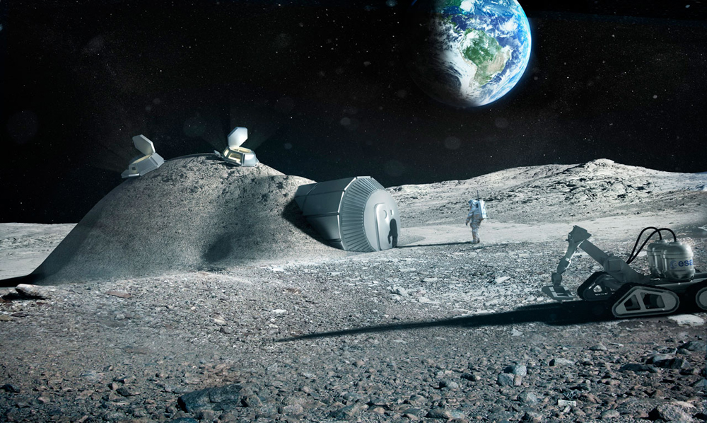
3D printing with Lunar soil by Foster + Partners[x]
Enrico Dini also, a passionate Italian inventor, has teamed up with the European Space Agency and the architects Foster+Partners to test the feasibility of a 3D-printed permanent moon bases built out of moondust. Contour Crafting is also aiming for the moon in a partnership the NASA. Give the significant challenges of scaling up 3D printing machinery to encompass an entire building, many concluded that, for the time being, the most pragmatic approach is to fabricate constructions in sections and then to stack these sections on-site.
Finally, if you are interested, I link you to some studios who realized some really nice project with 3D printing technique. I hope you enjoyed this article.
‘Symbols are more meaningful than things themselves’
Jenny Holzer
The definition of the word ‘symbol’ in the Dutch etymological dictionary says the following: ‘that which represents something abstract of absent’. To me, this is a very clear notion that there is no actual difference between letters and symbols. Both are representations of images we gave a certain meaning to understand each other in daily life.
Imagine ancient times where we communicated with sounds, clangs and certain movements. The visual aspect of life wasn’t half as important as it is now. There is no need for physical attendance of ‘the other’ to communicate your message. We live in our own virtual and visual bubbles where we are surrounded by symbols of many kinds.
In the last hundred years technology took over the world, physical labour will not be necessary in more than 50 years. Symbols ,the collective noun of codes, letters, numbers and icon’s, have become our life-force. Everything in our daily life runs on notably abstract ‘doodles’.
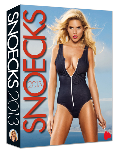
What stroke me of seeing this publication was that it is a clear example of the evolution we’ve been through. Alpha being cave drawings and Omega the clear letters and numbers on the spine of this magazine. On the one hand it makes me proud being a part of this species but on the other hand it scares the shit out of me that it is only a matter of time that we become a symbol ourselves.
This book is not from the Rietveld Library but my own.

If you want to know about Trans-Humanism look at this video documentary [X]
A boring childish future?
A futuristic boring childhood?
A childish futuristic boredom?
the book “7th Biennale Internationale de La Tapisserie somehow came closest to fulfilling these not easy criteria. Or maybe not. It mostly fits the childish criteria, the cover has a knitted foot on it, very naive and silly. but still quite pretty or intriguing. boring I would say as well, because i find nitting really really boring. Im sure it can be used as a good medium and bring out exiting results, and it sure does in the book, so delicate and structaral a material, photographed in black and white, but however, the procces of knitting is to me quite boring. so kntting is definitley not gonna be my future. A picture that captures me is a picture of th ework by a polish artist named Hanna Jung. the work is called “Two spaces –
The space for the nude and the space for a stone”. In a room you have a delicate fur like cloud of fuzzyness as a gigantic bed overflowing the room on the floor, and above a lamp like shape of the same fuzzyness. almost touching eachother, but not quite. he work comes out so fragile but still so space consuming and i want to touch it. but its not even possible to find a picture on the internet. And im sure, because im really good at internetting. Its really as shame with work like this i think, that they only are documened in a dusty black and white book hidden between to much bigger books in the design section of knitting and fabric where you would never imagine to be drawn in to a magical white cloud of dominating light fur.
This book came to my mind, first of all because it was small, and i already had a really heavy bag with me.
Further more, it kind of looked like an old schoolbook, all yellow and nothing fancy about it. The title is “basic typography”. It was probably trying its best to be very fancy at its time, who knows.
the text on it reminded me of the schoolbooks where you would have to follow the lines with your pencil in order to learn how to write the letters. a b c d e f g, and so on and so forth.
There was something quite calming about this childish first impression, and the faded yellow cover. Besides that, it also has strips of tape, preventing it from falling apart, which doesn’t help me thinking it could once have been very dear to someone, and made me feel kind of sorry for it. I don’t like the font much or the general design of the book but still it is appealing to me some how because its just seems so uselessly boring. the content of the book is served on a plate for the ready to eat, nothing hidden in there, and I am saying this without even opening it. Type fonts. its just the feeling I have. The subject is very geeky in my opinion, and indeed also the title “basic typography” But that is deliberately why i choose it. I would like to study graphic design myself which is also why i picked it. Will I ever find a subject like this interesting? Well maybe in a year or two, but now, it seems like a very distant and flat subject to me. Perhaps not typography in general, but definitely in this case. It just happened to appeal to the doubtful side of me that is about to choose a direction were covers can be so planned out and yet so horribly boring and non exiting.
17 Rietveld's Foundation Year students visited the "Stedelijk Collection Higlights /Design" in the newly opened Stedelijk Museum. Marveling at some masterpieces of Interbellum design or surprised –a little further– by the Scandinavian design some of us know so well from our grandparents homes, we arrived at the last part of this "Depot Salon" wondering what a 2012 selection of Design could be.

Researching contemporary design we composed the "2012 Supplementary" which we present in this post. From the exhibit "Stedelijk Collection Higlights /Design" we all selected a personal best and made it the focus of the researches published as part of the project "Design-in-the-Stedelijk"


")


