My first contact with 4D typeface was in Casco at Utrecht. The 4D typeface was from Herman Damen and it intrigued me and left some questions behind. After i dived in the subject I found the typeface of Lo Siento. The beautiful designs are however not really used in the public space and not well known by the public’ because of that. Why? Are the 4D typeface not useful in public spaces or are they just not clear enough? In this research I will analyse which kind of way 4D typeface can be an extra supplement in public spaces.
Plan of the research
To find out why 4D typeface it not that much seen in the public spaces I will ask some different questions to help myself in this research.
-what kind of 4D typefaces are already present in public spaces?
-what do people think about 4D typeface? Is it well known?
Examples of 4D typeface in public spaces.
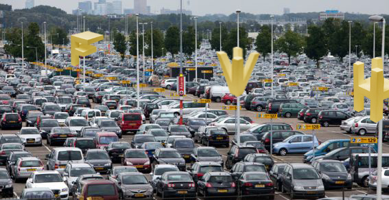
When we think about some known examples of typeface in public space we soon think about logo’s or indication of places (for example in public transport). It’s impossible to miss it on the highway: the Mc Donalds indication. Maybe that’s a part of the success of the logo next to the road; it is recognizable and readable from two directions. But is it also a 4D typeface? The definition of 4D typography: “4D Typography is the result of intersectioning, in an orthogonal way in space, two extrusions of the same character, which allows the spectator to read it from, minimum, two different positions in space.” (Lo Siento, 2012) that means that the Mc Donalds indication next to the road (what is readable from both sides) is a 4D typeface. But of course when the Mc Donalds logo is placed on a wall of a restaurant, this is not the case.
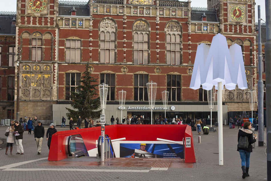
A second example of 4D typeface in public spaces is a place indication, for example a subway. In the Netherlands you see this a lot in the form of a cube with the letter ‘M’ printed on every side. The indication sign is readable from more perspectives (at least four). But… here starts the question: is it allowed to call this a 4D typeface when it is a cube with a printed letter on each side? When you ask me, it isn’t because the indication (the cube itself ) is not a character.


To define that 4D typeface will fit in public space, the opinion of the pubic on these places is important. To find out these opinions I went to Schiphol airport, the library in Middelburg and the railway station Rotterdam Central. Prominent is that a big part of the respondents (above 90%) never heard about 4D typeface. When I showed the 4D typeface of Lo Siento, there were not many people who recognized this way of typography. Of course they did when I showed them a picture of the indication of Mc Donalds. When I asked them about their opinion, a lot of people reacted really positive. Over all they thought that it is a really attractive supplement in public spaces. Eva: “For me it is really appealing. 4D typeface could give the usual (mostly boring) indications a new life.” Next to all these positive reactions there were also some negative points, mostly about the readability. Richard: “This way of designing is much better, nice! But I think it’s not always possible to use 4D typeface. The character ‘R’ is a difficult one, they should be careful with that.”
Ways to put 4D typeface in public spaces
In this research I couldn’t find many examples of 4D typeface, especially not in the public spaces. But the people I interviewed where really positive about it. I think (and the respondents also did) that 4D typeface could be a new supplement in the public spaces. I will give you some examples how we could do it. I hope that this way of typeface will pick up fast in the public spaces. For me this is a big discovery in the typeface.