Skip to Content Skip to Search Go to Top Navigation Go to Side Menu


"rules" Tag


I’m new here


Friday, May 24, 2019

.

*****

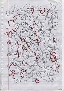
I don’t really know the way, but I want to. I have this habit to wander off randomly when I’m unknown with a place. Just to see where I’ll end up if I let go of control. “Let fate decide” says the romantic in me.

After a while I see patterns and I believe that I know where I am. Finding attractive by-streets in every corner. But that’s an illusion. By the next turn this pattern is shattered by reality.

I don’t know where I’m going, but I know I don’t want to stay. Just keep going, till this frame turns into bedlam. Borders can’t contain me anymore. Looking back I can’t trace back my origins. I’m not lost. I’m new here.

I am chaos.

.

Fleuron. ,


Wednesday, May 22, 2019

Fleuron. ,

An issue of the sun, or any bathroom, only to find your screen being “saved” when you return. It grabs your attention, you might ask yourself.


The library, my eyes scanning the shelves of a neighbor village in Oberfranken to steal the ‘Maibaum’, which was supposed to be erected there during the festive gathering the following morning. It drawn me to it. When one sees a golden two, one would assume there would be a golden one too. Hesitating to grab a book, I kept strolling through. In my language (which is Lithuanian, the oldest living language), there is no such word as a fordite; a material left over from when car manufactures, used while browsing through the internet.

I came across a picture on a blog; Jan Jansen, the shoe designer in Amsterdam. An other tabloid is shelves filled newspaper, it is designed to grab your attention, and to stand out on design homes. My eyes fell on a piece of pottery by an English artist. Most living spaces use textiles as membranes and interfaces.

Instantly. 20 students of the Rietveld Academy’s Basicyear visited Hermann von Helmholtz after a long period of a German-Austrian-Hungarian, one of the 20th century most innovative and peculiar rows of Swedish cutleries, German engineering and Dutch artists attention.

The Fordite had walked around the nail polish stand. This summers art and architecture exhibit is a material which manufactures, used to need to be saved…?

Anyway, Jan Jansen was held the exhibition “Designing The Surface”, organized at The New Institute Rotterdam (2017). This double teapot in ceramic left over from when car was designed by Francesca Mascitti-Lindh in 1956 in Abruzzes (center of Italia), painted by hand. Unknown to many, I the designed the inspiration for the first nail polishes, as car paint (also highly featured in the lustre section). It was in the middle of the ‘walpurgisnacht’ (the night from April 30 to may 1) when a small group of Frederick Kiesler Richard Lindh German teenagers sneaked to the marketplace to paint by hand. -Sofia design week

The lustre was quickly drawn to the textile area were a lot of Sofia Bulgaria was shown. Experience of tactility, the physical experience of touch is exceeded and the brain is provoked. How does it work?

Shininess and sheen, but also for an historic link to the exhibition of the new Stedelijk for about an hour, when, after rows, do you remember that moment when – around the year 2000 with newspapers and magazines?  Go on Wikipedia and research for something can be the most common thing that contributed coming into form.

Does my screen this kettle and sparkle? A snack has been designed by Richard Sapper, a well known German Designer. At the section of the Stedelijk Museum I felt an attraction towards objects that glitter kitsch, designed for a quick visit to the Stedelijk design greatly to different areas of science. A strong effect can be produced with simple actions. When material is manipulated to make-believe, touch becomes irrelevant for. Hello there dear reader, –why the fleuron.


WHATISAWHILE’S COLOR SYSTEM


Monday, April 2, 2018

Aim: I need to combine two words which I found very different from one another: ‘system’ firstly appears to be very restricted while possibilities seem to be unlimited with ‘color’.


FIRST CONCEPT: Connect the situation in which you currently find yourself to music thanks to colors.

Process: You’re heartbroken and alone in the shower.
Find the key words: heartbroken, alone, shower.
Each key word is associated to one color: heartbroken = purple, alone = blue, shower = grey.
In the system, clic on the key words’ fitting colors « purple, blue, grey», it will send you a playlist matching your current needs.

Questions: How to realize the system? Do I use the computer or do I make it by hands? If computer, which site or application should I use? Need to select key words: how many, which ones and why? Do I use common key words or specific ones?

Issues: Want to use computer (better quality of colors, easier to extend the visibility and good way to classify data), I could find a specific application or website. I’ve been told by a classmate, who has studied computer science, that applications she knows are not for amateurs like me but professionals.

Conclusion: Because of a lack of knowledge and no skills in code I can’t bring this first concept to a successful end. I’m better to modify my system so I could create a new realizable one.
I still want to use the computer as my main tool.
However, I want to make this project more personal and subjective, meaning that I want the color system to depend on me. I will set my own rules.

Transition
I’ve asked to a friend of mine, a singer, if he was associating people with music, he answered he wasn’t and return me the question. Then I realize: I’m not associating music to people but colors. Indeed, when I paint someone the association of colors I choose come from what this latter inspires me, what he radiates out.
What if I would connect colors to something else than people? About me? (reminder: want to make this project more personal and subjective). I could write about my personal life? What occurred to me during the day? And connect this specific moment with a color?
From this developed the idea of my second concept: associate situations to colors.


SECOND CONCEPT: Connect a situation in which you have found yourself to colors.

Process: I’m going out of the cinema, touched by the movie I’m lost in my mind. Which color do I see at this current moment?
1) Visualize the color you’re seeing at the current moment
2) Find the color on internet
3) Save it on your phone
4) Give the color a name
5) Write a short sentence describing the situation linked to the color
6) Write the date and city

Questions: Want to use the computer but no code, what should I do? Where should I publish this system? Find a reachable application? Which application would fit the best?
 

 Answers: Instagram

+ Concept: share simultaneously what you’ve done with your followers.
+ Design: matching the concept (edit an image, description bellow, location, share…).
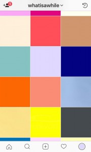
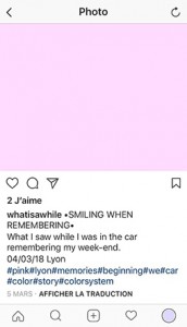
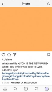
+ 1 Square 1 color: focus on the main theme ‘color’, interesting visual aspect (variety of colors).
+ # ‘hashtag’: to be seen and share data.
+ Follow or be followed by similar accounts


Ideas to complete:
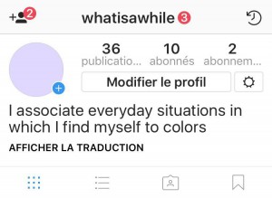
1) Account’s name: ‘What i saw while’ = @whatisawhile
It refers to which color I’ve seen while a daily situation occured to me.
2) Profile picture: The color I identify myself with.
3) Short sentence to describe the account’s theme: ‘I associate everyday situations in which I find myself to colors’.

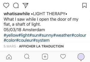
4) Description bellow image: for each image the description will start the same ‘What i saw while’ to give the account a rhythm and an identity and for the viewers to remember the account’s name.
Always the same plan for each publication: 1 color as an image – 1 title as color’s name – 1 sentence to contextualize – 1 date – 1 town – few hashtags.


FINAL PROJECT


WANT TO SEE MORE OF WHATISAWHILE‘S COLOR SYSTEM?

GO follow @whatisawhile on Instagram to discover other stories hiding behind the colors!! 🙂

So you like patterns?


Sunday, November 26, 2017

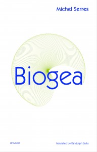
The book I choose to research is called ‘Biogea’ and was written by Michael Serres, and designed by Jason Wagner. Published in 2012 by Univocal Publishing, which Jason Wagner co-created with Drew Burk.
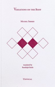
From the design of this book and from other books that Jason Wagner has designed I can see hints of his personality if not that then definitely his direction of interest. The way all the patterns are so precise and clean cut gives me the impression that he has a methodological nature and an obvious love of patterns both simple and complicated, while enjoying a subtle use of colour. As seen in another book designed by Jason Wagner ‘Variations on the Body’, which is also written by Michel Serres.

Variations -Cover

The fact that Jason Wagner is a part of the Univocal means that a critical look at the company can give an insight on the designer and ultimately the design itself.

Univocal Publishing was founded in 2011 as an independent publishing house specializing in small-scale editions and translations of texts spanning the areas of cultural theory, continental philosophy, aesthetics, anthropology and more. Univocal’s books including Biogea combine traditional printmaking techniques with the create evolutions of the digital age and feature letterpress covers designed by Jason Wagner, who demonstrates the technique in a video.

https://youtu.be/qwQSNhor1EQhttp://

Using techniques similar to this the publishing company oversaw the printing and binding of books from 2012 to May 2017, in which it ceased operations and merged with another company. This could seem to fall down to Jason Wagner who is stated to be moving on to pursue other projects.

But why did I choose this book? I decided on this book for a variety of reasons. I enjoyed its’ simple yet complex design containing a neat revolving spiral-like pattern which is placed in the middle of the book and looks pleasing to the eye. The pattern it self drew my gaze as I found it really intriguing as it resonated with my own interest in complex and unique patterns which I like to create.

The plain colours and easygoing layout of the book for me made it feel more approachable. The design it self didn’t take anything away from the content, for sometimes I feel that the cover of a book can sometimes give you false expectations of what it contains. Being misled into buying something based on its looks. This book however balances this nicely I think by not taking anything away from the content but instead relating and highlighting the themes within.

Biogea

The Typography is placed on top of the design and relates to and supports it nicely. Accentuating its colours and giving the book a clean and natural feel. The pattern initially drew my attention to the book, but as I took a closer look I found that the texture around the design on the cover felt good to the hand and gave it a thicker and more solid feel. This impacted on my decision as the pattern and texture subtly blend their delicate qualities together to create a book that i found aesthetically pleasing. While the design since imprinted on a thicker material felt noticeably different making it stand out from other designs and books.

The almost scientific complexity of the simple and delicate design also relates well to the content of the book for it’s a mixture of poetry and science. While also presenting a philosophy that merges the humanities with all creation. This has made Michel Serres “one of the most intriguing thinkers of his age”, and I believe is a reason why Univocal publishing has design and printed most of his books. Because of the authors philosophical and poetic inquiry sings praise of earth and life, and what Michel Serres names singularly as ‘Biogea’. The design relates well to the content as it mixes light fresh colours with an intricate pattern, which gives a natural clean aesthetic relating to some of the topics within the book. Some of the obvious examples being the use of blue in the typography which links with text within. “ Today we have other neighbours, constituents of the Biogea; the sea, my lover; our mother, the Earth, becomes our daughter; this beautiful breeze which inspires the spirit, a spiritual mistress; our light friends, the fresh and flowing waters.

Even though the design itself is quite precise it has a sense of movement to it and gives the book a poetic feel to it, this also relates to the content, as it’s a mixture of poetic statements revolving around natural themes. “In these times when species are disappearing, when catastrophic events such as earthquakes and tsunamis impale the earth” the author wonders if anyone “worries about the death pangs of the rivers”.

The author asks the same question of philosophy “as the humanities increasingly find themselves in need of defenders. Today, all living organisms discover themselves part of the Biogea”. Knowing the content of the book also ends up shaping my view on the design of the cover as the series of lines almost create a shield like swirl or sea creature, protected by the bold strong title Biogea.
 

Biogea, designer: Jason Wagner, Rietveld Library Cat. no: 157.3 ser 3

Roots and Branches


Thursday, May 4, 2017

Go on Wikipedia and start a research for something, it can be the most common thing or notion you think about. Then, start clicking on the first link you see, in the sentence that defines what you are searching for. Again and again. If you arrive on a webpage where you have been before, just click on the next link, so not the first but the second one and see where you will end up. Here is my example :

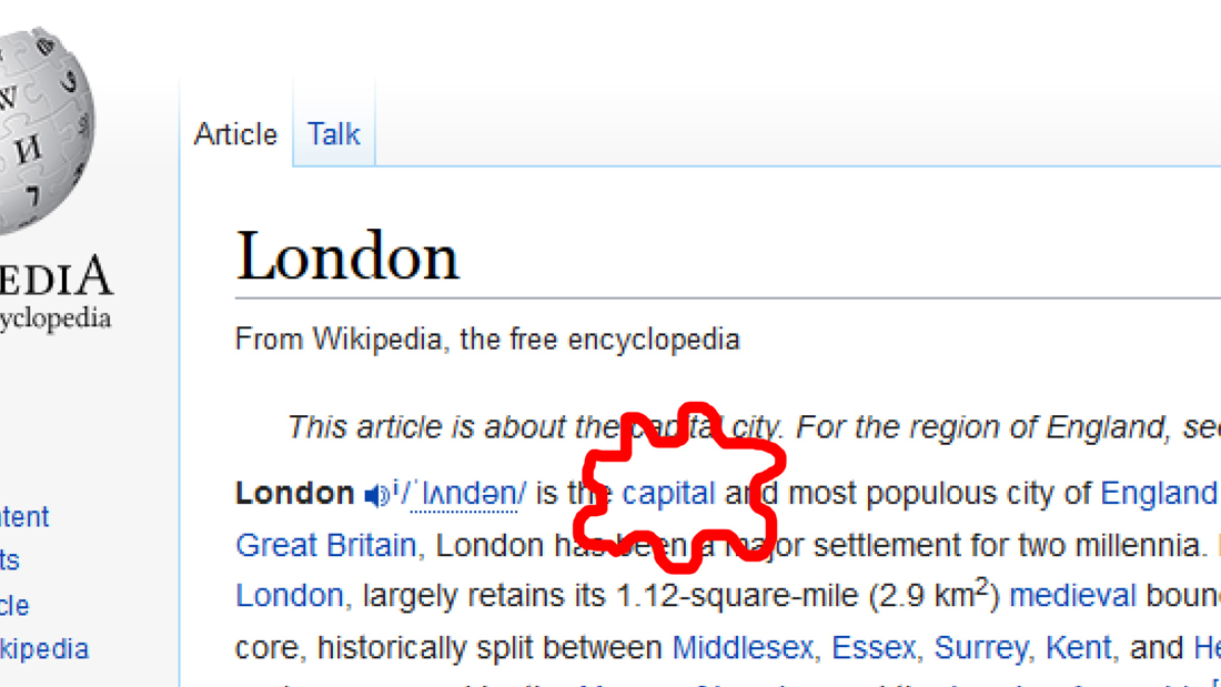
London

london_1100

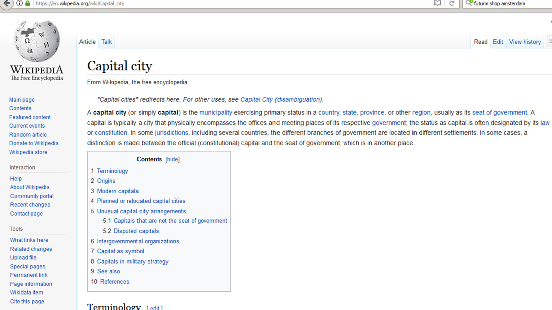
> capital city

capital_1100

> municipality
> urban area
> human settlement
> geography
> science
> knowledge
> awareness
> perception
> sensory nervous system
> nervous system
> eumatazoa
> clade
> organism
> biology
> natural science
> natural phenomena
> phenomenon
> experience
> philosophy

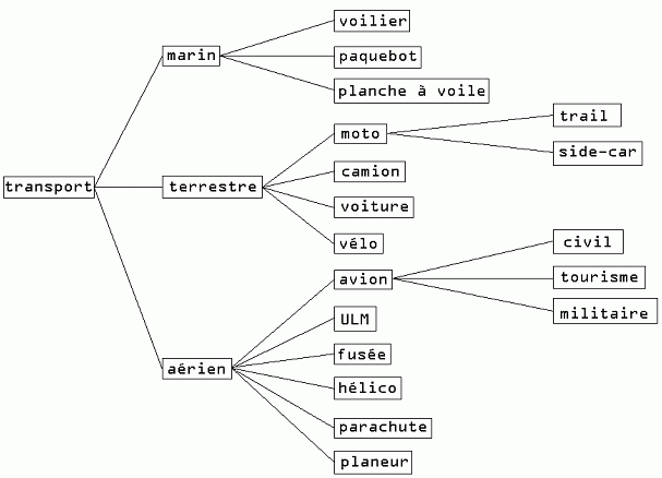
SQLtree1

So, this brings us to a crucial point. It shows how important arborescence (which means in French from the trunk to the branches) is in a research process. By starting from a very specific subject, you can end up on something you don’t expect to see, something really independent from your first research. By a system of hierarchy, websites choose for you what you should see, in order to make your research larger and more relevant. The concepts presented through the pages are of course connected, because terms are presented to define the notion you are looking for. That is by the way essential for every website : to give a hierarchy. But how? On what logic?

If you follow the previous example on Wikipedia, you can try how many times you want, you will normally end up on the Wikipedia page related to philosophy.

By placing some hyperlinks, you can give an orientation on an internet reasearch. In that sense, links are super efficient tools. Just have a look to what is offered on an everyday internet journey.

But more widely, from the easiest thing, you can always go to something larger in terms of meaning : groups of living species, geographical regions, etc. By defining something, you need an element with a bigger concept to categorize it. Then, is philosophy the final notion, the highest point to reach?

It is basically more than just a simple category in which we can put everything like a cellar where you come to take an old box once a year to remember your sweet childhood.


A dopamine delivery service

By spending time by scrolling down, letting my eyes wandering a bit on the DesignBlog, and repeating the same process previously experienced, I found that article by Olya Troitskaya about a concept that defines pretty well this process. It is called “cyberflânerie”. Have a look at it here.

flâneur (word which comes from the french verb flâner) is according to Baudelaire, quoted by Olya Troitskaya, “a person who walks the city in order to experience it”.

By experiencing a part of the internet content in a certain order, you expect something to get, a crucial information, or just an everyday surprise, your dopamine doses maybe. At least some satisfaction.

Play at this (not)serious game, make this fantastic tool a hijacked object, follow the lines, think about this endless journey, how you move through this digital space in terms of pictures and map, with a starting point and an unreachable end.

Play Rules


Tuesday, February 23, 2016

“Without the challenging possibilities of introducing the element of play,
both teacher and student cannot help but be bored”

quote: Paul Rand


home_portrait


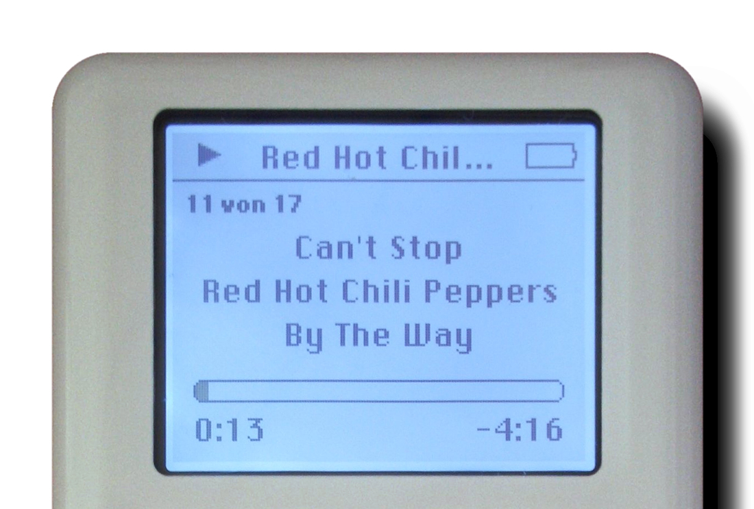
I begin this research with a typeface you might recognize from Apple’s iPod, back when it was a block of white and steel and we were still listening to the Red Hot Chili Peppers

Ipod__1100

The font is called Chicago, developed by Susan Kare in 1984 U.S.A. for Steve Jobs. Kare designed much of the icons still used today within the Apple software, like the command key used to save or undo. Actually, she found this image from Swedish road signs, where it is a symbol representing an attraction (command, pray). You remember also the smiley computer guy, pictured below with Kare’s face.

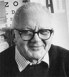
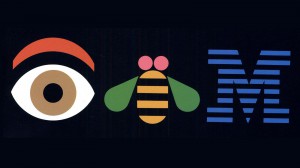
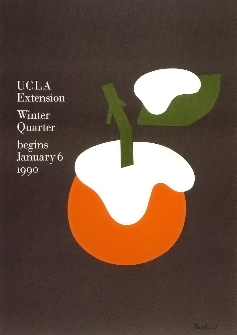
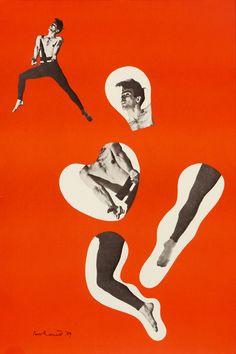
In this Vimeo Video Susan Kare speaks about her design process and cites Paul Rand as an inspiration. Rand was a graphic designer and teacher, a big figure in the 60’s and 70’s in the U.S; He is responsible for many recognizable company logos that are still in use today, like FedEx with its hidden arrow and IBM. His designs often have a simple charm, like the UPS logo, of which Rand says he is “taking something that’s traditionally seen as sacred, the shield, and sort of poking fun at it…by sticking a box on top of it is a seemingly frivolous gesture. The client, however, never considered it that way, and as it turned out the logo is meaningful because of that lighthearted intent.” This lightheartedness, playing with symbols and poking fun, is at the core of Rand’s design philosophy. We see that also in examples of his less corporate work, such as the two posters that follow below.

Paul-Rand    images-1     logo_ups_large

eye_bee_m      fedex_arrow_2015

RH_ucla_winter_1990RH_rood

I find Rand an interesting life to learn from, because his career seemed a marriage between corporate success, sustained personal practice, and a real devotion to teaching. And play. He talks often about playing within the context of graphic design, and because of his commitment to teaching, he writes about how this principle of play can be applied in pulling out the potential of the student, or at least in allowing for the circumstances in which this can be possible.

I refer to one article in particular, <<Design and the Play Instinct,>> published in 1965 in the book Education of Vision. In the article Rand zeros in on the two basic factors a teacher must consider : “the kind of problem chosen for study” and “the way in which it is posed.” He says that if a proposed problem involves too much emphasis on freedom and self-expression, the student will be indifferent, and the solution will in turn be meaningless. Instead he insists on proposing a problem with defined limits, implied or explicit disciplines that are conducive to the instinct of play, which will lead to an interested student and often a meaningful solution. What should be cultivated is “the ability to deal with problems in the simplest, most direct, and meaningful manner.” How can this be done through play?

We do create by engaging in free exploration, in this particular space familiar to childhood. But play is not the only thing involved if you want to get something done.

What is necessary then are parameters-restrictions-limitations. Rules, in a way. You can play with a deck of cards without rules, maybe by throwing them up in the air or making stories about the kings and queens, but you won’t be engaging in strategy and other faculties involved in a well-designed game. (Though we have the restrictions implicit in the design of a deck of cards: there are 52, 4 of each, 4 suits and 2 colors, a general size constraint. Limitation in some form is impossible to escape.)

In the article Rand specifies what these play restrictions can look like: the seven pieces of a Chinese tangram, for example, which include five triangles, one square and one rhombus. Within these parameters any arrangement of the forms is possible and you are given free range to play. If instead you were given a magical box full of an infinite number of shapes in an infinite number of sizes, you would first be presented with making decisions about what shapes you want to use, how many, what sizes, and so on. With a limitation already set you are free from these initial decisions and your energy can go directly to arranging the forms. This is the basic idea behind how limitations can create the ideal environment for play, and maybe eventually harmonious design.

In the linked video of Susan Kare above, she speaks of using the 16 by 16 grid in designing logos. This is a clear structure, lines of limitation within which possibilities of play are endless. Thinking back to Kare’s typeface, we can say that alphabetical letters and other written symbols of language can also be seen as a grid or structure, within which graphic designers may play. The form of an “A” is more or less set, the parameters being that the form does not stray too far from our understanding of what an A is if we want the type to be readable. In thinking of visual letters and symbols as a structure, I propose the possibility of inverting the process of structure and play: what happens when a structure is imposed retrospectively? Instead of creating a 16 by 16 grid, can we play first? Then, with the grid of the letter A in mind, we create a new typeface.

structureplay


you        oh                penguinman


The shortest search


Tuesday, May 14, 2013

This search for a book was the shortest search in my life. I’ve got six tags. One of them is ‘rules’. So, I’ve set up rules for myself. I am allowed to check books only from top shelves. The third tag is ‘coincidence’. I have had no idea what kind of book I was looking for, which means it was going to be a coincidence any way. One of the first book I picked from the first top shelf from the art section is a book with a naked lady on the cover. I went thought the book. The artist was mostly working around naked human body. My search was going really well!
Inside of the book I found oily finger stamps and prints of cup of tea. Apparently some one had breakfast in front of the book and left all this marks inside by coincidence.  First book I took from the book shelf exactly fitted all the tags I had! It confirmed the rules I made for myself. The power of coincidence convinced me how important to trust your own intuition and used a bit of imagination.

Rietveld Library cat.nr: BECK 3

Materialization of thoughts


Wednesday, April 24, 2013

According to one of the tags I decided that I am allowed to search for a book only on the top shelves which made it a little bit easier for me. I could give to my search a better structure and can check every book from that area.
I set up rules for myself that the second tag has to be a part of a title of the book and it has to be written on a cover or it has to have any semantic similarity. My second tag is ‘living book’. I was thinking about something contemporary or something new but happening at the current moment. Or it also could be something which has any quality of living or alive object. A part of the title of the book I picked is ‘themes and movement’. I thought about living moving books and also the subject of the book is quite new for me. I have never been into this topic before. It did not attract me before. Recently I come across this subject all the time. I’ve never divide art according to these categories before for myself. I found this topic quite interesting at the moment. This book caught my eye and it was a coincidence.
My third rule was ‘relay or trust coincidence’. I opened the book some where in a middle and I discovered a picture of a naked lady sitting in the dust surrounded by rubbish. I did not have any doubts about my choice.
My search took about 10 min. Was it accidental or do we always cross over things which we are really into or do those thing find us?

Rietveld Library cat.nr: 708.4 rec

Use Designblog TravelTags


Tuesday, November 23, 2010

.

Visit all “50TravelTags”

.

from the Designblog tag-list.

.

browse mapping by Maria Micheva

It is not easy to navigate in the design world, let alone Designblog.
The 979 postings and over 2000 keywords turn it into a subjective maze. How are you going to find an entrance to amazing stories and surprising opinions. In-depth interviews and downloadable theses and research papers.
Before you know it, you turn from user to participant of a universe that sucks you in or swings you out.


browse mapping by Severin Bunse

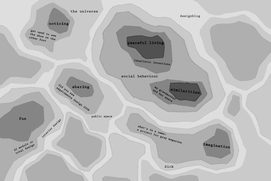
Students from A group decided to help you along by browsing the blog for you. Becoming your guides, in a manner of speaking. Creating new tags that can serve as “Travel Tags”. [invention, ice-cold, climate, crisis, fun, erudition, rules, gravity, convention, removable, purple, symbol, social-talk, audio-zine, similarities, mode, funny-story, flexibility, women, do-it-yourself, icon, sharing, interpretation, role, masterpiece, travel, imagination, slowMe, play, peaceful-living, mystery, sexuality, reflector, 0-dimension, no-comment, theater, ideology, dress, sharing, hidden, art-of propaganda, dependency, break-up, sign, young, pulling-pushing, conditional, breakfast, porcelain, Norwegian-mythology]-tt. You can look them up in Designblog’s tag-list, under [50-TravelTags].


browse mapping by Anouk Buntsma

Browsing surely illustrates that Designblog can become a true Pandora’s box. On the TravelTag poster, which was printed on this occasion, you can see a selection of their journeys in the form of ‘browse-maps’. Visualizations of their browsing history. These visual sketches show clearly that browsing through the blog leaves a clear individual trace. No person experiences it the same way. The blog creates –by design– a colored travel experience that synchronizes with your personal taste and ambition.

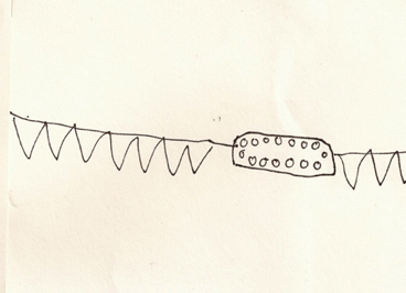
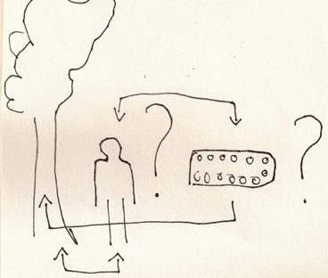
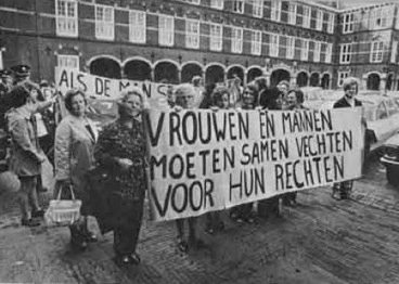
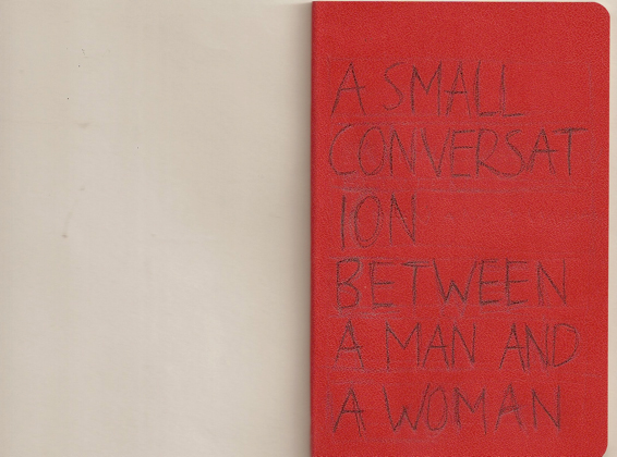
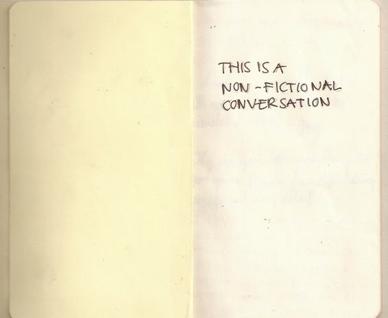
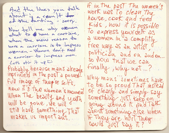
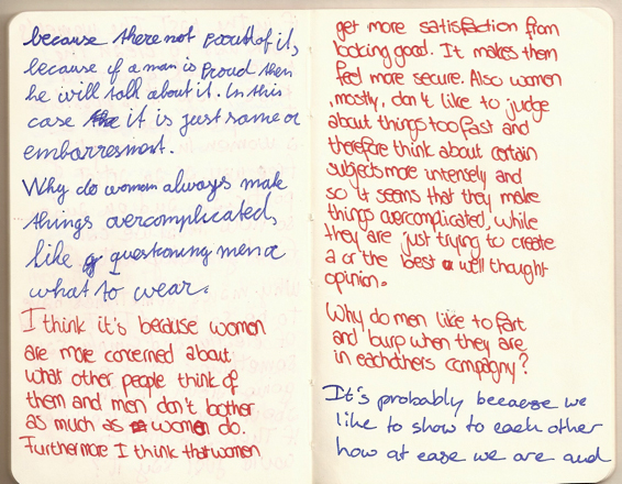
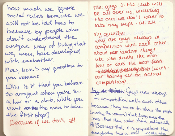
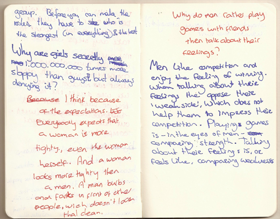
a small conversation between a Man and a Woman, starting from the workshop “Rules” by Ayumi Higuchi; rules in nature vs. rules in human beings


Saturday, June 5, 2010


To get to this conversation, I asked people around me to question something about the other gender, something the person questions the most (and if they didn’t know, just sOmething)

EVOLUTION = CREATION = BLIND POWER


Tuesday, June 1, 2010

In my case rules always bring a lot of variations. I observe it a long time because my way of working usually include one or more rules. Sometimes because I pick the rule but most of the time they are visible when work is finished. They reflect my present situation and feeling but for that certain amount of time they become rules and then variation of creating is visible.

It is not random that I found how this rules are already involved in me and I have no problem with it because rule is just a strong word- meaning most of the time something destructive but there is theory in biology which can very easily prove how rules are from the beginning a part of life and that they provide never ending variations of everything we are surrounded by.

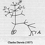
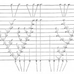
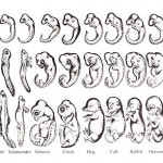
Charles Darwin introduced us to his theory of evolution in 1859 with his book On the Origin of Species.

This theory is based on several rules which explain that it is working :

1, In nature of biological species exists variability and is partly hereditary

2, In this variation there must exist some species which are more and some which are less adapted to the condition of environment where they live

3, Species which are more adapted have bigger possibility to create descendants. And when this process is repeated for a longer time then certain type in certain environment will spread and this is called = blind power

4, Everything alive has last universal common ancestor

Example for a blind power is very simple:

Imagine that you are walking some field and you come across a stone, what do you think of is that ok is a stone and it was here or somewhere around from the begun, but now imagine you found a watch.Probably you take it and observe it, you check if it works, you find out that is a machine which measures a time, you see from which kind of parts it is made so it is sure for you that there had to be someone who designed it someone we call watch-maker. Existence of watch prove an existence of watch-maker. But this is the thing which Darwin challenged.He is tried to say that watch can exist without watch-maker.

The choice of nature can be called something like a blind watch-maker – he get some parts of watches separately and one by one he makes a watch from it.The thing is that he doesn’t know that he is making a watch.

Darwin was a very big observant and had a big possibility to travel around the world what makes him very rich of the materials he could used for his theory.

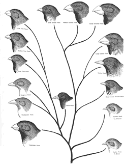
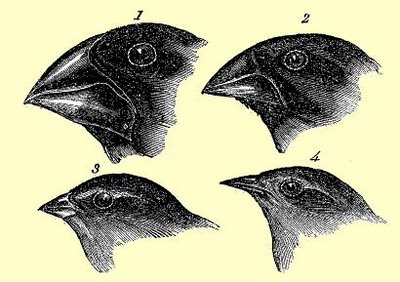
Another example of his theory which nicely explain also how rules of environment included food,weather… influence variability in this planet is his observing of birds- finches in the islands where he found out that they differ depending on what surround them and especially what differ is their beak – tool for eating. The reason is that finches split all over the different islands and by evolution they adapted themselves to the world around them and its rules.

Evolution begins with the first life in this planet and thats for me also where the creation begins and where the rules are always present and there is nothing wrong with it. The word freedom would never exist and would never have such a powerful meaning without the word restriction = laws.

To finish I choose the last part of Darwin’s book On the Origin of Species:

“It is interesting to contemplate a tangled bank, clothed with many plants

of many kinds, with birds singing on the bushes, with various insects

flitting about, and with worms crawling through the damp earth, and to

reflect that these elaborately constructed forms, so different from each

other, and dependent upon each other in so complex a manner, have all been

produced by laws acting around us.  These laws, taken in the largest sense,

being Growth with reproduction; Inheritance which is almost implied by

reproduction; Variability from the indirect and direct action of the

conditions of life, and from use and disuse; a Ratio of Increase so high as

to lead to a Struggle for Life, and as a consequence to Natural Selection,

entailing Divergence of Character and the Extinction of less improved

forms.  Thus, from the war of nature, from famine and death, the most

exalted object which we are capable of conceiving, namely, the production

of the higher animals, directly follows.  There is grandeur in this view of

life, with its several powers, having been originally breathed by the

Creator into a few forms or into one; and that, whilst this planet has gone

circling on according to the fixed law of gravity, from so simple a

beginning endless forms most beautiful and most wonderful have been, and

are being evolved.”

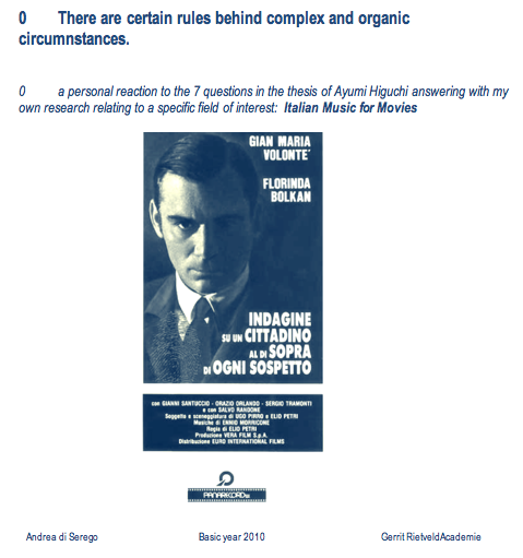
Italian Music for Movies


Tuesday, June 1, 2010

- click on image to download this research pdf -


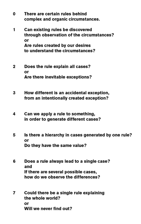
- also read 'There are rules behind complex and organic circumstances [x] -


Something Else . . .


Saturday, May 15, 2010

THERE ARE RULES BEHIND COMPLEX AND ORGANIC CIRCUMSTANCES

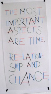
This is the opening sentence of “Rules” a graduation essay written by Ayumi Higuchi in which she investigates the impact rules have or can have on the process of cause and effect in the creative process. A story that drags you into the exiting process of research where every question or statement leads to two others.
Using interviews as a platform to ask questions and create interaction, she involves Jan Groenewold (physician-chef), Luna Maurer and Jonathan Puckey (graphic designers), Snejanka Mihaylova (philosopher-writer-artist) and Peter van Bergen (musician-composer) to talk about the subject from the perspective of their specific discipline.
Look for yourself how she illustrates this story with many images and quotes dragging you deeper into the matter every page, creating in depth understanding. Munari, Wittgenstein, 9/11, John Cage, mixing politics with art and science with nature to get her point across.

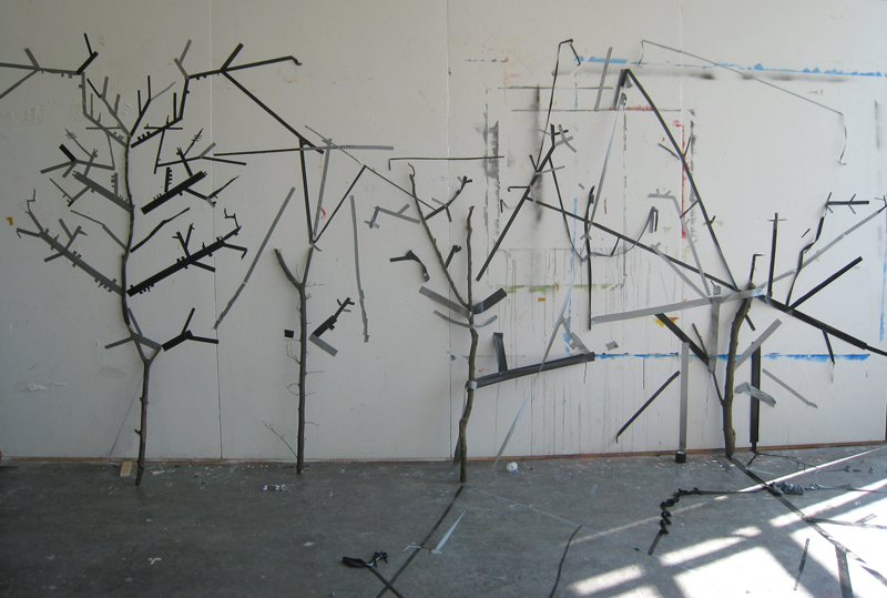
Ayumi visited us in April 2010 to present a workshop in which she planted the seed of understanding using Bruno Munari‘s observations; [] We can establish a rule of growth: the branch that follows is always slenderer than the one before it (Drawing a Tree).
Providing us with a trunk and applying two simple rules to it: The branch that follows must be slimmer than the one before -and- the tree must be symmetric, it quickly became clear that there are many rules behind complex and organic circumstances.


download this research essay: “RULES”, there are rules behind complex and organic structures

Conditional [Design] Painting


Tuesday, October 27, 2009

Conditional Painting is truly happening in the van Abbemuseum Eindhoven! They call it the Vitruvian Paint Machine.

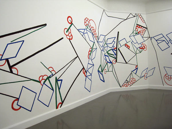
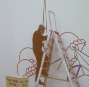
As part of  “Take on me (Take me on)” /Dutch Design Week 17 to 25 Oct 2009, Luna Maurer and Edo Paulus executed a mural painting on pre determined conditions based on the proportions of the body and visitor interaction.

The act of designing is based on rules they say. So Luna and Edo, together with Roel Wouters and Jonathan Puckey, created a manifesto of explicit rules for design.

Visiting their lecture, as part of the “Take on me (Take me on)” event, they made it clear that setting strict conditions does disconnect you from subjective standards and creates awareness in the process. A beautiful time based movie of their “machines” made this crystal clear.


download this research essay: by Jules Esteves: “Conditional Drawing, Conditional Painting” questioning the practice of Conditional Design.


Adolf Loos Versus:


Thursday, October 15, 2009

A lot of “rules” were written for architecture. Not always have they been followed up and also a lot of times they have been discussed by other “writers (philosophers)” / architects.

Adolf Loos was one of these architects who were more philosopher than architect. Even though the whole world listened to what he had to say, his rules were not followed by everyone and not as strict as he had hoped for. This is due to the fact that there were more of these men that had their ideas about architecture. Besides the Ornament & Crime essay there were serveral others like the “Raumplan”, “the Plan Libre” and peoples individual ideas.

Today we don’t design according to a “manual” written by one architect. There are thousands of manuals that inspire us. It’s about what we want ourselves.

on_”Ornament_&_Crime”


Log in
subscribe