Skip to Content Skip to Search Go to Top Navigation Go to Side Menu


"Type in Context 2" Project


Play Rules


Tuesday, February 23, 2016

“Without the challenging possibilities of introducing the element of play,
both teacher and student cannot help but be bored”

quote: Paul Rand


home_portrait


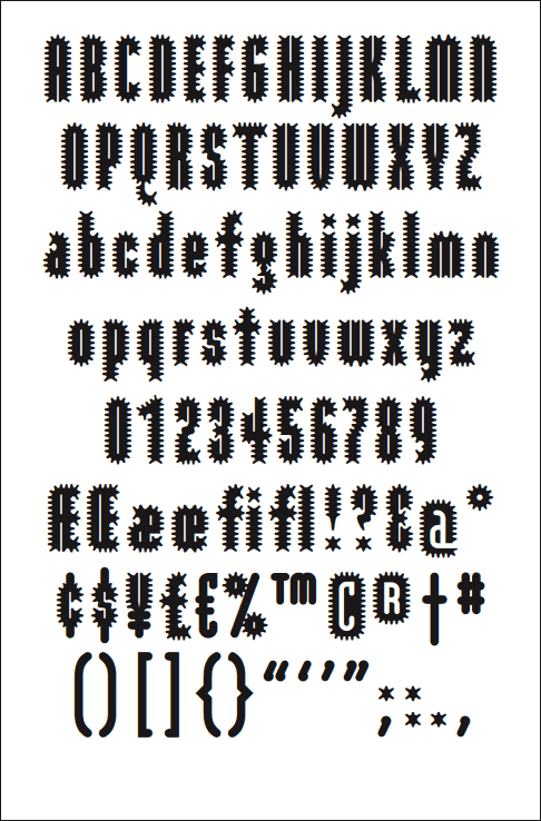
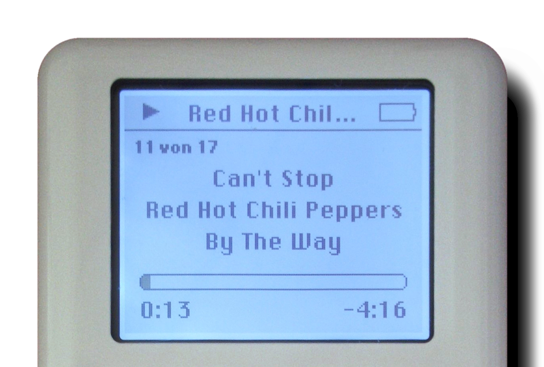
I begin this research with a typeface you might recognize from Apple’s iPod, back when it was a block of white and steel and we were still listening to the Red Hot Chili Peppers

Ipod__1100

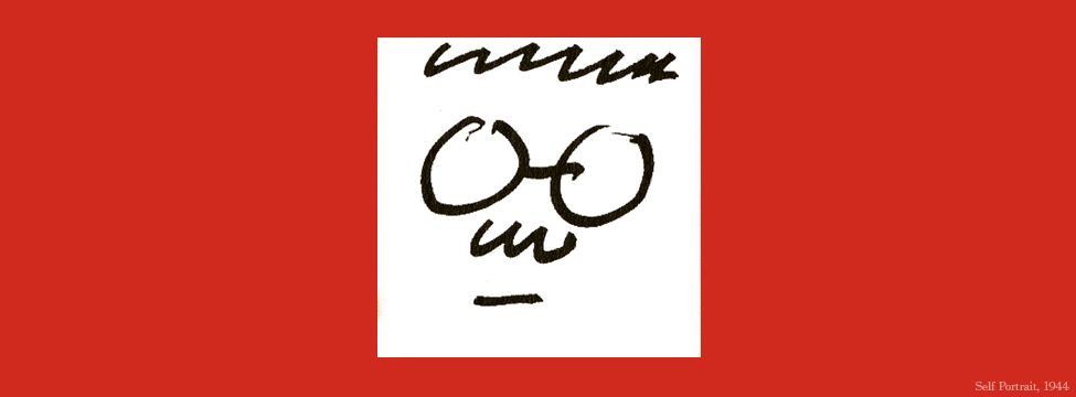
The font is called Chicago, developed by Susan Kare in 1984 U.S.A. for Steve Jobs. Kare designed much of the icons still used today within the Apple software, like the command key used to save or undo. Actually, she found this image from Swedish road signs, where it is a symbol representing an attraction (command, pray). You remember also the smiley computer guy, pictured below with Kare’s face.

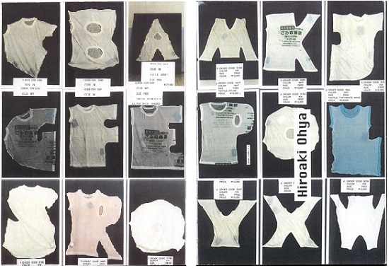
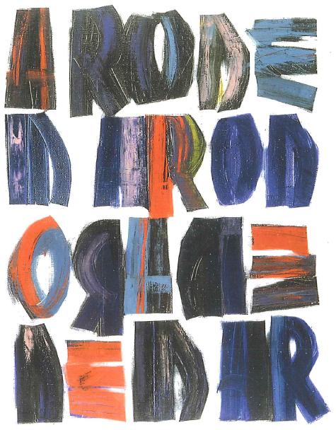
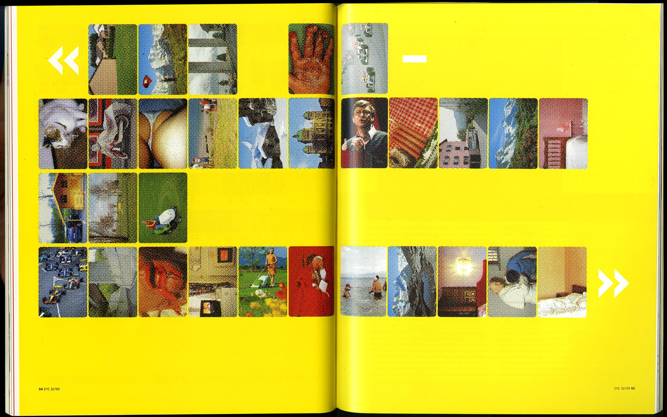
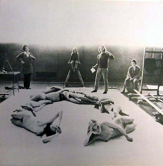
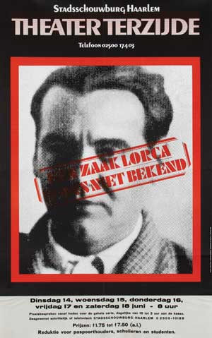
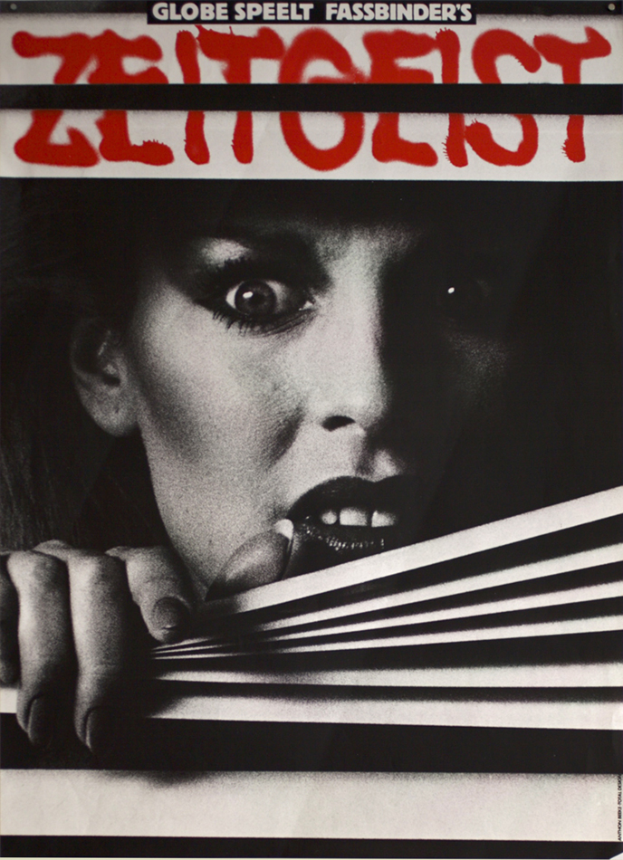
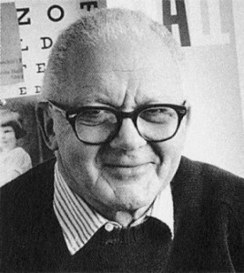
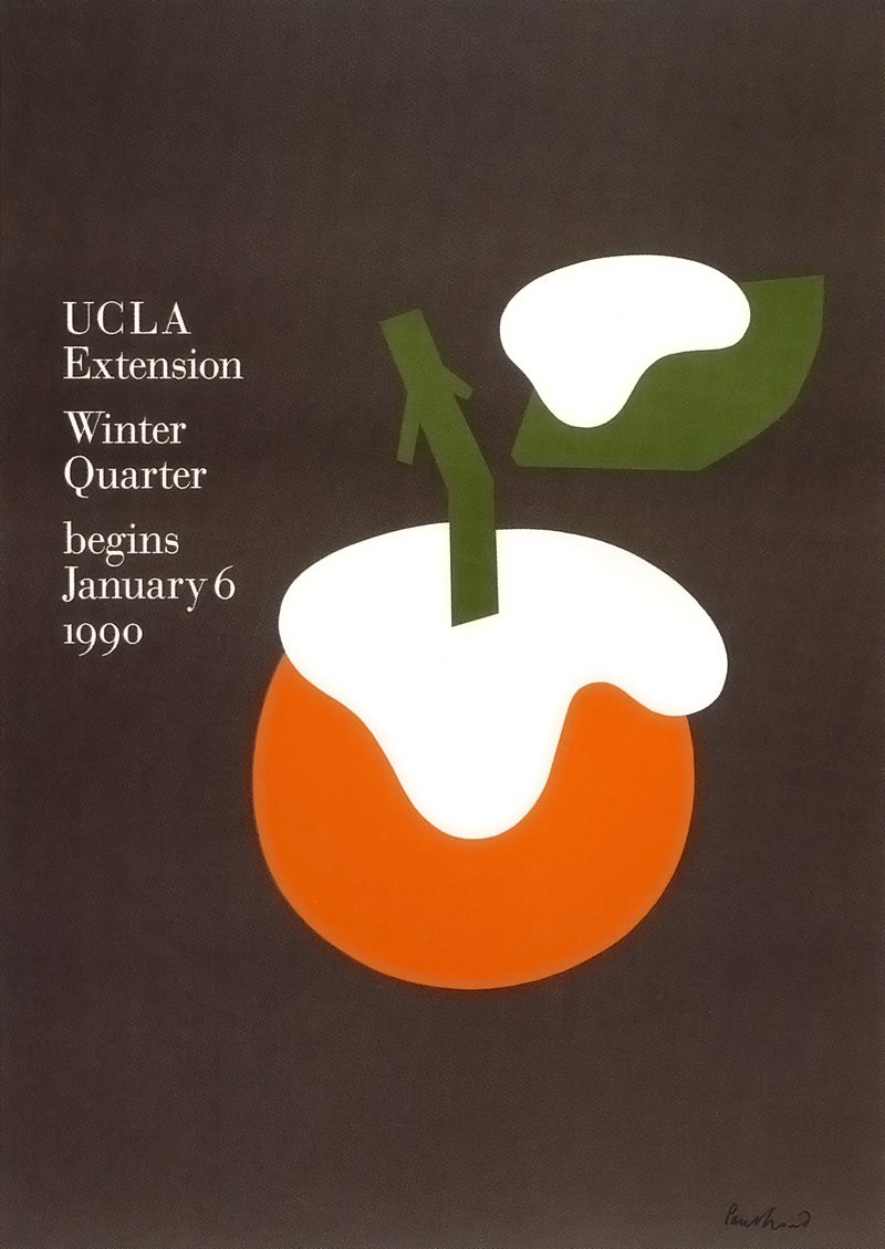
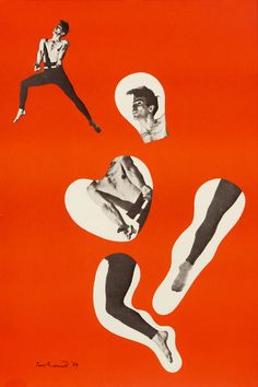
In this Vimeo Video Susan Kare speaks about her design process and cites Paul Rand as an inspiration. Rand was a graphic designer and teacher, a big figure in the 60’s and 70’s in the U.S; He is responsible for many recognizable company logos that are still in use today, like FedEx with its hidden arrow and IBM. His designs often have a simple charm, like the UPS logo, of which Rand says he is “taking something that’s traditionally seen as sacred, the shield, and sort of poking fun at it…by sticking a box on top of it is a seemingly frivolous gesture. The client, however, never considered it that way, and as it turned out the logo is meaningful because of that lighthearted intent.” This lightheartedness, playing with symbols and poking fun, is at the core of Rand’s design philosophy. We see that also in examples of his less corporate work, such as the two posters that follow below.

Paul-Rand    images-1     logo_ups_large

eye_bee_m      fedex_arrow_2015

RH_ucla_winter_1990RH_rood

I find Rand an interesting life to learn from, because his career seemed a marriage between corporate success, sustained personal practice, and a real devotion to teaching. And play. He talks often about playing within the context of graphic design, and because of his commitment to teaching, he writes about how this principle of play can be applied in pulling out the potential of the student, or at least in allowing for the circumstances in which this can be possible.

I refer to one article in particular, <<Design and the Play Instinct,>> published in 1965 in the book Education of Vision. In the article Rand zeros in on the two basic factors a teacher must consider : “the kind of problem chosen for study” and “the way in which it is posed.” He says that if a proposed problem involves too much emphasis on freedom and self-expression, the student will be indifferent, and the solution will in turn be meaningless. Instead he insists on proposing a problem with defined limits, implied or explicit disciplines that are conducive to the instinct of play, which will lead to an interested student and often a meaningful solution. What should be cultivated is “the ability to deal with problems in the simplest, most direct, and meaningful manner.” How can this be done through play?

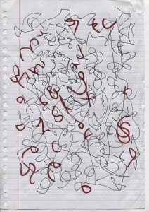
We do create by engaging in free exploration, in this particular space familiar to childhood. But play is not the only thing involved if you want to get something done.

What is necessary then are parameters-restrictions-limitations. Rules, in a way. You can play with a deck of cards without rules, maybe by throwing them up in the air or making stories about the kings and queens, but you won’t be engaging in strategy and other faculties involved in a well-designed game. (Though we have the restrictions implicit in the design of a deck of cards: there are 52, 4 of each, 4 suits and 2 colors, a general size constraint. Limitation in some form is impossible to escape.)

In the article Rand specifies what these play restrictions can look like: the seven pieces of a Chinese tangram, for example, which include five triangles, one square and one rhombus. Within these parameters any arrangement of the forms is possible and you are given free range to play. If instead you were given a magical box full of an infinite number of shapes in an infinite number of sizes, you would first be presented with making decisions about what shapes you want to use, how many, what sizes, and so on. With a limitation already set you are free from these initial decisions and your energy can go directly to arranging the forms. This is the basic idea behind how limitations can create the ideal environment for play, and maybe eventually harmonious design.

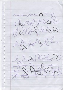
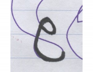
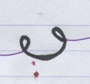
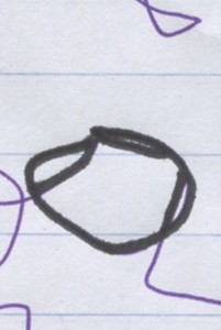
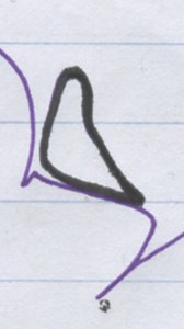
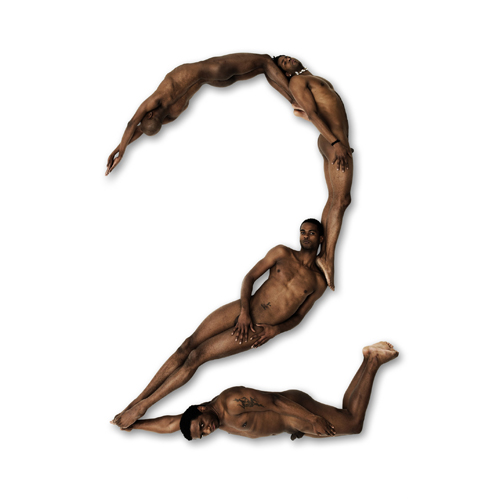
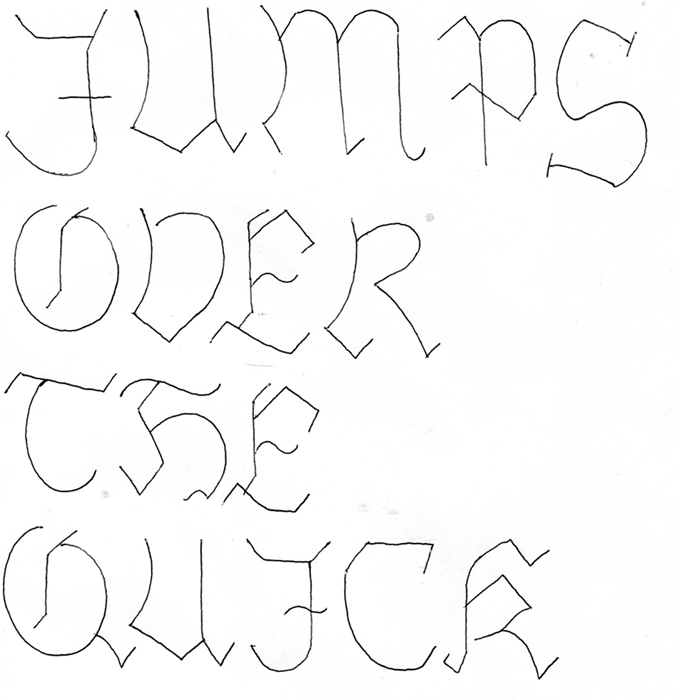
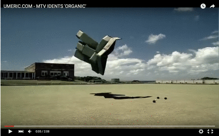
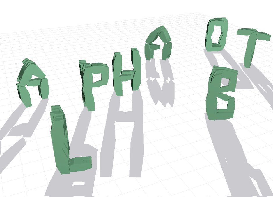
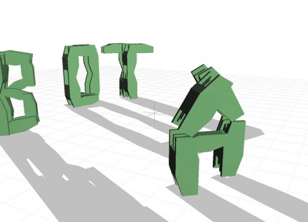
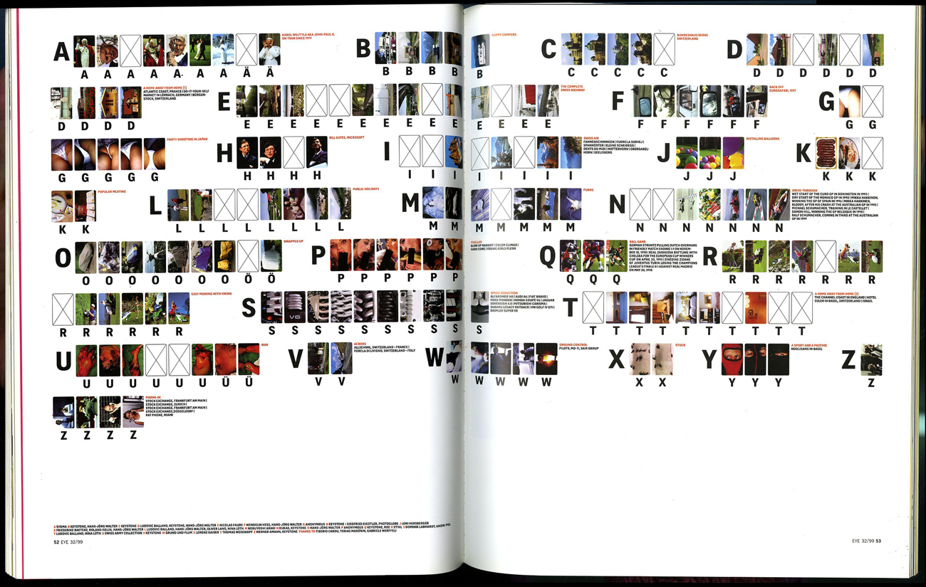
In the linked video of Susan Kare above, she speaks of using the 16 by 16 grid in designing logos. This is a clear structure, lines of limitation within which possibilities of play are endless. Thinking back to Kare’s typeface, we can say that alphabetical letters and other written symbols of language can also be seen as a grid or structure, within which graphic designers may play. The form of an “A” is more or less set, the parameters being that the form does not stray too far from our understanding of what an A is if we want the type to be readable. In thinking of visual letters and symbols as a structure, I propose the possibility of inverting the process of structure and play: what happens when a structure is imposed retrospectively? Instead of creating a 16 by 16 grid, can we play first? Then, with the grid of the letter A in mind, we create a new typeface.

structureplay


you        oh                penguinman


systems of thoughtful straights to speed up the round


Monday, February 22, 2016


IMG_2700IMG_2694


1 2


3 4


9 5


The code uses a sequence of vertical bars and spaces to represent numbers and other symbols. A barcode symbol typically consists of five parts: a quiet zone, a start character, data characters (including an optional check character), a stop character, and another quiet zone. The stripes can be scanned, the code is transferred to a computer where it is linked to the information about the product.

Unknown

It appeared for the first time on a piece of gum, invented to speed up the process of the person behind the counter, monitoring sales and supplies and eliminate errors and mistakes.

The speed and accuracy of the Universal Product Code made the barcode one of the most important and used designs of today.

In 1948 Bernard Silver, a student at Drexel Institute of Technology, was interested in developing a system to automatically read product information during checkout. Together with his friend Norman Joseph Woodland he started working on a variety of systems. Their first working system used ultraviolet ink, but the ink faded too easily and was rather expensive.


barcode patent1


His next inspiration came from Morse code. He used the dots and dashes of the code and extended them downwards to make narrow and wider lines out of them. To read them, he adapted technology from optical soundtracks in movies, using a 500-watt incandescent light bulb shining through the paper onto an photomultiplier tube from a movie projector. Although there was a interest from various of companies to buy the patent, the required equipment that was needed to process the information was some time off in the future.


KarTrak


Some years later David Collins used a similar system to developed a system called KarTrak IIIII, using blue and red reflective stripes attached to the side of the cars, encoding a six-digit company identifier and a four-digit car number, the system was found to be easily fooled by dirt in certain applications, which greatly affected accuracy. And was therefore abandoned.

In 1967, Collins formed the Computer Identics Corporation to develop a black-and-white version of the code for other industries. As its first innovations, Computer Identics’ moved from using incandescent light bulbs in its systems, replacing them with helium–neon lasers, and incorporated a mirror as well, making it capable of locating a barcode up to several feet in front of the scanner. This made the entire process much simpler and more reliable, and typically enabled these devices to deal with damaged labels, as well, by recognizing and reading the intact portions.
With these innovation the system became interesting for the food industry and in 1972, a supermarket in Cincinnati began an eighteen-month test with this system.


first accuscan


Barcodes were printed on small pieces of adhesive paper, and attached by hand by store employees when they were adding price tags. The code proved to have a serious problem; the printers would sometimes smear ink, rendering the code unreadable in most orientations. However, a linear code was printed in the direction of the stripes, so extra ink would simply makes the code “taller” while remaining readable.

All these technological and practical developments and decisions were crucial for the outcome of the design and therefore the success of the barcode.

Being first printed over a carefully designed package of gum, it soon manifested itself on almost all products that surround us. On a bottle of water, a wrapped piece of meat, a car tire, a steel pipe, plants in the plant shop and made its way into schools and hospitals. IIIII


barcode shop
One of the latest innovations: virtual shopping


so many stripes
beech forest in winterland
brilliant black and white


The ability for a visual design that only follows the rules of function, is present everywhere around us but rarely noticed, has to be included within other designs because of its economical value, and is still being useful after more than forty years makes the barcode a brilliant piece of design.

[white stripes on the hot and cold black lanes, crossing vast sands

long and longer directed, goal and great precision

moving all scanned created and known needs over water and land

straight to the verticals and horizontals of men]

For your (human) eyes only


Monday, February 22, 2016

Text in it’s digital form or as a product of a digital process prior to printing is what we mainly encounter today. However we don’t have to travel very far back in time to find a different reality.
Tracing the development of digitization of text the invention of text recognition software, also known as OCR (optical character recognition), might be said to have played a key role in the transition period to the above mentioned development.

OCRA_Typeface-1-1024x860

Commissioned in 1968 by the American National Standards Institute the font OCR-A was released, as a international standard for a font easily read by humans and computer. Thus enabling printed matter to be translated into digital form without having to have a person manually type in the information once again.
Due to the in today’s view limited ability of text recognition by computers, the outcome was a quite peculiar looking typeface.
One could for example mention the very weird captital “o” among other odly shaped characters. But here the logic goes towards enabling the computer to fast and easy make the distinction between a capital “o” and a zero, without doing what we as humans of cause easily do – which understanding which is meant due to the context in which it’s presented.
The general effect of the font is one that is not very easy or pleasurable to read for longer text pieces, in fact making it a font that is more suited for the needs of the computer than that of easy human readability. This I believe is an important point which I will return to later in the connection with CAPTCHA’s (an acronym for “Completely Automated Public Turing test to tell Computers and Humans Apart”).


However taking a leap from 1968 to todays society, OCR-software are now able to recognize almost any text in no time, let alone the fact that a vast amount of information all ready exist in digital format and might very well never enter the physical world as printed matter.
Being a child of the 90’s myself, my generation have been brought up in a time were the development of the computer and the internet and the digitization and accessibility of information that it brought along has truly underwent extraordinary progress. Text and images crossing the globe in split second enables us to pass the physical boundaries of time and space.

But let’s stay grounded for a second. Cause as we surf around the internet so does computers. Bots with algorithms designed to sign up for free emails in the count of several thousands, to send out millions of so called “spam e-mails turned out to be one of the problems that the internet encountered. The number of spam e-mails is estimated to be around 200 billions a day.

As a tool to avoid this the “CAPTCHA” was invented. A small box with hard to read text from which the user is supposed to decipher the letters in order to enter a certain webpage. The aim is to simply create a text which a person but not a computer could decipher, thus telling the two apart.


examplesoftextcaptchasdb0


Going back to earlier mentioned OCR-A font I find it interesting to see how the CAPTCHA actually operates in the same intersection between human and computers, just here the goal seems to be the exact opposite in actually striving to avoid OCR-software to be applied. In my research i started looking into the various CAPTCHA’s and tried out whether one could mimic some of the visual tools applied by such software. Which got me thinking, if one could imagine a complete font mimicking the CAPTCHA?
This example would of course only be a mere visualization of such a font, because of the nature of CAPTCHA’s an actual font would be ever changing in order to avoid OCR being applied upon it.


anti ocr test2


Apart from my own visual affinity for this type of text, I also find there to be a sincere need for such a font or at least at a symbolic level of hindering information from being to easily accessed by computers.

What I mean by this is that how much the last 20 years off development of the internet has truly amazingly achieved, I also believe that it has been engaged with a certain sense of nativity, which we are only now starting to realize, it seems.
It was apparently perfectly natural for us to browse around the globe using free search engines or sign up for free e-mail services or to move through cities of the entire world in street level perspective. But what does these services cost if not money? The answer seems to be personal information. The reality being that our every move are potentially logged and can be utilized to profile us as consumers in order to sell advertisement space. But not only that, as relatively recent ‘leaks‘ by Edward Snowden showed us it’s not only corporate industry but also governmental agencies such as the NSA that are interested in our personal information.
So what’s left to do- cutting our LAN-cables and WiFi connection while putting on the the tin foil hat? Neither seems very tempting.

So what I’m advocating is not total paranoia but maybe once in a while remembering the saying: “there is no such thing as a free lunch”.
CAPTCHA as a typeface is indeed not very practically, but what I find potentially interesting is possible tools to provide us with a shelter for automated accessing of our personal information- also if only for a short while.


the end captcha


Might as well be Chinese


Monday, February 22, 2016

‘When the ancient system of rope-knotting (Quipu) began to become impractical as the empire was growing bigger, the Yellow Emperor ordered his most praised scholar, the four-eyed Cangjie, to create characters for writing. Cangjie sat down on a riverbank, intent on completing the task that had been given to him, but found himself unable to create so much as a single character. He looked up and saw a phoenix flying overhead with an object in its beak. The object fell and made an imprint in the sand, that Cangjie recognized to be an impression of a hoof print. He asked a hunter passing by the river of what kind of animal he though the hoof print was. The hunter undoubtedly said it had to be a Pixiu, a mythical creature. This led Cangjie to the insight that he could capture in a drawing the special characteristics that set apart each and every thing on the earth, this would truly be the perfect kind of character for writing. From that day forward, Cangjie paid close attention to the characteristics of all things, including the sun, moon, stars, clouds, lakes, oceans, as well as all manner of bird and beast. He began to create characters according to the special characteristics he found, and before long, had created a complete set of characters for writing. When Cangjie wrote down the characters, the deities cried for heavenly secrets had been revealed, and the sky rained their millet tears.’ Cangjie later had a system for entering Chinese characters in a computer named after him.

If all seven billion people alive today would lay down their daily chores, give up on their petty conflicts, and would all come together to decide democratically, what the most important form of art is, the odds are that the answer would be

calligraphy

In the Chinese Cultural Sphere, which holds nearly a third of the total population on Earth, calligraphy is considered to be the highest form of art, being likened to pure life experience being put on paper. The brush, the paper, the ink and the ink stone, the materials used for calligraphy, even though very cheap, are poetically named the ‘Four Treasures of the Study’. In the Arabic world, albeit almost exclusively produced in a religious context, calligraphy is perceived as being an autonomous art form of great importance as well. In the Western world though, calligraphy has always remained more or less an additional art form, that should be seen as a form of illustration, or decoration, rather than standing on its own. I want to understand why calligraphy is seen as the highest form of art in China, while it appears to have played such an exceptionally insignificant role in Western culture.

The myth of the origin of the characters illustrates the almost divine status writing has for the Chinese. There is no comparable story in Greek or Germanic mythology. Never in Western history much attention has been paid to writing. Plato was even known to despise the practice, saying that it would degenerate our memory and could never capture the true essence of anything. Accordingly his written work is said not to contain the core of his philosophy, which could only be expressed through the spoken word.

The nature of the Chinese writing system can perhaps give us a clue as to why its calligraphy is deemed so much more important by its practitioners than that of the Latin alphabet. Chinese characters are logograms. This means that instead of a sound, as is the case with the phonograms used in the Latin alphabet, a character stands for a word or a phrase. You could say that the Latin alphabet is far more abstract than the Chinese writing system, which is much closer to nature in the sense that the characters are directly derived from the essential characteristics of the things they stand for. This becomes even more clear when we look at the earliest known calligraphy has been found on oracle bones and shells (Oracle Bone Script) used in ancient rituals. These primitive characters resemble the things they stand for much more closely, and are in some cases recognizable drawings.

Evolving Characters

Calligraphy itself is also described to be standing very close to nature. The stroke of a brush can be likened to ‘a boulder plummeting down a hillside’, or a line to ‘the gracefulness of the fleeting patterns left on the surface of a pond by swimming geese’. The nature of the characters make the difference in status between Chinese and Western calligraphy understandable. One can feel much more connected to a symbol meaning ‘love’ or ‘courage’ (many people in the Western world even have these symbols tattooed on them) than to a symbol that represents the sound ‘L’, for example.

Not only is calligraphy deemed more important in China than it is in Western culture, it is approached in a completely different way. In the 1th century, during the time of the Han Dynasty, the emperor heard that his cousin was dying. He immediately send a messenger to request and collect a piece of calligraphy from him, as he believed he could “commune” with his cousin, even after death, through the traces of his personality embedded in his handwriting. Today calligraphy is still praised ‘the most expressive and personal form of art’. Chinese calligraphy would also be the most confined form of art. Everything, from the material, the image, the way the brush is to be hold, to the order of strokes that form the characters, is fixed. In this it is the absolute antithesis of modern and contemporary art that is being dominant in the West. They honestly couldn’t be further apart. The modern and contemporary Western artist is expected to be original in his choice of material, his way of working, or his subject. To transcend boundaries, to break traditions, is what is being valued. Where Western art focuses on giving the artist as much freedom as possible, The oriental calligrapher is expected to follow traditions. One might ask how can he express himself, when the calligrapher is so bound to tradition. Because all calligraphy is made in the exact same way, the viewer can trace back exactly how a piece was made. Even the most subtle nuance in the speed and strength of the strokes stands out. Just as much as that the writer speaks to the reader by what is written, he speaks by how he writes. This makes Chinese calligraphy a very personal form of art, that can communicate very subtle thoughts and emotions. Like a monk in a monastery, the calligrapher is free not in spite of the strict limitations he commits to, but because of them.

That being said, even if I would learn enough Chinese to be able to read and write, which will take me years, I will never be able to truly understand, let alone appreciate the greatest form art that is Chinese calligraphy. The image below is a copy of Wang Xizhi’s Lantingji Xu, the most famous Chinese calligraphic work ever made, and would-be democratically decided to be the greatest work of art even made, but to be honest, all I see is black-ink brush strokes on slightly brownish paper surface. Though satisfied in the knowledge that I have learned a lot by making this post, I’m writing these last few sentences with a slightly sour taste in my mouth, knowing that great art is right in front of me, but not for me to see.

Greatest Work of Art

Physical letters


Monday, February 22, 2016


A


large_Curtain_2


This image is from a project of an hanging typeface that René Knip developed with Janno Hahn for the art academy in Istanbul, Turkey. I thought it was quite a beautiful image regarding typefaces and it got me curious with this idea of building curtains through the act of connecting letters.

In the first place I think it is interesting that we are speaking of objects now. Even though this typeface can and does work in an independent way when printed on a flat surface or on a digital platform, its design was developed based on the fact that it needed to work as a physical thing. The letters needed to be able to be hung and to connect between themselves.


BLOG1

A drawing is a different mechanism and makes use of a wider freedom while when you need to construct or build something it is dependent on a big set of criteria. Not everything is possible and it is ok. 🙂 The material, the craft and the limitations of earthly conditions give some direction on the process of making the design. Possibly they add a new layer or content and richness.


There are two artists about whom I can speak shortly in this sense.


BLOG6 BLOG2


Karl Nawrot (x) is a french graphic designer based in Lyon, France. We can say he has a very hands-on approach on the process of developing his designs. The  b&w image above shows two fases of the research for the typeface Lÿno that he designed in coöperation with Radim Pesko: first a sketch of cutout shapes made out of Albert Heijn packaging boxes that were later translated in a flat design. It is indeed a very experimental way of dealing with drawing, to try to find two-dimensional shapes through the making of three-dimensional sculptures.


Hiroaki Ohya is a Japanese fashion designer that has been working on the issue of clothing through a more artistic perspective. She transformed old t-shirts into letters (second picture above), keeping recognizable elements of the t-shirt, as neck and arm holes, and making letters that are readable.  They are intriguing pieces to look at, I feel, one doesn’t know if they are in fact still t-shirts or letters already.


~-~-~

B


96662_original


Going a bit further I wonder what does it mean for a letter to become an isolated object…?

Look at that little G lost on the sidewalk…

(Probably nothing very important but) I cannot help myself from feeling a certain fascination, seeing them out of their context and physically engaged in my world. One thing about symbols and language is how abstract and mysterious they seem to be when you don’t know how to read them. And when they are taken out of their function of communication they get some of these qualities back and open up a space for poetic understandings.

 
printing-press-letters


One of the first times it did happen was probably with the invention of movable types on the Gutenberg press. Even though as stamps they were not meant to be read themselves, letters started to take up space and had to be organized by shape and volume, not as a message.

Representative of the democratization of books, letters as objects are also very representative of the alphabetization. It only makes sense to shape so many things in the world as letters because so many know how to read. And actually primary schools are one of the places where you are going to see more letters-objects and to hear the actual speaking of the A, the B or the C as individual entities. This is done in certain schools for pedagogic reasons to get the students familiarized with the alphabet before starting to make words and sentences

A possible association of meaning that one can make of letters as things is with the playfulness of childhood and all the memories of the beginning of education for those who can read. There’s quite an abstract feeling in learning and schools if one thinks of it…


“Do you know what ‘A’ means, little Piglet? It means learning,
it means education, it means all the things that you and Pooh haven’t got”

Winnie The Pooh

I found this quote in the book  ‘One letter words, A dictionary’,  by Craig Conley, in which he tries to find the possible meanings that each letter can have when used by itself. It is quite interesting to find out a letter can be or mean so much. However I also like the possibility of a more poetic and abstract meaning.


~~


João Vieira (1934-2009) was a portuguese artist very much interested in the alphabet as a theme and on the idea of using letters as objects for their poetics possibilities. Like the situation of the second video above: “a runway of letters”. Which latent meanings are at stake? Or is it a formal exercise?


joao_vieira_uma_rosa
uma rosa é

Mainly known as a painter of letters,
he said in 2006 “I started to paint letters because I wanted to make poems with painting”.


Quite curious to see the way how this Portuguese artist dealt with the canvas since there is not so much tradition of painting in Portugal. There is a lot of literary tradition though. His first paintings were abstract and gestual and depicted simple shapes;  later he started to work also with quotations from famous writers and with the form of the alphabetical letter by themselves. His interest by letters grew into sculpture and into performances. In his first performance The spirit of the Letter (1970) he built several letters in wood that were later destroyed by himself and a group of kids. It was the next year he did the performance Expansions (first video above) where he made giant ones out of foam, plastic and leather and used them to interact and play with the public.


BLOG7_1100


~~

C


The Latin alphabet is based on sounds, the signs are phonographs, and I think it is where some of the interest of the topic lays. Each letter only refers to a sound that is a small fragment of a message. Without that it is a very vague and abstract form or thing and we are attributing to it the materialism of a physical thing. What does this object refers to anyway??

These letters are objects that can get old and used, they can be torn apart, they have a space in our bowls and stomachs. You can touch them, kiss them if you like, throw them in the thrash.

The same way that we animate objects in our imagination – as in filling them with life and identity – we do the same with this letters which is a kind of complex thing at this point. A mute symbol of a sound playing its life again.  Yes, complex situation but only an ordinary detail of daily life business.

..


 505944e557527f33c872008fa3254eca — 

BLOG4

zzZzee you aroud

Letters in Space


Sunday, February 21, 2016

If I think of letters and/or typography, I think of a flat surface with text. Like on paper and computer screens. But in daily life I am more interested in sculpture, 3d Objects and landscapes. So I searched for typefaces in 3d, who give me the feeling of a landscape or a sculpture. And already very quick I rolled in to the world of 3d printing.

Need a new name tag or a cool 3d logo? All out of magnetic alphabet letters, or play letters for your kid? You can make it very easy yourself these days. Just a few clicks on the computer and voila! You printed your design.

Roughly in the 30 years between the invention of 3D printing and the current hype is 3D printing steadily been on the rise. The first patents for 3D printing have already applied for early 80’s and the first commercial machines were already in 1988  delivered to the customers. So it has been a history of over 30 years, but now the hype is just starting? Especially because the quality of the available materials and techniques have been improved. Rates also declined for both the mac

hines and the materials. Around the year 2000 the cheapest 3D printer was around $ 45,000. Five years later, the rate was approximately halved and now you can already buy a professional printer for less than $ 10,000. There’s even a special printer produced for use at home, which costs less than $ 400. Also, all applications have increased. In the beginning the printer was called another name than 3D printing. It was called:  rapid prototyping. Especially because the method at that time was ma

inly used to develop prototypes, test models and mock-ups. At a later stage, the material was more spacious and the machines were faster and more accurate. Since then they are more often used for final products. But in recent years it has gained much more attention, and especially large prize declined from the machines and materials and the RepRap project brought a lot of media attention.

5. laser sintering 3D Printers (process)

Who would have thougt that by now we can send 3d letters? Well I did not.

In my search for artists who use 3d printing in their work, I found this project of Hongtao Zhou. A Chinese artist (currently living and working in the United States). He created a work called ‘textscape’ . When I saw it at first I didn’t know were to look. It was a combination of text and image, but the image was like a new landscape, especially when you see it from the side. Since Zhou comes from a country with a rich history in Printing, he used that rich Chinese history to develop his project.

20080320-earliest printed book brook2 ca1794542078c8c3ce84c62be373284b

Ancient China was the place were printing technology was first created. The earliest surviving examples from the woodcut prints from China date back to before 220 a.d. Back then it was mainly used to print on textiles and later on paper. Zhou, coming out of a country with such a rich history in printing, decided to dive into the modern variation of the old printing. However, his opinion about 3D printing nowadays is that, you are able to reproduce quickly objects extensively in 3D prints instead of actually creating

something new. He wanted to create objects rather than duplicate a text.

Textscape new york city

With his textscapes he creates letter sized 3D documents. But because he plays with the height of each letter he creates  a wide variety of new forms, landscapes and even cities. He designed a text that has the structure of the Central Park in New York City. In my mind it seemed like a city map. The text itself is about the past and the special places of the city. By providing differences in height in the different words and letters creates a structure. Especially when you do not focus on the words, but only the image, the city emerges. And especially by the material that is used during printing, creates a nice shadow play.

But how about the language that is used? I mean he is Chinese, why not use his native language?

Well later on he made several textscapes in Chinese. I think it’s definitely a good addition to his series. I think for me, especially as a Westerner with a totally different language, it is even more magical than his lyrics in English. Because I do not speak the language, and it can not even understand, it looks even more like a landscape or even a structure of a material.

article_textscape7 index

 He takes it even further, instead of only making textscapes in his native language and English, he also made works that are printed in braille. With these documents he makes the reading process interactive for a general audience or also for blind people to read. He combines knowledge as well as art.

 screen-shot-2013-03-10-at-10-49-45-am

The audience of this type of art is very versatile, because the work makes use of many different forms and specific types of writing. He makes use of braille, language characters, calligraphy’s and number systems to bridge text and its visibility in architecture, landscape, portraits and some abstract matters. This new way of dealing with art, the ‘textscape’, is a very innovative way to sculpturally reflect the subject of the text. The extrusion of letters at different heights engages the readers in a new and more interesting experience.


A wide variety of books and a bride with no groom


Sunday, February 21, 2016

notebooks  

– – – – – – – – – – – – –  – – – – – – – – – – – – – – – – – – – – – – – – – – – – – – – – – – – – – – – – – – – – – – – – – – – – – – – – – – – – – – – – – – – – – – – – – – – – –

A WIDE VARIETY OF BOOKS
AND A BRIDE WITH NO GROOM 

(Roughly about emojis)

 – – – – – – – – – – – – – – – – – – – – – – – – – – – – – – — – – – – – – – – – – – – – –– – – – – – – – – – – – – – – – – – – – – – – – – – – – – – – – – – – – – – – – – – –  – – 

Bride with no groom


The first time I saw Emojis  was 4 years ago, around 2011. I had done that big investment and changed my Blackberry for an Iphone. Coming from the Blackberry world it was very important for me to be able to chat for free so I downloaded Whatsapp, which was gaining popularity in my Ecuadorian chatting circle of life. But coming from the Blackberry world I was also missing to be able to send their super cute “Smileys” (how I called them before calling them “Emojis”, by the way my grandmother calls them “caritas” which means “little faces”).

Smileys, Emojis, or Emoticons where not included in Whatsapp and apparently they were not in my super new and slick Iphone neither. A friend recommended me to download an app called Emoji Emoticons, this applications was going to somehow make a Emoji Keyboard appear in my Iphone. So I did Sparkles on Apple iOS 9.3

remember finding very strange the fact that this Emojis will appear in my keyboard as another language. Between the options I had I could either write in Spanish or write Emoji. Technically I couldn’t do both in the same time. Emojis in Iphone interface at that time weren’t categorize as a complementary element to written words, as they appeared in my BlackBerry. Rather they appeared as a whole new language. The Emoji pack for the Iphone was also a lot wider than the Bb Smiley pack. Suddenly having so many options made me question my real need for them. They were all new so I was not used to them and they all seemed not suited to my usual way of communication and a bit arbitrary. Somehow because they where not the Emoji I was used too, they also felt “un-official”. I knew I could demand them to be official and that I couldn’t defend that the Bb smileys were official indeed, but I think it was an interesting instinctive (?) reaction.

I asked myself for example if I will ever need 4 Volumes of books (each one with their own color) and 3 types of notebooks.Where was the ecuadorian flag? And why was there a Bride and not a Groom? What happened with him? Is it the hat? This little and easy remarks (maybe a little bit too easy: Pseuo-Nationalist and Pseudo-FeministFace Throwing a Kiss on Apple iOS 9.3) catch my attention. With the time Emojis started to be used more and more and they started to feel like a some-how “official” thing. Despite this the arbitrary feeling to it was still there. They were being used for a lot of people but were they representing this people need of communication? (AND NOW OMG, MY QUESTION HAS BEING HEARD BY THE GOD OF ADVERTISING AND AlwaysG is also bitching about Feminist-Emoji-Rights…Face Without Mouth on Apple iOS 9.3: Always #LikeAGirl – Girl Emojis)

The ancestor of the Emoji is the “Smiling face”, even though earlier versions are known, Harvey Ball is recognized as the official designer of the smiley, he did it back in 1963. Emoji were born in the late 1990’s created Shigetaka Kurita, an employee at the Japanese telecom company NTT Cocomo. Kurita came up with the idea to add simplistic cartoon images to its messaging functions as a way to appeal to teens. He draw them using a pencil and a paper in a 12 by 12 pixel grid. This is how he came up with 176 crude symbols representing from faces to music notes. This emojis were a hit in the Japanese market, and other mobile providers adopted this feature. In 2007 when the Iphone appeared Apple and Google realized that they had to catch up and they added their own Emoji keyboard in the Iphones. This feature was hidden in the US Iphones, but we soon discovered that we could download an app to make them appear. By this moment the propositions given by provider were partially overlapping symbols and had its own way of coding. Emoji from a different provider often could not be displayed between them. Also emoji via email was a problem. 


National Park on Apple iOS 9.3
(This is a landscape painting hanging in the wall of this article for decoration and recreation purposes)


So Emoji added to the Unicode Consortium in 2009.Unicode which was founded in 1990 is a network of contribution members. This is the organization who punctuates, encodes, names and sketches Emoji to make sure that each platform (e-mail, iOs, Android, Google, etc) shows the same character. Then each platform can design their Emoji.  Since then the Unicode Consortium adds new Emoji features each year. This emoji features are held by employees from Apple and Google…Man in Business Suit Levitating on Apple iOS 9.3

In June 2015 there were 37 Emojis added, including an upside-down smiley, a nerd, a robot, a taco, a cheese, a hot dog, a mosque, a synagogue, etc. They also enabled, understandably, the option to change the skin tone of certain human-emoji to different hues on the FitzPatrick Scale, a “recognized standard for dermatology”

Looks quite hard to determine what Emojis are needed to represent all the Emoji-users needs for communication, it is clear that we are looking for solutions to be more expressive via text, but in the same time it also sounds too-easy easy to ask for emoji-representation of everyone. Tyler Schnoebelen lingüistic-related man has done some observations. As he says, “we’ve learned to talk, and we’ve learned to write, but we’re only now learning to write at the speed of talking (i.e., text), sending messages over vast expanses, absent any physical contextual clues. If you are talking to someone face-to-face, you don’t need an additional word or symbol to express “I’m smiling” because you would, presumably, be smiling.” But when we text between each other we loose all the non-verbal faculties like vocal intonation and body-language. Thinking about texting in this way makes very clear the necessity of a body-related language to emerge among chatters to leave intentions clear in a fast, casual way as easily as making a gesture.

But Emoji are not as limited as body-languageMouse Face on Apple iOS 9.3. Because among this very understandable body-expression conventions we also find other pictograms. Pictograms that seems to represent objects, actions or just words. And that have no defined meaning. This is the shady part of emoji. One of the reasons for which we cannot communicate solely with Emojis. With the times though there are some interpretations that have been stablished among certain people for example the girl with hands up in her head is in Japanese context a gesture for “OK”, but in other contexts is mostly interpreted differently. Each Emoji is still very much open for interpretation and I guess with time this language will be shaped to fit our needs for communication. We will add emojis we need and the existing emojis will be filled with the needed meanings. Until then I guess we will keep playing with this pictograms in this shady zone trying to scape from the limitations they offer and trying to use them our way. Hoping also that Emoji will find its way to make us all Smile and will not create any sort of discrimination feeling to start a war, or a second feminist revolution. 

senorita


Thats all I have to say. But I have also this emoji-related links to recommend: 
emojipedia.org
Tearsofjoy.nl
emoji.ink
emojiliteracy.com
emojitracker.com
emojinalysis.tumblr.com/
emojicate.com/

And things to read: 
nymag.com/daily/intelligencer/2014/11/emojis-rapid-evolution.html
time.com/2993508/emoji-rules-tweets/

BE VISUAL


Sunday, February 21, 2016


To share and receive, to express an idea or a feeling; that is what communication is to me. It can be transferred in various ways; through verbal and nonverbal communication. In the Arts, communication can be interpreted in a different way.  On this essay the main focus is image and communication. How images are understood as means of communication? As a starting point, the ‘visual essay’ of Beat Müller and Wendelin Hess called ‘The Impossibility of Neutrality” gives a view on the perception of communication. The impact globalization has in culture and economy, questioning how “neutral” a design could be? This ‘visual essay’ consists of images from various sources; from the Swiss Alps, from sports, the pope on tour to hooligans in Basel. From the founder of the Microsoft software Bill Gates to luxurious chalets, contrasting with pornography, war and violence. A visual combination arranged in a certain way, each image elaborating harmonious with one another forming a pictorial alphabet and text.


Impossibility-Neutrality_2_1300

Müller & Hess, The Impossibility of Neutrality, Eye #32, 1999


A similar approach as Müller and Hess has the London based artist and designer Paul Elliman with the “Untitled” (September magazine) 2013. The publication consists of an enormous private collection by the artists himself, of found images, reaching around 500 pages, a compilation of different sources from the world of fashion and photography to pornography. Paul Elliman modified every image by adjusting and cropping; by “zooming” into details. as a focus on the human body, emphasizing in such a way, physical gestures, such as the human hands for instance. A publication of powerful figures creating a variety of shapes and patterns. Without any further explanation of a written text; only the act of hands; a distinctively particular way of communication, in contrast of vivid colours. A synthesis of dynamic images capturing semi-nude and nude areas of the ergogenic parts, such as the chest and limbs of the human body. Gestures can be powerful, they are a form of information; a message that has been made by the sender towards the receiver.


elliman

Paul Elliman – “Untitled” 2013


Another project called by Elliman is called “The Alphabet” ’92 [x] in collaboration with 26 students of the London University. New ways and possibilities of opening up a communication were created. The result was an interactive piece or work that denies any stereotypes of the spoken language by making a new kind of alphabet by using objects and the human body to create letters. Image is the main element of it, structured by the human body. A unity of photographs decoding the language by giving it literal form and/or subjective expression. Shot inside a photo booth, students were deliberated to be themselves and interpret each letter of the alphabet by using only themselves.  By using only a few “ingredients” for instance; movement and the human body. The result is exciting and highly creative; could be a proposal which suggests to be open and think different regarding the process of ; reading and understanding.
 

“Language moves between us and the world on patterns of repetition and variation, and a mimetic example of this might be something like an alphabet” – Paul Elliman


As mentioned above the artist Paul Elliman and his projects “Untitled” 2013 and the “Alphabet” 1992, suggested a new way of communication which I would like to follow up to with an interesting example that can be found in the book of Hans Ulrich Obrist and Hans-Peter Feldmann  called “Interview” 2009.  They use a cryptic way of communicating, consisting of questions that have been posed by Obrist, to which Feldmann gives an image as the answer. A game between words and visual language, projecting social issues in combination with humor. The reader is allowed to make his own “translation” on every image as the possibilities of an answer are endless.


VT2A3857

Hans Ulrich Obrist and Hans-Peter Feldmann – “Interview” 2009


Moving on to one of the founders of the New Realism movement [x], Daniel Spoerri and his book “Coincidence as a Master” 2003. The Romanian-born, Swiss artist and writer have been collecting actual items such as; plates and cutlery for years. Creating himself the term “Tableau Piège” (snare-pictures) around 1960, which stands for; “objects, which are found in randomly orderly or disorderly situations, are mounted on whatever they are found on (table, box, drawer, etc.) in the exact constellation they are found in(…). By declaring the result to be a tableau, the horizontal becomes vertical”. What can be seen in this publication is a synthesis of found objects which each one has a story to tell. Taken from a “bird’s eye” point of view, of tables, frozen in time, captured in a certain moment. Remains of meals fixed on the table, an attempt of reviving a particular event. His own approach of expressing a story through fixed scenery of objects; a momentary need.


variant-spoerri

Daniel Spoerri  – “Coincidence as a Master” 2003


A similar approach as Daniel Spoerri has Uta Eisenreich as seen in her “A Not B” 2010 book designed by Julia Born. A mixture of colourful and playful photos, consisting still life images of objects like matches, balls, fruits and scissors. Rearranged in such an order which creates an optical illusion and language, where you might also come across with “spot-the-difference” mind game; experimenting between the thin line of common and uncommon sense. Eisenreich was inspired by scientific experiments, nursery rhyme poems and the “non-verbal IQ tests” for children,. The work contains of a variety of domestic objects directly connected with our everyday lifestyle. Questioning the possibility of placing in order items that has no function together although create a serene atmosphere. An exploration of structures between objects and space; “A Not B” takes us along into a playground of constructions of forms, the power of symbolism and youthful tendencies.


uta_346

Uta Eisenreich – “A Not B” 2010


Objects surrounds us, usually designed to fulfill every human need. Although, from another perspective objects can be used for another purpose. Through them we can create a whole new reality, new experiences which opens up possibilities. It is all about perception, how we see the world around us, how do you see it?  Eventually, everything is changing and new things are born. For instance, the collaboration between the “creative agency Forsman & Bodenfors, stylist Evelina Bratell and photographer Carl Kleiner” publishing the “Homemade is Best” 2010 cookbook for Ikea.  It consists of one hundred and forty pages of ingredients placed in such order of creating geometrical patterns.  A wide range of baking recipes motivating the reader to take action. Suggesting an alternative approach of reading a recipe; by looking the images of the ingredients, guides you to the recipe instead of reading a text of each step that has to be made. As a result focusing only on the ingredients that are needed. While you turn the page you can as well see the result of each recipe.


Language is not dependent on writing” – Ferdinand de Saussure


In conclusion as the examples of the artists mentioned above, communication can be understood without the use of words; the power of the image can be stronger. In depth, photographs can express an emotion and interact with its audience. Words can be unnecessary; the use of the body or an object can create another medium of communication.
 

Hardly readable – A graphic translation, the sound as a last abstraction


Sunday, February 21, 2016


A translation of roman letters into graphics and a translation of these graphics into sound. What happens if a language is changed into a system that we all have to learn new? A system that defines roman letters in new ways. Therefore a first abstraction into graphics and a last abstraction from the graphics into sound. Both, the individual graphics as well as the sounds can be connected and therefore they can create words in the level of language. To what extent is that still readable? Is our visual dialect able to understand that? And if we are able to read the graphics as new letters, can we associate them with new sound that is creating a virtual language that is not spoken?


AZART


AZ-art is about the art from A to Z by belgian Guy Rombouts. It is an alphabet translated into graphics. Each letter gets a fixed graphic. If the letters create one word the graphics create one cloud. That means that there are certain combinations between the graphics that are approximately working in the same way as certain combinations between letters in a font (space, connection etc.). Instead of one-dimensional strings the alphabet combines words as two-dimensional objects. With the use of different colours for each graphic the combination appears much stronger than a written text. If there appears a space that separates two words in the graphic translation it appears a second layer and therefore it becomes a third dimension when words create a sentence. The words are translated into new associations.


Writing Down And Reading Aloud


Questioning the system of a new graphic language means to make a connection to our understanding. How do we perceive things? How do we actually start learning to understand what we perceive? Being alive with the knowledge of speaking and listening, we learn our visual dialect as a second language. This second language is learnt by translation: writing down what is spoken and reading aloud what is written. Our roman letters are carrying petrified leftovers of a long historical development – connected to pre-alphabetic times. Therefore many people are questioning them for an efficient design. Also Chinese politicians and teachers were trying to simplify the logographic of the Chinese alphabet. What is a graphic translation about? In “Phonographic Translation” by W Haas it is explained that a worker in Tientsin needed half a year for learning the Chinese characters and he still could not remember them. These three characters represented just three works that he had to use every day. Chinese pupils have to learn the first One-Thousand Characters in primary school. Basically a contemporary graphic translation of a language is about the simplification of a language.


The AZ-art is about the transformation in two directions: X axis and Y axis


Every graphic is defined by an individual shape and colour. My description of the colours of the graphic alphabet is based on Goethe’s colour theory. I used the definition of red, blue, green and yellow and brought them in connection with the RGB-Values of each graphic.


blog blog2


blog3 blog4


blog5 blog6


blog7


Goethe’s colour theory


|||||||||| Because of its high dignity is is sometimes called crimson (even if this is actually drawn into the blue). By increasing the two poles (yellow and blue) to red an association, tranquilizers or gratification takes place. It gives an impression of seriousness and dignity and also of kindness and grace. Through a crimson glass one sees a well-lit landscape in a terrible light.

|||||||||| It is the color of the dark. It is a color energy and the highest purity a lovely Nothing. It seems to recede (the distant mountains can be seen in blue). It is pleasant to look at, there is a feeling of cold and reminiscent of a shadow. Although Blue rooms seem far, but cold and empty. Blue light is changing your mood into sadness. If blue is touched on its plus side it is pleasant.

|||||||||| It is the colour that is nearest to light. It has a serene, cheerful, gentle property. As gold it has a splendid and noble effect. It makes a warm and comfortable impression and in Painting it is used to illuminate. Howerver yellow is very sensitive and gets an unpleasant effect when it is dirtied or pulled into minus. Then it becomes the colour of shame, disgust and displeasure.


The sound as a last abstraction


As an outgoing sound I decided for the Wobble Bass with a 25% Filter Reso. Each graphic is based on this sound and is transformed in its visual appearance. That means that e.g. letter X is not transformed because it is a linear graphic. In its tone middle e.g. the filter frequency of letter N is transformed (30-90 Hz). The filter frequency of letter C is transformed (30-155 Hz) from the beginning to the end of the tone. Letter B is showing the strongest hearable difference. Because of its graphic the transformation of the outgoing bass has 4 high distances and 4 low distances. That means that the Filter Reso is 4 times transformed to 70% and 4 times to 0%. The filter frequency is 30.

Next to these 4 letters I also translated the 3 AZART- Options of a black, grey and white environment into sound. My research is ending with a playlist that I uploaded on SoundCloud. There you can find the sound of 4 single letters, the 3 environments and the combination of the 4 letter with each environment. These sounds are produced in a collaboration with Alexander Köppel (Exchange Student GRA – Inter-Architecture).


“What can I say?”


Saturday, February 20, 2016

The world is pretty big, it’s cool we fit on it. Beat Muller and Wendelin Hess also noticed that the world indeed is pretty big. They were asked to do a visual essay for the Eye Magazine with their opinion about the neutrality of a country in a global world. They answered pretty clean cut clear with:

“Die Unmöglichkeit der Neutralität”


Muller-+-Hess_1500


They put together an image-based alphabet,    mixing Swiss mountains,    portraits of the pope, bloody guys, sports,     porn and by this stimulating the     uncontrollable    visual    stream of today.

                                                                                                            We are very visually orientated animals; from cave paintings to computers. We did not start communication with words. Homo sapiens first attempts at passing information took on the form of cave paintings. A small child first learns to draw before it is able to master more complex communication.   28.000 years after the first cave painting the alphabet emerged in Ancient Egypt. From then on communication in written word gradually took over. When you look at newspapers over 100 years old you see a large amount of text and an absence of pictures. Compared with newspapers from today they look like a dry toast morning read. In The Netherlands the best selling newspaper would be ‘De Telegraaf’. When you compare their percentage of image use with other papers they have the highest. It seems like visual language is gradually taking over written words, like we are going back in history.


Naamloos-22


The origin of text and the origin of visualizing seem to have the same goal: communication. Somewhere between the two lay contradictions and overlaps. We often need one of the two to translate the other of the two. For example on your computer; The computer used to be a very complex machine that could only be used by trained experts. Only when the Graphical User Interface (GUI) was introduced did computers become everyday appliances. This means that the computer actually is a big bang bomb of information, codes and things we don’t really understand. This GUI translates all this information into images, metaphorical images we recognize and know the means of. It is an international language, all over the world people from different cultures use the same icons, folder buttons and trashcans.

Naamloos-2Amsterdam_Lawrence_Weiner_Translation

We are constantly translating things we want to say into something other people can understand. When the Dutch artist, Bas Jan Ader made ‘too sad to tell you’ [x] he was too sad to tell you. He communicated visually rather than with words. When I feel too sad to tell you I send you a Crying Face Emoji. Like caveman, like baby, like Bas, we reach out for visual communication.

 Naamloos-3

                                                              Image and language need each other, sometimes. Sometimes they become each other: like slogans. Slogans balance on the edge of image and language. The words in a slogan are not working as a neutral informative tool. The words in a slogan become images loaded with suggestions. Reading becomes looking and looking becomes reading. We become image readers, because we understand images more rapidly.

An artist who works with the tension between words and images is Ed Ruscha, an American artist born in Omaha, Nebraska. His interest in words and typography are the main subject in his paintings, prints and photographs. The words, sentences and phrases in his work often radiate more than only a neutral meaning. When I look at the word “The” in the image below, it no longer looks like a word but becomes a picture, leaving its body, getting new meanings and becoming a word again.

12am215ed-ruscha-ooo

The combination of a (background) image and a ‘word’ provoke a lot of suggestions that ask for multiple interpretations. You could say that these text-images explore the possibilities and limitations of non-verbal communication. Ruscha is aware that letters, as well as words can speak. Different forms of lettering can change the meaning of a word. About his liquid letters he claims “I could make an “o” stupid or I could make it hopeless or anyway I want it to be and it would still be an “o”. He wrestles with the question “What can I say?” and “How can I say it?” Language is like a loaded gun, and we shoot, so what can i say?


Een blik op Anthon Beeke


Saturday, February 20, 2016

Ik ben geboeid door communicatie en woorden, en specifiek in de manier waarop mensen met elkaar communiceren. Het eerste werk dat ik leerde kennen van Anthon Beeke was het ‘Blote meisjes alfabet’. De subtiliteit waarmee hij die schoonheid vertaalde in die naakte lichamen trok mij heel erg aan. Op basis daarvan heb ik besloten om Anthon Beeke te kiezen als onderwerp. Toevallig kwam ik hem tegen en besloot toen om over Anthon te praten via een persoon die dicht bij hem stond en zo kwam ik bij Aaf van Essen terecht.

 We waren op uitstap in het Lloyd Hotel, waar we een rondleiding kregen van artistiek directeur Suzanne Oxenaar, toen Anthon Beeke en Aaf van Essen net langs liepen. De tweede ontmoeting vond plaats tijdens de open dag van de Gerrit Rietveld Academie, Hierna vroeg ik Aaf voor een interview over Anthon Beeke, met als vertrekpunt zijn werk ‘Blote meisjes alfabet’.

interview Aaf van Essen

 “. . . Ik heb Anthon leren kennen doordat hij een vriend was van mijn echtgenoot en we beide Amsterdammers zijn van dezelfde leeftijd.” Begon Aaf. “Anthon is altijd een kleurrijk figuur geweest in de wereld van ontwerpers en kunstenaars. En dat heeft ook wel te maken met het feit dat hij een hele aparte manier heeft van denken en functioneren. Voor ik besloten had naar de Gerrit Rietveld Academie te gaan, was ik verpleegster. In 1986, toen ik 46 was, begon ik aan de Rietveld Academie. Anthon hoorde dit en zei tegen me: “Aaf, doe die Rietveld niet, kom maar gewoon bij mij, ik leer je het vak.

 Het is ook een lastige man, dus ik dacht ja, als je een nieuw vak wilt gaan leren, dan moet je ook dom kunnen zijn. Als je niet dom mag zijn omdat een ander verwacht dat je het allemaal weet en kent en doet, dan gaat het helemaal niet goed. Dus toen heb ik gezegd; Ik kom wel op je studio werken, maar ik ga wel gewoon naar school.

“. . . Waarschijnlijk kan dat wel als hij al te beschrijven is, ik denk door zijn fotografische kwaliteiten dat je hem zelf ook als een soort foto zou kunnen beschrijven. Als ik hem voor de geest haal, dan zie ik een man met een grote bos wit haar. Een zwarte goede regenjas van Japanse snit. Eigenlijk staat dat voor een soort rotsblok, een eigenwijs rotsblok. Ik denk dat zijn gevoel voor humor hem uit heel veel ingewikkelde situaties heeft gezet. En het is een plastische man, een muzikale danser. Hij ziet in heel veel dingen muziek. En dan zijn dat eigenlijk de ingrediënten waarmee je zo een goede ontwerper wordt. Daar moet je het mee doen”.

 “. . . Anthon Beeke heeft de schoonheid van de naakten heel delicaat behandeld bij de productie van het ‘Blote meisjes alfabet’ van 1969. Er ligt meer nadruk op de vorm, die van de letters. Het naakt valt minder snel op” Zijn liefde voor vrouwen en het veilige gevoel dat hij ze geeft, is duidelijk zichtbaar in het resultaat van het ‘Blote meisjes alfabet’.

De letter T van Anthon Beeke's blote meisjes alfabet gefotografeerd in 1969 en het cijfer 2 gevormd door naakte zwarte mannen van Naked Numbers 2005-2011.

De herwerking van 2011 is in samenwerking met Wim Crouwel geweest. Dit is te herkennen door het gebruik van het typeface ‘The New Alphabet’ in het boek. Dit alfabet is gebaseerd op de opkomende computertechnologie in 1969. Het werd door Wim Crouwel ontwikkeld en gepresenteerd in het kwadraat bladen formaat. Dit komt ook terug bij ‘The Body Type’ waar ze de nummers 1 tot en met 9 in de vorm van naakte zwarte mannen hebben toegevoegd

 “. . . Waar zo een zwarte man voor staat kan je heel makkelijk zo uitvergroten, dat doet hij dus niet [x]. Nu is hij van plan hetzelfde met volumineuze vrouwen te doen, dit is niet heel evident, bij een ‘l’ bijvoorbeeld wordt de vorm ontzettend geaccentueerd. Maar misschien komt hij daar goed uit.

 “. . . Gedurende dezelfde tijd als “the Body Alphabet” was er een culturele revolutie in Amsterdam, ook op het gebied van theater. Deze revolutie heette ‘Aktie Tomaat'[x], zij waren heel erg tegen het traditionele van toneel maken. Toen deze revolutie zijn effect had op toneel, begon je dat ook te zien in het straatbeeld in de vorm van de affiches. Toen deze belemmering was verdwenen en het theater vrij spel had, kon dit ook worden doorgewerkt in de affiches.

Theater-Terzijde-Haarlem AntonBeeke_Zeitgeist

Anthon’s eerste affiche voor een theater was in 1966 voor Theater Terzijde. Sindsdien van 1966 tot 1985 heeft hij de affiches en programma’s voor Zuidelijk Toneel Globe ontworpen [x]. Vanaf 1987 tot ongeveer 2001 bepaalde Anthon het gezicht van Toneelgroep Amsterdam. In overleg met de directeur van Toneelgroep Amsterdam vertaalden ze het toneelbeeld in affiches.
Veel affiches van Toneelgroep Amsterdam bevatten naakt. Dit resulteerde in nog een controverse, aangezien deze affiches overal op straat hingen en dit was destijds erg provocatief.[x]

resolve

“. . . Ik vond het altijd heel erg opvallend dat dit beeld op straat niet beklad is geweest. Aangezien dat best vaak is gedaan ook met ander werk. Hij vond het zelf niet storend, en ergens wel goed dat het een bepaalde reactie opleverde. Maar dus wel opvallend dat dat niet is gebeurd met dat werk, hij vond het wel geestig, het is ook heel discreet ontworpen.”

 “. . . Ik denk dat Anthon toch op de een of andere manier miraculeus raak heeft geschoten.”

interview Aaf van Essen

Subordination to the tool


Friday, February 19, 2016

« Biff » is a typeface, created in 1999 by Swedish designer Jonas Williamsson for the Lineto type foundry. Jonas Williamsson is part of the art and design collective REALA.

“Biff” is a font based on the aesthetic of the early (80’s-90’s) NYC graffiti, the description of the font on the Lineto website mentions in a direct way the throw-up graffiti style as main reference.

typo-biff.jpg
BIFF - by Jonas Williamsson

Big, simple and round letters were very common at that time, when the material available and the circumstances it took place in did not allow graffiti writers to do complex and precise pieces. Before it became the well documented worldwide culture it now is, graffiti started as a way for young uneducated urban populations to leave a trace of their existence or for gangs to mark their territory. Subways became the main vector of this « street signalization » because they travelled the city, passing from a neighborhood to another, going from the projects of the Bronx, to the wealthy streets of the Upper West Side.


80's graffiti on NYC's subway

This local phenomenon has been well documented at the time (1983) in the famous movie “Style Wars

In this context, the visibility and the ability to be easily read and recognized while using basic high-pressure spray-cans and painting fast in order to avoid getting arrested was more important than a proper styling of the letters, giving birth to the « bubble » style, also called « throw-ups ».

8
Throw-up style nowadays

Hand writing and drawing symbols are very ancient and codified practices, present for thousands or more years in the Western countries as well as in Asia or in the Arabic world. In Europe calligraphic handwriting based on the ancient Greek and cursive Roman scripts developed in the Middle-Age (around 600 AD) by Monks, using tools such as brushes or calligraphic pens on parchment, which allowed the writer to give a lot of contrast to his letters (switching between more thin or thick lines within the same letter). These tools and the calligraphic use that was made of them gave birth to Gothic typefaces, that can be recognized by their large amount of angles and ligatures. The first bible Gutenberg printed was made using Textura characters (also called “Blackletter”). Although cut from wood the letters still resemble hand writing. Gutenberg even enhanced that feeling by cutting the letters with small variations.


Detail of Gutenberg's bible

Amador
Textura Gothic Font

At the end of the Twentieth century, while New-York’s graffiti scene was getting a lot of attention from the medias and artistic world, influencing the arrival of similar movements (in style and in attitude) all around the world (especially in European capitals such as Paris, London or Copenhagen), writers in Sao-Paulo started developing a singular approach of this practice. Influenced by the artworks of heavy-metal bands coming from the West, they reinterpretate these Gothic typefaces (which are less and less used all around the world, exception made for these confidential subcultures) by using a mono-linear tool (spray paint) that does not allow any variation in the thickness of the line. Even their approach of graffiti writing and tagging is different than in New-York where it was all about the signature.

11879
Heavy metal artwork

Sao-Paulo writers (also called « Pixadores ») are closer to a classical writing logic, rather than a signing logic, copying an ancient font and paying a lot of attention to the space between letters and lines. The surfaces they choose to write on are also quite peculiar. By climbing and risking their lives, the Picadores draw their letters in a systematic and performative way on the faces of the tall buildings and towers of the city, creating impressive compositions, each group or individuals passing one after the other on a same spot.

In the same way “Style Wars” documented New-York graffiti scene, a movie like “Pixadores”  is a historically significant trace of Sao-Paulo’s writing phenomenon.

285382878_4fea6c7180_b
Tagged wall in Sao Paulo

Nowadays, typography is still developed based on classical calligraphy and Latin capitals, using the shape and contrast of regular calligraphic pens, while the worldwide writing practice is mainly made using mono-linear tools like BIC pens or round-tip markers. This gap between a common contemporary behavior and the survival of this old way of dealing with typography is very real.

A typeface like Gerard Unger’s « Flora » however, is an attempt to approach typography in a more contemporary way (the letters are based on his own hand writing). The website myfonts.com also released an interview with Gerard Unger, a dutch designer who studied and taught for a long time at the Gerrit Rietveld Academy. More famous typefaces are designed based on this more contemporary technique of writing like Din Mittelschrift [x] or even Helvetica rounded [x]

handmade-bic-textura

The above handmade transformation of a classic fractur and a textura letter type with my Bic pen illustrates clearly what happens when old calligraphic letterforms are re-written with modern writing tool [x]

Universal Language


Thursday, February 18, 2016

Juli Gudehus is an active German graphic Designer born in 1968. In her book Genesis she made the translations of the Genesis from the Christian Bible or the Torah in English, French, German, Italian, Spanish and in a more interesting way, in Pictograms.

Pictograms exist since cave art; they give information by a figurative drawing. It’s a common language that everybody can normally understand.


Genesis_1500


So this book is really about communication and most of all about universal communication. However, there is a lot of irony in it because the genesis also talks about the Babylon tower or how the humans where divided by god by confounded the language. The book which dignify the actions of god try to neutralize the consequences of his action.

This interesting paradox guide me to different universal languages. I will sum up with all these short discoveries.

First of all Esperanto, it’s an international language talk in 120 different countries. This Utopian idea was born around 1870 from Ludwig Lejzer Zamenhof. Its purpose is to be a second language and a bridge between cultures. This language avoids the risk of loosing cultural identities.

The sign language is another universal language which appeared around the fifth century BC. It’s a body language and manual communication uses at first to exchange information between deaf and mute people. Later it extends in basics exchanges in everyday life. The need to standardize an international sign system was discussed at the first World Deaf Congress in 1951, when the WFD was formed. In 1973 they published a standardized universal vocabulary.


International sign language alphabet

After the oral language and the body language the writing language of mathematics was constructed. First of all, you need to know that in each language the words have two components: the “signified”(abstract idea of language) and the “meaning”(concrete form of language). It’s a part of why languages are more difficult to assimilate. However, mathematics only use the “meaning” of the language and its why ambiguity can’t happen. Without these ambiguity mathematics looks like the more clear way of communication. Moreover, you can find mathematics everywhere in our human world: for example it rules the perfect way honeycomb is build or what we are wearing or eating today. And because it constructs our world it must be the universal language of this planet. But after all maybe mathematics is only a projection of humans on their environment. That is why I finally focus my investigations to the extraterrestrial communication or how human trying to communicate with something unknown. I continued this research on the hypothesis that this inter galactic language must be mathematics.


measurements


In 1974, the mission Pioneer 10 send the message Arecibo some 25 000 light year away. It was a binary message write by Frank Drake an American astronomer and astrophysicist. The binary system represents numeric values using two different symbols: typically 0 (zero) and 1 (one). Binary is what rules our digital world today and used by almost all computers and phones. The final picture of the message give information about the Earth and Humans: numbers,atomic composition of our principals components(as hydrogen or carbon), how our DNA structure looks like, how humans looks like , how tall we are, how many we are and where in the galaxy. Because of this long message distance we didn’t receive an answer yet and there is not a big probability to get one. In fact this operation was more about showing the capabilities of human technologies.

Here is a link to sent your personal binary message.


Arecibo


Another attempt took place in 1977. Two Voyagers spacecraft took aboard a gold phonograph record disc with 110 pictures of Earth and human life and 1 hour and 30 minutes of sounds and musics. A diagram on the record explained how to use it, partly written in binary arithmetic. The purpose is the same as a message bottle in the ocean but its goal is not anymore to communicate with an extraterrestrial life, it is also a time capsule for the future human generation.

This is a present from a small, distant world, a token of our sounds, our science, our images, our music, our thoughts and our feelings. We are attempting to survive our time so we may live into yours.

President Jimmy Carter

voyager-golden-record-images-supermarket-NAIC


Cosmic connection is the first TV message for extra terrestrial life. The message is transmitted from Toulouse (France) the 30 September of 2006 during the evening to the star Errai of the constellation Céphée and also on TV. The star is 45 light year from the Earth so we will maybe have an answer on 2096. The originality of the program is that the televiewers could send their own message out of the galaxy. These messages were shown in the same time as the TV show which was about the evolution of extraterrestrial idea from our society. But more than sending a message, this event was about sharing the thoughts of humans on extraterrestrial life.

capture


As all these messages tried to communicate with the outer world, they try to communicate with somebody or something with a capacity of understanding equal or more superior and of course similar with human. If an extraterrestrial life is not build on a mathematical logic, they may have some difficulties to receive and decipher our binary messages. But the hope to unite the nations under a same language is still present: even if the utopian and minor languages such as Esperanto, sign language and mathematics are not becoming complete universal languages. More than 1.8 billion people can more or less speak English. After decades of migrations and globalization, this language is probably the future of the universal language. Even before mathematics.

the death of a letterform – towards a new identity


Friday, February 12, 2016

screedbot

stop imagining that a book must have one line, that wraps over and over again, in the same way that onE side of a record album has only one groove, And see a text like a symphony with many voices running continuously in any directIon.

every voice is a body on its own.

it moveS, It grows, it makes decisions. each letter is alive in its own world. enter this world and don’t be worried, like all good video games it teaches you how to play as it goes along, and gets more and more challenging as your skills within this world grow. the game stays one teasing half-step ahead of yoU but that’s why you play on.

ask yourself: what is possible to do with, within, and without language?
letters, words and other symbols are information we surround ourselves with every day. transferring messages from A to B, typography is an image we created, an image-language we are dependAnt on.
in print, type is fixed, stAtic and permanent. on-screen –though not permanent– type is largely inanimate. text remains an inactive tool of communication. our current understanding of type assumes it to be of static nature, limited to properties such as form and colour. Introducing temporal media (Video/animation) changing with time, type is growing A new property.

type behaves. type evolves. or as the artist eduardo kac put it in 1997:

”type becomes fluid”

considering the dynamic capabilities of conteMporary, digital media, our static definitions of type seem very outdated.
early feature films contained temporal typography, featuring largely static text, presented in sequences and subjected to cinematic transitions. it was not until the 1960s when alfred hitchcock’s north by northwest (1959) opening title sequence—created by saul bass— hit the screens, containing animated text, featuring credits that “flew” in from OFf-screen, and finally faded out into the film itself. a similar technique was also employed by bass in psycho (1960).
Since then, motion graphics, particularly the brand identities of film and television production companies, increasingly contain animated type. they hAve become trivial.

look at MTV’s idents from 2010:

www.GIFCreator.me_RbEVlP

MTV ident ‘organic’ (1/12)

several animated bricks fly around over a football yard, a yard possibly all american teenage kIddies can Identify with. an everyday life scenery in which each part of this ‘brick-matter’ seems to move independently, following an instinct i don’t understand. eventually, after a moment of non-control, Each brick is being drawn to one another to form the brand’s identity
– a moving ‘M’ connecting with a ‘TV’.

moving shapes, merging into one.
2010’s animation at its beSt – but this we know already.

nikita pashenkov, creator of Alphabot (2001), a virtual robot that may transform to take the shape of any letter of the alphabet,  was one of the first programmers who gave life to a type being that consistently alters its form.
a single form may present multiple letters through processes of morphing, rotation or DEconstruction. multiple forms may present a single letter through processes of reorganization. the ‘alphabot’ transforms, firstly becoming the letter ‘A’, then ‘B’, and so on. without moving, It changes; it assumes a new identity. by this iNvention, type started to transform and mutate, to hide and interact. yet its new identity of behavior remains controlled by the human hand. the user types in a command – the robot translates – the letTer acts.

Nikita01-440x318

i ask

 you answer

A > B

the relationship remains uneven.

asking about the post-human condition, our role and relation with the machine or the digital world is a field I want to explore. human humanizing his surrounding. liking the letter’s motion to human gestures would therefore be a reasonable step to take when it comes to giving type a ‘life’. suddenly the letter has a leg, an arm, a finger pointing towards an information, i long to discover. he she it nods or shakes his her its body into a wild dance. he she it helps me by speaking my language. i feel connecteD, I am close to  ‘A’ – to ‘B’. but especially this way of personification is indicating the human’s urge to control his surrounding. i want To understand you, so you have to be like me.

let me suggest another relation.

what about a dynamic text in independent motion, a typography in complete metamorphosis? changing within space rather than moving across space (opening title sequences), merging from and into illegible visual elements?
a new self-sufficient algorithm, making own decisions for you to observe and thErefore creating a character with character, an identity expressing itself. a new ‘aliveness’ among us?

one body/many letters, many letters/one body

i am many.
a letter Is many.

in ‘beer’, a flash animation by komninos zervos (shown above), each letter undergoes a process of metamorphosis. two letters merge, becoming a single form, and thereby introducing a third letter. other Forms Move Independently, Adopting The Shape of one letter, then morphing into another. the forms, in flux, change between legible letters and abstract glyphs. their fluid deformation leads to new identities looking at the examples given, one can notIce that most of them come from a tIme between 5 and 15 years ago.

 where are the contemporary examples?

there is, at present, no substantial research into the properties and perception of fLuid typography. familiar methods for the analysis of typography have failed to keep pace with the development of digital technologies as they do not allow themselves to grow and allow additional dimensions such as fluid type’s capability to react and behave. there is an urge to re-evaluate our understanding of the nature of type just as to accept the notion that a single letterform may have various autonomous identiTIes.

nevertheless there do exist contemporary examples for other fluid forms of autonomous life within the worlds of the non-human or non-animal, namely the technological, alGorythmical.

take a look at ian cheng’s `emissary forks at perfection’

a Digital (a)live simulation and (foreveR) Ongoing story (2015- the very now) on screen in which cheng created different life forms through algorithms. beyond human control, an artificial intelligence called talus tWenty Nine manages the landscape, compulsively gambling on which character survives and which one may see the light of this randomly animated world for the first time. pushed together to occupy the same landscape, each form threatens to destabilize and mutate the other. “here, a story mAy escape its classical fixity and indefinitely procrastinate its conclusion.”

but back to typography.

giviNg type an autonomous life beyond control, you may ask yourself,

what’s in there for you?

if the game seems to only lead you towarDs lost battles and dead ends,

why should you keep on playing?

rethinking the human urge to find productivity in all that surrounds him Is a value to question. a certain un-readability arising from non-constant, fluid words, slogans and messages is indeed confusing but this situation of senselessness at first sight leADs to an encounter asking way more about the relation between human and a the letter itself. think of your probably long gone tamagotchi friends. you buIld a relationshIp by observIng them, listening to their needs, caring for them, so they care for you.

A = B

37485-Tamagotchi-Pink-Heart_R1

so why not entering this world of uncertAin messages hidden within the abstract structures of unreadable forms and images if there stilL Is the chance of reaching this certain point, as you’ve learned enough, to get into the neXT Level?

aS you know, the game stayS onE teasiNg halF-STep aheAd of you.

bUT that’S wHy yOU

pLAy ON

The Impossibility of Neutrality


Friday, February 5, 2016

Neutrality. Growing up in Sweden, the term has been a part of me since I was born, and a part of my country since before any of the world wars. It is defined by Merriam-Webster as “the quality or state of not supporting either side in an argument”. It is used throughout society in everything from neutral tasting yoghurt to neutral states in politics. But what does it mean? And is it even possible? I chose to explore and discuss a part of this which is dear to me as an art student, image making.

I started exploring neutrality through a work of Swiss designers Müller + Hess called The Impossibility of Neutrality, which is a commission by the English graphic design magazine Eye. It is an attempt to create an alphabet consisting of imagery instead of typography. Each letter in the alphabet has been replaced by multiple images. They chose multiple images because different people have different perceptions of what an image could represent. So to make this more precise, the viewer can look at multiple images to understand which letter the sender is trying to convey. The work deals with typography, text and photography, and how it is impossible to be neutral in imagery.

Impossibility-neutrality_1_1300

The Impossibility of Neutrality ©1999 by Müller + Hess, first published as Max Bruinsma's article Reduced to the Max in Eye-mag #32

From this work I went onward to The Photographic Dictionary by Lindley Warren. The Photographic Dictionary is a website with photographs representing words. Each word in the dictionary is represented by a photograph. The word that is represented by the photograph below is the word embrace. What happens in this work, just as in Müller + Hess’s work, is that the impossibility of neutrality becomes very apparent. The representation of the word becomes very personal, and in every image there are many messages that the viewer can read into, and every image can be interpreted in many different ways. An image can not show something neutral, as text can. Or can it?

bgk 007

Embrace by Brendan George Ko through The Photographic Dictionary

Stock photography is often used as an image that can just be interpreted in one way. It is a photograph showing something in a very non-personal and mostly objective way. It is used widely by, for example businesses, who in this way can acquire quality imagery for their business at a lower cost. When using a stock photography service, the user searches for a word or a phrase, and the matching photograph appears. For this to work, the image has to be non-personal and work for a specific use within many different contexts. Does this mean that the image is neutral? And does it apply to all types of images? Images showing people can hardly be neutral I think. Most of them show an accepted norm for the human being which they send as a message. But let’s take something else as an example. Let’s take this image of U.S. dollar bills. I believe it is more or less neutral. It portrays the dollar bills as they are, no more and no less. I feel it is not carrying any messages more than the concept of U.S. dollar bills. But then again the concept of U.S. dollar bills holds a lot of messages in itself, within everything from geography to economy and politics. And also, the bills are stacked irregularly and have creases on them, which makes me think of money that is earned in illegal ways, passed on in duffel bags.

_3LITEN

Dollar bills by iStock

Another type of neutrality which I think is interesting is when an image or a message has been used so many times and in so many different contexts that it has lost its original meaning and doesn’t really say anything anymore. An example is the art sold at IKEA. It has been bought, sold and shown so many times in so many different contexts that the original context or message is completely lost, and it now doesn’t really represent much at all. Maybe this isn’t neutrality, but more some kind of visual confusion or loss of context. But just like the stock imagery, these images are often just used to replace one word, which in this case is decoration and/or art. This makes these images neutral in the way that most people don’t really experience or see anything when looking at these images, but instead just see a materialization of the word decoration or art.

Ikea_Art_Liten

Audrey Hepburn from Breakfast at Tiffany's by IKEA

Something that I think fits very well into this discussion is the word perception. Perception is defined by Merriam-Webster as “the way you think about or understand someone or something”. People will always have different ways of perceiving things, and when looking at an image, the image is always interpreted regarding to the perception of the viewer. Perception connects to what the viewer has seen, heard and experienced before. This is why the portrait of Audrey Hepburn from IKEA has lost it’s original context. Because it has been seen more often at IKEA or as a decorative art piece, than in its original context. This is also why we are able to find different messages and meanings in what at first glance appears to be a neutral image of dollar bills shown above. If the bills would have no marks and stacked in a perfect order, then the assumptions and the messages we are able to read into the image would still be there, just that they would be other messages and meanings. And because of perception, my conclusion in this essay is that it is impossible to be neutral. Whatever image is presented, the viewer or user will always be able to see one meaning or another in an image, and an image will always be able to be connected to something in the life of the viewer and therefore be interpreted through this experience.

On a side note I also believe it is a bit funny that Müller + Hess are Swiss, from the viewpoint that Switzerland is supposedly the oldest neutral country in the world. I wonder if any of their government officials read that issue of Eye Magazine.

Modula Ribbed into a 3D art object


Thursday, February 4, 2016


PMoRib

Modula Ribbed by Zuzana Linko ©95


Above picture with the font Modula Ribbed by Zuzana Licko caught my interest because of the shapes with spikes and the black color. To me they seem very rough and science fiction-like in their aesthetics and simplicity.
 

. . . can Zuzana Licko´s font Modula Ribbed be transformed into a 3D art object and how?


First I want to know a little bit about Zuzana Licko, the font Modula Ribbed, J. Abbott Miller, the history of 3D Printing and what is 3D art before answering my question in a conclusion.


 MD_Licko_Van_Portrait_640

Zuzana Licko and her husband Rudy VanderLans


The designer of Modula Ribbed Zuzana Licko is the co-founder of Emigre, together with her husband Rudy VanderLans. She was born in 1961 in Bratislava, Czechoslovakia and emigrated to the U.S. in 1968. She graduated with a degree in Graphic Communications from the University of California at Berkeley in 1984.

Emigre, Inc. is a digital type foundry, publisher and distributor of graphic design related software and printed materials based in Northern California. Emigre Magazine was published between 1984 and 2005 and was one of the first independent type foundries to establish itself centered on personal computer technology. It holds exclusive license to over 300 original typeface designs created by a list of contemporary designers ().
 

– – – – –


The designer J. Abbott Miller was born in Indiana in 1962 and studied at the Cooper Union School of Art. Before joining Pentagram (a design studio) as partner in 1999, he was director of design, writing, and research at a multidisciplinary studio founded in 1989 his interest in “the public life of the written word” took shape through magazines, exhibitions, symposia and books. He is also the designer and editor of 2wice magazine.

In an interview with Eye magazine Abbott describes himself, “I am sometimes a very formalist designer, looking for metaphor and concept at every turn… I am a great admirer of typeface design, of the skill it requires, and of the subtlety it brings to the apprehension of content…” .


51q9JVpUF+L__SX315_BO1204203200_-190x3002016-01-21-17_07_52-e1458324987163-576x1024

Dimensional Typography by J. Abbott Miller


In his book “Dimensional Typography” he explore the spacial potential of typography in virtual environments. He showed examples of how the normally flat and static realm of the letter was subjected to spatial and temporal extrapolation.


abbott_dimenp

Polymorphous (right) designed by J. Abbott Miller and Zuzana Licko´s Modula Ribbed (left).


J. Abbott Miller designed Polymorphous based on Zuzana Licko´s font Modula Ribbed. It is a design seemingly inspired by textured prophylactics; he developed the “f” into a rubbery, three-dimensional avatar, bristling with nipple-like protuberances, designed for heightened reading pleasure in intimate settings.
 

– – – – –


Through my research I learned 3D printing refers to various processes used to synthesize a three-dimensional object. In 3D printing successive layers of material are formed under computer control to create an object. In 1981, Hideo Kodama invented two early Additive Manufacturing (AM) fabricating methods of a three-dimensional plastic model with photo-hardening polymer. AM uses an UV exposure area that is controlled by a mask pattern or the scanning fiber transmitter. Then in 1984, Chuck Hull developed a prototype system based on a process known as stereolithography, in which layers are added by curing photopolymers with ultraviolet light lasers.

Futurologist and author Jeremy Rifkin believes that 3D printing signals the beginning of a third industrial revolution. Using the power of the Internet, it may eventually be possible to send a blueprint of any product to any place in the world to be replicated by a 3D printer with “elemental inks” capable of being combined into any material substance of any desired form.

Abbott designed Polymorphous in 1996 12 years after the invention of 3D printing. Authors Jason Edward Lewis and Bruno Nadeau said about Abbott´s Polymorphous “… is type built for 3D virtual environments. Although it is possible to integrate standard outline fonts into the third dimension..”.
 

– – – – –

 
A 3D art is a three-dimensional work of art such as sculptures, sound art, installations and ceramics. Everything we can touch can be perceived as a three-dimensional object. For example, a 3D digital object is no longer confined to a virtual space since the technological development of 3D printers and this technique is used in many areas. Artists such as painters and sculptors illustrate their work through 3D technology. By creating a 3D model the artist is able to print the object and reproduce their design as a tangible object.


OLYMPUS DIGITAL CAMERAOLYMPUS DIGITAL CAMERA

My 3D object


After reading and learning about 3D printing, I tried to make my own 3D object from Zuzana Licko’s Modula Ribbed letter f.
First the f character was created in the 3D drawing software Maya, to successively be printed in two parts (it was too big to be printed in one piece in the machine in CadCam) in a dark gray plastic. After 2 x approximately five hours the two parts were printed, and I sanded their bottoms with thin sandpaper to get the surfaces perfectly straight, so they were easy to glue together. After gluing I sanded off the excess glue with a kitchen scourer until I was finished and extremely pleased with the object.


2016-My3Dprint_1100
 

I conclude that it is possible to transform Zuzana Licko’s font Modula Ribbed into a 3D art object as designer J. Abbott Miller proved in 1996 and I did myself just now. We turned Modula Ribbed letter f into a rubbery, three-dimensional avatar, bristling with nipple-like protuberances.


Log in
subscribe