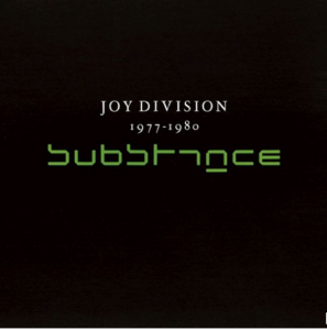
one of the most enjoyable jobs for a graphic designer into music is certanly the making of record sleeves. capture and synthetize the music and concept of the record in just one final visual/phisical product. after the record sleeve is set, both music and image are intertwined , giving one to the other a new shape , or, in the best case, exalting one another meanings and get to a new more complete concept-idea … usually is a personal overview /interpretation of the designer , but as well a clear and graphical unharmful attempt to translate/tale/interpretate the music work into “image”.
Never like in this case i found myself stunned-staring at the semplicity of the cover of Joy Division’s first official compilation album (released after 8 years from Ian Curtis’ death) while wondering about at this massive retrospective of one of the masters of dutch graphic design Wim Crouwel . The cover features the band name written in his original white font above the album title elsewritten using the New Alphabet typeface ( created by Crouwel in 1967 ) in neon green over a dead black background covering the rest of the sleeve… this indeed sounds pretty much like the music of joy division itself : dark, personal, experimental, progressive, jagged and sometimes difficult to “read” …
