Skip to Content Skip to Search Go to Top Navigation Go to Side Menu


"Metahaven" Tag


The ignorant ‘Homo Ludens’ of the 21st century


Sunday, October 23, 2016

Last September, after visiting the exhibition about Constant Nieuwenhuys’s ‘New Babylon’ in The Gemeentemuseum Den Haag, I delved into his work and ideas. I came a across a movie about Constant titled: City Rising by Metahaven. Intrigued by this contemporary view on Constant’s thoughts of society, I started to examine the thoughts of Metahaven on the web and especially found one of their latest works called The Sprawl (Propaganda about Propaganda), interesting. Having seen the exhibition and both the works from Metahaven, in my opinion the freedom of the individual is central in all three. Though the way the individual is presented by both Constant and Metahaven, especially in The Sprawl is entirely different. This led me to ask some questions:
Can we actually call ourselves free individuals with all the contemporary propaganda thrown at us? Should we act more towards Constant’s ideas? Is Metahaven pushing us into the right direction?
To explain my thoughts and to enlarge upon these questions, first I’d like to shortly introduce Constant’s ‘New Babylon’, Metahaven (City Rising) and The Sprawl and later on give insight to a correspondence between Metahaven and me.

New Babylon
‘New Babylon’ is the imagination of a progressive and modern utopian society by Constant Nieuwenhuys by means of maquettes, drawing, movies, graphics and manifests. In ‘New Babylon’ dynamics are crucial and where the inhabitants arrange their artificial environment. An automated community where labor is unnecessary whereby everyone can fully focus on developing their creative ideas. The individual decides how it’s habitat looks like without any restrictions or creative borders.

Metahaven
Metahaven is a Dutch design group based in Amsterdam founded by Daniel van Der Velden and Vinca Kruk. They’ve already had many exhibitions including the MOMA PS1 in New York and the Museum Of Modern Art in Warsaw. The group released several films and graphic designs focusing on contemporary political and social issues. For this instance City Rising (2014); a homage to Constant Nieuwenhuys’s ‘New Babylon’. The film is an exploration of the individuals’conditions of life, work, and love in neo-liberal times where the architectural maquettes of Constant’s ‘New Babylon’ are displayed in the video. This is a general example of what Metahaven deals with.

The Sprawl (Propaganda About Propaganda)
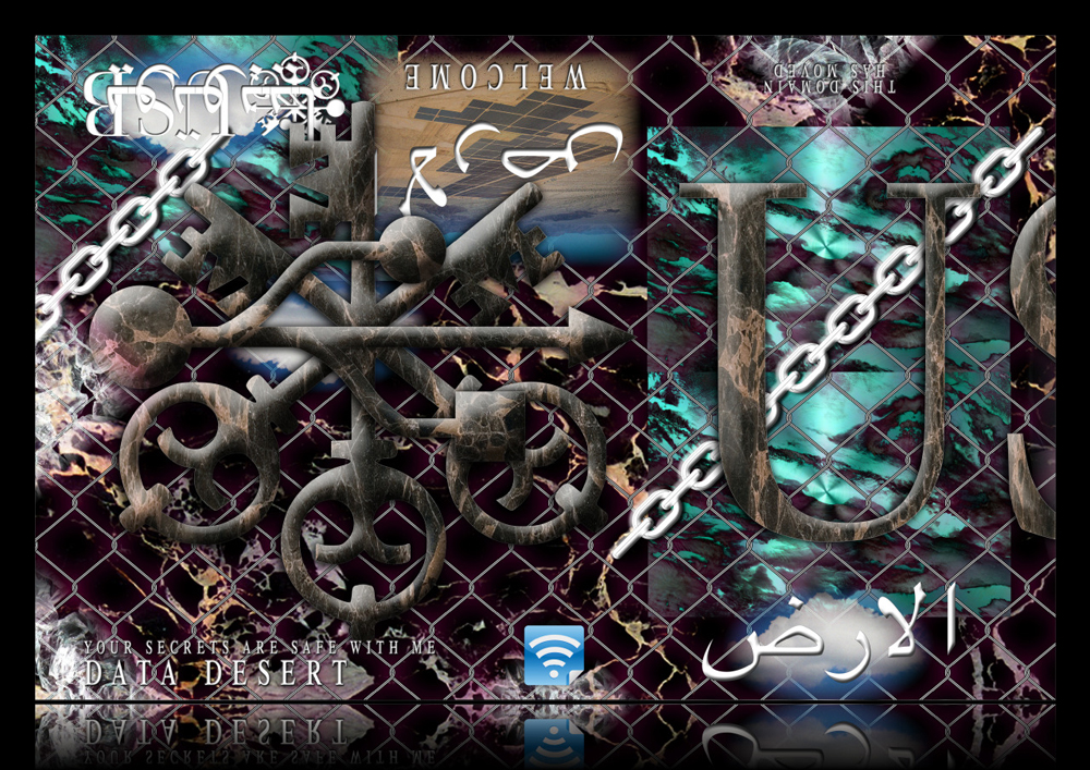
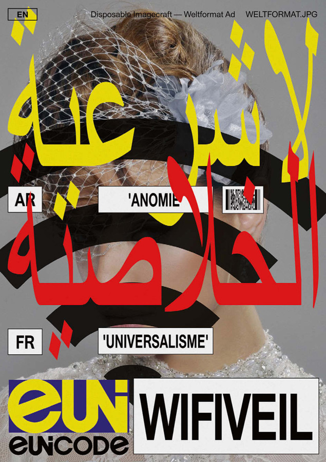
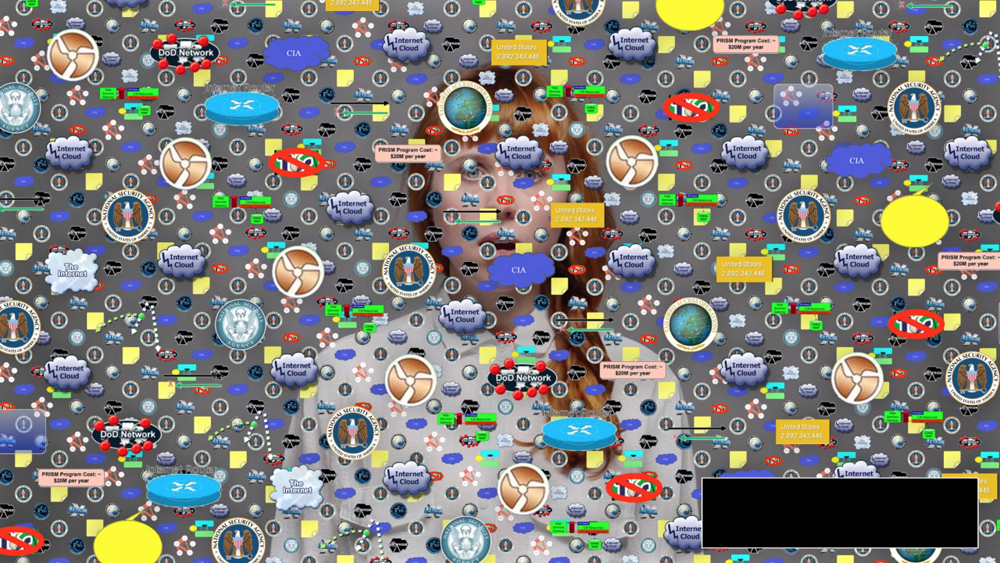
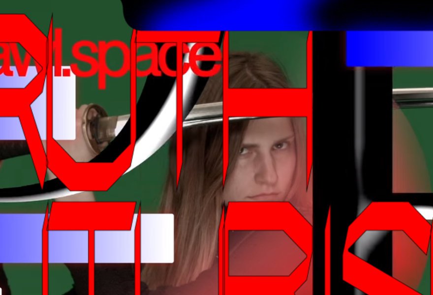
The Sprawl is a multi-channel video installation, feature-length film and episodic online documentary that considers the “ways in which fantasy can be designed so as to seem or feel like a truth”, as Daniel van der Velden describes and states that the Internet has become a disorganized geopolitical super weapon. Where, for example, funny cat videos distract us from urgent matters and that’s where The Sprawl jumps in by asking pressing questions about the internet in relation to our idea of the independent individual few others dare to ask. Looking at the design one can see that The Sprawl is a paranoid, digital trip in which the form and content keep on influencing each other in combination with futuristic beats and sounds by Kuedo, green screen-manipulations and glitch elements which deliver a chaotic and high pressuring image to the viewer.
All the different parts of The Sprawl, the so called “Shards”, can be found on the website sprawl.space; the interface of the project.

Fullscreen-capture-5272016-103924-AM


The Contemporary Individual
In both Constant’s ‘New Babylon’ and Metahaven’s The Sprawl, there is an interesting and different way how they approach and think of the individual. Constant claims –for his utopia to fully act well– that every individual should be able to free himself from daily routines such as labor, to become an adventurous, playful and dynamic human being, what he calls the ‘Homo Ludens’. So as a community, all individuals can create a new society where everything can be artificially influenced. Metahaven puts a question mark over the reliability of the internet and the information flows the individual engulfs. What is fantasy and what is real and objective? The internet makes extensive use of propaganda where the individual only gets the information certain people wants them to get. The Sprawl is trying to clarify this; that third parties and the internet form the individual by deciding which and what kind of information we can assume to be relevant. Metahaven tries to convince us we’re not that much of individuals at all, because of all the contemporary propaganda thrown at us.

In the correspondence between Metahaven and me, I asked them a question about The Sprawl to better understand the true meaning and purpose of the project.
My question: (Translated from Dutch) “How does Metahaven thinks to convince the individual by means of The Sprawl that the information we absorb in our daily life is manipulated; and in what way their chosen design contributes to this goal?”.
Unfortunately Metahaven didn’t want to answer the question based on the facts that they don’t speculate about their own made work not knowing what will be written about it and they don’t want to interpret their own work; they are of course fully entitled to do so.
However, they did send interesting references to articles which already conduce to better understanding The Sprawl. Troubled I couldn’t completely understand the project first;
from the article of Ruth Saxelby (see link below), it became clear this is actually a conscious choice of Metahaven:

-The Sprawl is less concerned with what “the truth” is, and more interested in the impact that the internet avalanche of conflicting truths has on the reality we experience, both individually and collectively.-

-The Sprawl’s tagline is “propaganda about propaganda,” and its third manifestation—dropped like breadcrumbs across YouTube—is the one that feels closest to the spirit of the project; its fragmentation is a reflection of the way we half-see, half-read, half-understand the world in these hyper-distracted times. But what does propaganda even mean today?-

“I used to think that propaganda was about persuading people. Jacques Ellul who wrote the classic study of propaganda in the 1960s, French philosopher, called it mass persuasion. He didn’t say propaganda was good or bad, he said it was a part of modern society, a part of technological society, a part of mass industrialized society, whether it’s getting people to wear condoms or to get them to become Maoists. Soviet propaganda used to be, ‘Believe in communism, Moscow is the shining beacon on the socialist hill.’”
“Now it doesn’t seem to be about that. It’s just about deconstructing the other side, disrupting Western narratives, of any sort. There’s a steady stream of disinformation whose purpose seems to be to sort of undermine the very idea that truth is provable.”—Peter Pomerantsev, The Sprawl


Metahaven Is Breaking The Propaganda Machine – The FADER
Every individual has the right to create it’s own truth and what to believe. The internet gives us the idea we get equal choices and information flows, though this isn’t true. Big parties as multinationals, internet-companies and media-tycoons or even Metahaven, have a greater possibility to proclaim their “truth”. The individual is often not aware where certain information arises from.
To get back to Constant and Metahaven together. It indeed seems we, the many individuals, are trapped between many flows of information each claiming to proclaim the truth; while no one really knows what is the “truth” nor whether it exists, and far from being able to call ourselves “Homo Ludens”.

a_39078

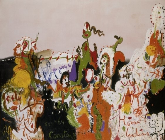
Constant Nieuwenhuys,’Homo Ludens’, 1964. picto©Constant Foundation/SM

RiCB-D/TRftBL


Monday, November 30, 2015

– https://www.youtube.com/watch?v=KmwZNivC4r0 

1

Rammstein in Contemporary Book-Design


Daniel van der Velden, the man, the genius, the mystery… in terms of designing a series of publications collecting highly
eloquent essays on uprising tendencies and phenomena in contemporary culture, what can you expect from a man giving you this look:


Daniel_van_der_Velden_1000


as he plays the song “Du Hast” by the German band Rammstein on his iPhone 6 to introduce himself prior to a lecture on his work – A whole lot in my opinion.


My research is dealing with a book that was designed by this very man – the mastermind behind Metahaven, an Amsterdam based design and research studio whose work in a way couldn’t be more contemporary. A typical Metahaven design usually even exceeds the expectations of contemporary in its extroverted way of layering and heavy usage of political and economical iconography. The result often is a somewhat futuristic, hardly readable, almost autonomous graphic. A work of art in which a mysterious overflow of visual content makes the purpose of providing information seem of secondary interest. There is a feeling of playfulness to a lot of Daniel’s graphic designs that on first sight does not leave the impression of being the product of a structured research and design process.


You will agree when looking at a few examples…


tumblr_n3khhuX4xS1qeg0aeo1_1000

032c_doppelseiten_032c_26.indd tumblr_myc2z1trxy1qeg0aeo1_900

tumblr_nc0fy1QUF81qeg0aeo1_1000


1.1

My personal analysis: the literal overflow of visual information is to be understood as a representation or comment on the way we perceive information through new mediums in the digital age. In our globalized day and age one is confronted with an overwhelming amount of text and images simultaneously, overwhelming to such an extent that the core of the singular information often gets lost before being processed and saved by its recipient. In that way it makes sense to think of Metahaven’s design as a ‘political instrument’, a term used by the studio itself, emphasizing the important role spreading information digitally has played in recent political uprisings and hinting at the potential the field of design has as a means of communication.


2

A Reason for the Black Label


backcover-1cover


The design of the publication I chose to do my research on doesn’t make use of this ‘visual overflow’-technique at all and is therefore hardly recognizable to be designed by Metahaven – this makes the preceding introduction more or less unnecessary. Instead of multi-layering of various typefaces there is “only” one layer of text in a font that at first sight seems to be Times New Roman – just one layer of black text in a traditional lay out giving only the basic information of the title of the book and its author on a relatively neutral background. One would normally not call this blurry smudge of pink and orange ‘relatively neutral’ but we are talking about Metahaven here and in this context, metaphorically speaking, the design feels a bit like going to church

church-building-clipart-FaithChurch

.

In search of the chaotic element, the signature of Metahaven on the cover page of the book, I stumbled upon this obscurity…
Screen Shot 2015-12-05 at 15.58.27


There it was – the definitive reason for my choice. At last a sign, a seemingly random element – The black label. A bar-like shape on the bottom right corner framing the front page of the publication adding a sense of mystery to the picture. When finally opening the book I felt confirmed of my selfishly made up theory that every Metahaven design was constructed, following an illogical master plan based on a very personal philosophy that is escaping a conventional approach of communicating by introducing the ungraspable – communication through exclusion. As a matter of fact the black label can be found on every single page of the book except for the back cover.
28738-Web_IMG_0588 25472-Web_IMG_0586 28573-Web_IMG_0582


2.1

Imagine going to a concert of one of your musical icons. After having lost a bit of distance and respect due to the mediocrity of the concert experience you feel brave enough to approach the artist himself and ask him about the essence of his work. In the following case this mediocrity was actually more a product of bad preparation and incredibly flat interviewing rather than a bad performance of the man himself – but you should always make best use of your more self-confident moments.

When approaching Daniel after a lecture on Metahaven’s new publication ‘Black Transparency’ I wasn’t too sure about what kind of answers I could expect from this larger than life character and if he was even in the mood of explaining the artistic decisions he made in the process of designing ‘institutional Attitudes’. (By the way the book is part of a series of publications, which is why I consciously decided not to speak about the content in this essay.) After a while of awkwardly standing next to him while he was signing all the publications people had bought I found the moment to ask him my three definite questions:

1.

Times New Roman? Really?

2.

Why the psychedelic smudge of color?

3.

What is the reason for this?

Screen Shot 2015-12-05 at 15.58.27


2.1.1

There is something relieving but tragic about the moment you find out your romanticized idols are actually rational people who have solid reasons for what they do and how they do it.

1.

The font used for the Antennae Series is a rare variation of the Times used to set a fitting stage for the serious approach the series has to the subject of recognizing contemporary tendencies in art, culture and politics.

2.

The Aesthetics of the background images are the result of researching images from thermo-graphic cameras, which are directly related to the subject of the Antennae. In this case Antennas are understood as objects that search and recognize information in their environment.

3.

The Black Label is nothing but a library label, a combining element of the series to make the single publications more recognizable.  🙁
http://survincity.com/wp-content/uploads/images/546500-e1338395736644.jpg

Rietveld library catalog no : 700.4 gie 2


Filosofie op z’n hoogtepunt


Friday, January 21, 2011

Kunst en design. Vullen zij elkaar aan? Is het familie? Hebben zij überhaupt wel een relatie? Als ik mensen om mij heen vraag naar verschillen tussen kunst en design kom ik bedrogen uit. Lang nadenken wordt vervolgd door: ‘Ik heb geen idee’. Maar ook over overeenkomsten lijkt ‘men’ nog niet nagedacht te hebben. Een interessante kwestie dus. Om te beginnen zoek ik op wat kunst, en wat design, in de volksmond als betekenis krijgen opgespeld:

–      Kunst: Kunst is alles wat door een mens is gemaakt en tot doel heeft menselijke zintuigen of geest te prikkelen door originaliteit of schoonheid.

–      Design: Design is daarentegen de creatie van objecten, omgevingen, grafisch werken (en enzovoorts) beoogt, zowel op functioneel als op esthetisch gebied en afgestemd volgens de eisen van de industriële productie.

Kunnen wij zo stellen dat kunst met een functioneel doel design wordt genoemd?

1] Temple of Truth. Three 7m high “Roman” columns consisting of paper strips with gossip articles, press statements, and chats regarding WikiLeaks. Part of the Metahaven installation at Graphic Design Worlds at the Triennale Design Museum in Milan, and also part of the WikiLeaks Identity research project. January 2011. 2] Happy Crisis. This poster is part of the Metahaven installation at Graphic Design Worlds at the Triennale Design Museum in Milan, and also part of the WikiLeaks Identity  research project. January 2011. 3] Radical Transparency. Transparent plastic banner. Part of the Metahaven installation at Graphic Design Worlds at the Triennale Design Museum in Milan, and the WikiLeaks Identity research project. Length: about 7m. January 2011.

(more…)


Log in
subscribe