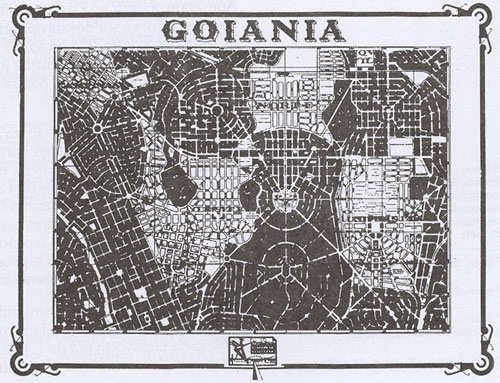
Searching here on the Designblog I tried to find something about my home country, Brazil. I did research about it but found very little significant posts, one mention over here another one over there. Tried something about my hometown Goiânia but there were no results at all. My wish is that in the future a student from my area bump with some content about us in here and get surprised.
So here I’m going talk about housing in the area I come from, Goiânia, more specifically about construction, I think it’s a good starting point to build some content I would like to see in here too and it also goes along with what I’ve been researching through drawing.
A FOREIGN IN MY OWN PLACE
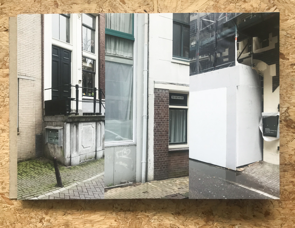
Living here in the Netherlands for almost 2 years already without coming back to Brazil really sparkle something about my hometown inside my brain. I like to remember about how the landscape looks like, cause it’s just so different from everything I see here, then suddenly I start rediscovering the place where I come from.
Compared to Holland or Amsterdam everything is more precarious, Brazil and the majority of people doesn’t have the same economic background that Holland has, the material situation is much different, what shapes and sculpt the land in a totally different way.
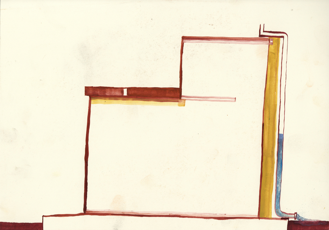
There was a initial city plan that started to be followed but because of many factors people themselves started to change the surrounding the way they could.
Living on a foreign country makes you be able to see with fresh eyes the place where you come from. My family never really traveled around so despite the images that I would see in movies, television or internet everything I would see was Goiânia, Goiânia and Goiânia. I never realised how come the place was so embed visually inside my brain. It came for me very strong recently, everything I would always see but take it for granted, it came back now for me as such a powerful visual source of inspiration.
1. HUMAN FORCE
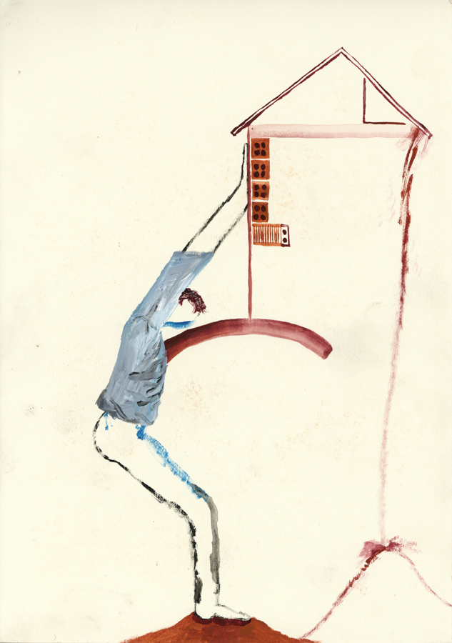
Construction work is normally made by man in Goiânia. It can be normal that the owner also works with the bricklayers and workers. My dad did help to build our house and others too, I remember that my neighbor too, it’s funny because in my dad’s house some of the walls are not so straight and there are always some sort of imperfections around. It’s also possible to build the house in the way you want, there are some protocols to follow but very little people follow it.
The human force can be found everywhere, there are many people working in the service sector in Brazil. It’s also very normal that a lot of jobs happens out of formality, so many times there is no contract or third parties behind the bricklayer and who is paying for the house to be build.
MAKING SHELTER
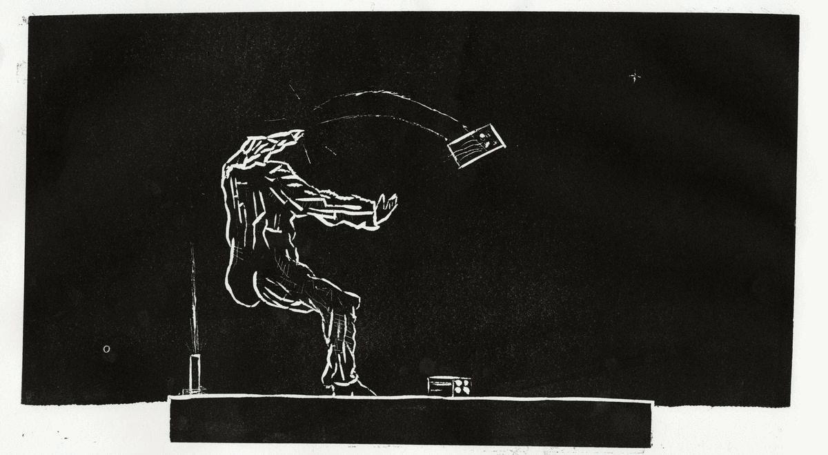
It can be pretty common that man work without necessary protection in constructions. Jaime was our home-keeping for a long time, and I remember when he did fall from a scaffolding during some work he was doing in my house. He was not specialized on that kind of service at all, he lost some nails in the fall, but he was fine.
Not only people can fall but houses that are build downhill can also fall and get destroyed, that happens often in some areas.
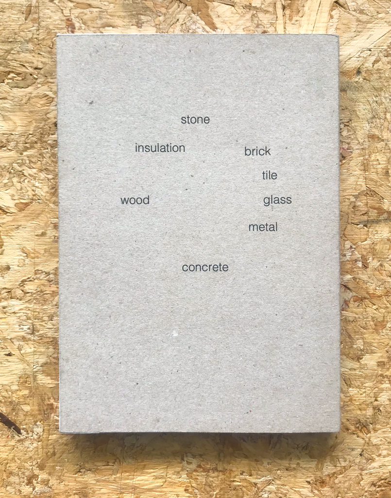
2. MATERIALITY
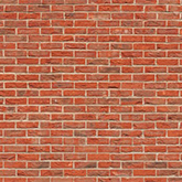
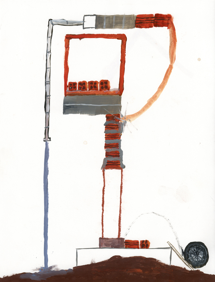
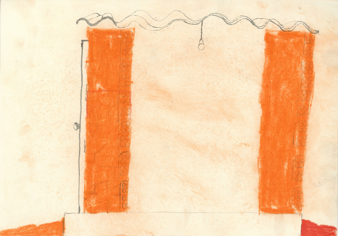
6 HOLES BRICKS
It’s the most used kind of bricks the 6 holes bricks as my dad says on the video above. I find it quite pretty, they are made out of clay and have a beautiful orange. The sun also make it shine when it’s pretty new.
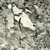
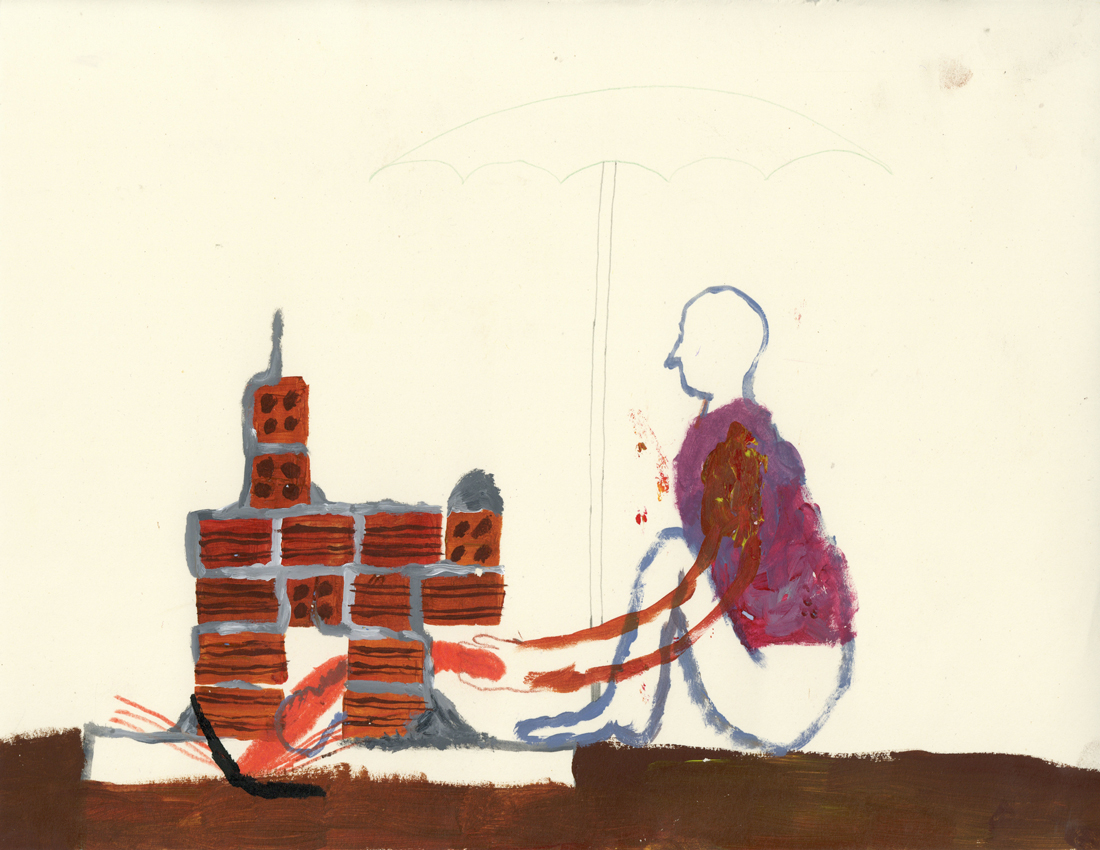
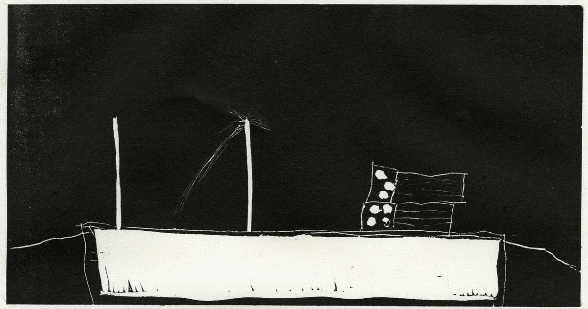
It’s normal that families start constructions and sometimes the money is over but the house not. You can see many properties with unfinished houses and some material left. These days for me they look like beautiful contemporary sculptures. Symbol of something for the future. Makes me think about some of my plans and goals, the ones that if they were a house, they would be like this sculptures right now. Why did this action was stoped? Is the family taking care that the work continues? What are they dreams and visualisations for when the sculpture it’s done?
UNDESIREBLE BELLYS
Protection is necessary. Against the weather, non wanted looks and also from non invited people and it’s many non wanted actions. My grandmother lived in Urias Magalhães and she had pieces of broken glass on the top of her walls. The pieces were out of green glass and had a pretty colour, even though it did look quite frightening.
“Grandma, why are there pieces of broken glass on the top of your wall?”
“This is to cut the thief’s belly’s”
3 . GRAVITY
THE LAST FACTOR
Gravity is an important law of physics, every act or move we do is subjugated by the laws of gravity, we are subordinated by it all the time, so wouldn’t be the case that constructions are out of nature laws.
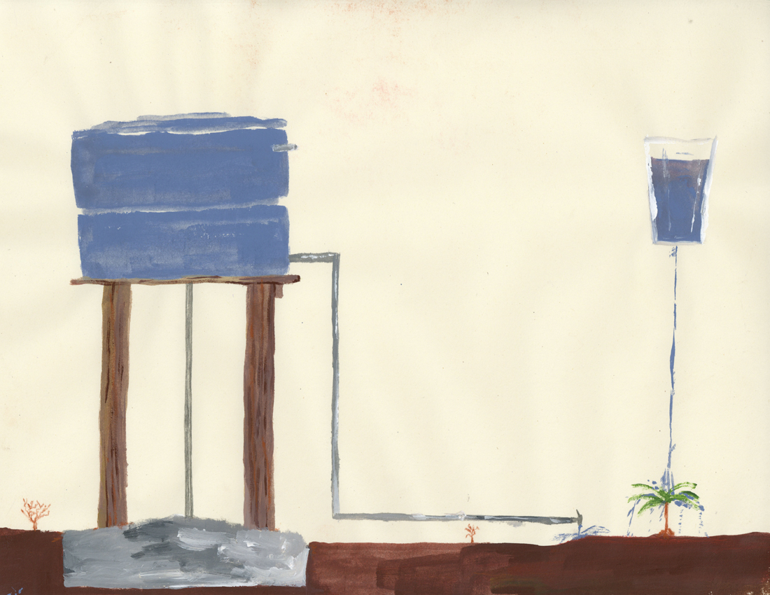
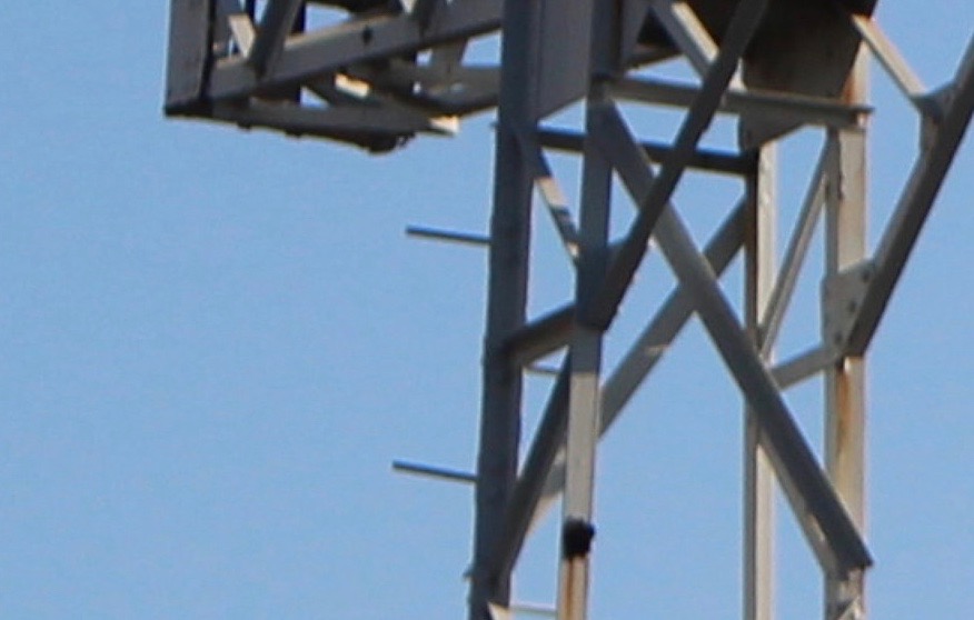
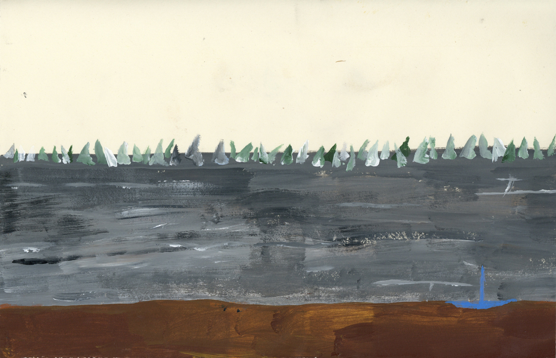
One important part of a construction that also strikes me visually are water tanks. It’s something necessary once many neighborhoods don’t have sewage treatment sometimes. Water tanks have normally a wonderful blue that goes along with intense blue skies too. It can be normal in some areas to bring water fresh from the ground. It’s also normal that you dig holes and take a look if there is in your area some fresh water, then you are lucky!
I did drink water fresh from the ground my whole life and I prefer it’s taste then the water in Holland. Anyways, socially it’s more interesting that every single house has drinkable tap water available like Holland. In Brasil many people can’t drink water from the tap because it’s not healthy to do it on longterm, it has also a weird taste.
Some Brazilians living abroad are so culturally used to not drink water from the tap that even in countries like Holland they still buy water from bottles.
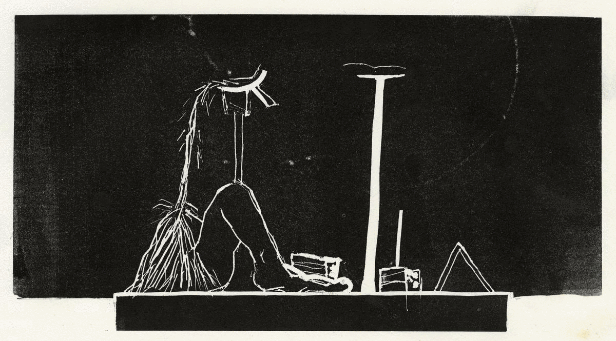
IT’S NECESSARY TO REST
Hammocks were items designed by indigenous people in Brazil to sleep, rest, relax or even to see the time passing. It’s still a highly used item nowadays between Brazilians that normally put it in their porches. It’s not so used to sleep at night by most of the people but it is for naps in the afternoon after a huge almoço on a Sunday, together with the family, that’s a moment that hammocks are quite disputed, for example.
Even though people don’t sleep so much at night on it, the acupuncturist I used to attend told me that many back problems I was having by that time could be solved having a hammock in the room instead of a bed and mattress, he had one himself.
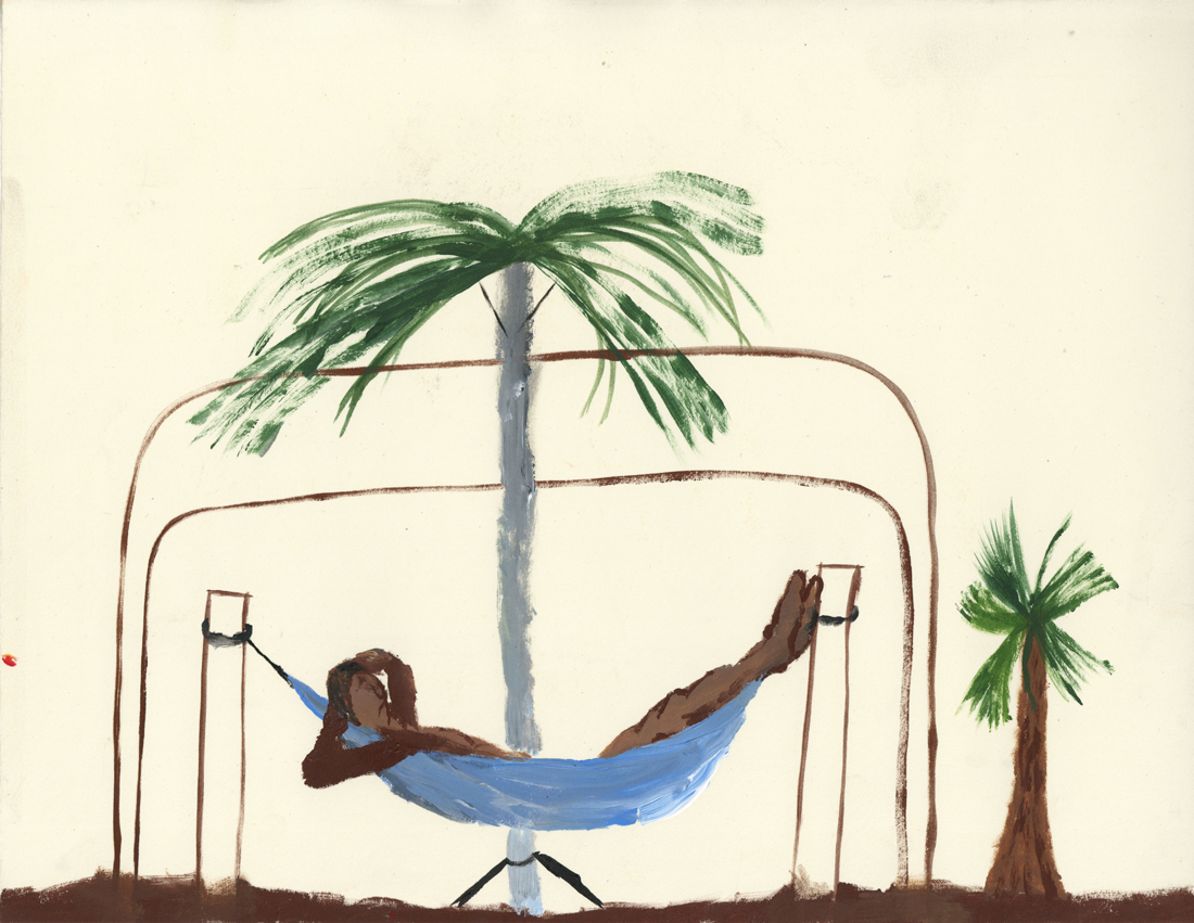
“To work is good but to rest after it’s even better”