Skip to Content Skip to Search Go to Top Navigation Go to Side Menu


Archive for April, 2011


The gemeente museum The Hague/Berlage


Friday, April 29, 2011

“Walk into a new city; naked. Looking down; barefoot. standing outside a train. Looking for an exit; following the exit signs.  Cold stone touching with every step, feeling the pattern on the tiles when eyes are closed. Being invisible. look around; the world loading itself behind every corner. To visit.”


A city is not one thing. It has all the little details people tend to forget or do not see when they walk into a city. A space is never empty; even the air carries the identity of the surroundings. A big problem if you ask me for the city designers. How can be decided if a building fits the city; the persons; the air it’s going to breath?

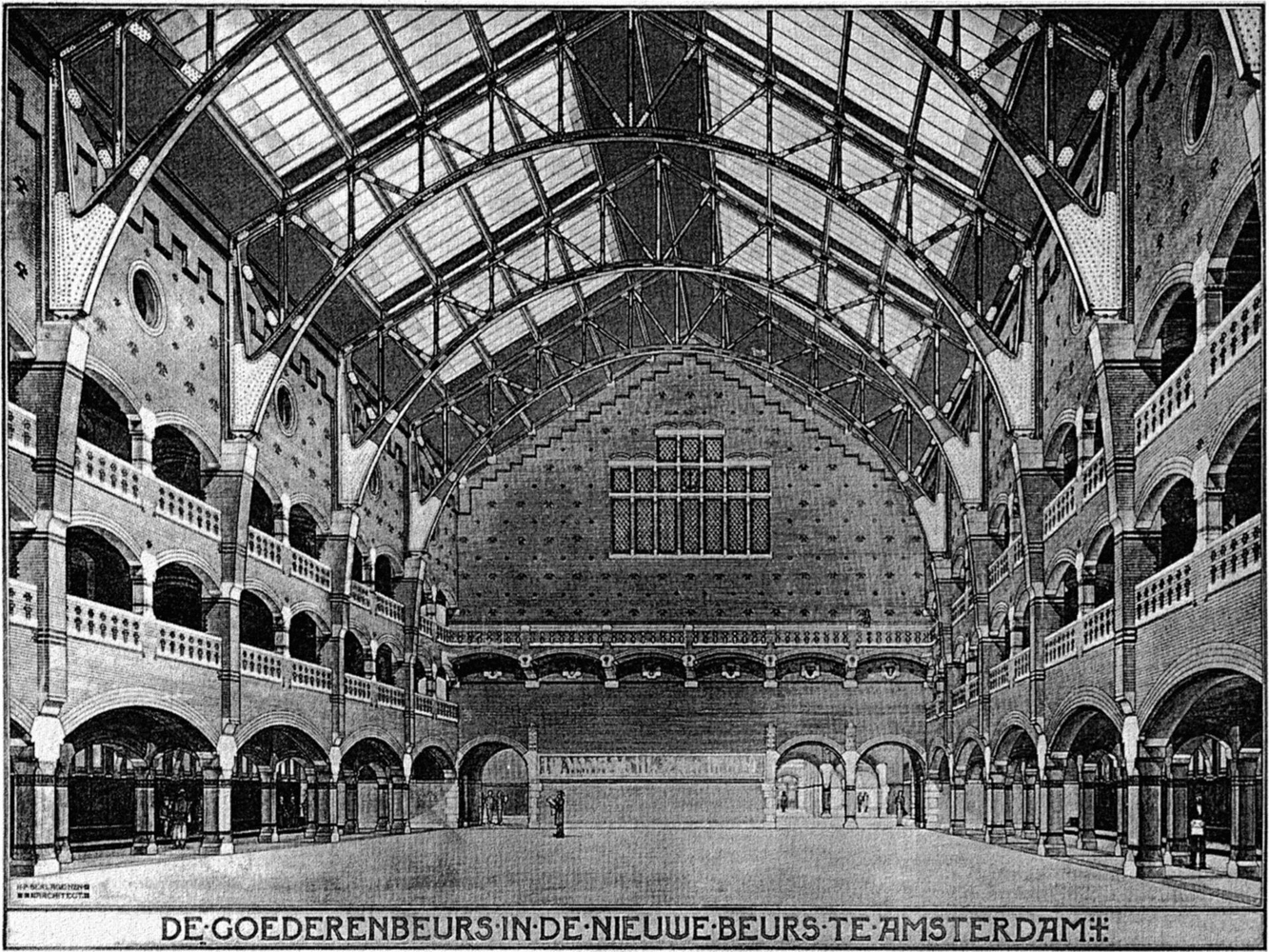
Let me tell you the story of an architect called Berlage.

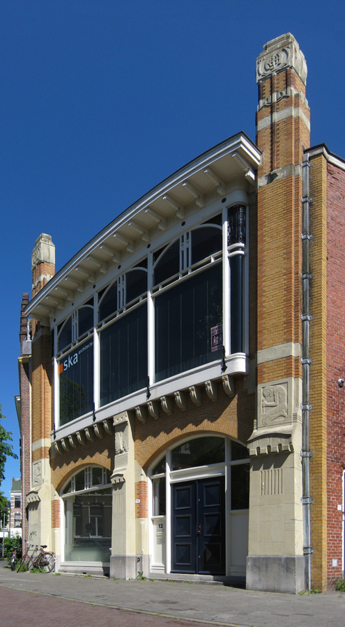
Berlage didn’t start his architectural career in Holland, although he was born here. He first tried to build a career as an artist through applying at the Rijksacademie. This didn’t work out, so he took the next step and he went to study in Zürich at the Eidgenössische Polytechnische Hochschule, and after that he decided to make a tour through Europe. He returned to Holland again when big projects were planned and he was to be the assistant of Theo Sanders [x]. Together they made a plan for the competition to make the new Beurs in Amsterdam. Their design was quite historicizing and eclectic. Compared to the, after they stopped working together, design of Berlage itself; which was a much smoother design, and more focussed on modern architecture in one monumental-looking piece which still fitted the surroundings. In this period Berlage focussed more on the Romanesque, than on the older eclectic style. The design of Berlage was realised in 1883. This was the beginning of his career.

The old stock exchange of Amsterdam

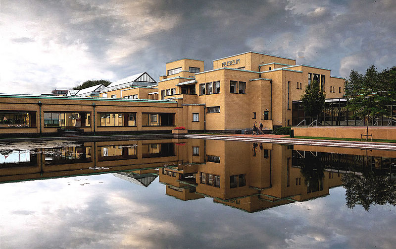
One of the other most important buildings further in his career is the Gemeente Museum in The Hague. This was also his last mayor work within architecture. It actually opened its doors after he died in 1934. In the construction Berlage decided, instead of using the upperclass-floor material, to actually use plain bricks for the facade.

(more…)

beauty is the content?


Thursday, April 28, 2011

The exhibition had the effect of a breeze to me. After spending hours on the internet, coming across hundreds of images, of which you never really know their origin; and when the manipulation of any image is a knowledge available to any 10 year old, seeing these images in the museum seemed like a pause in the middle of all that noise.
I knew at least watching these, that their purpose was neither glamour/beauty nor economical or political.
These images are somehow free from the media society, which is allowing them to just be, simple as they are, an “objective” observation on life. Of course some decisions were made by the maker of the experiment, incorporating some subjectivity in the result, but all in all, these images depict some sort of truth.
Without pretending to be anything else than documentation or aknowledgement of what “is”, you become interested and surprised by their beauty value, but certainly more because of the fact that these images are not seeking it. But couldn’t we have this feeling by just going to a science museum? To placed them in an art museum and naming them art is really questionable. Since these images are not meant to be beautiful in any way, even if we find them beautiful, it seems a bit too simple to show them to the society as “hey, look at these, we never noticed how pretty they could be”. It’s almost as making an exhibition of children drawings in a museum, of course they can be interesting, but it’s more of the rank of a gallerie exhibition. A museum should show works that are relevant socially, in the sense that each exhibition should (and are meant to) convey a message. These scientific images in this context just seem to be visual enjoyment. Somehow I couldn’t figure out clearly where was the museum going with this choice.
Nonetheless, it made me wonder how strange and surprising nature, the universe or us are, and made me think that in these overmediated times, we can easily derail from our own awareness of basics, such as our own body, by being just a big communicative muscle.

László Moholy-Nagy’s: FILM


Thursday, April 28, 2011

László Moholy-Nagys films can be categorised into two categories. 1. Films of objects and 2. Films of people…

László Moholy-Nagy was raised in a small village in Hungary during the early 1900 hundreds. In his youth he studied both law and fought in the First World War before he attended an art school. In 1919 he moved to Vienna and in 1923 he became a teacher at the Bauhaus.

László Moholy-Nagys art can be described as abstract constructivism often strict, sometimes humorous and playful. László Moholy-Nagy is not only an abstract painter but also an abstract photographer, teacher, theorist and filmmaker.

Get the Flash Player to see this content.

When considering film-works from László Moholy-Nagy it is tempting to make a psychological journey through the history of a mind.
In the film ”Grossstadt Zigeuner” from 1932 a group of village people, probably in Hungary, can be seen dancing, singing, working, children are playing and animals are running around. The images flashes fast and chaos is present. I consider the films, in themselves, to be a kind of documentation of human life in a certain place at a certain time, memories from his own life. Films of people.

In the other category, the one with films of objects, you find works like the ”Ein Lichtspiel” from 1930. Indefinable objects in constant movement, lit with strong reflecting light, flashing by in short cuts create abstract films. These abstract films seems to reflect city life, structure and the new harmonic world of pure art, politics and thought.

When viewing these two categories it is possible to claim that a strong yearning for self-reflection of human life and history was important for László Moholy-Nagys. By using his own experiences from his diverse life the films undertakes a divers form. Like a rule of nature.

When considering modern art from mid and late 20-century there seems to be a will to purify art as far as possible. Abstract painters used strict forms and the ideas of de Stijl and Bauhaus was strong. When considering this, László Moholy-Nagy’s films can be seen as unfitting in it’s variety and non consistent form.
László Moholy-Nagy himself claimed that good art and design should emotionally reflect the world around us.

Can art reflect life by purifying itself?

Considering the diversity of László Moholy-Nagy’s work and his claim of reflecting emotions and life in his own work it is possible to think that László questioned the idea of purification that his predecessors aimed for. Parallels can be drawn, to the philosophical thinkers of the time, Freud and Marx who structured the realm of truth by purifying theories of human behavior such as Freud’s theories of the unconscious as an explanation of reality or Marx’s claim that the truth can be found in the structure.
In modern thinking, with philosophers such as Derrida in mind, the idea of pureness and truth has been seriously questioned.

“My” “own” conclusion is that László Moholy-Nagy’s “films” indicates the impossible claim that “purity” of “art” truly “reflects” “life”.

more on Moholy-Nagy's films go to [x]

Left out


Thursday, April 28, 2011

As I walked through the exhibition, I imagined at some point that I was not there with my fellow art students, but with a friend of mine who is a biologist. This made me feel excluded; I knew that the content of the works on show contained a lot of ‘scientific’ information of which I didn’t have the slightest clue. What’s the purpose of one of these organisms shown in a framed picture? What does it consist of, how does it function? I felt I couldn’t understand the narrative behind the representation, and that this left me unhappy, unlike my biologist friend. Had we seen these pictures in a science museum, with explanations next to the images, I would have felt better: I could try to understand. But no, not here. Then suddenly it struck me: being art students, we constantly talk about art, we recognize the rhetorics, hell we’re even beginning to use it. When we go to a museum, we understand the context. But for people who have no background in art, it can be difficult to grasp all its aspects (also because in my opinion a lot of artists can deliberately stay a bit vague). Walking in the Beauty in Science exhibition, I felt for the first time like I imagine Henk en Ingrid could feel about museums: “I don’t understand what you’re showing me, nor why, and you don’t give a decent explanation!”. For me, the exhibition underlined the importance of communicating the value art can have for its audience.

nature vs art?


Thursday, April 28, 2011

Zooming in on something makes you experience the thing your looking at in such a different way then looking at it from a distance.

Seeing different structures, colors, layers and framing things in a different way makes you think about more then only the object. It makes a difference if you know where you’re looking at, because if you don’t, you’ll probably wonder more, and if you do, you start connecting more things.

In the Exposition ‘Beauty in Science‘ in the Boijmans van Beuningen museum in Rotterdam we are confronted with a lot of ‘beautiful’ visuals that appear when we approach something out of nature in a different way, by for example zooming on something like blood cells moving.

While we are looking at these ‘wonderful’ and ‘beautiful’ images you can start thinking about the thing that contains this beauty or maybe even start appreciate it more when you see it real size. You start wondering about life, the world, the universe, us as uman beings ..things we might all think about once in a while;)

I think it’s really interesting to see these things displayed, because I personally never look trough a microscope(well, not every day) and I don’t see what a lot of scientist do, but I don’t think it is necessary to connect it to a peace of art created by human hands or mind. At least not as they do.

In a lot of texts or quotes on the wall they refer to the fact that the world creates beautiful things. And we as human beeings for example try to imitate what nature creates every day. By displaying everything so big I have the feeling they really want to put it in your face that we have to look more around us and accept that the world already contains so much ‘beauty’ that it’s unnecessary that we want to create more.

I think we all agree that nature creates beauty and of course we might want to reproduce or create, inspired by these wonders of nature, but therefore making art is a totally different thing.

But what happens if we approach art in a different way? Literally approaching art in a scientific way is what you can do while visiting Google Art Project online.

While zooming in so intense on a painting, framing/cropping it differently and seeing it on your computer screen makes you search for different compositions, details. Brushstrokes almost become something else and seeing cracks in the paint or the canvas and colours make you think about art, ageing, the maker….

You see an artwork in you’re own setting at home and you can zoom in more then your bare eye can do in a museum.

Should it be like this? Is this necessary? A way of archiving? …it could be a good inspiration source, just as nature is and what scientific images show us.

Again I think, it’s another interesting thing man is capable of doing …evolution? And we do it, produce it. But it could be reductive for art.

Not Enough


Sunday, April 24, 2011

To me, most of the exhibition about beauty in science was a bit dull. It seemed more as inspiration material you could base an art piece on, or relate it to.

But, not as something ready to be exhibited in an art museum.

Sure, i was perceiving science a little differently, now that it was placed in an art museum. Opening other senses/putting other parts of my brain in motion.

But I think it wasn’t enough, and a too easy choice, to just frame something that didn’t really have a human filter to it that much.

That suggestion of a different view/way of looking wasn’t there for me.

It felt too national geographical(?) as if the machine that was used to document, had too much to say in it. Instead of an artists creative angle. That bridge between mysticism and science/“the real”. That is what makes something art to me.

I read the exhibition more as pieces out of balance, so to say.

I did enjoy watching the changing shapes/loose forms video at the beginning. Wich in my eyes was displaying a world on its own. Not like the rest of the exhibition, as a specimen of ours. But, maybe more as a metaphor for it. Constantly changing, mutating.

It had this physicality to it that I missed in the other pieces. I can’t really lay my finger on it. But, maybe it was just stronger because the piece had moving images.

I later found out it was flower reacting to sound waves.

pretty cool.

Naive Beauty?


Saturday, April 23, 2011

To be honest I went quite fast through the exhibition. Not meaning that I disliked it, but the images of different microorganisms from either humans or nature were fascinating but simple. You didn’t need to investigate them deeper to understand what the intention was. According to Sjarel Ex, Director of Museum Boijmans van Beuningen, they were a pure and real example of life. But is it?

Looking at the images, we think we understand the philosophy of the living. Something we don’t always think about or look at in the same perspective.
I really enjoyed the images themselves, but personally I’ve seen a lot of them before in biology books or at science museums. In a book or at a science museum you would usually see the microscopic organism next to a text and an example of how we see it with our eyes, which is in this case simplified with just an explanation of the organism. For an art museum, I think this is a good choice to keep the attention with the images.
I still don’t agree with the title “’Beauty in Science” as scientists intention is not to make these organisms beautiful. It is not the beauty in science, but the beauty in organisms. But I don’t know weather we could have got to this beauty without science. Maybe it would have been more beautiful if we didn’t know, if we were not so informed.
People might be going to this museum without realizing that this presentation is just another example of our greediness. Why is it not enough just imagining how the organism works?
Only a real scientist, investigating with honesty, might get closer to thinking he knows how it works. While we, maybe the audience in an art museum, are all naively pretending to know.
So putting it up in a museum is, I think naive and pretentious and not ‘a pure and real example of life’. Not saying that the images are not visually inspiring, because they certainly are.

god


Thursday, April 21, 2011

we live in a world  that already saw the truth reflecting in a fountain, but for some reason we choose to continue creating aesthetic objects and paintings and to call them art .
i believe that by putting science in the museum we are not really having the focus shifted from art to science but – giving critic to the art world.
i don’t mean the cliche of romantic space pictures (which are a complete lie – we all know that this is not a sight that could be really seen by a human eye, but a representation of different gas by different colors ), or the micro so you could see the- macro, beauty of the little things, etc, etc…
i mean to say here, that, for a reason reality t.v is the most popular thing, you can not avoid the fact that art is trying to imitate reality, we always look for a narrative, if we don’t find, then we invent one.
but the artist is the one that is doing it all the time, seeing the world as a museum, the scientific fact of life as an art piece.

question is : by putting science in the gallery are we calling the public to see the nature that lies outside, here between 4 walls and take credit (and money) for doing it or are we actually calling the spectator to realize that outside it is not nature/science, it all art.

exploring universes


Thursday, April 21, 2011

the images in the exhibition “beauty in science” shows a dimension in nature which the human eye is not able to see and capture without the means of technological processes which make these realities visible. particularly the images of bacteria shown reveal an entire universe of peculiar forms, shapes and colours, which are partially recognizable, yet strange and at times even mystical. through the means of scientific research in microbiology and evolution of related technology we are able to further and further explore the multitude and vastness of this particular universe. science and technology make us aware of other dimensions coexisting with our visible reality and can introduce us to its beauties as well as horrors. new worlds and universes that are existing, yet not graspable are unlocked and made visible for the human eye.

similarly, artistic expression can unlock and open up new worlds and universes that might seem strangely familiar yet unknown to the viewer. The artist through development of his artistic expression and “researching” his inner world, his intrinsic motivations and interests, can create, or better unlock the door to a new universe, which he shares with the viewer by means of his work. through his peculiar visual language, use of forms, shapes, colors, materials and ways of presentation, the artist reproduces, creates and shapes his visions and ideas, his inner world, and makes it accessible, or at the very least visible, for the public.

scientifically explored worlds are existing, scientifically proven, yet not graspable without the expression of the scientist.
artistically explored worlds are existing within, yet not graspable without the expression of the artist.

science tries to understand the world, art can be an attempt to reflect it and to reflect on it by various means since it can mirror through exaggeration, abstraction, reflection, etc. eventually reproducing what the world surrounding him resuscitates within the artist.

both disciplines, art and science, can open up new universes by extracting information and translating the latter into a framework apt to human understanding through the use of peculiar technologies and techniques.

Science in art museum


Thursday, April 21, 2011

It is interesting to see what happens when something is moved from its ordinary place to a new context. This is exactly what happened at the exhibition Beauty in Science. Purely scientifically pictures were exhibited and hanged with the proposition and question, does this count as art?

The pictures were beautiful and well chosen but still the exhibition felt somehow unfinished and sterile.

But when I entered the last room there was a picture of universe hanging at the roof. It made me think how very surreal it is, that we live inside this image. It made me think about how we so badly want to understand why, and this is what this picture and exhibition communicates to me. About wondering why, about the need of decoding our reality, a desire of understanding and search for the meaning of it all.

That is the reason for religion? Then we asked as scientists. I think art works the same. That’s why the science images works in an art space. Because there is the same questions asked but with different approaches.

zoom in zoom out


Thursday, April 21, 2011

I ‘enjoyed’ the exhibition ‘beauty in science’ in a way, but in a way that I enjoyed biology or physics class in school sometimes.
To see the dazzling complexity of our human existence has since long fascinated me.

To look at life in a scientific way lets me wonder what ‘really matters’.
It demystifies life and mystifies it at the same time.
It lets me see what my ‘living’ is made out of and in what context it is placed.

When I zoom out I feel tiny.

When I zoom in I feel like a world on it’s own.

I am a universe.

I am a small spot in the universe.

Science reminds us, whatever we do we will always be part of nature.

But my fascination didn’t go much further than when I was sitting on my school bench being explained the development of a thought in our brain for example or simply looking at a night sky.

The pictures presented in the museum were without question beautiful and presented in an appealing and nicely detached way… but we have seen them before in books,videos and magazines and sometimes a glance of it even in ‘reality’. For me they have always held a strange beauty, as for the searching eye beauty can lie in almost everything. Their artistic message seems obvious.

Still I felt, the exhibition didn’t go much further than that. The question if science can be art seems utterly irrelevant for me as artists today make use of every aspect of life constantly.

The pictures seemed to be”readymades” in that sense that they were taken from an everyday life context into the “white cube” in order to generate question and thought within the viewer.

Is there a particular sort of appreciation, a sense of harmony, connectedness when ‘nature’s footprint’ is detected in a work of art (or science) ?

I had another realization I want to share: In that exhibition art made a comment on science. science comments on art/beauty as well.


Boijmans


Wednesday, April 20, 2011

Het meest interessante deel van de tentoonstelling ‘Schoonheid in de wetenschap’ was het allereerste filmpje van de tentoonstelling, omdat er veel gebeurt maar weinig bij wordt verteld, zodat je je eigen verbeelding de loop kunt laten; in plaats van iets op microscopisch niveau leek het mij een natuurramp of oorlog gezien vanuit de lucht.

De rest van de tentoonstelling was voor mij geen openbaring in de mogelijk van schoonheid vinden in wetenschap; die kende ik al. Voor een tentoonstelling in een museum vond ik de afbeeldingen ‘leeg’  waardoor ik de stelling

” Scientific imagery is not exactly a “true copy”of reality but a result of a complex process of mediation; both using complex equipment to obtain them, and having to learn how to see them, how to interpret them. “

frappant vond; hoe ver kun je ze interpreteren dan? Het is toch vrij duidelijk? Dit is daar een cel van en die is zo klein dat we hem niet met het blote ook kunnen zien, wat verwondering oproept als we dat uitvergroot wel voor ons krijgen.

De onderdelen ‘de foetus’ en ‘het heelal’ vond ik ten opzichte van al die close ups een fijne tegenstelling; hier word ons eigen kleinheid onderstreept; we denken dat we het hoofdpersonage in ons eigen drama zijn maar we zijn allemaal een stipje op het stipje aarde, en als we de beelden op de foetus-film zien worden we even geconfronteerd met hoe fragiel we beginnen met leven. En de mogelijkheid tot deze associaties vind ik boeiender dan de afbeeldingen die als enige functie hebben dat ze mooi zijn.

Looking at learning / Learning to look


Wednesday, April 20, 2011

We relate to an image in context with the place where we see it. Showing scientific images in an art space can be confusing if you don’t know what you’re in for.

It’s a worthwhile contemporary experiment in the sense that science has become an omnipresent part of our reality, and it’s interesting to explore the limits of the meaning and purpose of scientific images.

I can recognize the blown-up images of molecules because I have seen similar ones before or by reading the description. In a place of science, this might not have happened: I stood back and let them sink in, taking a closer look at the abstract forms, realizing: This could be anything. Not knowing how big this thing is in reality, I can imagine it to be anything. Something small zoomed in or a city from a distance. A couple of times, I saw something I would have liked to copy or use, say, as an animation. There’s a fun thing about those images, beckoning me to play. A thing I found funny was how some images could have passed as modern art, had they been painted on canvas.

worms or curly fries?

A different aspect I thought about was the visual properties of nature. Some of these colors were very nice. I wondered if this was an actual attribute of the object or if a pigment had been added by the scientist to make a certain membrane better visible.

In the end, I do believe that scientific images can be put in an art space to enhance the viewer’s flexibility when it comes to the subject. Personally, I found these images very romantic. The devotion of human kind to find their origin developed with them into being and will never fade. Now that’s love!

Spacecollective.org: Points of View


Wednesday, April 20, 2011

The website spacecollective.org is where geeks feel understood. I don’t meet too many people who know what I mean when I say the word ‚jetpack’. Then again, maybe it’s the wrong word to say. When I explain that I mean a backpack with rockets attached to give you the ability fly, some may think I’m materialistic and lazy, but it’s not only about wanting to have an easier way to school.

It’s about something amazing that in theory we have the technology for, but isn’t quite developed yet, not well enough anyway.

Something virtually real but just out of reach for the general public.

Like the prosthesis you control with your mind, for example, that are being developed over the last years. Dreams are coming true, and it’s all thanks to science.

I rely on science just like another person may rely on god. Some people don’t respect people without a religion. But that non-religion mindset is a religion in itself. I believe in it, I defend it and it is what I am, as in, it is part of everything and everywhere. It is what makes the world a beautiful and cruel place.

The importance of discussing and learning about science is simply that it is interesting as hell. It gave me the shivers when I first learned about the theory of relativity, and the motivation to find out more about what we are, where we are and why is without boundaries.

The beauty of spacecollective.org is the broad spectrum that is posted. It’s not only about technology or progress; it’s just as much about ways of looking and thinking, reflecting on morals and ideas, on value of emotion and logic. It’s philosophical, a root attribute of scientific research.

In my opinion it is crucial to think about those arguments when working with scientific or technological research. We’ve learned over the past decades that it’s not just about getting faster, stronger, better, but that we have to live with the consequences when we change something. Many people will agree with me on this, and just as many people will say the more important thing is to keep it natural.

(more…)

art equals science


Tuesday, April 19, 2011

About the exhibition Science in Beauty is said that ‘science is a quest for new knowledge about the real world. Art creates its own reality and therefore summons up emotions and often a sense of beauty in the viewer’.
I think that you can switch the words science and art in this sentence and it will also make sense: ‘art is a quest for new knowledge about the real world. Science creates its own reality and therefore summons up emotions and often a sense of beauty in the viewer’.
Art and science, in my opinion, are both used to investigate our reality.
You can read the ‘statements’ about science from Part1 as if it is about art too:
– art as offering the possibility to view in a variety of ways:
zoom in the micro-visuality of things, to literally see the invisible, but also enabling us to view from above, the larger picture (of the globe for example)
– art is not exactly a “true copy”of reality but a result of a complex process of mediation; both using complex equipment to obtain them, and having to learn how to see them, how to interpret them
– for the uneducated eye, if we don’t know what are these images, they have a strange beauty, vivid color, and complex form, they open a possibility for a “second” aesthetic look at nature (the first being simply the appreciation of a landscape), but as an appreciation of an image
– but science as well as art had to invent those images, in the sense that it invented the procedures and the equipment of gaining access to them – which brings the crucial question of the making of the image
So if it’s easy like this to swop the terms art and science around, then what is the difference?

“AVATAR green”


Friday, April 15, 2011

In the avatar-project (design class) I am focusing on, and working with color, color and psychology. At first I found this lamp interesting because of it’s color. I am looking and trying to translate the colours around me and therefore I reacted to the lamp.
From what I have learned about green is that it’s a calming color, pleasing to the senses. For example hospitals uses light green rooms, and that is because green is concluded after studies to have the most calming effect on the patients. But more than that green is a symbol for cycle of life in the nature, and this lamp is the evidence of why, because it is naturally created as an result of the cycle of life.
Green is an ideal color to work with in interior design, because it dominates the nature and we are so used to see it, and therefore it harmonizes with us. In this lamp, green was not an active choice from the designer, it came out of nature itself. This is what I think is beautiful with this lamp. It is like the lamp is created as a platform, for the creation itself. The dark green is a result of living algae, which requires only sunlight, CO2 (carbon dioxide), and water. When taking care of the algae, light is created, in form of tiny amounts of electricity ”breathed” out from the algae.
This is functioning not only as a lamp but in a way a reminder of the ecological system we live in, a reminder of the responsibility we have, because we are a part in it. If I as the owner of the lamp take care of the algae it will reward me with light. So the lamp has two functions according to me, a source of light, a reminder of the cycle of life. Because the light comes is created in an environmental friendly way it also reminds me of the issues of earth, but I don’t think this lamp ”forces” me to think environmental-friendly, neither puts guilt on my shoulders, for me this lamp is instead of a political piece somehow very poetical.

Mike Thompson created the design of the Latro (Latin for thief) based on a recently proven technology whereby tiny amounts of electricity were tapped from living algae. Latro combines the energy potential of algae and the functionality of a hanging lamp. Synthesizing both nature and technology in one form, Latro is a living, breathing product. Algae require only sunlight, carbon dioxide (CO2) and water, offering a remarkably simple way of producing energy. Owners of Latro are required to treat it like a pet – feeding and caring for the algae that will reward them with light.”

TYPOGRAPHIC MATCHMAKING [IN THE CITY]


Thursday, April 14, 2011

My first discoveries
One of the first impressions I got of the Typographic Matchmaking, was an image of a huge three-dimensional shape with letters that I did not manage to read. However, I could sense meanings and my curiosity grew to decrypt this ‘unknown language’. The shape proved to be a mixture of both Latin and Arabic words, translating each other and forming a common text. As a matter of fact, it was a construction of the type font StoryLine, and one of the outcomes of the Typographic Matchmaking 2.0:

khtt.net
Naturally, I had discovered The Khatt Foundation – Center for Arabic Typography. Founded by Huda Smijtshuizen AbiFarès in 2004, this online platform offers a space for projects which develop Arabic typography and design, and deal with its relation to the Western society.

The project
The first initiative to the Typographic Matchmaking took place in 2005-07, the second in 2008-10. There is a lot to say about the project. The Typographic Matchmaking 1.0 deals with the typographic needs of contemporary design in the Arab world, specifically for publications and new-media. The Typographic Matchmaking 2.0 / in the City stretches the research into the urban space. Here, the focus is to bring the marriage between Arabic and Latin writing cultures to the three-dimensional city.

Huda Smijtshuizen AbiFarès introduces 15 professionals from Europe and the Middle East to collaborate in 5 teams. Each team consists of one Arab and one Dutch type/graphic designer and one architect or industrial designer. Each team also deals with a different subject. It is inspiring to me that they immediately move away from the original classical type and experiment with both language types, starting from scratch. The participants then visit respectively each other’s countries, and the cities of Amsterdam, Beirut and Dubai.

Backgrounds
I find it interesting to mention, that one of the reasons argued for the Typographic Matchmaking is, that because of the poor matches between the Arabic and Latin fonts, most bilingual design projects in the Middle East start in English before getting translated. Too often, the street sign you meet in the Middle East are written in a way that forces the Arabic language to adjust to the Latin language. The basic idea is thus to create new fonts that work both in Latin and Arabic, and especially to find types that create harmony between the different language structures. The aim of the project in the City, is also to bring back the sense of belonging to fast growing multicultural cities in the Arabic environment. One of the big challenges here, is how to deal with a visually already overcharged space. New alternative spaces within the contemporary, shopping dependent, urban structure may engage inhabitants on many levels and create a more emotional relationship with the direct environment and the larger world.
Another important reason is the demand for Arabic identity in the West. I could very well imagine that even people who do not speak Arabic, can connect to their roots through the presence of Arabic script.

Nuqat-folly, with poetry on its walls in the type font Nuqat:

Yielding outcomes
The Typographic Matchmaking is a merging of two cultures, where both adaptation and play are central. I was curious to see how two totally different kinds of languages can translate each other and at the same time meet each other’s ‘needs’.

The font named Nuqat is developed with a grid. The text is created out of dots in both language structures. The system of the grid has here the capacity of making a text where the letters are – or disconnected, or linked to each other. I find this font interesting for its apparent multiple possibilities. I also like to see how it could suit in different public spaces.

Here is a link to see some examples of the Nuqat used in several ways:

(more…)


Log in
subscribe