This description appeared in my research on the Amsterdam residential graphic designer/teacher Karel Martens.
His name was stored in my memory, but I didn’t know anything about him, probably because I’m Danish and just moved here. I guess every Dutch person would or should know him or at least his works, in fact even touched them. He designed coins, stamps, phone cards and signs.
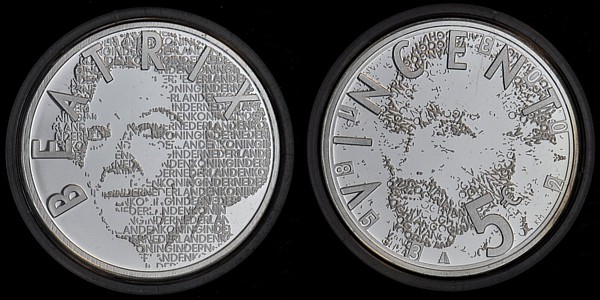
€ 5 (Queen) Beatrix and Vincent (van Gogh) coins
His style is very clean I would say; clear colours overlapping each other and forming a new colour. But what I really found interesting about his works is his way of translating a language or information into form or grid; his own new language.
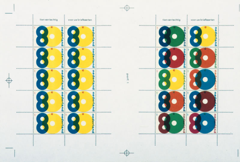
proposal for a festive sheet of good-will stamps. The design was never executed
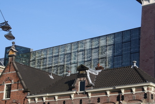
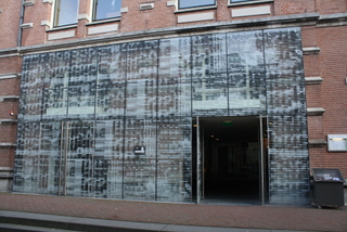
A good example of that is the façade he did of the philharmonic in Haarlem. It is situated in front of the big old church St. Bavo. I found some pictures on the Internet, but they didn’t give me the right impression, so I went to Haarlem to see it in real life.
The philharmonic building itself is very old, but as part of its recent restauration he designed this modern glass façade around the entrance and on a piece of wall high in the air.
l: the view of the glass facade from the church / r: glass facade entrance


