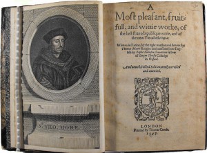
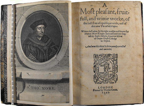
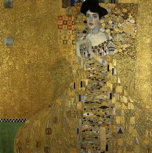
A page of the 3rd publication from the first english version of Utopia, made in 1597 by Raphe Robinson
The book Utopia was published in 1516 by Thomas More. The word itself means “nowhere”, from the ancient Greek language. As it is said, it was written to give an example of a better society rather than the one of Europe in the sixteenth century could be like.
As I started reading it there was just one question that kept arousing into my mind: how could the Utopians be so willing to obey the rules? Was More making use of his famous black sense of humor when he designed them?
The Utopians are a group of devoted, placid people; they all dress with the same garments and eat in big cantines. Their sense of community is greatly strong. They agree with all the rules. But that sounds so atypical. More, as many other utopians have done, created a little society where human feelings as fear, hate, jealousy and rage almost didn’t exist.
In fact, many utopic authors created a world in which these feelings didn’t exist either. Like the dystopian work of Aldous Huxley, “A Brave New World”, in which humans take pills to be constantly happy. Most utopias are made to terminate all bad feelings. But why not learn to control them and coexist with them? The deeper the pain, the deeper the joy. A world without these feelings would be a passive world. And in a passive world, there’s little space for big strokes of imagination and self-thinking. How boring would that be…
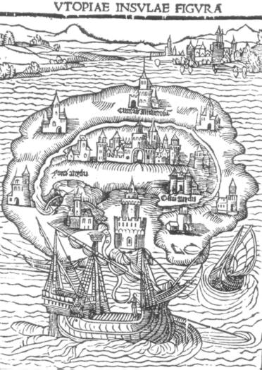
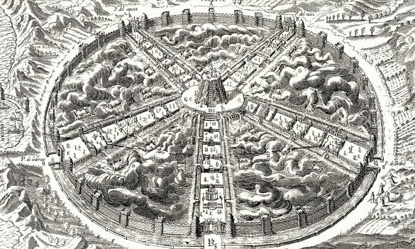
An example of how the island of Utopia could have looked ~ how it was illustrated in the first edition
That lead me to think that most utopias are dangerous. As they represent the most ideally perfect aspects of society/mankind, and perfection is a subjective concept, they are very susceptible to not to fit the personal needs of every human being. So they can easily set apart any person who doesn’t correspond the same ideal, and put her in a cage.
Hitler almost realized his own utopia, and drove many people to serve him in this savagery. Maybe the others could sympathize with him because they saw, too, the heaven in Hitler’s mind. However after the discovery of the Holocaust, utopias could never be the same.
I’m not sure if I could, as many people do, relate that much Thomas More to the humanists of the 15th century. They put for the first time men before God, seeked the ability of the human being to think by itself and break with traditions, and supported more the science rather than the superstition. Thomas More was a deeply religious person, and he even stated being God’s servant when he was executed. However, his book Utopia pursues the finest achievement of a human community in what regards society organization, behaviour and education. So to have gone gone so deep into the matter, shouldn’t More have had a real passion for humanism?
More’s book is not easy to read. Used as we are, “free” educated thinkers from the 21rst century, to judge and compare everything with our current times, I think it’s difficult to put yourself into the mindset of the 15th century. I believe it’s a truly visionary book to be written back in that time, when religion had a considerable place in the european population, taking big imporance in every act.
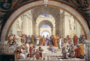
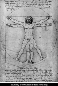
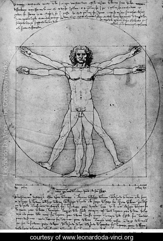
Renaissance artists from the 15th century seeked, too, to find perfection and utopy in the human body
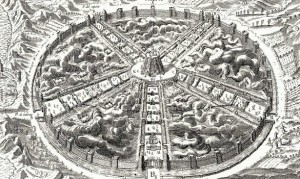
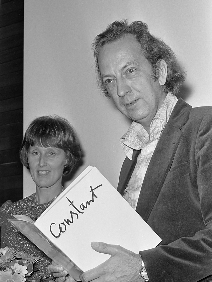
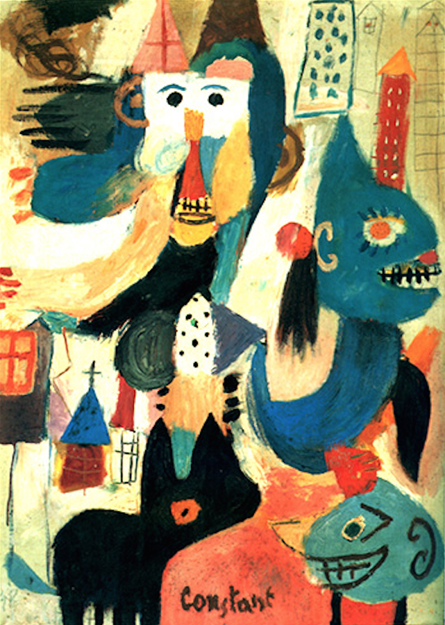
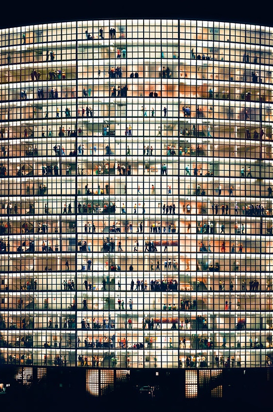
And exactly 440 years after Utopia was published, Constant Nieuwenhuys started working in New Babylon. His structures were motivated by the devastated cities he saw after World War II; he started thinking about how architecture influences daily life, and how it creates a specific environment depending on its shape and interior organization. When I thought about Constant and More together, I couldn’t imagine such differents idealists. But as soon as I started going deeper into his ideals, and tried to understand them, I could see some resemblances. On one hand, I think they were united by the fact that they both had a fascination for anthropology. Constant and More put a great effort into imagining, each one their own way, ways to enhance culture and society. What would have happened if we combined the community of More with Constant’s architecture? Perhaps it would have been a total failure, as it is like combining two opposite worlds that scream for way divergent paragons of life. Constant architecture was made to play, whereas iddleness was totally forbidden in More’s book.

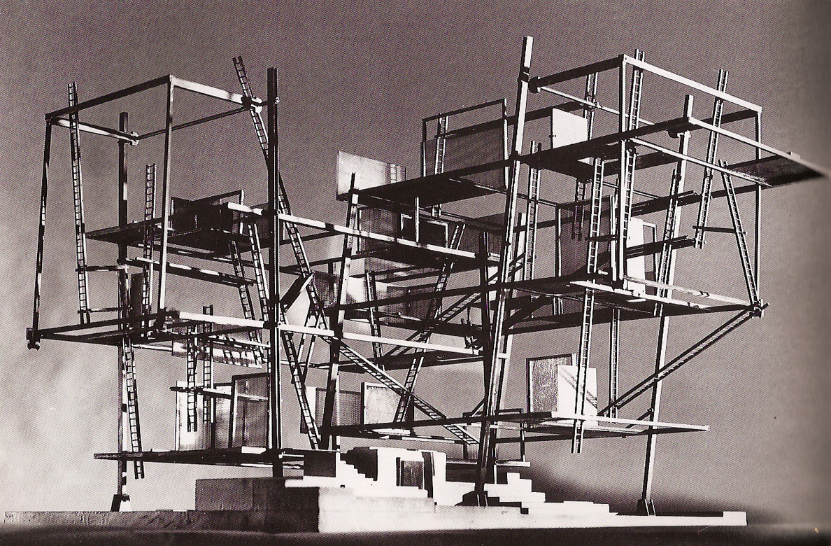
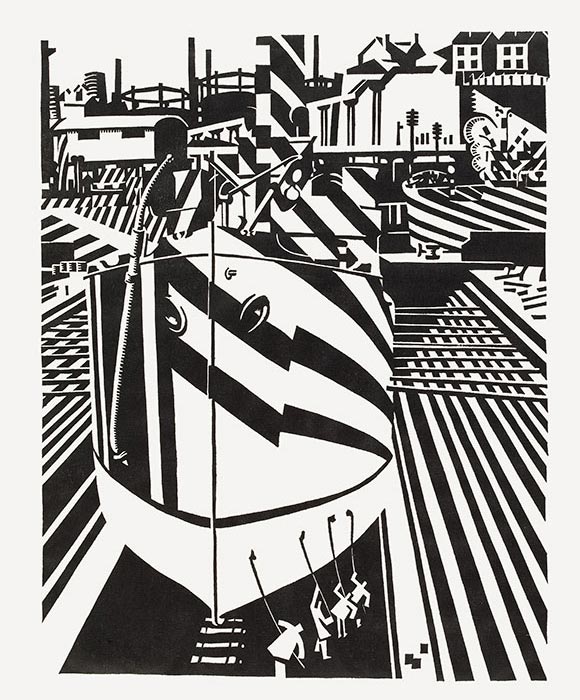
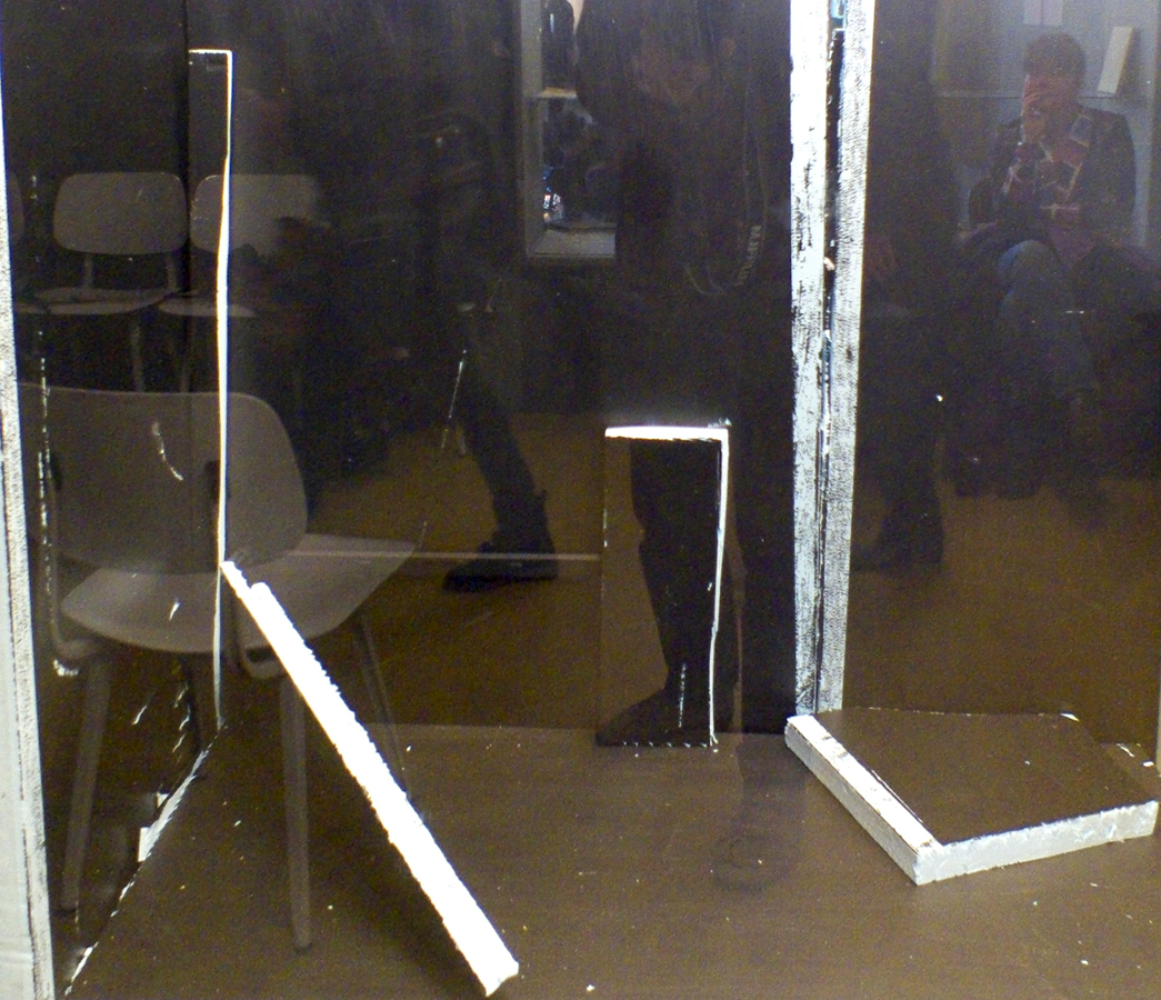
An example of one of Constant's scale models for New Babylon
I can also imagine that some art tendencies would have been banned in Utopia. As they hide, as well, butcher houses because it stimulates human violence, they would have probably limited art to just beautifully looking things that appeal to “nice acts”.
But what More, with his deeply religious faith (which maybe nowadays would have been translated into a deep love for mankind) would have designed for nowadays? Aren’t we almost living in a utopia right now, isn’t Amsterdam some sort of bubble? How would he would have felt in our current capitalist world? He was not an artist but I believe he had a deep love and understanding for humanity. Which doesn’t take him that far from art..


