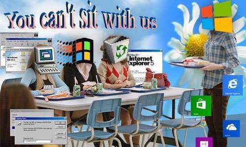
"internet" Tag
Can we control our Nature ?
Saturday, February 9, 2019
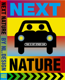
Front cover of the book Next nature
Next Nature is a book designed by Mieke Gerritzen and edited by Koert van Mensvoort, Mieke and Michiel Schwarz. it was published in 2005. The design of this book is really interesting, not so much because of the paper chosen, the format of the pages or the functionality, but more because of the choices made on color, as well as the fonts and basically the whole visual identity, that is closely linked to the raised subject. The relation between text and image is really particular and intense with a lot of repetitions for example. This is not the only book by Mieke Gerritzen treated in this way. Her work as a designer and artist is a study of the image culture, in relation to technologies and all kinds of digital medias. She also designed other books such as mobile minded for example, “A booklet about the mobile world of quotes, essays, statistics and factoids, all reflecting the very young state of wireless thinking”, is said on the website, showing that there is still a relation to technologies.
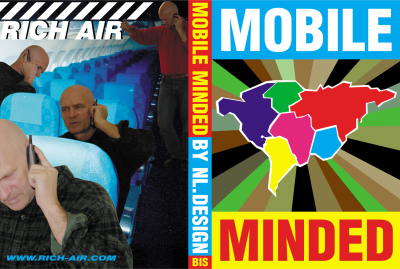
<code.Front/back cover of the book mobile minded
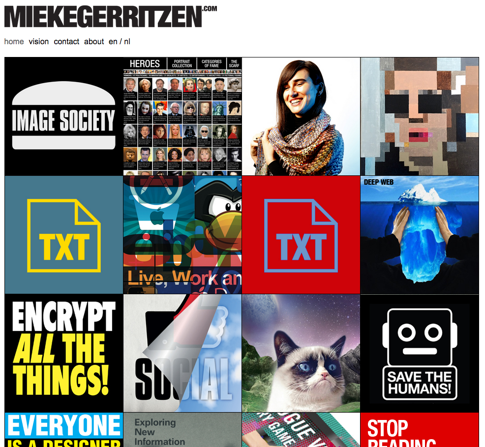
Her website transcribes this idea quite well with a lot of of images, fonts and projects coming to your eyes as you open the page. It even gets you lost a little bit.
Koert Van Mensvoort, artist, philosoph and scientist, and one of the editors of Next Nature, made a few conferences to talk about what is next nature. At a certain point, he draws a graphic comparing the things that were born and that we control (genetically modified fruits for example), those who were born but that we don’t control (the sun), and then does the same with the things we created : a car is controlled by us but a computer virus not for example.
In the end, he proposes that we think of nature as a nature caused by us : next nature.
 4
4
Image taken from the facebook/instagram page virtual experience : https://www.facebook.com/virtualexperiences.net/
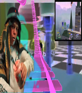
The idea of next nature and the designs, visuals that join it, are present a lot on the internet. On many pages you find a lot of content with a crazy amount of information, different elements mixed together, images repeated or put there without any explanation. This is something that you find in the book, on the first pages already. When you open the book, the first two pages are heavy repetitions of photographs of dogs and of a font « next nature ». This kind of designs came, in a way, with the explosion of internet , and of a new digital era, following different artistic domains. For example, codeine/purple trippy visuals or videoclips mostly came with new rapers such as yung lean for example, with his music « ginseng Strip 2002 » . The video came out in 2013, but contains a lot of references to things that were popular in 2002. A lot of music artists consider this video clip as a revolution because of the raping style that is slower, along with the instrumental, but also the visuals for the video clip, and the outfit he’s wearing. For a lot of people, this is at the origin of a whole fashion/music trend that has been really popular the past years. In his videoclip « Hurt », you find a lot of visuals that are old computer/digital styled, often absurd and colorful, really similar to the book’s visuals.
Screenshot from the video clip of Yung Lean - Hurt, on youtube.
The interesting thing is that this book next nature came out in 2005, but in 2005 only 9 % of the world population was using internet while now it’s 55.1 %, knowing that we are also more on earth. So, this kind of visuals were a lot less common in these days. The title next nature was actually more than accurate because it anticipated a lot of things.
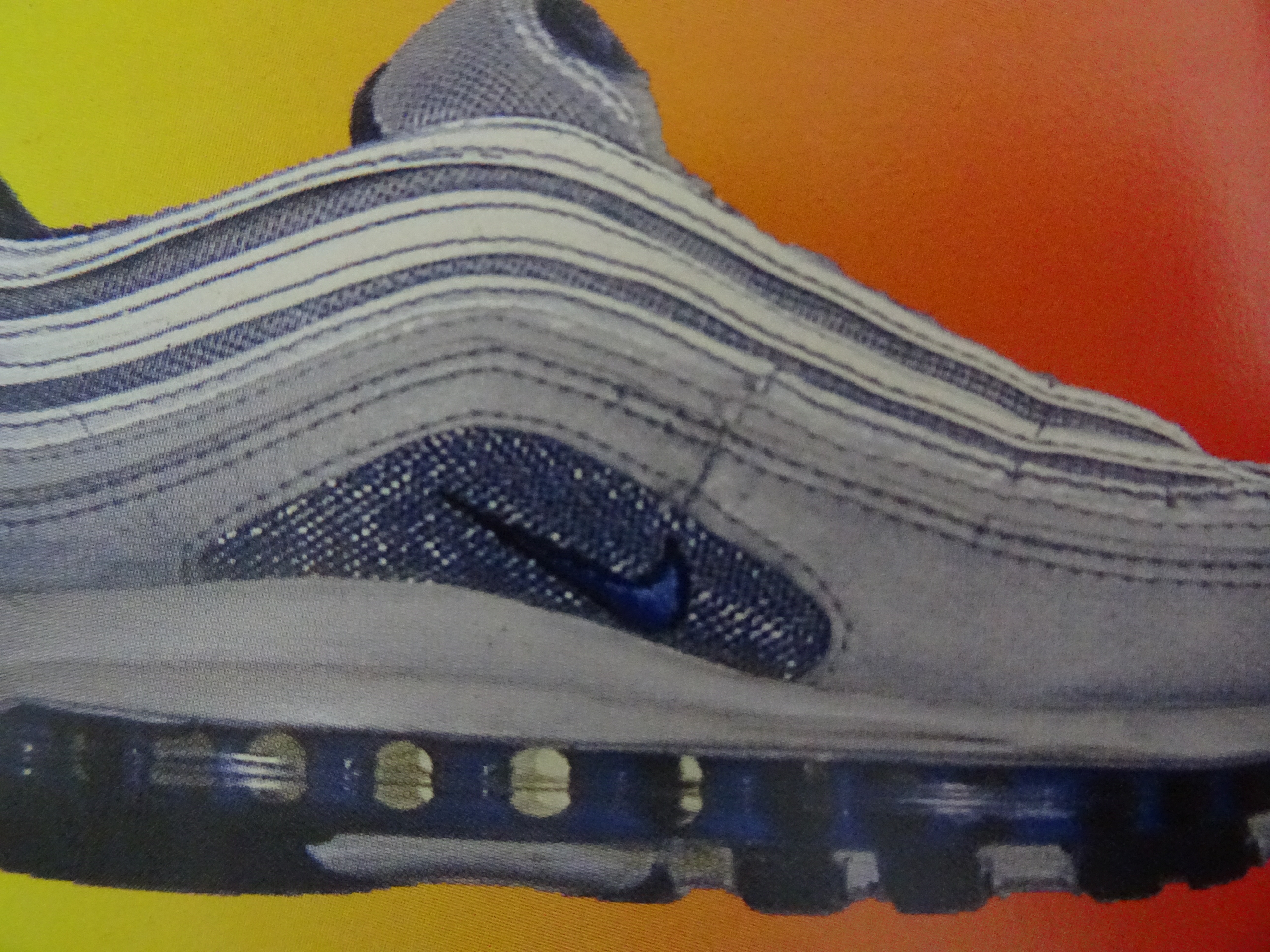
As i said earlier, the content of the book is a lot about new technologies and medias, and so is focused on modern society, in a way : « in this world it is perhaps fitting that we can now – thanks again to our technologies – also manipulate the images of nature ». Most of the images chosen in the book are symbols you find in big cities or famous logos remade with different colors, like the apple logo made as a pear for example. Even the use of pop culture images (Nike P.18 ; Coca cola P. 30) is recurrent.
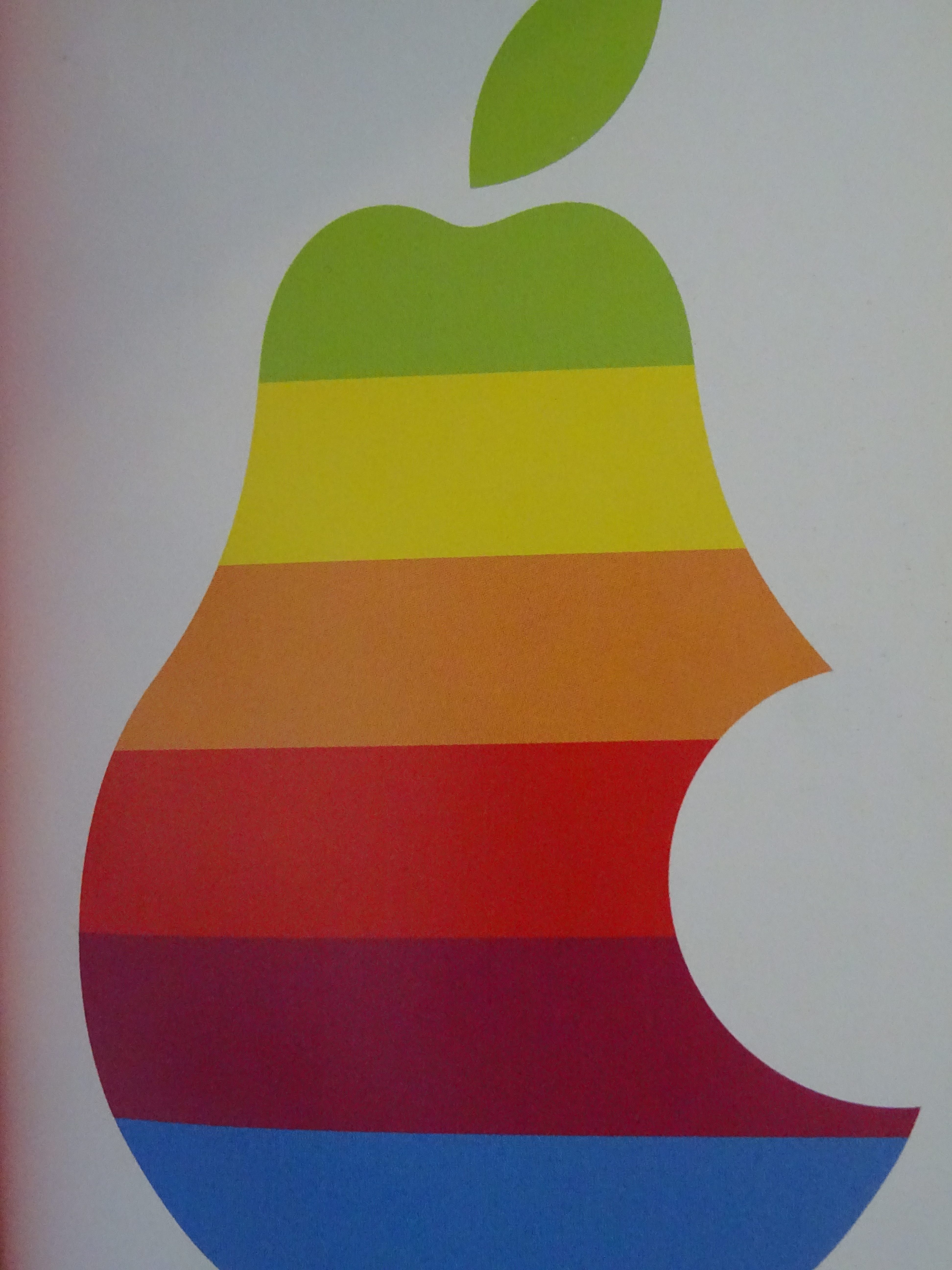
Images from the book Next Nature
You can see that one of the main topic of the book is the consumer society, something also present on internet with “memes”, on social medias for example. It is humor, of course, but often about technologies, politics or the actuality, so it’s still an analysis of the modern society, even most of the time a criticism, in it’s own way. In the book, they’re almost using these modern society symbols as a lifestyle, a way to use social medias, to wear clothes, to talk, to write, to listen to music. This kind of designs take the side of accepting and amplifying the fact that we are over exposed to a big quantity of information nowadays. It’s like if they were ironically trying to like this society. For example, P.113, the supermarket is compared to a neighborhood, because it has everything : theater, a club… « The supermarket […] as lifestyle ». This crazy quantity of information is translated by the fact that each page is really different : some fonts or colors come back in the book sometimes but the display of the elements, or backgrounds, is always changing.
front and back cover from Everyone is a designer in the age of social media
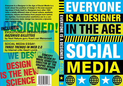
Mieke Gerritzen also published a book called : « everyone is a designer in the age of social media ». For me, this goes with the idea that us, the spectators, can now take a major role in the visual identity of objects, ideas and that by sharing it, liking it, we actively chose the way we treat the information we receive and have a role in what our designs look like. It also goes with the idea that nowadays, we, as humans, are designing our nature, the next nature.
https://miekegerritzen.com/books/
https://www.nextnature.net/2006/07/save-our-next-nature-buy-the-pocket/
https://miekegerritzen.com/vision/
https://miekegerritzen.com/exploding-the-world-of-graphic-design/
https://www.facebook.com/virtualexperiences.net/
Koert Mensvoort: Next Nature. design by Mieke Gerritzen, Rietveld library number: 754.2 nex 1
http://www.dmlp.org/legal-guide/fair-use ©
Friday, October 26, 2018
The other day I was working on this essay, or what I thought it would become this essay, and I bumped into something. I saved an image of the artwork “Kubus Geschirr” from Wihelm Wagenfeld on google to add in pages. But while in pages, I couldn’t find this saved image anymore.
Weird technology.
So I tried something different, I made a screenshot of the image on google. But, while I did this, the internet immediately brought me to a page about:
fair use.
Never heard of it.
My original plan to write about the differences or similarities on how “Kubus Geschirr” from Wilhelm Wagenfeld, appears on the internet and in books got replaced for my interest in the world of fair use.
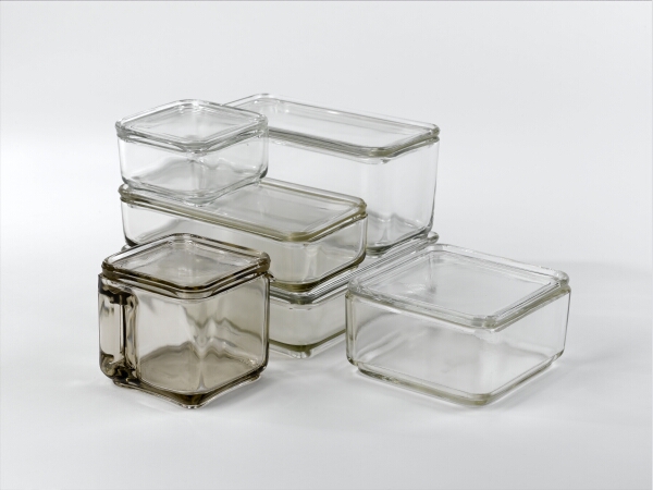
c/o Pictoright, SM Amsterdam 2004
Fair use has a few similarities with copyright. You use the term fair use if something is a small part of a copyrighted work, you don’t have to ask permission or pay a fee to use it. Where as with copyright you have these five restrictions:
- Check who owns it
- Get permission to use it
- Give credit to the creator
- Buy it
- Use it responsibility
But with fair use, its slightly different. If for example an image has a fair use coat over it, you can use it for education, news reporting, criticizing/commenting and comedy/parody. In comparison to copyright, fair use has some rules as well:
- It has to be a small part of a bigger thing
- It has to have a new meaning, it has to be original
- It has to be a “rework”
- It is non profit (no fee)

These are the words from someone else, but I remade it, so it's a fair use.
If you ask me, this is al about respect and owning.
Its about getting the credits for something YOU have made and YOU have brought into the internet, you did it, so you want to be sure the credits are still given to yourself. Wait, but you don’t have to pay for it if you made a new work out of it, because then its fair law. ???.
As you can maybe sense I get a little bit confused about this. I’ve never experienced copy right. There are parts of it that I get, but also parts I really don’t get.
It’s interesting to think about it.
Why would it be so important to get credits for your own work? Is it about self-respect and pride? You’re proud of something you’ve made and you want to show it to the world, but you’re also too jealous when someone tries to steal your work/idea so you put a watermark on it and do something with copyright so you can control it.
I spoke a friend from high school about this subject. She always wanted her friends to put her name in the description or tag her when we putted a photo she made on instagram. I thought it was lame, just be proud you made this photo and own it that way.
I recently asked why she wanted the credits for making the picture. Her answer was that she compares this issue with artists that put their initials on their work or musicians who put their name on their album cover. She sees it as an appreciation for the work she has made and that she would think, I would also like to get that recognition for my work.
Yes, I agree actually. I love when people like my work, so of course I want my name on there. Its a kind of attention your sometimes longing for. Some people more than other, but I dare to say its human.
I asked her later how the internet changes this issue. She thinks that on the internet stealing is easier, which makes you want to have good copyright, to prevent this.
So there is a difference between copyrighting on the internet and in real life. On the internet you can be anonymous and steal someones work within copy and paste. You can steal world wide and also publish world wide. And you can punish someone from stealing your work to ask for a fee and get it of the internet.
In real life its you’re own social circle you’ll steal in, its harder to be anonymous and also harder to publish. When you want to confront someone with it, you’re having a conversation. But on the other hand, making a picture or a copy of something specific in a book is really easy to do and also easy to spread around.
In both worlds we have to deal with copyright, but in these worlds there are different approaches. I feel like on the internet the feeling is more intense, because copyright is a big deal on the internet. It’s less personal, but it is personal. Copyright makes it personal and tender. In real life, in books, copyright violations are harder to detect and easy to do. Again, in both worlds you want to publish your work, get recognition, but also know that someone can use your work for other purposes. It’s a decision you make.
My suggestion is to apply copyright in the real life-life:
Copyright is the new self respect.

Like and copyright.
Social isolation in cities; Balance, Pro’s, Con’s and the Internet.
Wednesday, May 17, 2017
The ‘Happening’
An appealing aspect of every city is it’s ‘happening’. This could be translated here as: there’s movement, conversation, and just plain interaction, negative or positive, whether that be the honking of the horn or just the ‘good morning’ to the elderly man reading the paper at the café. This has always been something that is somewhat comforting, at least to myself. An example of a ‘happening’ city could be Naples, because, the core sidewalk principal that we will mention further into this article is fully in effect, and despite the city having many problems such as waste management, or crime, there is an underlying sense of happening. And of course, something to keep in mind is also the level of comfort each person has when it comes to being close, or around, to borderline illegal activities. The streets are packed, scooters flying up and down the street, people talking, arguing, people exchanging services on the street and not just in shops, the list goes on. This sense of happening helps someone who could be a victim of social isolation feel grounded, balancing between the familiarity of being in cities, and knowing that if there’s something they need to know, if the word is out, the sidewalks will be the first place to find out.
The Internet also plays a part in this in 2017, as it’s a hub of information, but the one thing separates it from a city, is of course, it’s human interaction. And although the information that you get on the city sidewalk is conditioned to whom you’re talking to, and not to thousands of sources, the difference is that you are able to have a human discussion with this person, and not just the long deep stare into a screen, searching until you find something vaguely similar to the answer you were hoping to find from your search engine. This social isolation also occurs because a lot of times, we, or at least I, fall into the mistake of underestimating our fellow humans and assuming they don’t know about my interests, or about what I’m looking for. Chances are, if you risk conversation, they actually will. And if they don’t, oh well, that’s the beauty of discussion. And that’s the beauty of sidewalk chatter, conversation and interaction in the city.
This happening is present in the sidewalks of large cities and mostly the social structure of sidewalk life hangs partly on what can be called self-appointed public characters. A public character is anyone who is in frequent contact with a wide circle of people and who is sufficiently interested to make himself a public character. A public character doesn’t need to have any special talent or wisdom to fulfill his function – although he often does. He just needs to be present. His main qualification is that he be public, and that he talks to a lot of different people, instigating and creating interaction and discussion, leading us to conclude that news actually travels faster in these urban areas, seeing how sidewalks can serve as steady flows of information.
Social isolation in cities, and its virtues and disadvantages
I wanted to find out more about how different people handle stress. I read up on an article that explained that city dwellers’ brains, compared with people who live in the countryside, seem not to handle it so well.
The example given in the article was from a case study by Dr. Meyer-Lindenberg and his colleagues, where, as they were stressing out their subjects, they were looking at two brain regions: the amygdala and the perigenual anterior cingulate cortex (pACC). The amygdala is known to be involved in assessing threats and generating fear, while the pACC in turn helps to regulate the amygdala. It turned out that in stressed citydwellers, the amygdala appeared more active on the scanner; in people who lived in small towns, less so; in people who lived in the countryside, least of all.
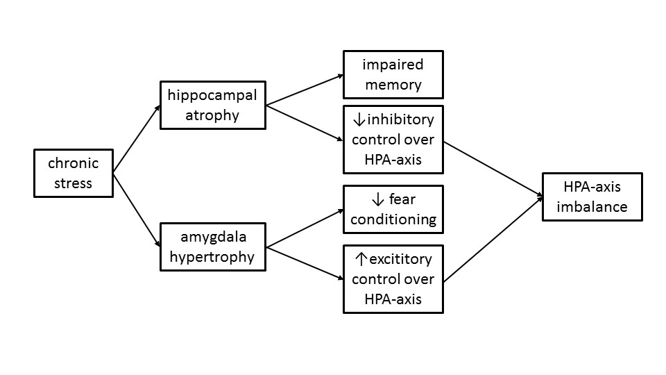
Here the important relationship was not with where the subjects lived at the time, but where they grew up. An erratic link between the pACC and the amygdalas is often seen in those with schizophrenia too. And according to the data, schizophrenic people are much more likely to live in cities.
Dutch Dr. Jaap Peen and his team found out in their meta-analysis that living in a city roughly doubles the risk of schizophrenia. To explain inner-city and urban–rural variations in psychiatric morbidity, there are two main theoretical concepts, which originated from the early ecological research of schizophrenia, and from the Chicago School of Sociology: There’s the ‘drift hypothesis’ and the ‘breeder hypothesis.’ The ‘drift hypothesis’ assumes that sick and vulnerable people are more or less doomed to remain in socially unstable, deprived neighborhoods, while better off people move away. On the other hand, socially deprived neighborhoods can also have a pull-function on sick and vulnerable people, as they move to these areas with low social control and greater tolerance towards deviant behavior, this being what they call the ‘social drift hypothesis’.
The second theory, the ‘breeder hypothesis’, assumes that various environmental factors cause illness. These can be physical factors (air pollution, small housing, population density) and also social factors (stress, life events, perinatal aspects, social isolation). A lot of the stress factors mentioned above are more common in urbanized areas. Urbanization is modestly but consistently associated with the prevalence of psychopathology. They even suggest that levels of urbanization should also be taken into account when planning the allocation of mental health services.
“Obviously our brains are not perfectly shaped for living in urban environments,” Dr. Adli says. “In my view, if social density and social isolation come at the same time and hit high-risk individuals … then city-stress related mental illness could be the consequence.”
Cities, the theory goes, might be part of the reason why a person’s dopamine production starts to go wrong in the first place. Repeated stress is thought to lead to this problem in some people, so if high social density combined with social isolation could be shown to do so, and thus to alter the dopamine system, we might have the first rough sketches of a map from city living that leads all the way to schizophrenia, and perhaps other things.
Many other possible impacts of city living on brain function are also being investigated. Aircraft noise might inhibit children’s learning, according to a recent study from Queen Mary University in London. (Although traffic noise, perversely, might help it.) Researchers in the US and elsewhere have also found that exposure to nature seems to offer a variety of beneficial effects to city dwellers, from improving mood and memory, to alleviating ADHD in children.

Privacy
I found that the perfect balance of social isolation between keeping to yourself and social interaction in a city was the ability to be able to wander and explore, go out on the hunt for information, but always have a private base to return to, to let loose and relax. Privacy is precious in cities. It is indispensable. Perhaps it is precious and indispensable everywhere, but in most places around the world you aren’t allowed as much of it. In small settlements everyone knows your affairs. Whilst in the city nobody does, unless you allow them in. This is one of the attributes of cities that is unique to city dwellers, whether their incomes are high or their incomes are low.
According to Jane Jacobs, in her book The Death And Life of Great American Cities, “A good city neighborhood achieves a marvel of balance between its people’s determination to have essential privacy and their simultaneous wishes for differing degrees of contact, enjoyment or help from the people around them. This balance is widely made up of small, sensitively managed details, practiced and accepted so casually that they are normally taken for granted.”
The more common outcome in cities, where people are faced with the choice of sharing much or nothing, is nothing. In city areas that lack a natural and casual public life, it is common for residents to isolate themselves from each other to a marked degree. If mere contact with your neighbors threatens to entangle you in their private lives, or entangle them in yours, and if you cannot be so careful who your neighbors are as compared to people who can be, the logical solution will seem to then be avoiding friendliness or casual offers of help. Better to stay thoroughly distant.
It’s important to recognize that a lot of adults either don’t want to become involved in any friendship relationships at all with their neighbors, or if they do succumb to the need for some form of society, they strictly limit themselves to one or two friends, and no more. And the individualism and privacy that comes with city living makes it possible to choose to be solitary, which a lot of people find hard to deal with, but for a lot of people it is actually a luxury. So compared to town living, where interaction with your neighbors is almost inevitable, city living provides a choice; whether to keep to yourself or to socialize, and this is a choice that for many people can be quite hard to handle.
In light of the increasing push for us to work at home, here’s an interesting statistic from Robert Putnam, a Harvard political scientist and the author of Bowling Alone (which looked at how social ‘glue’ such as bowling clubs, which were so prevalent in 1950s America, have almost disappeared). It comes from a New Yorker article about commuting: “I was shocked to find how robust a predictor of social isolation commuting is,” said Putnam “There’s a simple rule of thumb: Every ten minutes of commuting results in ten per cent fewer social connections. Commuting is connected to social isolation, which causes unhappiness.”
Conclusion
I’ve come to conclude that although I do feel like a very open and city involved person, I need to know that I always have a safe haven to return to, where I can shut the blinds and lock society out for whatever time necessary. And what’s interesting about this in today’s day and age is that although we shut ourselves out, we still have access to the Internet and social networking. Being connected to the Internet let’s us control our interaction with the outside public world. Comparing the Internet to let’s say, the sidewalk interactions of a busy city is quite simple. We have, of course, the human vs. screen interaction, but more importantly, the Internet enables us to be in total control of what we discuss, and more importantly gives us freedom to search for answers from numerous sources instead of resorting to information from whomever is around. This isolation can be healthy or unhealthy for some, depending on who you are and how you deal with it, but without a good balance, it all falls apart.
The Blind make the Blind See
Monday, December 9, 2013
When I walked along the bookshelves, trying to find the most interesting book in the entire library (which is quite a task I have to say), the first thing I noticed that I was not able to read the title on the spine of one of the books I was passing. Usually I would just pass by the book, like people pass by signs written in a language they do not understand, besides, I am not interested in books which are not worth adding the title on the spine of the book. It is almost like the designer tries to tell you already that it is not worth it.
Though the title was on the spine of this book and it was in English.
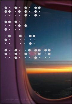
The reason why I could not read the title of the book is because the title is written in braille. Not in the way of feel-able braille but in big and small dots. The dots are printed in silver on purple, reflecting the light in the room which makes it even harder to ‘read’ or recognize the text.
So I decided half consciously, half unconsciously to take the book from the bookshelf to take a closer look at the cover. I reached out to the book and grabbed it from the shelf. Because I am right-handed the first thing of the book I see, when I pull it from between the other books, is the backside. (Provided that it was not placed upside-down or backwards on the bookshelf, which was not the case here.)
![Help me, I am blind - cover[3]](https://designblog.rietveldacademie.nl/wp-content/uploads/2013/12/Help-me-I-am-blind-cover3.jpg)
![]()
I now realize that it is a pity books are to be read from left to right. Since then the front of the book is on the left side of the cover. Because of this and the fact that the majority of the people is right-handed, you will always see the back of the book first when you get it off a bookshelf. Most books are designed with the thought that you will see the front of the book first and the back last. If you experience the book the other way around, you get answers before you even have questions, causing you not to be interested in looking any further.
So I grabbed the book from the bookshelf with my right hand. Unintentionally already reading the back of the book, which contained both the title, the writer and photographer of the book. So when I turned the book in my hands to the front it already was not a question anymore what this previously so intriguing text in dots on the front of the book meant. Though what I immediately noticed when turning the book in my hands was the nice manageability of it. It has the size of a small purse, a slightly bit smaller than A5 paper format, which makes it very hand-able.
I personally always appreciate this very much in a book. I do not like to read books which are so big you can barely hold them or so small you can not even hold the pages without covering at least a quarter of the page with your thumbs. In my opinion reading a book should be a pleasant and comfortable activity, independent of the content being pleasant or not. Unless, of course, it was the artists specific intention for the book to be not comfortable or pleasant in its physical appearance.
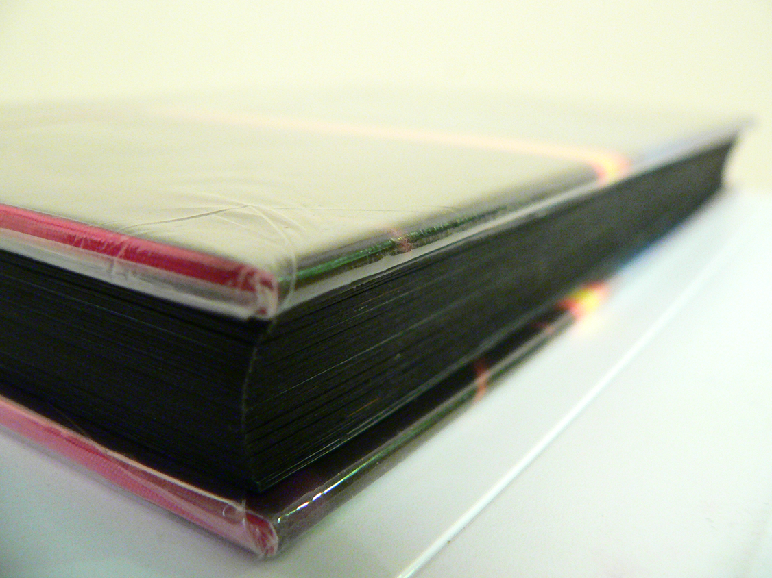
Another thing I noticed, when turning the book in my hands, was that the cover was filled with one big picture spread over both the front, spine and back, keeping the three connected as one. The picture slightly being out of focus suggests the view of a sunset with an object reminding me of a curtain partly covering the view. Also this raises questions, it being partly unclear about what you are seeing. You can quite clearly recognize the sunset though the object in front is raising questions as ‘what is this object?’ and ‘where are you when this object is in your view?’ The last thing I noticed before actually opening the book was that the sides of the papers were black, matching the dark design of the cover well. The black edges keeps the book together, prevent the book from splitting up in paper en cover.
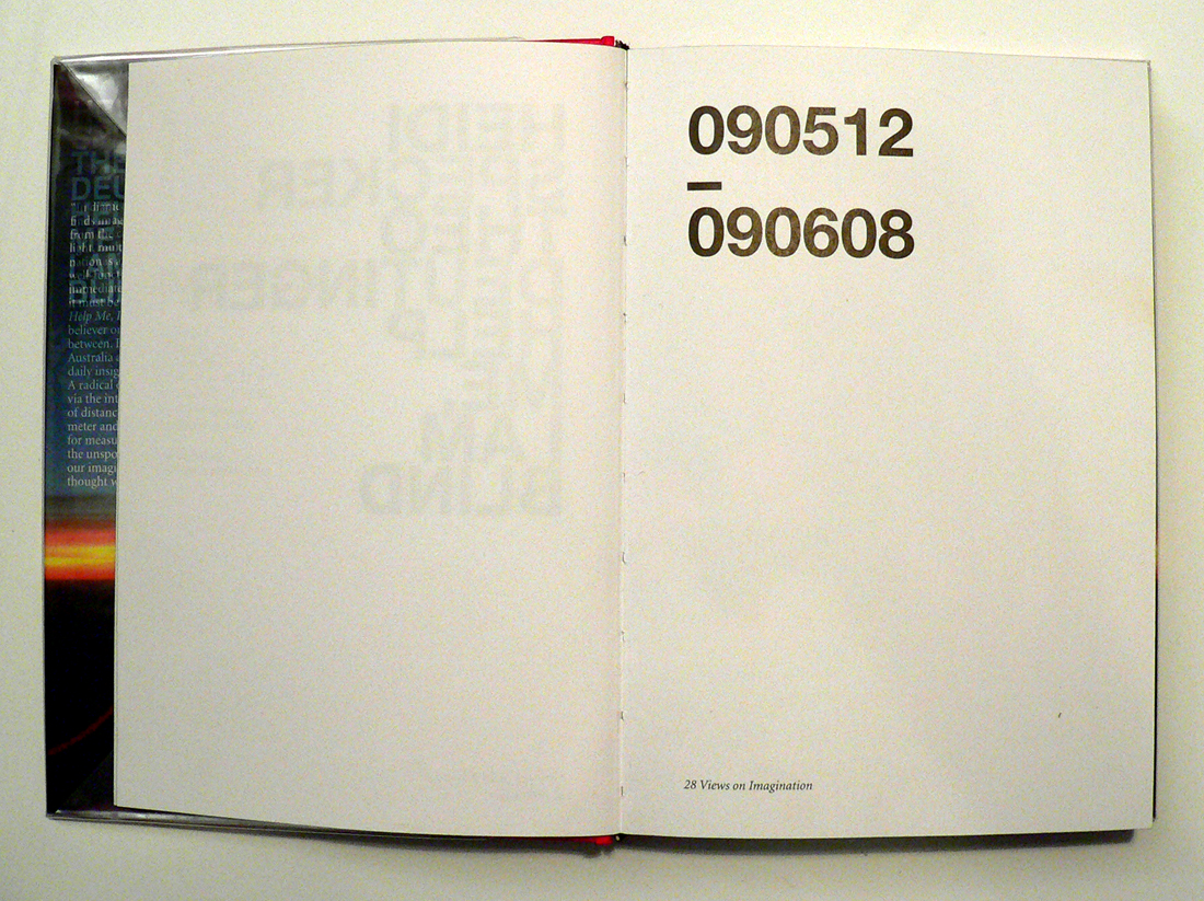
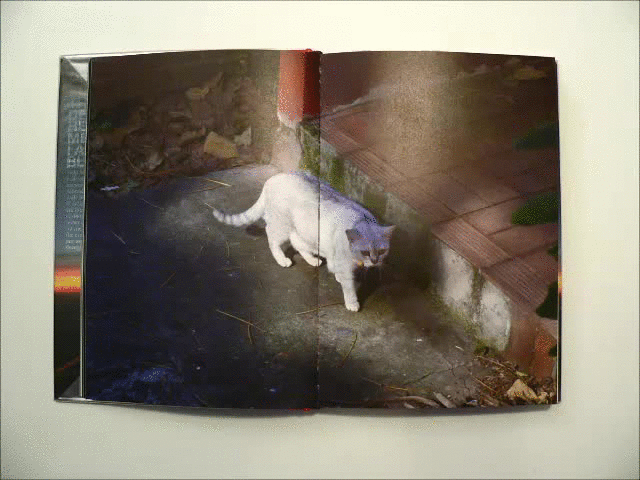
When I opened the book on the first page, I was confronted with two numbers divided by a short horizontal line. When taking a closer look I found out that those two numbers stand for the passing time in the book. The texts in the book start on 12/05/2009 and ends on 08/06/2009 covering 27 days of the southern hemispheres autumn and the northern hemispheres spring and summer. Every single day in that month is represented in the book. First by one or more pictures than by a text. These pictures (by Heidi Specker) from Australia are given another meaning through the texts (by Theo Deutinger) from Rotterdam.
The Book is build up in such a way that you are first confronted with one or more pictures, allowing you to find your own connection with and between those pictures. All these photos cover a spread, only allowing you to take in one photo at a time. While looking through these photos there is never one clear answer to the question what connects them. Is it a subject? An abstract keyword? Or just the day those pictures were taken?
The groups of pictures are followed by the texts, which always start with the date and the title on top of each other divided by a short horizontal line. All the texts start on the right page, leaving an empty white page on the left. This empty page is very pleasant when going through the book since it allows you a deep breath after those very informative photos. The content of the text seems to be based on the photos without any further knowledge gained from the photographer. They start right from what you see and develop into a more personal description from the writers perspective.
The book ends with the photo from the cover (which turns out to be an airplane window) and the text:
‘For a moment I totally forgot why I am on this Lufthansa flight heading to Frankfurt. Or isn’t it me who is flying? Suddenly I have the feeling that I have never been to Australia at all.’ – 090608, Evidence
In this way Christoph Keller both brings back and abandons the distance between Heidi Specker, the photographer, who was there to experience Australia through making photos and Theo Deutinger, the writer, who experienced Australia through the photos and his texts.
For more information on the designer Christopher Keller have a look at this: [link]
Rietveld library catalog no: spe 1
Networked Encounters Of The Nth Kind
Saturday, November 19, 2011
This thesis by Daniel de Zeeuw won the 2011 Rietveld Thesis award. The Jury rapport said: “a very thorough research on internet and its relation to notions of conspiracy. A text in which everything is so well connected and hangs so good together that the reader starts suspecting a conspiracy. Daniel has such a complete knowledge of the field he is writing about and has such an extensive grip on the vast amount of literature he has handled that the text sometimes starts looking like a PhD dissertation“.


You could hear voices no mainstream media would ever dare to speak
With the rise of the Internet, a special realm of being has exploded and taken on enormous proportions. Between the mass-medial hermeneutic machines and the sub-medial everyday is now another world-historical playing field: below the thresholds of newspapers and television stations, but broadly distributed and encoded through visual formats nonetheless: a self-replicating and self-distributing of the General Intellect, including the infectious diseases that torture it. We are all potential witnesses and accomplices to what is going on anywhere, anytime, or so it seems. The structure of the Internet is like a conspiracy theory.

Download this thesis: Something Is Out there! Networked Encounters of the nth Kind: The Art of Conspiracy
[images Graduation Show, Daniel de Zeeuw]
from the jury rapport: Something Is Out there! Networked Encounters of the nth Kind: The Art of Conspiracy is according to the jury a very thorough research on internet and its relation to notions of conspiracy. A text in which everything is so well connected and hangs so good together that the reader starts suspecting a conspiracy. Daniel has such a complete knowledge of the field he is writing about and has such an extensive grip on the vast amount of literature he has handled that the text sometimes starts looking like a PhD dissertation.