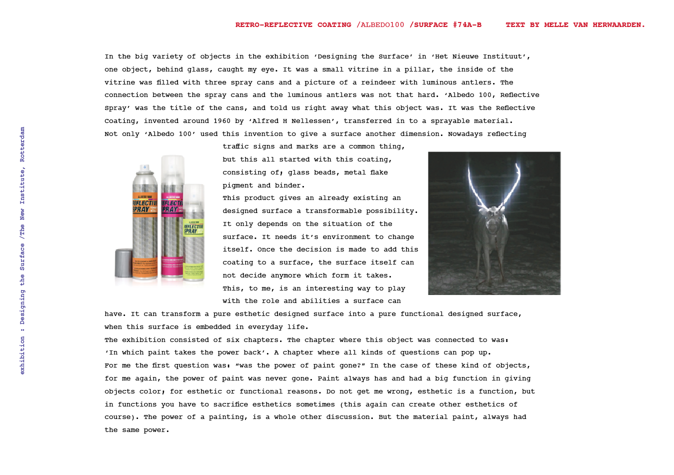
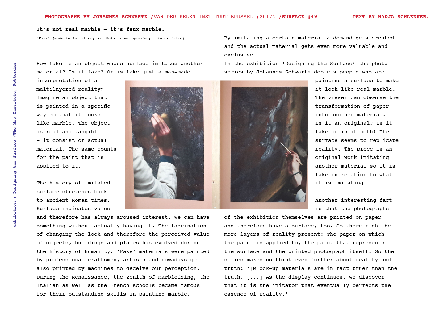
Walking around Shinjunku, Tokyo’s district, one may have noticed the unusual buildings standing out on its east side.
The Ichiban-Kan (“building number one”) and the Niban-Kan (“building number two”) were designed by the architect Minory Takeyama in 1966. They were commissioned by a Korean Toyota salesman, asking him to design both buildings at the same time, and finally completed in 1969. Respectively, one was home of 49 tiny bars distributed through its eight floors, and the other hosted bars, clubs and sauna.
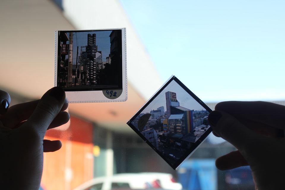
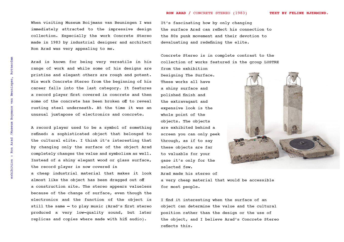
Slides from the 1970s, reproducing the two buildings. Domus Archive
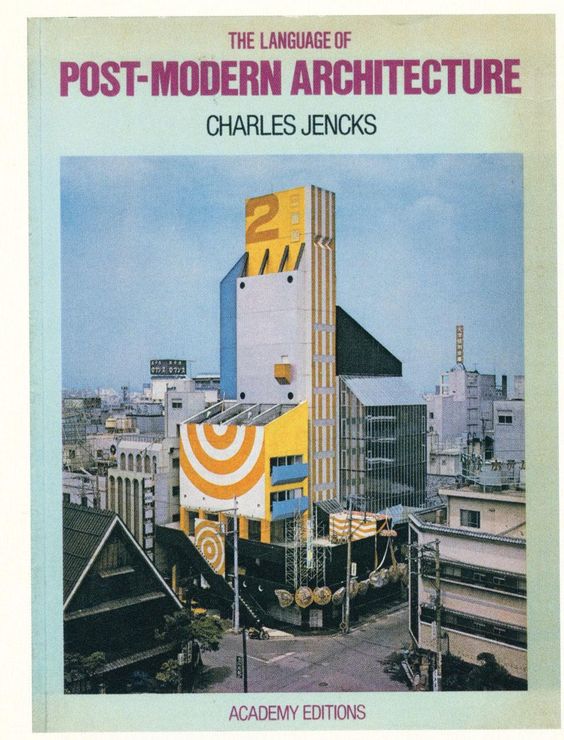
In 1977, the cover of Charles Jenks’ The Language of Post-Modern Architecture features an enigmatic Japanese building. It raises the Niban-kan as an icon of Supergraphics, along with its adjacent brother building the Ichiban-kan.
Niban-Kan’s colored surface has been painted over by now, blending now with Tokyo building’s flat designs.
But what made this building so special, beside its colorful surface ?
In the 60’s, East-Shinjuku was the land of protest and porn, where one could meet the radical, intellectual, and other underground Japanese subcultures. This area’s hyper activity led to an important street competition, where signs and speakers had to be bigger and louder.
Minory Takeyama was challenged to implant a new architecture in the given context. It had to stand out of this saturation of lights and neons, while blending in with the energy of the district.
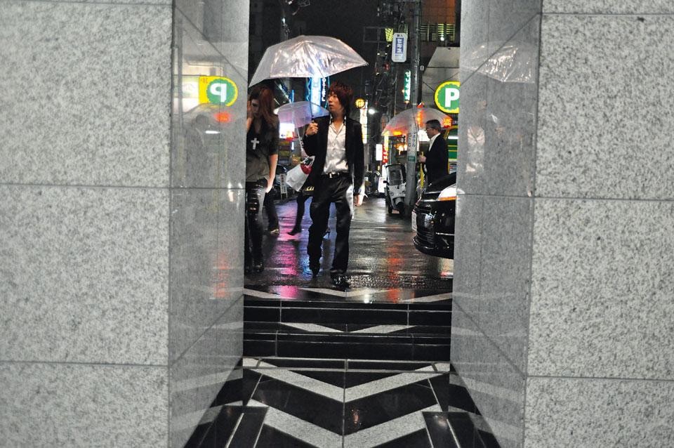
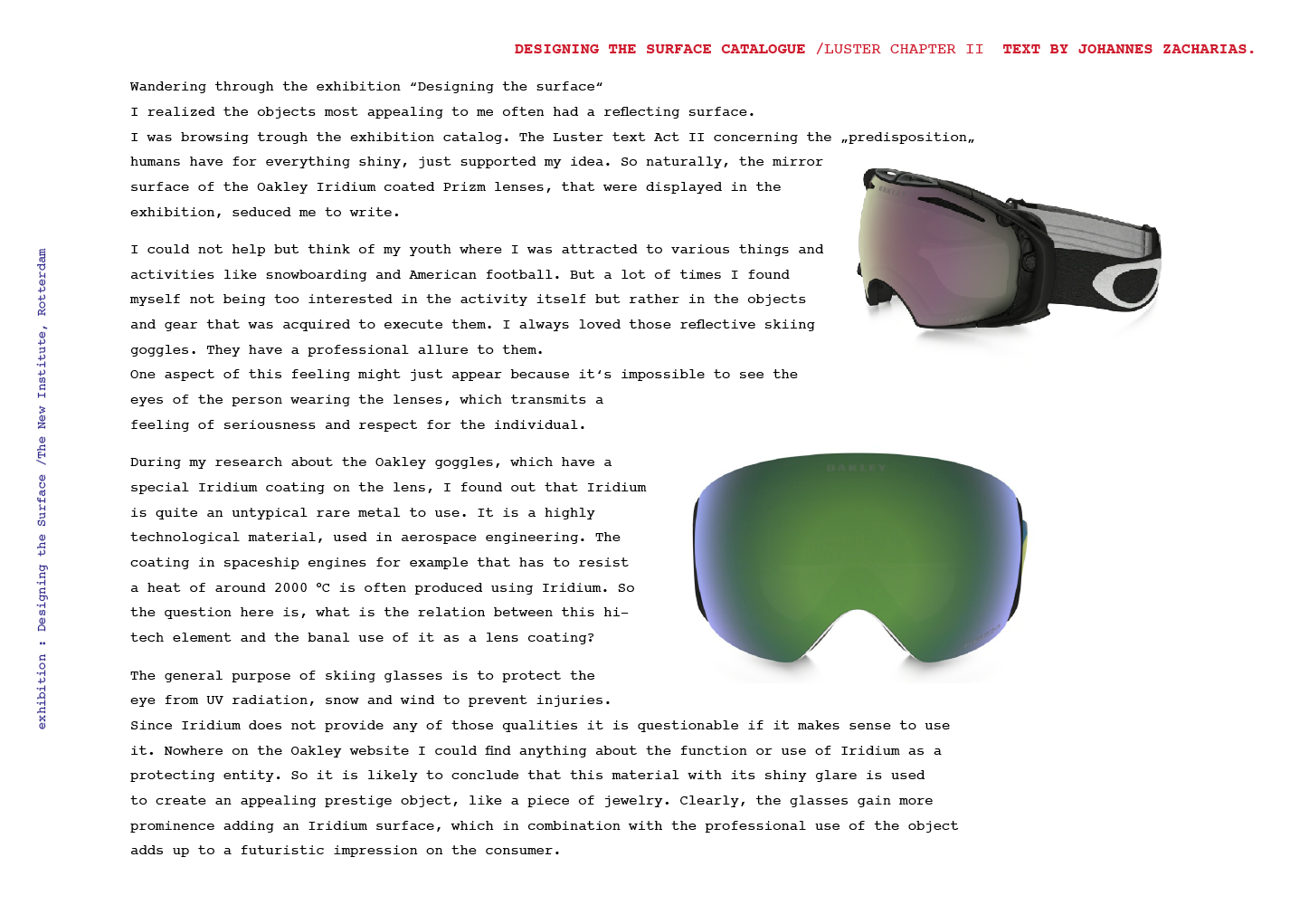
Entrance of the Ichiban-kan building
Japanese architecture is typically vertical, where each floor has a common area with entrances to shops and bars. As architecture was being more and more influenced by western design in term of multi-storey models, Takeyama exploited the local past of architecture and brought the verticality back to the front, creating a vertical street through the facade. The late-Modern “High Architecture” aim to reveal the movement directly from the outside, such as what’s going on, and how to get there.
The front shows the circulation, to arouse curiosity. This is completed by signs that bring an informative layer to the surface. At night, neons reflect on the glazed area, which emphasize the gap between the surface and the platform, and reveal part of the building’s activity.
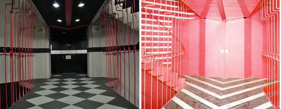
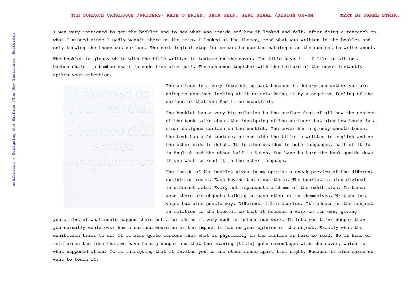
Left: a view of the Niban-kan interior today. Right: The same space with the original flooring, as seen in a 1970s Japanese publication, Domus Archive
The Niban-kan and the Ichiban-kan are representative of Tokyo’s relation between private and public space. You can go from the street to the seventh floor without encountering a door. By directly opening to the street, those buildings breaks the boundary and transmit a feeling of public space from the street.
Entrance of the Ichiban-kan building, with a direct access to the outside
In the exhibition “Designing the surface”, The Niban-Kan was presented as an item from the, ‘agency’ category, through Charles Jenck’s 1977 bookcover.
Agency is an action or intervention producing a particular effect. Minory Takeyama’s colorful and ambitious buildings were possible to realize at that time, far from the actual strict rules of urban planning. This freedom made it possible to bring local tradition in the actual architecture and –promoted by Charles Jenk– become a figure of Post-Modernist Architecture.

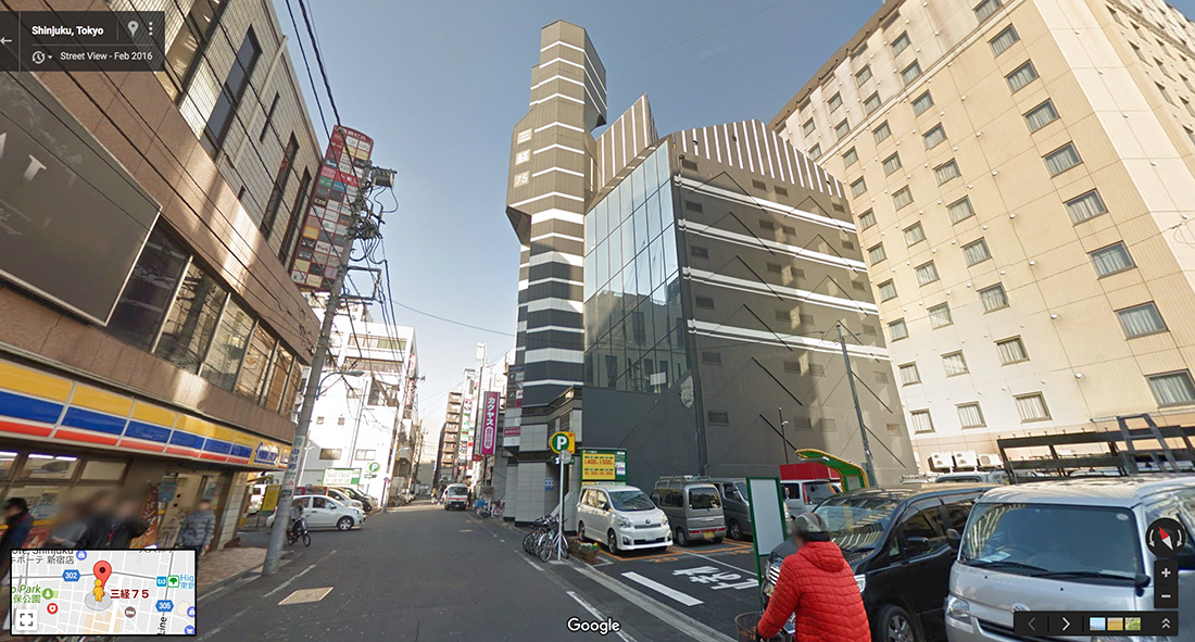
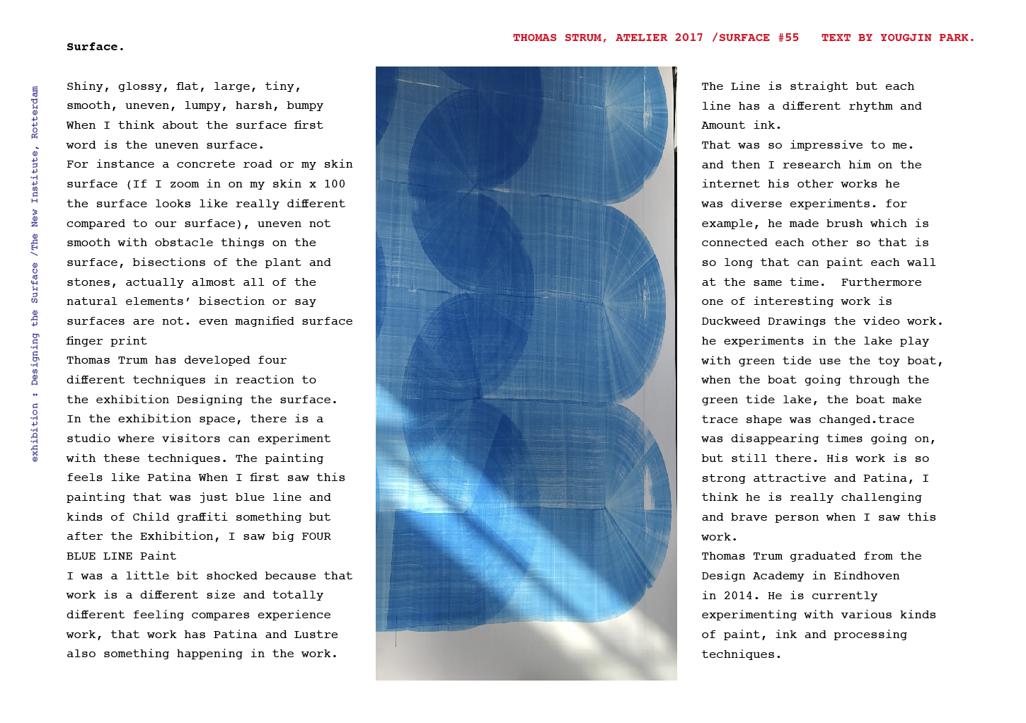
Ichiban-kan and Niban-kan seen from Google street view 2016
Architecture became almost a banal experience, we are surrounded by buildings that we don’t question much, because the more we see them, we forget them. We take design for granted. But sometimes one stands out and makes you travel.
It’s fascinating how design, by small changes of the interface, can revolutionize the way we experience our environment.
Charles A.Jencks, The language of Post-Modernist Architecture 1977-1987, London. New Institute. exh.cat.no.61-agency