Tuesday, October 23, 2012
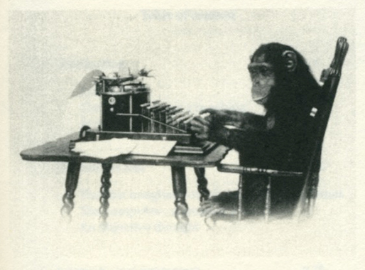 Lydia Sachse [x] graduated from the Rietveld Academy Department Graphic Design in 2012. Her graduation theses was titled “Half Constructed Infinity; On Algorithmic Literature and Text Generators”. It shows her fascination for complex machines and mathematical order as well as the visual beauty of chance. The essay’s introduction starts with two quotes and before you know you –artist as well as designer– get caught in this rich and intriguing subject;
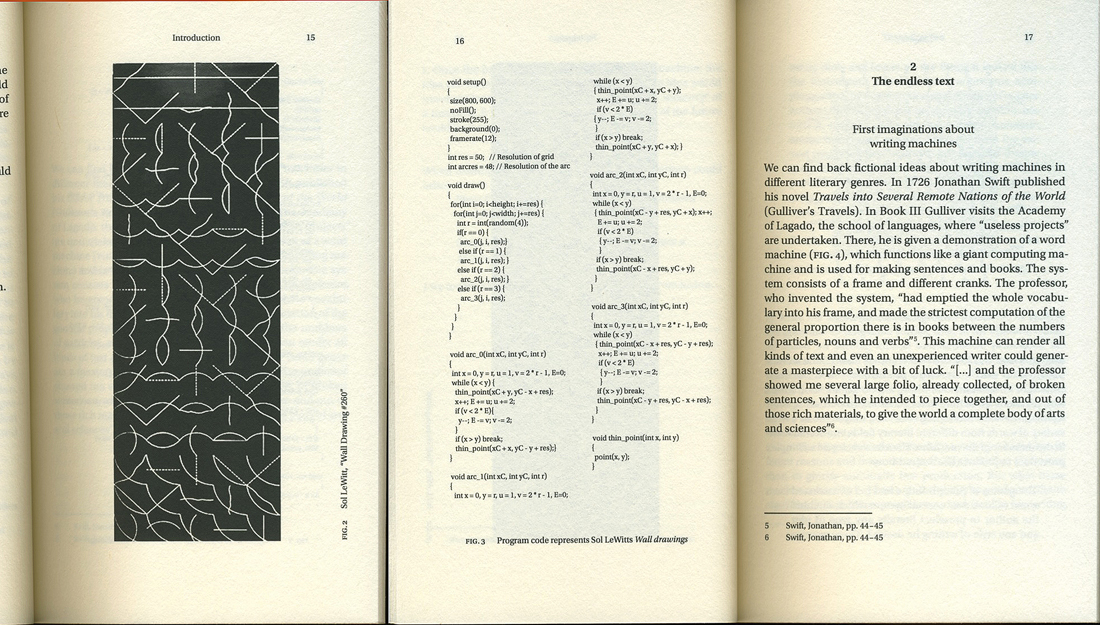
Roald Dahl, The Great Automatic Grammatizator
“carpets … chairs … shoes … bricks … crockery … anything you like to mention – they’re all made by machinery now. The quality may be inferior, but that doesn’t matter. It’s the cost of production that counts. And stories – well – they’re just another product, like carpets and chairs, and no one cares how you produce them so long as you deliver the goods.”
Sol LeWitt, Paragraphs on Conceptual Art
“When an artist uses an conceptual form of art, it means that all of the planning and decisions are made beforehand and the execution is a perfunctory affair. The idea becomes a machine that makes the art.”
“The subject of the text is automation with a special focus on text generators and algorithmic literature. Text generators are not limited to the computer, Already the invention of the movable type transformed religious and literary writing into algorithmic structures and even sytemic theory of rhetoric (Aristotle) was a step towards this direction. This research focuses on different examples of automatic processors from the 20th century and how these emanate from each other in consideration of the technological background.
Inspired by mathematical thoughts scientists and artists started to experiment with computer generated text in the early fifties. Many writers got exited by the new possibilities of computer technology with the hope of finding new ways of artistic expression…..”

Download this thesis: Half Constructed Infinity
[Algorithm: pattern of action which describes how to achieve an aim in several steps (functions as work routine)]
By admin
/ Categories: Graphic Design, image + language, Scripties Tags: automation, conditional, conditions, constructed, Dadaism, generator, Sol LeWitt, stochastic, technology, text
No Comments
Friday, January 16, 2009
Isn’t that a great name Merel Woudwijk. You know i am wondering about Merel, because she got an idea to make her own alphabet. An alphabet that no one can understand. Very abstract and powerful alphabet. She call it “The alphabet of spaces”.

Why these abstraction, because of the inspiration of artist Sol Lewitt and her conceptually idea spread away in her mind to make such alphabets. There were more than 100 prints in woodcraving, some prints in silkscreen, 32 prints in etchings, and 42 prints in lithograph full with care and patient. She choose the basiccolor black for her alphabet, because it gives her good results and comments
posting by Raz Barsati
Wednesday, January 7, 2009
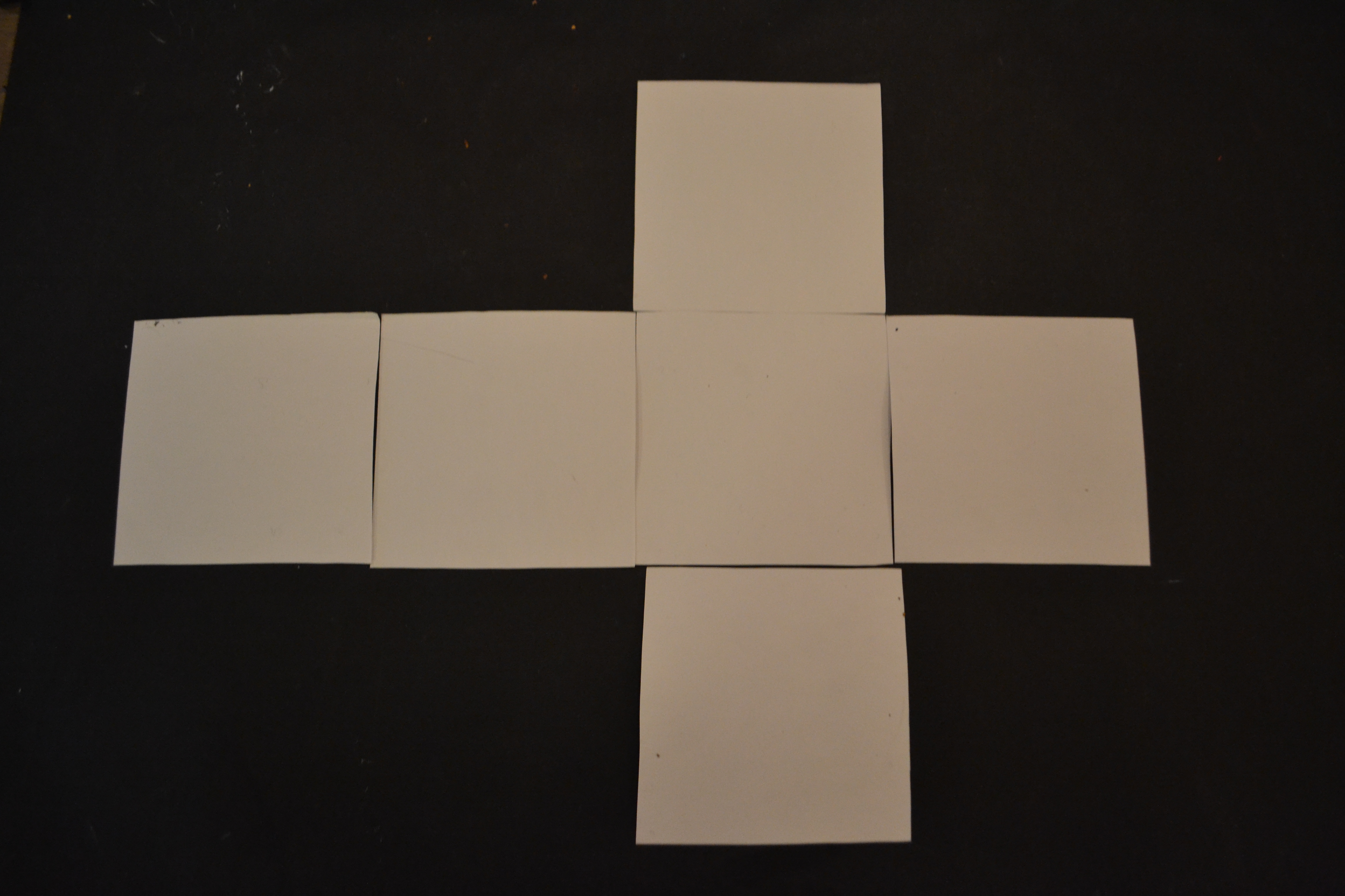
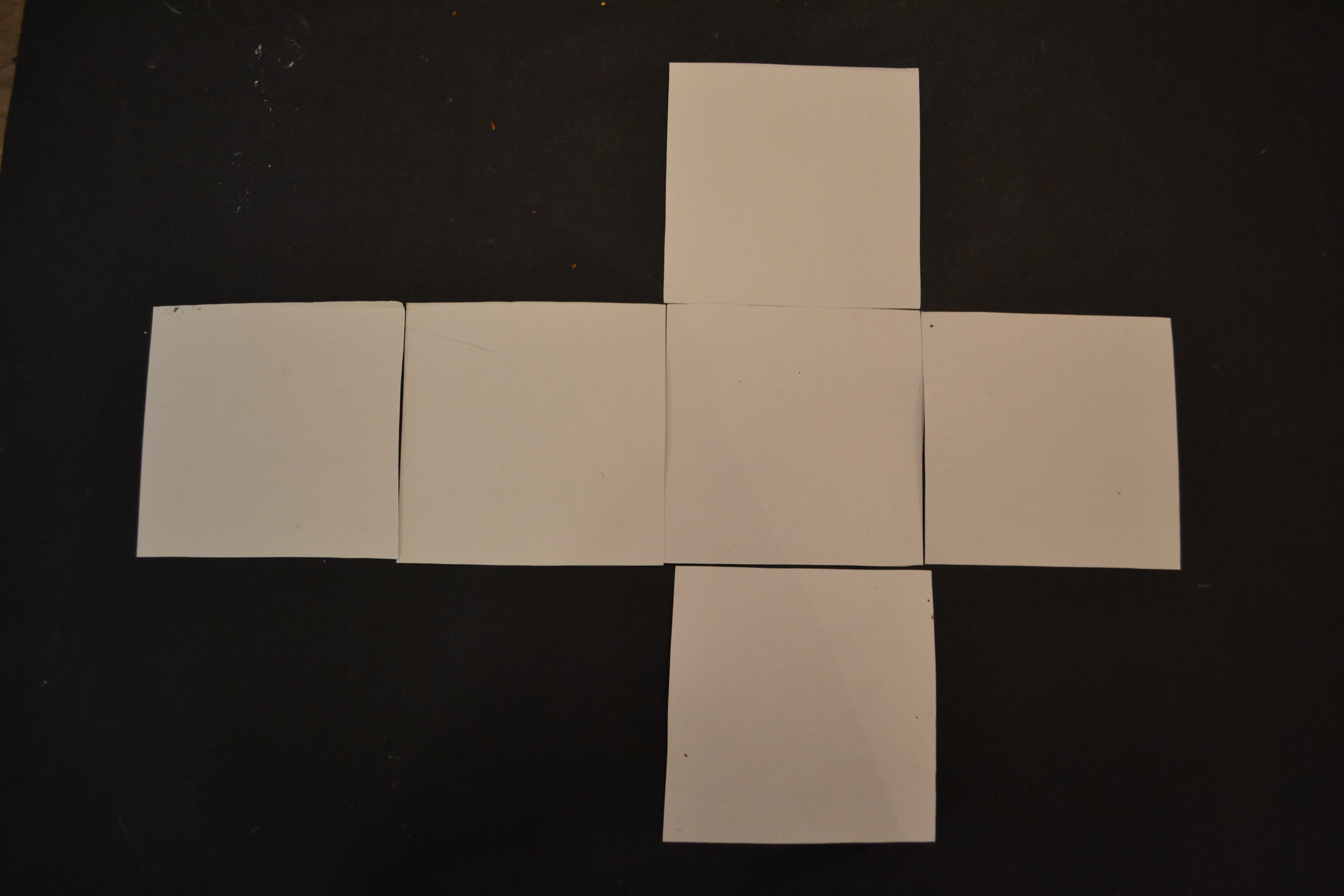
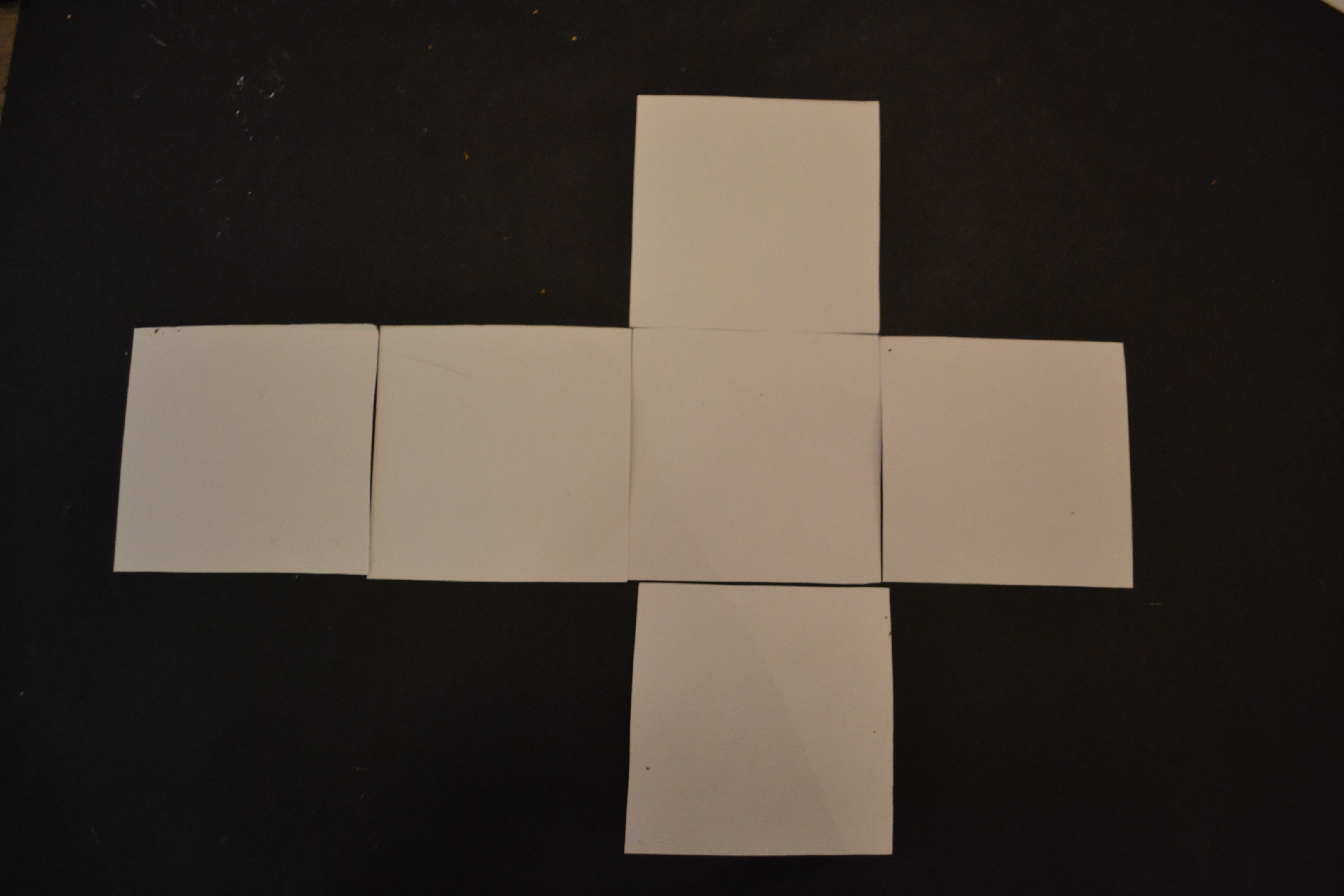
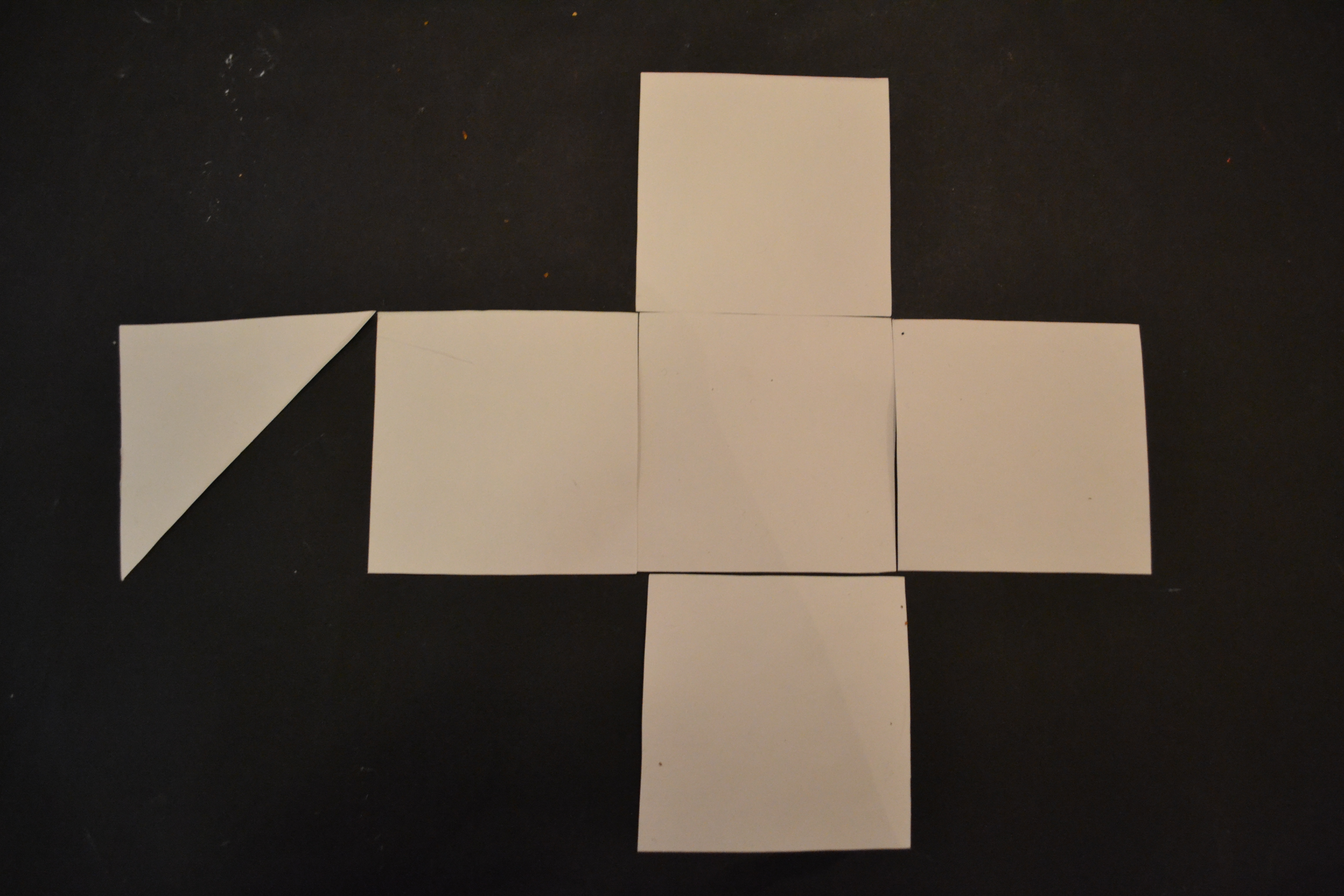
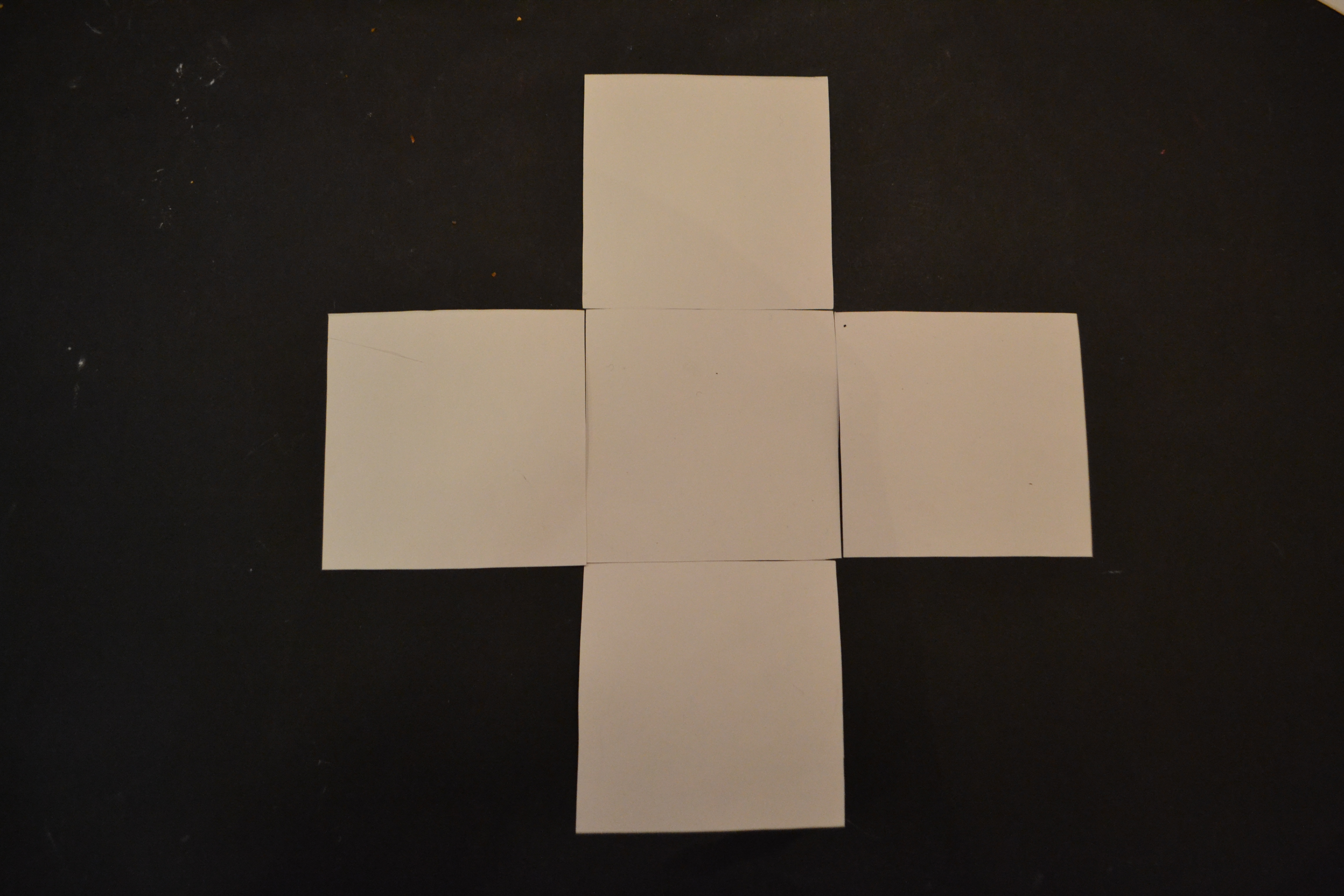
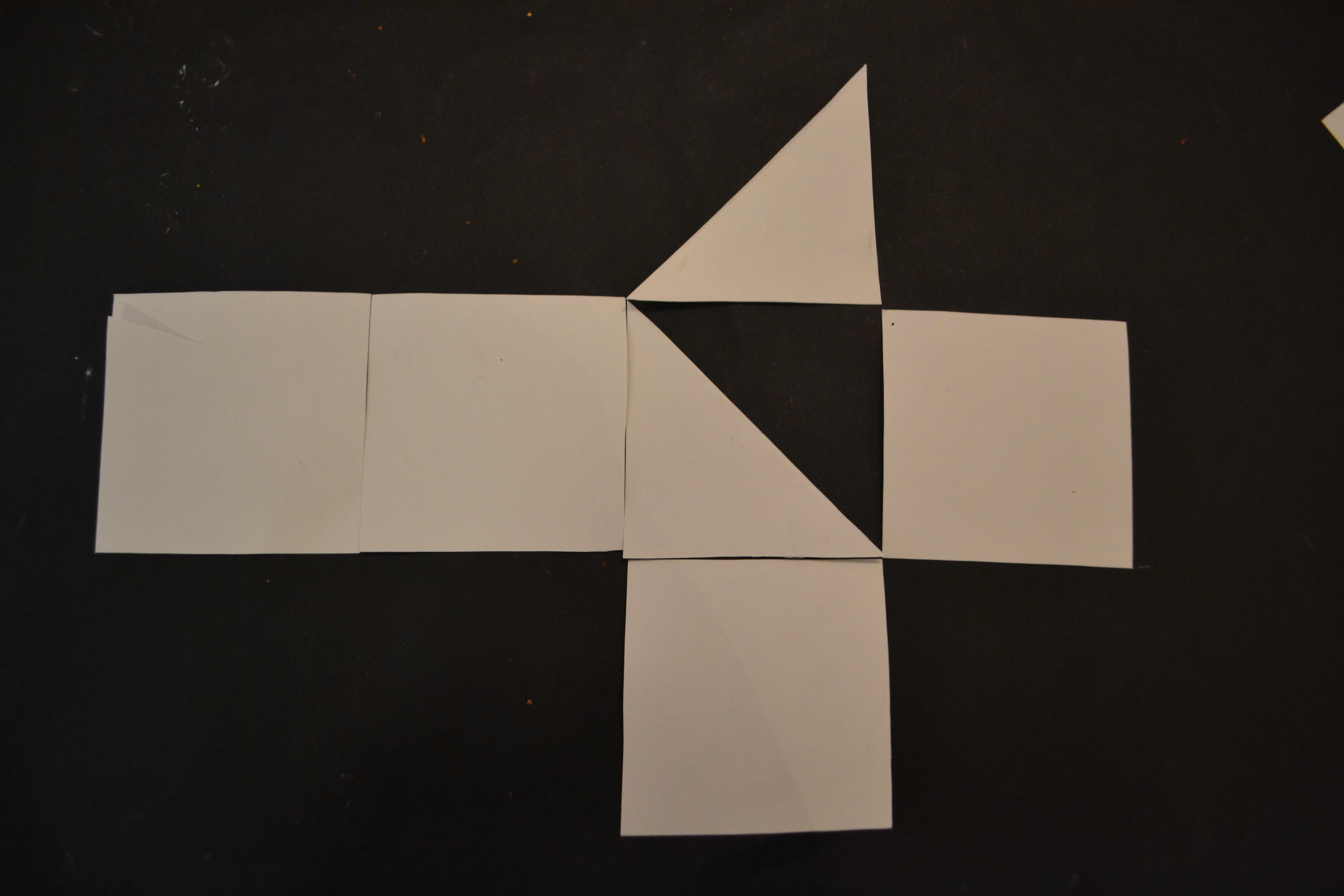
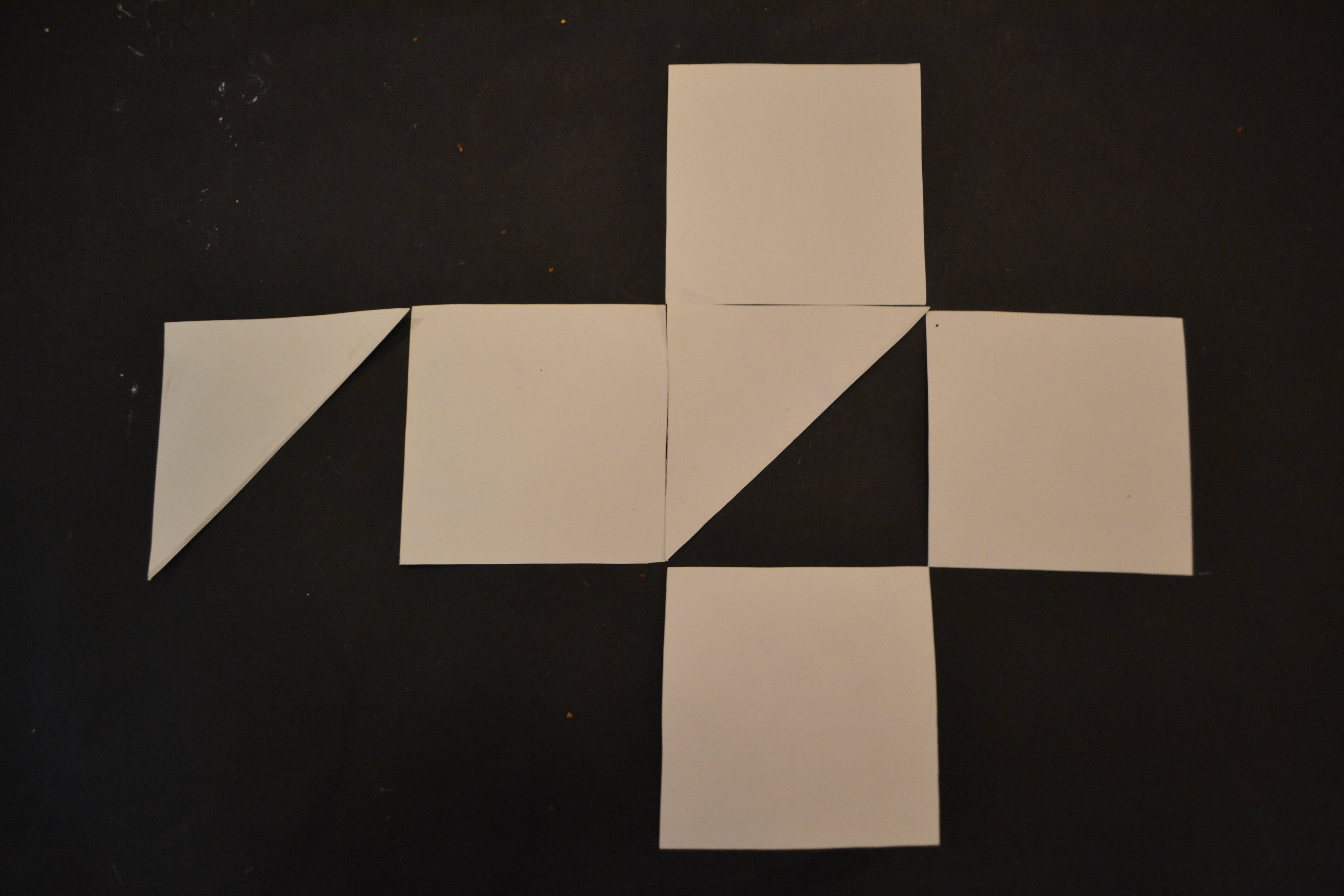
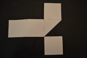
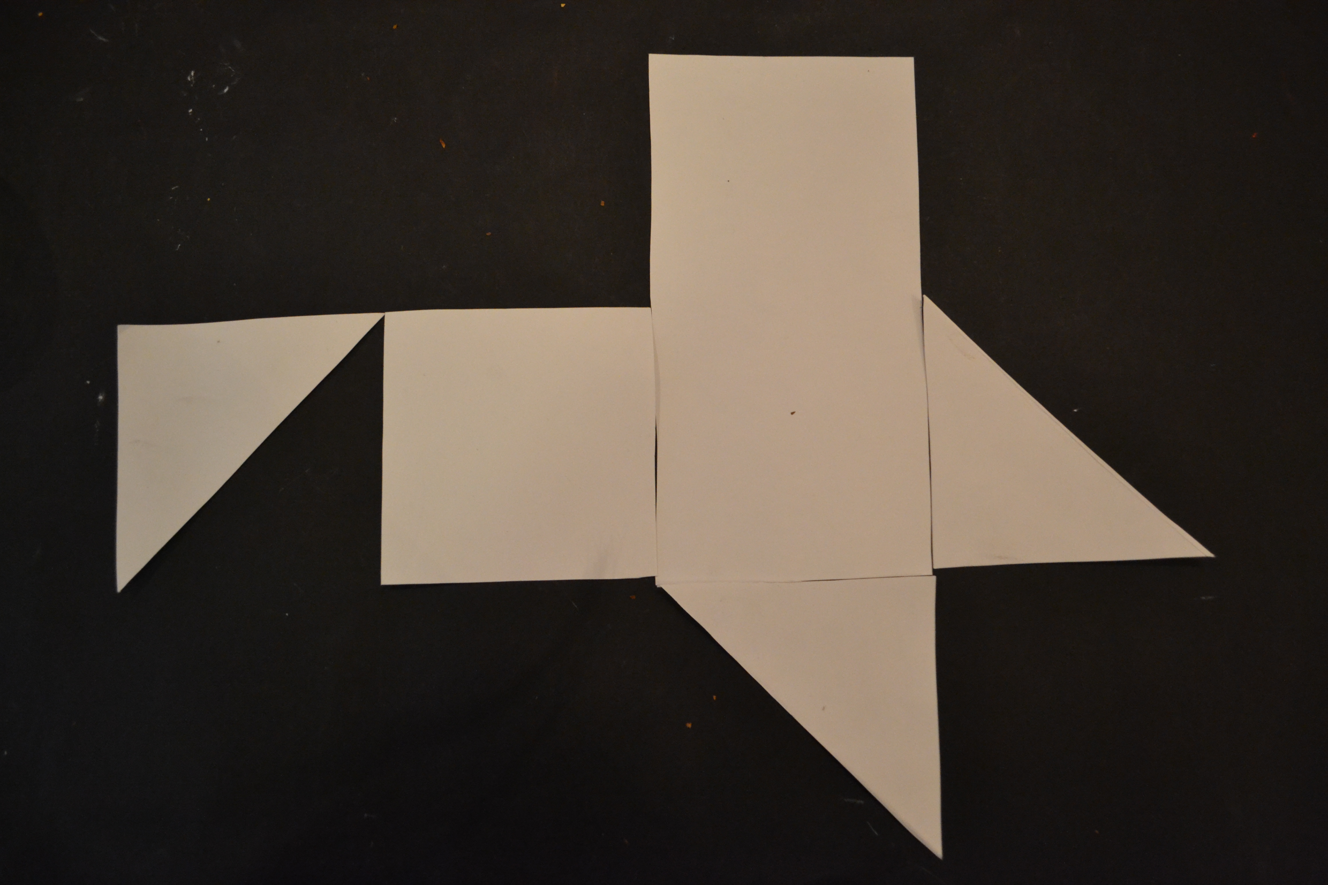
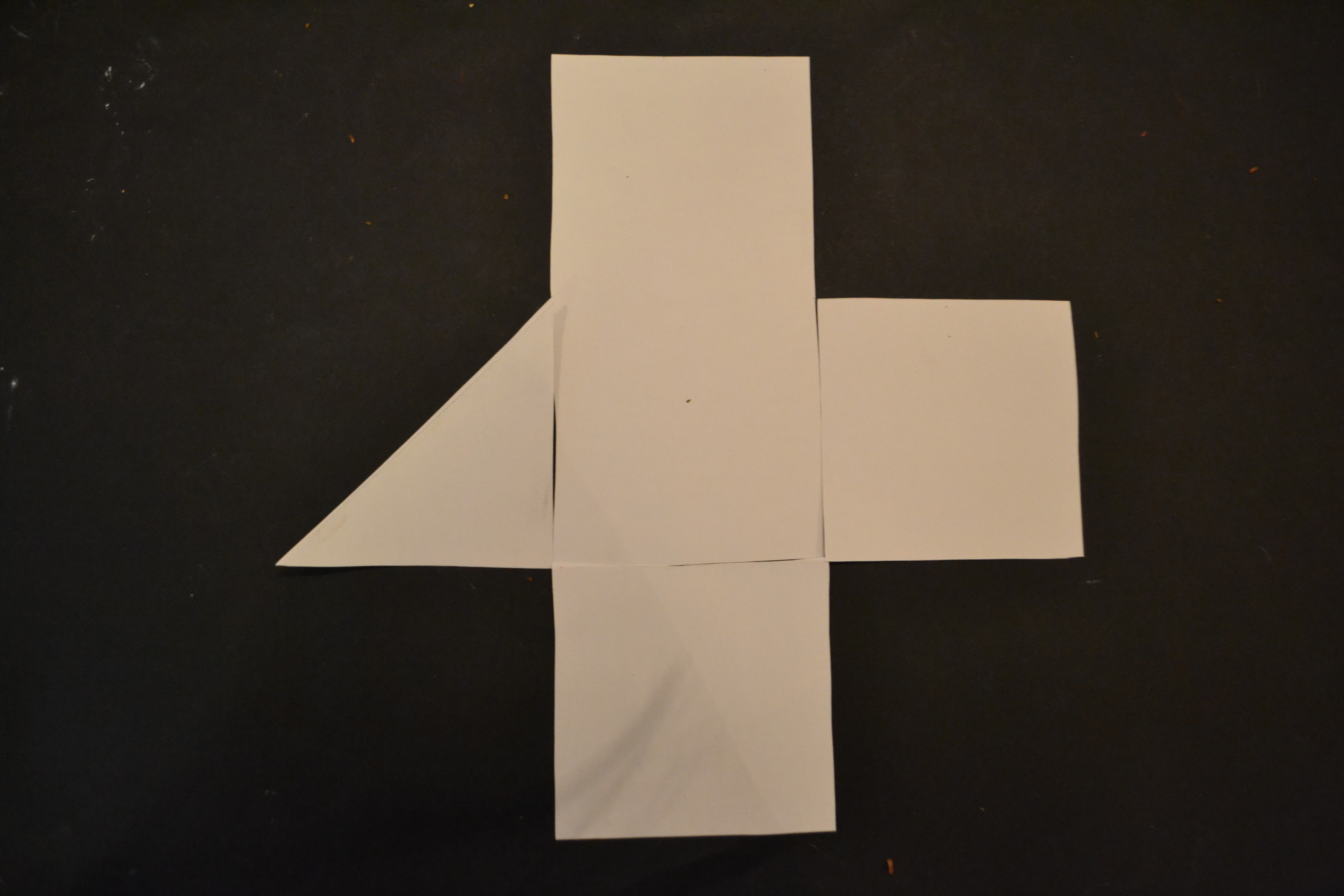
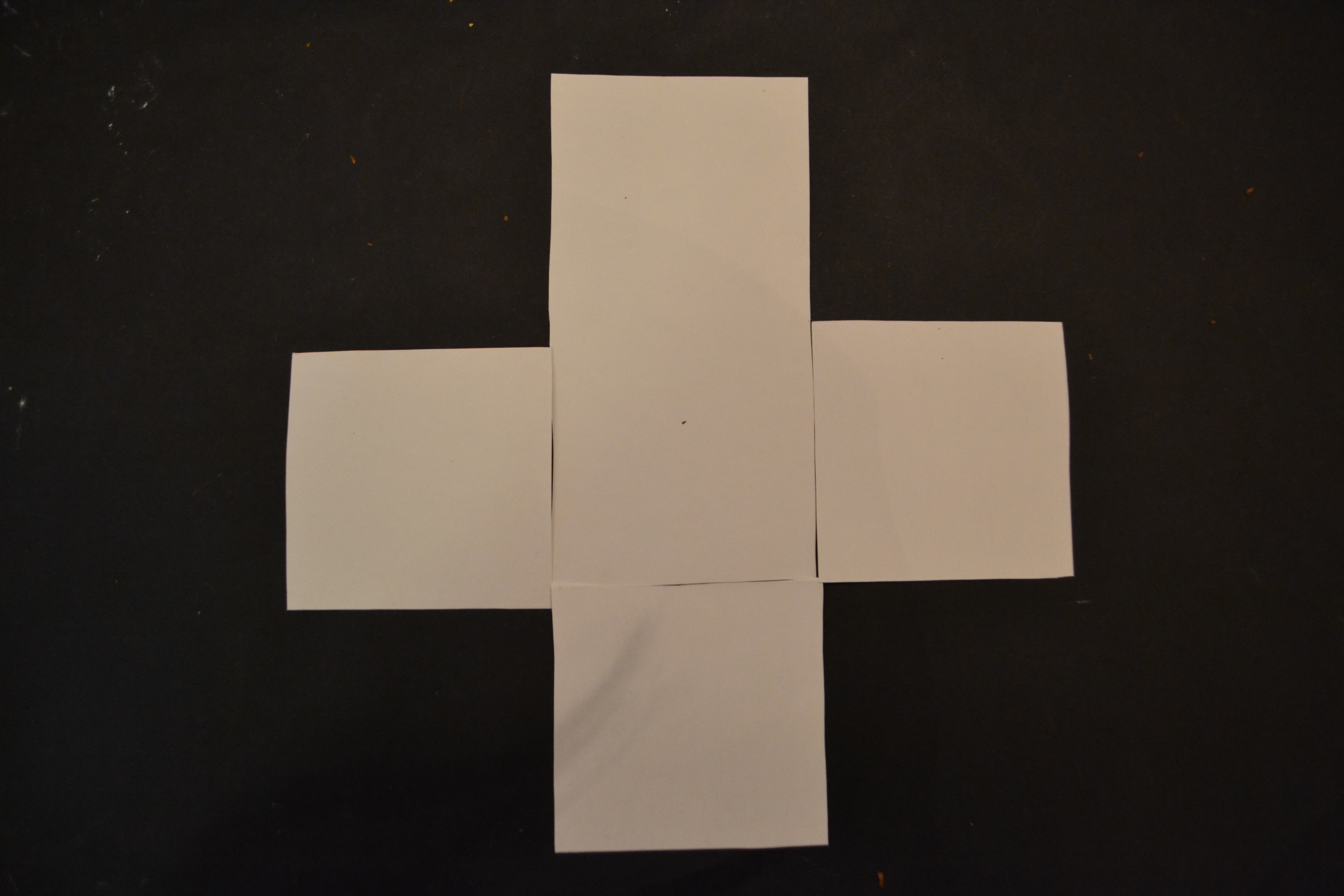
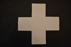
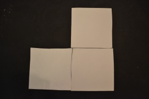
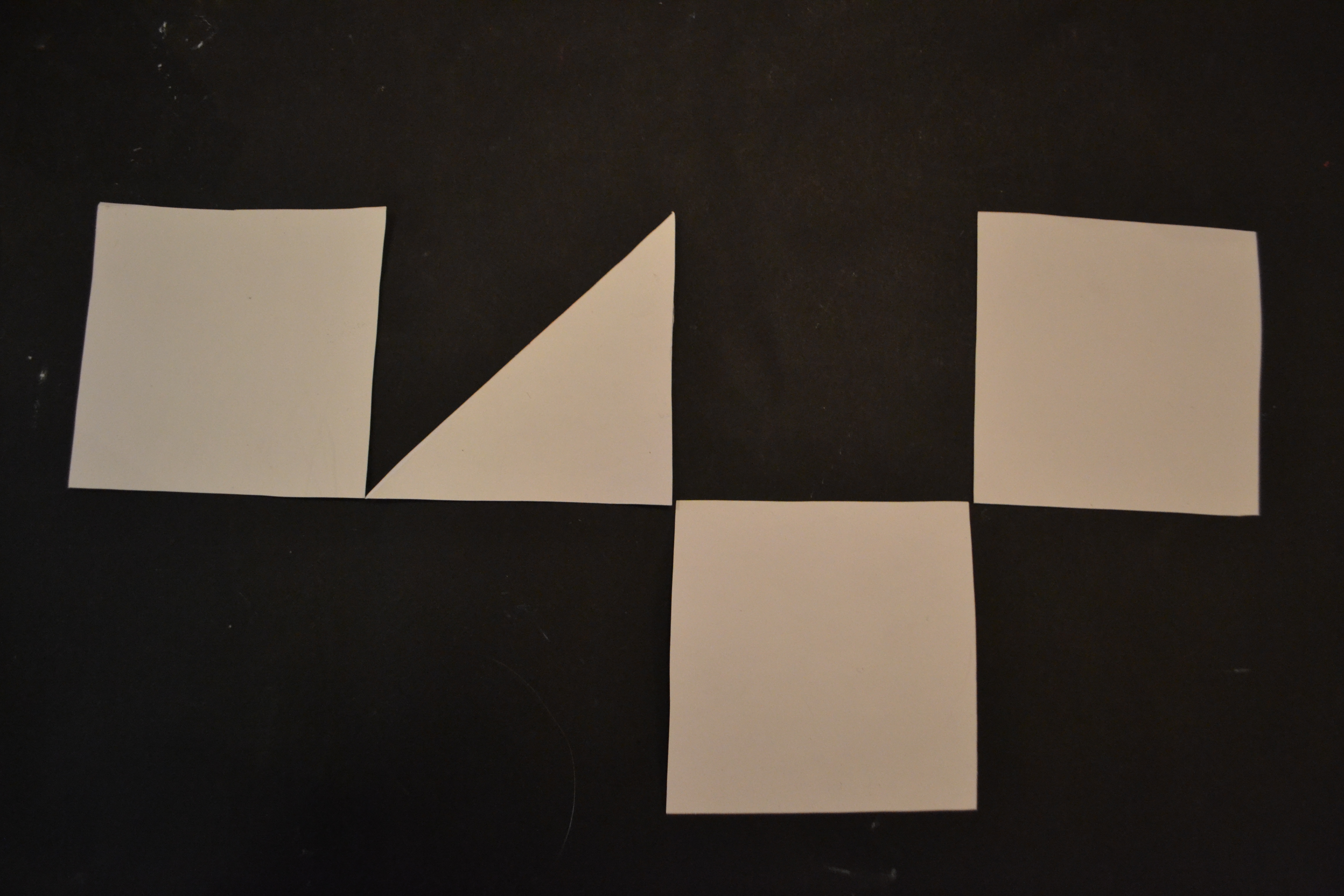
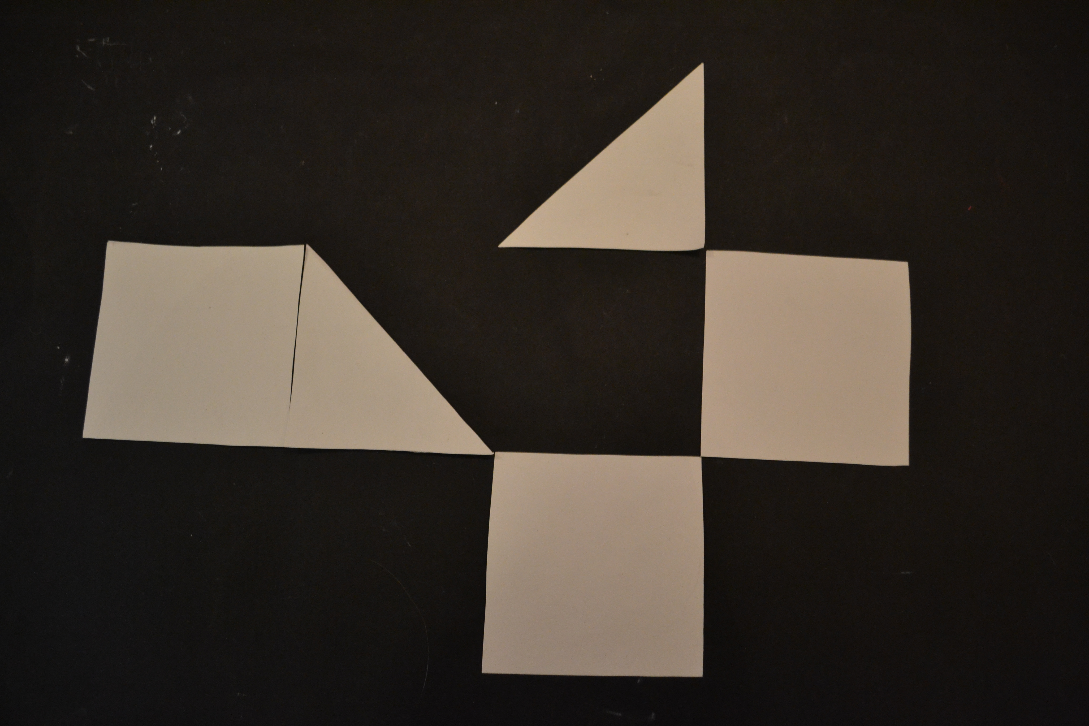
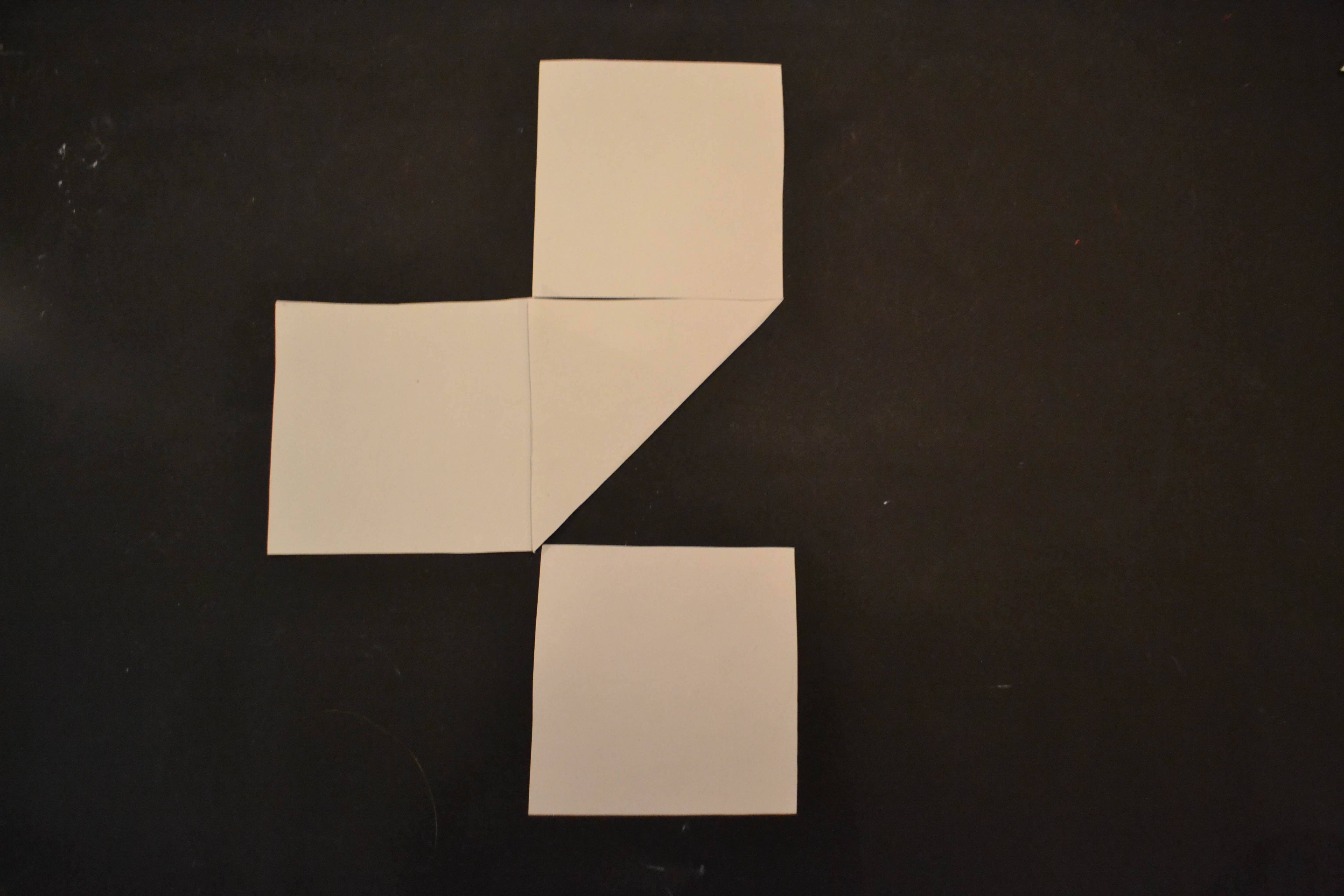
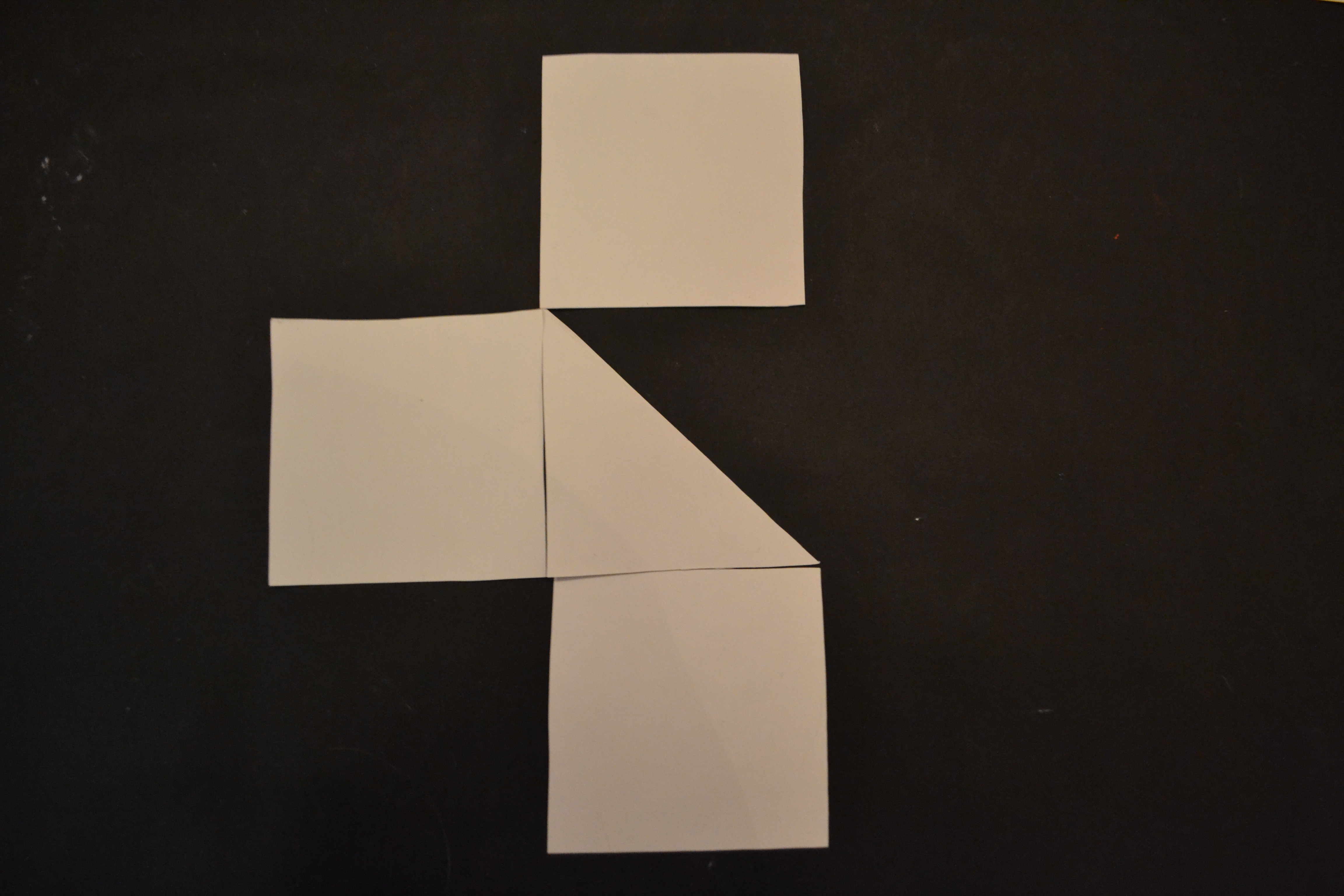
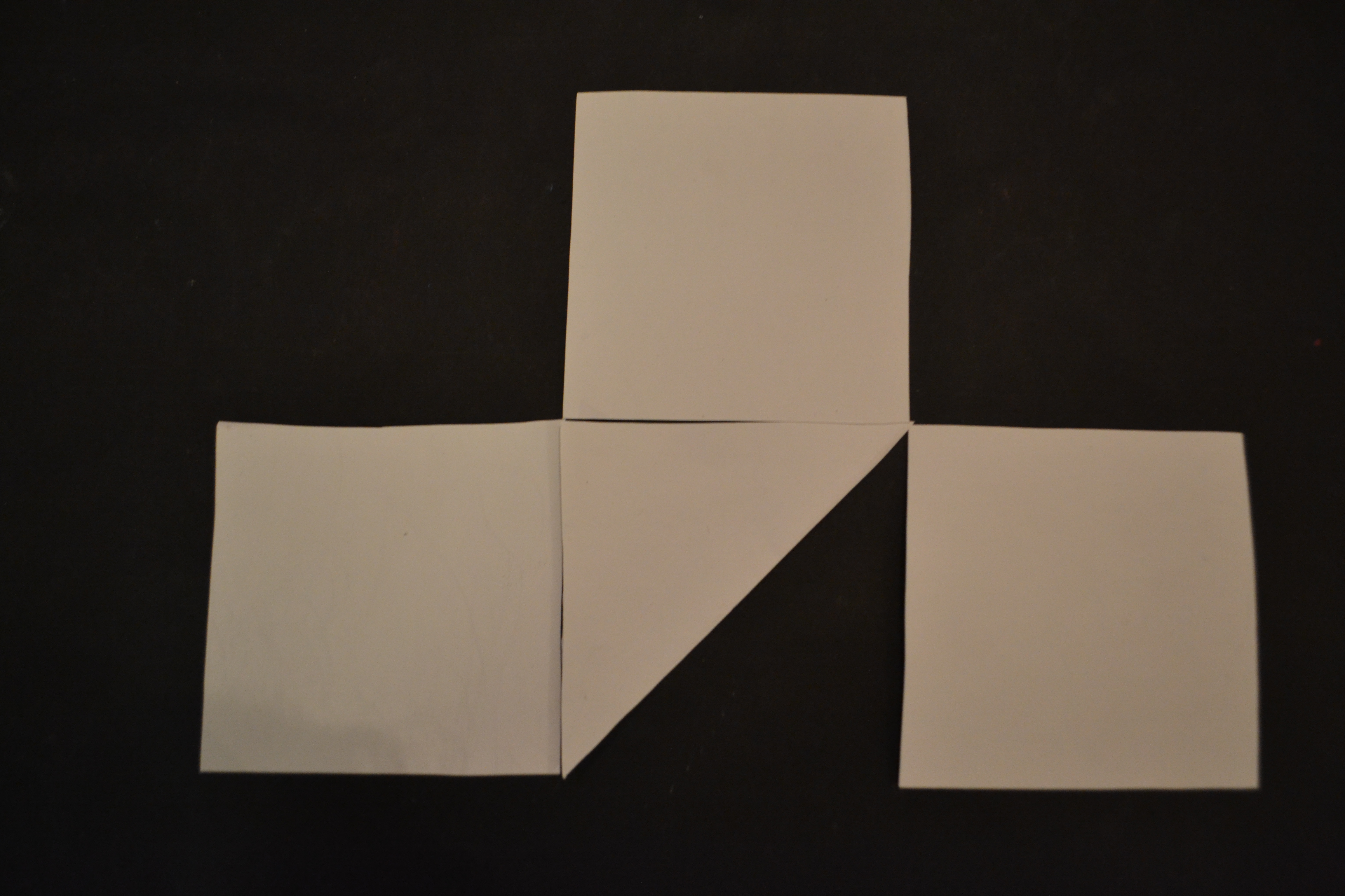
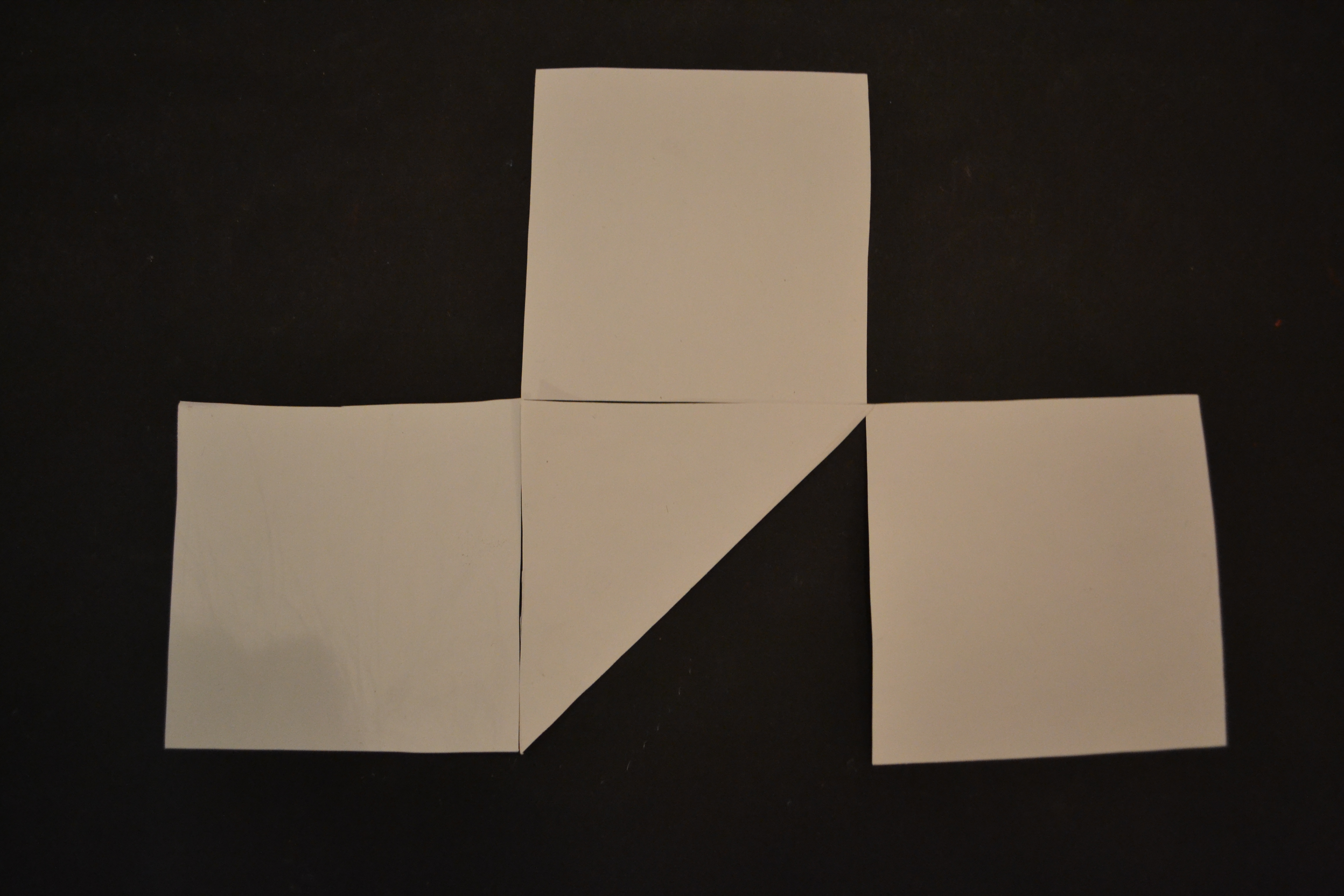
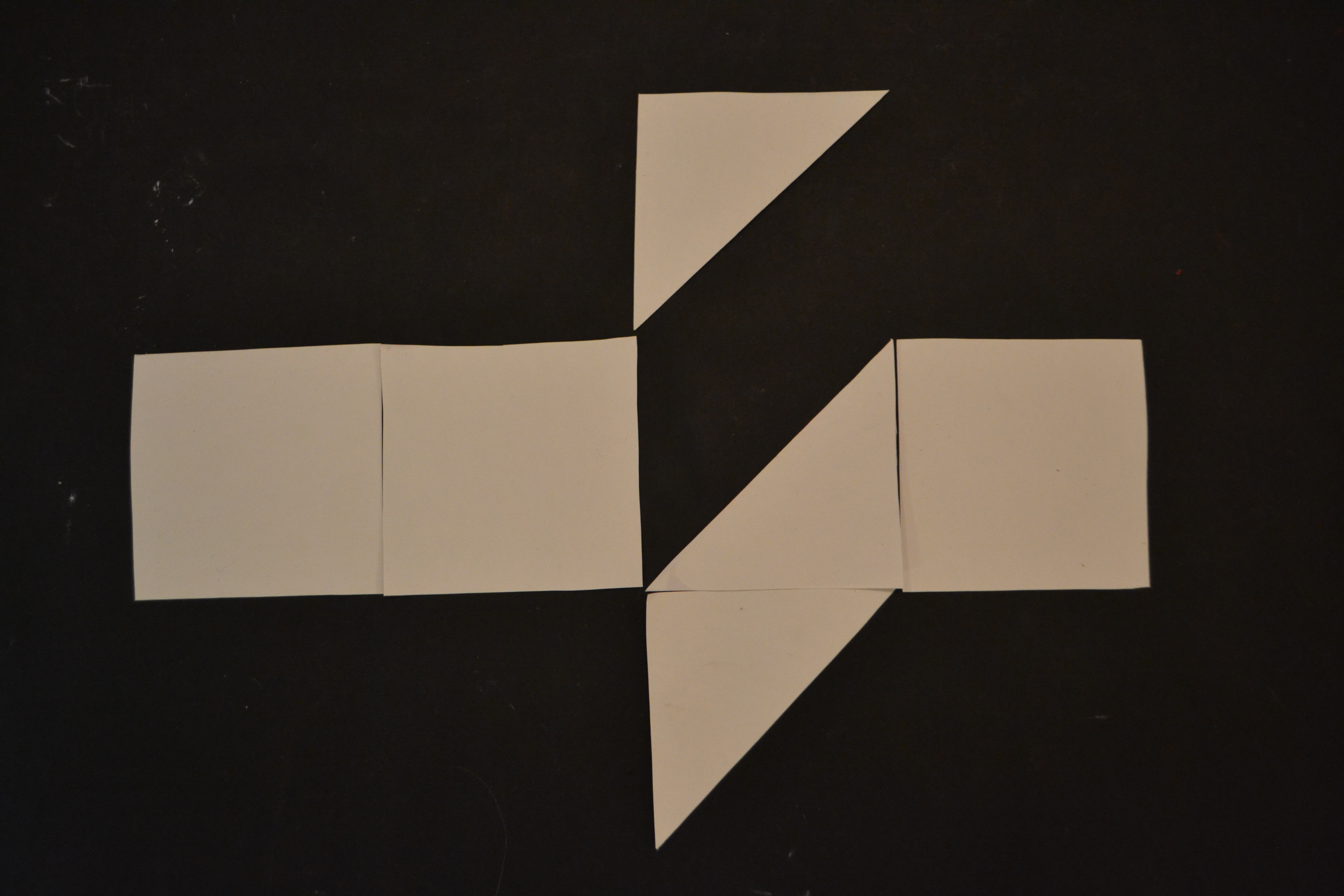
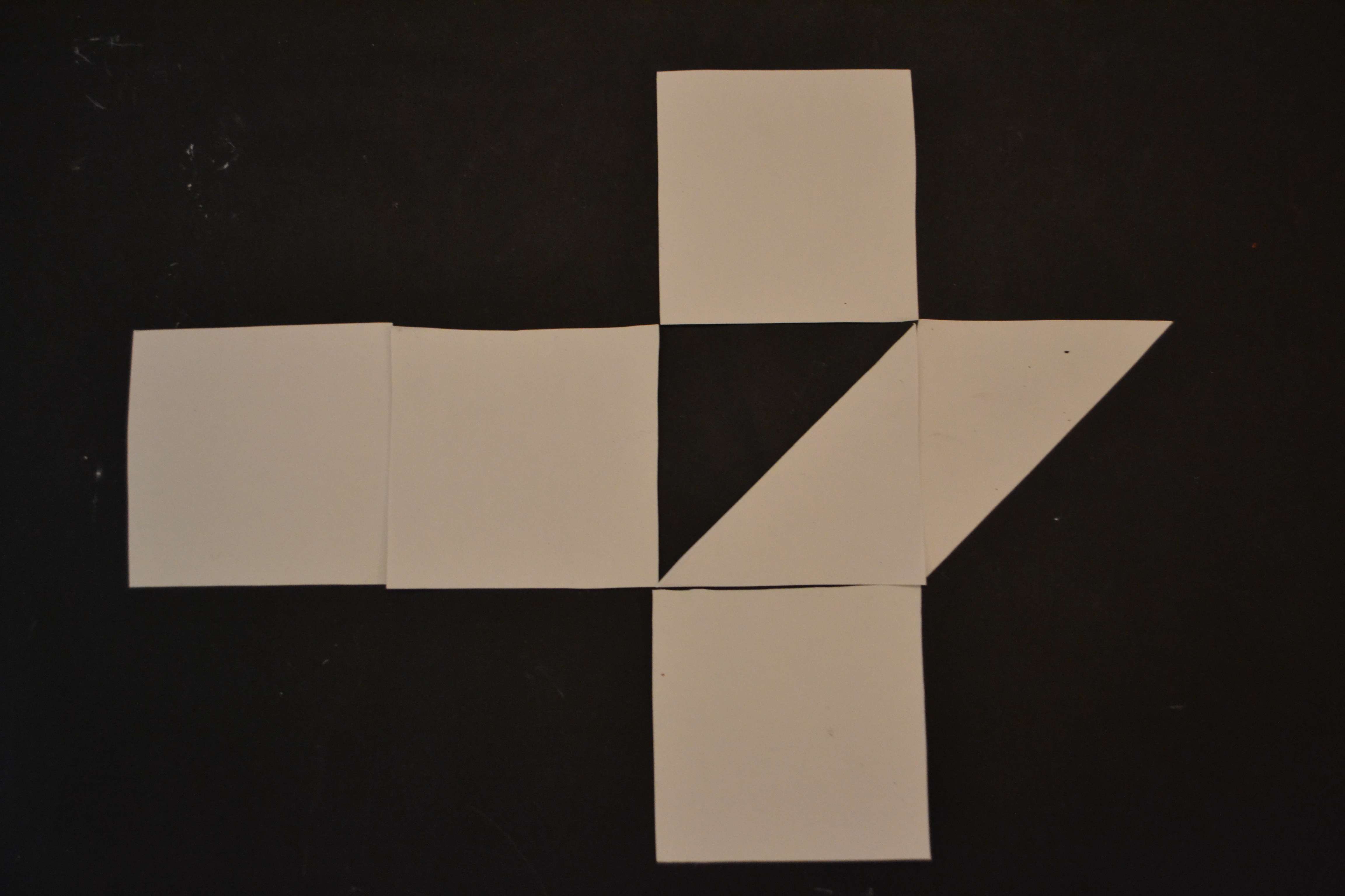
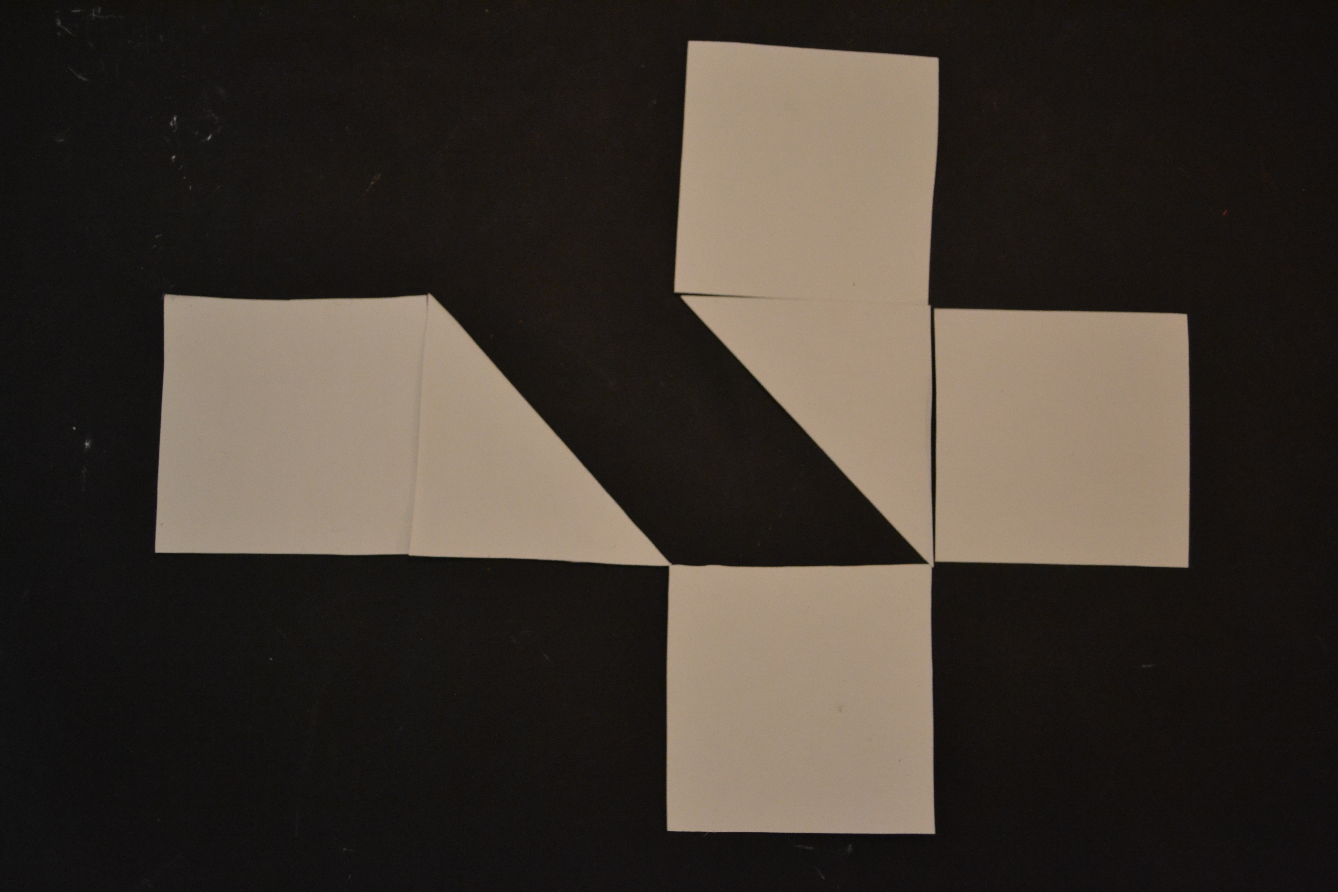
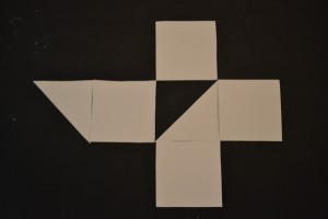
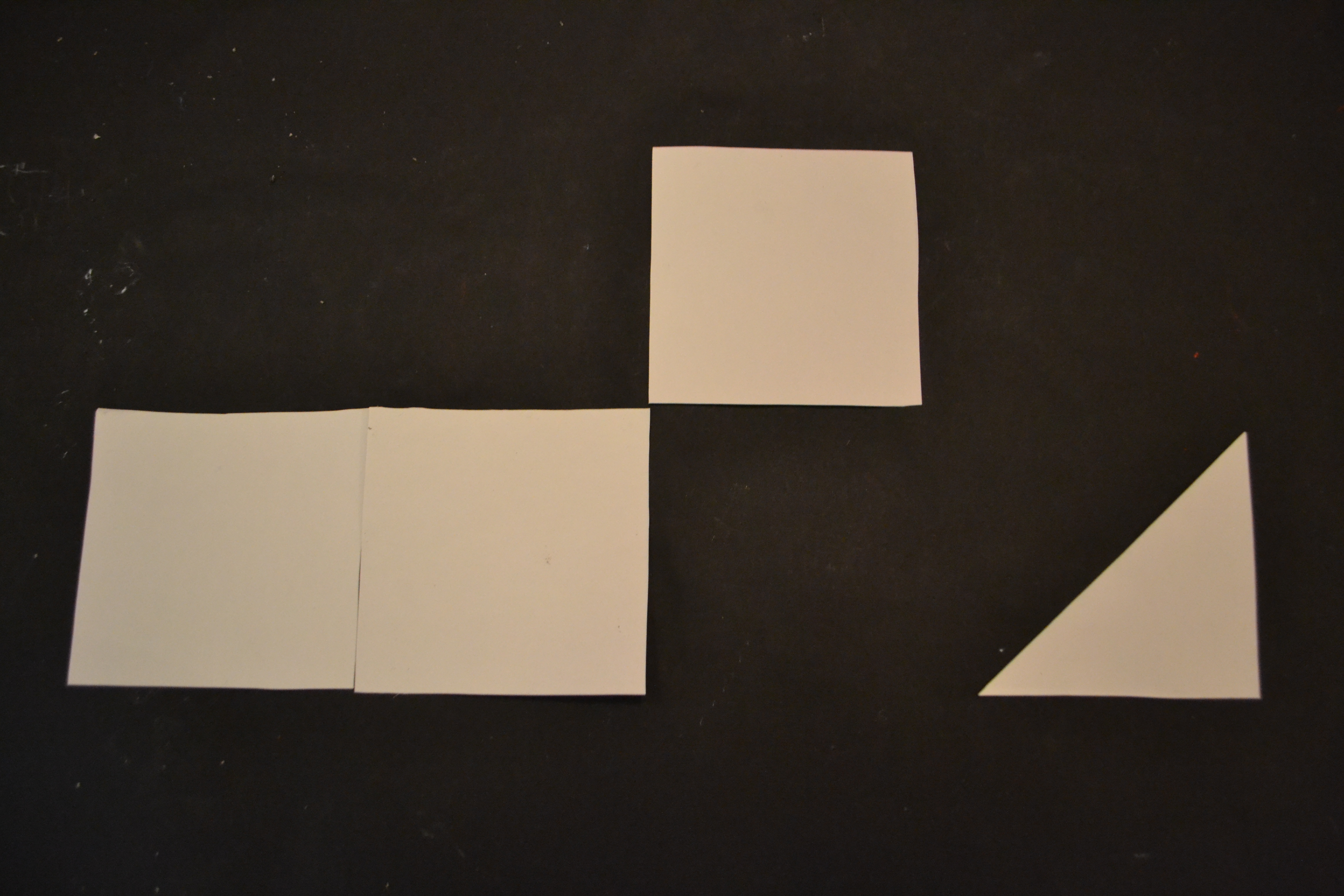
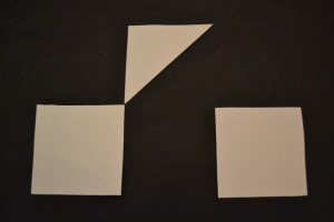
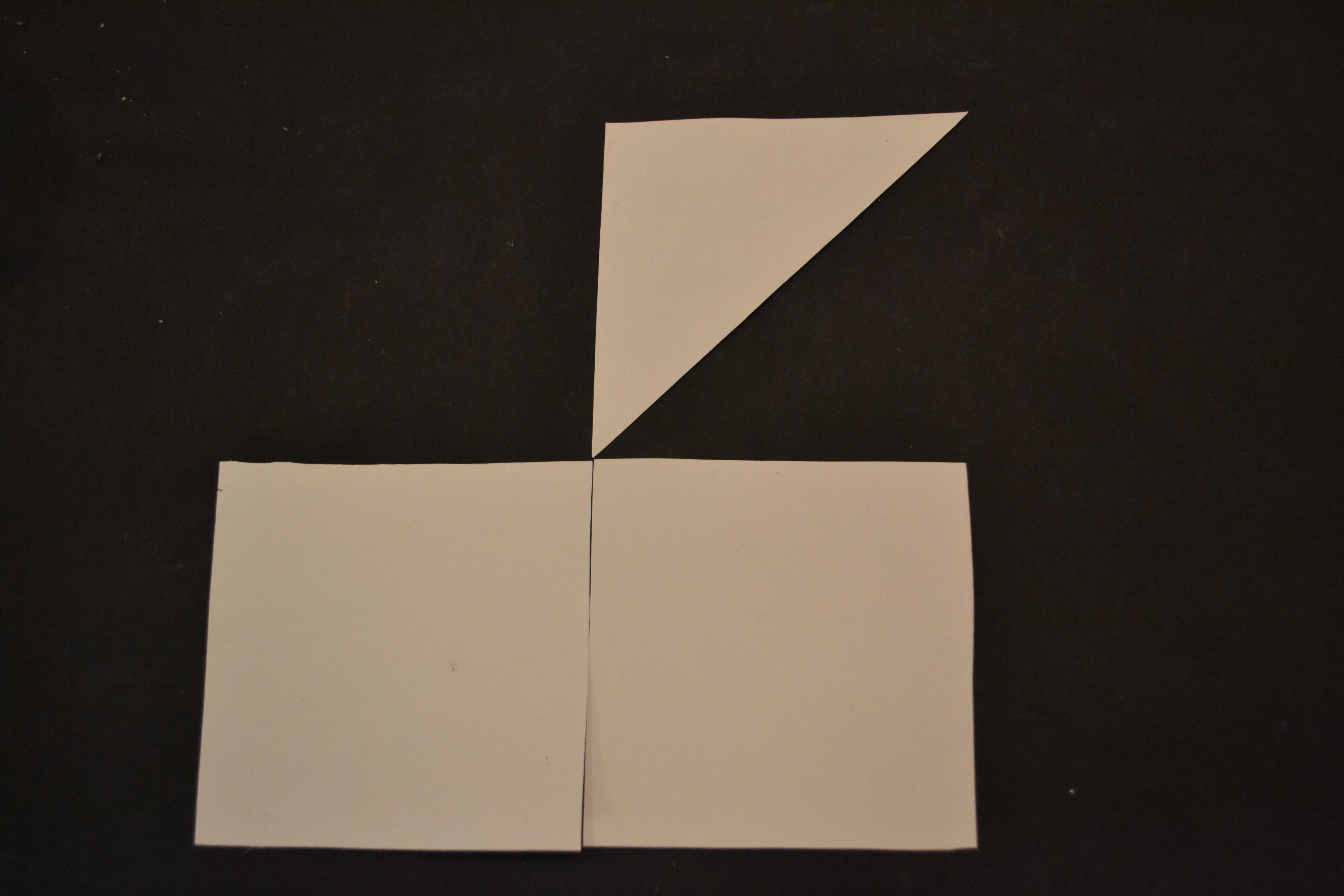
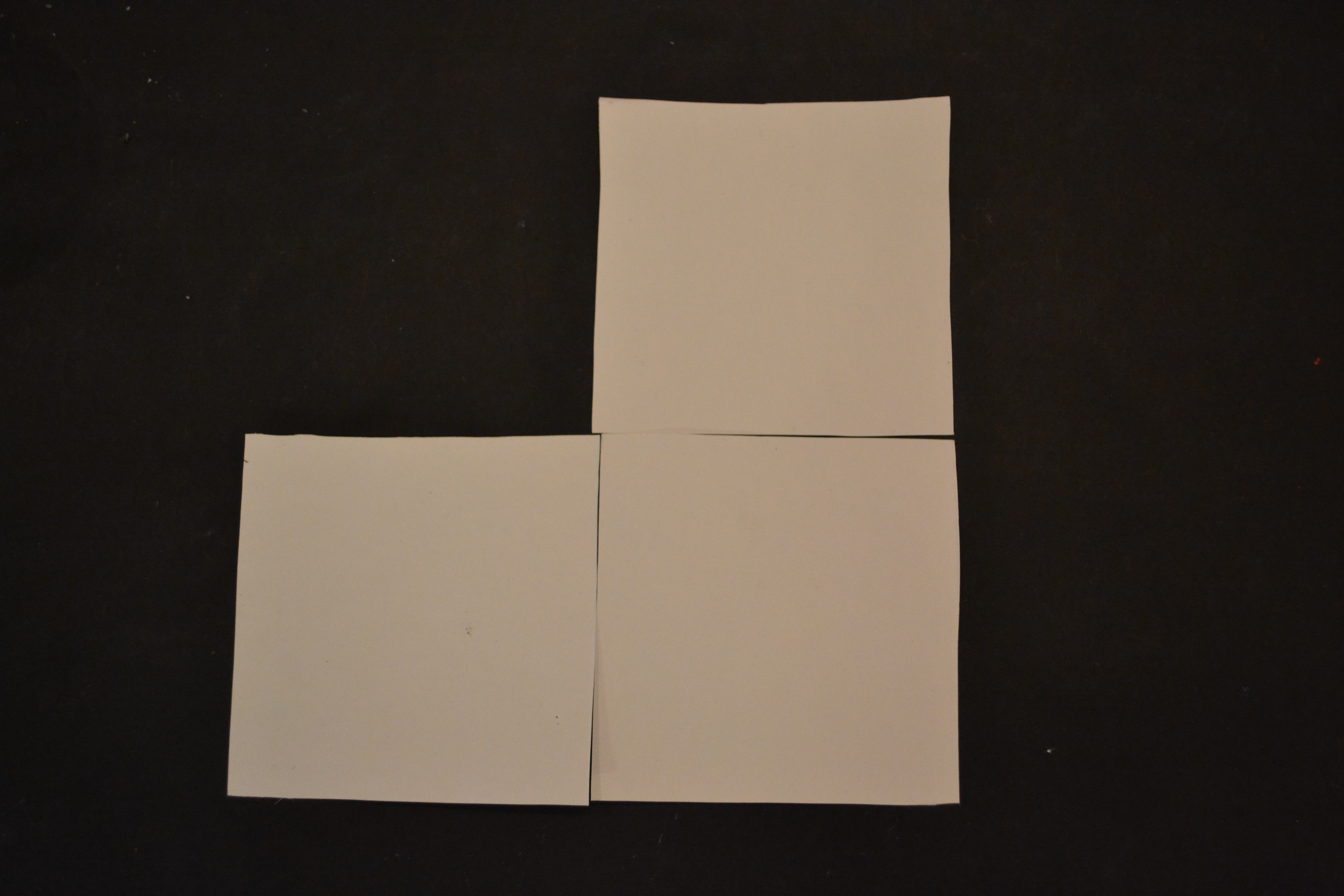
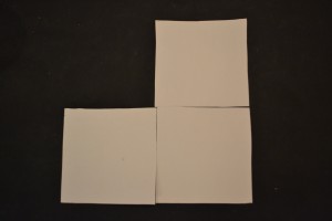
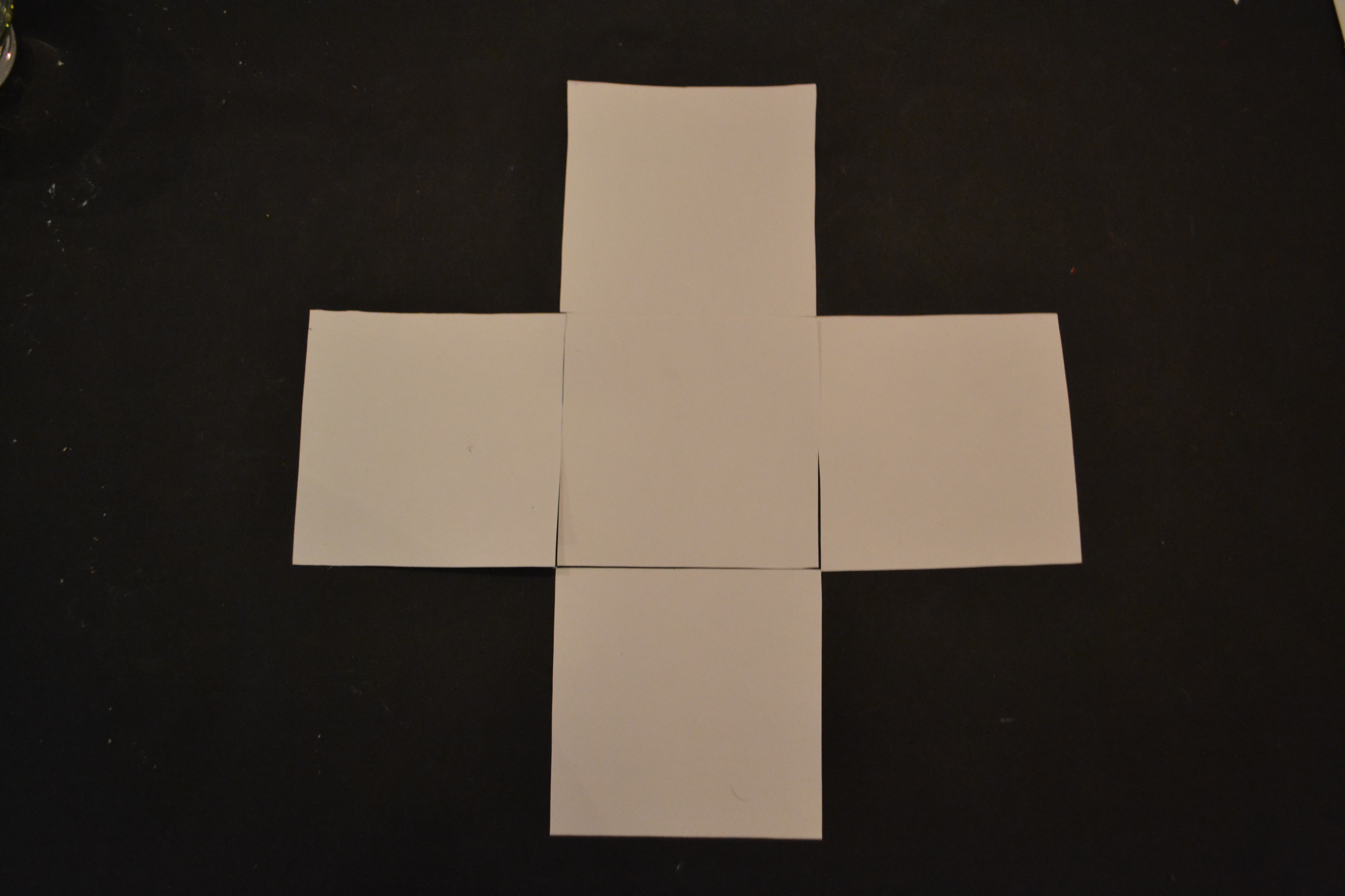
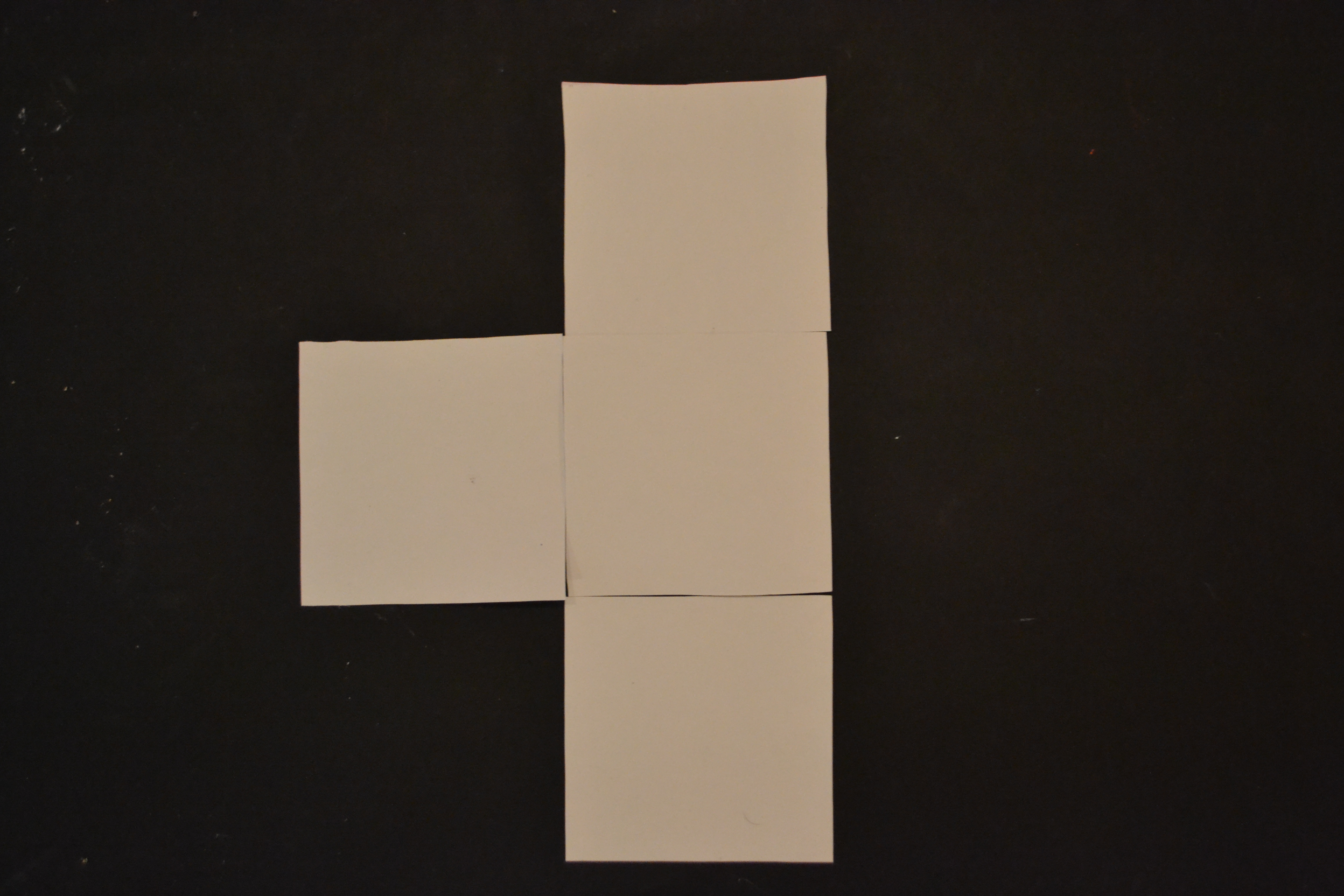
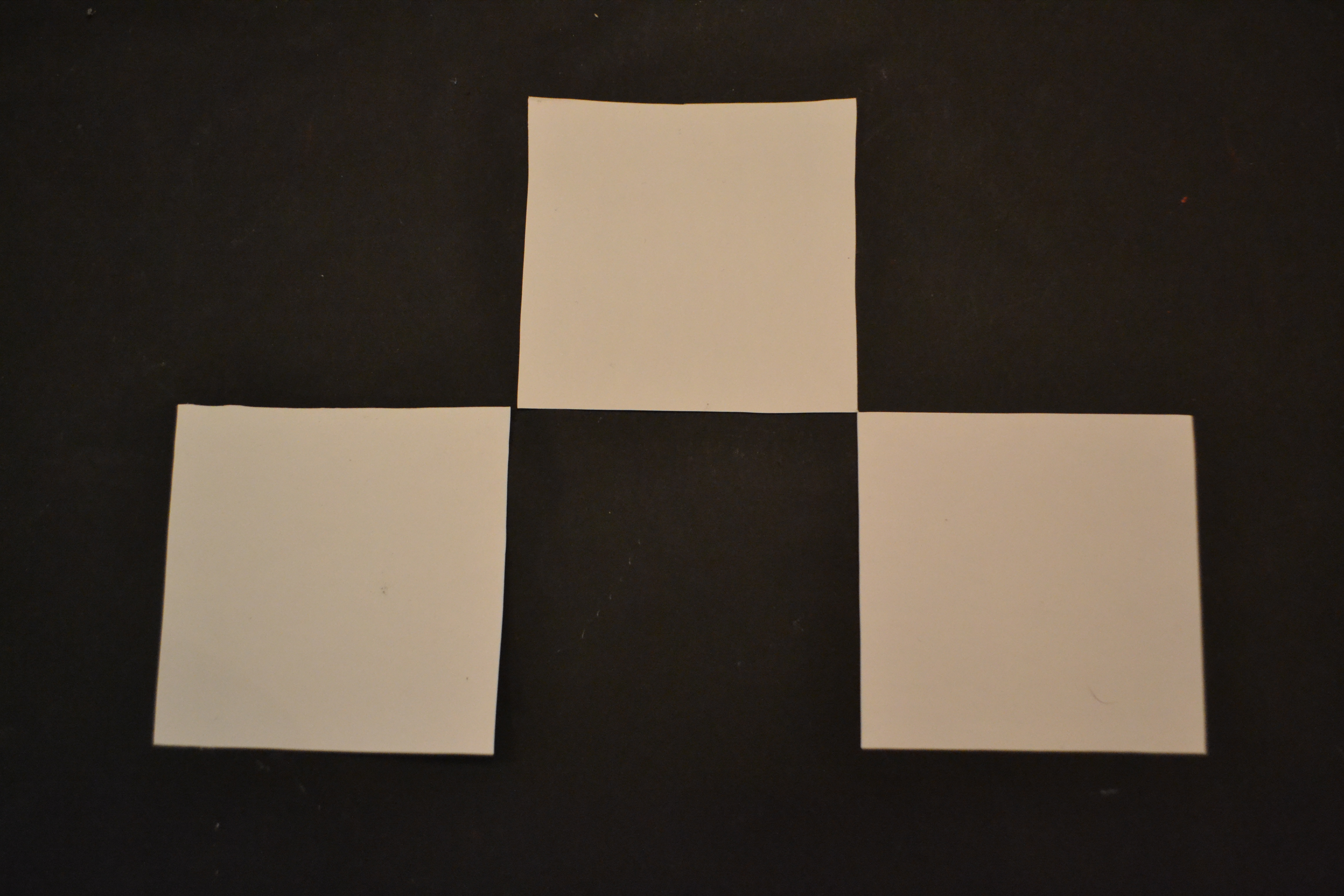
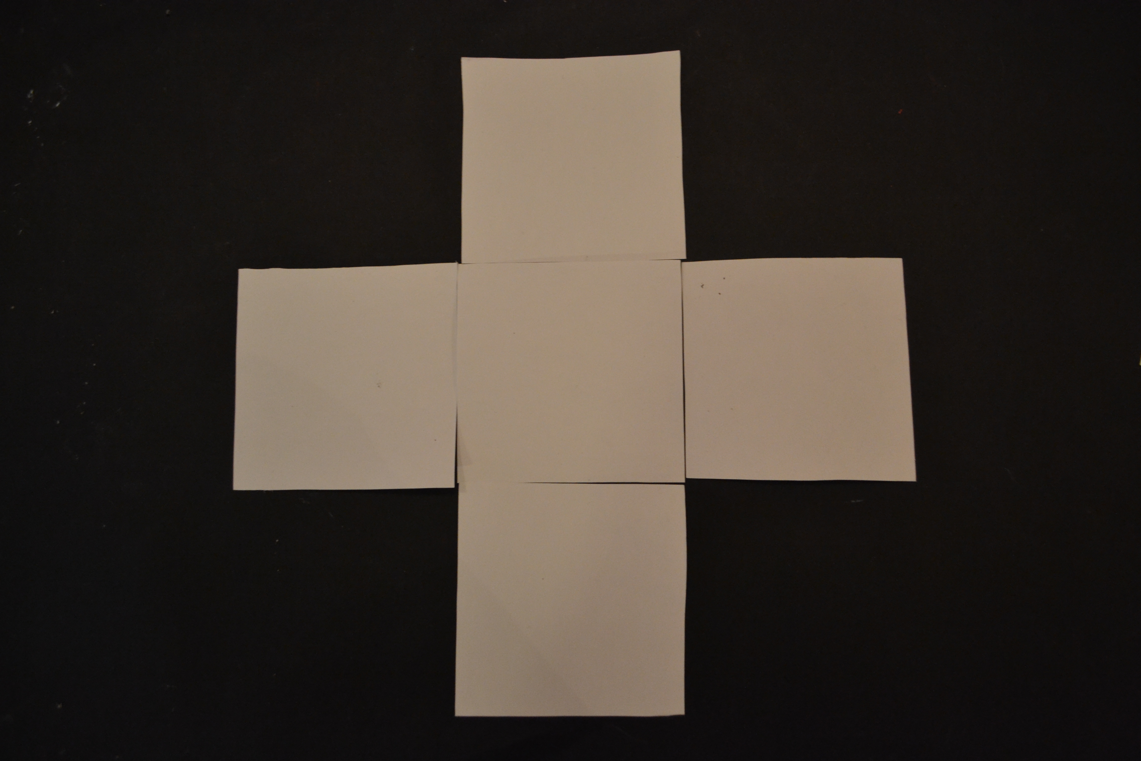
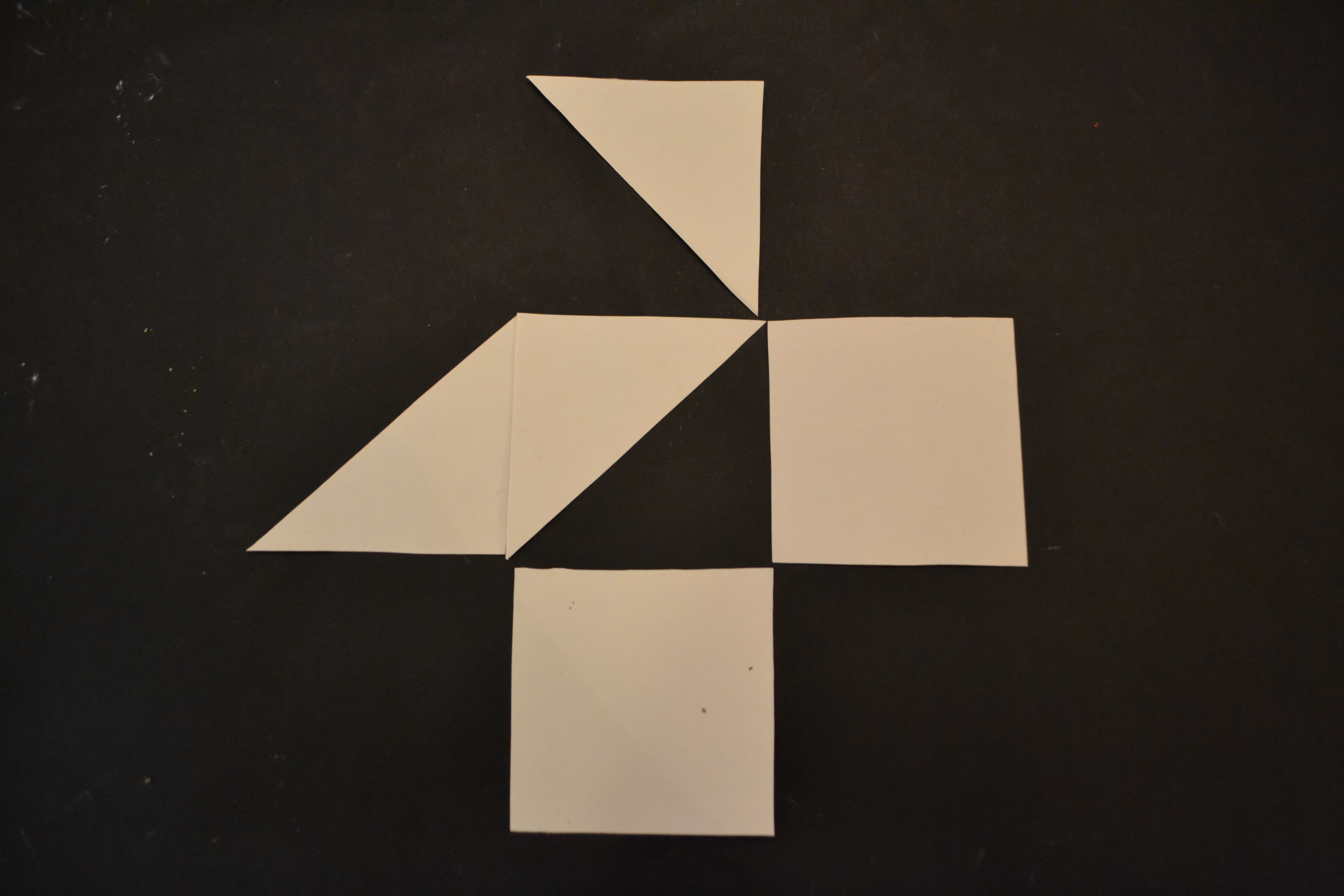
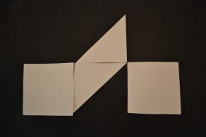
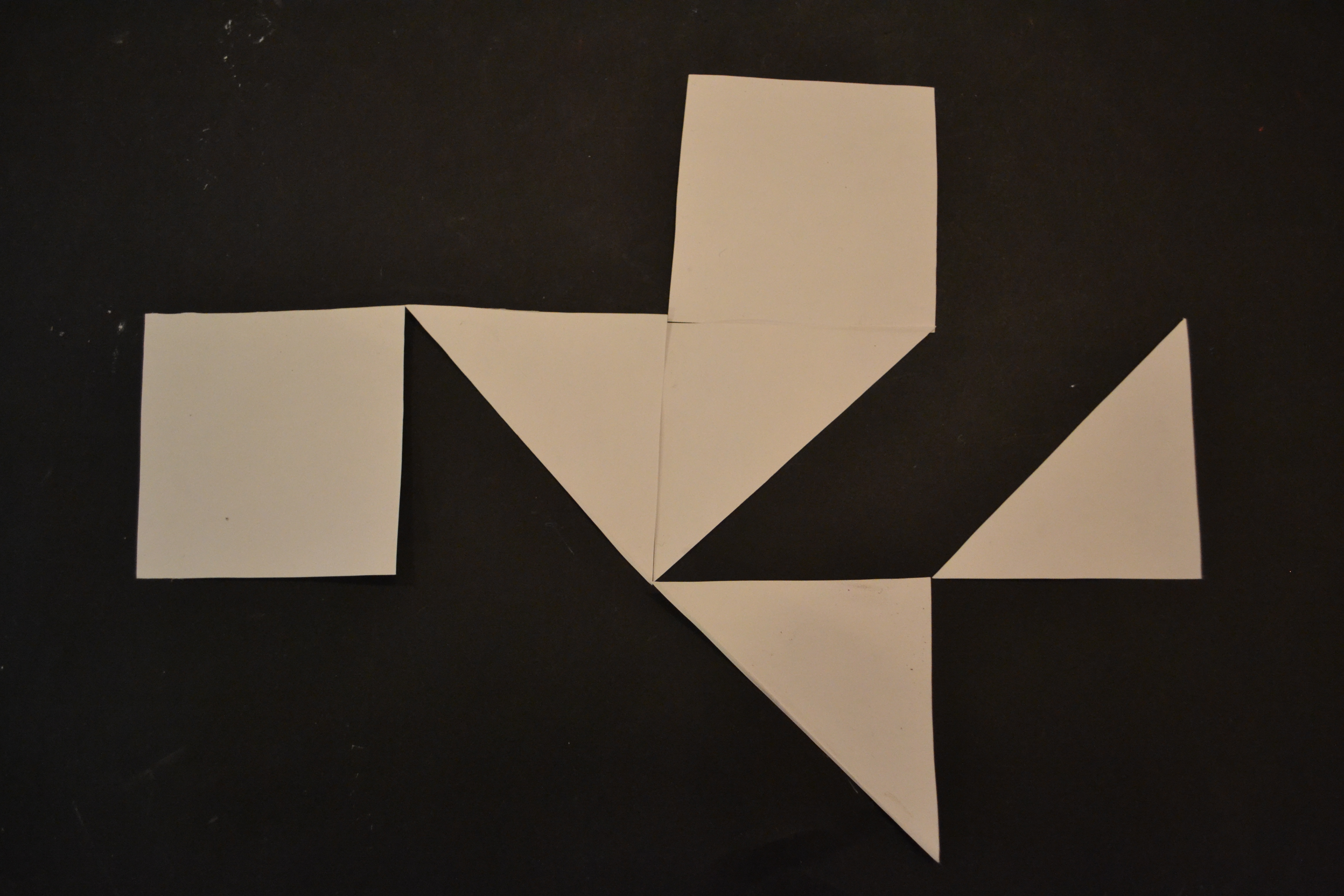
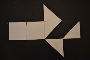
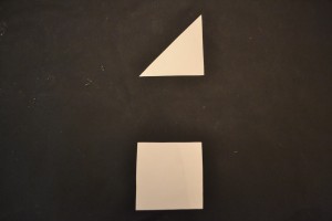
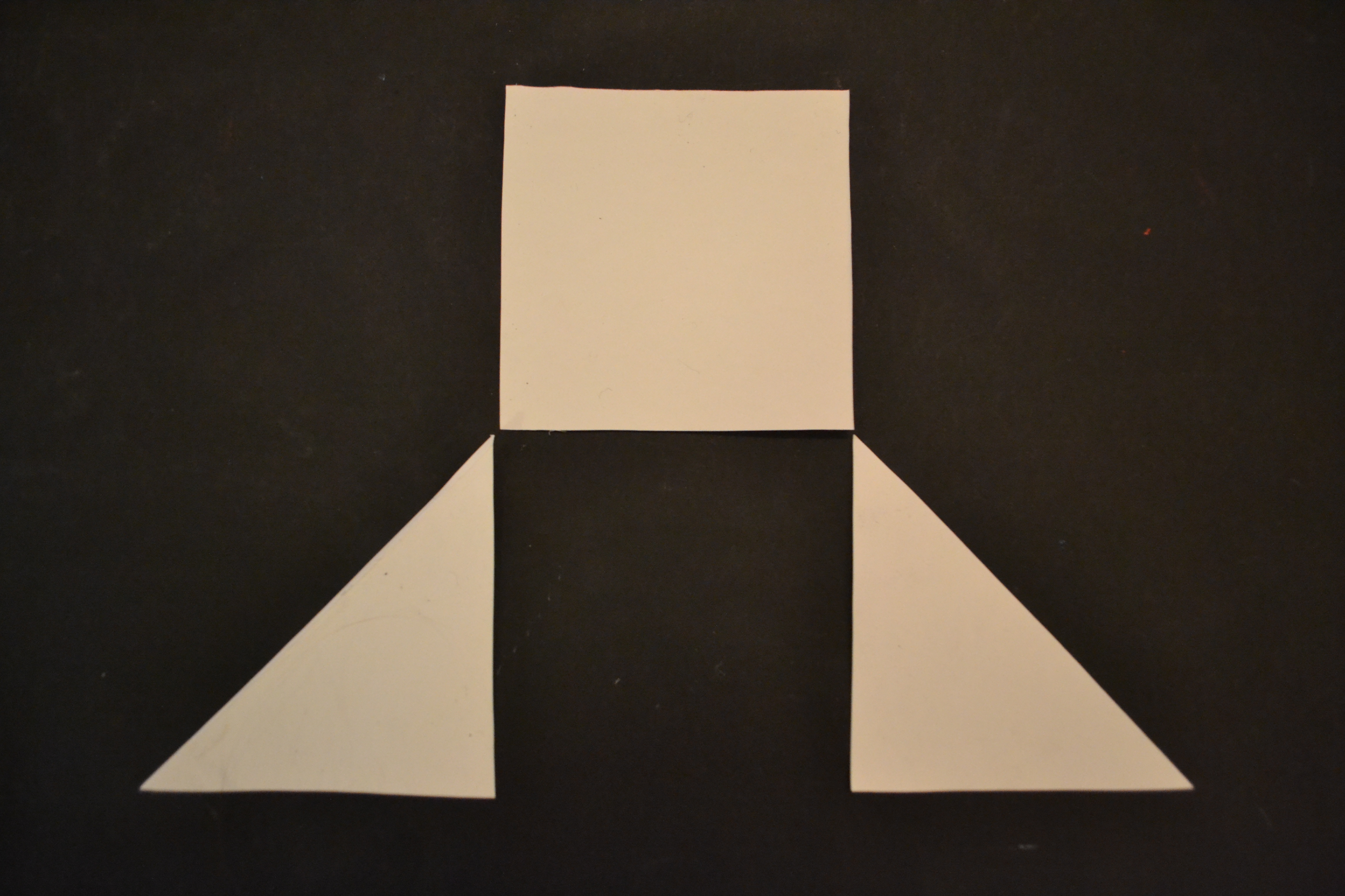
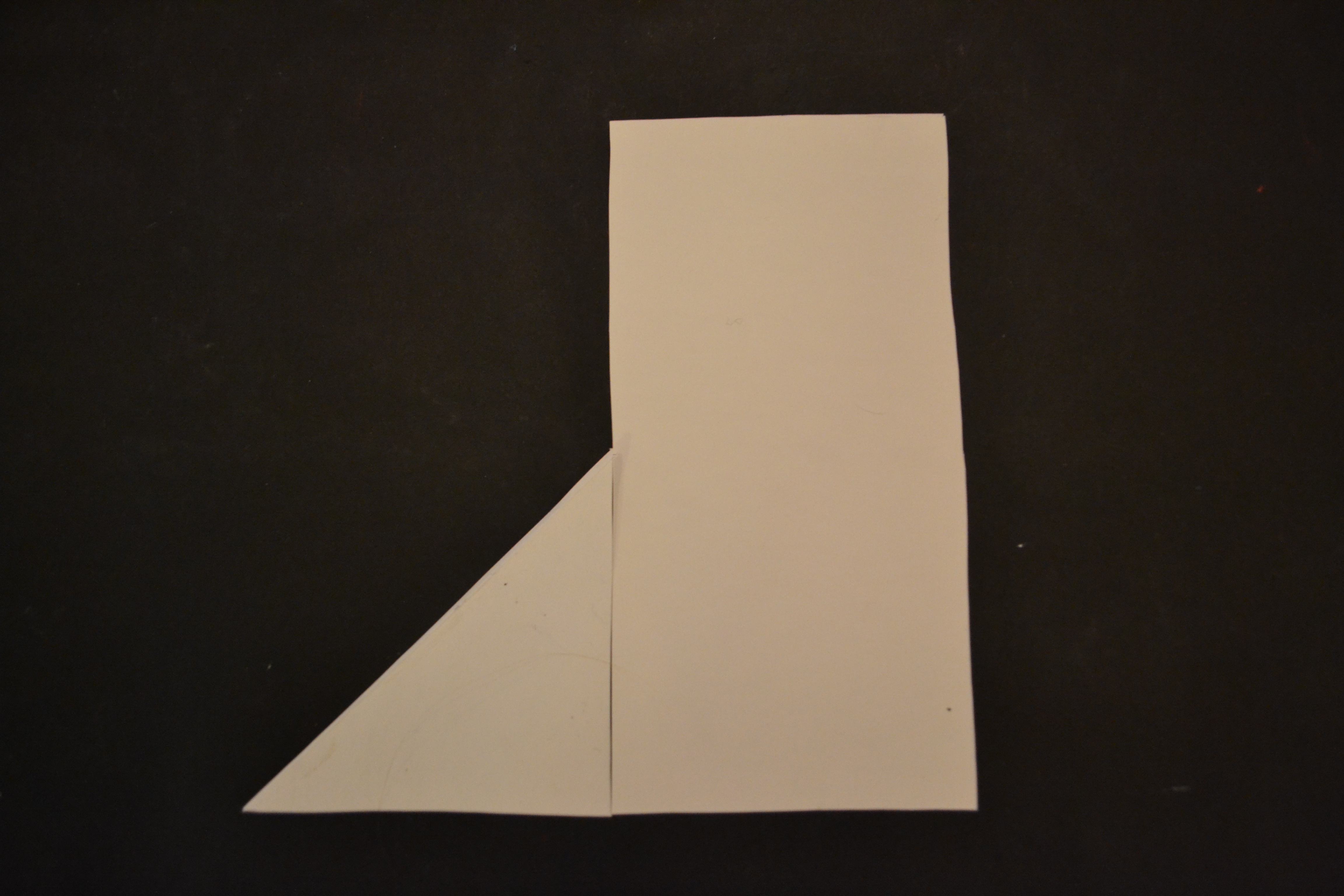
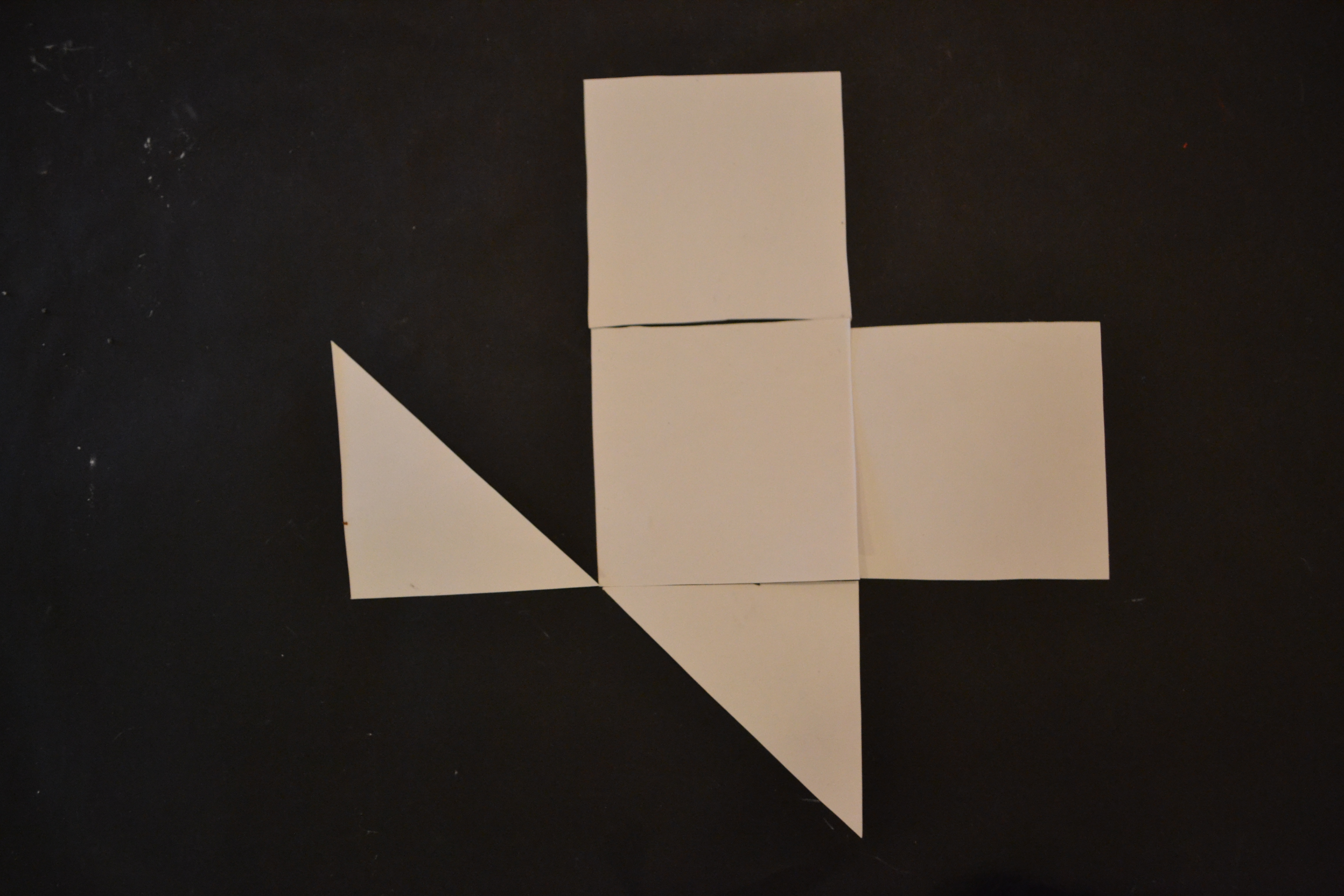
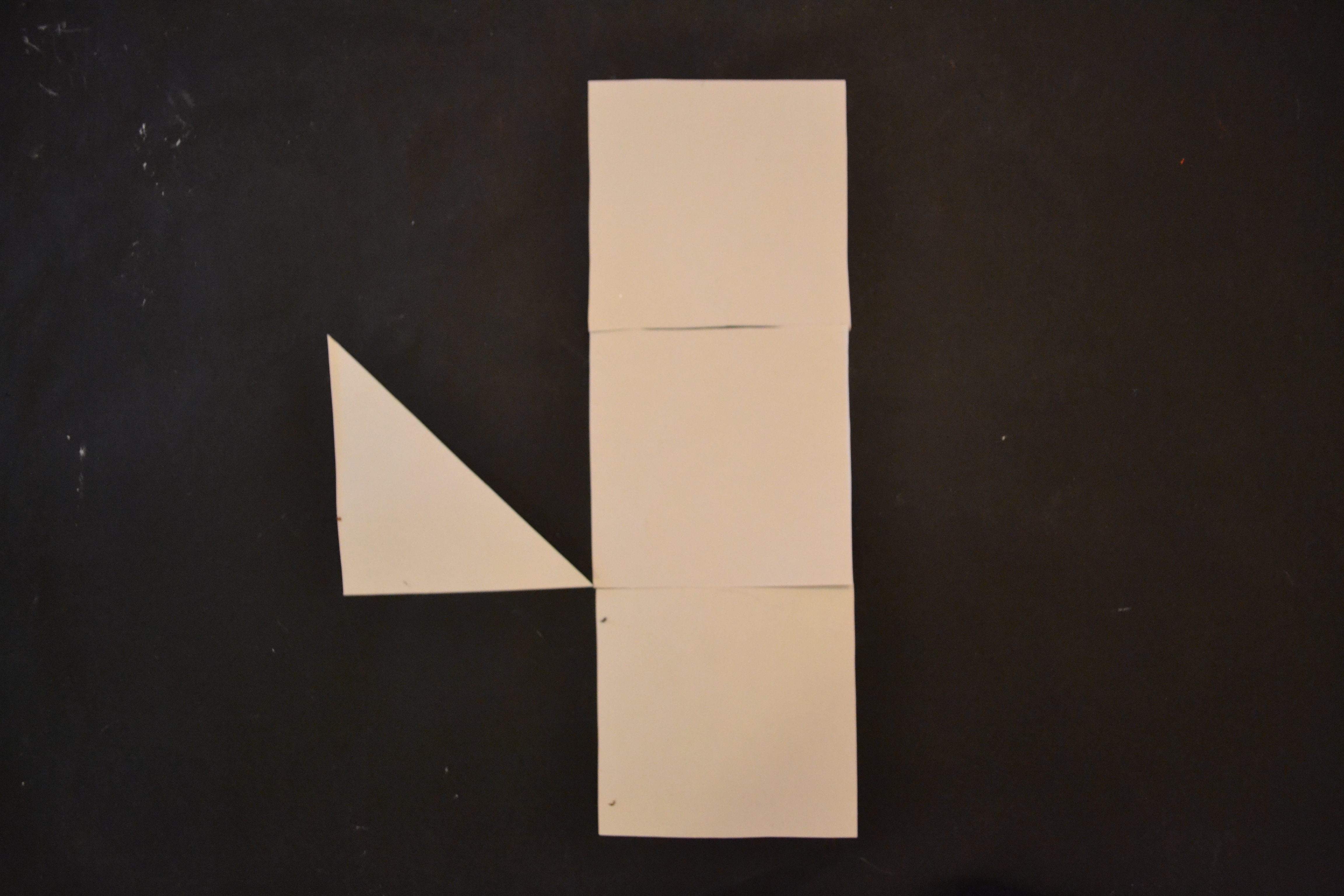
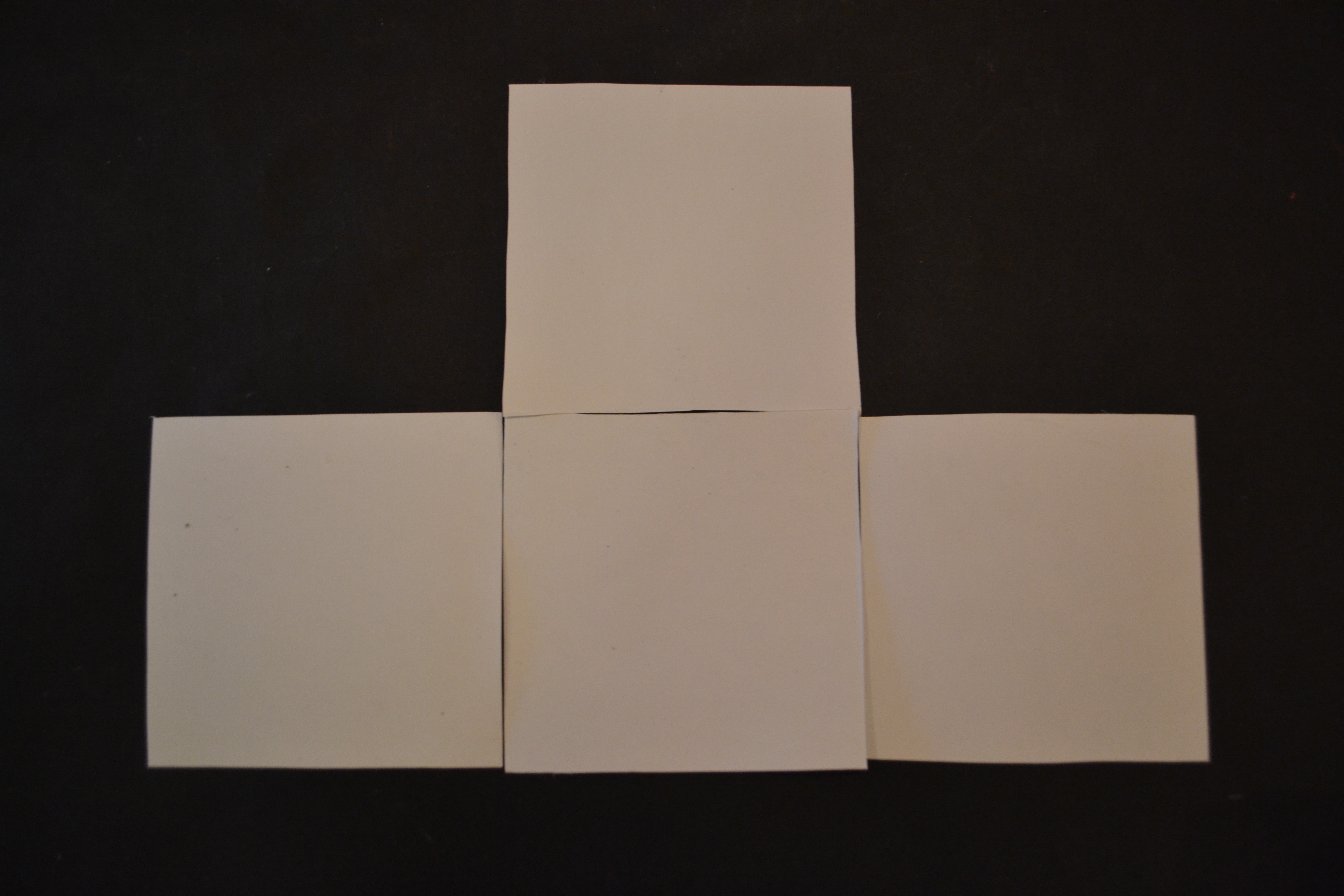
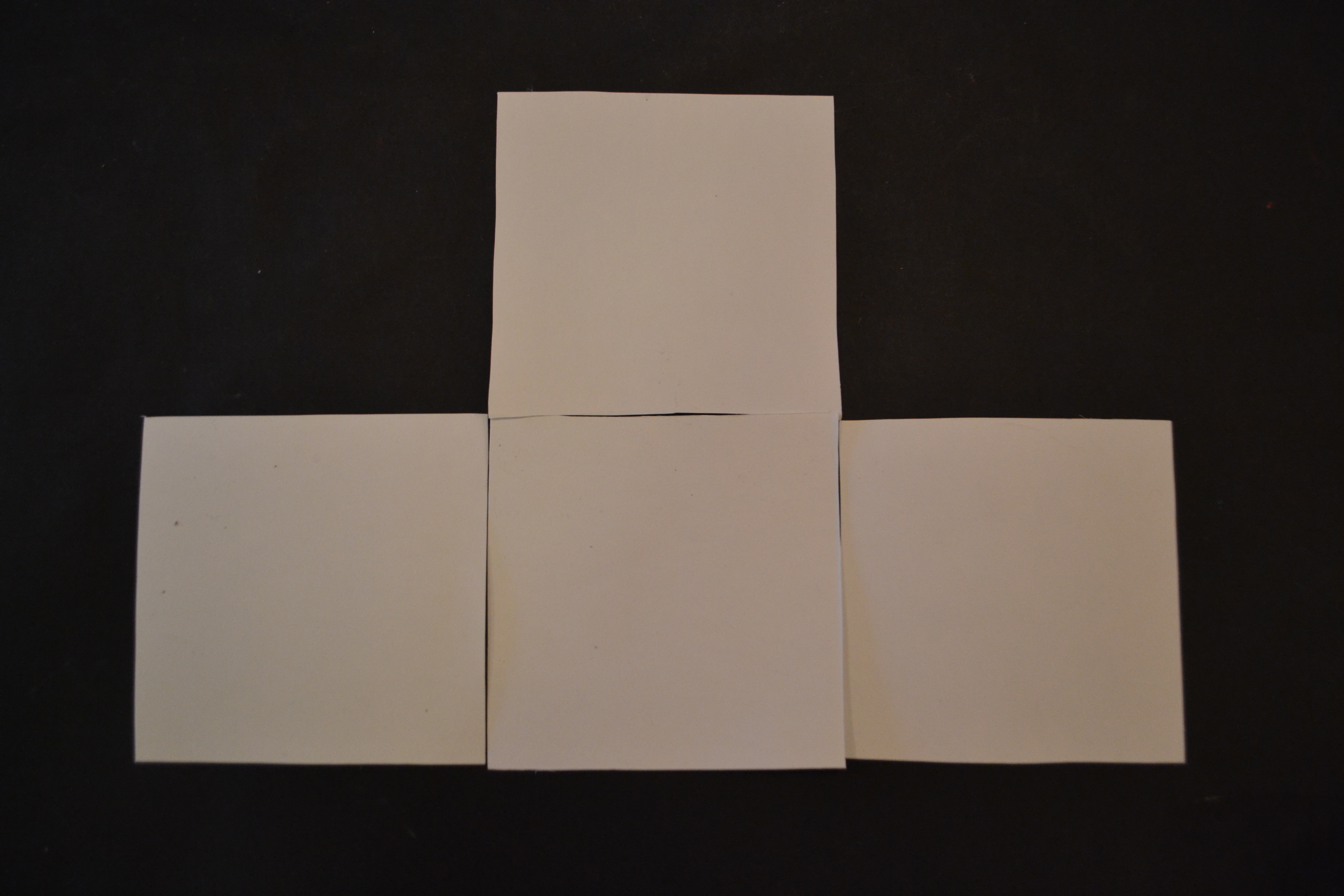
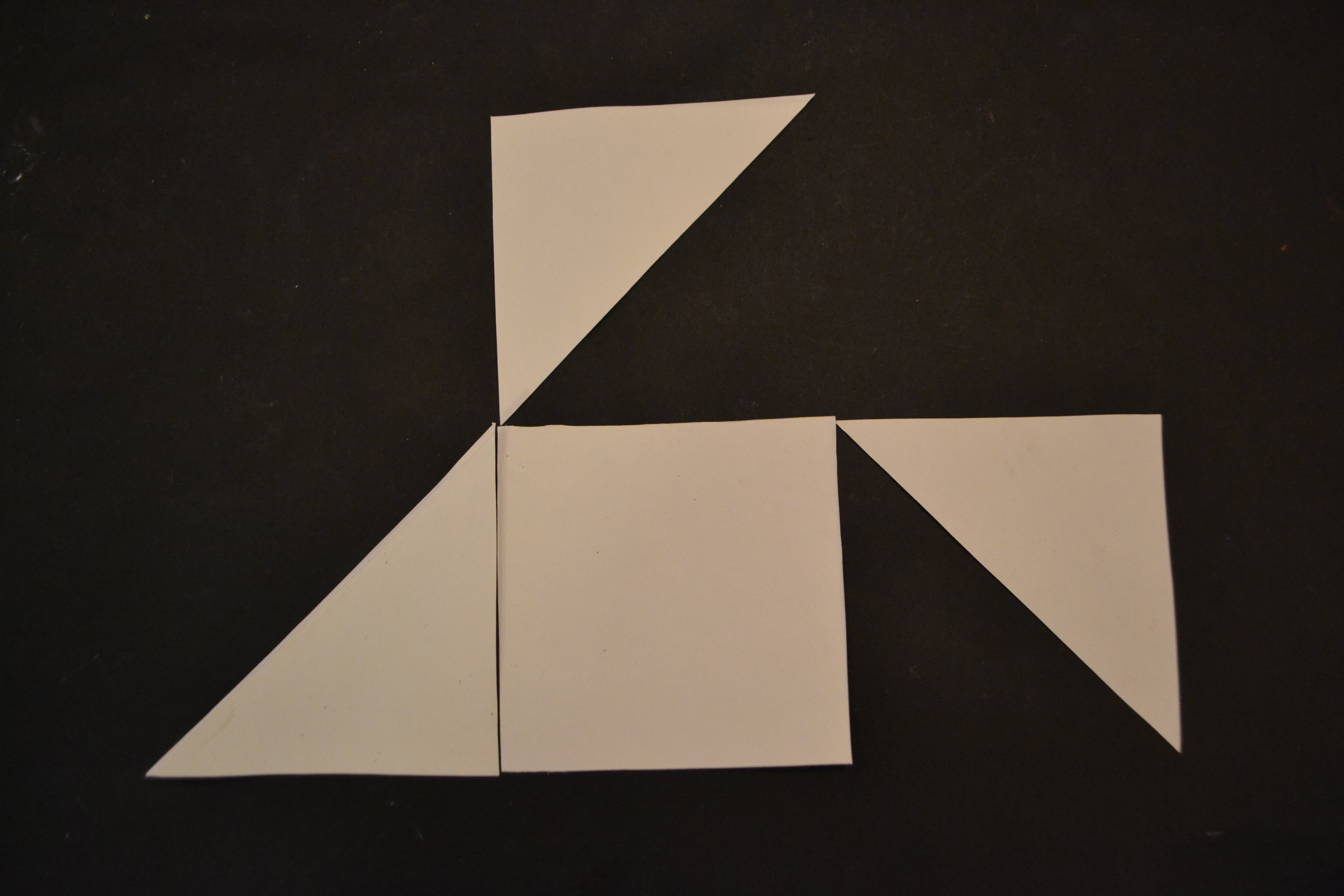
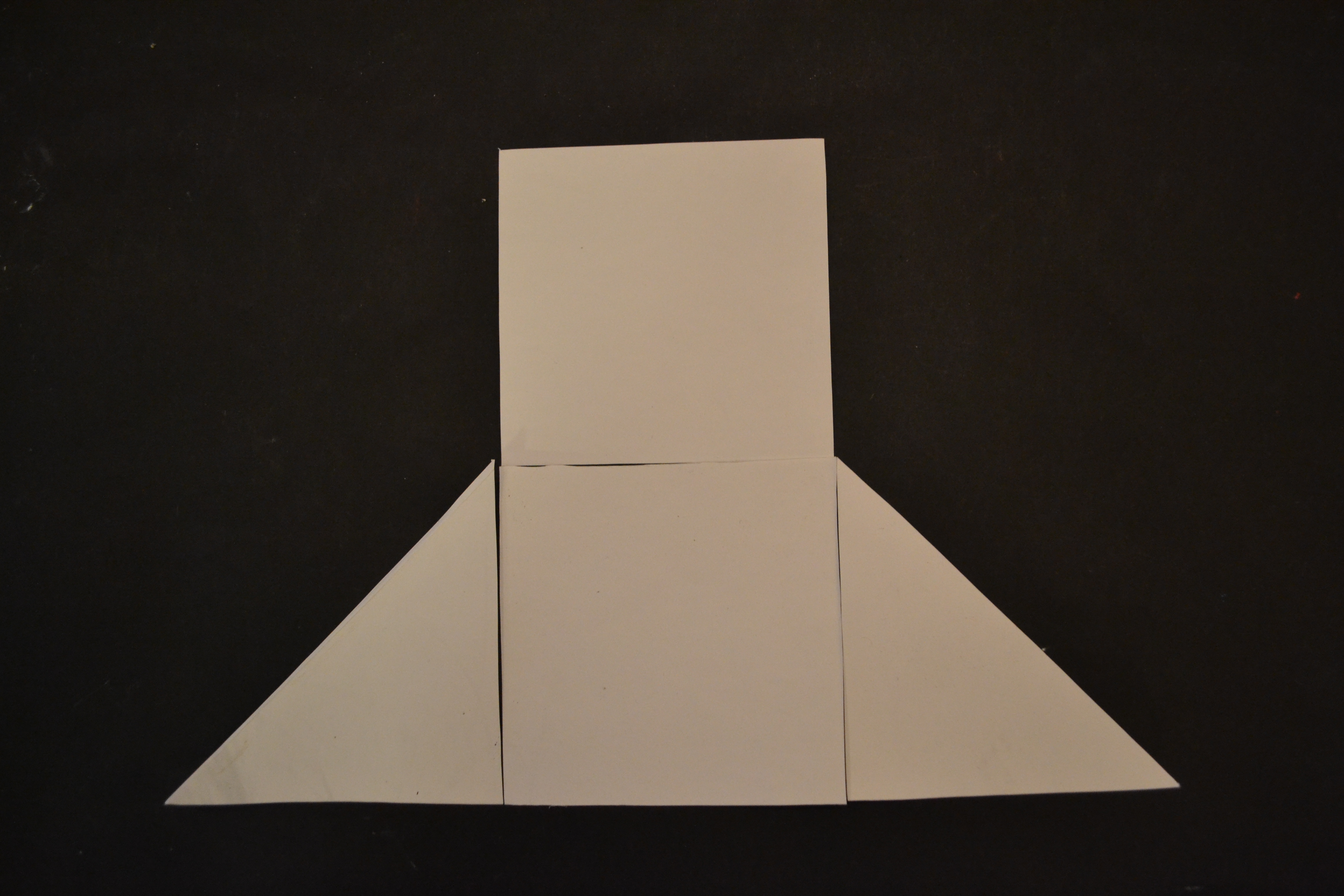
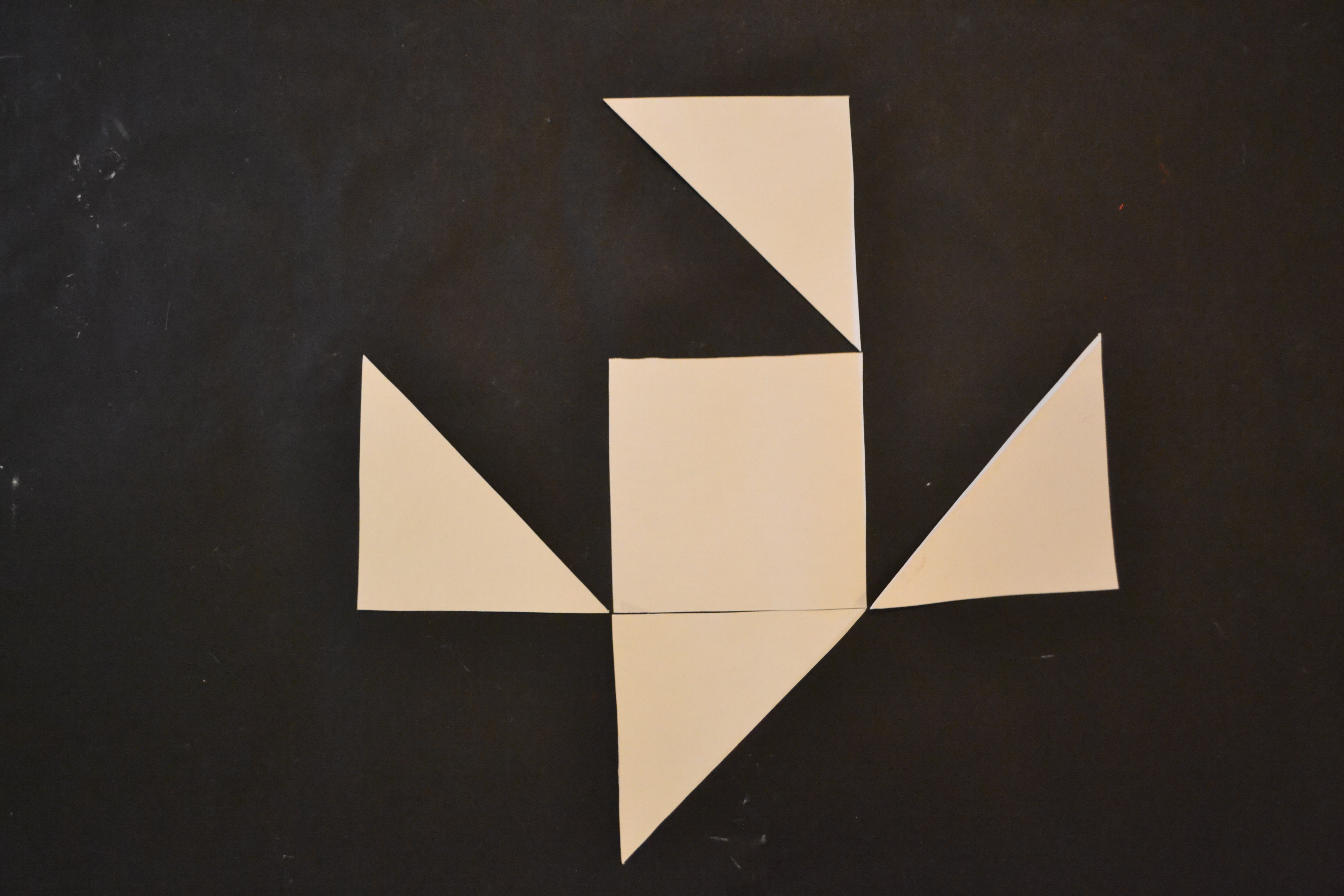
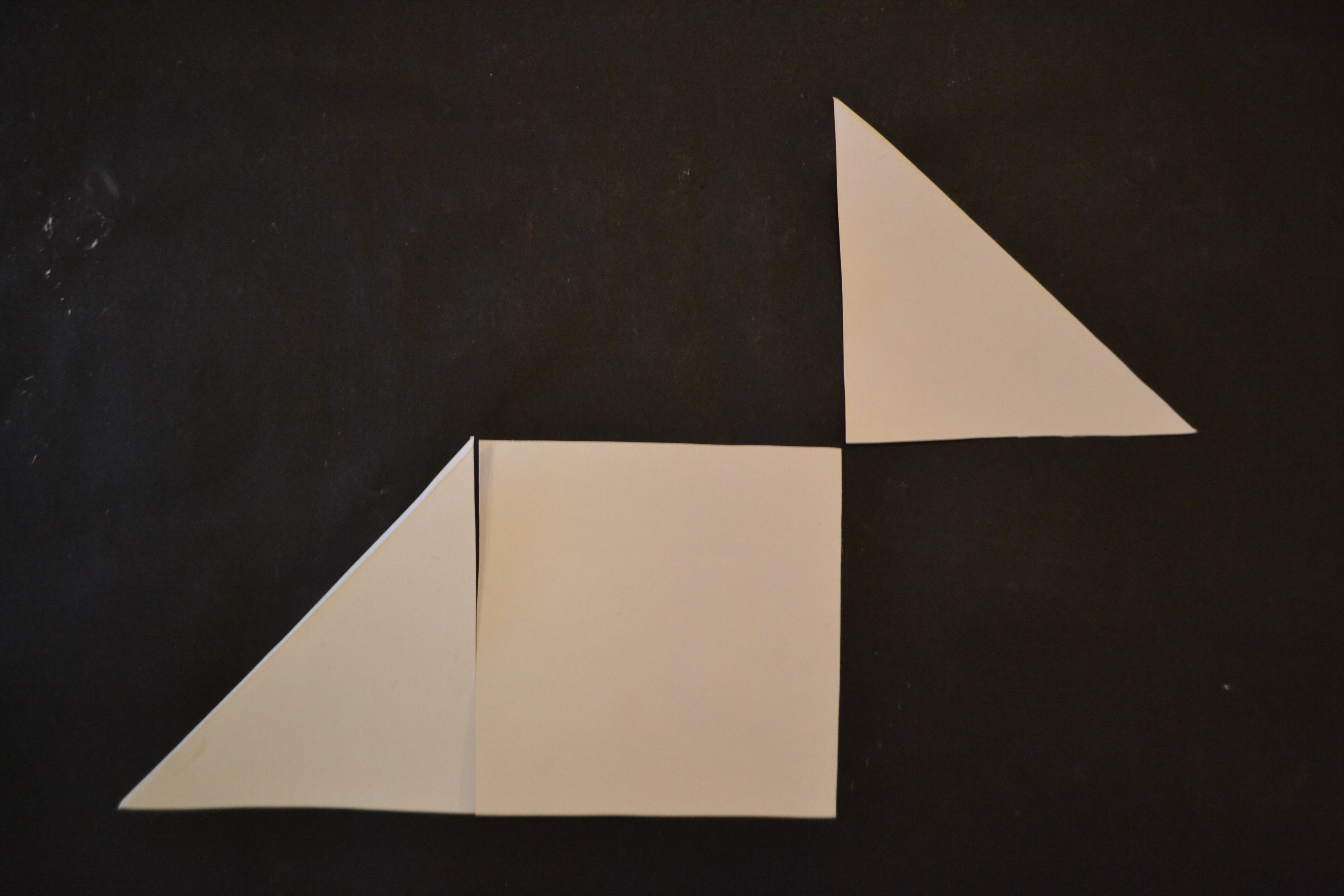
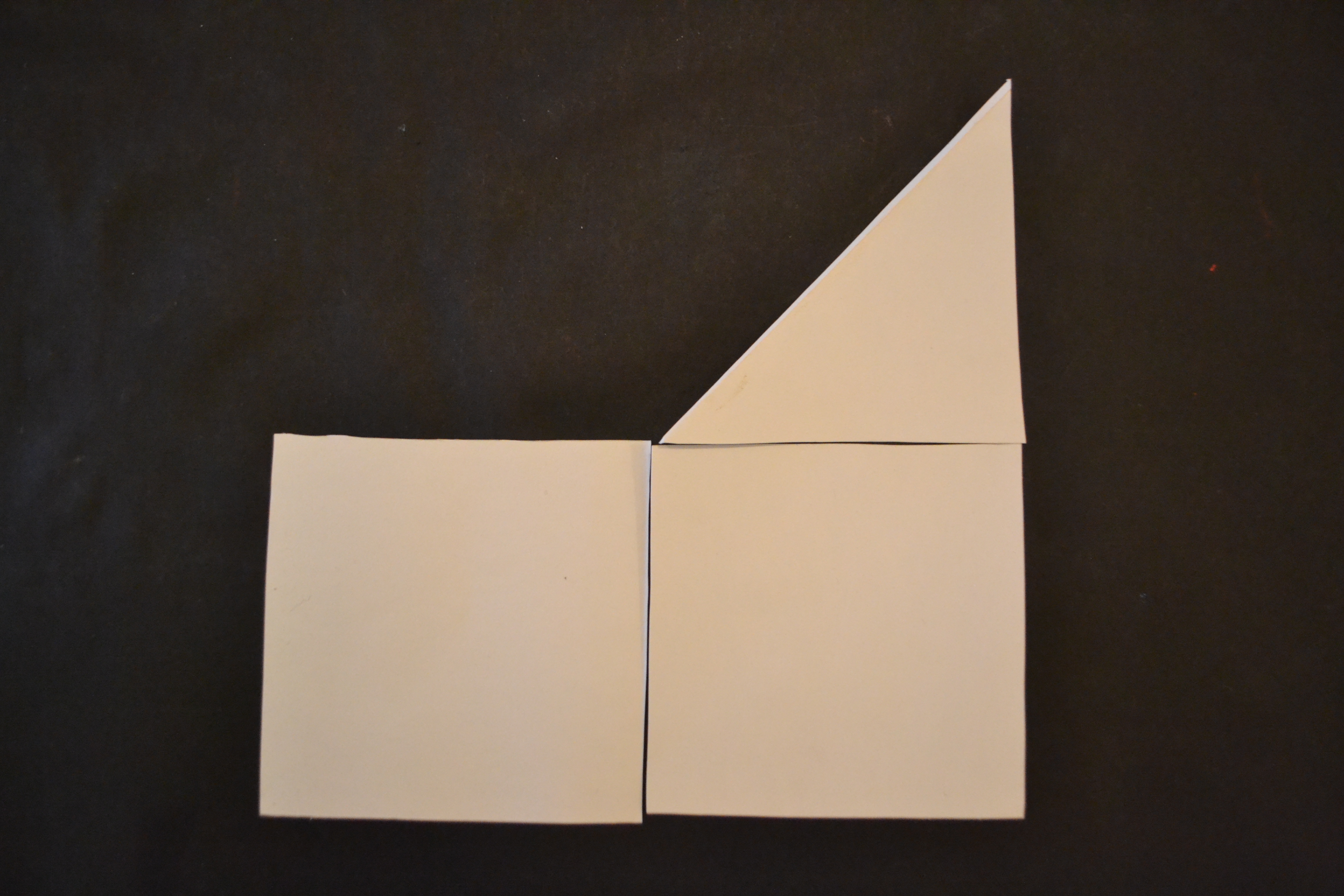
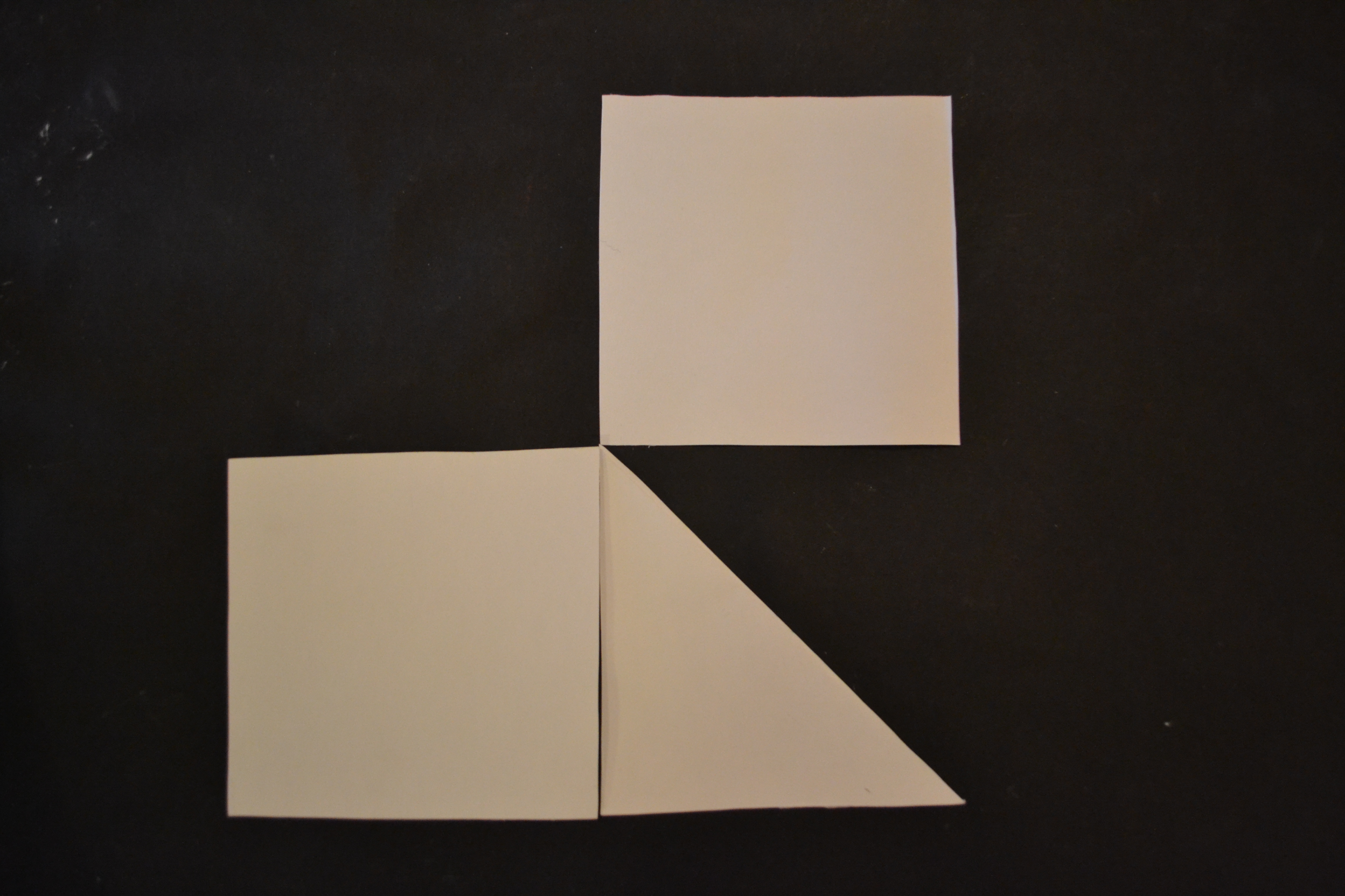
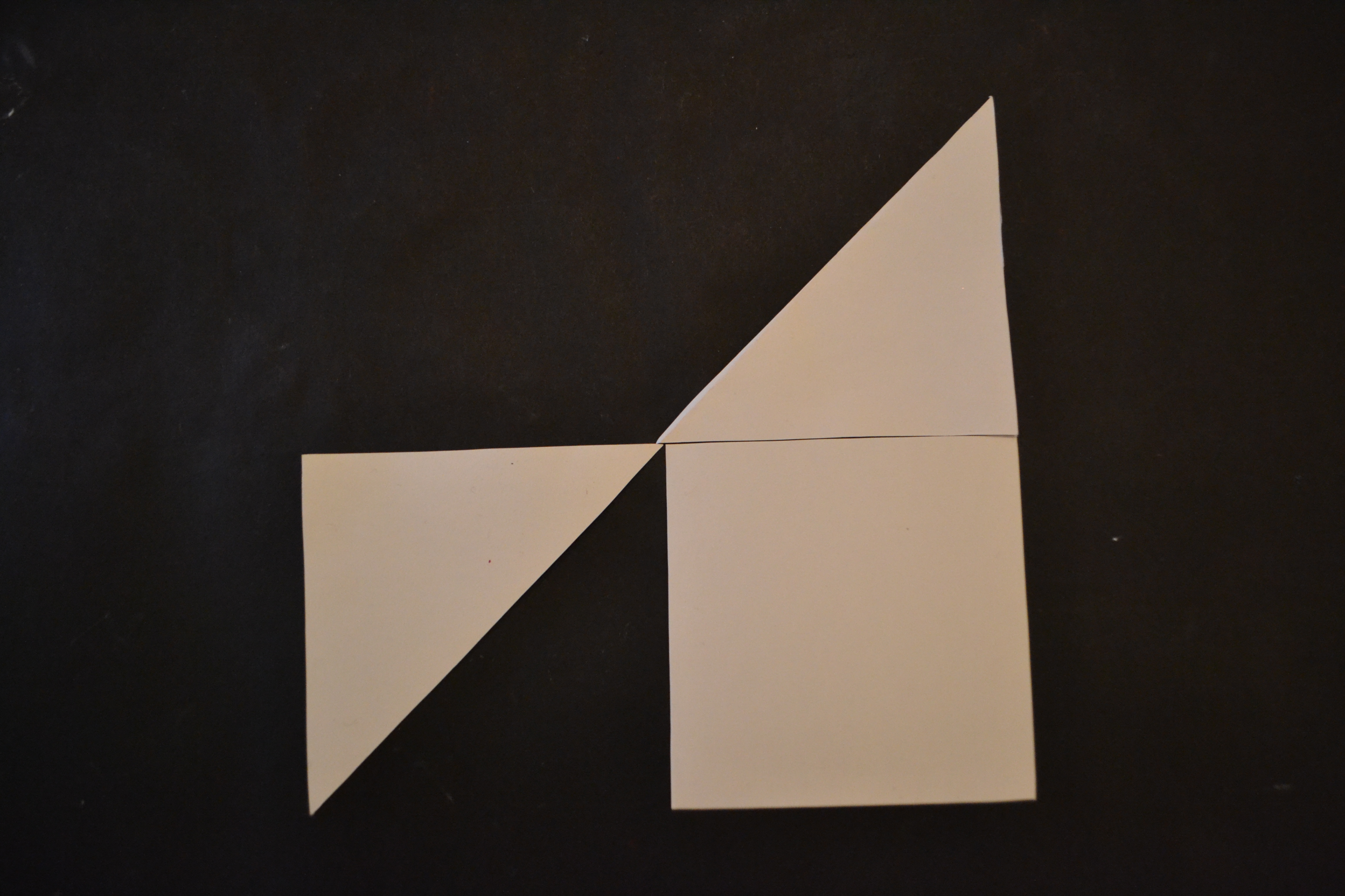
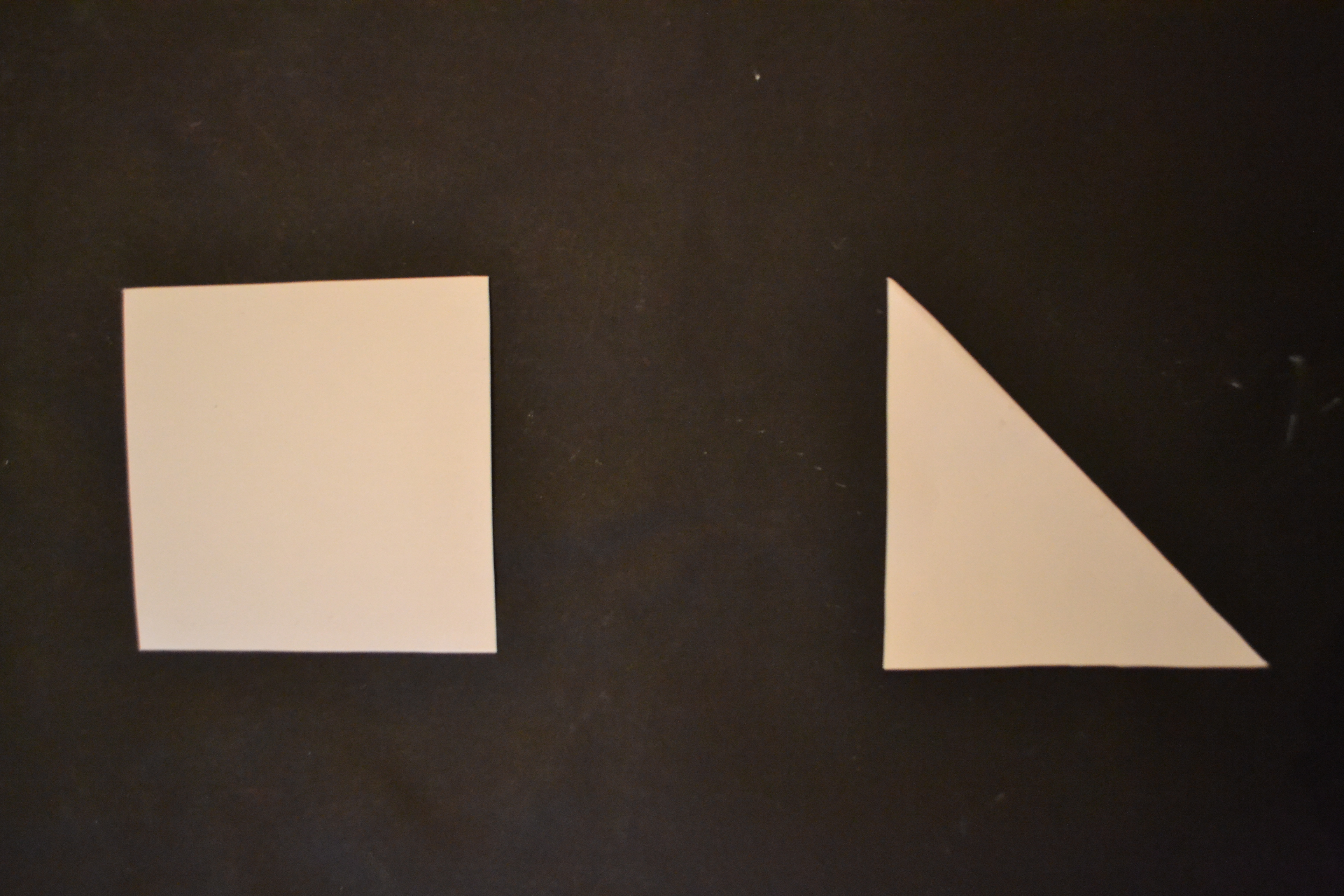
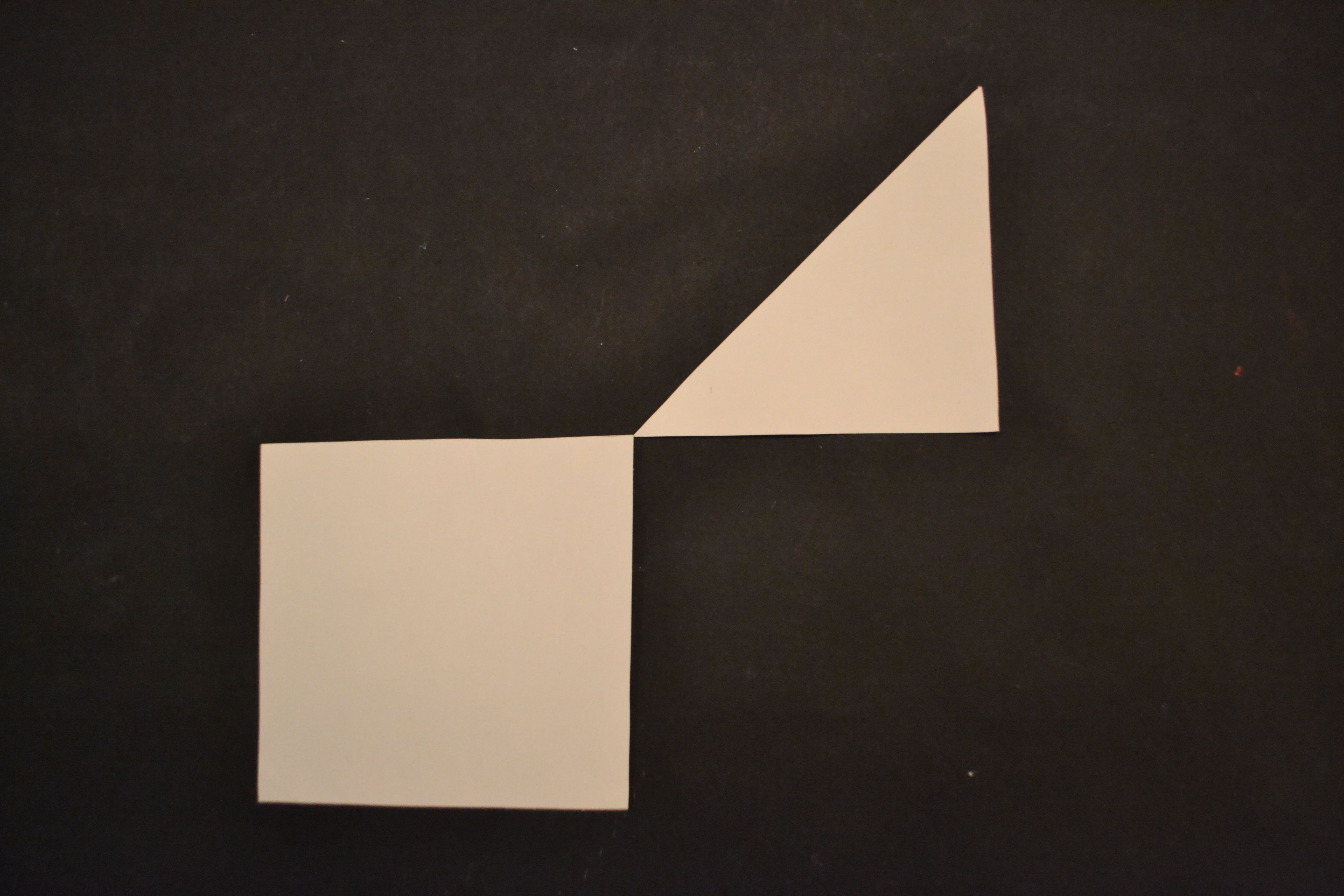
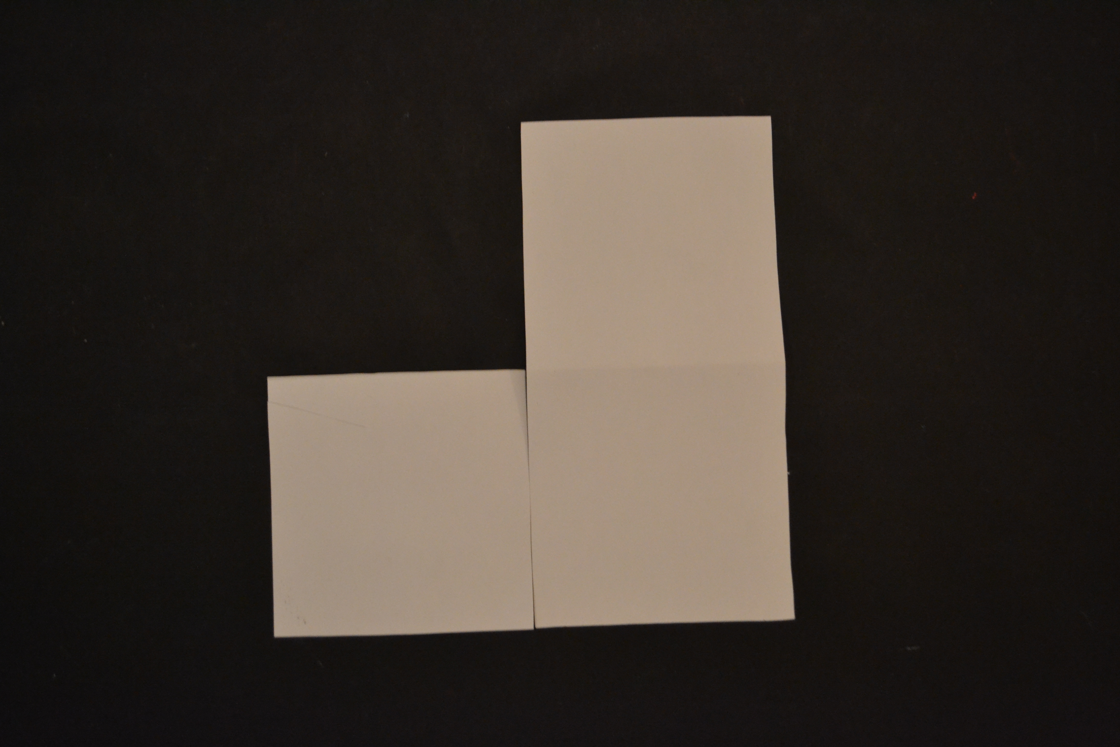
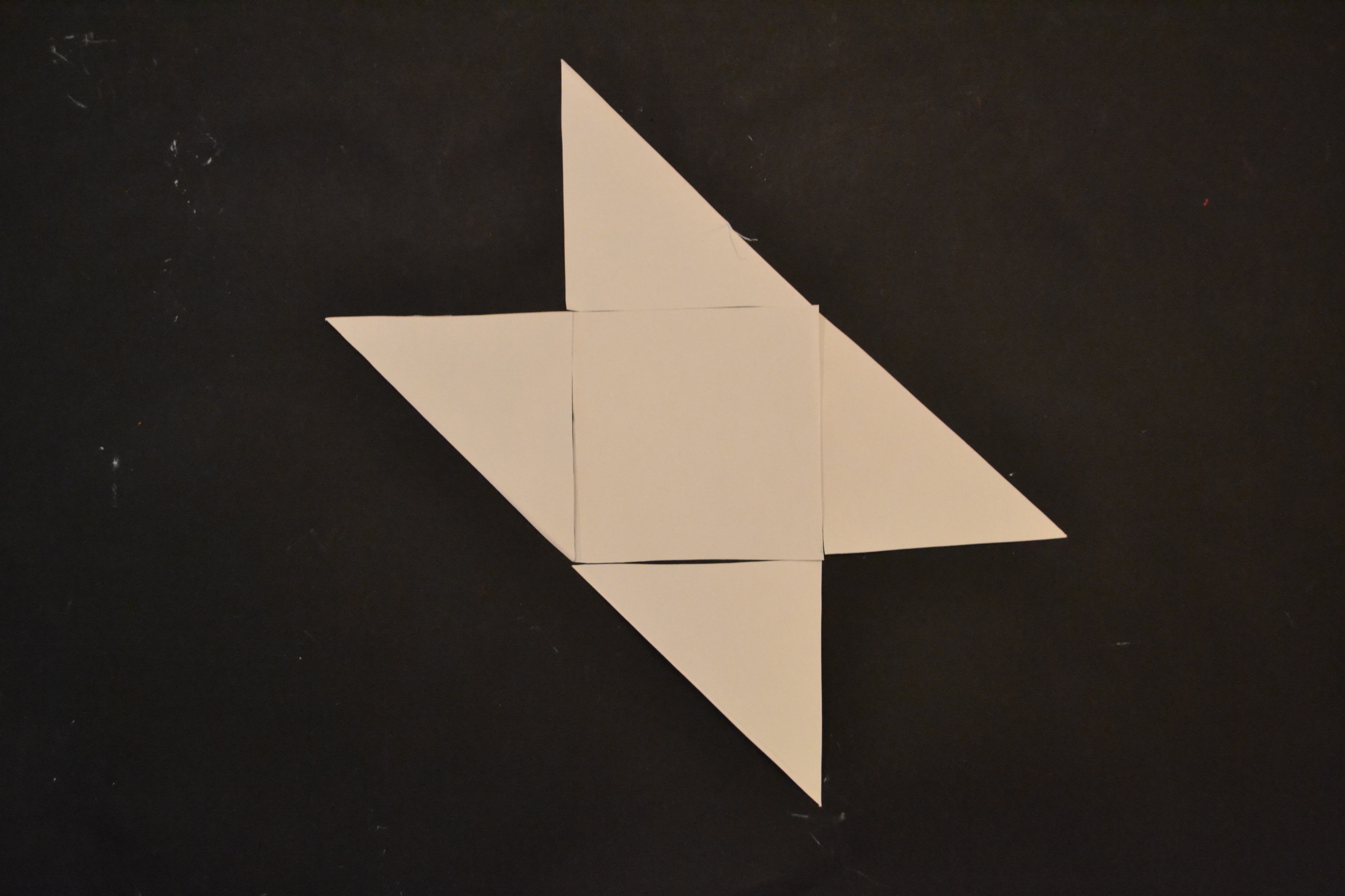
With a speech by Simon den Hartog, former director of The Gerrit Rietveld Academie, a small retrospect exhibit on the work of Jan Slothouber was openened at the “van Abbemuseum” in Eindhoven NL. An intimate group of affectionado’s and family bridged the gap of almost 50 years, when Jan Slothouber together with Willem Graatsma started his fascinating journey into the world of the cube. The Centre of Cubic Constructions represented a highlight in this extraordinary focussed research, culminating in the 1970 representation at the Venice Biennale.
Seemlessly scanning the architectoral space occupied by art and design, the exhibit –designed by Erik Slothouber and curated by Diana Franssen– clearly presented an extraordinary focussed spectrum of work


Some weeks later we revisitted this exhibit with a student research team of the FoundationYears C group. Exploring the cubic constructions we found direct relations between the work of Slothouber and the minimal art of Sol LeWitt. The choice for a simple universal and modular form makes it posible to built a grammar for an entire body of work in which all the steps in the process can become interesting in their own right. “in which even the concept can become as interesting as the final product” (Sol Lewitt, cat Sonsbeek 71).
The specific context of typedesign addressed in our workshop presented striking relation between their works and those of more contemporary designers like Radim Pesko and the Swiss designers Dimitri Bruni & Manuel Krebs of Norm


More research was conducted to explore related content or workapproach of other designers like, Bram de Does, Karl Nawrot, Na Kim (website) and Ji Lee.
This was part I of the C_group research.
All researches linked in this posting can be downloaded in A4 format and are also available as hard copy research prints at the ResearchFolders available at the academy library
By Henk Groenendijk
/ Categories: architecture, art, exhibitions, graphic design, product design, type design Tags: Bram de Does, cubic, Jan Slothouber, Ji Lee, Kaba, Karl Nawrot, Na Kim, Norm, Radim Pesko, Sol LeWitt
No Comments