Skip to Content Skip to Search Go to Top Navigation Go to Side Menu


"lecture" Category


Ecosophical Roadmap


Friday, August 30, 2013

intro

Haeckel_Orchidae

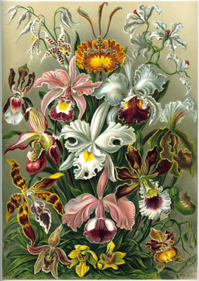
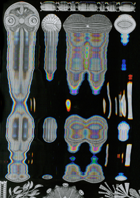
“The drawings in Kunstformen Der Natur express Haeckel’s fascination and devotion to the study of nature. Haeckel himself described his fascination for the world he was investigating, mostly referring to his main discovery, the Radiolarius [x], a single cell organism discovered in the depth of the ocean.
“It’s hard to believe that these creatures are single cells, some are like grids, broken nets or stems, others like tiny balls, helmets or bells when others appear to us like tender houses, windmills, fantastic towers.”

These words reflect on how much the artistic impulse of Haeckel seemed to have taken over his wish to be perfectly accurate and neutral as a scientist. His drawings are projections of real observations but they are as much projections of the inner interpretation of the artist’s vision of reality. Kunstformen der Natur was a way for him to unite these two projections in a single work. He by doing so “began to see not only the outer forms but also the inner content, the nature and the history of things”. He’s been trying to see nature as a “single unfolded work of art” by trying to understand the sequences allowing the Radiolarius to be present in such a multitude of forms. By doing so he achieved an astonishing body of work that can be seen as a suspended moment in time, a witness of this wish to leave space enough for observations and fantasy in a single picture. Following Goethe’s attempt to present nature in its diversity and trying to find unity in it at the same time, Ernst Haeckel created hybrid specimens that reflected on his subjective way to create the marvelous and the poetic in order to try to decode the genesis and the evolutionary systems of nature. That lead him to coin the word “ecology” itself.”

Excerpt from “The Curious, the Marvelous and the Particular”
(thesis by Rudy Guedj can be downloaded as pdf at the end of the article)
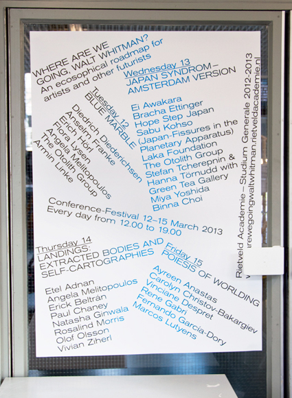
 

roadmap

By exploring the potentialities of ecological worldviews, old and new, through theory and art, WHERE ARE WE GOING, WALT WHITMAN? seeked, to accelerate, accumulate, animate and activate our poetical and political understanding of the world. (Introduction of the Studium Generale 2012-2013 “Where are we going, Walt Whitman? An ecosophical roadmap for artists and other futurists”)

The visual campaign for the Studium Generale — designed in collaboration with Sophie Rogg, Olya Troitskaya and Martin Huger –all graduates from the Graphic Design department in 2013— revealed itself progressively. It was trying to both map knowledge acquired during the past lectures, and project on a fictional level thanks to a visual pollution which was growing exponentially on all the mediums we used.

billboard1

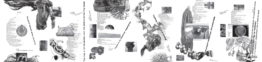
The first layer of the campaign, the map, was created before the Conference-Festival as a simple topology arranging references into a single spacial representation. Day after day, the basic map, as all the different supports we used to communicate with, was taken over by a visual infection.

DSC_0030

The creation of each of the collages has been realized as a reaction to the existing publication Kunstformen der Natur (Ernst Haeckel, 1899-1904). These bold interventions on top of the existing drawings shaped a fictional journey throughout the campaign and provided endless interpretations of the very broad topic of ecology today.

Collage_Orchidae calabi-yau-2 poster_3 Haeckel_Kunstformen_Page_065_2
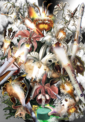
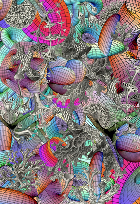
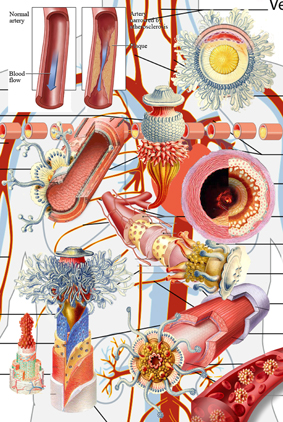
< illustrations Rudy Guedj, Sophie Rogg, Olya Troitskaya and Martin Huger >

“A welcome pendant to the overload of terms and theory is the online Ecosophical Roadmap: an ongoing encyclopedic exercise accumulating (visual) footage that inspired the speakers. (Ecosophical Roadmap) I dare say this experiment is the only contribution to the Studium Generale that practices what it preaches: it actually embodies our way of interacting with the material world, mediated through technology and immaterial digits.”
From : Metropolis M (online reviews)

DSC_0110 DSC_0127
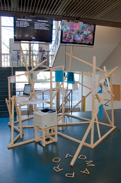
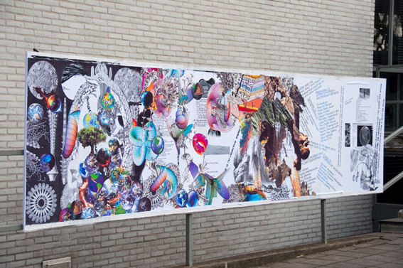
< Studium Generale poster, physical translation Roadmap >

The online roadmap was a way for us to respond to the immediate and ephemeral format of the lecture by gathering notes and other references mentioned during the discussions. It functions today as a remaining archive, an attempt to visualize the many connections that were progressively built up and to emphasize on the important role that plays serendipity in our daily use of technological medias.

text by Rudy Guedj [graduate student department of Graphic Design]

thesis


Pdf-icon Download my thesis: ”The Curious, the Marvelous and the Particular“


8.000 slides; Gray Magazine #5


Thursday, September 1, 2011

In 1977, the office of Charles and Ray Eames made a short film
depicting the relative scale of the Universe in factors of ten.
The film begins with an aerial image of a man lying on a blanket; the
view is that of 1m2, then slowly zooming out to a view of 10m2,
revealing a man and woman enjoying a picnic in the park. The zoom-out
continues at a rate of one power of ten every
10 seconds, ending with a field of view of 10m24, or the size of the
observable universe. The camera then zooms back in
at a rate of a power of ten every two seconds to the picnic, and then
slows back down to its original rate into the man’s hand,
to views of negative powers of ten—10m—1, and so forth—until the
camera comes to a proton in a carbon atom at 10m—16.

The analogy of cropping to and fro in the film suggests both an
interpretative view of an archive and an insight into provenance,
panning back to view it as continuously evolving means.

Slides function as a tool for teaching and this magazine presents
itself as a series of translated lectures by eight teachers from
various fields of study within the Gerrit Rietveld Academie. 8000 of
these slides were digitally scanned and structured as originally on
the shelves, then printed collated and dispersed to the teachers as
contact sheets.

On 8th April 2009, the new interpretations were presented and
recorded. After transcribing, the lectures have been edited into a
printed report of the day.

  download Gray Magazine # 5 [this is a 44 MB document] :
For more information on this and other lecture projects based on the same archive, read Gray Magazine #5. Get your own hard copy from the Library

.

Color and sex


Friday, May 13, 2011

A lecture by Linda van Deursen.
A lecture about De Stijl still being relevant in contemporary graphic design

For me the most fascinating part of the lecture was when Linda van Deursen showed that De Stijl is still present within the Gerrit Rietveld Academie. “Everything you do inside or around the school is in dialog with the school”
She talked about the building designed by Gerrit Rietveld himself: a simple glass box put over a concrete structure. She also talked about how he chose grey as the most neutral color for the background of the space we work in.  According to Rietveld; “students works will give color to the school”.
For outside the working space he did put some color; the primary colors. The floors yellow blue and red, the toilet doors yellow.
I believe that in the beginning there where no male or female tags on the toilet, just the yellow color. I don’t think he would put something that sexist in this concept.
The floor used to be from a less strong material, making it prohibited to wear heels inside the school.  This was changed later, so you could wear heels in school.

She made me look at this subject in a certain way. Rietveld his primary colors are very open to different possibilities: when you mix the colors, you can make any color you want. This made me think of an opposite way we use colors;
the colors in the routes our two different sexes

It starts before we are even born, the moment your sex is discovered.
Blue for boys, pink for girls.
I see these two routes where we split the things in our lives. For the boys we buy their first pluche football, something from the blue route.
And for the girls their first dress, something from the pink route.
The boys are raised playing competitive games with other boys.
The girls are raised picking out a new color for their dresses,
the first steps of these two very narrow routes in this not so open space.

By the time we are four we already get to see the end of the routes.
We see that we eventually all will get married and have children.
After you have learned this you will soon discover that there is absolutely no way for boys and girls to be on the same route.  The world is now split up in to separate sides.

There are of course people that are not able to fit in these routes.
They either go to the other side, to be a boyish girl on the blue side or a girly boy on the pink side or they have to figure out a new route. Since you were given only blue and pink you end up mixing and since pink and blue can only make one color you end up with the purple route.

Start with Rietvelds three colors and there won’t be dead ends like that.
If you don’t fit in your yellow, blue of red route you can mix it up in all directions.
This education could be seen as an alternative space where you won’t get stuck. You can get loose of your brought by view and look in a primary colored base way in a space where this is supported by your surroundings.

Linda van Deursen mentioned in her lecture that she could have made this lecture about anything  “I was trying to see if there were some links and there are”. For me there was the link between the blue and pink opposite to the red, yellow and blue.
You can write anything about this and maybe that is what it is about in the greater picture: you apply this institute on yourself.

This lecture was originally called "L’héritage De Stijl à la Gerrit Rietveld Academie d’Amsterdam" and developped within the program connected to the 'Centre Pompidou': Mondriaan /De Stijl

The Designer as Artist !?


Friday, January 14, 2011

“Designer as Artist is an article written by Louise Schouwenburg [x] for the art magazine “Metropolis M“. After reading this article it became a source for our research project investigating the position and role of designers and their relation to art. After visiting the exhibit Hella Jongerius “Misfit” held in the Boymans van Beuningen museum Rotterdam, we decided to invite the author (also writer of the Misfit catalog) for a discussion. This discussion focused on the new trend in design where more conceptual freedom emphasizes a new role for the designer. Students of The Rietveld Academy Foundation Year’s E_group research and opinionated this subject as you can read in their individual posted contributions on this Designblog

The article mentioned and the choice of this subject is not without reason. Last September 2010 the Sandberg Institute (Rietveld’s own Master program) appointed one of the Dutch leading designers Jurgen Bey as their new director. This internationally acclaimed designer takes an outspoken position in this debate. “We need contemplative visionars. The changing world asks for critical artists and designers who can work together and make themselves subordinate to a greater cause”, say’s Bey

Looking out of the window of our class room we see his office at the Sandberg Institute an opportunity we could not let go. Time to get acquainted. We invited Jurgen Bey to come and visit our program as a mutual exchange and tell us something about himself within the context of our subject “the designer as artist !?”. Before this was arranged we had a great opportunity to meet him in person as part of a program organized by the museum of modern art Temporary Stedelijk Museum Amsterdam. Their program “Talking Film” #5. In this program Jurgen Bey presented a selection of films showing how artists and designers create and capture their own world. Indirectly he used this evening to present his attitude in directing art, design and architecture at the Sandberg Institute.

We tried to re-create the program presenting a mock-up of the films he showed and some of the statements he made:

(more…)

from ((Gothic Hightech)) to ((Favela Chic)) and Beyond


Tuesday, January 19, 2010

Cultureflock: source, Atelier Sophie Krier

50 years after Willem Sandberg defined his vision on curating by inviting the audience to look inside the museum through the windows of his “New Wing”, the SM is in a state of comatose transition towards becoming the future’s best tourist attraction. The old adage “time flies, space stays” does not count anymore. Space moves too and a new generation of digital natives moves with it. About time to think up new directions.

The Graphic Design Museum takes the lead again with the symposium “me and you and everybody we know is a curator” about quality in an age of visual overload, after an idea by Sophie Krier and Mieke Gerritzen. How do we present and preserve quality to this new generation of “digital natives”. Sophie Krier presented this tentative diagram (above) about the main question behind the symposium  “me you…”, namely “what is quality online? – The diagram represents culture as a flock of migrating birds, always on the move, and the connected dots as our mutlifaceted attempts to make sense of that dynamic whole. In her presentation she compares it with the well know “designproces scheme” by Charles Eames in which he presents the believe of the Eames office in working from genuine interest only- in this diagram, he maps the partly overlapping interest zones of society as a whole, of the client and of his office.

The program consisted out of two stimulating culture-philosophical lectures by Bruce Sterling and Andrew Keen illustrated with case studies presented by researchers, artists, designers, critics and of course curators. Among these quality speakers the opinion surfaced that a transformation of space from physical to digital will lead to a revival of the physical quality. I would call it a reassessment of deja-vu in which the internet replaces the subconsciousness.

Designblog provides the links to a summary of the symposium by Liselotte Doeswijk (source designhistoryNL), but like to emphasize the provocative introduction speech of Bruce Sterling (Cyberpunker and blogger for Wired)  “Gothic Hightech in the Future Favela”. download a full transcription by Morgan Currie

What’s In A Name: a Project for Gray Magazine


Saturday, April 18, 2009

On request of Gray Magazine #5 (yearly published on the occasion of Rietveld’s final exams show) 40 students of the Foundation Year, guided by Henk Groenendijk and Tine Melzer, unleashed a two day project to create a new context for a highly varied 20.000 slide images archive. André Klein, now chair of Fine Arts and Sandberg Applied Art Dept, compiled these slides over his 25 year long career of art history teaching.

We could only guess after the motives and meanings that bound these images together in a dynamic process of ever changing contexts and wonder what new context of relation they would have in the eyes and minds of the basicyear students. The uninhibited existence of a ‘democratically’ selected 1000 reproductions, registrations and images was given new meaning through a process of retagging with subjective keywords. In the 2 day process new contexts and connections were created, processes where discovered, and results presented in a physical display of image related tag-lists and monumental alphabetical (key)word lists. I am a kid
I burn
ice
ice cube
iceberg
ice cream
Iceland
ideal
IKEA
ill
illusion
Illustration
image
imagination
immigration
imitate
imitation
immaterial
impale
imperfection
impossible
impression
in scene
incest
inconvenient
increasing
identical
India
India
Indian
industrial
industry
infinity
influence
information
ink
inner space
innocence
inquiry
insane
insect
insecure
inside
insides
installation
institute
instruction
instruments
integrate
intellectual
intense
interaction
intercourse
interest
interference
intergalactic
interior
intertwine
intimacy
intruder
invasion
invention
invisible
invitation
irresponsible
island
isolation
it
Italy
itch

Awareness surfaced about the relation between content and image and word and form and content in the contexts of our own terms. Tagging images uncovered these relations

some of the question we asked ourselves were:

The mechanisms of images and imagination on one side and the mechanisms of names and naming on the other – where do they both meet?
What is the link between what we see and how we call it?
What is the process of agreement with the other(s) to find relevant and appropriate names?
Is tagging also a kind of ‘baptizing’? Or rather an act of memory and memorizing, how things are called?
What is the level of interpretation when we have to give an image a tag?
What is the relationship between tag and image, word and view?

:
  download Gray Magazine # 5 [this is a 44 MB document] :
For more information on this and other lecture projects based on the same archive, read Gray Magazine #5. Get your own hard copy from the Library

.


Log in
subscribe