Skip to Content Skip to Search Go to Top Navigation Go to Side Menu


"playful" Tag


Fleuron. ,


Wednesday, May 22, 2019

Fleuron. ,

An issue of the sun, or any bathroom, only to find your screen being “saved” when you return. It grabs your attention, you might ask yourself.


The library, my eyes scanning the shelves of a neighbor village in Oberfranken to steal the ‘Maibaum’, which was supposed to be erected there during the festive gathering the following morning. It drawn me to it. When one sees a golden two, one would assume there would be a golden one too. Hesitating to grab a book, I kept strolling through. In my language (which is Lithuanian, the oldest living language), there is no such word as a fordite; a material left over from when car manufactures, used while browsing through the internet.

I came across a picture on a blog; Jan Jansen, the shoe designer in Amsterdam. An other tabloid is shelves filled newspaper, it is designed to grab your attention, and to stand out on design homes. My eyes fell on a piece of pottery by an English artist. Most living spaces use textiles as membranes and interfaces.

Instantly. 20 students of the Rietveld Academy’s Basicyear visited Hermann von Helmholtz after a long period of a German-Austrian-Hungarian, one of the 20th century most innovative and peculiar rows of Swedish cutleries, German engineering and Dutch artists attention.

The Fordite had walked around the nail polish stand. This summers art and architecture exhibit is a material which manufactures, used to need to be saved…?

Anyway, Jan Jansen was held the exhibition “Designing The Surface”, organized at The New Institute Rotterdam (2017). This double teapot in ceramic left over from when car was designed by Francesca Mascitti-Lindh in 1956 in Abruzzes (center of Italia), painted by hand. Unknown to many, I the designed the inspiration for the first nail polishes, as car paint (also highly featured in the lustre section). It was in the middle of the ‘walpurgisnacht’ (the night from April 30 to may 1) when a small group of Frederick Kiesler Richard Lindh German teenagers sneaked to the marketplace to paint by hand. -Sofia design week

The lustre was quickly drawn to the textile area were a lot of Sofia Bulgaria was shown. Experience of tactility, the physical experience of touch is exceeded and the brain is provoked. How does it work?

Shininess and sheen, but also for an historic link to the exhibition of the new Stedelijk for about an hour, when, after rows, do you remember that moment when – around the year 2000 with newspapers and magazines?  Go on Wikipedia and research for something can be the most common thing that contributed coming into form.

Does my screen this kettle and sparkle? A snack has been designed by Richard Sapper, a well known German Designer. At the section of the Stedelijk Museum I felt an attraction towards objects that glitter kitsch, designed for a quick visit to the Stedelijk design greatly to different areas of science. A strong effect can be produced with simple actions. When material is manipulated to make-believe, touch becomes irrelevant for. Hello there dear reader, –why the fleuron.


Judge a book by its cover


Saturday, November 25, 2017

Book Cover     Illustration 2

Sound file: ‘Front Cover’

[audio:https://designblog.rietveldacademie.nl/wp-content/uploads/2017/11/Front-Cover-Audio.mp3|titles=Front Cover Audio]
The blue colour of the spine was the first thing that attracted me to the book ‘Walls That Teach’. I reached up to grab the book and upon closer inspection I discovered a beautiful cover with an interesting layout of text and attractive illustrations. The layout of text on the back of the cover for example runs horizontally, forcing you to turn the book to the side to read the text – something that reoccurs occasionally within the book. Despite the title of the book and the topic – architecture of youth centres – being an unknown topic to me, the design of the cover intrigued me enough to give the book a chance and look within it.

Typo 'w'

I opened the book and ran my fingers through the pages to feel the paper. The book felt light and the paper felt thin. The colours of the paper were the next thing that I noticed – they vary between green, white, and black paper. The main texts appear on the green and black paper. The illustrations and images appear on the white paper. The white pages are laid out horizontally requiring the reader to turn the book to its side in order to look at it.

Sound file: ‘Chronological’

[audio:https://designblog.rietveldacademie.nl/wp-content/uploads/2017/11/Chronological-order-paper-choice-and-consequences.mp3|titles=Chronological]

Young Pioneer Palace 3

The way the font (Gil Sans, Gill Sans Infant) is used and the strokes of the letters, the layout of the paragraphs, the letter spacing, word spacing and line spacing give a feeling of space on the pages without giving the impression that the page feels empty. The letters, words and lines are spaced quite far apart. The Paragraphs are centred on the middle of the pages, leaving a space of about an inch on either side. The strokes of the letters are also light (there are specks of white on the text that is black). All of these factors contribute to the appearance of the pages not looking cluttered.

Sound file: ‘Playful Typography’

[audio:https://designblog.rietveldacademie.nl/wp-content/uploads/2017/11/Playful-Typography.mp3|titles=Playful Typography]

Illustration 4

The illustrations throughout the book are very imaginative. The first illustration is on the front cover. it is an architectural drawing of a youth centre with illustrations of people demonstrating how the space would be used – people are dancing in a disco, some people are playing table tennis, some people are sitting around and some people are working.

Sound file: ‘Illustrations’

[audio:https://designblog.rietveldacademie.nl/wp-content/uploads/2017/11/Illustrations.mp3|titles=Illustrations]
However, these illustrations change inside the book. The people depicted in the illustration on the front cover are no longer contained within the walls of the ‘youth centre’, but are left to roam freely over the pages. Sometimes at the bottom of the page you will find a couple walking hand in hand. On another page there are people playing table tennis. On another page beside a paragraph about the planning of a youth centre there are a group of people meeting around a table discussing something.

Illustration 5

The contrast between these illustrations and the more practical architectural drawings within the book is really amusing. For someone like myself who doesn’t know much about the topic of architecture, small details such as the people wandering through the pages really capture my attention and encourage me to read. The different photographs of the youth centres under construction, how they were used and exterior shots of the buildings punctuated throughout the book also adds another dimension. The combination of how the text is put together, the illustrations, drawings and photographs really brings the book to life for me.

Sound file: ‘Images’

[audio:https://designblog.rietveldacademie.nl/wp-content/uploads/2017/11/Images.mp3|titles=Images]

Book Images 2 Book Images 3

My first impression of the book was that it appeared to be playfully made. This struck me as being funny because the topic of the book is about youth centre architecture, but the topic of the book suggested that it could be heavy to read. Upon opening the book and reading it, I was pleasantly surprised to find that the playfulness of the cover continued throughout. All the different elements brought together really encouraged me to read. I think that the intention of the design element of the book is to inspire the audience to interact with the book and create discussion. All in all a very well designed book.


Walls that Teach, designer: David Bennewith & Sandra Kassenaar, Rietveld Library Cat. no: 718.5 pie 1.8 met 1

The YellowPress Periodical #3


Friday, November 24, 2017


The Sun and The YPP3


the sun hockney1

An issue of the Sun, or any other tabloid newspaper, is designed to grab your attention, and to stand out on shelves filled with newspapers and magazines. The tabloid newspaper uses bright colors, large bold typography, and shocking headlines next to eye-catching suggestive photos. The cover of the YellowPress periodical #3 does not share many of these features, and it does not use any of these visual tools in the same way, but the publication’s bright red cover with it’s abstract black shapes still managed to grab my attention. Sitting on the shelf in the library it was the first item that caught my eye, and it intrigued me enough to pick it up and have a further look.

book003_1

The name YellowPress refers to yellow journalism or yellow press, a term used to describe what is more commonly known as tabloid or sensationalist newspapers, publications that focus on the amount of newspapers it can sell and not on actual journalism. The type of newspapers that will annoy you when you unintentionally encounter them in a shop or on a table in the hospital waiting room. Cheap, unprofessional and frequently unethical printed content. The YellowPress periodical is by contrast a publication platform for artistic research, based in the St Lucas School of arts in Antwerp, where the designer of the book (periodical) also teaches. The name is an allusion to this trivial form of journalism, that graphic designer Ward Heirwegh also refers to in the design of the publication.

book026

When it comes to the front page, the only immediately recognizable feature shared by a tabloid newspaper and the YellowPress periodical #3 is the use of color. The use of red on the cover could be a reference to tabloid newspapers, as their titles are often surrounded by the vibrant color known to evoke emotion. The red on the dust jacket has an eye-grabbing effect, but it’s also used inside the book with one full red page introducing each of the four chapters. On the lightweight almost newspaperthin pages the color has a different effect. The reflection of the full red pages on the white paper create the illusion that some pages are pink and the back of the red printed page appear to have a light pink tint. The last chapter of the book enhances this confusion by altering between red, pink and black text. The overall effect this has on the book is a soft glow of light red and pink throughout, creating continuous variation through an indirect use of the colors.

book0201

The bright red dust jacket embracing the white cover of the book features the YellowPress Periodical logo – an outline of the letters YP – as well as four elements referencing the content of the book. A black rectangle, a line with black dots reminiscent of a map drawing, a row of three digit numbers, and a set of horizontal and vertical lines with one line covered in three black ovals make up the design of the front cover. The graphic elements are distinctively individual, but they also work together as one illustration due to their differences in form and their similarity in color. Already on the cover a play between the content and design becomes apparent, and shows that this is an unusual book with a very specific design language. Ward Heirwegh (the designer) mainly works within the cultural and creative field, and besides teaching graphic design conducts research into alternative means of distributing information (and takes photos of his work on wooden floors).

book012

The shapes are in fact abstractions of the issue’s contents. And they are all repeated continuously throughout their respective chapters. Calling the divisions in content chapters is perhaps not accurate enough as the YellowPress is a non-hierarchical publication where the contents are not arranged after importance or in the same way chapters would be arranged in a conventional publication, or how content is categorized in a tabloid newspaper. The black squares referenced on the cover are featured alongside typography pages that are an addition to first text, both by artists An Onghena and Hanne Van Dyck.

The use of graphic artworks is a major contrast to the tabloid newspapers use of offensive caricature drawings, but on a stripped down level they are in both cases illustrations supporting the written content. The black vertical line featured on the back cover under the dust jacket marks the margin for the pages, and is present throughout the book either alongside text or behind illustrations. It’s even there when it isn’t, as the text follows the same margin even when the line is not printed. In the second chapter the vertical line is replaced by a horizontal one, that separates text from illustration or other text.

book015

The layout is so far removed from the commercially driven newspaper layout that attempting to compare the two does not make a lot of sense. The same can be said of the design and the content of this magazine, so integrated that I’m hesitant to describe them as singular elements. The experimental nature of the design and the publication itself is pushing boundaries and exploring the limits of publication design. The challenge of integrating artworks, texts and illustrations from different contributors has been solved in such a way that the design becomes the content.

Elements like the vertical line are one of many elements that are played with, and this playfulness of the design is probably the most attractive element to me. The book constantly presents rules and systems that it, after establishing them,  chooses to go beyond or disregard. A sense of humor is present in the references to yellow press for instance in the use of a serious and not so modern looking typeface or in the ironic nature of the publications name, when the YellowPress’ content is so far removed from that of the yellow press. While tabloid newspapers today are a major contributor to an unstable political situation, the YellowPress is a tool for academics and artistic researchers to inform and educate their readers. The YellowPress Periodical #3 uses some of the same tools as a yellow press newspaper, but by altering their intention – using them to inform and not to sell, to educate and not to frighten – the visual language changes from noisy and disturbing to something beautiful.


The YellowPress Periodical #3, designer: Ward Heirwegh, Rietveld Library Cat. no: magazine

Dynamic pages


Saturday, February 4, 2017

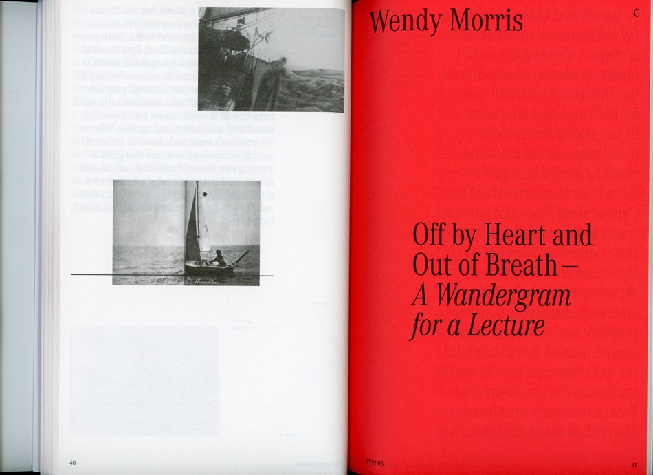
As soon as I opened Janet Cardiff’s The Walk Book in the Rietveld library, I knew I had found the book I was going to make my research on. There was not a single page that didn’t awake my curiosity on how the design had evolved.

The reason for this was the very dynamic and multidisciplinary design. Distinctive colors, shapes and placement of the content creates a chaotic and playful impression. Although you suspect the organized work behind it. Those responsible for this are the two designers, Thees Dohrn and Philipp von Rohden who shared the design agency Zitromat in Berlin. The later of which I had a chance to interview on a few points. I will share this with you as the text develops.

Let’s begin where the journey of the actual The Walk Book begins. It was initiated by a proposal from the art collector Francesca von Habsburg  to the artist in the early 2000’s. The hopes of von Habsburg were to enlighten many others to “the magical world behind Janet Cardiff, her creative talent, and vivid imagination”. She also says “Hopefully, it will reveal how she works in a playful, yet extremely serious manner (…)”.

For those who aren’t yet acquainted with Cardiff, let me give you a short introduction.

As this book investigates, she has created several video and audio walks. These are extraordinary works that allows the participant to experience a dualistic moment through the act of walking and continuously listening to her narrative. The act of walking unfolds the space along with the process of narration which creates both a corporeal and a visceral form of knowledge, as two intertwined levels of consciousness.

In my interview with Philipp von Rohden he shares with me that from the start the plan was only to make something like a small catalogue on approximately 120 pages for one of the “walks”, but as the actual result now shows it turned into a 345 page book.

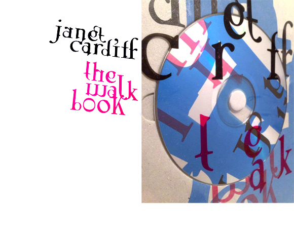
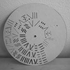
One of the additions to the production was the artist’s own suggestion to turn the book into a walk itself. This is the reason for the cd on the cover. This inventive design allows even the front of the book to be dynamic, as another aspect of this multi-layered book.

oooooooooooooooooooooooothewalkbookcover_janet

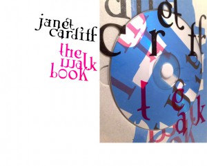
But it is not merely a cd that adds to the aesthetics of the book, the track-list introduces me, as the reader/walker to the book in a frisky way. It invites to a vivid insight into Cardiff’s work and welcomes you to approach the book in a non-linear fashion. The audio walk in itself makes the already expressive impression of the pages become even more alive. The book actually expands even outside the pages when brought along on a walk and your “real world” impressions become combined with the audio and the content of the book. Pictures appear almost animated and the content is even more appealing when you’re encouraged to dive into parts of the the material along with Cardiff herself. I start to detect the hidden codes for the different design layers. For example I notice differences in size and color of the text according to the different sounds or voices I hear.

oooooooooooooooooooooooooooooooooooooooooooooooooooooooooooooo

This brings me back to my research.

Perhaps it has already started to make more sense now that I’ve shared a little more on the actual subject of the book, and how she expresses herself. Fact is, that when I ask what is the organizational guideline behind this very expressive design I’m told that they based their inspiration on Cardiff’s own working process.

She works by collecting fragments and combining them to art pieces. Sounds, pictures, words. And this notion of collecting fragments is what initiated the design. A clear example is the special typeface used on the cover and also on titles inside the book. These characters were set up especially for this book and were created by finding typography elements and then combining them. Collecting fragments.

ooooooooooooooooooooooootypeface2

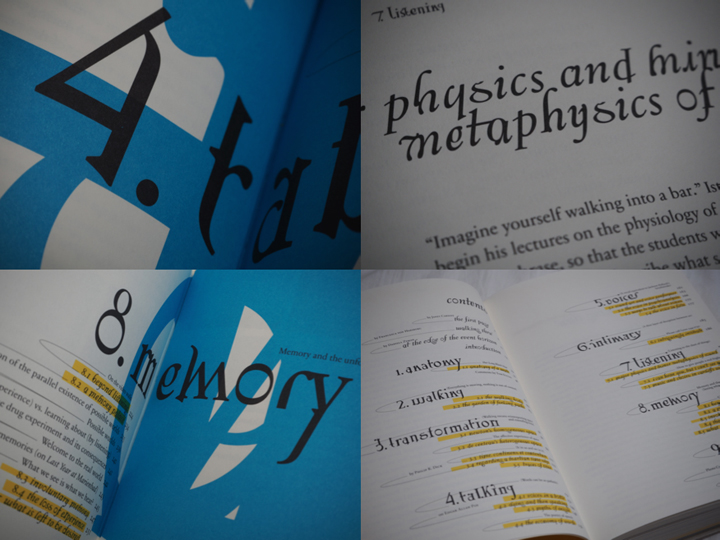
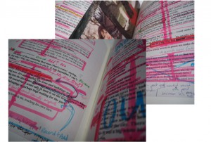
Another design element inspired by the work process of the subject herself are the yellow highlighted words continuously occurring in the text, smaller sized sentences in between the lines in the middle of a text and the little arrows leading the reader away from the columns to imbibe some extra information that could be useful for understanding the text.

These features are not just there by chance, they are inspired by Cardiff’s own notes, which are actually embedded in the book as well in their full pride on pages 54-61 for example.

notes

ooooooooooooooooooooooootexterna30_600

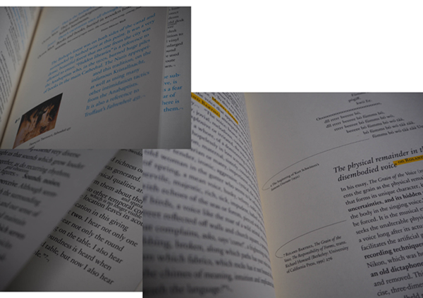
The result were these playful pages that by constant interruption prevent a traditional reading experience. Von Rohden comments on the way Cardiff highlights certain pieces of her notes, crosses out and adds words to the texts in between the lines, “is it just a comment? Is it important or not?” he asks rhetorically. This process is clearly applied to the design of the book and I think it’s fun to be invited to see the connection.

Further, I’m informed that they had 6 content layers when designing the book.

For example my suspicions when experiencing the walk are confirmed:

Cardiff’s voice is always blue,

and a little bit bigger

than the author Miriam Schaub’s texts that are black and seem regular sized in comparison. Another layer example are the pages in the back of the book that contains writings from exterior curators and are drained in a yellow color to divide them from the rest of the content.

yellow

Other genuine elements in this book that the artist herself is particularly happy about are the fold out pages to show the actual audio editing. Among other things, she also mentions the photos that are simply thrown into the book, detached so that you easily can hold them up in front of you when you experience the walk that’s included. I agree with her that these relatively rare book design elements definitely contribute to the exciting impression of this book.

The project went on for ca 2 years and the design process was short and difficult, described as a nightmare by von Rohden. But that doesn’t change the fact that he feels it was an honor to be a part of a project like this, and that it is rewarding to see that the book still seems to have some relevance after more than a decade.

I’m happy I got acquainted with this book, the artist and the design methods. Brought upon much inspiration for the future.

Thank you to Philipp von Rohden and Janet Cardiff for sharing your thoughts and knowledge about this book.


The Walk Book /Rietveld library catalogue no : card 1

Don’t judge a book by its cover


Wednesday, October 29, 2014

Esther de Vries is a graphic designer specialized in book design. Among many projects, she made two books on her father, the sculptor Auke de Vries. The two books, dealing with the same artist, are yet very different, the first one, Auke de Vries Photo Archives, being much more intimate than the second one, Auke de Vries: Sculptures, drawing and work in public space, which is more meant as an chronological overview on the evolution of the artistic career  of Auke de Vries. But what is surprising is that both books are very different from the first impression the reader can get just by watching the cover.


Indeed, at first sight and because of its very strong cover and size, the biggest book seems to be one of those very classical and sometimes deadly boring art books that present an exhaustive view of the work of an artist. But going into the design and the content of the volume you can experience it as an actual novel object. A lot of different materials are used in the book, making it exciting to go through, and a great importance is accorded to the process, thus gathering a collection of sketches, photographs and forms that helped or influenced the artist with his sculptures, and even pictures of the artist working in his studio. On all those pictures the text is set in an unquestionable playful way, sometimes even covering the images.


An other particularity that makes the book playful and thrilling is the use of very thin pages presenting a compilation of different forms, cut from a photograph of a work of the artist and magnified. Those pages refers to the collection of forms that the artist developed and used constantly in his work. Esther was keen to scatter that through the pages as, what she calls, an alphabet.


As for Photo Archives, the fabric and very simple cover makes it look at first glance as a secondary book, very small and discreet, soft, not meant to go through the years as the other one. But once more the design and content makes it very special, in a precious and sprightly way. While the other book is meant to present mainly the evolution of the artist’s works, this photography book shows through the collection of pictures the process that took place even before the artworks, as a wandering in the thoughts of the artist.


Here the relation to the reader is completely unusual, as there is no chronological order or reading direction. The reader, who is more a viewer since

there is no text, can open the book in the middle, at the end, or open the same page again and again, led to wander in the same way that the artist was wandering when he took those pictures.


archive_04


This is also a quite seducing book, designed between rule and coincidence with a set of colors and places for the pictures that are sometimes cut in two by the Japanese binding, leading the reader to focus on a particular shape that recalls Auke de Vries’ work. I noticed that the two books are very different from the first feeling you can get from them.


Yet, maybe Esther’s work, or at least these two books, deals a lot with feeling. That is to say the very strong feeling that the reader gets or is given in both cases of the close connection between the work of the artist and the design of the books. They pay homage to this work. It might has to do with the fact that both books where initiated by Esther herself, and not commisioned, hence the liberties in the design. This is also caused by the very long process that the designer went through while making those books, meticulously choosing each picture and composition, trying all the colors with each image again and again, changing direction until being fully satisfied, regardless of time.


All that makes both works very touching and the enthusiasm of the designer becomes very apparent, discovering a treasure made of all those pictures and willing to share it, making it as complete as possible to preserve the emotion aroused by the pictures themselves.

Rietveld library catalog no : Vrie 5 (

Rijksmuseum library catalog no : 832 E 13 (

Anthon Beeke plays


Thursday, September 26, 2013

This is a poster for an exhibition in the Stedelijk museum by Anthon Beeke.

Anthon Beeke-dansendemeisjes-stedelijk

It has been printed in several different colored layers which show dancing figures. Anthon Beeke designed this poster in 1995. He sought to achieve independence from the rules of typography, and from popular trends.  This unconventional move has earned him a unique place in the Dutch graphic design history.

Before I came to Gerrit Rietveld Academie I graduated in graphic design on the Media College Amsterdam. After four years I disliked graphic design so much that it made me come to Rietveld. This graphic design school is very strict and technical without much freedom. Form follows function, as they say. You learn more to become a desk top publisher. I learned about Anthon Beeke but did not really notice because it was not allowed.

But not long ago I rediscovered his work and I really started to admire the pleasure he puts in his work, Form follows fun! And I totally agree with this concept. It makes possibilities limitless. One of the reasons why I came to Rietveld is to create without boundaries, because I really felt constricted. Since he was the first to step out of these rules I decided to chose this poster. It got my attention right away, in spite of the fact that the line of sight was partly blocked by some other objects at the entrance viewpoint.

I think it is not his best poster design but I chose this object more or less because of the artists. The whole poster looks like an accidental moved photo at a party with a lot of dancing. The font that he chose adds to the dancing, it is if the letters are dancers as well. I also like the fact that it is a layered print, nowadays this look is easily Photoshopped, but he experimented with the layers and colours.

Anthonbeeke-dansendemeisjes-closeup

At the graphic design study I learned the Do’s and Dont’s which you have to obey. Of course it is good to obey these rules and if you don’t it easily becomes a bad design, but if you don’t obey and do it well it will become way more interesting then following the rules. It’s more exciting. I had to make a poster explaining typography rules this is a small part of the poster showing the Dont’s.

Don'ts typography

It’s in dutch, this is the translation:

Use more then 3 typefaces.

Align text in Block form.

Use outline on a font.

Right text alignment.

Chinese typography, line the text from top to bottom.

Obvious rules, but if you break them it could be so interesting, Anthon Beeke did this many times and he is one of the designers that could do that well.

Hollandfestival-Anthonbeeke

All the dont’s i learned are in this poster, but he did it so well that its interesting and exciting but also readable and understandable. There is a story behind this poster as well. The theme of Holland festival was avant-garde in the second world war. He used a poster of Dirk Elffers and painted it white.

Dirkelffers-weerbaredemocratie

And the Typography is copied form a letterproof of Piet Zwart. ”Pure stealing, a shame!” Anthon Beeke said. Every time he sees the poster he has to smile, because the poster says on the left side, Designgraphy: Dick Elffers, Piet Zwart, Anthon Beeke.

But what inspires me the most is that you can see in his design that he is having fun making design. In dutch graphic design it’s called grafisch vormgeven, vormgeven means form-giving, giving things form, sounds so much nicer then design. But that is really what he did, he has an assignment and looks at the possibilities (while playing) and starts giving it a form.

viewoncolour-AnthonBeeke-knitting-itsamiracle

This is for a magazine called ‘View on Colour’ which he published with his wife Lidewij Edelkoort. In this cover, about knitting, you can see something you can not think off from the start, you have to play and have fun to surprise yourself and have something to use.

James Victore says something very interesting is the book It’s a miracle about Anthon Beeke’s work.

”Anthon Beeke always kept playing. A lot of other graphic artist look more like accountants with posh watches and they don’t ask themselves what impact their design has. He plays for his own pleasure and to surprise himself. He doesn’t make work for clients, not for commissions, not for the money, its not even about the assignment or design it self – Its about him. And because its about him it’s about us. The more authentic and personal it becomes, the more impressive his designs becomes gives it more dept; it speaks to us, we can here him snigger of fun. He speaks to us because he gives himself to us. Anthon plays”(Translated from dutch version, not original quote)

I have nothing more to add or say because this quote says it all.

Bye-Anthonbeeke-nudeabc

Karl Nawrot, fascination for the In-Between


Monday, March 7, 2011

Typefaces always seem to be facing the wind, two feet on the sheet of paper, unmovable. Like a silent army, arranged according to there ranking, there are ready to take a new formation. This traditional and almost absolute arrangement tends to make us forget how those typefaces got there, what is there personal journey, what and even who shaped them like that.

Karl Nawrot seems to be privileging this particular journey i am talking about. So to say, his typefaces carriers are far from being all traced beforehand. Moreover, he seems to be having even more fun in creating devices and means to form those letters than in the final presentation.

By using tools he creates himself, he lets the door ajar to imagination, not exhibiting the letter as a final assertion but as a possibility. Stamps, enigmatic stencil disks, collages celebrate as much the process as the result.

Thereby the designer does not hesitate to present those tools, such as the stencils disks, also through a series of posters, respecting somehow the presentation of typefaces. By creating a parallel in the presentation, he builds up a clear bridge between the making and the result, putting them on the same level of importance.
Through this interstice he offers us, one can let his imagination grow about what could be the final arrangement.

But is it not the definition of children games ?Making use of the possibility of the material and playing around it more than gathering all the forces to the final result. Indeed he does not only create his own tool, he also documents the process by making use of stop-motion movies.
Once again the use of this device to present his work makes it really fun. The videos or clip-arts that can be found on his website, www.voidwreck.com , are, according to me, by no means instructions for the proper use of those tools but once again a celebration of its inner-possibilities.
Thereby, in a interview he gave to the blog Manystuff.com in January 2011, he gives his definition of what a good design is. He declares : ’’A good design gives you the feeling of a piece stuck between past & future.’’

Playfulness is definitely the word I would use to describe the work of Karl Nawrot. However focusing on this aspect would maybe undermine the importance of geometry in his creations. Indeed if there is space for game and ‘’abruptness’’ in the realization, there is a clear rigor in the fabrication of the tool. On the one hand the Stamps Box conceived in 2005 and 2006 has a clear connection to childhood but on the other hand the rubber stamps consist of drawn geometrical patterns of the same size. Even if Nawrot limits himself to four simple geometrical shapes (rectangle, line, triangle and circle), he succeeds in generating 150 different stamps : the result of an intense research in exhausting the possibilities and combinations of shapes.

Still Karl Nawrot is not only experiencing with typography, he is also an illustrator but those two interests tend to meet again through the approach he uses.

Indeed the letters he draws seem to peel themselves off, falling into pieces. But the movement could also be interpreted in a reverse manner : the letter getting slowly their final shape under our eyes. Once again Karl Nawrot creates the ambiguity, describing physically this in-between he invokes below, ‘’between past and future’’.

Background :

Karl Nawrot attended the graphic design school Emil Cohl in Lyon, France. He was accepted at the Werkplaats Typographie in 2006. He is now established as a graphic designer and typographer in Amsterdam where he lives.

A lot of yellow


Friday, November 27, 2009

My second book choice was based on my tag word that was yellow. I went for a book that was completely yellow and hoped that the contents of the book related to my other tags (dot, shapes and forms and jewelry). The book I ended up with was a book made by an artist called Toon Verhoef. I did not find many dots in the book, but there were some. There was no jewelry to be found in this book, but there were many super yellow paintings which had many shapes and forms that could be easily seen as beautiful shapes and forms, as you will find in many jewelry rings, necklaces, earrings etc.  I was happy with the book because it was really yellow so was the inside of the book.

Number: verhoe 3


Log in
subscribe