Wednesday, September 8, 2010
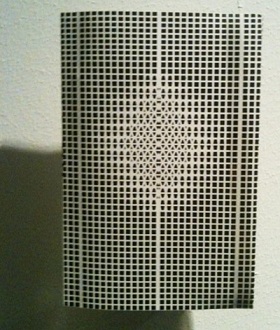
Als je langs de rijen loopt, wat een geweld.
Een boekomslag die je bij de lurven pakt, een boekomslag die je verwonderd, eentje die je doet reageren. Des te groter de reactie, des te intenser het exterieur bij je aankomt.
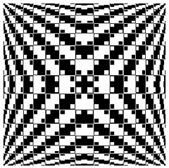
Ik was niet zozeer opzoek naar het wow-effect, maar simpelweg naar een boek waarbij ik me comfortabel bij voelde. Een middenweg van gevoelens van nieuwsgierigheid en het vertrouwde. Ik vond ik dit bij het boek ‘OMA 2008’. Ik ervoer dit boek als onherroepelijk direct maar niet schreeuwend om aandacht, het evenwicht ervan beviel me. Zonder te weten waar de inhoud over gaat .(Dit is onmogelijk te raden, de voorflap bevat geen text)
Het ontwerp straalt een bepaald soort anonimiteit en helderheid uit die mij niet alleen aanspreekt, maar die mij misschien zelfs fascineerd. Misschien ben ik jaloers op bepaalde kwaliteiten die ze bezit, haar orde en gekristalliseerde duidelijkheid. Misschien word er met me gespot, Zij die pronkt met haar krachtige lijnen en wiskundige precisie.
‘Ah but don’t you know not ever to judge a book by its cover?’

Het boek laat een duidelijk contrast zien. Zowel letterlijk als figuurlijk. Naast het vanzelfsprekende contrast van het patroon aan de buitenkant, is er ook nog een contrast in het opzicht dat het boek een zelfverzekerdheid uitstraalt en wilt opvallen maar tegelijkertijd alles verzwijgt over de inhoud, wat we noemen een ‘tease’.
Langs de rijen…Ik moest stoppen. Maar te lang kijken is ook niet aangenaam. Alweer haar Geweld.

Tuesday, September 7, 2010

///moma 2008///design and the elastic mind!
A highly unpredictable book. The design is complex – not easy to categorize while a lot of the other books made by the same hand where based on the idea of creating something that *looks so simple but is still such a cool idea* or at least somehow fit into the composition of the exhibition.
————————————————————————————————————————————————
So this one (and also one or two other objects I found really cool>>thinkbook!) seemed to have something outstanding to it. The complex structure of lines indicating some kind of DNA-String or 3D-Animation and forming the letters in the title and then suddenly the space in between in the subtitle – nothing you would do in the first place since it makes the titel harder to read — I find that really interesting.
————————————————————————————————————————————————————————————-
Maybe this is too much interpretation, but it seems though the designer had consciously created a problem by using one media (ex.: in the graphic on the cover: there is a lot of white space to the the top and bottom parts whereas the sides are packed with black lines) and used another media to balance this problem (the texture of the pages on the top and bottom uses the same pattern as te graphic and gives the white space a reason to exist) –
———————————————————————————————————————————————————————————–
ps: Also have a look at the see-through print on the cover that you can only feel or see if you look at it against the light, it creates a really cool contrast to the the design on the cover which is supposed to look 3D but in the end is only ink on a flat peace of paper!