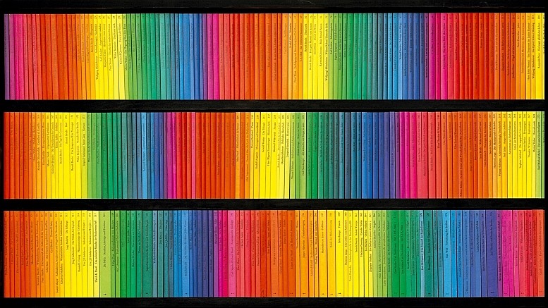
It is said that you can’t judge a book by its cover. Can you, then, judge a book by its spine?
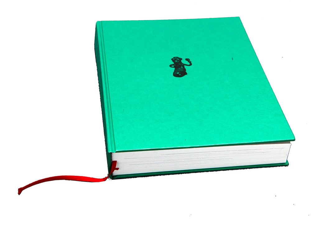
Without even reading what was actually written on its spine, my attention was already drawn to the book “Panamarenko: Workstation Biekorfstraat” through the way it was presented to me; acting as a successful gateway to everything that it had to offer in terms of material. As a piece that was advocated for and supported by the Museum of Contemporary Art Antwerp, the designers, the duo Van Looveren & Princen, no doubt had a great responsibility on them when tasked to design the book. This becomes evident by looking at even the connective piece between the cover and back-cover that stuck out of the bookshelf, ready to be chosen.

An olive-green, textured fabric, wrapped and spanning from part of the front cover to part of the back cover, with the two separate pieces of text coming together to form the greater title. The two texts are as similar as they are different; One is presented in a care-free and playful manner through its stylized font, as if handwritten, whereas the other gives of a much more stern vibe as if passing an ode to the typewriting system with its more ridged typeface. However they find common ground and confide in each other in the manner that they seamlessly contrast the fabric on top of which they are placed by being left blank in regards to their colour. The use of a more casual and characteristic typeface for the first part of the title of the book presented me with a very personal impression of the contents that the pages would contain, almost intimate; almost as if the artist himself entered the room and wrote his name on top of the spine (Despite this, this does not relate to Panamarenko’s signature). This is then contrasted by the continuation of the book title which is shown in a much more organized in presence, which made it a lot more clear upon even the first glance that everything that was to be presented inside would be done so with an approach aimed to provide a sort of guidance and structure.

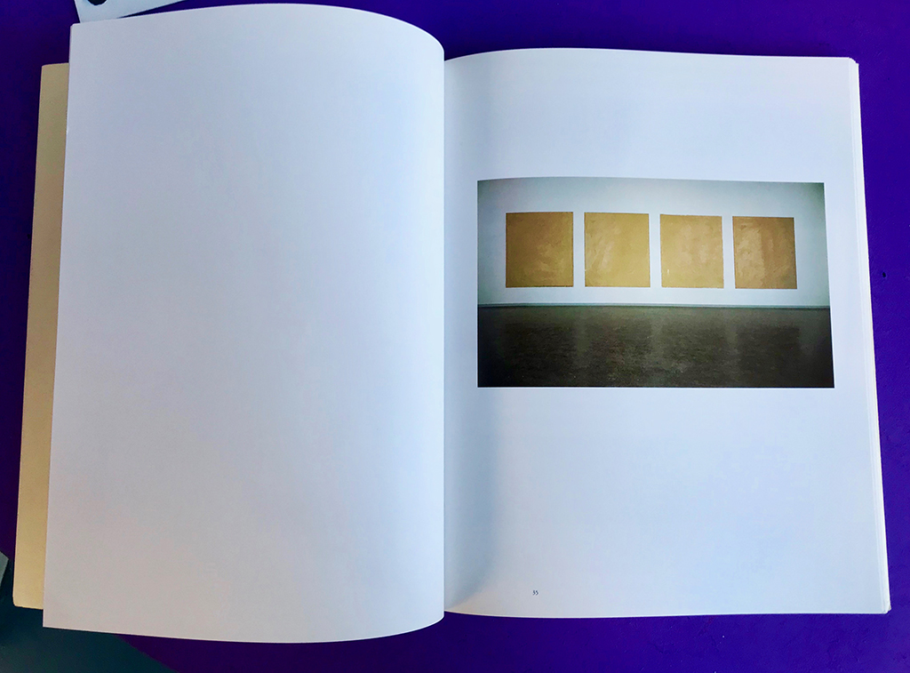
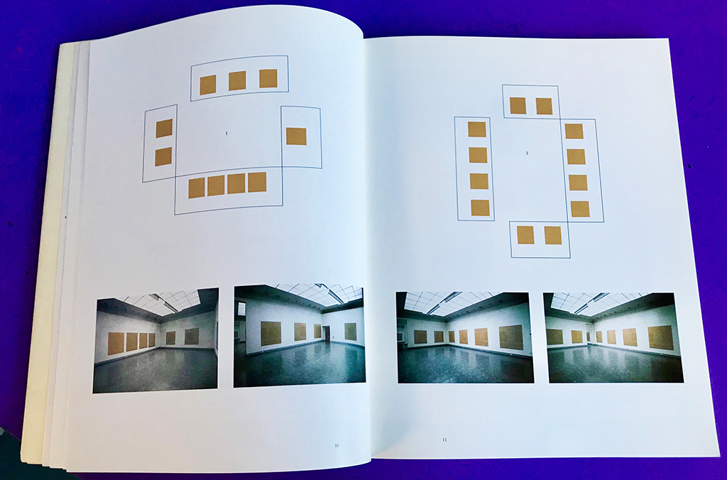
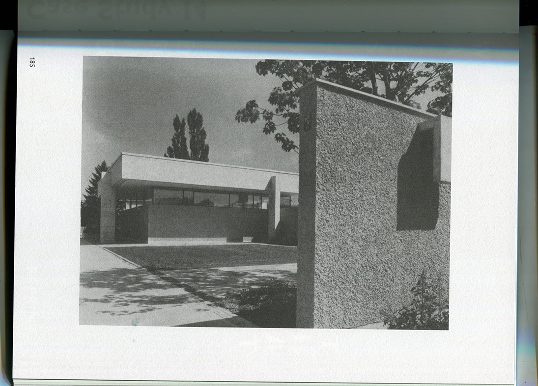
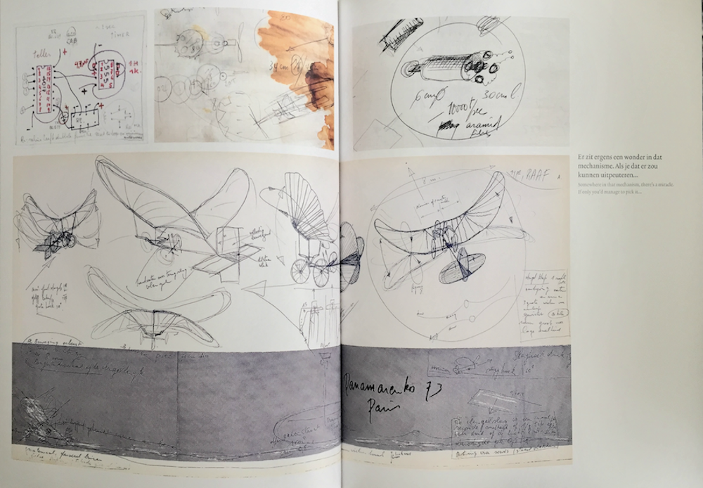
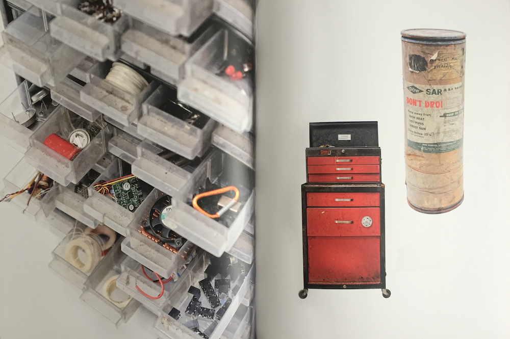
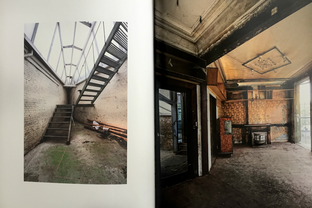
In fact, the book does exactly so with its material – providing a very extensive list of everything the artist contained in his house in an, at times, almost satirical catalogue-like manner. This plays well into the duo’s style of work, which tends to present a plethora of objects in a very efficient and condensed style, as can be noticed by some of their other works. The book itself focuses on the preservation of the entirety of the artist’s workspace, which acted as a his hub for creativity from 1970-2002, acting as a means of casting light on the creative process of the artist’s works; Most of which noteworthy for their science–fiction inspired, machine like structures. The title, as such, give off a strong idea of what was to be shown, by presenting the actual street address >Biekorfstraat< in which the house was situated, in addition to providing the purpose of the house as a workstation.
Despite looking through the book prior to taking it up to the librarian to have it chosen, the simple yet effective presentation of the spine drew me to it as though it exposed the entirety of its contents to me all at once, and opened the world of Panamarenko to me. It was not just the textured fabric, only the typefaces and simply the contrast that drew me to choosing the book, but a combination of all three, indicating that the spine of the book was not a quick idea thought up by Van Looveren and Princen, but rather an important aspect of the book which was deeply thought of before being put into final production.
Willemse, Hans; Baere, Bart De; Coulon, Didier; Deleu, Luc; Willemse, Hans: Panamarenko, Workstation Biekorfstraat. design by Van Looveren & Princen, Rietveld library number: pan 9