Skip to Content Skip to Search Go to Top Navigation Go to Side Menu


"exhibitions" Category


Bauhaus and Communism?


Monday, April 22, 2019

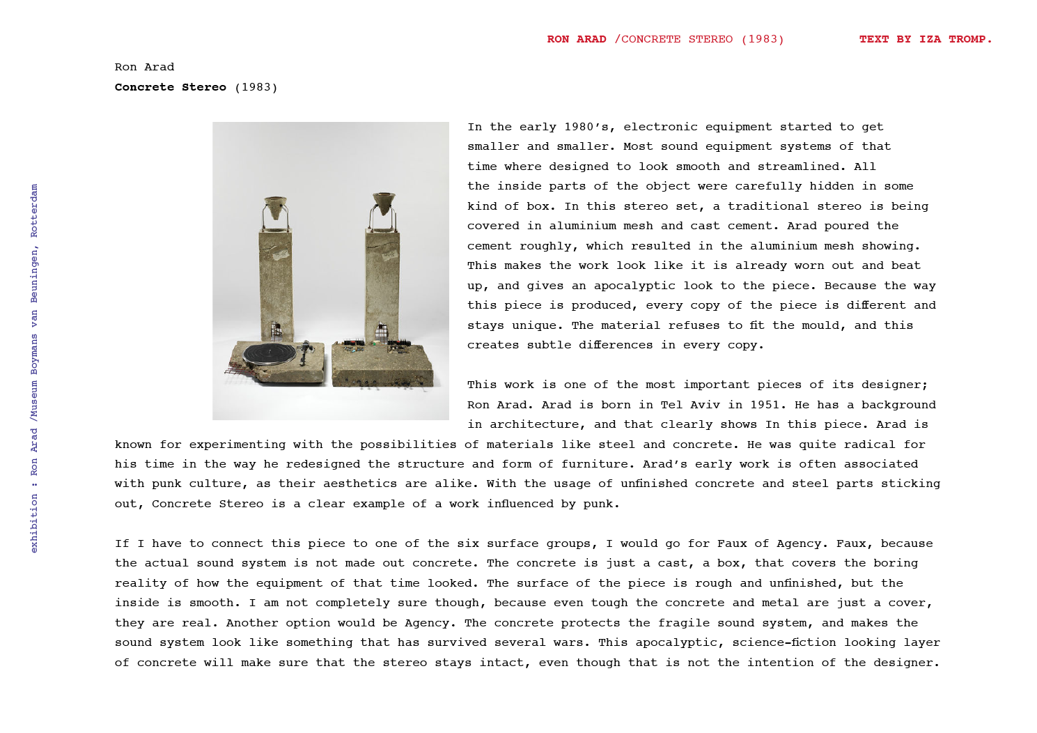
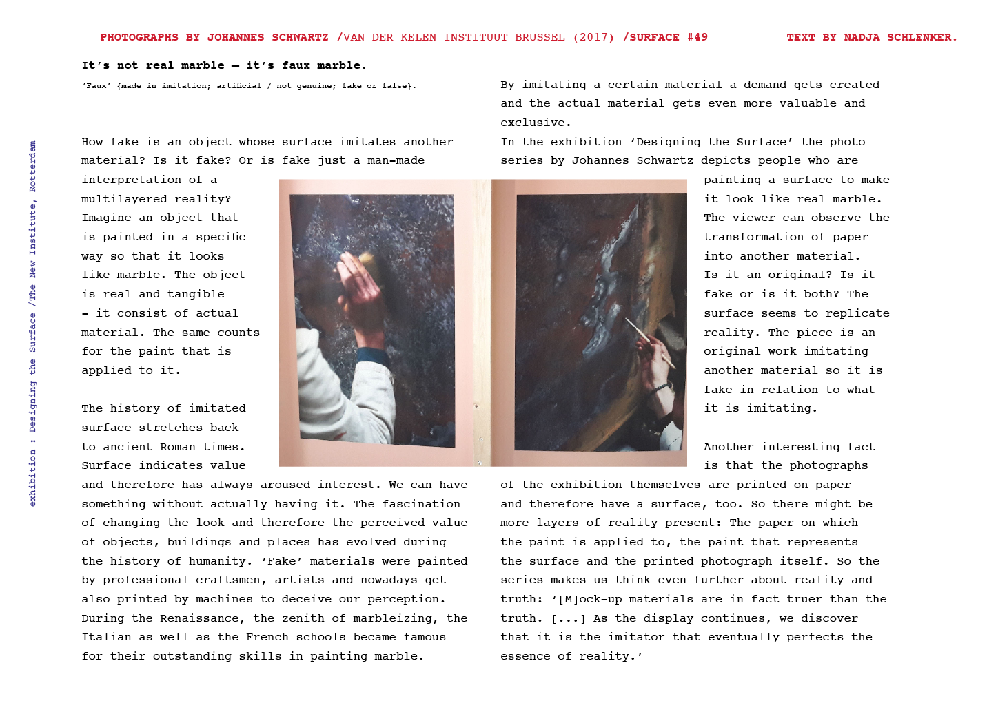
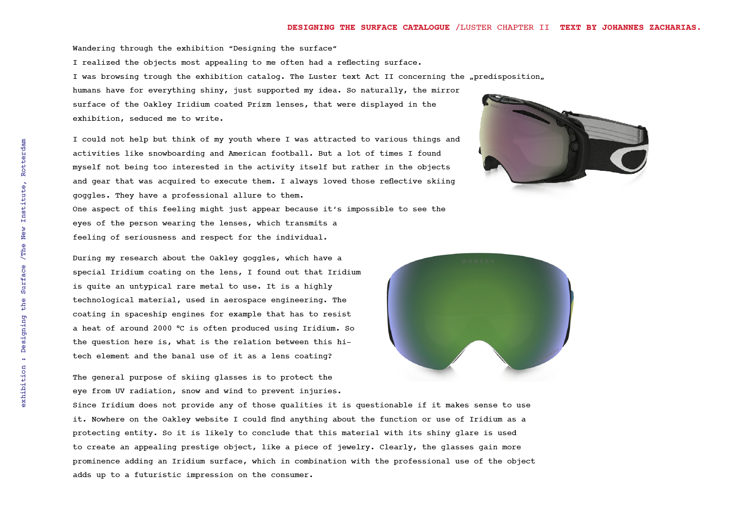
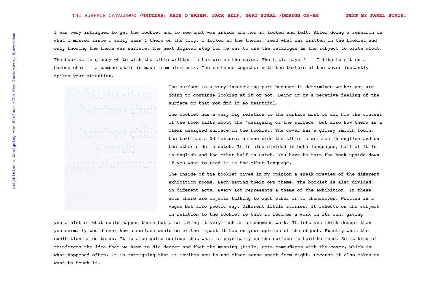
Let us therefore create a new guild of craftsmen without the class-distinctions that raise an arrogant barrier between craftsmen and artist! Let us together desire, conceive and create the new building of the future, which will combine everything – architecture and sculpture and painting – in a single form which will one day rise towards the heavens from the hands of a million workers as the crystalline symbol of a new and coming faith. 

In place of the old bourgeois society, with its classes and class antagonisms, we shall have an association, in which the free development of each is the condition for the free development of all.

Quotations from the ending paragraph of the Bauhaus Manifesto written by Walter Gropius and the the Communist Manifesto.

To me it is striking how both of these quotes talk about equalness, breaking away from classes – in society and in a working context, and how these changes will affect everybody. Yet, both ideologies, Bauhaus as a school and Communism as a form of society practiced around the world, has very prominent leading figures, who in one way or the other, has the power to rule over the students/citizens. For example, when Mies van der Rohe took over the leadership of the Bauhaus school (at this point it was located in Dessau) he had interviews with each student, to determine if they would follow the rules, else they would get kicked out. This can be linked to the arbitrary imprisonments in Cuba, happening both under Fidel Castro and now, as a higher power determining what you can and cannot do, in a society/school that claims freedom and equality as their main goals. The scale of these decisions are of course tremendously different, one is an entire nation and the other an art school in Germany, but still I find the similarities of the Bauhaus and Communism as ideologies and then as practiced in real life quite fascinating.

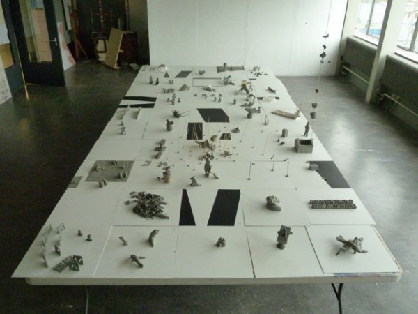
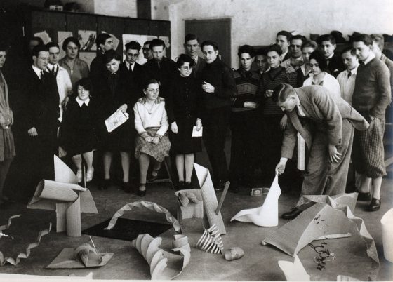
To look further into this, I have chosen to read Animal Farm by George Orwell and compare the degeneration of the animals original motive, to the Bauhaus and the Rietveld Academy as schools that are, at least to some extent, based on the same ideas of teaching. This, I guess, is very clearly seen in the Basicyear – Vorkurs in Bauhaus – which was created by Bauhaus teacher Johannes Itten

Animal Farm starts of with the animals dreaming of a better life, in which they are all equal and not treated as the means to an end, but like living beings with rights no different from the humans, who rule over them. When the opportunity for their dreams rises, they seize it and try to create a life and society where they all work and receive equally. The story is never specified as communist within the book, but Orwell has stated that it is an allegory to Russia, before and after the revolution in 1917 that then led them into the Stalinist era. This new society first flourishes and is enjoyed by most until one of the pigs, Napoleon, sees a chance to gain more power. He does so by constantly telling the other animals that this is actually what they want, that he is choosing to do and so in their service. Finally *spoiler alert* it comes to a point when the other animals cannot tell a human being from a pig, their “chosen” leader has become what they tried to escape and it seems like an inevitability that this should happen.

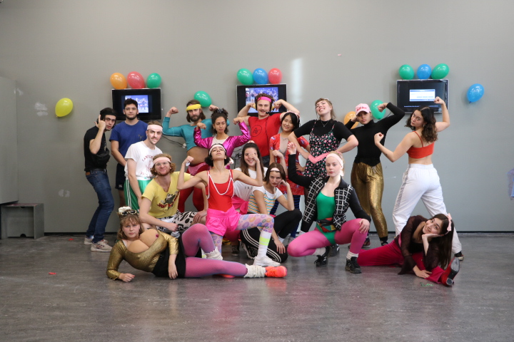
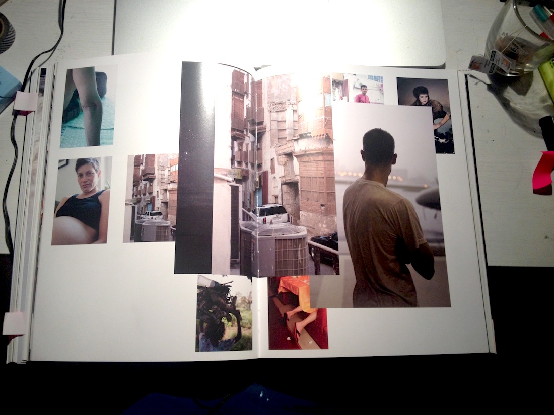
To me, at least, this bears a lot of similarities to how the Rietveld Academy functions. A way of showing and telling one thing, but then not fully living it. This can be seen in the departments, how openness and inclusivity is advocated, while in reality inter-fluidness can be quite hard to achieve as a student. With classes only for ones own department (as in TxT), extremely long waiting lists for facilities (as in Glass) and very limited opening hours (as in Ceramics). Of course complete freedom and total sharing is very hard to obtain, if not impossible, but should you then, as a school, really claim these traits? On the other hand, you could claim that TxT, Glass and Ceramics are some of the departments that actually live up to the heritage of the Bauhaus as they are somewhat material and technique based.

In this context I feel it is interesting to bring up the subject of the Fine Arts department, as this goes against all the teachings in the Bauhaus. Creating just for creating, separating art from everyday life, from the craftspeople, from the non-artist. The fact that this is now one of the biggest departments at the Rietveld, can be seen as a sign that the Rietveld is becoming what the Bauhaus set out not to be. It was an animal, that turned out to be a pig and is now indistinguishable from a human. Or almost, at least.

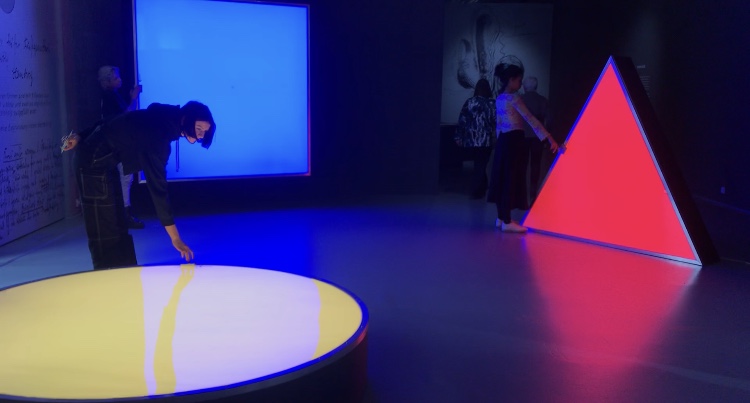
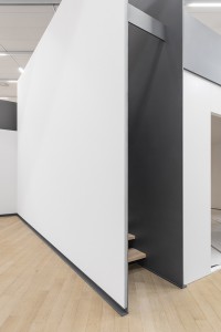
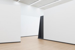
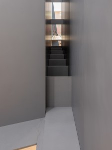
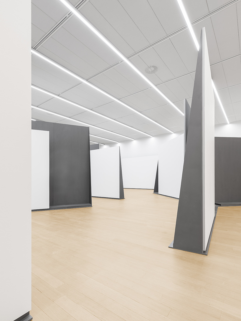
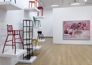
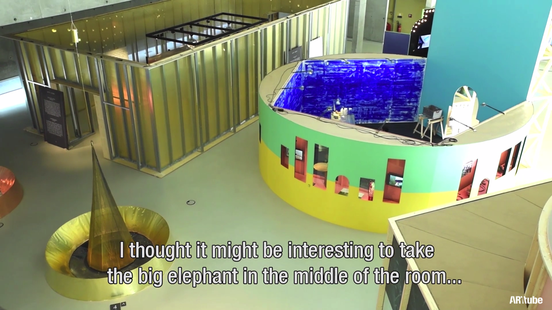
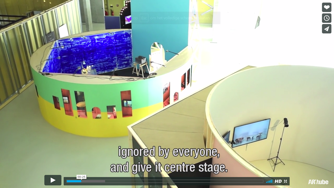
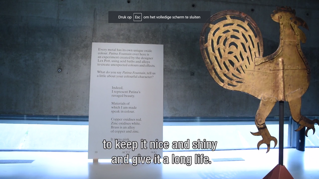
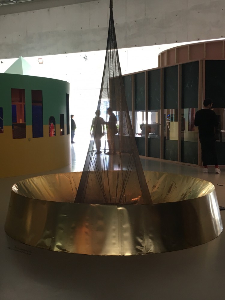
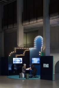
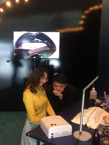
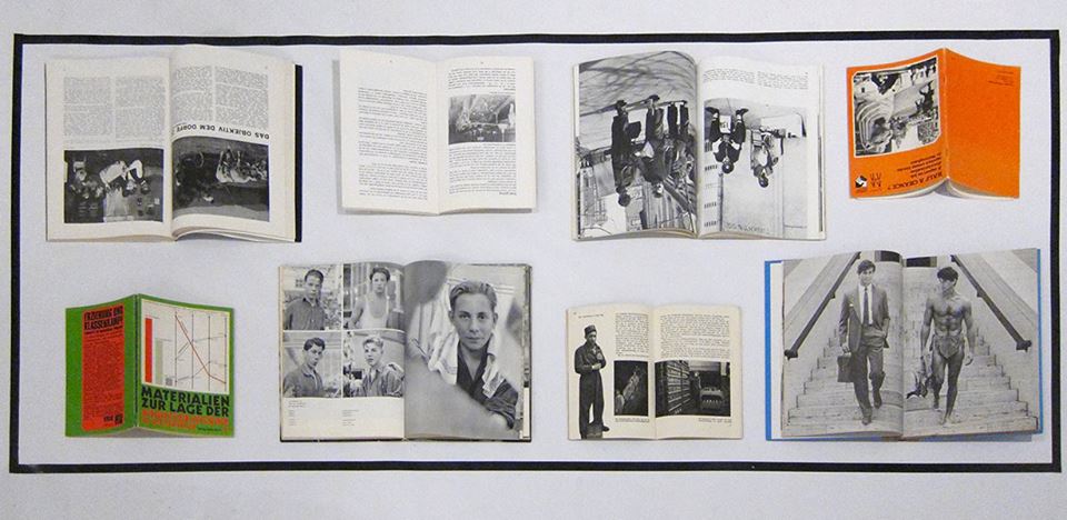
Finally, let us look at how the Bauhaus aimed to integrate art and life, to live with art, to build a gesamtkunstwerk, which is also very much apparent in their inclusion in arts and crafts – creating things that are not art for art’s sake, but are actually usable and meant to be used in real life. When paired with the exhibition Netherlands ? Bauhaus – pioneers of a new world, at Museum Boijmans van Beuningen, it can be eye opening to see that something that was initially meant for use and created in a sense of togetherness is now showed in vitrines, where you cannot touch, feel, or try to use the work for its purpose. Is this exactly the opposite of what the Bauhaus was trying to do?

Doing aerobics before painting?:


Sunday, April 21, 2019

When I first heard “Bauhaus,” my first impression of it was just “big movement important in the history of European art” Because I didn’t have much interest and think it was not really related to me but the Boijmans Museum’s exhibition of Bauhaus, where I went without any expectations, influenced me more than I expected.
The systematic learning of basic things, such as materials and colors, seemed boring at first glance, but turned out to be the most dynamic and interesting things. Exploring the properties of materials, understanding the various and contrary things, geometric shapes and colors are the most essential elements for art, but I had missed them.
Through the writings of Johannes Itten, founder of Bauhaus Vorkurs (preliminary course), I could understand exactly why Bauhaus put so much effort into these things.

Let’s take a look at the works that I saw at the exhibition and the writings of Johannes Itten together.

Two of the most distinct elements of Bauhaus: Geometric form and primitive colors

“The clear geometric form is the one most easily comprehended and its basic elements are the circle, the square and the triangle. Every possible form lies dormant in these formal elements. They are visible to him who sees, invisible to him who does not. Form is also colour. Without colour there is no form. Form and colour are one…Geometric forms and the colours of the spectrum are the simplest, most sensitive forms and colours and therefore the most precise means of expression in a work of art.” •1

It was like the playful work of children. It made me think differently about the concepts and the properties of materials that I had been knowing.

Forms and colours were discussed and presented in any number of polar contrasts. These contrasts can be presented as intellectual concepts…The students had to present these carious contrasts, separately and in combinations, in a manner that allowed our senses to perceive them convincingly.” “All artistic effects are based on the creation of contrasts. We not only studied their contrasts – smooth-rough, hard-soft, light-heavy—visually but also explored them with our fingertips…To deepen and control the experience, students had to contemplate, touch, and raw these textures until they knew them by heart and could reproduce them out of their inner perception, without the natural model.” •2

Among the many exhibited items, the drawings that caught my eyes turned out to be Vorkurs works.

I was fascinated by these rhythmical lines and colors 

“ The teacher’s most difficult problem is the liberation and deepening of the inner spiritual sense of perception. To conduct exercises in that area one needs a very pliable, labile material which reacts immediately to the slightest motion of the hand. I used india ink brushes and soft charcoal” “The success of these studies wholly depends on the student’s ability to overcome his intellect and the function of his senses and give himself totally to spontaneous feeling. An inner automatism quite naturally gives a convincing outer form to his feelings.” 3

Johannes Itten’s ideals of education were very impressive and as a Gerrit Rietveld student, I related to that.
Itten found it difficult to judge students because they all have different talents and characters.
So the vorkurs was built, and students were able to have time to think fully about their interests and aptitudes as they went through this course. I think it is the same reason why Rietveld Academie persists in the basic year while many other schools have given it up already.
Students at Bauhaus had to explore and enlighten themselves without relying on the knowledge from the outside. Itten emphasized inner growth and self-examination, so he went back to the quest for more basic things and helped discover students’ interests and talents through them.

I felt lost when I came to the Rietveld Academie at first. I was used to the crammed Korean education, that was why it was difficult and awkward for me to think about myself and being on one’s own. Now I’m used to it and this new way of education has given me a chance to think deeply about myself.
Drawing and painting, theory, design, mixed media and sculpture, learning these five subjects, and using various workshops, I could see what I liked and disliked, or what I didn’t do well. The fairly free atmosphere of discussion and feedback also helped me broaden my horizons.


Pictures of Rietveld Academie basic year class


pictures of Bauhaus vorkurs

Interestingly, both educations seem to be exploring materials.

They have a lot in common, but the reason Bauhaus’ education seems more interesting to me is probably because of the physical exercise. Itten gave the class exercises in relation, breathing, and concentration to achieve a spiritual state and physical readiness during the instruction period.•4
He thought the training the body as an instrument of the spirit is essential to an artist’s creativity. That is why, before attempting class, the students were asked to limber up their bodies and minds by physical jerks, controlled breathing, and meditation.•5
I agree with his opinion as a yoga and meditation lover. I believe that the body and mind are connected and the brain also moves more actively when the body is ready and activated.

Imagine, wouldn’t it be more fun and energetic if we did yoga together at school or if we did weird exercises before we painted?

pictures of Bauhaus Vorkurs physical exercise

pictures of Rietveld Academie basic year class E’s aerobics performance

Maybe ‘Basicyear’ is the most important time as an artist. This is because it is an opportunity to experience many challenges and failures without constraint. So far, I have been busy just completing my assignments. After learning of Bauhaus’ educational philosophy, I began to reflect on my attitude and to think about how to deal with my work in the future. I will bear in mind the philosophy of Bauhaus, which is attentive to the sounds of body and mind, faithful to the basics and always exploring.

•1,5) Frank Whitford, Bauhaus, Thames and Hudson, 1984, London
•2,3,4) Gyorgy Kepes, Education of Vision, Studio Vista, 1965, New York


A commentary on the Lower Level Gallery display design for the STEDELIJK BASE


Monday, February 19, 2018

–>On December 14, 2017, the Stedelijk Museum opened its doors to inaugurate the curatorial re-purposing and display of their permanent collection. Under the influence of the research and architectural design of OMA/AMO’s Rem Koolhas and Federico Martinelli, STEDELIJK BASE presents on the Lower Level Gallery, a display and curatorial experiment.

I attended the festivities and found myself overwhelmed by the masses gathered, and the maze of thin steel panel-structures overloaded with works. The crowd of Art enthusiasts traveled the space restlessly and it became a dense environment where all senses where assaulted. Every corner of the space was utilized and the works where closely displayed, interacting and clashing with each other both in context or physically, showing in this first installment of the exhibition pieces from the 1800’s to 1980’s in a great hall tracing endless possible routes by means of the a set of slim self standing steel panels from which most of the artworks where hung or held. Its kind of hard to talk or read about this exhibition if you haven’t seen, so if you are reading and haven’t, and can’t see the animation below, click on the black box.


1


I have visited the exhibition repeatedly in the past month to informally survey the thoughts and reactions of spectators on day-to-day basis, to get a broader sense of how this specific architectural endeavor on artwork display has been perceived. Eavesdropping conversations and asking around, I’ve heard all kinds of inclinations towards this unexpected environment:   A young student anxiously disapproving a Barnett Newman cornered by a pile of chairs collaged into a wall that, in her opinion, deflated the experience of such a powerful painting into a piece of an absurd scalene puzzle where great art works where being interrupted.

A couple eagerly wandering about the labyrinthine pathways, surprised by the fact that every direction their eyes turned to, there was either a piece provocatively displayed or in conversation with another, that otherwise could have never been intertwined. I myself have been in a constant state of flux about how I feel about it, as in the many visits I have payed to the show I could relate in separate occasions to one or both of the previously mentioned comments, both retrieved from my time in  the BASE’s lower level, dismissing the first floor more or less entirely, due to its conventional curation and display that is densely misted over the experience and for some, controversy of the former. In fact, in the last few visits I didn’t even pass by the first floor and proceeded to focus on the lower level.

Looking for more insight on the stimuli behind the final decision to discharge an overload of works  in this particular manner, I consulted the statements made by the people behind this project. Martinelli expressed in a publication in the OMA’s web project description, that the design and display was highly bound to the way in which and due to the multimedia means of communication function, from a users perspective, people have become prone to focus, process and compare abismal amounts of information. As a way to homologate these tendencies, the disposition and amount of works in the gallery, are in fact, a reflection of these communicative behaviors, where artistic perspectives can be assimilated.

That being said, I still am not sure if I fully appreciate the collection’s display management. If, in deed, it seems to have managed a dialogue between works and compiled and engaging environment to freely associate and compare different works, this does not necessarily mean that it has a positive repercussion on the value some pieces can have by themselves. Even though I felt the heavy devaluation of certain works have been a consequence of this overcharged curation, I have to mention that it has been the very reason I returned and have been in a constant state of critical thinking regarding the reasons behind STEDELIJK BASE’s curatorial experience.

I realize that the dominant ways of communication are shifting the way we perceive things, but should we let them stimulate the way in which we view everything else? Are our lives so strictly joint to  the high tides of rapidly flowing information that it is becoming the standardized form of perception? Is this merely a superficial association? How can we evaluate it, in any case?

Error or hyperlink?


Thursday, February 15, 2018


It is tricky to recognize when you are misplaced, it is even harder to respond to it right on the spot. You are supposed to serve your human, you are most and foremost functional and have sublime social purpose. Then your human drags you out of your context so inconsiderately that it leaves you nothing but to show your worn out bottom on the pedestal which supposed to elevate you. As I approach you, by climbing the stairs which is set up next to you, I have the chance to look at you horizontally. Although, a deep and artificial ravine appeared between us. The human expression provoked by your forced position urges me to interact with you but the circumstances leave me unsatisfied.


Mies-vd-Rohe-chair_950


 Chair by Mies van der Rohe (but it doesn’t matter)


The chair was the first object at the exhibition which talked to me through the atypical situation that chance created. The situation was somehow absurd and opened to interpretation. Just as if Pawel Freisler, a Polish avant garde artist would had created it to dislocate my train of thoughts.

Freisler “was negating reality and its status quo by encouraging people to create alternative imaginary order. In his work a given subject or place served as a catalyst for creating an extraordinary social situation.

His actions in public space are a form of probing reality, to reveal its absurd dimension. (…) In 1971 he undertook his first work with a table and a chair. What mattered was the table’s status as a “basic idea”. He was attempting to arouse interest, to break routine, without giving observers any hints as to the real meaning of his activities”.

I found myself in the position of a pleased voyeur, which tickled both my curiosity and fantasy. I was busy with taking photos then I looked around with a sheepish grin. As if I was afraid of being caught on the street while taking sneaky pictures under a stranger’s skirt.


 freisler_6656354

freisler

Pawel Freisler – Activities: Table and Chair


Self-realisation as a spectator helps to stay alerted and turn reflective. Gabriel Lester found another way to break habitual patterns down. He introduced a project (SEEN) in an arts centre where “projections suggested a look inside. The projected scenes are environments where groups of people observe something that is out of sight, hidden behind the wall. This juxtaposition – created by watching a projected environment inhabited by people who, in turn, appear to be watching something out of view – provokes the sensation of the observer being observed, and consequently a higher awareness of one’s active and inverted role as a spectator –

as though watching an image that is quite literally looking back at you.”

SeenF-1600x1027

SEEN (2006)


Standing and staring underneath the pedestal, the unusual imagery in my head widened my perspective as I was abducted of the traditional and passive spectator’s role that I usually undertake. I started to look at Stedelijk’s way of displaying more critically as their concept seemed to override the artworks so much that whole new stories were about to emerge. My story, and the museum’s story. But certainly not the chair’s.


The designers explained, they made the arrangement in order “to  reinforce cross-connections and shared narratives. The lay-out understands the collection as a network of relation rather than as a presentation of individual artworks. To capture these networks, very thin walls define an almost urban environment of free association and multiple relations.” 


How much freedom do I have while walking between the walls of the designers’ concept? How much space do the objects have to be explored from three meters high?


 Zofia Kulik and Przemyslav Kwiek were post war Polish artistic duo and uncompromising critics of their surroundings. They said once: “The world is half wonderful, half ugly. The humanistic and artistic theories are usually formed in the mood of the former half. This creates a false edifice of ideas and philosophies, especially a false concept of the artist, his mission and values, his false status.


IMG_9331_950

 Chair by Mies van der Rohe (exhibition design by Rem Koolhaas)


Real exchange with the chair could not happen. I could not find anything beyond the meanings that I gave to it. The revealing moment that I experienced did not say much about the object itself. It was about the gap between me and it, and all the uncanny thoughts I filled the gap up with. The chair appeared to be in the weird melting pot of the museum’s peculiar way of showcasing, chance, and my tyrannical associations, which made me unable to explore the chair’s real properties.

But still,

how handy errors can be?

.

.

Are they errors to be fixed or useful hyperlinks?

It’s all about context


Thursday, February 15, 2018


Although being already more then few times now at the Stedeljk museum, it’s always pleasant be here,  environment, the architecture itself and the natural light that create a charming atmosphere all around.We moving towards the so called BASE 1 to see the new permanent installation of iconic works from the collection of the Stedelijk Museum. It occupies the entire new wing of the museum and features a selection of around 700 pieces grouped around historic movements, social themes, and influential artists.

After I’ve made aware about that what I am going to see is going to be like this for the next 10 years, I approached my visiting focusing my attention mostly on the division of the space and the solution founded to display the artworks.


rem-koolhaas-AMO-stedelijk-museum-amsterdam-base-exhibition-space-OMA-designboom-07 700-3

700-1 700-2


The space allow visitors to experience the collection through an open-ended route.The chronology can be followed on the perimeter, while freestanding walls in the middle create separate sectors highlighting groups of artworks that represent a specific theme or aspect of the collection.

I have this constantly feelings of jumping between a sort of labyrinth in which I can keep choosing different directions but as soon as I taken one, those vertical high walls create a dynamic and cozy environment, almost like little galleries inside a enormous place.


The layout display  the collection as a network of relations rather than a presentation of individual artworks. All the artworks do not loose their independence even tough, there are chairs and carpets hanging at the walls, and the displaying of some works are not as we are used to see.


I am  wondering about how they bring inside here this massive standing steel walls? And how they organized  works in different areas of the collection…


I’ll try figure all this out a little bit more

stay tuned…

700

Painting, smoking, eating, chairs, table, shelf.


Sunday, January 21, 2018

Oil, canvas, metal, clay,

Met in The Stedelijk one day.


A strong effect can be produced with simple actions. Sometimes it makes a big difference by just putting together things that never met each other before.

Maarten Baas’s clay furniture is something that I didn’t see at the times of the old Stedelijk permanent exhibition. The composition includes are different size colored chairs, a bookshelf and a small table. They are actually made out of a synthetic clay put on top of a metal skeleton. The objects are placed on white square shelves attached to a wall on different levels.

It will be difficult to write about only one of these objects because they are placed so close to each other that I immediately thought of them as one composition.

philip guston and clay furniture

The wall on which all the clay furniture is exhibited happens to be in close conjunction to a nearby painting “Painting, smoking, eating” by Phillip Guston. This neighbourship doesn’t seem to be random. Put in this corner of the space all these objects create a common vibe. The thick and handcrafted legs of the clay furniture resonate with the fat lines of the paint on Guston’s canvas. The furniture and the painting are so alike that you can easily imagine these chairs, the table and the shelf to origin from Guston’s painting which makes them highly connected. The painting is so much over-layered with paint that it produces the visual effect of the furniture almost dripping on the floor. Both furniture and painting have this tactility in them. You can see how thick and greasy the layers of the paint is, so you want to touch the legs to feel the softness of the clay.

marten baas clay tablePhilip Guston

To conclude I’d like to emphasis again how beneficial the neighbourship of these objects happened to be. Putting Guston’s  painting and Baas’s furniture together places the dilemma of placing art and design in the space in a whole new light.

continue reading

Centre of attention: elephant or cockerel?


Monday, June 5, 2017

Ten seconds of watching Arttube’s video about the Designing the Surface-exhibition (posted on the website of het Nieuwe Instituut), brings you Chris Kabel, “concept and curator”, saying the following:

SC1_1100

Although just having visited the exhibition, I did not remember seeing a thickset, usually extremely large, nearly hairless, herbivorous mammal (family Elephantidae, the elephant family) that has a snout elongated into a muscular trunk and two incisors in the upper jaw developed especially in the male into long ivory tusks, [x] at all.

I started doubting if I had seen the same exhibition he was talking about but looking at the video we pretty surely had. But also on the screen (see above) there is no elephant to be seen. Maybe the zoo (or, so called fun fair)

SC2_1100

is too big for the elephant to be found? Impossible. Kabel even mentions giving the elephant centre stage,

SC3_1100

so it must not be too hard to find this “elephant.” What is really meant with the elephant in the room,

an obvious major problem or issue that people avoid discussing or acknowledging [x]

is the surface in design: apperently ‘avoided’ (as quoted above) or ‘ignored’ (Chris Kabel), en therefore in Designing the Surface, put in the centre of the room. Also should be to be found in one of the two other animals in the room: the golden cockerel.

The golden cockerel might be a bit rare – it’s one out of the three animals (an elephant, a zebra and a cockerel) n the zoo –  it is one of the first objects to be seen and written about:

ACT I PATINA: How does the fate of a golden cockerel and his companions intertwine with that of the tormented tale of two fountains, the first crafted from copper and the second one built from brass?

All to be found in a zoo perhaps? Or in the near surroundings of a church?

Gold-plated weathercock, lent by Museum de Roode Tooren, is a weathercock like any other apart from the fact that it’s gold-plated, and therefore it doesn’t lose its shine.

SC5_1100

Normally sitting on the church’s tower in Doesburg, shining bright and golden, the weathercock is certainly put in central view. And now put on the ground, looking at it from closer by, we are obviously not looking at the rotting wooden cockerel inside, but at the shiny golden elephant.


Gold-plated weathercock. Museum de Rode toren. exh.cat.no2-patina

I see your true colours, that’s why I love you


Sunday, May 28, 2017

As soon as I walked to the exhibition, I was faced with two ‘fountains’ if you can call them so. Lex Pott [x], a Dutch designer, a graduate of the Design Academy Eindhoven, uses UV-light and acidic water to explore the “inner colour’ of materials. First fountain is made out of copper, an element that has a green colour when found in nature,however the colour that I saw was orange due to the outer catalysts that accelerate the change of color. Same thing was happening to the fountain on my left that was made out of brass.


True colour dome, 2017
The Preservationist

Although I was never a big fan of Chemistry, the project that dealt with exploration of inner, unseen colours really attracted my attention. The two objects themselves are a marvelous visual as well as inspiring method of working. His project has a very close and even straight-forward connection to the Subject – Patina. By oxidizing the metal, the designer creates a thin layer that variously forms on the surface.  Colouring different kinds of metals requires accurate recipes. Pott’s project demonstrates the results of a research on metals and their true colours. By doing such, he reduces the material to its very essence.


True colour
The Resplendent

While losing electrons, it seems that the material opens up to the artist and the viewer giving an impression of acquirement of ancient wisdom that was hidden underneath the green surface. I believe that the viewer and the artist have a similar feeling of control evoked by the impression of nature opening its secrets to the human kind.


Lex Pott, True colors Dome / True colors Cone. exh.cat.no.4A/B

Lustrous Lips and Fingertips


Sunday, May 21, 2017

Warning: Do not scratch the surface.

lips


The nail polish stand is linked to the Lustre section of the exhibition for the visually obvious reasons such as its shininess and sheen, but also for its historic link to car paint (also highly featured in the Lustre section) as an inspiration for the first nail polishes.


tumblr_on9d8801wK1rze8z7o5_1280 Designing the Surface Nail Salon Screens


The exhibition designed to feel like a fun fair, is divided into pavilions. The Nail Salon becoming an attraction for visitors. Drawn to it like magpies, visitors are able to get one nail painted and glittered. Somehow promoting the addition of Lustre to ones body, to have one nail become like a car door, while you watch two screens flash lips dripping with gold and gloops of glossy colour, nails painted and paint peeled from pristinely polished cars. Somewhat hidden is a third screen. I must admit I did not catch it at first. Too distracted by the glitter goodies, to notice the children labouring in mines. Since I did not pay full attention to this third video, I am not sure what they are rummaging in the dirt for? How is it linked to getting your nails painted? To the lips pouting at you from the first screen and to the expensive cars in the second. How are these poor children linked to these items of luxury?


Perhaps they are mining for titanium dioxide or ground mica, which can be found in some glittery nail polishes? Why then was this screen placed out of view from the person sitting getting shiny minerals added to their fingers?


I wonder if the artist Jonathan Auch was offering a critique to lengths we go to to increase our lustre? These videos differ from the artists’ usual street photography style. Black and white photographs of real people in real settings. Rough, gritty, textured faces of everyday faces. Seems odd then, this choice of work for this exhibition. Accentuating the fake-ness of the surfaces we crave to have not only on our cars but also on our very bodies, and who in another part of the world this may affect.


Jonathan Auch for Koehorst in 't Veld, Nailsalon screens Mother/Father/Child 2017. exh.cat.no.24A/24B/24C

Designing the Surface Supplementary Show /New Institute


Monday, February 13, 2017

bieb_15029_mahoniehout-03_950

Gebr.A.R.& P.van der Burg /wood and marble painting examples in color 1876


Supplementary Surface Show Under Construction


20 students of the Rietveld Academy’s Basic Year visited the exhibition “Designing the Surface” organized at the New Institute Rotterdam (2017).
The intriguing aspect of surface, an issue that is generally avoided in a discussion about the context of content, raised our curiosity.
The exhibition and the accompanying publication was inspiring as were other additional exhibits like ‘Screen Savers’ or various shows in adjoining musea.

/FAUX /PATINA /LUSTRE /TEFLON /AGENCY /SLIM

Curious for our reflections on these subject?

Chose an image and click on it.

We assembled this small supplementary research show for you to enjoy.


PastedGraphic-4

FelineH VanilleOugen

SimonMarsiglia Screen shot 2017-02-13 at 12.05.50 PM CeliaNabonne

KaanKorkmaz JimKlok

Screen Shot 2017-02-12 at 11.43.35 PM

KimLang OfiaBaytocheva FelineHjermind

NadjaSchlenker JohannesZ

Parelstrik vantablack

blauw_400


What is the difference between a waiter and a piano player?


Monday, October 5, 2015

The world opened a new window in 1844, when the public entered “French Industrial Exposition” in Paris. Quickly afterwards, various large public exhibitions were held in different parts of Europe. In 1851, the first-considered International Exposition was held in London called “Great Exhibition of the Works of Industry of All Nations”. A new platform was born, where art, science and technology from different countries were brought together.

In the process of the development of the platform, the pavilions became a tool to improve the image of each country from 1988. A study called “Expo 2000 Hanover in Numbers” by Tjaco Walvis showed that 73% of the countries at Expo 2000 were primarily interested in improving their national image. The world fairs had evolved into big vehicles for national branding.

 “In the desert of life the wise person travels by caravan, while the fool prefers to travel alone”, (African proverb)

As the importance of the pavilions’ look grew, the budget grew with it.

world's fair

At Expo 2000 Hanover, the average investment pr. pavilion was €12 million: A budget that made governments doubt their participation since the benefits were often assumed to outweigh the costs.

In a world today, where branding is a key asset: Is it possible for the artwork to stay as strong and sensuous to the audience? Does the creation of a salable layer (that has to be considered and assessed) leave the message behind? When a world fair tries to destroy the line between exhibition and exposition, is it possible to make both’ part equal?
Creating a community inside of the world fairs figurative walls is interesting. But at the same time, I’m constantly aware of the galleries’ need to sell. Does art lose its artistic value if it has to be salable? And does the price affect the experience of art?

CHART ART FAIR had its debut in Copenhagen 3 years ago. A Danish offer of how a world fair could look like. The CHART director Simon Friese wants to establish an international art platform for the Nordic region: “The ambition to do CHART in the first place was actually to make a platform that had the curatorial level to be able to attract an international audience coming here (…)”

CHART ART FAIR

But in the crowd, I feel like the gallery presentations convey get lost. The event has been located the same place all three years: Kunsthal Charlottenborg. In the 17th century surroundings, the location won’t disappoint you, but in the big spaces I feel an enormous distance between the art pieces and me as a viewer.
Before you are invited indoor, you can see advertising on display in different shops around town. Large video installations were put in shops as a warm-up before the fair this August. But every shop they have chosen had a specific status and price range. The locations were obviously chosen to attract an audience with a high income: because the buying of a ticket is only a small part of the money that’s exchanged inside the fair’s walls. If you’re interested in ownership, you can take the matter up with the gallery owner you can find next to every stand. Gallery owners you also can meet in the lounge section solely for specific members of the art world. (Some transported in limousines).
But why do I care? Do I want to play a role in the social club of the arts? Even though CHART is a new-born, the number of viewers has increased with 50% the past two year. Apparently, there are a lot of people, on national and international ground, who are interested in a Nordic art platform. Simon Friese and Denmark’s most famous gallery owners are those men who rule the roost, since they decide the selection of the approx. 28 galleries which are participating.

World’s Fairs are great scenarios to enlighten upcoming art and new ideas. The first telephone by Alexander Graham Bell was shown at Centennial Exposition in 1876. And the infrared touch panels were finally presented to the public at the 1982 World’s Fair in Knoxville, Tennessee, after 40 years of research. A lot of people, including myself, imagine the World’s Fairs to be like in the 1950’s, but the medium has changed.

Bell's  telephoneFirst touchpad 1982

In the old days, the rich would cross the sea to see the wonders firsthand, but the internet put an end to that. “I don’t know today how a World’s Fair can be viable, because everybody has a camera in their pocket,” says Louise Weinberg, World’s Fair Archive Manager at the Queens Museum. With everybody having art from each corner of the world in their pocket, you don’t need to go to foreign countries. With the internet, the outcome of World’s Fairs has been a massive slump.
Is CHART trying to transform art into a trade again? At Kunsthal Charlottenborg, the artwork or art “actions” seem like entertainment you can quickly pass without being further included. Is that the intention of the yearly event? And then I cannot not think about; are artists meant to serve the rich?

cyber and (un)aware


Monday, December 1, 2014


Jacob Jensen’s 1997 waterproof Beowatch (produced by bang & olufsen) was designed as a personal, unisex timepiece that makes telling time convenient and accessible. additionally, it also functioned as a remote control that controlled the volume of later bang & olufsen music centers. this design prompted me to question its present-day relevance in the design exhibition at the stedelijk museum, Amsterdam. over the last two decades the technology industry has undoubtedly grown and so has the way in which people engage with methods of measuring time. it is noticeable that less people wear wrist-watches everyday and the norm has adapted to using smartphones or other multifunctional devices to keep track of time.

this research will further discuss the design of the Beowatch in relation to the myriad of social questions it raises such as today’s security in wearable, intelligent technology and the aesthetics of unisex design.

b&o-image1

few wearable objects are designed to be unisex, particularly jewellery (if we classify a wristwatch as jewellery). i am drawn to the statement this wristwatch is indirectly raising about society’s perceived aesthetics of gender. the design is created as ‘neutral’, an object that is seen through its own entity- regardless of preconceived ideas of masculine and feminine beauty. throughout history, wearable objects or fashion, has had a very divisive characteristic – creating standards and room for assumptions. this design forgoes these notions and is created as its own autonomous form.

balancing aesthetic and (multi)functionality reiterates how the Beowatch was very modern for its time;.Jensen’s approach to design drew my attention as he states “…we expand our concept of…what a watch should look like. the sight of an object does not necessarily have to show its function…” (1994, Jacob Jensen design [paperback], Paul Schäfer). this relationship between functionality and aesthetic is a core issue that designers are faced with.

however, it is a challenge nowadays between technology and its external design. technology is becoming increasingly intelligent with wristbands/watches that gather data to measure heart rates, count steps, give directions, forecast weather, play music, interact with other devices, predict the position of the moon etc  and the visual appeal of wearing this technology. for example with the recent design release of Apple’s iwatch and Google’s glasses there is already considerable criticism on this ‘cyber-human’ image and artificial intelligence we are sometimes reluctantly and often unavoidably accepting.

b&o-image2

Jensen redesigned the concept of a remote control in the Beowatch by making it multifunctional (acting as a remote control and timepiece). similarly, designers today are changing conventional objects into ergonomic designs that fabricate, sync or react together with the human body. there is an evident focus from the technology industry to attach these gadgets and lumped plastic to people especially by getting them onto wrists. of course there are many benefits of having such tools; they are accessible, readily available and can make tasks faster. however, the fact that these devices become so quickly absorbed into the culture of everyday society is blurring the boundaries of our true basic needs.

they are also perhaps just purely adding insult to injury- for example do people need to know how little sleep they are getting? or if they have eaten too much on one day compared to the next? or if they have skipped a day of exercise? this data collection that these devices provide may give us information but it is still not enough, what is more important is the reasoning- why we slept/ate bad and missed exercise, for example. simply knowing these facts without reasoning is the added ‘insult’ to the injury/damage that has already been created. for instance if your watch tells you that you haven’t exercised enough, things that you probably know already, would you change your routine just because your watch is telling you? in most cases, not. there are versatile calculations everywhere, but the problem is what to do with this information and how to interpret it.

it is irrefutable that the pace of technological advancement is remarkable; but this also affords the risk that people will develop a better reading of their technology/ wristbands and lose their sensitivity and awareness in reading their own bodies.

b&o-image3

since the Beowatch, wrist technology has advanced further than the individual, as over the past decade debates have risen over personal security and privacy. it is unknown to the individual how much is known about them through their digital dossier. we are uncertain about where our information is stored or if it is being used for analysis; examples we have witnessed recently include the NSA files, cyber-hacks with phone applications and celebrities, Facebook scandals, Wiki-leaks and much more. these personal items have the potential act as a sensor or tracker, they constantly collect data which are ‘invisibly’ fed to different networks. though this subject may seem far fetched from the design of the Beowatch, the design is relevant as it marks part of the evolution of our technological reliance and dependence. it is uncertain where this line is between the personal object and a device that is actually just a form of data to a bigger establishment.

b&o-image4

the Beowatch nowadays represents a certain phase in design (1993-1996) as well as the literal time. it represents the start of multifunctional, human-fitted technology. though now the object is more about its face than its function, being presented in a showcase at the Stedelijk Museum, it is still highly relevant and raises many direct and indirect issues. As the son of Jacob Jensen said in an interview: “a product which survives the test of time, even when it has been out distanced by technology, contains a concise idea carried out at the right time, and with an aim of thorough reworking” (Timothy Jensen in Jacob Jensen design, 1994, Paul Schäfer). though technology has definitely distanced since 1997, the design of the Beowatch has survived by providing a mark for its time as well as offering insight into how we should speculate the future of cyber-human technology.


Wolfgang Tillmans : One’s Own Master


Monday, December 9, 2013

Wolfgang Tillmans, (born August 16th, 1968), is, perhaps, known today as one of the most renowned contemporary fine art photographers. He is known as the “documentarian of his generation”, and is much regarded among his peers and contemporaries.

If you have ever encountered Tillmans’ work, whether that might be a single photograph, a spread of his photographs published in a magazine, a book or an installation, the ‘taste’ and presence of the artist himself is inevitable.
It is clear in the presentation of his work, that Tillmans ignores the traditional separation of art exhibited in a gallery from images and ideas conveyed through other forms of publication and presentation, and more importantly is giving equal weight to both.

wolfgang-tillmans-installation-view-serpentine-gallery-london-c

In an interview with Nathan Kernan, Tillmans is reported saying:

“I guess I could have an easier life if I didn’t care so much about all the different manifestations of an image, if I didn’t care about making the prints myself or in my studio, but somehow I see that as being part of my work, and the time spent dealing with a print is also time spent with the work. I understand my work better through this process.”

What stroke me at first as surprising and unusual, was that the artist is designing a book, or better to say is containing his own work, that at first might not have had the intention of being presented in that format. That is actually quite innate to Tillmans.
Through a more dedicated research and engagement with his work I have come to realize that it is quite natural for me to grasp that he, in fact, does design end edit his books himself.

1

1

Concretely, I have found myself acquainted with three of Tillman’s books: Burg, Truth Study Centre and Neue Welt. Burg being the first of the three was published in 1998, and Neue Welt the latest, published in 2012.
All of the three, were published by German publishing house TASCHEN.
Although one might think that having such a big house as TASCHEN publishing your work would almost completely strip you of your creative role in the design of a book, Tillmans stated in an interview [link to full interview], that on the contrary, he has full creative control over the design and content of his books.

The a fore mentioned book, Burg, is a bit larger in format than the latter two, which, on the other hand, incidentally almost completely resemble each other. They were published with the gap of eight years, however if we judge purely by “outside” traits, Truth Study Center and Neue Welt are ‘fraternal’ twin sisters.

5
Unlike Burg, they are both soft-covered and their front cover is completely wrapped with a single photograph, and the author and the title are stated in the same white colored typeface, although the font size of the Truth Study Center is significantly bigger than that of Neue Welt. At the bottom center of the cover states TASCHEN, the publisher.

The spines of the books are, also, both white and use the same typeface, as that of the front cover.

The back cover is, in both cases, a different photograph than that of the front cover.

4

8
In spite of the slight differences, all of the afore mentioned books seem to share the same design principle. They either start or finish with an accompanying essay or an interview on Tillmans and his work, with the text pages being ‘interrupted’ or ‘accompanied’ with smaller scaled images of Tillmans’ work as if to kind of visually demonstrate the written content of the text, that being the case in Burg and Truth Study Center. The two mentioned, as well, end with listings of Tillmans’ biography and curriculum vitae, bibliography and words of acknowledgement and gratitude.
However, the newest of them, Neue Welt seems to have ‘cleaned out’ the ‘unnecessary’

9

information even more, as only the very last page contains publishing information.
What is, also, unique to Neue Welt is that this book has both front and back cover flaps inside which is printed the index of all of the book pages. Except for the pages with the interview, in this book there is not one single spread that does not contain photographic image, from the front to back cover.

6

7
 

Tillmans does not view books as collections/ archives of his work but as exhibition space in themselves. Neue Welt is constructed and should be viewed more as an installation of Tillmans work than a regular book. Whilst browsing through the book (Neue Welt) the white space of the paper becomes equivalent to the white walls of a gallery/ museum. Tillmans designed the book in a same manner he would curate his exhibition. All of the photographs are carefully scaled and placed, not only to be true to the artists style but to give them proper space and interrelation to bring out the best of them and to create a strong work as a whole.

IMG_7458

Interacting with the Neue Welt the holder starts to relate to it and think of it as a sort of portable exhibition.

The way it is designed, the viewer is not only challenged to engage with each singular picture or a narrative that is usually expected in photo-books, but with the connections Tillmans creates between the photographs. Having that in mind, holding his book in your hands feels almost like a privilege. The same kind of privilege one feels when one sees an exhibition of an artist’s work.

IMG_7460

Engaging with these books, for me it was very interesting to see how they become a work of art in itself, through process of design. Although, as a viewer you have the liberty to observe every single image in depth, it is in a way impossible to ignore the whole structure and rhythm of a book as a whole. The artist’s language and modus operandi is inevitable. I ascribe this to the fact that it was the artist himself who designed his books.

IMG_7462

During my studies at the Rietveld Academie, I have myself had the chance to be a designer of my own books, and it was whilst working with the photographic content of my own that I learned how differently does this content work in the medium of a book. The format and structure of a book give the content a new meaning and experience than observing it as single, or even series of photographs printed and pasted on a wall.

I am of the opinion, that it is the artist personal involvement and connection to the content, while designing it that creates this special flavor of the book and it would be interesting to see the direction in which book design would go if more and more artists were designing books on their work themselves.

More on Wolfgang Tillmans and Neue Welt:

http://tillmans.co.uk/

http://www.americansuburbx.com/2013/01/review-wolfgang-tillmans-neue-welt-new-world-2012.html


Rietveld library catalog no: til 3 and til 1

Neue Welt has unfortunately not yet been acquired by the Rietveld Library, but is author's own.

NINETY-ONE BOOKS IN ONE


Monday, December 9, 2013

Books. They are there. Just there. As long as I can remember. Starting with Maan, Roos, Vis (Moon, Rose, Fish) and Wie heeft er op mijn hoofd gepoept? (Who shitted on my head?), learning the alphabet, learning how to read. But there is another way of looking at books. a total different kind of books. How does the book look like and why. Why is it done the way it is, why does it work this way and why did they do it.

Design.

When we were looking at the books in the library of the Gerrit Rietveld Academy, this was the book that got my attention. “Boy Politics”. It’s the color of the cover I saw at first, the grey, green color. Typical Rietveld I would say. Now when it’s lying next to me in the room, it’s almost like camouflage against the wall. Maybe this color is something we inherit from the Rietveld because the designers of the book, Anton Stuckhard and Andrea de Sergio both graduated last year at the Rietveld from the Graphic Design Department.

boypolitics 1 DSC_0407

Second thing you see: the way of binding. Screws. Good combination with the title I would say.

Boys. Strong. Screws. Politics. Connection.

On the cover there is only text, 5 narrow columns next to each other. The title is pretty clear in a simple fond. The cover is the index of the book but on the same time every number in the columns is related to another book. The front and the back cover page form the index together. Because it’s simple and clear you get immediately a lot of information. There are ninety-one numbers, relating to the other books and twelve different themes.

Science. Education. Work. Family. Hygiene. Sport. Media. Art. Sexuality. Murder. Music. Fight.

When you turn the book around there is in the right upper corner a small text.  It tells about the makers of the book, they didn’t design the book but they designed the presentation from which the book results. Marc Roig Blesa (2009, VAV, and Rogier Delfos. They work also together at the “Werker” Magazine. It’s a contextual publication about photography and labour that inquires into the possibility of formulating a contemporary representation of work [link].  While reading the small text you find out that the whole book is made out of ninety-one other books, the other books related to the numbers on the cover. The pages out of the books they choose are a visual essay analyzing the historical and still present instrumentation of the figure of the boy. All the books used are from Roig Blesa’s personal book collection, published between 1920’s and 1990’s. These books were presented at the Rietveld Library, organized in conjunction with the Marginal studies, a workshop by Marc Roig Blesa and Rogier Delfos at the Graphic Design Department. In the vitrines they presented the different books, opened on the page you see now in this one. So in a way, the design of the presentation was determent for the book. In between the different subjects there is again a thin paper with the index on it. All the books in the vitrines had a number, these numbers are the numbers related to their place in the index.

253324_584267184938477_1406346908_n

The pages are printed on a bit bigger than A3 format, but they are folded in the middle so the size of the book is kind of A4. The folding of the copied books and the folding of the A3 paper isn’t the same. It’s done that way that the left page of the first book becomes the right page of the new book, and so they form a new page with the second book. The difference between the images is very nice, they change from black-and-white into color and back again. Because it are all copies from the old books, they couldn’t choose them self which images would be color or black-and-white, but the rhythm in it is great. On the side of the pages you have a folding line and not a cut, you can open the page and see the copied book page in total. When you flip one page, you have two different books next to each other but that’s something you almost don’t recognize.

Boypolitics1Boypolitics2

The different size is what you see immediately but the subjects are the same. Also the switching between text and images makes it interesting to look at. On the top of the page there is on every page a small white line and on the bottom there is only black. Just to make sure that you see that it all are copied pages. Reading for me was a bit harder because the language of the books is various. German, English, Spanish, Dutch.

The image language in the book speaks strong, for me at least. The way the different books (Werker and this ‘catalog’) were putted together, forming a relation, made me curious how the rest looked like. Because the text that’s on the pages isn’t complete, you mainly focus on the images. As said before, a visual essay. While relating to the year the books are made and the photo’s it was for me a playful and inspiring way of trying to understand a bit of the boys history. The size, the weight, the coloring, the screws, the simple idea of only photocopies turned into a book, makes you want to hold it in your hands and really understand it.
In a way I think that the designers of the exposition were the main designers, they were the ones who provided the inside of the book and related the images. But without the strong outside it would have remained only a temporary presentation. The designers of the book found the perfect solution in translating it.

In & Out of Amsterdam


Sunday, December 8, 2013

This sparkling red cover with white arrows  caught my eye in the library.  There won`t be more colors in the book (except for photographs). I don’t mention it as a regretful. The retraint use of colours in the book emphasize both the cover and the inside.
cover

The cover is giving informations on the topic (conceptual art), the location (Amsterdam  and further links) and the period (1960-1976).As an object the book is pretty thick especially because of the choice of the paper. The cardboard of the cover is like wrapping the book which is bound separately with a black textile.
The book is dealing with conceptual art.
This field is generally using a lot of words to translates the works. In that case, graphic designer´s purpose is to communicate the ideas in the most efficient way. To reach this point they have to find a visual language to lead the reader in the way they consider as the most interesting. Here the structure is pretty clear. The book is comfortable as an object (as mentioned above) and comfortable to read.

This is first due to the black bold letters and central texts. Then the colors of the photos are softened and finally the white paper is not too bright.
Now we´re sure the reader is not confronted to practical difficulties the designers still have to focus on how to relay the information and find the balance between text and image.
Divided in chapters, the book first talk about the raise of the conceptual art especially linked with artist who have been working in Amsterdam. Then the book become more visual presenting artists through their works (mostly photos).  So when the book comes closer to the artists and conceptual artworks it becomes visual when you probably expect more text and informations.
The reader can easily spot the chapters because of the blank left page facing the title written in bigger letters on the right page. The first part of the book is about conceptual art and does not focus on artists so much. To illustrate the ideas developed in the texts and make them understandable images are included.

DSCN1661
The text placed in the middle leaves a lot of white space next to it. This is used to add  details that are not directly part of the text like information concerning a photo or references. There is only one single typeface used. The only difference is the size of the letters making the text more or less big according to its importance. So this book is really trying to explain the content in an organized and comprehensive way.

DSCN1658 copie


In the end of each chapter is an index and everything is gathered together in the end of the book in a bigger and complete index. This index also contains pictures to be in harmony with the rest of the books logic and design.


Index
Then we come to the second part of the book based on specific artists. Here the text gets smaller and is present on the first left page of each artist´s chapter only. This because after using a lot of text the reader should be able to have a sensitive and personal approach to the artworks. The presence of the text is only to provide informations that can not be translated through images (biography…). So that we can focus only on the works themselves.

At this point we only have pictures to understand. But still we are not facing the real artworks so the photographs and the graphic design can decide how to introduce them.
First because of the angles and the distance, then by the size of the printed picture in the book and the choice to select colors or not, finally by the order of the presentation and the links created between the chosen images due to their positions towards each other. That’s all the explanations the reader has.
With this system the graphic design leads to a certain way of looking at the artworks while they still give a lot of freedom to the reader.


Point of view

In my opinion the visual communication of this book makes its topic clear and understood but still asks a bit of interest and subjectivity from the reader who has to experience the book (exactly like in an empirical process)  to get  knowledge from it.

Rietveld library catalog no: 706.8 che 1

Grayson Perry


Monday, October 28, 2013

From the big design collection of the Stedelijk museum, I could point out a few pieces which I like a lot. Still, by having the limitation of choosing just one, I had no trouble remembering this one big pot I’d seen on my way. Not that I especially like ceramics, (nor shiny pots I would say) but for some reason this specific one got all of my attention in a completely positive way.

Strangely familiar was the name. From Grayson Perry. I thought: never heard of it, but in fact it looks strangely familiar to me. These drawings on it were telling a lot, making sense.

IMG_66581

After this first innocent impression, the investigation process started. First of all, as I cannot deny, I googled it – images. An amazing work collection appeared. I was happy already with my selection. I found out very quickly that apart from ceramics Grayson Perry also makes tapestries. Also it was easy to understand he likes dressing up as a woman.

Research went on for long, and still I know nothing of him. He has his name on a few book covers, is active on discussions about art, culture, education… Made a 3-episodes documentary for channel 4 in which he introduces 6 tapestries and discusses the idea of taste held by the different social classes in the United Kingdom. It was very successful, and won the turner prize in 2013. In 2002, Stedelijk made a solo exhibition with Perry´s work.

I went through one of his books: Grayson Perry, portrait of the artist as a young girl, a biography written by Wendy Jones. I found a lot of interest on his childhood, full of fantasy. He tells about his parents and sister, how they got married and divorced thanks to the affair of his mother with the milkman. His father left the family, which he takes as the event with biggest impact on him and his life; his stepfather violence or his teddy bear, which he sees a bit as a God.
Later on he studied in London, had lot’s of fun and lived in squats.

Grayson Perry has an alter ego, Claire. She is the kind of woman who eats ready-made meals and can barely sew a button. He likes to dress up like a girl since seven. Nothing ever made him stop. But Perry says that he is not pretending to be a woman; he is just a man in a dress. He is married and with a daughter born in 1992.

One of the reasons that made me identify this much with his work is that he likes to make things that he finds beautiful. Not with a big idea behind it, just in a spontaneous way. I think as well that sometimes is nice just to enjoy art, with no interpretation or understanding.
Grayson Perry thinks it is sad that in contemporary art the craft work is getting a bit lost. Like as if the concept is all. On this I agree with him, if it is all about concept, than why is it art and not philosophy? This way most philosophers are doing great works of art every time they use an object to explain their idea. I like to look at an art piece, and together with the concept to see something personal of the artist, that he actually did himself. Perry finds it very interesting about Duchamp and his urinal and all, but that is quite old now. It was new to point at a random object and to say it is art, but not anymore. Also that the question is not about what art is, because we’ve seen already everything can be art. This way the question becomes ‘’what is the good art?’’. For him a good concept is not enough. He compares it with a film that has this great subject but not good visuals and sounds. It might make it a good film, but not a good work of art.

In the end I think the reason why he is so famous is that he provokes other artists and people in general, somehow in a conservative way; but very cleverly, it is hard to criticize or contradict. Also he always speaks his personal opinion, but at the same time he justifies it very well, as if he is praying to people for some new art religion of esthetics and craft work, easy and accessible. He is going back to the old way of looking at art, the beauty of shapes and colours, and the feeling it gives to people. Instead of giving confusion which is after explained with the concept. I see it as the difference of drawing and illustrating. Before works of art were like a drawing, which tells the story by itself. Now it became like illustration, of a concept which should most of the times be told together so that you get the complete picture. Then again it is all a matter of what each identifies with or to find a good balance.

He will give lectures about the state of art on the 21st century on Reith Lectures from BBC radio 4, October or November 2013. I give everyone the advise of taking a look at his work and the things he wrote and says. Enjoy!

I am telling Grayson Perry’s opinion based on this interviews:


HAND MADE


Wednesday, May 22, 2013


on April 18th DesignResearch visited


“HAND MADE”


and researched the relation between craft and design

and how craft does relate to art and design….


to see all >click< for latest essay’s

by G_Group students


“Hand Made” is an exhibition organized

by museum Boymans van Beuningen,

taking crafts as its principal theme


more info

 /site Design.nl /site [Metropolis M [Dutch] /site Boymans van Beuningen


Log in
subscribe