Skip to Content Skip to Search Go to Top Navigation Go to Side Menu


Archive for May, 2013


I get excited by old stuff.


Wednesday, May 29, 2013


an old and very shiny little bowl to drink from.

wear a simular creation on top of your head.

a cup with a lid.

another hair accessory from horn, gold and diamonds. fancy stuff. this is a ring. with something like a lock inside. if you do not read dutch you can only emagine what it is for. it looks mechanical. porcelain parrot. no purpose.

a glass model of a big and powerful canon!

for making coffee. made from silver and bone. this is a shiny container for sugar. these are for storing liquid.

i do not know what this is. but i know i like it. someone was ment to drink from this. h 38,0cm × b 61,0cm seal ring. nice. very very old.

this is a porcelain monkey holding a snuff box.

this is for serving gravy. lots of it. this is a cup for something. another knife for food. even older than the first.

this is a tiny eg that can open. and close. finger ring. from back when diamonds where a little rougher. this is a jar with dead stuff from the ocean.


Old things are exiting because they are old. These things where made because it was possible, with the aim of perfection. carefully created with perfect skill. looking at beautiful things makes me smile. In the old days, rich people acquired these artifacts, because they could. To show off, and to create a visible distance from the people who couldn’t afford the decadent lifestyle they represented. A similar trend is still present today.  Nowadays they buy overpriced modern design or old and rare stuff, but the concept is the same. Being able to surround my self with beautiful things, of which the design has no practical function, is a privilege, that I enjoy very much. Even if it is just for the time I am hanging out in a museum, or in  a fancy place of someone else. I am fascinated by old things because they are old and rare. They come from another world. One that I can never become a part of.


violin. most likely with a crappy sound. watch. this is a glass. it is nice.

this is jewelry. for wearing. it is also a whistle this is a wooden dog. for no purpose.

9 bottles for expensive liquid. in a box that fit!

pocket watch. a whole lot of detail on 5cm. a mug. this, i think, is for storing cutlery.

old and thin container for liquid. pretty cabinet. very locked. this is where to put the salt for the table. there are 2 of them. some one had 2 of these.

birds cage. for tiny bird.

old, heavy and shiny. for tea and coffee. this container is either for soup or potatoes. it is 1 piece of a very much bigger set.

really old guns in a box that fit! put hands in these. to show you dont need to use them.

a little, old, sculpture of a grotesque monster. no purpose. fancy snuff box. made of solid gold. very old and very expensive table. could possibly contain all my belongings. one in each drawer.

items from the collection of the Rijksmuseum Amsterdam


Fashion With a Gold Tread


Wednesday, May 29, 2013

2013. We eat while we walk the dog and call our grandmother at the same time. There’s no time for sitting down. You see, time is money, and definitely not worth spending on a bench in a beautiful park doing nothing – or on repairing an unraveled sweater. It’s easier (and cheaper perhaps) just to buy a new one. But can time be measured in gold? We talk a lot about time over our worn out jackets.


Perhaps a short explanation is needed.

Seven years ago, Saskia van Drimmelen gathered a few people she knew and shipped off to Bulgaria. After eight years of designing clothes for the fashion elite in Paris, she had decided to quit her own (and at that point quite successful) brand, in search of a more fulfilling way of making clothes. In a book about Bulgarian crafts, she had found pictures of needlepoint lace unlike anything she had ever seen before – and so the treasure hunt begun. What started as a research on old fashioned and nearly forgotten techniques, became what today is known as Painted.

They call themselves a hybrid fashion collective. Many people stand behind the name Painted, but in the front seats you find Saskia together with theater director (and also Bulgaria explorer) Margreet Sweerts.
Their latest project is called Golden Joinery. Inspired by an old Japanese tradition where broken ceramics are repaired with golden paint, Saskia and Margreet invite you to repair your ragged clothes with a golden thread. They organize workshops where you can bring your beloved but broken sweater, jacket, dress or pair of jeans, and together you make it as good as – or perhaps even better than – new. And this is the frame of our conversation.


Painted is doing something different. In lack of a better name – perhaps combined with peoples need to categorize everything – Painted and their series of clothes are often referred to as slow fashion. Saskia and Margreet rather (if they really have to give it a name) call it slow clothes. Though many of the ideas behind their brand is compatible with the slow fashion thinking (like the sustainability and the anti buy and throw away mentality) Painted is still doing something different.

They work in the periphery of the fashion world, far away from catwalks, collections and trends (when they were asked to open the Amsterdam International Fashion Week, their answer was a YES with a big BUT – resulting in a room where models practised their tightrope skills, while the audience could walk around and watch).

Painted means spending time on making the clothes. Most of their garments are developed over years, and a normal procedure could be this: One starts making, lets say, a dress. Then leaves it to rest for a while, until somebody else finds the inspiration to continue. The garment grows in the hands of different people, until it’s finished. Nothing is planned or designed to the end, it becomes while it’s being made. All the contributors have something to say, and every piece is different from another.


I asked Saskia and Margreet what they thought making something by hand added to a clothing, and they answered with returning the question; What do I think making something by hand adds to a clothing? I was not capable of giving a straight answer at the time being –  and I’m not sure I am today either. But I know it adds something. Something of value, whatever that means. I know for instance that buying sweaters on a fleamarket and only afterwards realizing that it has been made by somebody’s hands, makes the scoop three times as good. This is of course a quite subjective way of thinking. Perhaps my idea of an old, gray haired and slightly chubby woman, sitting in a rocking chair knitting (I know this is the case only one out of twenty times) makes the sweater even warmer. Or maybe it’s the idea of somebody spending their time doing it that warms?

By the end of our talk, Margreet draws a scenario; If your house was burning, and you could only save what you could carry in your arms – what would it be (and now let’s look beyond computers and smartphones)? After the workshop, thinking about what I would have saved, I realize that this might be what Saskia and Margreet are trying to create in their clothes. A value that goes beyond money. Not just another really beautiful dress – but a garment with something close to affection.

I like to think that time invested in an out dying technique (let’s say a Bulgarian needlepoint lace) or in repairing an unraveled sweater makes it more worth than the machine produced alternative. I mean, time is after all money. Maybe we just haven’t learned to recognise the currency yet.

www.paintedseries.com


Epilog
After attending their workshop, and becoming a part of their secret, golden brand, Margreet and Saskia asked me to add a song to their playlist, a song about something broken or golden. Not that it really has anything to do with anything, but it’s about a broken heart and I felt like it belonged here as well.

Christopher Owens – A Broken Heart


Empty wallet – NO WASTE


Monday, May 27, 2013

“The Sea Chair”

When I first saw the Sea Chair I immediately reacted on the aesthetics – it’s imperfections, hints of craftsmanship, and it’s strange plastic molding. The plastic resembled, though not clearly, marble stone. Soon after I found out of it’s relation to the Great Pacific Patch [x].
The Great Pacific patch is a floating soup of plastic debris covering an area one and a half time the size of USA and is trapped in the currents of the North Pacific Gyre. Many organizations have tried to clean it but it has been deemed as “the worlds largest dump” – feared impossible to defeat.

The plastic debris releases chemical additives and plasticizers into the ocean and finds is way into the food we eat. The fishes and seabirds mistake the plastic for food, as you can see on the picture above showing a Laysan albatross chick (90 % of Laysan albatross chick carcasses and regurgitated stomach contents contain plastics.)

The Sea Chair is made of plastic debris collected from this garbage patch. It is part of a project with the same name lead by design duo Studio Swine, Azusa Murakami and Alexander Groves; in collaboration with Kieran Jones determined to clean this floating dump and lower the production of plastic

The overall concept is to design with sustainable systems while treating the aesthetics with the same importance. With the use of design they form the plastic waste into an aesthetically desirable object. They believe that desire is the factor for change.

The sea chair project uses craftsmanship, together with recycling and protection for the environment, as a part in the ecological cycle. Like a craftman the designer should follow the whole process of production. Studio Swine uses tools and created devices to collect and process the marine debris along the shoreline. The Nurdler is a machine, that was created while being inspired by the miners, sorting plastic from the other waste. The next step is in the Sea Press which is a furnace and hydraulic press that heats and molds the plastic into the stool.

The Nurdler

The Sea Press

The stool is just the start in Studio Swine’s environmental cause. They also want to convert fishing boats into plastic refineries, so that the fishermen would collect plastic instead of fish. They mean that this would lead to lowering the demand for new plastics and therefore also the production of new plastic. Eventually this would also mean that the fisher men could continue fishing instead of picking plastic.

The connection between chairs and the seamen comes from a tradition amongst Britain’s port towns where sailors were required to have carpentry skills for repairing wooden ships at sea and after they retire many of them would continue to make wood furniture, in this case instead of wooden chairs the fishermen would make plastic chairs.

The Sea Chair proves that Eco-design goes hand in hand with craftsmanship and collectivity. Eco-design, since the 60’s, has questioned consumerism, taking inspiration from craftsmanship before the industrial revolution when eco-design was considered a norm and goods such as furniture tended to be made locally by craftsmen using local resources. Studio Swine follows the eco-design concepts of “Do-it-yourself” and engaging the community by making the production process accessible. On their website you can access a manual and video for how to build the devices and create the stool .

Though I desire one of those sea chairs, I’m not gonna be able to make one in this short amount of time. Instead I decided to make the smallest effort in creating from recycling waste material. I was going to empty my wallet from all the “shit” I gathered when I decided to use it as my “waste” material.

So I limited my self to this source material and one tool

I intended to make jewelery or at least functional objects but I’m not a designer so it resulted in something else…

A story of…


Monday, May 27, 2013

Beginning of a story tree
1683,
mentioned in printers
forgotten for many winters,
The scabbard?
The millboard?
no CARDBOARD!
paper?
no
heavy-duty paper!
The Kellogg brothers,
and by the others,
being used
being wrapper
flaked corn cereal shelter,
heat-sealed bag
for when you need to bake,
than being named
not to be ashamed,
“the brand”
by demand.
Kieckhefer Container Company
“hmmm good idea”
money!
honey!,
being use more
even offshore.
After all,
the way of carton being swerved ,
Being observed
Being tested
Being developed
being differed,
Containerboard
Folding boxboard
Solid bleached board
Solid unbleached board
Binders’s board,
being bored?
Ok,
let’s talk about
CCM,
two paper type paper,
higher grammage
problem?
no!
advantage.
The strength!
like sandwich,
line
wave
line,
brown
white,
poorness
majesty,
till 20th century,

(more…)

“Traditionel Japanese way, but with a strong european perspective”: Nederlandse trots


Monday, May 27, 2013

The other day I went to „the Frozen Fountain“ to look at the tableware and furniture from Scholten & Baijings. The dutch-designer-duo is famous for its minimalist – but still detailled – designs. They produce furniture, hometextils, various objects and tableware.


When you walk in the shop at the Prinsengracht in Amsterdam, you enter a fairy-tale world full of beautiful things. Every time I’m there, I imagine how it would feel to own a house with all these beautiful things in it. From the large selection that is exhibited, I‘m particularly fascinated by the products of Scholten & Baijings. At first glance, they seem quite banal. But if you‘ll look closer, you‘ll discover a lot of charming little details, an unusual handling of materials and a eye catching play of color. Scholten & Baijings work since many years with the owners of „the Frozen Fountain.“ Their cooperation has enabled quite a few product launches and contributed to the renow of the dutch designer couple.


Scholten and Baijings products are characterized by their minimalistic design, their striking forms and their handsigned colours. But what I like best about their work is the fact, that you can feel the craftmanship behind every object. Their products, regardless of whether their dishes, their „vegetables“ or their furniture, reflect their way of working: To imprint their very own stamp on a product, they first dismantle a common object, they peel it like an onion and then rebuild it based on their own vision, layer by layer, and with their personal signature.


Although they work – as they say – in an intuitive way, start with a sketch, make a model on which they can experiment as long as necessary before converting it into the finished product, they never work only „from the gut“, but always enrich their work with thorough research. During this whole process – the two call it “atelier way of working” – the product is continuously developed.


 “Colour Porcelain” – Scholten & Baijings, 2012

You can see and feel this process in every object by Scholten & Baijings. Wheter in their interpretation of the „MINI one“, which they showed at the Milan Design week in 2012. Or in their „vegetables“, which they produced from A-Z in their own atelier. For those very realistic objects made of textile, they did everything by hand, dying the fabrics, forming the shapes with threads, stichting in details, with one purpose: To see whether the intencity of the work changes if everything is produce inhouse. For me, those vegetables do not only look good enough to eat, they also carry a soul – a soul that were breathed into them during the intense and intimate work process.


The same goes for their tableware, which are my favorites: The pieces of the „Total Table Design“ collection look as they were made from cardboard, even though they are from porcelain. To achieve this result, Scholten & Baijings started their research with paper. They folded, cutted and worked as long with the bendable material, until the found the desired shape – and the wanted effect: The collection plays with the ephemeral cardboard fragility.


“Paper Porcelain” – Scholten & Baijings, 2010


To reinforce this impression, they used the Japanes porcelain from the firm 1616/Arita for the production. The name says a lot about the history of this manufacture: 1616 stands for the year, when they were founded and Arita is the name of the city, where they come from and still are. Scholten and Baijings met the pepole of 1616/Arita in Milan, where they showed the Dutch duo a piece of raw porcelain, which they liked because of its grey-white color.  After this initial contact, they deepened their research of the porcelain from Arista, first with books and then with a trip to Kyoto. They stayed in a house in the mountains, where they realised first designs, which they perfected back in the Netherlands. In the course of this development, they discovered that the porcelain from Arita was exported to Europe extensively from the port of Imari/Saga, between the second half of the 17th century and the first half of the 18th century. For Scholten and Baijings this fact closes a circle:“Our tableware is made in a typical and traditionel Japanese way, but with a strong european perspective.“


Traditional Japanese Arita Porcelain


“Delfter Porzellan”

So when I drink my coffee out of a cup by Scholten and Baijings, I do not only hold a beautiful piece of design in my hand, but also a piece of history: In a wider sense a piece of cultural history and in a more personal sense a piece that tells me the story of the journey of two designers, who are constantly exploring their craftmanschip-limits. The coffee out of a Scholten & Baijing cup taste very very good!

The picture (frame); one and two things


Monday, May 27, 2013

The 18th century picture (frame) with a frame in a few sentences.

The 18th century (picture) frame without a picture In just a few sentences.

The 19th and early 20th century picture (frame) with(out) a frame in just a few sentences.

The late 20th century (picture)(frame) (with)(out) a (picture)(frame) (with)(out) a (frame) in just a few sentences.

The late 20th century discourse of talking about the late 20th century (picture)(frame) (with)(out) a (picture)(frame) (with)(out) a (frame), and why we apparently are not capable anymore to talk about the 18th century picture (frame) in just a few sentences.

Some stuff about the discourse of the late 20th century (picture)(frame) (with)(out) a (picture)(frame) (with)(out) a (frame) and the seperation of the (picture)(frame)’s (picture)frame.

A text written by S.M.F.F.A.B.H : “What I think is up with the work False Abstraction”


Sunday, May 26, 2013

Lets read this

 This could be a foto of CHANTAL HOOYBERGH, but I couldn’t find one.
Chantal Hooyberg is originally a restaurateur and was commissioned to make the work ‘Fals Abstract/Breccua Fricano’ by Harmen Brethouwer. She restores sculptures, wall and ceiling paintings, gives color advices for rooms and makes reconstructions of old paintings. She lives just outside of the Netherlands and her studio is based in Arendonck, Belgium. That’s all great.

But after trying to find anything more on the internet I realized that it is almost impossible. Chantal is the one who made it. A worker. The instigator of the whole project is Harmen Brethouwer, a man who is far more easy to find on the internet and his work.

Within a couple of minutes I come across an article which explains that it is not uncommon for Brethouwer to be a client to specialist workmen and woman. From painters to bronze, earth ware, marble imitation etc. Also the restriction to two shapes stand out: A square with a hole and the conical shape. Harmen Brenthouwer is more than that though, he wrote a couple of books, is enormously interested in art history and tries to apply this in his own work, in combination with the self placed restrictions of the earlier mentioned shapes. When visiting his website you notice that he divides his works in several categories: Antiques, Art Deco, Chino series and Minimal. By clicking on one of them I come into a web of more diversions in more specialist techniques. While browsing through his website I wonder if it’s really possible for him to have mastered all these techniques, could he have done this all by himself? Or is the need for help a given fact, something he couldn’t do without compromising in any way?

I leave that question for what it is and try to zoom in a bit more on the specific work made by Chantal Hooyberg or should I say Harmen Brethouwer? I don’t know. The whole idea about false abstractions was to ask several leading marble painters to let them paint their most perfect piece of marble. This consecutive to the book he wrote “False Abstracts” where he poses the question how abstract a painting can be, when painted according to nature. 32 different and imaginary marble paintings with a hole in them, resulted. I cant help it but to feel a bit puzzled by the outsourcing thing. I have the feeling that the difference between design and execution is prominent. He, as a designer, came with a plan (the thing what a designer does) and handed it to the craftsman and woman to be executed by them. (making is for the craftsman). This is at least the separation that Ialways thought was true (and Wikipedia confirms my idea as well). I feel, I feel a hierarchy. I hope its not me. But it feels to me that the craftsman is placed subordinate to the designer but I also feel it might just be me. That I might think physical labor is more mundane then the real thinking. Then again maybe the worker envies or hates the thinker, but does the thinker the same with the worker. But I don’t know. I admire the work, I am jealous of the skill but I admire the idea also, and the organization that was necessary to accomplish this work. It feels that I have to choose. Crafts or Design. The construction worker or the architect. I reckon I could also just admire the co-operation of the people. The power of more but also that feels like an easy choice. Saying that everybody did a good job. Maybe I just shouldn’t compare them at all. Chantal Hooyberg and Harmen Brethouwer.

I have continued a couple of days later with the text I’d written then. Reading it back there are two things that pop into my mind. The first is the feeling that I came to the right conclusion. Why should I compare the two. I think many zen-boedhists will agree on the fact that without black there is no white, and without a builder there is no architect. My second realization is that my ‘English’ is not were I would like it to be in. On my way to finish the blog, I realized there is still a question unanswered.

“Could he have done this all by himself? Or is the need for help a given fact, something he couldn’t do without compromising in any way?”

Probably not. Is the answer, mastering all these techniques takes a lot of time, maybe even so much that there would not be space or time for the actual designing part. This has something to do with the separation of labor, the one is a specialist in a field, the other in a different field. The one is not better then the other. And with this moralistic sentence I close this blog.

Thank you.

I don’t have the skill to create a 3D dress like van Herpen’s Pythagoras tree, but since I have 123Dapp I might have the skill to duplicate it”


Sunday, May 26, 2013

Iris van Herpen’s dress the ‘Pythagoras tree’ was one of the first things I saw when I entered the Handmade exhibition at the Boijmans. The question: why is this in a handmade exhibition? Came to mind first. Right after my fascination for 3D printing was back again. Followed by a long stare at the dress, how did she do this? Of course some jealousy comes along too, with a dress like this, wishing I would have the skill yet to create it.

Van Herpen’s work, often described as “wearable sculpture”, fuses fashion with art.’’ My goodness how many times did I read this sentence when searching the web for more information about Iris van Herpen. Fuses fashion with art? So fashion isn’t art and sculpture is? The reason for me to place it within Design and not Art its because it is functional. Of course there are many opinions about, if van Herpen’s work is made to function as a Garment or not. But you can not deny that if you wanted to you can wear everything she creates. The “Pythagoras Tree” dress was made in collaboration with architect Julia Koerner. She studied architecture at the University of Applied Arts Vienna, Austria. A lot of her designs are produced from organic structures and compounds. She has worked on a 3Dprinted dress with van Herpen before. For this dress a Technique was used, known as ‘Mammoth Stereo lithography’. It is a 3D printing process in which the garment is built slice by slice from bottom to top, in a vessel of polymer that hardens when struck by a laser beam.
The collection Hybrid Holism by van Herpen is inspired by a work of the architect Philip Beesley , named Hylozoic Soil (2007). His work is about architecture not just being a space for people to exist in, but the architecture itself becoming a living being. When seeing Beesley’s work in general I can make a clear connection between the two. It feels like van Herpen want’s to recreate the aesthetics  of the architecture into something wearable.

Philip Beesley- Hylozoic grounds


Iris van Herpen- Hybrid Holism

When we think of something being handmade, we mostly think of the past and the interaction between human and raw material. Nowadays the amount of handwork that is being made is becoming less and less .Also many different technique’s are being realized. Therefor you start questioning which technique’s are considered within the category Handmade. Van Herpen’s dresses are hard to define. They are definitely design because it is not only functional but they are clearly based on a concept as well. But she is not designing only, when trying to get the dress to function properly she is engaging herself in engineering. And many of the programs she work’s with to realize her garments are programs used more often by engineers then they are used by designers.

My fascination for 3D printing started a few years ago when I first heard about it. I knew it definitely was going to change everything from the moment it would be accessible for everyone. It would change our consumer society, and our view on authenticity. It may not have this impact quite yet, but it is coming soon. The way the development has quickly progressed is mind blowing. Lately a 3Dprinted gun has been making head lines in the USA and the The Netherlands too. A man from the USA managed to create a working gun and posted a YouTube video of it online. After this had been on the news everywhere, the HVA ( a university of Amsterdam) tried to reprint it, the did not manage to print it, because they were stopped. But it had made headlines in the Netherlands.


Gun use, printed


It always takes something shocking for people to realize how a certain technology has developed right under their noses. Another recent headline, was body parts being printed. A small boy Kaiba Gionfriddo, had a life threatening condition cured by having an artificial windpipe and an airway splint printed and inserted in his body. It is the first medical achievement concerning 3D printing. If they are able to print body parts already, I can’t imagine what they will be able to print in a few years. I might not ever have to give birth to child, I could just print one on my 3D printer.


Van Herpen makes use of both 3dprinting and handwork in one garment. This blurrs the line between hand or machine made. Why is it we value handmade things so much? Is it because of the society we live in, in which everything is mass produced? I think mass producing and machines are two words that obviously go together. Many handmade items are mass produced as well and are valued equally to the machine made products. So it’s all about authenticity. We human’s tend to like it when we own something no one else has. It makes us feel more important. This feeling is linked to the handmade products we value so highly from before the mass producing era. Van Herpen’s dress might not be handmade, but it is the only existing one so we value it the same as we value the handmade products at the exhibition. This made me think: I can change the value we give van Herpen’s dress, all i have to do is create a second one. Since the dress is 3D printed it should be possible to have an exact replica made. After a long but pointless search on the internet for the blueprint of the ‘Pythagoras tree’ dress, I came along an app called autodesk123D . The app is created to make 3D printing of existing objects easier, all you have to do is take 20-40 pictures of an object from different angles and it will create the 3D blueprint for you. Since I found out about this app too late it wasn’t possible for me to visit the Boymans again to take the pictures, and try out if it is possible to create an exact replica online. I guess i don’t have the skill to create a 3Ddress like van Herpen’s Pythagoras tree, but since I have 123Dapp I might have the skill to duplicate it.

If you are interested in 3D printing, and living in Amsterdam visit:

www.ground3d.nl/

Not all boys dream of being kings, not all girls dream of being queens


Sunday, May 26, 2013

 
The intimacy of Grayson Perry´s drawings and the DIY characteristic
of punk and queer movements


The first time I came across Grayson Perry´s work happened on the same week I had a discussion with my classmates regarding minorities and the quantity of women inside the art academies X how many of them do we actually see in contemporary art galleries and museums.
Not only for briefly getting to know his beautiful works, but I was mostly glad to hear he was a successful and Turner Prize winner artist who also happened to be a transvestite. He made it out there despite for his choice of appearance or behavior and above all: his body of work does speak about all of these matters in a very subjective and personal way.
I hadn´t thought or researched much more about Perry until I visited the Hand Made exhibition at the Boijmans van Beuningen museum in Rotterdam with the Foundation Year. For my surprise the centrepiece of the exhibition was The Tomb of the Unknown Craftsman, by Grayson Perry.

The Tomb of the Unknown Craftsman is a tomb in the shape of a ship, which has been cast in iron, a floating reliquary that is forever earthbound. This, he says, is the tomb of the unknown craftsman, dedicated to the many thousands of artists over the centuries whose work survives but whose names will never be known. The political and whimsical aspects of the work promptly awakened my curiosity and interest in his art, so I decided to start researching about him.

Perry is mainly known for his ceramic pottery and tapestry, where he combines classical forms with his drawings and sketches. The drawings have a strongly autobiographical aspect, often depicting himself as Claire, his feminine alter-ego, and his teddy bear, Alan Measles, as a representation of the father figure, always providing comfort and affection. Many of his works picture sexually explicit content and for that reason they have been raising harsh criticism among art critics. But Perry habitually portrays the life of the working class as well as inciting discussions about minorities, sexuality, class and race. He has said, “I like the whole iconography of pottery. It hasn’t got any big pretensions to being great public works of art, and no matter how brash a statement I make, on a pot it will always have certain humility… For me the shape has to be classical invisible: then you’ve got a base that people can understand”.

Looking closely to the drawings on the pottery and trying to understand what they wish to communicate I could not help but think that their guerrilla-like motto and storytelling elements reminded me of the punk zines and the DIY (do it yourself) aesthetic of the punk and queer movements. In my mind, the way Perry uses the form of traditional vases as a free base and platform for the materialization of his thoughts immediately related to the intimacy and freedom of speech of the hand made booklets.
The hand made zines played a very important role in the punk movement in the late 1970s. Through the making of a zine one could express his own or a group´s principles and spread the word while being able to escape from the control of the publishing companies and media. In my opinion the exceptionally underground aspect of it is what provided the freedom necessary for the makers to loosen up from any possible apprehension regarding public judgment in order to feel welcome to express their most genuine political thoughts. I can recognize this very same bravery and freedom of speech in Perry´s drawings.

For Perry art should be able to communicate to the public and not only to the high-class art related intellectual minority. He also reflects on crafts as a form of art and in an interview to the Victoria and Albert Museum in London, he mentions that craft and art are greatly linked and that is actually one great thing about it. Craft by definition is something that can be taught to someone else, you can teach someone how to throw a pot and they can become as good at it as you. Whereas art is very much linked to an individual vision and it´s not necessarily something that can be taught. One can be derivative and take up someone elses vision but he won´t ever become that person.
Perry calls himself an artist and craftsman and he makes use of crafts as a solid and clear base for his art, a base that becomes a tool for the expression and carriage of his message.
Not surprised I discovered Perry was involved in the Chelmsford punk scene in the late 1970s, he lived in squatted houses and at some point shared a house with the pop singer and transvestite Boy George, who became an inspiration for him. He is also the father of Flo, a 21 years old girl, and the husband of the author and psychotherapist Philippa Perry.

An essay concerning what I think of Design and Art and Crafts and ugly glass objects and Christien Meindertsma and her PIG05049 and her Single Sheep Sweaters.


Saturday, May 25, 2013

I find Design a difficult term. When I think of Design objects, I think of the Museum für Angewandte Kunst in Frankfurt, which I, to my rather substantial displeasure, accidentally visited once during a school trip.
The building contained a few rooms filled with all sorts of glass Design objects, ranging from a little unpleasant to straight up horrible stuff. According to Wikipedia, the museum exhibits “more than 30,000 objects representing European and Asian decorative arts.” All I saw were contemporary glass lamps and mobiles and vases pretending to be all sorts of extremely valuable and expensive.
Having said all these mean things about Design, I myself completed an education in Graphic Design not that long ago. I have caught myself calling myself a Graphic Designer quite a few times.
Christien Meindertsma is also often called a Designer. In her bio a position on this matter is not being made, but in her CV the word Design appears very often. (It also says that in 2010 she was part of the show “Dutch Domestics – Design as Research” in the Museum fur Angewandte Kunst Frankfurt)


Christien is interested in raw materials. She explores these materials in thoughtful ways, making simple books and products that lay bare complex and otherwise hidden processes. If you’d like to hear her talking about her work you can follow this nice link.

I know Christien Meindertsma from her project PIG05049 (or actually from the TED talk she gave about it). For this project she spent three years researching the afterlife of the ordinary pig, and all the products that it ends up in after slaughter. All items are presented at their real scale in a book, a visual encyclopedia. Amongst some of the more unexpected products were: Ammunition, concrete, cigarettes, heart valves, brakes, chewing gum, porcelain and cosmetics.

Only recently I discovered one of her other projects, called One Sheep Sweater. It was on display in the cliché corner Eerlijk (Honest) at the Handmade show at Boijmans van Beuningen.
Christien started working on this project in 2003, when she was still studying at the Design Academy Eindhoven. In 2004, she made a collection of cardigans that were each made from the wool of one sheep.
After a few years of working with all sorts of wool and yarn manufacturers for her poofs and (Texel) ottomans, she picked up the One Sheep Sweater project again. Her goal was now to make them with a 3D knitting machine, to create an industrially made product, that would still tell a story of where it came from. She used Merino sheep from Holland and was part of the whole process from the shearing to the knitting.

I can very much relate to Christiens’ work most of the time. Though I don’t really have a particular interest in raw materials, I am very much concerned with the ways society deals with agriculture, whether it being for meat, wool, seeds, crops or other commodities. We are completely unaware of production processes and I find this very intriguing.

I think some of Christiens’ works I would call Design, for example the poofs and the ottomans and these Designy lamps that unfortunately remind me a bit of the glass Design objects that I mentioned earlier. However, the two main projects mentioned in this essay I consider to be art.
In my opinion Crafts, Design and Art are all the same things, namely words. The word Design reminds me of ugly glass objects, but that is really nobody’s fault, and it will hopefully not stay that way forever. The word Art is something I have more respect for, but I have also seen horrible stuff that was called that. With the word Crafts I mostly think of handwork, (which I use quite a lot in my own work, when I think about it now) but I also associate it with exceptional skill. And, as we all know, skills are awesome.

The words Art, Design and Crafts have different associations, but I think it’s extremely difficult to separate them from each other, if it is even possible to find out what they really mean. Some things that are considered Art can also easily be considered Craft, like some old Mannerism paintings, or more contemporary Hyperrealist paintings or sculptures. Some things that are considered Design may be considered Art. And some things that are considered Art, may by some people be considered Design.

Value is one of the main themes in Christien Meindertsma’s works. Trend forecasters tell us that, as a reaction to mass-consumerism, crafts will be valued more and more in the future. I’m hoping for this trend to develop in a large scale, for I think it has great potential to contribute to shifting our views and beliefs into less destructive and more beautiful ones.

PIETER STOCKMANS THE GUY WHO FELL IN THE PORCELAIN


Saturday, May 25, 2013


Could craft be seen as art, or the other way round? Is it even possible to combine these two?
According to the broad work of Piet Stockmans, the answer seems to be clear. 

Pieter Stockmans is a well experienced ceramist, born in 1940. He worked for the Royal Mosa Maastricht, taught at the art academy Genk and the Design Academy at Eindhoven. From 1989 he started to work as a freelancer, which he is still doing these days. Al the work he makes, is a signature for himself. Piet is devoted to his work, and this devotion/passion is what brought him to the level he is working on now, you could almost say he is obsessed with the material so he knows the qualities of it. He searches for the essence, the edge in his designs, in material, and in function of the object after this, the material became the way of expressing himself. He thinks from the possibilities that the china is giving him. Not only the possibilities, but also limitations are an inspiration.


His tableware is an experience, its light, thin, sophisticated, fragile, beautiful, elegant, clean and minimalistic. A cup becomes something more than just a holder for your drinks, as soon as you touch it, you feel the fragility, and the almost sharp edge on your lips. Next to his spotless tableware he also has other projects, he exposes his work in several museum, does projects for public spaces, he designed the tableware for the prince of Monaco for instance, he sells fabricated works in stores and still does handmade. Just recently he cooperated with star restaurants and master-chefs. This collaboration was very valuable for both of the parties. The plate should be a compliment to the dish, it should replenish each other. Instead of just being an tasteful dish and a nice designed plate. These two things come and work together. With this kind of corporation you clearly can see that Piet changed the approach, of something we take for granted as an everyday routine, into a certain appreciation.


Is Piet Stockmans an artist, a designer or an ceramist? And according to the Boymans van Beuningen ‘handmade’ exposition, what is his relation to that? 

He strives for authenticity in his work, that is of main importance and also he tries not to loose himself in the technical advantages of nowadays so we can label him as authentic. What is it, that his work expresses. Piet is searching for new possibilities and challenges which is important. His approach towards his own work is very artistic. It becomes autonomous. What I found also interesting about it, is that how far can you go if we talk about art and design. With his tableware, is it not art because it has a proper function? Does art have a function? In his philosophy comes forward his way of dealing with a process or way of thinking. In which, hopefully, we all can recognize ourselves.


His philosophy,

“Creation is founded on doing, not thinking;
the act of making, brings forth ideas which in their turn give rise to other ideas;
gradually, along the way, strange as it may seem, decisive choices are made.
Like the automatism of the plowing farmer,
or the habit of prayer,
or the recital of mantras,
or else the repetition of an everyday gesture.
It is a search for simplicity, for calm, for physical well-being.”
Piet Stockmans 


For the outside world it can be hard to define the work of Piet, because you can organize his work in three parts, artistic, craft and industrial. For Piet himself those lines are thinner then we are experiencing it, he is continuously moving between them without any distinction from each other. The things is when he is designing for an tableware project it can inspire him for any kind of new work: the evidence that each part is closely related. I think we have to take in account what the artist is trying to say with his works, what is the purpose? What is the thought behind it? What is the artist willing to express? And last but not least how does Piet think about it himself? He says, “I am a designer,  because doing one artwork doesn’t make you an artist” which is true. I find this a modest profiling. In case of Piet Stockmans, I think if we not divide his work in several segments, and see it as one, Piet is in my eyes definitely an artist, and also a designer and also a ceramist.


http://www.pietstockmans.com/


Interview Piet Stockmans (in Dutch)

Golden Joinery – a fashion label with focus on the genuine, personal meeting


Friday, May 24, 2013


Quick fashion, one trend after another. Passion for fashion becomes synonymous with renewing yourself and being up to date.

In today’s reality where we consume more than we need, where we meet and communicate through one screen or another and where machines can basically do everything, there are some necessities for experiencing the genuine and personal that cannot be simulated by any kind of machines.

Saskia van Drimmelen has been a fashion designer for two decades, graduating from the fashion Department of Arnhem Academy of Arts. For eight years she had her own brand and followed the fashion markets system with presenting two collections per year. Her collections were selling at leading boutiques such as Colette (Paris), Brown (London) and Van Ravenstein (Amsterdam). Her work was shown and bought by museums all over the world and Adidas asked her to design a sneaker. But along the way her interest and approach changed direction. Together with Margreet Sweerts, theater director, she begun to investigate ways to create more personal, unique, “slow” clothes and in 2007 they started Painted Series – a story in garment. A label with an embrace of handmade as opposed to mass production. They travelled to places where almost forgotten knowledge of craftwork still was practiced. To Bulgaria where women knew the tradition of making needlepoint and from the Assiniboine tribe in Northern America they learned about beadery. Collaborations started with different people involved to make the slowly ever-growing collection, like a bands repertoire. The collection is not bound to a season or trends.

The starting point for Saskia and Margreet were beautiful antique family garments from Bulgaria that had been inherited through generations and added to in each led. The pieces carried a story and a soul that inspired the duo to create garments with the same idea of letting designers and artisans traditional techniques contribute. As a result the collaboration creates a personal, unique, delicate piece of clothes that carries a story, tradition and a close relationship to its creators.

With the quote from Leonard Cohen “There is a crack in everything, that’s how the light gets in” the Painted present their latest project Golden Joinery. Often when we repair broken things we do it with intention to hide it and make it as if new. An alternative “broken is better than new” aesthetic – that it actually can add value and the symbolic aspects – fascinates the fashion collective. With the passion for imperfect love they invite me for a workshop where clothes that are broken or stained can be repaired with a golden scar. The inspiration came from the Japanese tradition of repairing broken ceramics with golden paint, a technique called Kintsugi. The invitation is to bring a piece of clothes that you hold dearly and that is defect, to a workshop and repair it with the same idea as Kintsugi, with golden thread or patches of golden textile. The clothes breath new life by sharing the joy of making with the traditional techniques and an important aspect is the experience and the interaction. The participants are contributing to a new brand that slowly will arise.


 Gintsugi on a Seigan's Ido shape tea bowl [source]

In Painted’s studio in the west of Amsterdam, four women came together with the originators of Golden Joinery and their brought broken beloved clothes wear. For a couple of hours we took a break from our duties and sat down to repair and to meet. I brought for myself a “new” but long looked for, perfectly worn out second hand leather jacket. The seams on the inside were completely trashed, the lining material was sticking out every time I put it on. I healed it with golden thread and the jacket slowly held together again. The golden thread gives me the feeling that it will hold forever. Knowing that, I will walk around with the golden thread on the inside, towards my body giving the feeling of a secret. If the jacket opens you might glimpse some shimmer and if you ever heard about Golden Joinery you will know the deal.


The people that come to the workshop are now a part of a new slowly arising brand. The logo, a small golden ellipse, that Saskia stitched on the left inside of my jacket is shining like a beetle and makes me a part of the ever-growing Golden Joinery. The event and the knowledge that more people have been joining the same thing –and you might spot the signs on the street–, makes it a bit special. My relationship to this jacket is now closer, like a friend that I supported. I haven’t known the friend for a long time but some you get close to quicker and some events can enhance this intimacy. This definitely did.


Apart from Amsterdam, Painted will give the workshop Golden Joinery to enrich garments in Maastricht, New York, Wrightwood, Ahmedabad, Eindhoven, Paris and Mallorca.

Correction on my explanatory letter


Friday, May 24, 2013

Dear Frank,

I’m terribly sorry to bother you again, but after reading a copy of the last letter that I’ve sent you I felt I had no choice. I realized that by only sending you pictures of the works from the Shift and Progression series, I was kind of disproving the point I tried to make. It started making sense, a bit too much sense if you ask me.

When you look at the objects from this series next to each other, of course you will see a gradual shift and progression, providing the thing with some sort of concept (although I wouldn’t call it a strong one). Also I realized that this title could be applied to nearly all of his work.Anyhow, I’m supplying you with some additional images of Smith’s work. Now from different periods of his career, so the ‘designer of shapes’ thing I told you about will be more clear.

I hope that now you can see my point a little clearer, and that I don’t change my mind again too soon.

Regards,
Giel

Explanatory letter on my Shift and Progression


Thursday, May 23, 2013

Dear Frank,

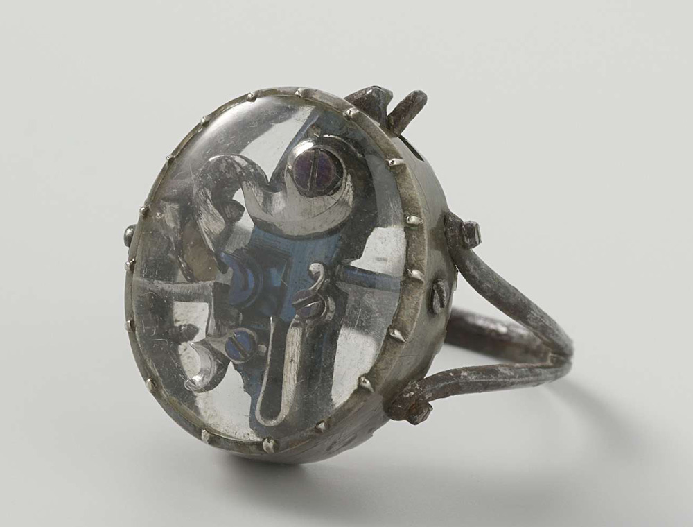
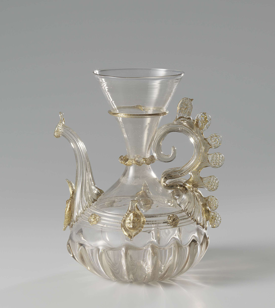
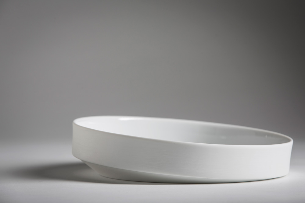
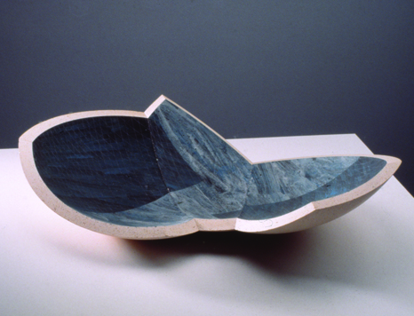
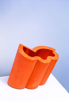
It seems to me that a short while ago we had a small misunderstanding about my feelings for the work Shift and Progression no.3 by Martin Smith. I’m writing you this letter, hoping to get things straight again, making you understand what it is that made my thoughts about the object shift, and made my initial liking for the object progress towards great annoyance.

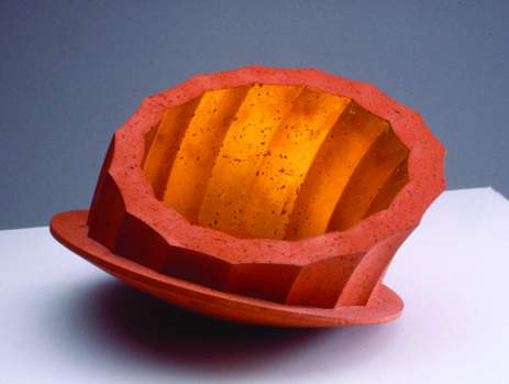
At first I praised the work and to your question of why I liked it, I answered: “It’s the ungraspable nature of the thing, it seems to radiate from the inside through clever use of material and reflection, it almost seems a mystical object.” At the time of writing it was probably how I really felt, but at this present moment it’s nearly impossible for me to recapture that feeling.

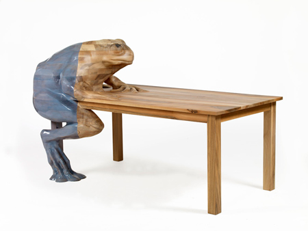
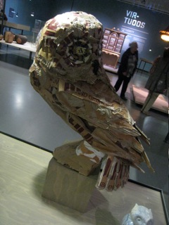
A lot of my initial feeling probably had to do with the context I first encountered the work in. On the Hand Made exhibition it was one of the few objects that managed to attract my attention for a substantial period of time. It was mostly because I didn’t really get what I was looking at. Not many other objects managed to do that, a few examples: a cardboard owl, a ceramic owl, a table of which one of the legs is a frog made out of epoxy, I guess you get the picture. And don’t get me wrong, it is not that I was in no way attracted to any of the things in the exhibition, but the attraction was only visual. With this object I felt, there would be something more to it. But how wrong did I turn out to be.

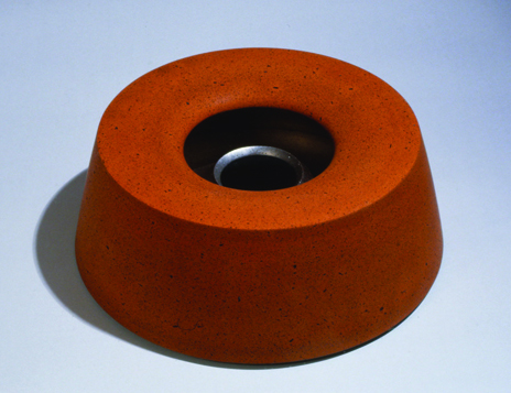
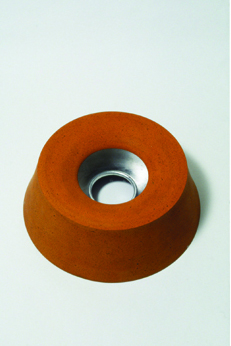
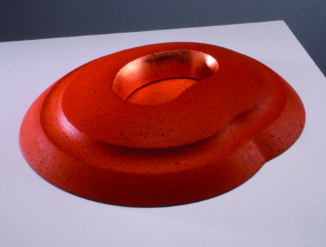
After I started searching for Martin Smith on the internet, I soon hit a dead end. Apart from his personal website, and a mentioning of him as being a professor on the Royal College of Art in London, there was nothing to be found. His personal website showed a range of works, all ceramic. Browsing through all this, I soon felt I might’ve been wrong.

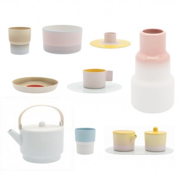
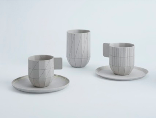
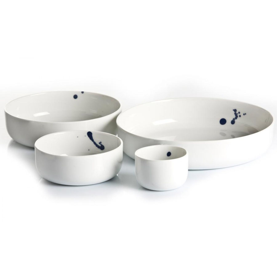
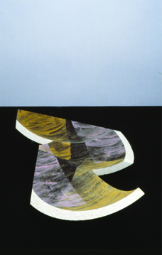
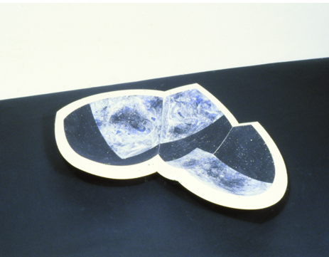
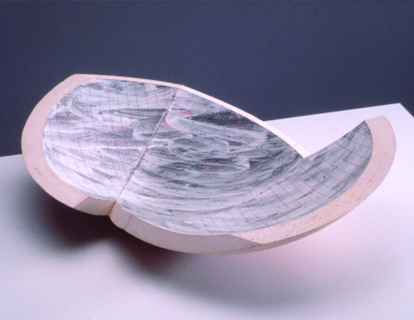
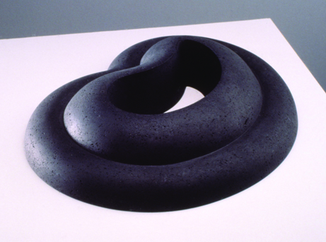
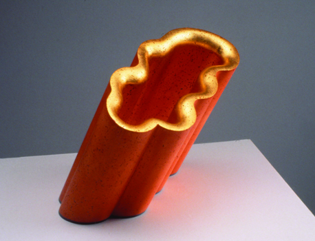
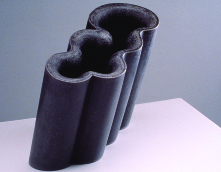
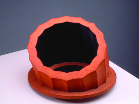
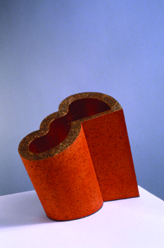
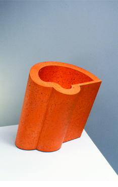
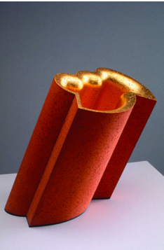
All his works definitely show his great skill in ceramic techniques, but never did I encounter a real surprise. He seems to work in series, every few years he changes the color of his clay, or adds another material to it, but that’s it. Series and series of basically the same type of object but slightly different. The first impression I had of Shift and Progression, that there had to be ‘something more’ to it than meets the eye, was definitely proved wrong. The website did offer me a quite brief description of his practice, namely: “an ongoing investigation of the formal language of the vessel and the way that it can both contain a space and define a place.”

What exactly was meant by this, I could only guess. Well I did get the formal part. Most certainly, when talking about form, he is exploring the possibilities of the materials he’s working with. But ‘contain space and defining a place’ really annoyed me. Any object can define a place. When placing a banana in a white room, it both contains space, and defines the room as the room with the banana in it. Put another object next to it, and both of them do the same. It didn’t seem to make much sense to me, just an attempt to put a fancy label on what he likes to do and is good at, working in clay.

Then, somewhat desperate I went to the library of the Stedelijk Museum. All they had was an 80 page book, which offered me a brief description of the mans life, and a lot of pictures of ceramic objects I had just seen on the internet. The only thing that I found out there, that seemed to be of any importance, was his interest in exact sciences, and the fact that he first studied to be a geography teacher. This, at least, could explain a bit about the impersonal and calculated works I had seen. But still made me wonder, what did it do in the museum, and why at an design exhibition?
It is possible to say that Smith is a designer of shapes, of course. These shapes, according to the book I found on him, are often the result of mathematic calculations. Also the chemical processes, for things as the glazing and ‘what happens when and at what temperature’ during baking, are approached in a very scientific manner. Even in his earlier period, where he made raku vases and bowls, he would calculate everything so precisely that the surprises that happen during baking, which are a important characteristic the technique, were reduced to a minimum. So the guy kind of struck me as a scientist, and even though the worlds of science and art aren’t that far apart, it’s just not the stuff that manages to interest me.

Then I decided to send the man an e-mail, hoping that he could explain me a bit more about his work, and light that once existing spark again. I asked him what he wanted to evoke with his viewers, what was meant by ‘containing space and defining place’, and whether he as well felt his work belonged in this Hand Made design-exhibition. But the man never cared to answer.

So in short, it was the cold approach and one-sidedness as I experienced throughout his entire body of work, really put me off. Even Shift and Progression now seemed devoid of any interesting aspect I found in it at first. All of the work seemed to me nothing more then just empty vessels, meant only to show off the technical skill of the artist.

Well, I hope this gave you a little more insight in my personal relation to the object and the gradual evolution it was subjected to.

Regards,
Giel

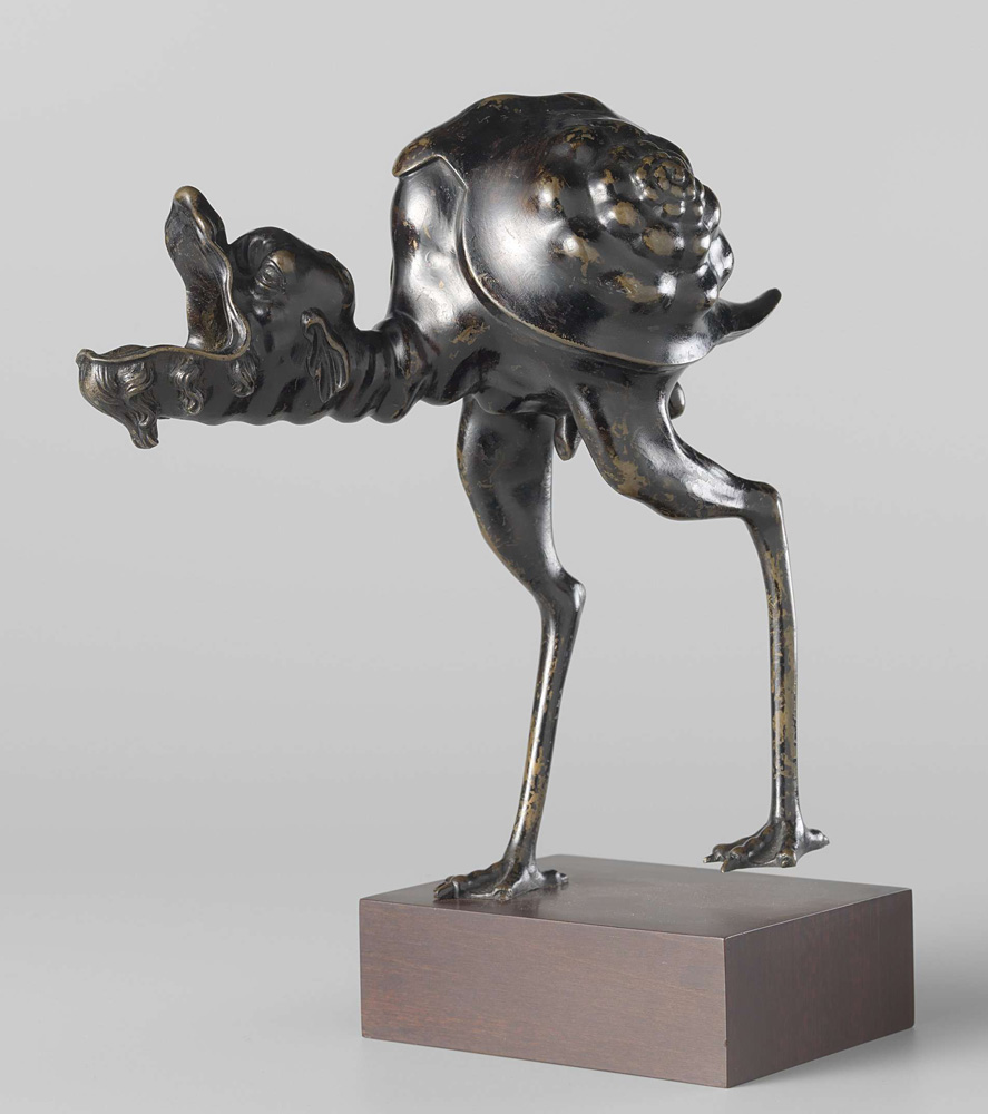
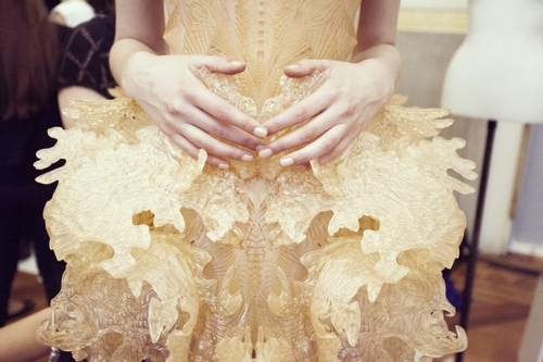
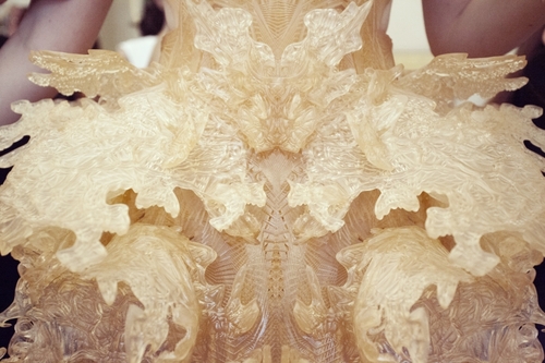
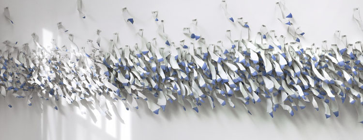
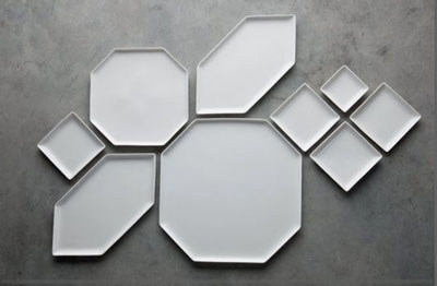
P.S.: I included a few pictures to prove my point. Also one of the  cardboardowl and of the epoxyfrog I told you about, just for fun!


A short introduction to the Uncanny in Design


Wednesday, May 22, 2013

In an essay from Freud published in 1919, called “The Uncanny”, he examines the phenomenon of the Uncanny. He describes it as a class of frightening things that lead us back to what is known and familiar. It is the return of the repressed events and memories that live within our minds. The uncanny is anything we have experienced in adulthood that reminds us of earlier psychic stages, of aspects of our unconscious or the experience of the human species.
According to contemporary artist Mike Kelly, “The Uncanny” can be felt when experiencing things like non art objects such as ancient Egyptian funerary objects, figures used for rituals, cults, and religious worship, anatomical models and wax figures, also contemporary hyper realistic sculptures. The scale of an object, The doubling of objects, and the “Almost Human” factor, can all produce that uncanny feeling. I am going to introduce to you now, 5 designers that possess these qualities in their work and designs.


First i would like to introduce Lidy Jacobs,
She takes the feeling of the Uncanny extremly seriouse in her work. She hand makes stuffed plush toys out of all sorts of different textures of fabric. And simply in its construction it reminds me of childhood and the imagination associated with dolls and toys. but the figures also present something terrifying, she adds elements of sexuality, that points back to adolescents and comments on  society and situations that arise between genders.

Her works really stood out to me in the exhibition “Hand Made” that i saw in Rotterdams, Boijmans Van Beuningen Museum. I saw brightly colored stuffed toys that somehow reminded me of my childhood but yet the figures were so outlandish that i could not place them with something recognizable in my mind.I connected with it but i was still lost as to what it was. This intrigued me.


Next i would like to look at Amsterdam based fashion designers, Viktor and Rolf. Graduates of the Design Academy in Arnhem, you can see here where the lines of art and fashion blur. There garments are known for being unbelievable unique .

As well as creating commercial garments and there haute couture collections, they also create life size and miniature porcelain dolls made in the exact likeness of the models that wore the original garments.


I find there application of the double in there doll making to be the definition of “uncanny”! You can see there collection here on their website


For a more structure based designer i chose Joep Van Leishout. Famous for his innvovative housing designs, his work borders on fine arts and design. He makes houses and sculptures in the likeness of our bodies (anotomically correct i might add) and blows them out of proportion.

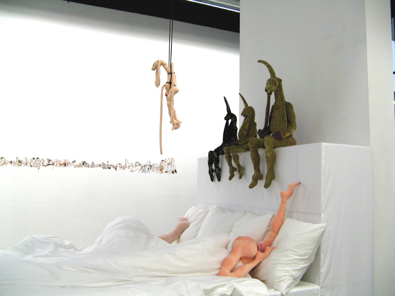
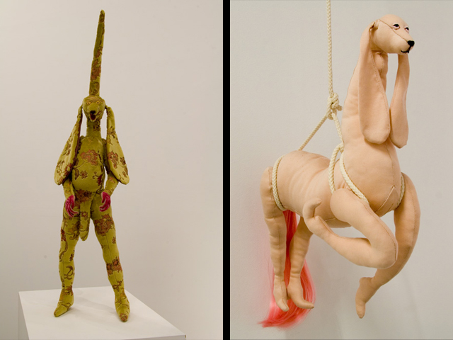
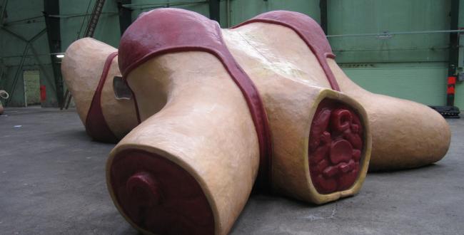
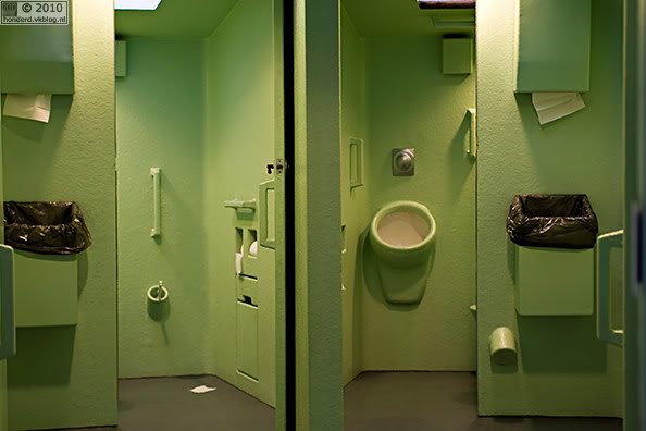
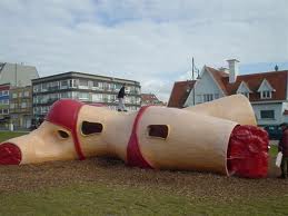
The material he uses also gives a flesh texture even when the work is NOT related to the body, You can see his work around the Netherlands, At the Verbeeke Foundation and he also built some of the bathrooms in the Boymans van Beuningen museum.


Next i present furniture designer Maarten Baas. In his series called “Smoke” he has set fire to designs chairs we all know, from the high class French designs to the Reitveld chair. Again we see the use of the double here, an uncanny resemblance, although in the end it is something quite different.

 In his series “Clay” we see furniture that seems to be askew or off in some way. Almost like a child’s drawing manifested in reality. “Clay” speaks to me because of it imperfections, its hand made appearance. With its liquid appearance it looks as if it would melt right here. Thease days the mass production of furniture cause us to loose touch with the hand made journey that furniture goes through. Here it feels personal again.


Lastly i will introduce you to yet another Dutch designer named Zoro Feigl, an Amsterdammer who works with movement in sculpture. His witty constructions breed movement, and often are shocking with there seemingly flawless construction. In “poppy” its almost as if a flower is opening, as the seconds pass it then feels like were standing beneath a twirling woman’s skirt, then we are standing in a wind tunnel. Its in this process so many things are called to mind. With help of the image, the sound and the feeling of the wind produced by the device, it truly is an Art Experience. See for more of his work here on his website


HAND MADE


Wednesday, May 22, 2013


on April 18th DesignResearch visited


“HAND MADE”


and researched the relation between craft and design

and how craft does relate to art and design….


to see all >click< for latest essay’s

by G_Group students


“Hand Made” is an exhibition organized

by museum Boymans van Beuningen,

taking crafts as its principal theme


more info

 /site Design.nl /site [Metropolis M [Dutch] /site Boymans van Beuningen

Why Not?


Wednesday, May 22, 2013


Choice, Cover, Sound. What can I find? Books, Visual, Design Why should I choose this one? Well. It wasn’t easy at all. But it was at the same time. operating 6 different words, which are never combining on the same title but can be easily associated with one single cover.
That was the idea. That was the choice. That was the start and finish point at the same time.
“Why not?” – that is the title for the third book I took from the library. The name that matches all of three chosen tags. If you start to Google it with "why not.." you will immediately have few options
Why not design,
Why not associates?
Why not" and "why not both".
You will also find website called WhyNot which propose "How to Use Everyday Ingenuity to Solve Problems Big and Small" or
Why Not Eat Insects? Or
Why not build more Schools Without Walls?”
Why not take up knitting again?

Sex and intimacy after 60: Why not both?
Why not kill two birds with one stone and send IRS to Gitmo?
Dogs on trains? Well, why not?
Why not be a naive?
Why not to swipe your girlfriend's skincare?
SO when I was googling in the library by hand, touching, looking for something special, taking, putting back to the shelf, searching and exploring and when I saw the perfect book for that
I had no more doubts – that was the right one.
That is funny, you don’t care actually what you will read about. Just simple choice of a book, as a subject, as a thing, as a piece.
Ask “Why?”, think “Why Not”? And take it!

Rietveld Library cat.nr: ?


Log in
subscribe