Skip to Content Skip to Search Go to Top Navigation Go to Side Menu


Archive for January, 2014


Shades Of Blue


Thursday, January 30, 2014

Ignaz Schiffermüller was an 18th century biologist who was particularly interested in butterflies. He created two colour charts, one of which was comprised of 36 shades of the colour blue, which Schiffermüller thought would make distinguishing between blues in the nature he was observing easier. This very particular motive for creating a colour chart inspired me to try and recreate something equally charming and with an equally egotistical goal. I decided to try and make forms which could be delicate and natural, but abstract at the same time, like shapes of colour, but which would pertrude from a surface and create shadows, forming “shades” of blue.
Here is a link to see the original colour chart.[x][x]

My piece is made up of only 20 pieces.

DSCN3714_redu

IMG_4158_redu

I >Am< >Here< In This Space >With< You


Monday, January 27, 2014

Have you ever had different impressions than in the past or than other people in the same space? I can give two examples;

image1_Hanna Lee

There is a place where I always pass by with my bike. Today, I decide to walk along that same space. I stroll in this space. I ramble through every corner and small alley. My feet lead me to the scenes which were always there but very new to me; an ivy-covered wall, small scribbles of children probably who lives in this neighborhoods, tiny bike tricycle lying on someone‘s front garden and windowsill-piece with nice touch. I enjoyed these scenes while walking through the same place where I pass by regularly. I always thought I knew this place very well, but today I was only started to become conscious of these new and everyday-life scenes.

My friend and I passed through the narrow alley and came to a small door. When we opened the door we were able to enter a space. It was deep and narrow. The width was not enough for us to stand side by side. The side walls are high and ceiling was open towards a nice blue sky. I could see a bird flying and hear the wind. Space was quite dark, but I felt very comfortable and fresh. But my friend had left the room already, later she explained why; she felt almost choking so left the space early.

This might be a daily experience which we encounter often, but if it occurs too often we might not put any extra attention to it. I had a curiosity for this event, and wondered why there are such differences according time and person. I am sure that many readers had the same experience like this and wondered about it.

image2_Hanna Lee

Metaphorically speaking, space is ‘vessel’ that contains food, and this food can be defined as ‘happenings (or events)’ in the space. This ‘vessel’ gains its meaning only when it is used and it meaning will be even enlightened if the ‘food’ is delicious. On the other hand, the shape of ‘vessel’ differs according to its containing food; bowl, plates or cups. Every food has is matching vessels, if it is not matched well; simply, the food loses its merits. And of course this same food in same vessel can be tasted differently to every people depending on their preference or their body conditions. This ‘taste’ can be also, metaphorically, defined as ‘spatial-experience’. I want to explore these factors that create different taste which can be said as ‘recipe’- The secret of tastes. And I presume this factors-recipe- is ‘Experience’.

I "Am" "Here" In This Space "With" You : read or download my thesis below


It appears you don’t have a PDF plugin for this browser.
No biggie… you can click here to
download the PDF file.

This essay initiated my graduation project “A Scenic Contemplation” presented at the grounds around the Rietveld academy as part of the 2013 graduation show.

650-_MG_0721_Hannalee_V

– A Korean Philosophy about window and surrounding says: “ Window is a frame that can hold scenery.
This philosophy about the window is called “borrowed scenery”. The borrowed scenery method reflects the exterior landscape into the inner spaces, forming new scenery.
This method does not destroy environment. It just borrows the environment. If you follow this philosophy you can live with a breathing landscape painting. When you borrow a landscape via the window, the architecture can breathe thought the window. The borrowed senery method make your senses soft.
I was impressed with this philosophy, especially with the attitude and the way how they treat the environment. They did not use the environment only for their own sake, but they borrowed the scenery and lived along with it.

It is a humble way to live with the environment.

text by Hanna Lee [graduate student department of inter-Architecture 2013]

Screen shot 2014-01-27 at 12.59.03 PM Download the publication ”A Scenic Contemplation“


UnDeR My Own COnstRUCtIOn OF RUIns


Monday, January 20, 2014


while wandering around the city center I become an observer….


ruin_image_5


sPACes considered to be MOnUMents turning out to be RUIns in the FRAGMents of my MeMORIes.


ruin_image_10


what I mean is a …

RUIN

– that what happens to the image from the moment of first gaze
– is in- between
– although beeing a man made it seems to be a gift of nature
– a law of nature that all things must fall into
– is to pass from perfect state into a state of imperfection
– it is a remnant of a future
– a souvenir -and souvenir as a suggested memory
– solitary presence whose reasons we understand less and less


ruin_image_15


Figuring out or misusing a building is an interesting way of defining an architecture for ourselves, and that becomes possible with ruins I am talking about.
Where is a ruin there must exist a natural force which created it. Like buildings which were here before us and lived lives of previous generations, survived repetitive demolition of past dreams of future. sometimes trying to reconstruct from old is just a human inabil- ity to adapt to the new conditions and a fear of letting go. Visually I don’t see a ruin as an old architecture not being able to keep up with the shape which it was designed for. I see it as a transition from design back into nature.

text by Denisa Kollarova [graduate student department of Graphic Design 2013] : the images above are random compositions of the folds and flaps that construct or decapitate the pages of a limited Cyclostyled publication of the essay : more Denisa Kollarova

Screen shot 2014-01-20 at 2.36.21 PM Download this thesis [44Mb]

Cyberflânerie


Tuesday, January 14, 2014

The thesis of Olya Troitskaya “Virtual walking” studies a gesture of strolling in physical and cyberspace.

It looks into the history of a “deliberate walk”, starting from the concept of the flâneur developed by Charles Baudlaire, its degradation by capitalism into the figure of the shopper, its later radical political update coming with the concept of the “dérive”, its development through a notion of “Psychogeography” with Guy Debord and Situationist International and its popularity later in 1990s in artistic and academic circles, building up psychogeographical praxis in various ways.

Physiologie_du_flaneur
Louis Adrien Huart / Physiologie du flâneur

Further the thesis draws a parallel between these historical processes happening in the real space to the ones taking place in the cyberspace.
With the development of capitalism flânerie becomes increasingly restricted. Is it possible that Cyberspace, that can be looked at as an update of a personal, bodily and architectural space, would become a more popular place for flânerie?
If in the 1990s “cyberflânerie” is associated with a free “strolling through information space, taking in the virtual architecture and remaining anonymous”(1), then in 2000s it doesn’t seemed such an intriguing activity as in the early days of the Web.

The processes happening to the internet in 2000s can be considered similar to ones happening in 19th century Paris, lead to the change of its original, playful identity.

live-rmb-city-1
Cao Fei / China Tracy, 'Live in RMB City'(2009) Video
: Courtesy of Artist and Vitamin Creative Space

Various artistic practices are being developed around a cyber stroll. Will they react to the changes happening to the figure of cyberflâneur and challenge its appropriation by capitalism, similar to Debor’s challenging capitalism’s hold over the city? (x) http://www.ceramicstoday.com/articles/051998.htm, last accessed: 06.09.2013

What is the future of the cyberflâneur? Is it possible to learn from Situationist’s example? Where to look for the “dérive” in cyberspace?

text by Olya Troitskaya [graduate student department of Graphic Design 2013] : more www.olyatroitskaya.com


Pdf-icon Download this thesis ”Virtual Walking“


The studio of Karel Martens


Wednesday, January 8, 2014


I had my worries walking around the book shelves in the art book shop San Serriffe. I didn’t know anything about art books how to look at them and how to look at the design.
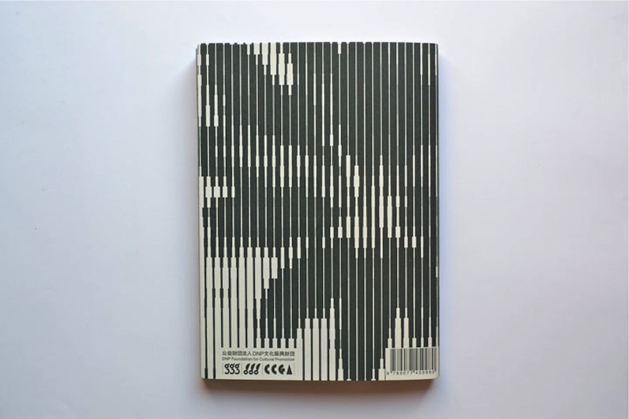
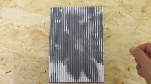
I skipped though some books but didn’t find them interesting. Then I saw a cover that caught my attention. I didn’t know the artist but I was enchanted by the simplicity of the graphic black-and-white book cover with Japanese text on the side and the title ‘Full color’. The size of the book felt a bit small in my hand, handy and easy to flick through the pages.
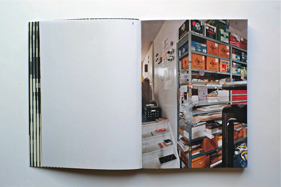
I turned the first page and discovered a colorful photo showing a bookshelf filled up with paper rolls and used fruit boxes properly containing more papers. The photo only shows a small part of the room but on the following pages the panorama of the room which turns out to be an art studio is shown. Page by page I was guided into the head of a graphic designer’s studio.


book coverbook-shelves2


It turned out to be the head of the Dutch graphic designer Karel Martens. He is specialized in typography, working with prints and books.

After his studies at the School of Art at Arnhem in 1961, he became a freelance graphic designer.

Since 1977 he has been teaching in graphic design at his old school in Arnhem and at the Jan van Eyck Academie in Maastricht. He is now working as a supervisor at the master-program Werkplaats Typografie [x] together with Armand Mevis. This program is based on practical assignments and self-initiated projects. It also works as a meeting place for graphic designers.


The book ‘Full color’ which is showing Martens’ studio was published on the occasion of the exhibition KM, Ginza graphic gallery in Tokyo in May 2013 [published by Roma Publications].

With the information about the artist and his work I started to look deeper into the book.

The photos by Johannes Schwartz are divided into 4 parts by the graphic designer Julie Peters together with Martens himself.


book2

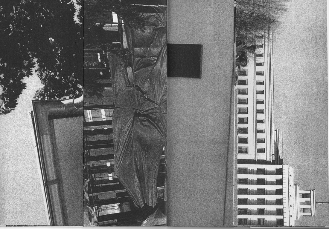
The first part contains photos from the artists’ studio. They seem to form a long panorama, cut up and organized so you see some parts of a room at one photo and the second part of the room at the next photo. This way of organizing the photos gives you the impression of flashbacks and even more if you already know his work.

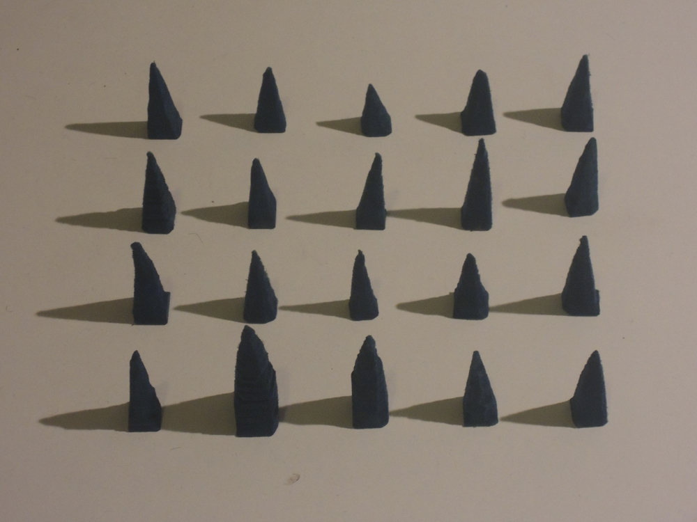
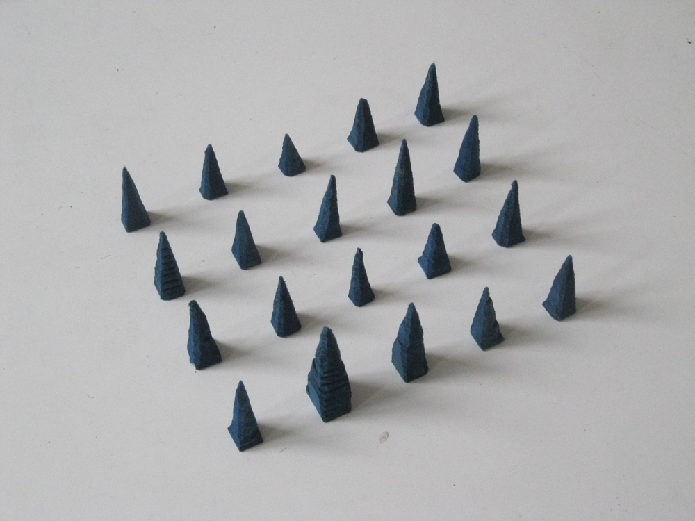
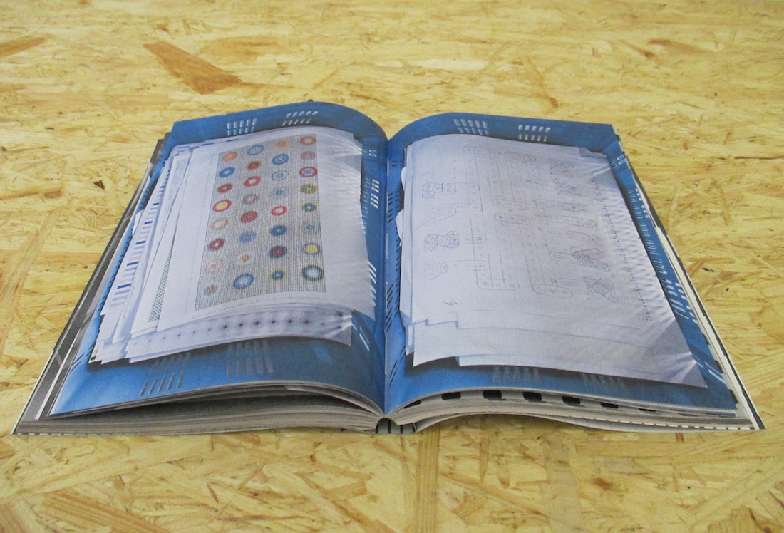
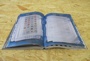
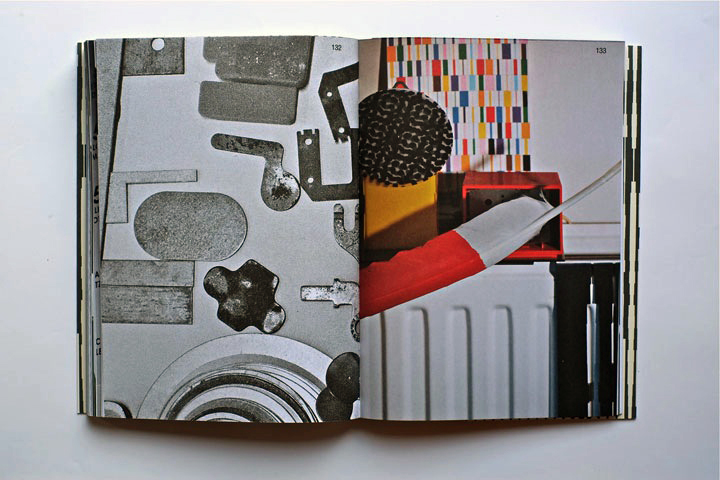
The next part is Martens’ archive, collected in boxes from the bookshelves. Here you look directly into the boxes which contain sketches, illustrations and prints of the artist. If you look at the prints you’ll find some of the shapes recognizable. When you flick through the book you get the impression of a system of colors and shapes which are being repeated. An example of that could be the small industrial metal pieces which shapes are to found on some of Marten’s prints. It seems like the editing of the book creates some sort of pattern – just like Marten’s prints.


book2


The third part is a close up of Martens kinetic work with clocks seeing from behind. A study about composition and color, by printing a dot pattern on two glass disks and attaching the disks to the second and minute hands of a clock. The chose of photographing the clocks from behind is again a way to show the process from his work.

The last pages in the book are writings by David Senior and Martens him self. The text is in English and Japanese describing the project around the book and the work of Martens.

One thing I was wondering about was why Martens choose to have a graphic designer on this book when he himself makes books. I asked Johannes Schwartz about that and he told me that the making of this book includes a close co-operation between all 3 artists. This book does not only work as a documentation of an artist. Not only the contents of the book tells about the artist and his work but also the editing is very important.

The result is this fascinating portrait which gives you a good insight knowledge of Martens’ visual language.
If you are curious for more please check one of his other books “Karel Martens: printed matter/drukwerk, 2nd Edition” which contains a big amount of exhibitions, art works and articles he have been taking part in. This book gives you a good insight into Martens’ environment and way of working too.

Rietveld library catalog no: marte 1

cover back


Log in
subscribe